
Summary - Learn everything you need to know to build, design, and share data dashboards that will accelerate your business growth.
Dashboards are useful tools that present complex information in an easily digestible and understandable way. They’re particularly valuable nowadays, where businesses send and receive many types of data, whether from web services, databases, or even AI.
These gather and show data so that you can keep track of key performance indicators (KPIs) and metrics in just one place. These platforms provide insights into how your business is doing through current data, which you can compare with past trends.
Let’s dive deeper into the ins and outs of a dashboard, its importance, why every business should have one, and more.
- What is a dashboard?
- Why are dashboards important?
- How have dashboards evolved?
- Why you need a business dashboard
- Dashboard features and visualizations
- Types of dashboards and how to choose the right one
- 5 tips to consider when building and designing a dashboard
- Additional resources to help you build a dashboard today
What is a dashboard?
A dashboard is an information management tool used to track business KPIs, metrics, and key data points that are relevant to your business, department, or a specific process. Dashboards collect and visualize data from multiple sources, such as databases, locally hosted files, and web services. With these, you can monitor your business performance through historical trends, actionable data, and real-time information.
For businesses, there are hundreds of processes that impact your performance. And with so much data your organization sends and receives these days, managing and extracting value from it can be a challenge. BI tools like dashboards simplify data analysis and distribution. This way, businesses can leverage their data to make smarter, better, faster data-driven decisions.
Moreover, a well-designed dashboard levels up your approach to information management. Everyone in your organization, regardless of role, will need to stay updated on your company's performance, whether it’s about campaign performance, new wins, or churn rate. Dashboards bring everyone (and your metrics) together in one place to answer these questions.
What's the difference between a dashboard and a report?
While it may seem like the terms are interchangeable, there are actually a few significant differences between the two.
Let’s look at similarities first. Dashboards and reports both:
- Provide historical data
- Bring multiple metrics together
Where the differences lie is that:
- Reports are static; dashboards are interactive with live, dynamically updated data
- Reports share information on known areas of interest or goals; dashboards monitor known areas of interest or goals
Why are dashboards important to business?
Dashboards simplify data analysis and distribution, allowing you to save time and gain control of your processes and performance. You can also avoid data overload by showing only the most relevant and crucial information.
There’s this misconception that dashboards are just useful for those in executive management. It’s probably because building dashboards used to be a lengthy process. However, we’ve developed dashboards that are easy to use and understand so that everyone on your team can make the most of your data assets.
Now, with PowerMetrics you can build a dashboard in a matter of minutes without having to see a single line of code. We love dashboards because they promote data democracy — something we’re pretty passionate about here at Klipfolio.
You can use dashboards in any area of your business. Your marketing team can use them to track website performance and conversion rates, while your sales teams can use them to track opportunities. Additionally, executive teams or founders can use them to get a holistic view of company growth and performance.
Why do I need a dashboard?
When used effectively, dashboards can significantly change how your organization operates. Here are three reasons to invest in this tool.
1. Get more value out of your data
Information is power, and data is one of the most valuable assets your organization has. But what good would it be if no one understands why they’re relevant to your business?
A well-designed dashboard is a powerful tool for sharing information and promoting collaboration across departments. With it, you can display crucial business data and be assured that everyone in the organization can understand them and leverage them to make better decisions.
2. Consolidate and automate multiple data points
Dashboards bring different types of information together on a single reporting interface. As a result, you can create reports easier and faster. You no longer have to log into multiple services and open many spreadsheets.
With a tool like PowerMetrics, you can quickly connect and manage your data with just a few clicks and your login credentials.
3. Align teams and departments
Data doesn’t lie. When it comes to collaboration across departments, dashboards give you a clear and unbiased view of your business’s current performance. This way, everyone can discuss strategies for improvement since they know exactly how things are going.
Also, with tools like TV dashboards, you can cast your dashboard to a screen in your office so that you can display crucial metrics. Sharing information openly and making it accessible can empower your team to work toward your end goals based on these data insights.
The ultimate dashboard feature: Data visualizations
Choosing the right data visualization method is a critical element of dashboard design. These visuals can make complex data even more digestible and understandable. After all, it’s simpler to spot trends in a chart rather than going through various spreadsheets.
When picking a visualization, consider what the goal is. You want to choose a style that displays the information you want to highlight so that everyone is on the same page.
Let’s briefly go over what data visualizations are and how you can use them.
There are three common types of data visualizations in dashboard design:
- Tables
- Line charts
- Bar charts
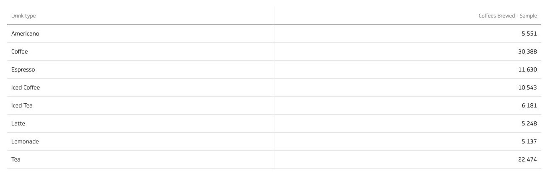
Tables
Tables arrange data in columns and rows and can include extra graphics like small charts or lines showing trends. One of the main benefits of this layout is that it helps in comparing and analyzing data more effectively.
Use a table to:
- Show data that fits well in a two-way layout, like categories and values
- Break down big sets of data into smaller, more understandable parts
Don't use a table to:
Display large amounts of data, as it can make the table too hard to read
Best practices for table visualizations
- Organize your data well. Start with labels, categories, and numbers, then add graphics
- Keep it simple: try not to have more than 10 rows in your table to avoid confusion
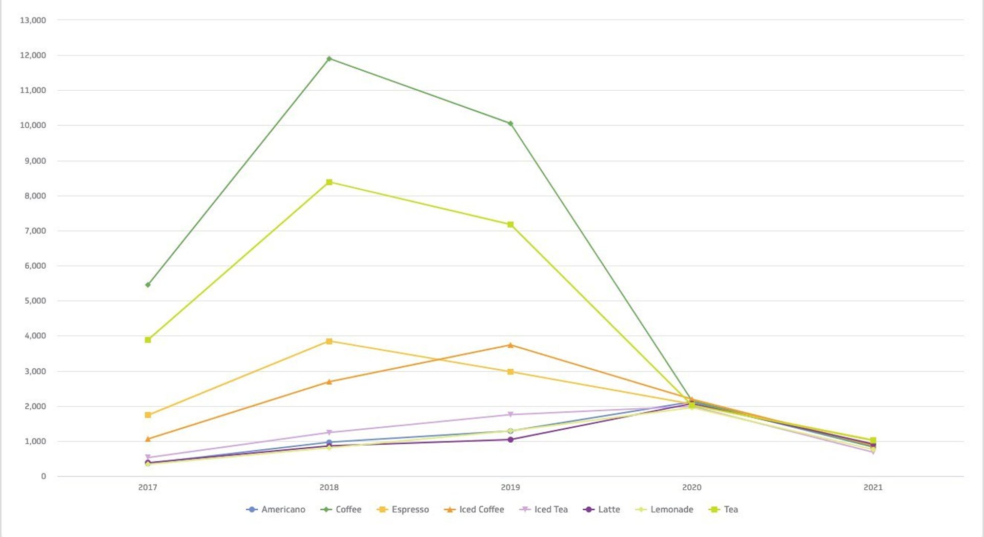
Line chart
Line charts can help you see how values change over time. Their simple and precise format lets you spot trends easily. Additionally, you can use multiple lines in a chart to compare different variables.
Use a line chart to:
- Understand trends, patterns, and changes in your data
- Compare different but related data sets
- Predict future trends
Don't use a line chart to:
Get an in-depth view of data; line charts are best for general trends
Best practices for line chart visualizations
- Assign different colors for each category you're comparing, and use solid lines to keep it clear and concise
- Avoid comparing more than four categories in one chart to keep it easy to read
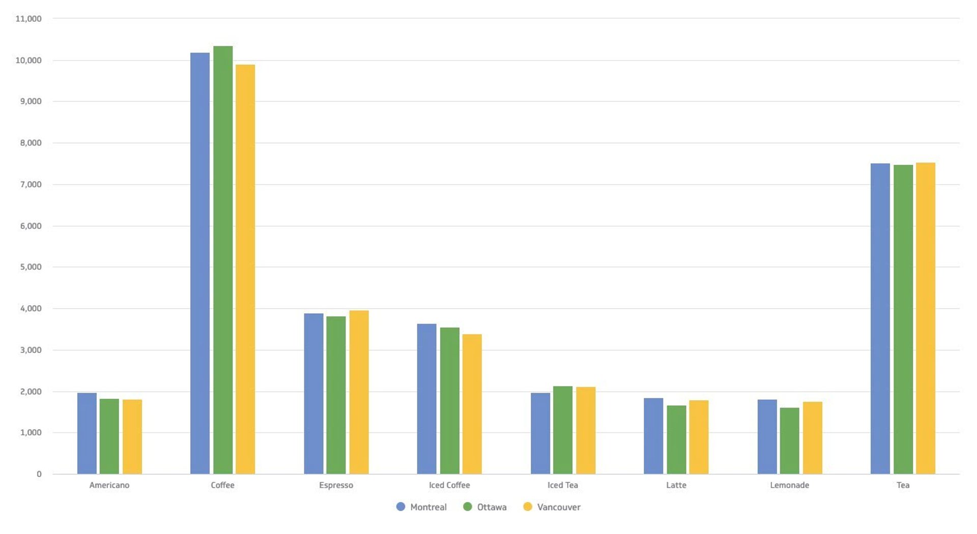
Bar chart
You’re probably familiar with bar charts since they’re one of the most popular types of visualization. As the name suggests, these are characterized by rectangular bars that show the difference between different variables or data sets.
Use a bar chart to:
- Compare two or more values in the same category
- Show how different parts make a whole
- Compare up to 10 groups of data for the best viewing experience
- Understand how different data sets relate to one another
Don't use a bar chart to:
- Show just one value in a category
- Display data that changes continuously
Best practices for bar chart visualizations
- Keep the colors and labels consistent throughout so you can easily identify relationships
- Make the y-axis label shorter and clearer, and remember to begin at 0 for consistent data presentation
To learn more about data visualizations in-depth, check out our guide to data visualizations.
Types of dashboards
There are four types of dashboards: operational, strategic, analytical, and tactical. But how do you know which is the right type for your business?
In summary:
- Operational types of dashboards tell you what is happening now
- Strategic types of dashboards track key performance indicators
- Analytical types of dashboards process data to identify trends
- Tactical types of dashboards offer detailed insights into short-term projects and departmental goals
What is an operational dashboard?
An operational dashboard helps you monitor real-time or transactional data against key metrics and KPIs, such as sales performance and inventory levels. What’s great about operational dashboards is that they update frequently—even up to the minute!
Operational dashboards are designed to be integrated throughout the course of your daily workflow. Front-line workers, supervisors, and team leads benefit the most from these tools. They often contain contextual information, too, so users can explore the data and use the insights in their corresponding roles.
Metrics you can track on an operational dashboard
- Website performance metrics like new users or bounce rate
- Follower count or comments across your social media channels
- Return on ad spend to track the effectiveness of your digital advertising dollars
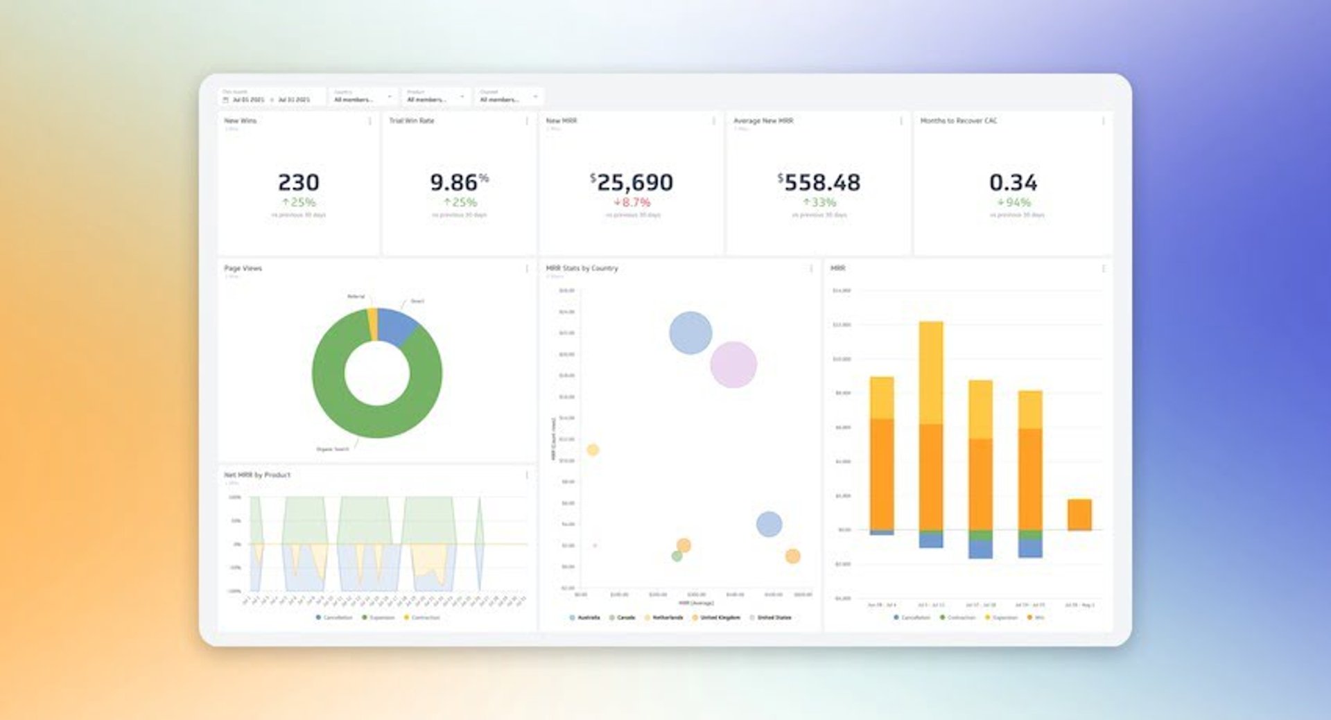
What is a strategic dashboard?
Strategic dashboards are used to monitor the status of KPIs related to overall business performance, including market position and financial health. Unlike operational dashboards, it updates less frequently since it focuses on long-term trends and objectives.
Executives and senior management officers can check strategic dashboards weekly to check the progress of ongoing projects and make sure every step stays aligned with strategic goals. Monthly, quarterly, and annual reviews allow you to see the bigger picture and forecast accordingly.
Metrics you can track on a strategic dashboard
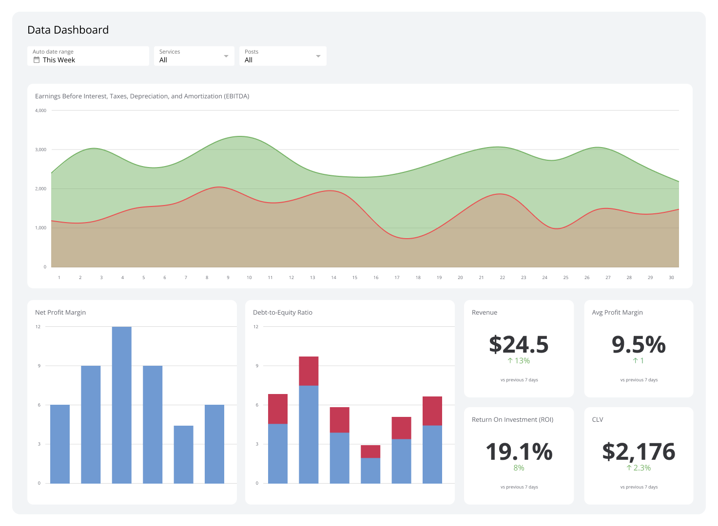
- Monthly, quarterly, or yearly fiscal performance
- Account and MRR growth rate
- Earnings before interest, tax, depreciation, and amortization (otherwise known as EBITDA)
What is an analytical dashboard?
Analytical dashboards help you make sense of large volumes of data. With them, users can assess trends, predict outcomes, and set targets based on historical data.
Traditionally, data analysts were responsible for developing and designing analytical dashboards. Over the years, no- or low-code business intelligence or BI dashboard tools like PowerMetrics have paved the way for everyone in the organization to maximize data. From marketers to founders and executives can now build analytical dashboards and share information with ease.
Metrics you can track on an analytical dashboard
- Annual contract value to track the dollar amount an average customer contract is worth
- Measure your company spending habits with the Bessemer Efficiency Score
- Understand the increase in daily active users over a period of time
What is a tactical dashboard?
A tactical dashboard is used to connect strategic planning and operational activities. These tools offer real-time or near-real-time data to help users make informed decisions that affect short-term goals and strategies.
While strategic dashboards focus on long-term insights and operational ones monitor day-to-day activities, tactical dashboards offer detailed insights into a specific project or department’s performance, from status and costs incurred. Basically, they track the progress of initiatives against set targets and goals.
Metrics you can track on an analytical dashboard
- Milestones reached to track the status of ongoing projects and operations
- Sales targets or production efficiency, and other department-specific KPIs
- Machine uptime and employee productivity to check resource utilization
Blend all four dashboard types for ultimate success
Now that you’ve gotten a deeper look at each type of dashboard, you should consider using them all to create a powerful system for monitoring and managing your business at every level. PowerMetrics can help you maximize them all in one place.
Learn more about dashboard design and the secrets to an incredibly effective dashboard in our guide to dashboard design.
How to choose the right dashboard based on business reporting requirements
This chart will help you understand which type of dashboard is the best fit to meet your business goals. The questions will help you to determine why you need a dashboard; the design, features, and training required based on your audience; the metrics to use that will help fill performance gaps; and the ultimate end goal that you’re working towards with your dashboard.
| What question are you looking to answer? | Best fit: Operational | Best fit: Strategic | Best fit: Analytical |
|---|---|---|---|
| What problem are we trying to solve? | Increased data awareness and access to time-sensitive data | Line of sight into top-line organizational KPIs | Access to trends or deeper insights |
| Who will use the dashboards? | Managers and their teams | Directors and executives | Analysts and executives |
| What gaps exist in our performance? | Daily performance | Monthly, quarterly performance | Performance issues, weekly performance |
| What are our goals? | Increased employee awareness and tracking against goals | Setting strategic goals, achieving KPI targets | Setting analytics goals and increased visibility into key processes |
How to choose the right dashboard based on technical reporting requirements
With the proper tools, technical reporting shouldn’t seem too scary! As mentioned, many dashboard tools are now more user-friendly and accessible so that everyone can make better decisions through data analytics.
These technical-focused questions will help you further narrow down the best-fit dashboard for your business needs.
| What question are you looking to answer? | Best fit: Operational | Best fit: Strategic | Best fit: Analytical |
|---|---|---|---|
| What is the state of our data infrastructure? | Web APIs, databases, spreadsheets | Web APIs, databases, spreadsheets, data warehouse | Data warehouse, database |
| What are the data latency requirements? | Low-latency, time-sensitive, real-time | Incremental updates needed for accurate, right-time information | High latency, accurate data |
| How many data sources are we pulling our data from? | Multiple systems and applications to improve visibility | Multiple data sources within a single dashboard or set of visualizations | Multiple data sources within a single dashboard or set of visualizations |
Dashboard design tips to get you started
Creating an impactful dashboard is about presenting data in a way that's visually appealing, functional, and tailored to your audience’s needs. Here are five strategies to help you build a dashboard that truly stands out and effectively serves its purpose.
1. Design your dashboard with your audience in mind
An effective dashboard is one that relays a clear message. And the first rule of effective communication is to define your audience.
From the very beginning, you must determine who (and how) your dashboard will be used. Depending on who your audience is, your dashboard may be viewed on mobile devices, web browsers, or even TV dashboards. These are all important considerations when you start to design your dashboard.
A business dashboard helps users understand how their business is doing through data visualizations. Although you might not know every detail about how your tools collect and process information, what’s important is that you’re able to see the main points of your business’s performance.
This way, you can quickly spot potential issues and figure out areas for improvement. The best business dashboard gives you the information you need and delivers it to the right people at the right time.
2. Identify your key metrics
Think about your main pain point when building your dashboard. This way, you can configure it to display the metrics and KPIs you want to track. By identifying the problem you want to solve, you’ll have a better idea of the aspects you need to monitor to achieve it.
If you’re not sure where to start, you can check out MetricHQ, Klipfolio’s online dictionary of metrics and key performance indicators. You can sort by category, service, or even check out the popular metrics.
There’s Instant Metrics, too. These are metrics that you can add to PowerMetrics with just a click and your login credentials — you don’t need an API key or a line of code to get the data you need.
3. User context
When you’re building your dashboard, make sure you consider the context in which the dashboard will be viewed. If the first step was to identify your audience, now you have to select the visuals that will be meaningful to them.
For example, an executive may want a compact dashboard with clear, simple visualizations so they can see the bigger picture at a glance. On the other hand, an analyst or technical marketer may want to dive deeper into the data with more sophisticated visualizations.
User context is key to the effectiveness of your dashboard. More than the data it displays, it’s about whether users can easily read and understand the information presented.
4. Design for immediate action
A dashboard should generate a response from those who use it. This could be to recognize successes or to highlight problems that need attention across the company or in specific departments.
When designing your dashboard, use a simple color scheme and fewer symbols. This way, you prevent confusion and distraction to make the platform easier to understand and use no matter where it’s embedded.
5. Test, evaluate, and tweak
As you and your team use your dashboard, you should collect feedback from those who interact with the tool frequently. Getting their comments can help you adjust the dashboard to meet their needs and help them make data-driven decisions in their respective roles.
Boost your business performance with dynamic dashboards
Nowadays, you can create a dashboard and share information across departments. With this level of empowerment and data transparency, everyone in the organization can stay informed on the business’s performance and growth rates.
Choosing the right type of dashboard is crucial to address specific needs and keep the team moving toward your company’s overall goals. Aside from the type of dashboard, you should also design it in a way that relays the data in an easily understandable way.
Resources to help you build a dashboard today
- Sign up for a free PowerMetrics account. You can get started here.
- Check out our latest PowerMetrics how-to series on YouTube: How to build a dashboard, how to visualize your data with different chart types, how to segment and filter your data, and how to apply dashboard filters.
- Explore MetricHQ, find the metrics that matter most to you, and try Instant Metrics.
- Listen to the Metric Stack podcast to hear how founders, leaders, and marketers, and more successful with data.
- Subscribe to our weekly Metric Stack newsletter to get a new benchmark in your inbox every week, in addition to what's trending in the world of metrics, expert interviews, and tips and tricks to help you level up your analytics.
Related Articles

6 dashboards I use daily to run my SaaS company
By Allan Wille, Co-Founder — April 10th, 2026
Klipfolio Partner How-To #1: Duplicating dashboards across client accounts
By Stef Reid — November 27th, 2025
The Starter Guide to Dashboard Design
By Emily Hayward — September 24th, 2025