Data Visualization blogs
A collection of our most recent articles on
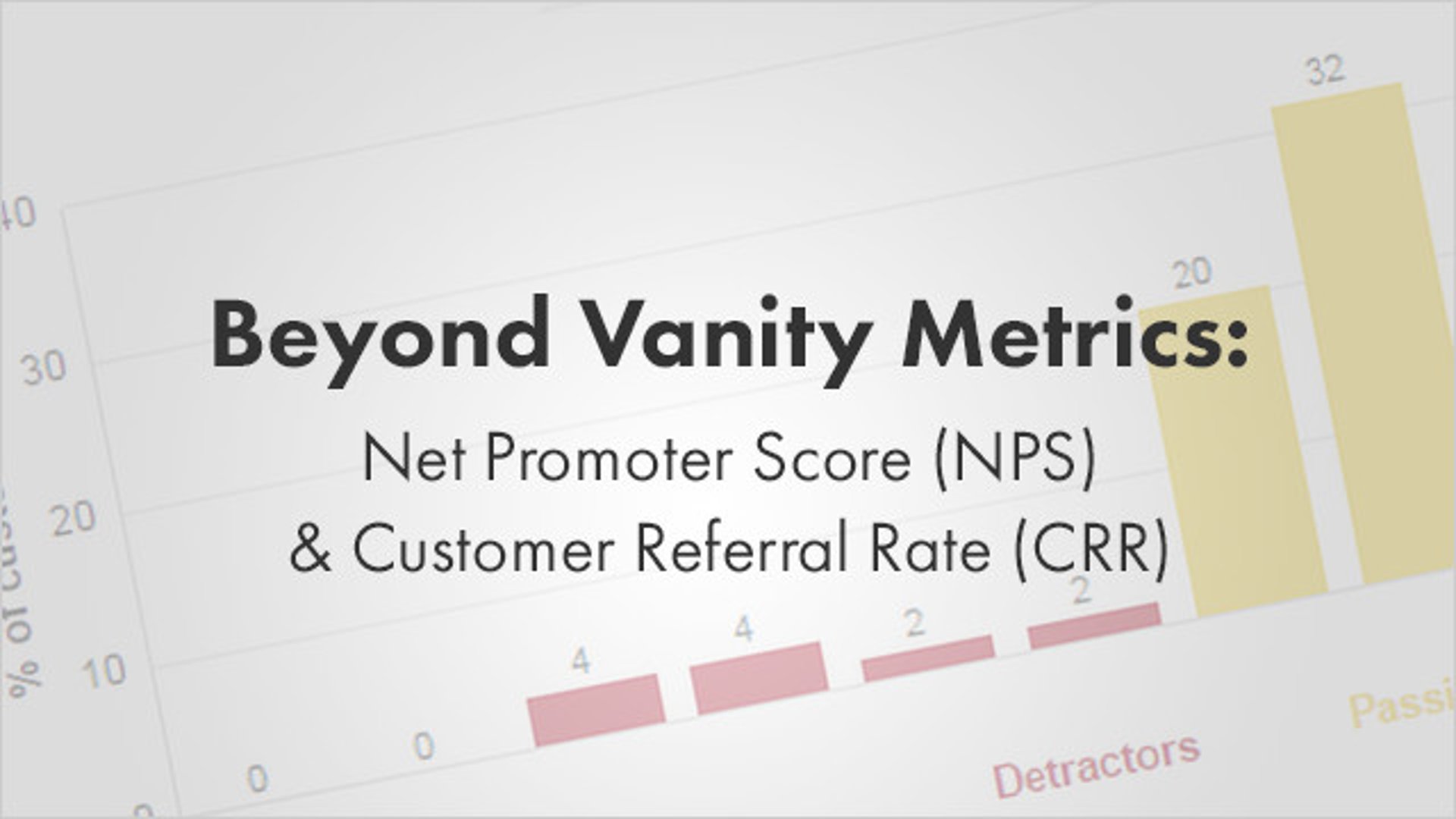
Beyond Vanity Metrics: Net Promoter Score (NPS) & Customer Referral Rate (CRR)
By Jonathan Taylor — September 25, 2015

The Most Important Formula in Klipfolio
By Zach Kathnelson, Partner Manager — September 25, 2015
It's not about the database. It's about you. The biggest Klipfolio update ever.
By Allan Wille, Co-Founder — February 6, 2019
Ready, aim, fire! How a simple bullet chart can help you hit your targets
By Jonathan Taylor — April 10, 2012

How to use burndown charts to manage agile software releases
By Ali Pourshahid — January 10, 2019
Using the new pictograph data visualization on your dashboard
By Jonathan Taylor — February 26, 2015

Cervinodata’s 5-year partnership with Klipfolio leads to 1200% growth
By Mitch Dupuis — August 26, 2019
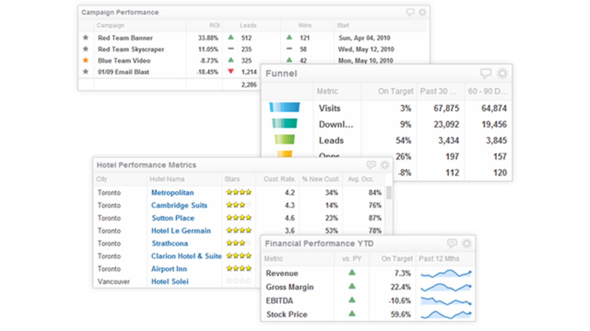
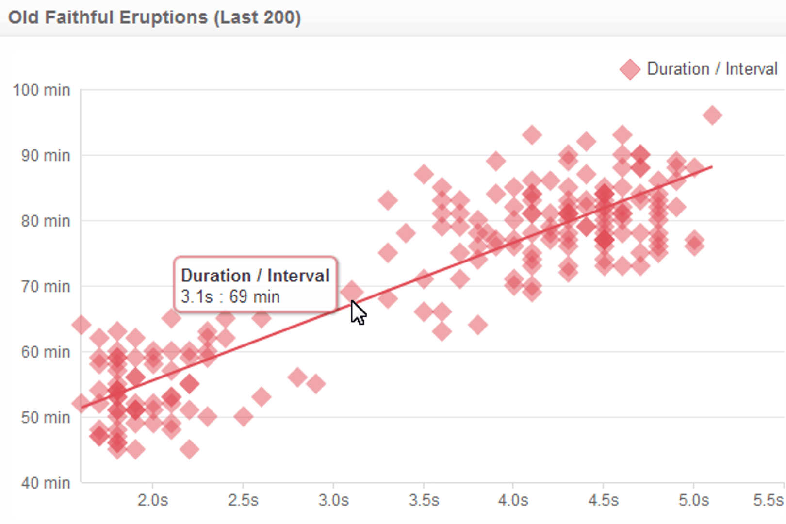
Component overview - 5 features to make your charts stand out
By Jonathan Taylor — November 27, 2012

COVID-19: A dashboard for exploring historical data about the virus
By David Mennie — March 23, 2020

Salesforce Training Resources 101: The Basics that You Need to Know
By Jonathan Milne — September 25, 2019
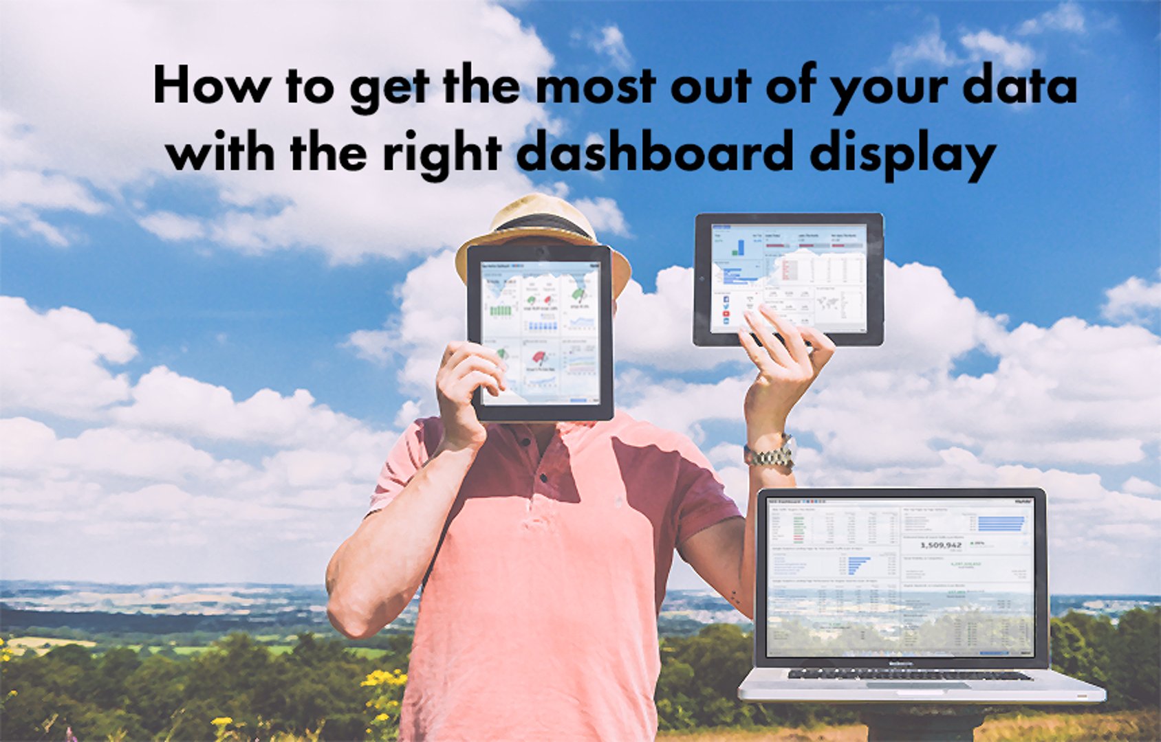
How to get the most out of your data with the right dashboard display
By Jonathan Taylor — August 23, 2016
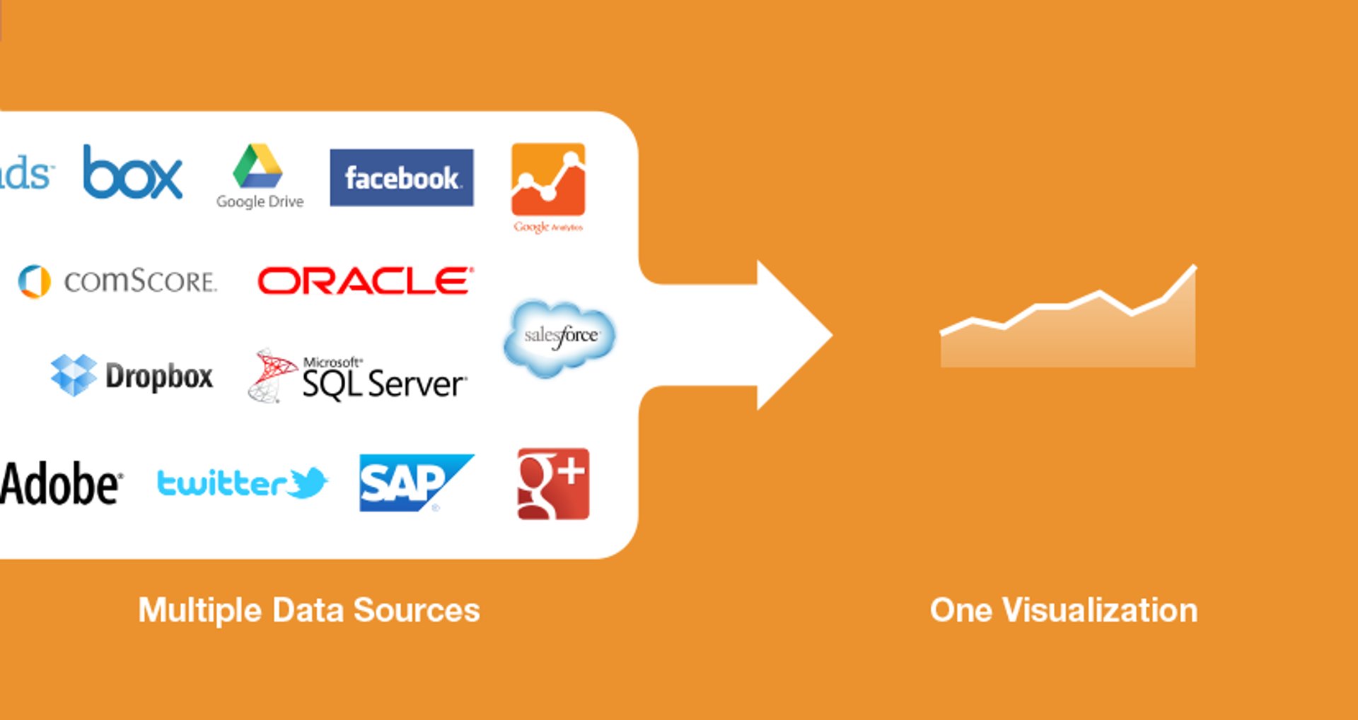
Meet your data mashups - 3 examples for your dashboard
By Jonathan Taylor — October 15, 2013

Side hustle metrics: What you need to consider for side hustle success
By Mark Brownlee — January 21, 2019
Can DevOps teams have a life in the age of cloud-based software?
By Ali Pourshahid — September 11, 2015

What Is Data Visualization?
By Emily Hayward — October 6, 2021
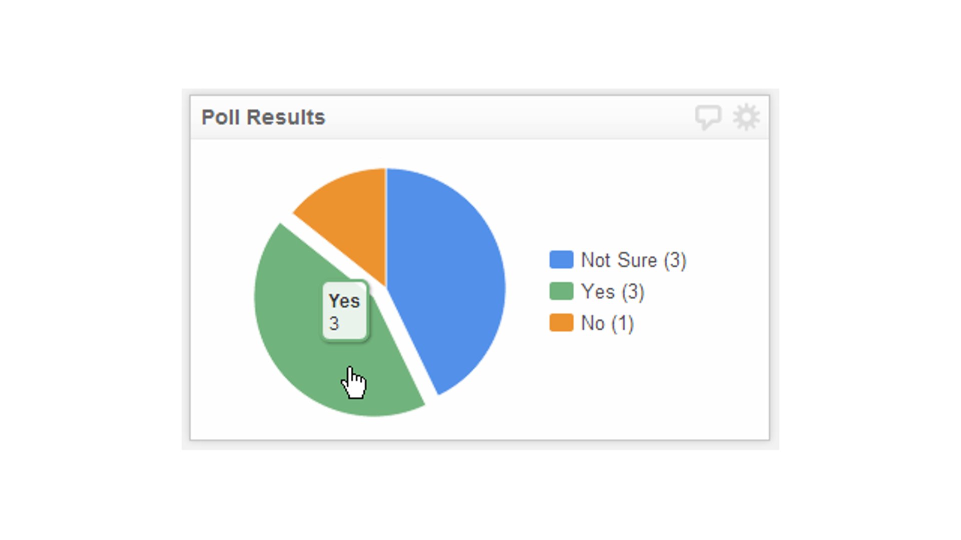
Displaying poll results using a pie chart
By Jonathan Taylor — May 9, 2013
Component overview - Turning the tables on data visibility
By Jonathan Taylor — September 13, 2012
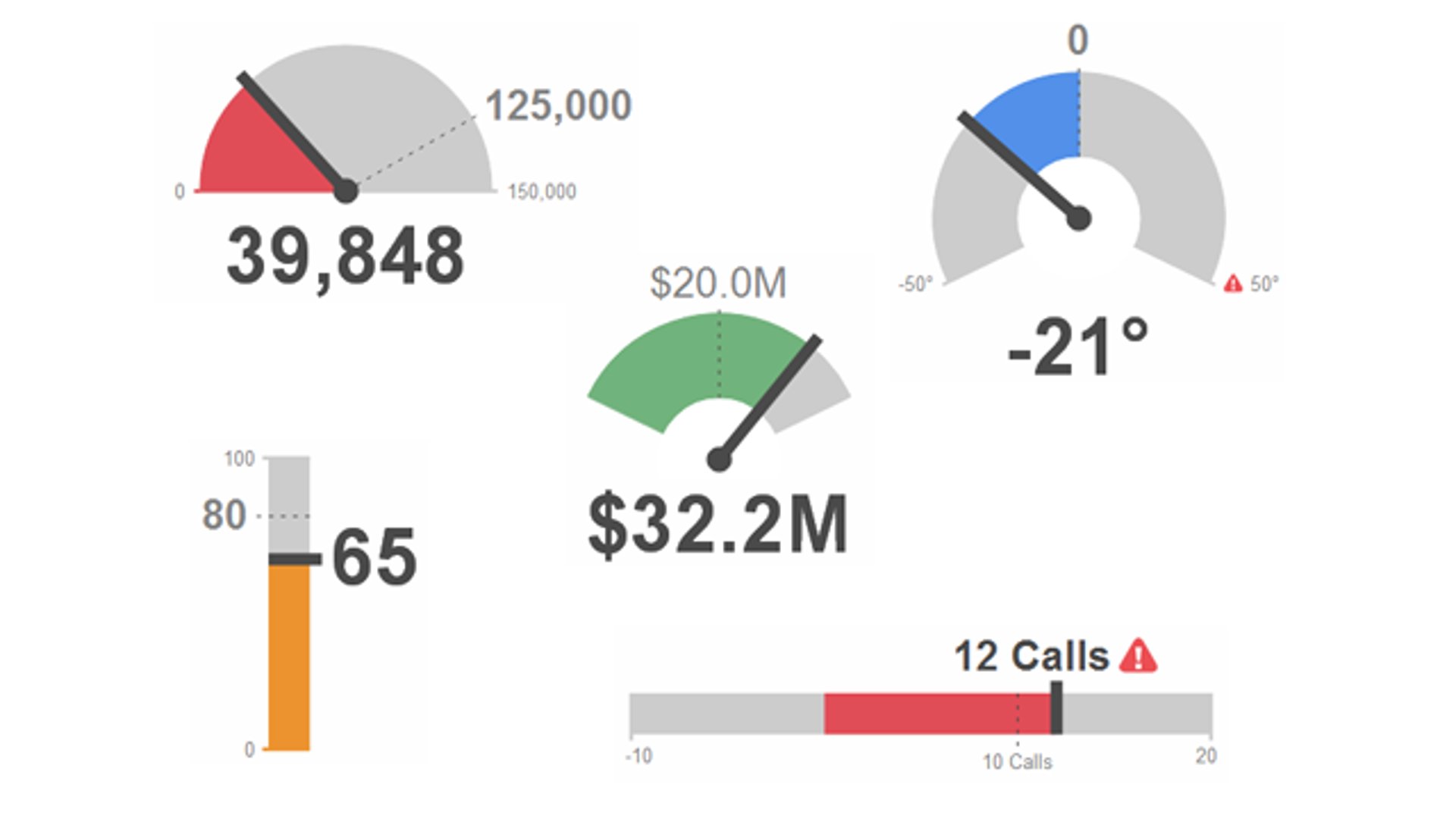
Full-throttle ahead - Best practices for the Gauge KPI visualization
By Jonathan Taylor — June 22, 2012
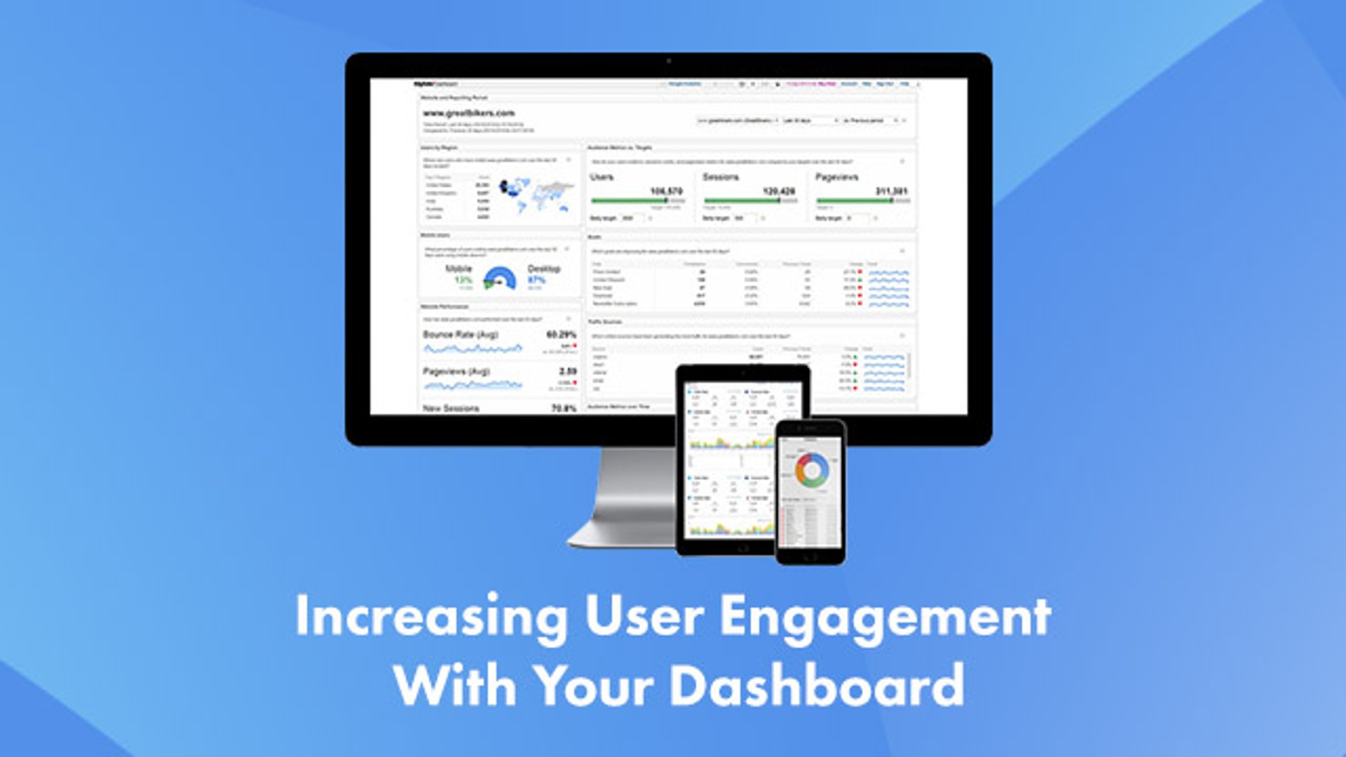
Best Practices - 3 Ways To Increase User Engagement With Your Dashboard
By Zach Kathnelson, Partner Manager — April 9, 2015

How (and when) to create a custom metric
By Mark Brownlee — January 23, 2019
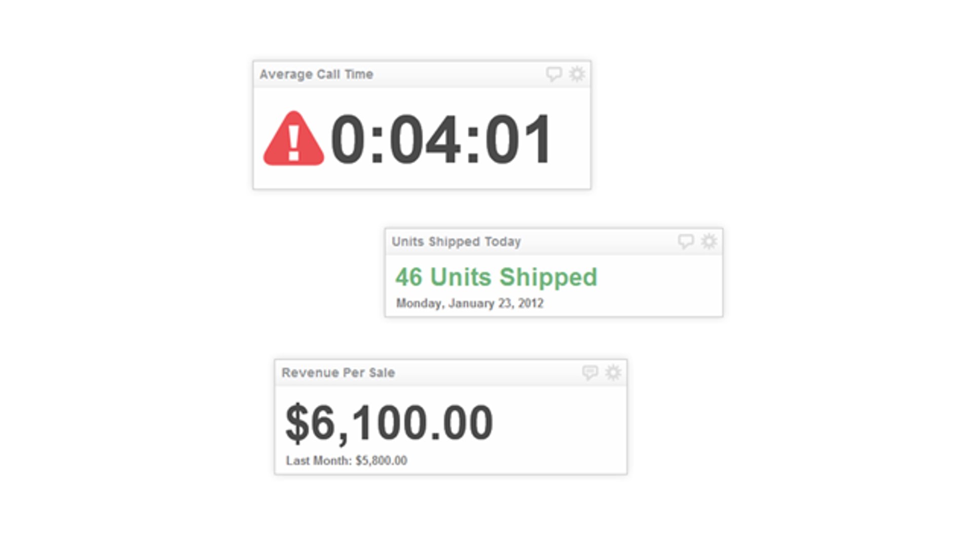
Component Overview - The "Value" of simplicity
By Jonathan Taylor — August 30, 2012
Release Roundup - 4 new data visualizations for your dashboard
By Jonathan Taylor — November 16, 2012
What is a TV dashboard?
By Emily Hayward — March 31, 2021
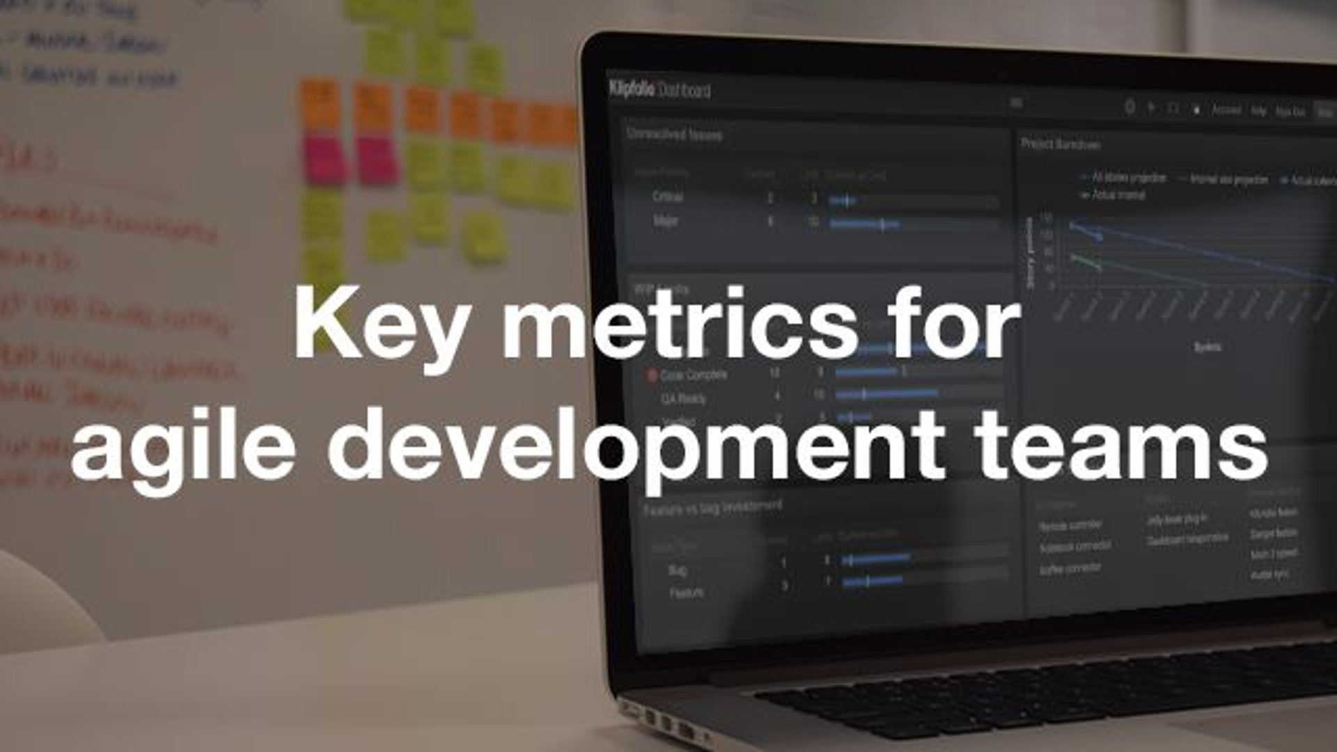
Key metrics for agile development teams
By Ali Pourshahid — July 17, 2015
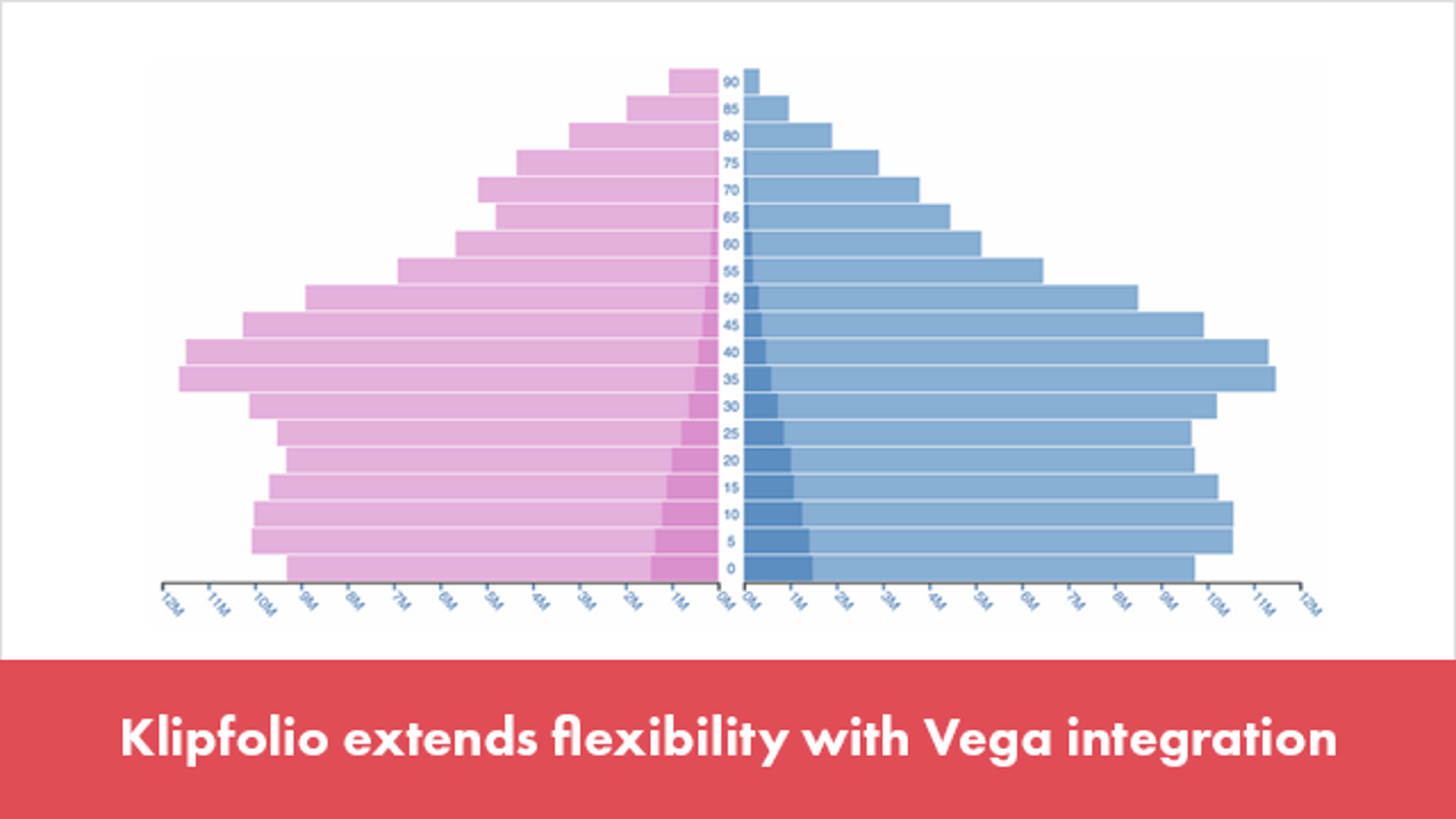
Klipfolio extends flexibility with Vega integration
By Ali Pourshahid — June 24, 2015

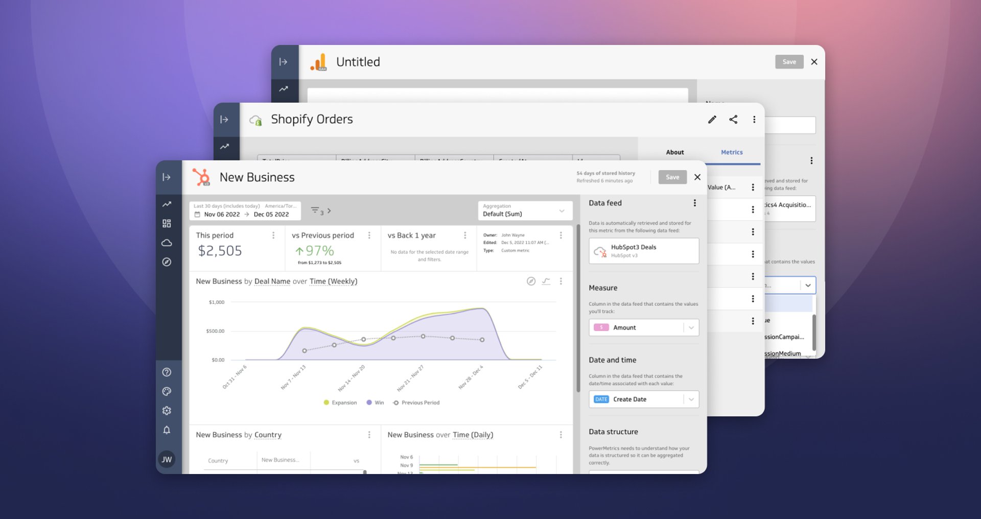
How to: Create custom metrics in PowerMetrics
By Emily Hayward — July 19, 2022
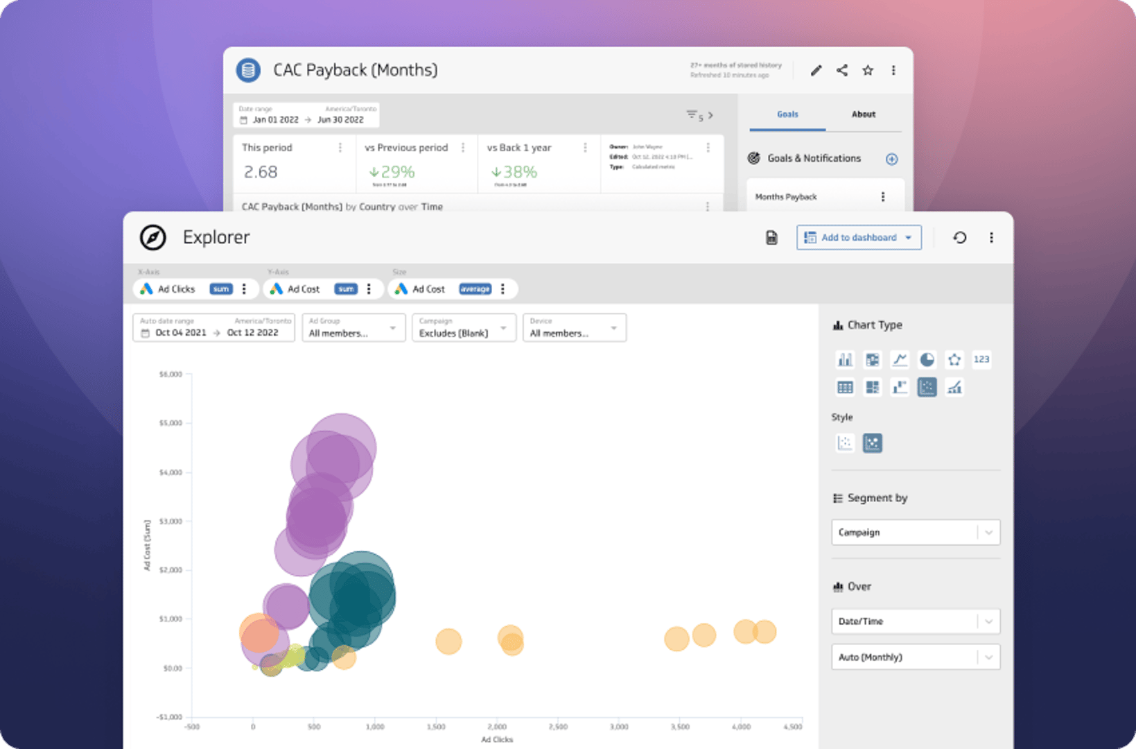
The Power of Data Exploration
By David Mennie — October 24, 2022
Live Data, Live Preview
By David Mennie — December 5, 2022

Landing page metrics and the 5 stories they tell
By Jonathan Milne — May 2, 2017

Reach company goals faster with leading and lagging indicators
By Stef Reid — April 9, 2019

PowerMetrics Case Study: The Project Booth
By Cathrin Schneider — April 11, 2024
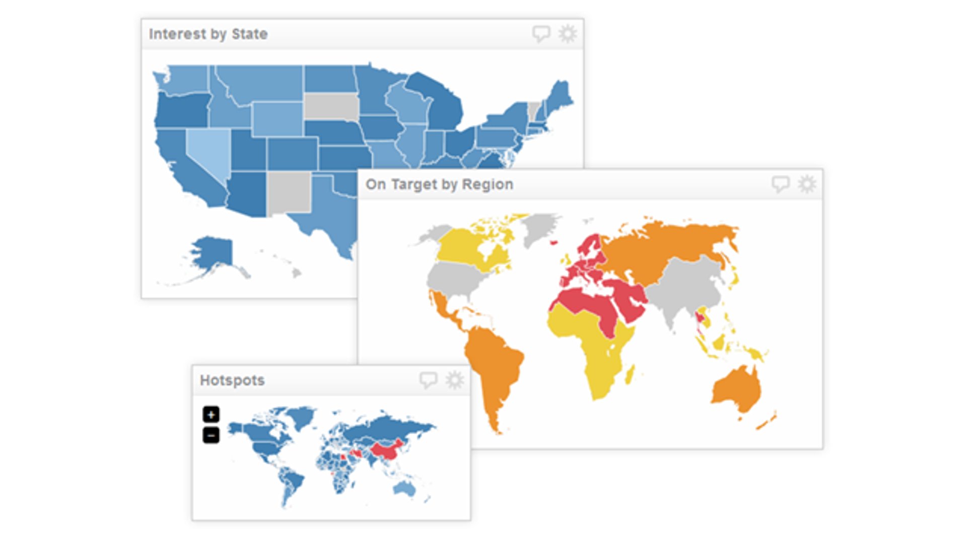
Component overview - Mapping your performance
By Jonathan Taylor — October 16, 2012

Become a better CFO with these three metrics
By Jody Grunden — October 18, 2019

Becoming data-driven: Advice from 15 Klipfolio users
By Mitch Dupuis — July 19, 2019