Klipfolio Blog


Think in Horizons, Not Seconds
By Allan Wille, Co-Founder — May 26, 2026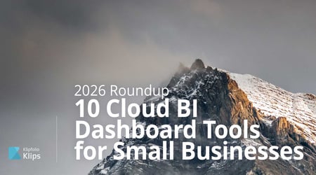
10 Cloud BI Dashboard Tools for Small Businesses in 2026
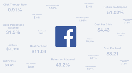
6 Facebook ads reports every agency needs to attract and retain high-ticket clients
By Tanya Brody — April 10, 2026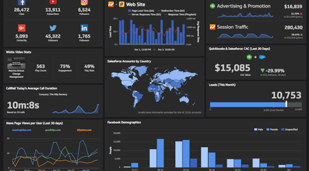
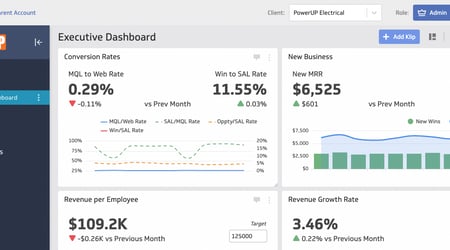
6 dashboards I use daily to run my SaaS company
By Allan Wille, Co-Founder — April 10, 2026
The 5 ways to make your business partnership last a lifetime
By Shaughn Finnerty — April 10, 2026
The Role of Data Analysts in the Age of AI
By Geta Viasu-Räisänen — March 19, 2026
Business Metrics vs. KPIs: What’s the Difference?
By Jonathan Taylor — March 13, 2026
The 5 most important SEO KPIs for digital marketing success
By Sanket Patel — February 24, 2026
Mind the gap: how to conduct a gap analysis that propels your business forward
By Stef Reid — January 29, 2026
The Architecture of Innovation: Our Solutions Team
By Meggan King — January 22, 2026
Anatomy of a great API
By Danielle Hodgson — January 21, 2026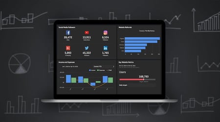
What is a KPI, metric, or measure?
By Jonathan Taylor — January 20, 2026
Why Speaking With Customers Still Matters More Than Ever
By Allan Wille, Co-Founder — January 14, 2026
The Hidden Value of SaaS Sign Up Rate Benchmarks
By Priyaanka Arora — January 10, 2026
Klipfolio Named Innovative Vendor in 2025 ISG for AI Analytics

SMB Dashboarding 2026: Trends That Will Shape Reporting
By Allan Wille, Co-Founder — December 17, 2025
What are the best inbound marketing KPIs?
By Jonathan Taylor — December 17, 2025
Klipfolio Partner How-To #1: Duplicating dashboards across client accounts
By Stef Reid — November 27, 2025
Real-Time Dashboards for Reporting: Why Live Beats Static
Client management in 5 steps
By Jonathan Taylor — November 26, 2025
Klipfolio Partner How-To #2: Company Properties can simplify client set-up
By Stef Reid — November 26, 2025
Why every digital marketer needs to learn how to deploy marketing technology
By Jonathan Taylor — November 19, 2025
Top 10 Marketing Dashboard Ideas for Tech Companies