Klipfolio Blog


Protectionism does not equal Prosperity
By Allan Wille, Co-Founder — February 26, 2025
2025 BI and Analytics Trends for Small and Mid-Sized Businesses
By Allan Wille, Co-Founder — December 18, 2024
Promoting data literacy with metrichq.org and the power of AI
By Allan Wille, Co-Founder — October 12, 2023
How to Build Google Analytics 4 Dashboards in Klips
By Jonathan Taylor — June 6, 2023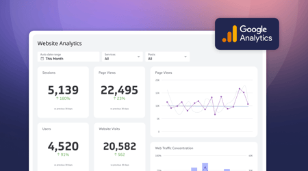
How to use the Google Analytics 4 Query Explorer to export data
By Jonathan Taylor — June 1, 2023
Secure and accessible dashboards for your extended team
By David Mennie — April 25, 2023
Unlock Data-Driven Decisions with ChatGPT & MetricHQ
By Nicolas Venne — April 3, 2023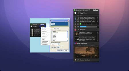
You've spoken and we've heard you - The re-launch of Klipfolio Desktop
By Parker Selman — April 1, 2023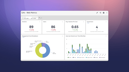
Guide to migrating your digital marketing dashboards to Google Analytics 4
By Jonathan Taylor — February 13, 2023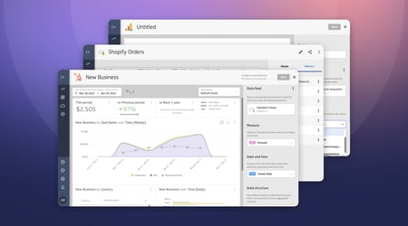
Live Data, Live Preview
By David Mennie — December 5, 2022
How to write KPIs in 4 steps
By Emily Hayward — October 3, 2022
The Starter Guide to Metrics
By Emily Hayward — June 22, 2022
22 expert informed metrics for SaaS Head of Finance
By Jonathan Taylor — May 25, 2022
SaaS Finance Metrics Cheat Sheet
By Emily Hayward — May 11, 2022
How to design a SaaS metrics dashboard
By Emily Hayward — April 27, 2022
SaaS Metrics Cheat Sheet
By Emily Hayward — April 21, 2022
5 SaaS subscription metrics for financial reporting
By Emily Hayward — April 5, 2022
With so much data out there, why is there so little trust?
By Allan Wille, Co-Founder — March 23, 2022
The Top 10 SaaS Affiliate Programs
By Emily Hayward — March 16, 2022
What are HubSpot lifecycle stages?
By Jonathan Taylor — March 14, 2022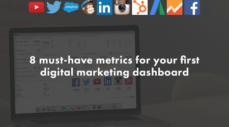
8 must-have metrics for your first digital marketing dashboard
By Emily Hayward — February 23, 2022
How to Build a Content Marketing Dashboard
By Emily Hayward — February 16, 2022
5 Google Ads metrics to measure advertising performance
By Emily Hayward — February 2, 2022