
Summary - If by some cruel twist of fate, I was only allowed to build one type of component for my dashboards, hands down that component would be the table component. It is the equivalent of a Swiss Army knife - it has every tool you need to survive.
As promised, I'm back with another overview of one of the components available in Klipfolio Dashboard for web and mobile. This time we're going to take a look at the table component.
Table Component
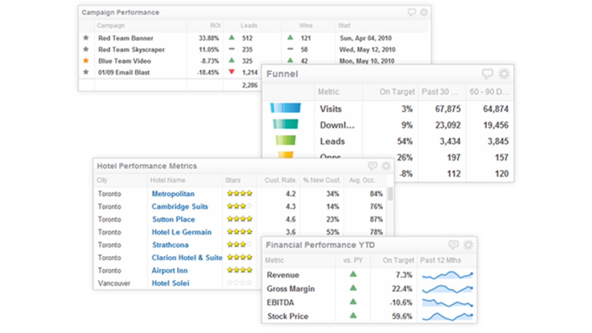
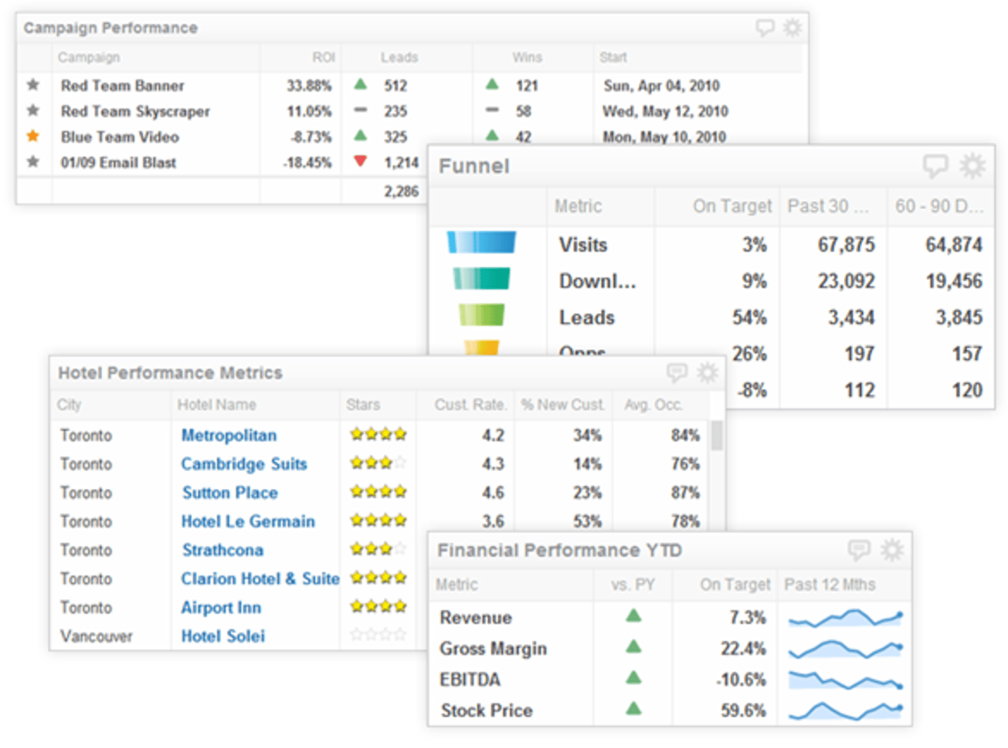
If by some cruel twist of fate, I was only allowed to build one type of component for my dashboards, hands down that component would be the table component. It is the equivalent of a Swiss Army knife - it has every tool you need to survive. The table component can display bar and line charts, spark lines, bullet charts, currencies, numbers, text, hyperlinks, and even images.
The table component is ideal for displaying such a wide variety of data that it'd be a disservice to limit it by saying it is best used for one type of data set or another. Let's just say that tables are a powerful way to show your data along with some contextual information. For example, say you want to show YTD (year to date) sales figures. Well, with the table component you can show that value along with a sparkline showing performance over the past 12 months, all while comparing that value to the previous year's revenue.
Key features
- Results row with custom formula support
- Column borders, width, and alignment
- Full conditional indicator support
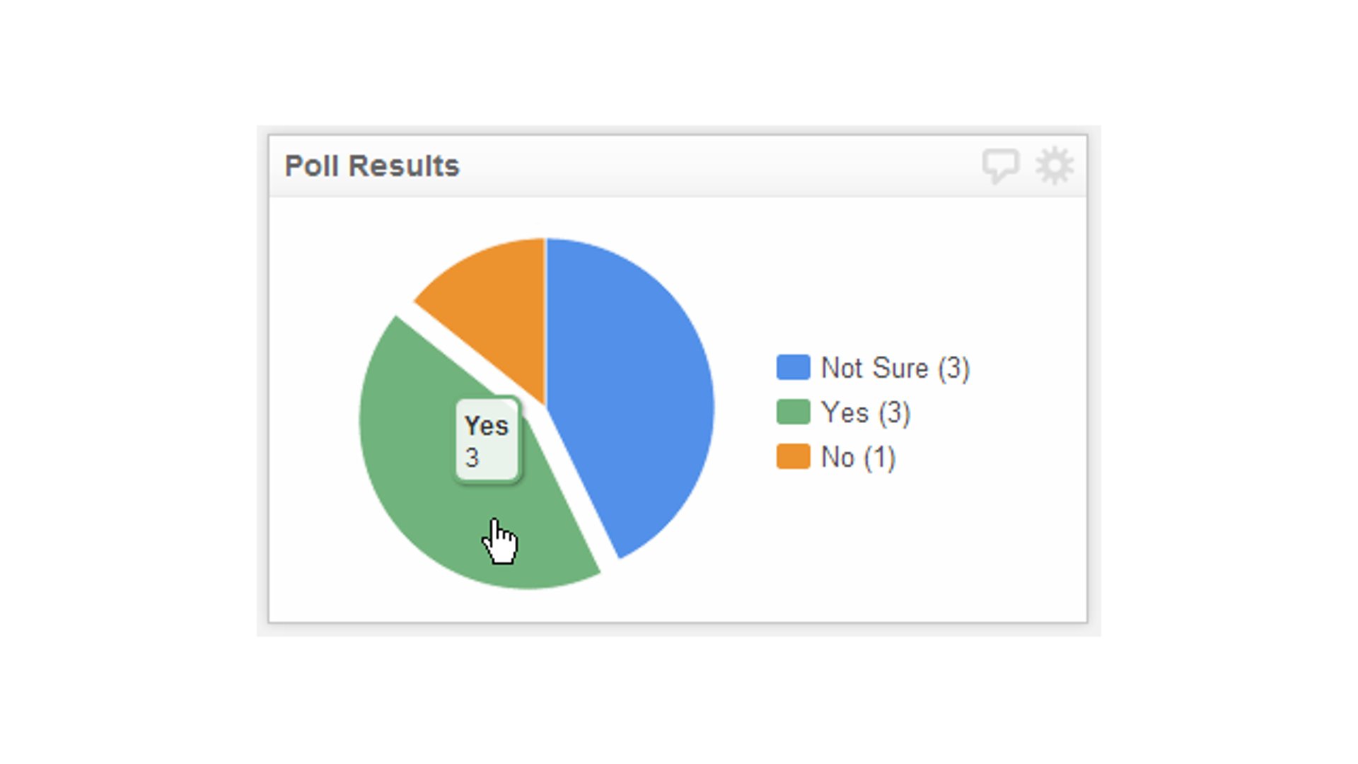
- Show text, numbers, images, links or mini charts (like sparklines or bullet charts)
- Column sorting and column reordering
- Text style, colour, and line wrap
Best practices for the Table component
Here are some guidelines to help you create effective tables in Klipfolio Dashboard.
- Simplicity
Maybe it's the fact that I work for a BI vendor that values simplicity so highly that I find myself repeating Henry David Thoreau's mantra over and over: "simplicity, simplicity, simplicity." Or maybe, it's the fact that when I look at a data visualization, I really don't want to have to work hard to understand what's going on. With the table component, the key to simplicity is providing context. It's inevitable that some tables are quite large, but that's no excuse for disregarding the number one best practice for data visualizations (check out Stephen Few's website to take it from the master himself). The table component provides ample opportunity to give your values context, whether it is in a corresponding row or a column header.
- Mini charts
As you can see from the image above, mini charts like spark bars, spark lines, and win / loss charts are one of the coolest features of the table component. Used correctly (see my above point), mini charts provide add that extra layer of highly relevant information to your visualization. They can answer key questions about your data like how your values are trending over time (spark line), or how they are performing compared to a preset threshold (win / loss charts). The only word of caution here is to make sure that the mini chart adds to the value of the component, and isn't being added simply for its "wow" factor.
Read this article to get started with mini charts in your table components.
- Results rows
Results rows are a useful way to summarize information from a column using common math functions like an average, sum, and max/min/median equation. Results rows become more important the larger the column because they help make it easy to spot exactly what's going on in your table. As well, you can create custom results rows for any column and use them to summarize information from different components, or even from data not included in the Klip itself. Again, it is imperative to provide context for custom results rows since it may not be immediately clear what you are trying to accomplish. One way to do this is to use the prefix / suffix options.
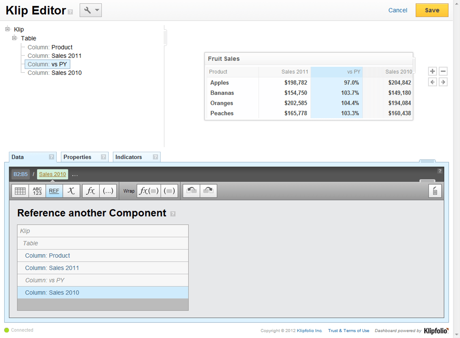
- Hidden columns
The hidden column feature isn't one that immediately jumps out at you and says "hey, I'm pretty useful." But that's why I'm here. Hidden columns are useful in at least two different scenarios. First, they can be used to set up indicators to compare two columns of data without having to show one of the columns. One example of this is with comparing this year's revenue to last year's revenue. Second, hidden columns can be used in conjunction with the component referencing feature to set up formulas in other columns. The best example of this is if you are using a SUM function to tally up 12 months worth of sales, but don't want to recreate the formula for each column where you want to use that data. By referencing the hidden column, you can quickly supply a crucial part of your formula without having to rebuild it from scratch.
Is that it?
The table component can be used in so many different ways that it's really hard to give a definitive guide to best practices for this visualization. Let's not forget that tables also utilize features like indicators, hyperlinks, and images. The fact is that you can do pretty much anything you want with a table component, and I can assure you this isn't the last time this component will be featured here on the KlipBlog. But, until next time, why not head over to our support site and learn more about the table component.
Related Articles

Klipfolio Partner How-To #1: Duplicating dashboards across client accounts
By Stef Reid — November 27th, 2025
The Starter Guide to Dashboard Design
By Emily Hayward — September 24th, 2025
What is a data dashboard?
By Emily Hayward — August 18th, 2025