
Custom dashboards for
you and your team
Klips lets you build real-time, pixel-perfect data visualizations
and distribute powerful custom dashboards and reports.


Connect your data
all in one place
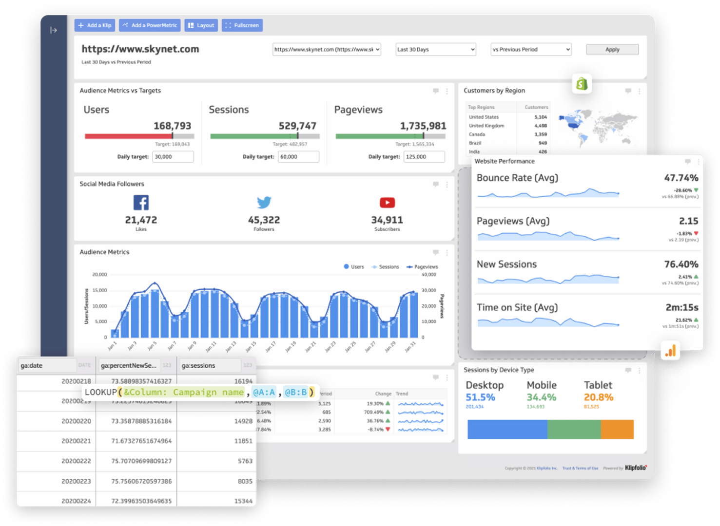
Bring all of your data together to build custom dashboards and reports—no data warehouse required.
Real-time, raw data refresh is streamed into your visualizations so you always have insights at your fingertips.
- Klips integrates with 130+ data services. If you don't see what you're looking for, connect using our REST/URL option
- Pull in data that's stored on premise or in the cloud, upload spreadsheets, or write custom queries
- Use Excel-like formulas and functions to transform your data, perform calculations, manipulate dates or text, and add logic and statistics
Security, privacy, and access are our top priority. Read about the steps we take to ensure your data is always safe and secure.
Complex data?
Klips can visualize that
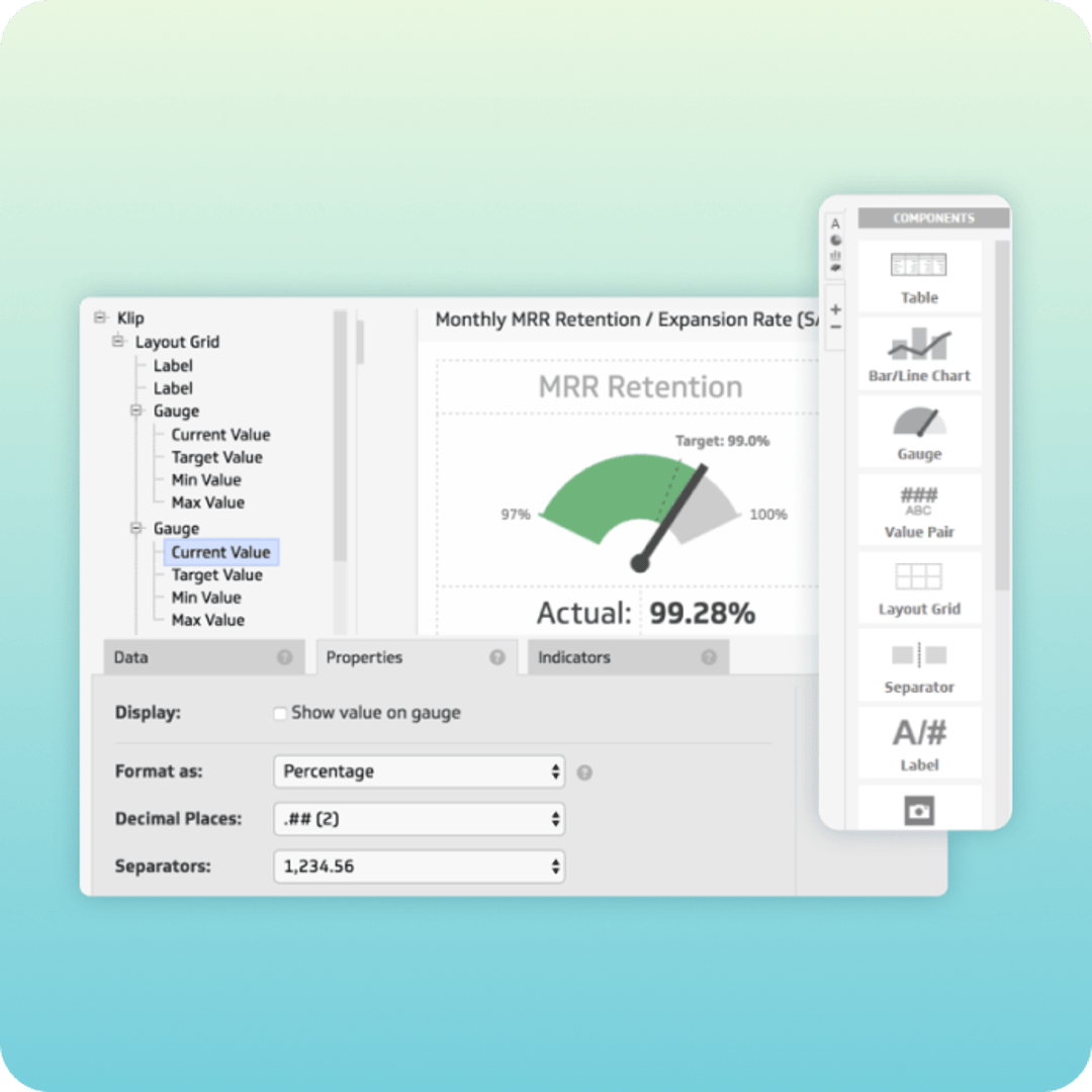
Klip Editor
Consolidate and streamline complex data with our extensive library of formulas and functions, filtering, grouping, aggregating and sorting.
Dynamically assign values based on user input and properties and filter using those variables in Klips and dashboards.
Extensive
Chart Library
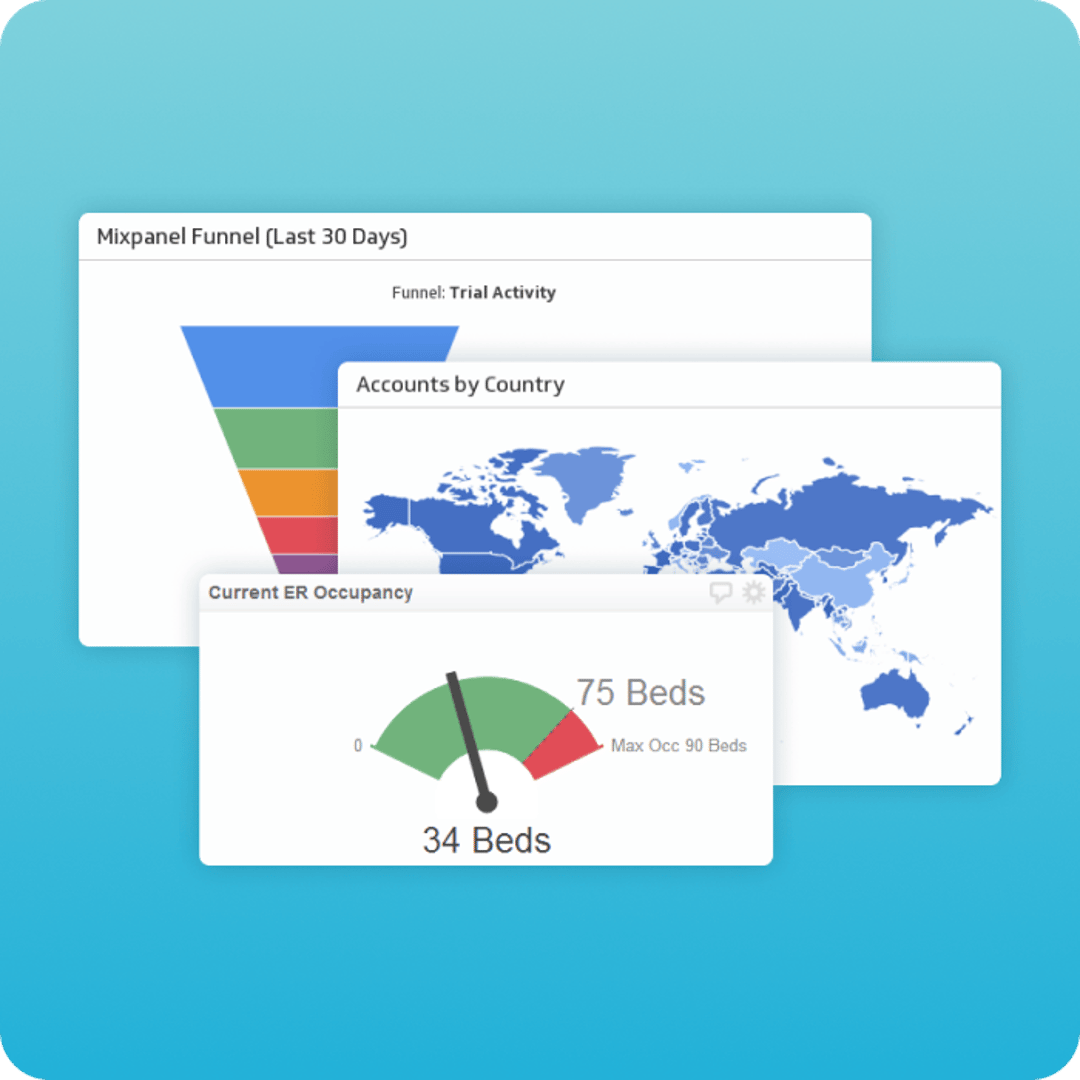
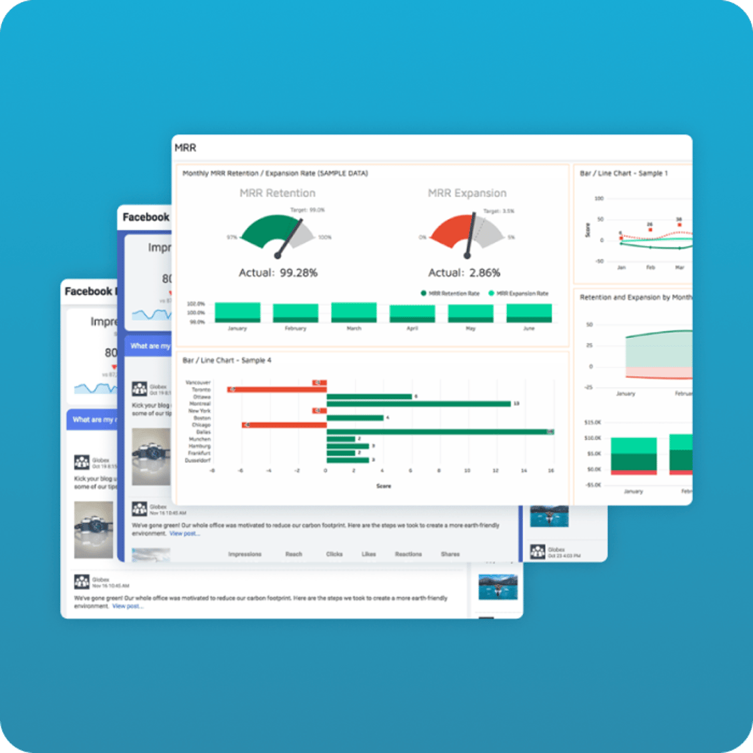
With 30+ chart types to choose from, there's a visualization for every need. From pie, bar, and line charts to more comprehensive charts like gauges, pictographs, maps, or funnels.
HTML, CSS & JS
Customization
Control the look and feel of your dashboards and Klips with custom themes. Modify display properties in the Klip Editor or dig in and build powerful, one-of-a-kind visualizations using the HTML template component, along with JavaScript and inline CSS.
Save time, reduce risk, and get great results with Klipfolio Services.
Our data specialists and engineers will work with you to close gaps quickly and help deliver a solution that aligns with your business goals.

Onboarding and Training
With customized training plans, our experts will guide your team on how to get the most out of Klipfolio products and deliver the right data to the right people.

Implementation Services
We'll get it done together. Think of our experts as your extended team. From data stack integration to metric and dashboard creation, rely on us to get your system up and running.
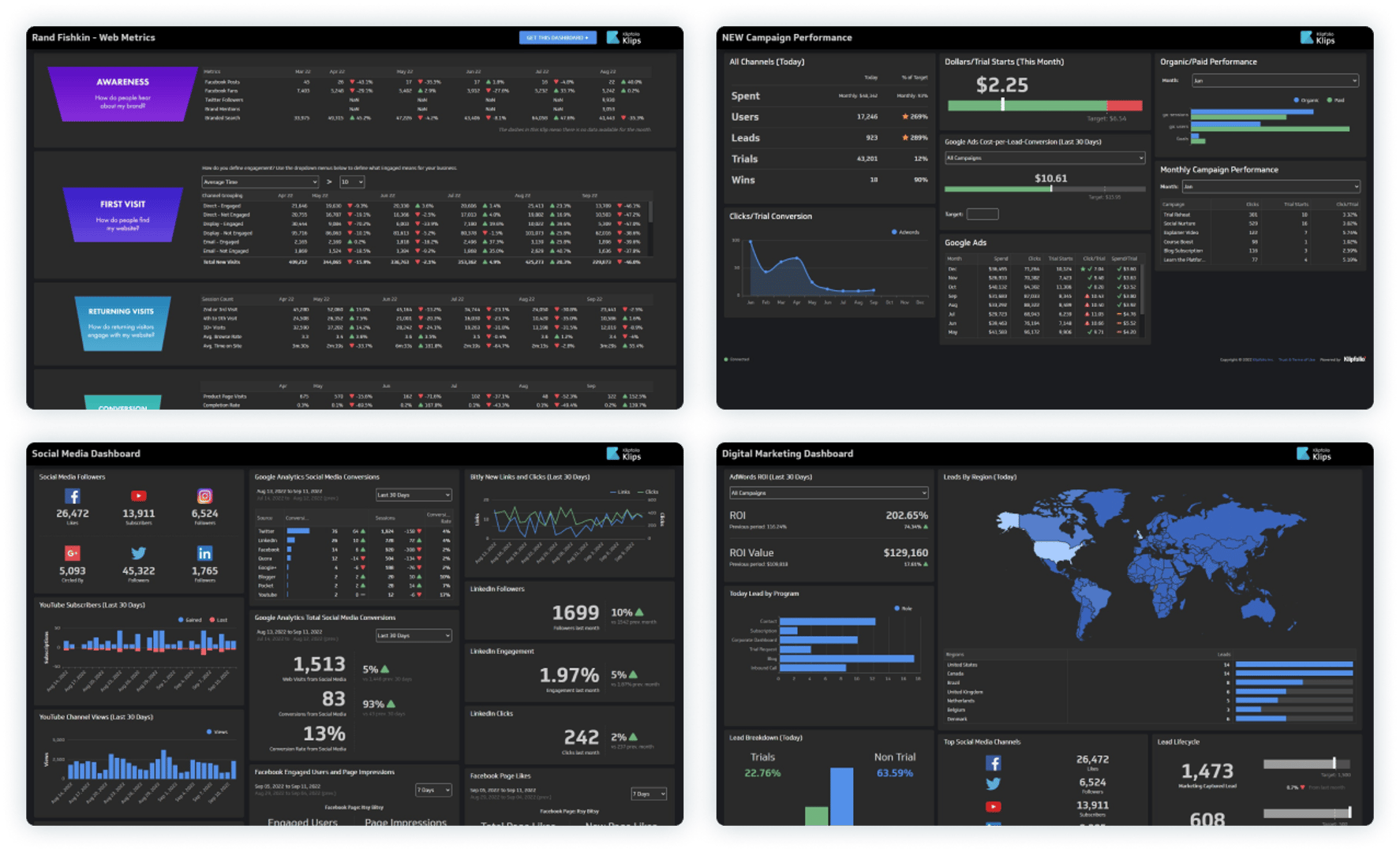
Live dashboard examples
Get inspired by 90+ interactive dashboard examples that you can view by department or service.
View Live Dashboards
Sharing and distribution
for decision-making with confidence
Creating dashboards and reports for clients? Learn more about client management.
Automated Reporting
With automated reporting, sharing insights is easy. Render your dashboards and reports as PDFs or images then share them on a one-time basis or schedule an automated email at a frequency you define.
Published Links
Published links let you share your dashboards with anyone inside or outside of your organization using a public or password protected link.
TV Dashboards
Display your dashboards in full-screen dark mode on TVs in meeting rooms, reception areas, or around your office.
User and Group Sharing
Choose the level of control you need to manage access to your data. Share with individuals or groups, grant view or edit rights to dashboards, Klips, and data sources or assign custom roles to further define permissions.
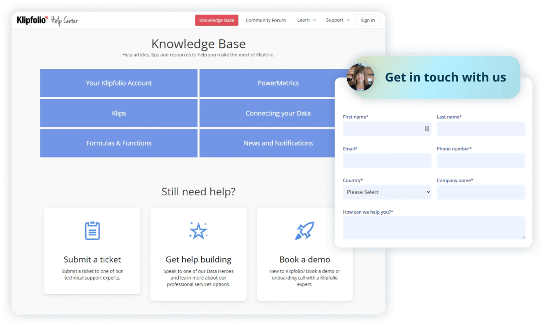
World class support for you and your team
Our mission is to help you succeed with data.
Have a technical question?
Our support team is available via email or our help center.
For self-serve learners, access our extensive library of� video tutorials, API documentation and guides, and help articles.
Need priority support?
If you need immediate assistance or help with complex technical questions, our Priority Support Power-Up ensures your request jumps to the top of our support queue.
Looking for training on how to build your own dashboards?
Our Data Hero team will get you up and running. Spend 1-on-1 time with a Klipfolio expert and get answers to your dashboard and design questions. Data Hero users get priority ticket handling. Learn more about Data Hero.
Need a hand building custom dashboards or don't have time?
The Klipfolio certified partners in our Partner Directory are here to build your custom dashboards and reports. Klipfolio partners have helped thousands of businesses connect their data and deliver insights where and when it's needed most. If you can dream it, our partners can help you build it.

See what our customers are saying about Klips
I build dashboards for clients across many industries and it is by far the best tool I've come across for building KPI reports that are used daily and motivate teams to make progress on business goals.

Andrew W.
Director at IT MOOTI
I like how much you can customize the look and feel of your dashboard. Klipfolio connects all of our disparate systems within our HR department. Seeing survey, HRIS, and ATS data in one dashboard is really cool.

Carolyn S.
People Insights Manager at formstack.com
We upload daily data about our business and it's really helpful to get insights and monitor revenue in real-time.

Sebastián P.
CPO at E-Planning.net