Case Study - Summit Sports

Published 2011-09-06, updated 2023-03-14

Summary - "We looked at lots of dashboards and had almost decided to build one in-house... A dashboard needs to be compelling, and Klipfolio Dashboard presents the data in a way that's intriguing."
Klipfolio Dashboard shines in Summit Sport's command center. With two big-screen LCD versions of Klipfolio Dashboard displayed on the walls of the common area, Summit Sports looks like the NORAD command center. And it serves a similar purpose – with a glance at the key performance indicator (KPI) dashboard, Summit staff members can see the exact status of the company's most important performance metrics.
Summit Sports is a very inventive, technology-savvy sports equipment retailer. Although it has five stores in the metro-Detroit area, Summit's main focus is on its ecommerce sports equipment web sites. Listed on the Internet Retailer Hot 100 list, Summit is no stranger to searching out – or creating – the best tool for the job, whether it's the company's project management system or the integrated platform for the organization's many different ecommerce web sites.

Dashboard visualizations need to be compelling
After consolidating the web sites, Summit's Director of Web Development, Dennis Kopitz, decided to tackle a new challenge. Performance reporting for Summit was available as batched reports on an intranet site, with a few of the more important reports being emailed to stakeholders. This arrangement really wasn't good enough – it wasn't getting the vital information to the people who needed it in real time, and in a compelling manner.
Summit had the performance data in its consolidated database, but the information had to be pulled out and presented in an engaging, unavoidable format. A method of simple, clear data visualization was needed. Normally, the Summit development group tends to do the design themselves when they need a new tool.
"We're in a fast-changing business, and we don't like to have to conform," says Kopitz. "We looked at lots of dashboards and had almost decided to build one in-house." But during his research, Kopitz came across the Klipfolio Dashboard, and realized that it was precisely what he needed, especially in terms of user interface and presentation. As he says, "A dashboard needs to be compelling, and Klipfolio Dashboard presents the data in a way that's intriguing." Why re-invent the wheel – or the user interface – when it's already been done?
A dashboard for answering and asking questions
At the same time, Kopitz could see that Klipfolio Dashboard software was accessible from a development standpoint. "We didn't want to be locked into something we couldn't change," he explains. A very hands-on company, Summit knew it would want to customize its dashboard software and make adjustments as the company developed and the market changed.
Another important factor in Summit's search was the ability to drill down from the dashboard to a variety of databases and to link to web sites directly from a "Klip". Klipfolio Dashboard is made of different interchangeable Klips that each present a KPI in their own visual format. With most of Summit's business in ecommerce, the interactive capability of Klipfolio Dashboard was vital. Says Kopitz, "Numbers on a dashboard answer some questions, but they also produce more questions, so the drill down is important."
In addition to the "NORAD" dashboard in the common area, Summit has another big-screen KPI dashboard displayed in the development area, and another in the IT room, each showing Klips on performance indicators of specific interest to the group. The command-center dashboard shows sales and order statistics by date and channel, web-site traffic figures, and an unusual Klip that has surprisingly proved to be everyone's favorite: it displays real-time customer comments from the web sites.
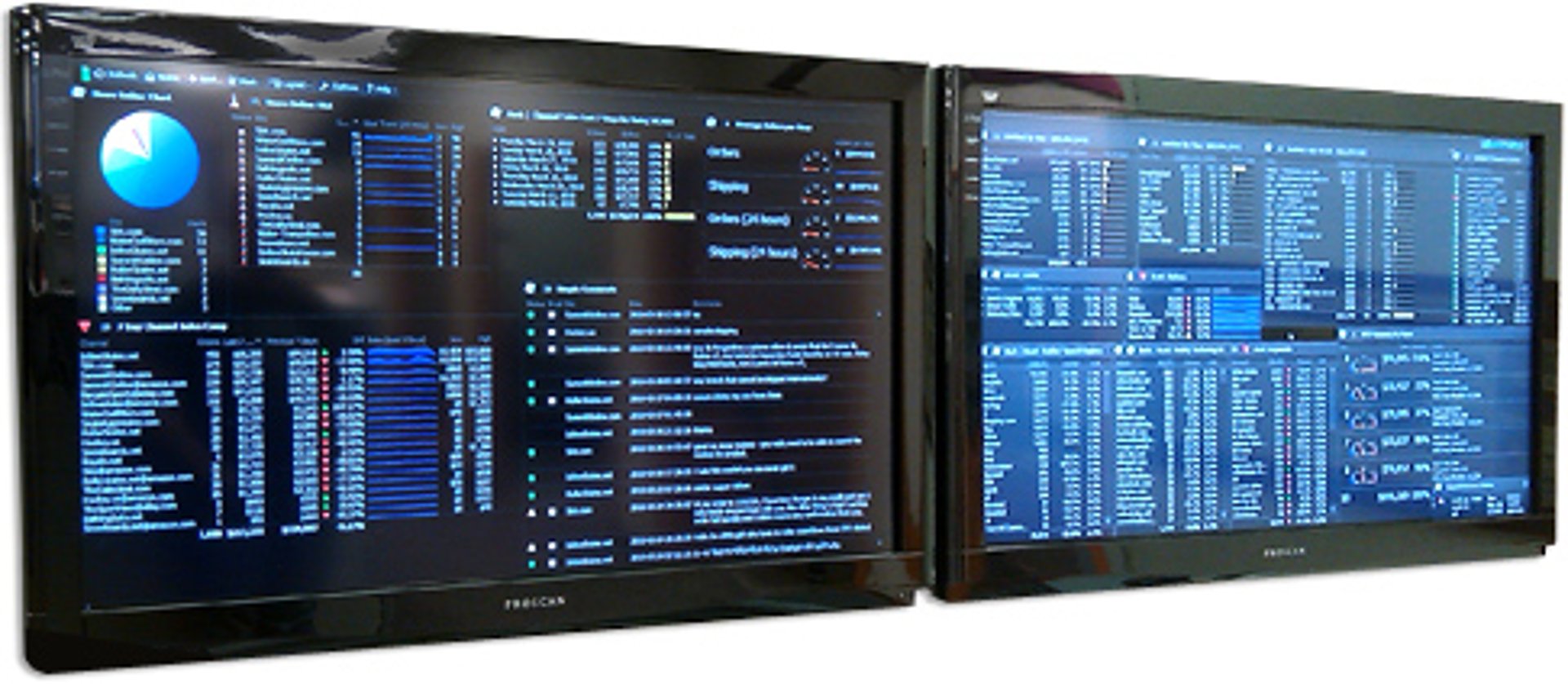
The IT dashboard contains Klips that interest the IT team – statistics on server and CPU usage, for instance. With green, yellow, and red color-coding, and alerts that appear when a threshold is reached, it's easy for the team to know when to take action. One of the most useful alerts in the IT room is for problems with automated web feed processes. Kopitz explains, "It used to be easy to miss the fact that an automated process wasn't performing properly. Now that we have these processes registered and monitored on the Klipfolio Dashboard, we can't miss it if something goes wrong." For instance, if there's a failure in the automatic process that creates the important Froogle product feed files, Kopitz's team will know instantly.
In addition to the big screens, managers have Klipfolio Dashboard configured as a sidebar on their PC, with Klips that apply specifically to their area of interest. For instance, executives and department heads have Klips that show the high-level numbers they need to be aware of. Kopitz's team has created an internal web site of Klips so that users can select the ones they want on their own dashboards.
Real-time customer commentary
User adoption of Klipfolio Dashboard at Summit has been very enthusiastic. Unlike the old system of reporting, Klipfolio Dashboard display attracts attention, and it's hard to miss a sidebar on your PC, so people are aware of the key performance indicators they need to monitor. Klipfolio's usability and the fact that the dashboard is customized for each user's special interests are also drawing converts. At the moment, Kopitz's group has about 30 development requests from the staff for new Klips they want to see on their dashboards.
With Klipfolio Dashboard, Summit management finds that staff is showing more initiative in business processes and customer relations, improving the company's bottom line. The web-site feedback Klip is a good example. Kopitz says, "Nobody on staff has time to read 30 customer comments every morning, but people notice the real-time Klip on the dashboard. They respond by taking action – fixing things on the web site that wouldn't otherwise be noticed."
With the success of the initial dashboard project and additional Klips already in development, Summit is looking at expanding the performance management culture to more employees using Klipfolio Dashboard. To get a closer look at how your business data could be visualized,
Related Articles

Pauw Agency brings transparency to the music industry with Cervinodata
By Erik van Dorp — September 29th, 2020

Three Ways Unito Uses Data As Rocket Fuel
By Lauren Thibodeau — September 25th, 2020
Digital Agency Tracks Return on Ad Spend (ROAS) for Clients with Klipfolio
By Mitch Dupuis — March 16th, 2020

Irdeto saves 15 hours of marketing report work per month with Klipfolio
By Mitch Dupuis — February 20th, 2020