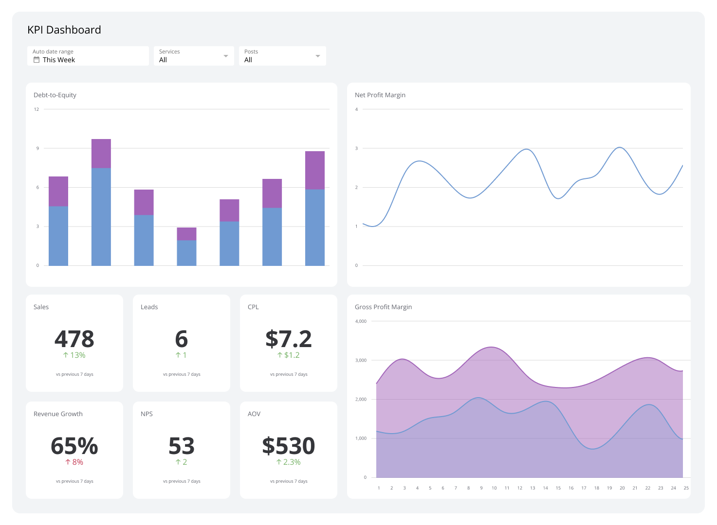
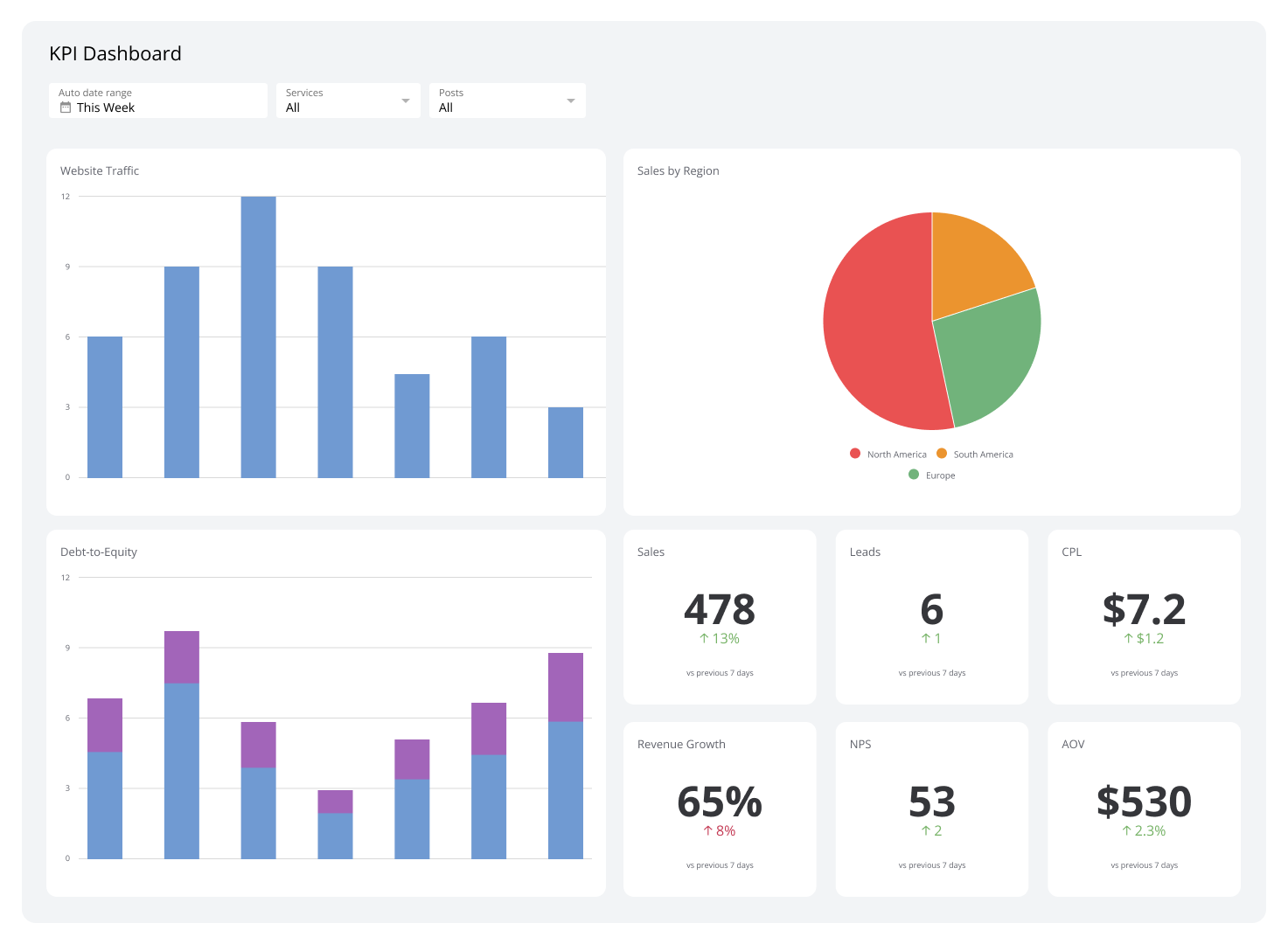
KPI Dashboard
A KPI dashboard consolidates your key metrics into a single, real-time view — so every team stays aligned and every decision is backed by accurate data.
What is a KPI dashboard?
A KPI dashboard is a centralized display that consolidates key performance indicators and metrics from multiple data sources into a single, real-time view.
These dashboards collect data from multiple sources to ensure consistency and accuracy while reducing the need for manual reporting. Their customizability lets you tailor visuals, alerts, and metrics to specific objectives, roles, or audiences — keeping them closely aligned with your organization's priorities and supporting informed decision-making at every level.
Modern KPI dashboards include interactive features, such as drill-down capabilities, that let you explore the detail behind top-line metrics. This encourages greater engagement with data, helping you identify underlying trends and take proactive steps to improve performance.
Types of KPI dashboards
KPI dashboards come in various types, each tailored to specific needs and objectives. Understanding the distinctions between each helps you manage your data more effectively.
Operational
Operational dashboards focus on live metrics and day-to-day activities, offering instant visibility into ongoing processes. They are designed for frontline teams and managers who need to follow time-sensitive tasks such as production rates, customer support tickets, and delivery schedules.
Alerts and notifications are standard features in operational dashboards. They highlight anomalies and ensure issues are addressed before they escalate.
Examples: Supply Chain Dashboard, Project Management Dashboard, Customer Service Dashboard
Analytical
Analytical dashboards are geared toward in-depth data analysis, letting you discover business trends, patterns, and insights over time. These dashboards merge historical data and present it in a way that enables you to evaluate company performance and identify improvement opportunities.
Use an analytical dashboard to analyze campaign performance, track ROI, or understand customer acquisition trends. These dashboards are typically more detailed than other types and support informed decision-making by presenting KPIs alongside comparative and contextual data.
Examples: Web Analytics Dashboard, Digital Marketing Dashboard, Social Media Dashboard
Strategic
Strategic dashboards are designed to align with long-term goals and provide a high-level overview of your organization's overall performance. Executives commonly use these dashboards to monitor progress toward strategic objectives like revenue growth, market expansion, or sustainability targets.
This type of KPI dashboard is less concerned with granular details. It emphasizes aggregating information from trends and goal alignment over real-time data.
Examples: Finance Dashboard, Profit and Loss Dashboard, Budget vs. Actual Dashboard
Tactical
A tactical dashboard bridges the gap between strategic planning and operational execution. It focuses on short-to-medium-term actions needed to meet broader goals. Mid-level managers commonly use this type to monitor departmental outputs, project timelines, and employee productivity.
Tactical dashboards help you transform strategic objectives into actionable plans by highlighting progress, bottlenecks, and resource needs. They include metrics tied to key areas of your business, keeping you focused on priorities and enabling quick adjustments when necessary.
Examples: Facebook Ads Dashboard, Sales Manager Dashboard, HR Dashboard
The benefits of a KPI dashboard
A KPI dashboard's usefulness extends beyond data acquisition. Here are the key benefits of using one:
1. Centralized data access
KPI dashboards pull data from various sources into one unified platform, eliminating manual reporting and the need to switch between systems. This centralization saves time and ensures data remains consistent and accurate across your company.
Centralized data access also enhances collaboration by giving everyone a shared view of critical metrics and KPIs. When your team works from the same accurate, up-to-date information, alignment in planning and execution follows naturally.
2. Real-time performance tracking
Real-time updates let you monitor key metrics as they occur — valuable for addressing urgent situations like production delays, customer service escalations, or sudden shifts in sales trends.
Real-time visibility also helps you stay ahead of opportunities. Tracking spikes in web traffic or sudden demand increases, for example, lets your business capitalize on emerging trends more effectively.
3. Improved decision-making
A KPI dashboard turns complex data into visual formats like graphs, charts, and tables, making it significantly easier to interpret and act on. This clarity helps you identify trends, assess progress, and pinpoint areas that require immediate attention.
KPI dashboards also provide context by comparing current metrics to historical data or benchmarks, giving you a clearer picture of progress over time.
4. Alignment with strategic goals
KPI dashboards keep teams focused on your organization's top priorities by directly linking metrics to strategic objectives.
Your dashboard might highlight progress toward revenue diversification, market share expansion, or audience growth — helping everyone understand how their contributions connect to broader outcomes. This promotes collaboration and clarifies how everyday efforts support long-term success.
5. Enhanced accountability
Well-built KPI dashboards show clearly who is responsible for specific outcomes by tying metrics to teams or individuals. This fosters accountability: employees can see how their work impacts business success, and teams are motivated to hit their targets.
KPI dashboards also give managers an easy way to monitor team progress and spot areas that need attention. For instance, a dashboard can surface which team members are falling behind on sales quotas, enabling targeted coaching or support.
6. Customization for specific needs
Different roles and departments have unique priorities, and a KPI dashboard can be customized to reflect them. A marketing team might track campaign performance, conversion rates, and social media engagement, while an HR team might focus on employee retention and training completion rates.
This level of customization ensures each user sees data most relevant to their role, improving efficiency and enabling more targeted decisions.
7. Increased workplace efficiency
KPI dashboards significantly reduce the effort needed to track and analyze performance metrics by automating data collection and reporting. You no longer need to spend hours compiling reports — that time goes toward analysis and action.
Automated updates also keep information current and reliable, so stakeholders always have the most accurate insights available.
8. Early problem detection
Identifying problems before they become serious is much easier with a KPI dashboard. Whether it's a sales decline, a production bottleneck, or a drop in customer satisfaction, a KPI dashboard surfaces early warnings so you can act before issues escalate.
Addressing problems quickly mitigates risk, maintains steady operations, and builds a culture of continuous improvement.
Examples of KPI dashboards
Executive Dashboard
An executive dashboard gathers analytics and surfaces the metrics and KPIs most critical to strategic decision-making.
By offering insights into financial performance, operational efficiency, and customer satisfaction, the dashboard enables leaders to make quick choices aligned with broader business goals. Rather than overwhelming you with excessive detail, it focuses on KPIs that reflect your business's health and progress.
| Who's it for | Chief executive officers (CEOs), chief financial officers (CFOs), chief marketing officers (CMOs), chief operating officers (COOs), department heads, senior vice presidents, business analysts, strategic planning teams |
|---|---|
| How often it's needed | Real-time, daily, weekly, monthly, quarterly, yearly |
| Covered KPIs | Revenue growth, profit margins, market share, customer acquisition cost (CAC), customer lifetime value (CLV), employee turnover rate, sales conversion rates, operational efficiency, return on investment (ROI), net promoter score (NPS), compliance adherence, sustainability metrics, strategic initiative progress, financial liquidity ratios, shareholder value, competitive benchmarking, gross margin, cash flow, cost of goods sold (COGS), operating expenses, lead conversion rate, churn rate, productivity metrics, brand awareness index, customer satisfaction (CSAT) score, debt-to-equity ratio, inventory turnover, earnings before interest and taxes (EBIT), working capital |
Marketing Dashboard
Marketing dashboards enable marketers to track campaign performance, analyze customer engagement, and measure the effectiveness of marketing strategies in real time. Key metrics include web sources traffic, customer retention rate, and lead conversion rate.
This dashboard can align marketing activities with broader business objectives. Email open rates and click-through rates can reveal the effectiveness of a product launch campaign, while web traffic sources highlight which channels produce the most valuable leads.
| Who's it for | CMOs, marketing managers, digital marketing teams, brand managers, content strategists, social media managers, campaign analysts, SEO specialists, marketing analysts, customer insights teams, senior marketing executives |
|---|---|
| How often it's needed | Real-time, daily, weekly, monthly, quarterly, yearly |
| Covered KPIs | Web sources traffic, lead conversion rate, CAC, ROI, lead generation rate, CLV, bounce rate, click-through rate (CTR), click-to-open rate (CTOR), social media engagement, brand awareness, cost per lead (CPL), customer retention rate, sales qualified leads (SQLs), marketing qualified leads (MQLs), campaign performance, sales growth, lead-to-customer conversion rate, ad spend efficiency, search engine rankings, content engagement, NPS, average order value (AOV), customer satisfaction score (CSAT), cost per click (CPC), cost per acquisition (CPA), share of voice (SOV), traffic sources, video engagement rate, influencer performance, organic search traffic, paid search performance, affiliate marketing performance |
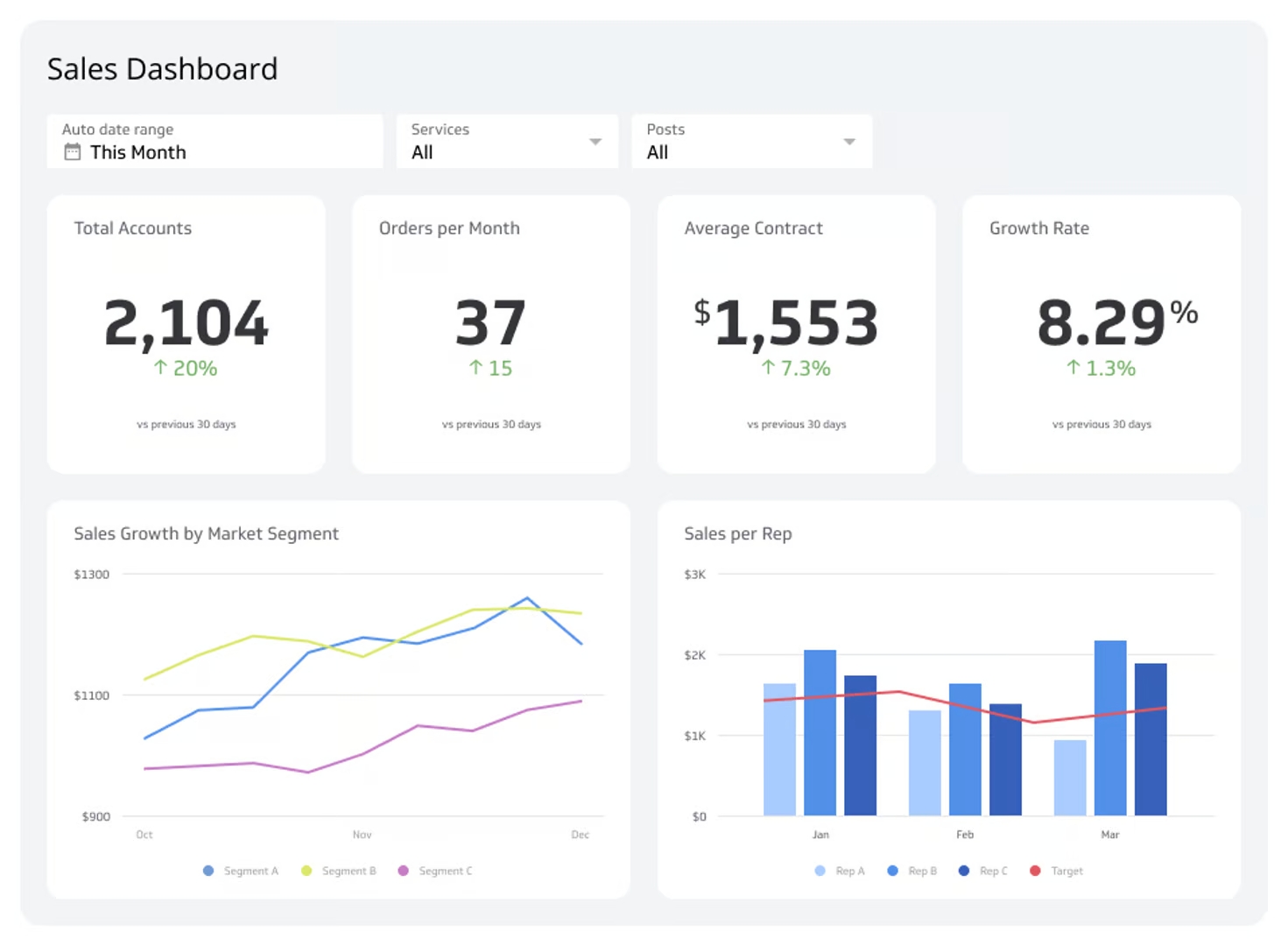
Sales Dashboard
Sales dashboards track and analyze the health of your sales operations. They consolidate data and give you quick access to average deal size, sales cycle length, customer acquisition costs, and other metrics that pinpoint areas of success and identify active bottlenecks.
Beyond tracking metrics, a sales dashboard helps maintain alignment between day-to-day sales activities and broader business objectives — enabling you to prioritize opportunities, adjust strategies based on real-time data, and allocate resources effectively.
| Who's it for | Chief sales officers (CSOs), sales managers, sales executives, account managers, business development teams, regional sales managers, inside sales teams, field sales teams, sales analysts |
|---|---|
| How often it's needed | Real-time, daily, weekly, monthly, quarterly, yearly |
| Covered KPIs | Total sales revenue, sales growth, sales targets vs. actuals, lead conversion rate, CAC, average deal size, sales cycle length, win rate, sales by region, sales by product, sales by channel, sales pipeline value, sales quota attainment, new customers acquired, churn rate, sales per representative, deal velocity, CLV, sales opportunity stage, revenue per sales rep, number of meetings or calls booked, number of proposals sent, sales forecast accuracy, follow-up rate, cost of sales, opportunity win/loss ratio, sales forecast vs. actual sales, sales per customer, product upsell/cross-sell rate |
Supply Chain Dashboard
A supply chain dashboard displays analytics from various stages of the supply chain process.
It tracks metrics like order accuracy, on-time delivery, and warehouse efficiency to provide a complete picture of how well your supply chain operations are running. This lets you assess risks accurately, pinpoint inefficiencies, and make performance adjustments.
Real-time data makes a supply chain dashboard especially valuable. Monitoring the backorder rate can indicate inventory shortages, while transportation performance metrics reveal where you can reduce costs.
| Who's it for | COOs, supply chain managers, logistics managers, procurement teams, inventory managers, warehouse supervisors, transportation coordinators, demand planners, quality control teams, production managers, and supply chain analysts |
|---|---|
| How often it's needed | Real-time, daily, weekly, monthly, quarterly |
| Covered KPIs | Inventory turnover, perfect order rate, on-time delivery rate, supplier lead time, procurement cost, production cycle time, demand forecast accuracy, stockout rate, back order rate, freight cost per unit shipped, warehouse utilization rate, supply chain cost per order, inventory accuracy, return rate, transportation time, order cycle time, capacity utilization, supply chain carbon footprint, supplier defect rate, purchase order cycle time, distribution center performance, order-to-cash cycle time, shipment accuracy, safety stock levels, logistics costs, days of inventory on hand, damage rate, labor productivity, overall equipment effectiveness (OEE) |
Customer Support Dashboard
Customer support dashboards help you manage and improve customer service operations. You'll find support metrics like ticket resolution time, agent performance, and customer feedback — giving you an at-a-glance view of team productivity and customer sentiment.
You can also use the data from this dashboard to identify recurring problems, adjust workflows, and implement targeted improvements that enhance both agent efficiency and customer satisfaction.
| Who's it for | Customer support managers, customer service representatives, customer experience teams, quality assurance teams, call center supervisors, help desk agents, support analysts, account managers, customer success teams |
|---|---|
| How often it's needed | Real-time, daily, weekly, monthly |
| Covered KPIs | Average response time, average handle time, first response time, first contact resolution rate, CSAT, NPS, customer effort score (CES), ticket volume, ticket backlog, ticket resolution rate, support channel performance, agent performance metrics, escalation rate, call abandonment rate, re-open rate, cost per ticket, customer retention rate, churn rate, feedback or survey response rates, live chat satisfaction rate, queue wait time, knowledge base utilization rate, self-service success rate, unresolved ticket rate, time to close, agent availability percentage |
HR Dashboard
An HR dashboard is essential for managing and analyzing human resource performance across your business. It pulls together critical data on recruitment, employee performance, turnover, and compensation — helping you track workforce trends and identify areas that need attention.
These insights help you steer your HR strategy. Employee retention metrics, for example, can drive initiatives like improved engagement programs or compensation adjustments to reduce turnover.
| Who's it for | Human resources managers, HR executives, talent acquisition teams, payroll administrators, employee engagement specialists, learning and development teams, benefits coordinators, diversity and inclusion officers, workforce planning analysts |
|---|---|
| How often it's needed | Real-time, daily, weekly, monthly, quarterly |
| Covered KPIs | Employee turnover rate, retention rate, time-to-hire, cost-per-hire, offer acceptance rate, absenteeism rate, training completion rate, employee satisfaction score, employee engagement score, diversity and inclusion metrics, gender pay gap, headcount by department, promotion rate, internal mobility rate, average tenure, employee productivity, compensation and benefits costs, overtime hours, attrition rate by role, performance review completion rate, skills gap analysis, recruitment funnel metrics, workforce demographics, compliance training completion, grievance rate, employee net promoter score (eNPS), employee wellness program participation, succession planning metrics, retirement eligibility rate |
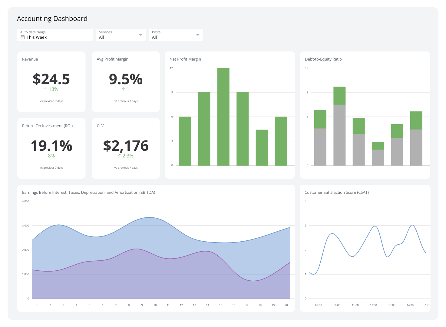
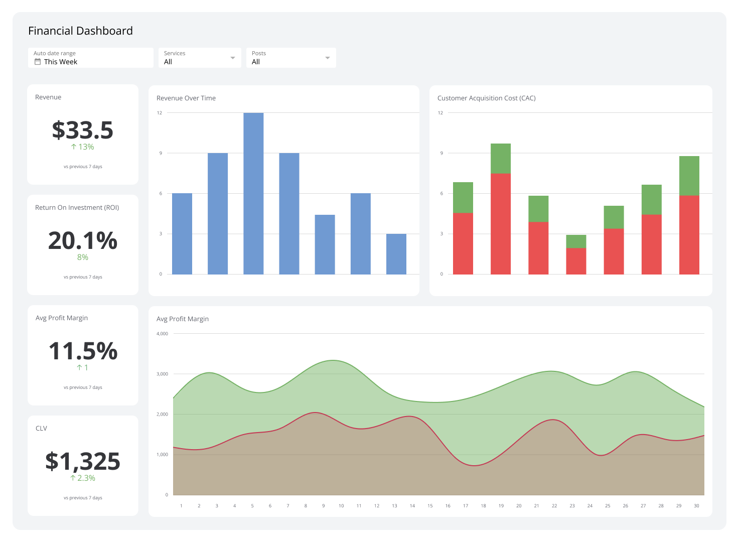
Financial Dashboard
Financial dashboards provide a real-time view of your company's financial health. Metrics like revenue, gross profit margin, net profit margin, operating expenses, cash flow, and ROI let you track performance against budgets, monitor financial trends, and identify spending anomalies before they become problems.
These dashboards are indispensable for timely decisions. They help prevent financial overruns and keep your organization's finances aligned with its targets.
| Who's it for | CFOs, financial analysts, accounting teams, budget managers, auditors, controllers, tax specialists, investment managers, corporate treasurers |
|---|---|
| How often it's needed | Real-time, daily, weekly, monthly, quarterly, yearly |
| Covered KPIs | Revenue, gross profit margin, net profit margin, operating profit margin, earnings before interest and taxes (EBIT), earnings before interest, taxes, depreciation, and amortization (EBITDA), cash flow, working capital, return on assets (ROA), return on equity (ROE), ROI, revenue growth rate, expense-to-revenue ratio, COGS, accounts receivable turnover, accounts payable turnover, debt-to-equity ratio, current ratio, quick ratio, operating expenses, budget variance, net income, gross margin, days sales outstanding (DSO), days payable outstanding (DPO), inventory turnover, burn rate, break-even analysis, financial forecast accuracy, capital expenditure (CapEx) trends, shareholder value, dividend payout ratio, tax liabilities, compliance adherence |
Manufacturing Dashboard
A manufacturing dashboard provides a comprehensive view of the manufacturing process. It updates in real time, pulling data from multiple sources including databases, published reports, and connected systems. Consistent monitoring lets you quickly spot and resolve production problems — such as equipment malfunctions or delays — before they affect output.
A manufacturing dashboard also enhances inventory control by providing live insights into production rates and inventory levels. This data supports production scheduling that meets consumer demand without overstocking or misallocating resources.
| Who's it for | Operations managers, production supervisors, supply chain managers, inventory controllers |
|---|---|
| How often it's needed | Real-time, daily, weekly, monthly, quarterly, yearly |
| Covered KPIs | Production rates, equipment efficiency, uptime, inventory levels, order fulfillment, downtime tracking, yield and quality control, cycle time, lead time, scrap and waste rates, cost per unit produced, labor productivity, energy consumption, supply chain performance metrics, first-pass yield, maintenance costs, work-in-progress (WIP) inventory levels, supplier lead times, on-time delivery rate, equipment failure rate, machine utilization rate, total cost of ownership (TCO) for equipment, rework rates, customer returns and defects, scrap costs, production capacity utilization, raw material usage rates, shift performance, product defect rates |
How to create an effective KPI dashboard
A well-designed KPI dashboard is a powerful tool — but it must be tailored to your specific needs and objectives to deliver results.
Here are five steps to creating an effective KPI dashboard:
Define your objectives. Identify the purpose of the dashboard. Determine which business objectives you want to monitor and how the dashboard will support decision-making. Whether the focus is on sales, marketing, or overall performance, aligning the dashboard's design with broader strategic goals is essential.
Select relevant KPIs. Choose KPIs that provide meaningful insights directly tied to your objectives. Avoid overcrowding the dashboard with excessive metrics — prioritize those that drive actionable outcomes. A sales dashboard should show metrics like revenue growth and conversion rates; a marketing dashboard should show customer acquisition costs and lead generation rates.
Organize data effectively. Structure the dashboard to present data clearly and logically. Group related metrics together and use data integration to combine information from multiple sources, ensuring consistency and accuracy. Visual aids like tables, graphs, and charts help highlight trends and performance levels at a glance.
Ensure real-time accessibility. For maximum effectiveness, the dashboard should provide real-time or regularly updated data. This ensures users always have the current insights needed for informed decision-making.
Test and refine. Before rolling out the dashboard, test it with a sample group of users to gather feedback. Refine it to improve usability and align with evolving business needs.
Build your KPI dashboard with Klips
A KPI dashboard consolidates data from multiple sources and presents it in clear visuals — graphs, charts, and tables — so you can track goal progress and make faster, more confident decisions.
By automating data collection and reporting, a KPI dashboard eliminates manual effort. Automatic alerts keep you informed as issues arise, so you can act immediately rather than discover problems after the fact.
Klips offers customizable KPI dashboards built for growing teams that need real-time visibility across every part of their business. Explore our dashboard solutions here to see what's possible.
At a glance
Focus Area
KPI monitoring, real-time performance tracking, dashboard design, business reporting
Metrics List
Revenue growth, profit margins, CAC, CLV, churn rate, NPS, CSAT, lead conversion rate, sales cycle length, employee turnover rate, inventory turnover
Reference Rate
Real-time, daily, weekly, monthly, quarterly, yearly
Related Dashboards
View all dashboards