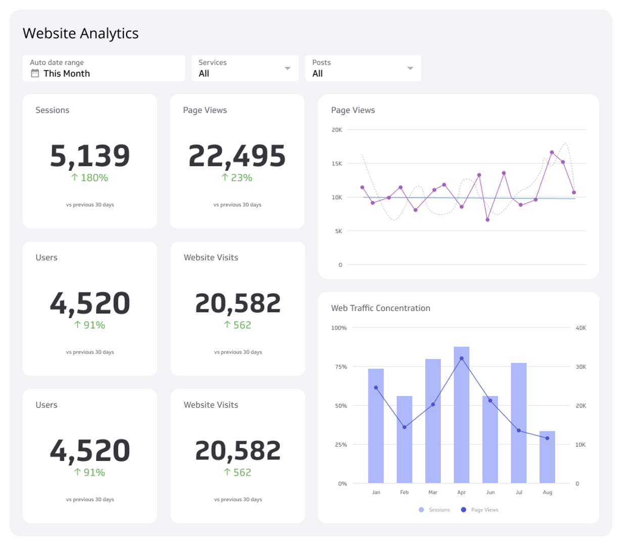
Web Analytics Dashboard
A web analytics dashboard tracks website performance metrics to provide insights needed to optimize site performance, improve engagement, and identify online trends in real time.
What is a Web Analytics Dashboard?
Web analytics dashboards deliver an overall view of user interaction with your website and offer actionable insights into performance and user behavior. They focus on understanding website traffic patterns, user engagement, and overall site efficiency to influence strategic decisions.
Unlike broader web analytics tools, like Google and Hotjar, these dashboards centralize website-specific data to highlight online trends and opportunities for website improvement. More importantly, it enables you to identify strengths and weaknesses in your digital process and optimize your site for improved user experiences.
Examples of Web Analytics Dashboards
Sales Performance Analysis Dashboard
A sales performance analysis dashboard focuses on metrics like revenue trends, sales velocity, and team productivity to provide powerful insights into how your sales team or process performs against set targets. By breaking down performance data, it lets you determine the strategies that drive results and the strategies that require adjustments.
This dashboard emphasizes actionable information directly impacting revenue generation, such as which sales channels perform best or where deals get bottlenecked. It is designed to analyze performance at the individual, team, or organizational level, offering a simple but detailed look at sales efficiency that guides you on how to refine your strategies and enhance your overall sales.
Who’s it for | Sales managers, executives, team leaders, sales analysts |
How often it's needed | Real-time, daily, weekly, monthly, quarterly, yearly |
Covered KPIs | Total sales revenue, revenue growth rate, sales targets vs. actuals, average deal size, sales by region or territory, sales by product or service, win rate, lead conversion rate, sales cycle length, sales by individual team member, customer acquisition cost (CAC), customer lifetime value (CLV), churn rate, pipeline value, pipeline conversion rate, sales forecast accuracy, upsell and cross-sell revenue, sales quota attainment, sales expenses per deal, deal velocity, number of closed deals, average discount offered, sales activity metrics (calls, emails, meetings), renewal rates, gross margin on sales, sales by customer segment, competitor impact on sales, market penetration rate, repeat purchase rate, percentage of sales from new customers |
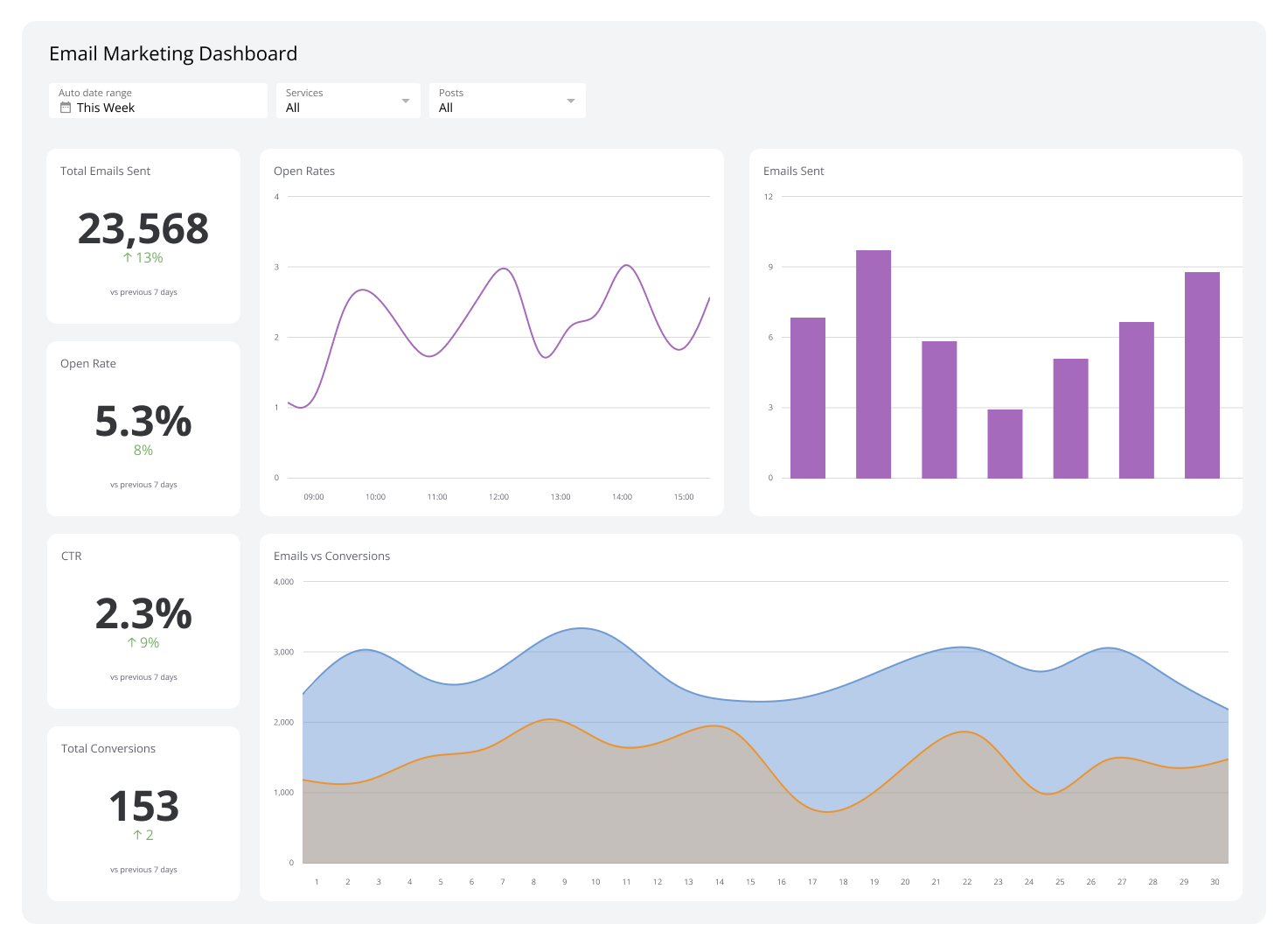
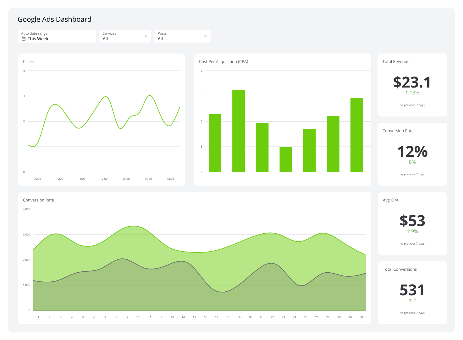
Marketing Analytics Dashboard
Marketing analytics dashboards give you an overview of how your marketing campaigns and strategies perform across multiple platforms. Their metrics are generated from channels like social media, email, and paid ads to show how your marketing activities contribute to greater business objectives.
These web analytics dashboards also reveal the connections between different marketing channels to reveal how they collectively influence audience behavior. Moreover, they support better decision-making by highlighting marketing patterns and enabling more effective resource and budget allocation.
Who’s it for | Marketing managers, executives, campaign strategists, data analysts |
How often it's needed | Real-time, daily, weekly, monthly, quarterly, yearly |
Covered KPIs | Website traffic, traffic sources (organic, paid, social, referral), conversion rate, cost per acquisition (CPA), return on marketing investment (ROMI), click-through rate (CTR), bounce rate, lead generation rate, marketing-qualified leads (MQLs), sales-qualified leads (SQLs), CAC, CLV, social media engagement (likes, shares, comments), email open rates, email click rates, ad impressions, cost per click (CPC), cost per thousand impressions (CPM), average session duration, pageviews per session, top-performing content, keyword rankings, search engine visibility, organic traffic growth, paid search performance, social media follower growth, demographic targeting efficiency, campaign ROI, landing page conversion rate, webinar or event attendance rates, influencer campaign reach, affiliate marketing revenue, sentiment analysis for brand mentions, video view-through rates |
Financial Analytics Dashboard
A financial analytics dashboard simplifies financial tracking and decision-making, allowing you to evaluate key performance indicators like profitability, liquidity, and solvency. By analyzing it, you can get an accurate live assessment of your business’s financial position.
Unlike generic financial tools, this dashboard lets you generate customized reports that reflect your business, such as ROI for individual projects, product lines, or departments. Generally speaking, it streamlines the financial management process, providing both high-level insights and granular details to foster the creation of data-backed decisions to improve your bottom line.
Who’s it for | CFOs, financial analysts, accounting teams, executives, investors |
How often it's needed | Real-time, daily, weekly, monthly, quarterly, yearly |
Covered KPIs | Revenue, net income, gross profit margin, net profit margin, operating expenses, EBITDA, cash flow (operating, investing, financing), accounts payable, accounts receivable, current ratio, quick ratio, working capital, debt-to-equity ratio, return on investment (ROI), return on equity (ROE), return on assets (ROA), earnings per share (EPS), budget variance, cost of goods sold (COGS), break-even point, net burn rate, forecast accuracy, revenue growth rate, expense ratio, financial risk indicators, liquidity ratios, inventory turnover, profit and loss trends, year-over-year revenue comparison, fixed vs. variable costs, capital expenditures, tax liabilities, dividend yield, interest coverage ratio, market share, cash conversion cycle, payroll expenses, funding runway |
HR Analytics Dashboard
HR analytics dashboards provide data on organizational dynamics, recruitment, and workplace performance. With their aid, you can track things like recruitment funnel effectiveness, voluntary turnover by department, and the impact of training on employee productivity.
For instance, they can indicate that retention rates drop after four months or that specific departments experience longer hiring cycles.
These dashboards also evaluate compensation alignment with market benchmarks, monitor the effectiveness of employee engagement initiatives, and highlight diversity gaps within teams and leadership levels. If you leverage them, you get to align HR practices with your companies for a more resilient and efficient workforce.
Who’s it for | HR managers, recruiters, department heads, executives, workforce planners |
How often it's needed | Real-time, daily, weekly, monthly, quarterly, yearly |
Covered KPIs | Employee headcount, headcount growth rate, employee turnover rate, voluntary vs. involuntary turnover, average tenure, absenteeism rate, time-to-hire, time-to-fill, cost-per-hire, offer acceptance rate, internal mobility rate, training completion rate, employee satisfaction score, engagement score, diversity metrics (gender, age, ethnicity), promotion rate, retention rate, performance ratings distribution, salary distribution, pay equity ratio, overtime hours, workforce productivity, employee net promoter score (eNPS), ratio of HR staff to employees, recruitment funnel metrics (applications, interviews, offers), training ROI, workforce planning accuracy, demographic trends, attrition risk score, succession planning metrics, compliance audit results, benefits usage rate, leave balances by type |
Customer Support Dashboard
A customer support dashboard shows metrics that reflect the performance of customer service teams. It clearly shows how effectively your support inquiries are handled via metrics such as average response and handle times, ticket resolution rates, and customer satisfaction scores.
Beyond monitoring performance, this web analytics dashboard spots recurring support trends, such as frequently reported issues or high-impact problem areas. Also, it underlines gaps in service coverage, workload distribution, and areas where your process can be improved to boost customer satisfaction.
Who’s it for | Customer support managers, team leads, customer service representatives, executives |
How often it's needed | Real-time, daily, weekly, monthly, quarterly |
Covered KPIs | Average response time, first response time, resolution time, number of support tickets (opened, resolved, pending), ticket backlog, customer satisfaction (CSAT) score, customer effort score (CES), net promoter score (NPS), first contact resolution rate, customer retention rate, average handling time (AHT), support team utilization, escalation rate, number of reopened tickets, agent performance (individual and team), ticket volume by channel (email, phone, chat, social media), service level agreement (SLA) compliance, ticket response rate, customer complaints, number of active support agents, agent satisfaction score, cost per ticket, ticket categorization (issue types), resolution by channel |
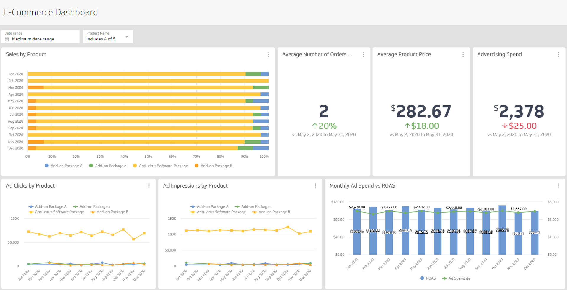
E-Commerce Performance Dashboard
With an e-commerce performance dashboard, you get a full overview of metrics and KPIs that indicate the health and success of your retail operations. This dashboard obtains data on sales revenue, web traffic, cart abandonment, and conversion rates, then consolidates it to help you understand how your digital storefront is performing.
For example, it shows which products are driving the most revenue or identifies stages in the checkout process where customers drop off.
E-commerce performance dashboards also concentrate on customer behavior and can highlight opportunities to optimize marketing efforts, inventory management, and pricing strategies. Thus, they enable your business to improve operations to produce a far superior shopping experience.
Who’s it for | E-commerce managers, marketing teams, product teams, executives |
How often it's needed | Real-time, daily, weekly, monthly, quarterly, yearly |
Covered KPIs | Total revenue, conversion rate, average order value (AOV), total number of orders, cart abandonment rate, website traffic, product views, top-selling products, sales by channel, CAC, return on ad spend (ROAS), CLV, new vs. returning customer ratio, refund and return rate, inventory turnover, COGS, average checkout time, number of items per order, gross profit margin, order fulfillment time, revenue by device type (mobile, desktop), payment method usage, sales growth, marketing channel performance, website bounce rate, product rating and reviews |
SEO Analytics Dashboard
An SEO analytics dashboard allows you to monitor and analyze your website's organic search performance. It showcases the effectiveness of your keyword strategies, tracks search engine rankings, and evaluates traffic sources to ensure that your website always remains relevant at Google, Bing, and other popular search engines.
With this dashboard, you get to spot opportunities to enhance website authority as it monitors backlinks, domain ratings, and page load times. Moreover, it drives attention to technical SEO problems, such as broken links or missing metadata, which can negatively impact your search engine rankings.
Zeroing in on SEO’s key aspects, the dashboard ensures that you can always optimize your strategies and maintain a competitive edge in search results.
Who’s it for | SEO managers, digital marketing teams, content teams, executives |
How often it's needed | Real-time, daily, weekly, monthly, quarterly, yearly |
Covered KPIs | Organic traffic, keyword rankings, click-through rate (CTR), bounce rate, average session duration, pages per session, backlinks, domain authority, page load speed, search impressions, keyword search volume, keyword difficulty, conversion rate from organic traffic, cost per acquisition (CPA) from SEO, top landing pages, organic vs. paid traffic, new vs. returning visitors, organic revenue, SEO traffic growth, top organic keywords, referral traffic, SEO goal completions, competitor ranking comparison, indexed pages |
Customer Retention Dashboard
A customer retention dashboard delivers a detailed view of how well your business maintains its existing customer base. It examines patterns in customer loyalty, including factors like repeat purchases and account renewals, to measure the effectiveness of your retention initiatives. This dashboard can also uncover upcoming issues by detecting declining engagement and usage to help you proactively address churn risks.
With a strong emphasis on long-term customer value, a customer retention dashboard gauges the success of programs like discounts for loyal customers or exclusive benefits for members. The data it presents can guide your teams in creating strategies to strengthen customer loyalty, making the dashboard an essential tool for sustaining revenue and reducing customer turnover.
Who’s it for | Customer success teams, marketing teams, product managers, executives |
How often it's needed | Real-time, daily, weekly, monthly, quarterly, yearly |
Covered KPIs | Customer retention rate, churn rate, repeat purchase rate, CLTV, CSAT score, NPS, retention by segment, time to first repeat purchase, product return rate, number of support tickets per customer, customer engagement rate, customer feedback volume, upsell/cross-sell success rate, retention cost per customer, customer renewal rate, loyalty program participation, churn by reason, customer health score, average revenue per user (ARPU), active vs. inactive customers, customer tenure, retention by marketing channel |
Engagement Dashboard
Engagement dashboards capture key interactions between users and your platform to offer a detailed look at their behavior. It keenly tracks user activity, such as page views, click-through rates, and time spent, to evaluate the effectiveness of your engagement initiatives. Simply put, these dashboards are designed to uncover patterns and changes in user interest over time.
Analyzing an engagement dashboard lets you recognize highly engaging elements and areas where users lose interest. It provides actionable insights to improve content, features, or user experiences that sustain interaction and empowers you to develop strategies for maintaining user involvement with your brand.
Who’s it for | Marketing teams, product teams, community managers, customer success teams, executives |
How often it's needed | Real-time, daily, weekly, monthly, quarterly, yearly |
Covered KPIs | User engagement rate, average session duration, pages per session, bounce rate, CTR, social media engagement (likes, shares, comments), email open rate, email click-through rate, video view count, average time spent on page, active users (daily/weekly/monthly), conversion rate, new vs. returning users, user retention rate, engagement by demographic (age, location, device), user growth rate, content engagement rate, interactions per post, app downloads, feature usage rate, user feedback/ratings, CSAT, user-generated content (UGC) submissions |
Social Media Traffic Dashboard
A social media traffic dashboard provides visibility into how visitors arrive at your website from various social platforms. It creates platform-specific metrics such as referral traffic, click-through rates, and audience behavior once users land on your site. In addition, it lets you concentrate on the social campaigns that drive the most meaningful engagement.
By leveraging this dashboard’s insights, it becomes possible to understand which platforms and content types consistently attract high-quality traffic to your site. This makes the dashboard an essential tool if you want to create a cohesive strategy that turns traffic into tangible outcomes.
Who’s it for | Social media managers, marketing teams, content strategists, digital marketing teams, executives |
How often it's needed | Real-time, daily, weekly, monthly, quarterly, yearly |
Covered KPIs | Total social media traffic, traffic sources (Facebook, Twitter, LinkedIn, Instagram), CTR from social platforms, engagement rate (likes, shares, comments), impressions, reach, social media referral traffic to website, bounce rate from social media traffic, conversion rate from social media traffic, top-performing social posts, social media audience growth, follower count, follower demographics (age, gender, location), time spent on site from social referrals, CPC from social ads, social media ad impressions, ROI of social media ads, social media sentiment, hashtag performance, UGC interactions, social media engagement by platform, content shares |
Audience Demographics Dashboard
An audience demographics dashboard presents who interacts with your brand across various channels. It categorizes audiences based on language, location, gender, age, and income level to give you a clear picture of your target market. This data helps you find trends in audience behavior and preferences, which can ultimately be utilized to tailor your market strategies and improve your company’s relevance.
This dashboard also highlights demographic shifts, allowing you to dissect how your audience evolves and whether new customer segments are emerging. Because of that, you can quickly gain information on how your audience evolves in response to your marketing endeavors.
Who’s it for | Marketing teams, content strategists, digital analysts, customer insights teams, executives |
How often it's needed | Real-time, daily, weekly, monthly, quarterly, yearly |
Covered KPIs | Audience age distribution, gender distribution, geographic location, device type (desktop, mobile, tablet), language preferences, time zone distribution, interests and behaviors, customer segmentation (new vs. returning visitors), traffic source by demographics, engagement by demographic segment, average session duration by demographic, page views per session by demographic, conversion rate by demographic, revenue by demographic, CLV by segment, top-performing content by demographic group, bounce rate by demographic, device usage trends, demographic-based social media engagement, campaign performance by audience segment |
Session Analytics Dashboard
Session analytics dashboards offer an in-depth view of how users engage with a site by tracking metrics like session duration, bounce rate, and pages per session. By observing these metrics, you can better understand the flow of user behavior and identify high-performing pages or areas for improvement.
Who’s it for | Marketing teams, website administrators, UX designers, data analysts, and content strategists |
How often it's needed | Real-time, daily, weekly, monthly, quarterly |
Covered KPIs | Total sessions, new sessions, returning sessions, average session duration, pages per session, bounce rate, sessions by traffic source (organic, paid, referral, direct), device type, browser and operating system usage, engagement metrics (time on page, interactions), scroll depth analysis, sessions with conversions, sessions categorized by landing and exit pages, trends over time, abandoned sessions, session behavior and pattern insights, conversion rate per session, sessions with multiple page views, session frequency, demographic segmentation (age, gender, location), average session value (revenue), sessions by campaign, content or product views per session, peak session times, average load time per session, exit rates by page, device-specific session performance |
Referral Traffic Dashboard
A referral traffic dashboard shows the influence of external sources, such as social media posts, affiliate networks, and partner websites, on your site’s traffic. For example, it might show that a referral link from a partner’s email newsletter generates higher conversion rates vs traffic from paid ads.
By analyzing how different referral sources perform in terms of session length, engagement, and bounce rate, you gain the insight necessary to pinpoint and prioritize high-performing channels. Over time, adjusting your focus toward the most successful referral partnerships will enhance your overall marketing ROI, which leads to more qualified traffic and higher conversions.
Who’s it for | Marketing teams, SEO specialists, content strategists, digital analysts, e-commerce managers |
How often it's needed | Real-time, daily, weekly, monthly |
Covered KPIs | Total referral traffic, referral traffic by source (social media, blogs, partner websites, influencers), referral conversion rate, bounce rate from referral traffic, new vs. returning visitors from referral sources, average session duration from referrals, pages per session from referral traffic, referral traffic trends over time, top referring domains, referral traffic by geographical location, referral traffic by device type, average order value from referral visitors, campaign performance by referral traffic, user behavior after landing on site from referrals, sessions from email campaigns, referral traffic by content or product pages, referral traffic from organic vs. paid sources, cost per acquisition from referral channels, engagement rates from referral traffic |
Web analytics made easy with Klipfolio
A web analytics dashboard consolidates key website data to outline your site’s performance. It enables you to track how users navigate your website, which pages generate the most engagement, and where improvements can be made to enhance user experience and drive conversions.
With customizable reporting and visualizations, these dashboards simplify decision-making. By focusing on important metrics, you can refine their strategies and drive better results and Klipfolio makes it easy to visualize web data and enhance your digital strategy.
Related Dashboards
View all dashboards