
What's New
Looking for PowerMetrics updates? Click here
July 2026
Reset user input controls
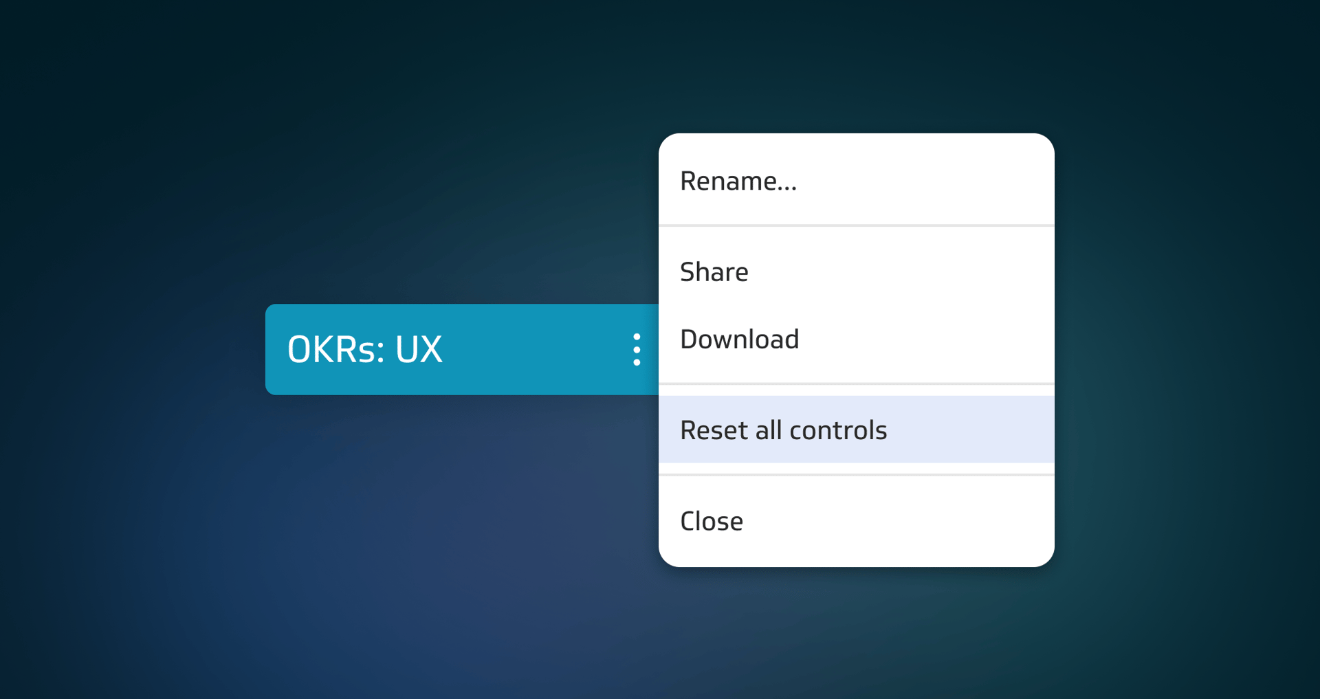
You can now easily return user input controls on dashboards to their default settings.
Learn moreMarch 2026
New permission for custom roles
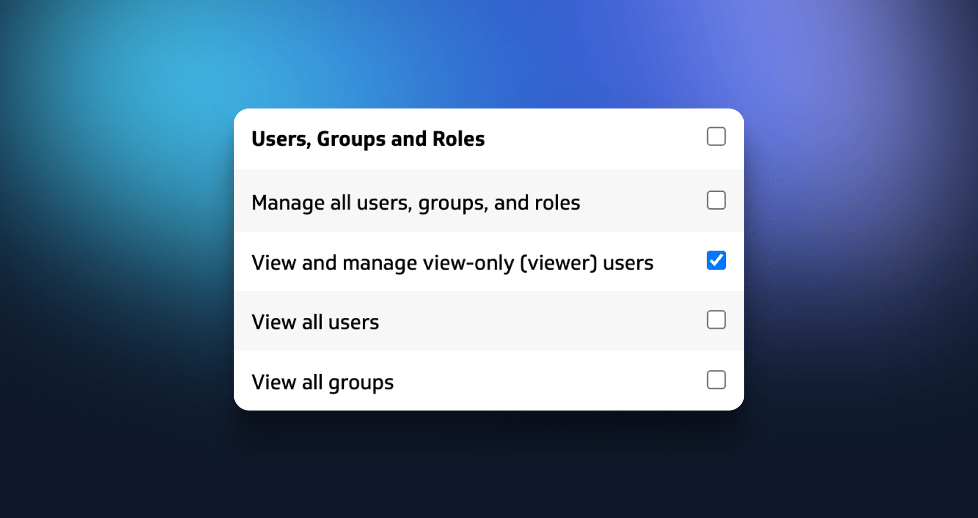
The new "View and manage view-only (viewer) users" permission lets Admins grant users the ability to add and remove viewers–especially useful for self-managed client accounts! Learn more about custom roles.
January 2026
Enhanced security
Users can now remember up to 5 devices for multi-factor authentication (MFA), and admins can require MFA for all account members that use email login.
Learn moreDecember 2025
Split columns

Splitting a column of comma separated values into multiple columns makes it easier to work with separated values that align with a set of dimensions, for example, when creating GA4 data sources.
Learn more
New and improved billing system

We’ve partnered with Stripe to bring you more streamlined, simplified billing. Learn more about our new plan pages and bill management UI.
Klipfolio API key access
The new “Manage API key” permission gives Klips admins more control over who can generate Klipfolio API keys.
Learn moreNovember 2025
New authentication method for Snowflake.
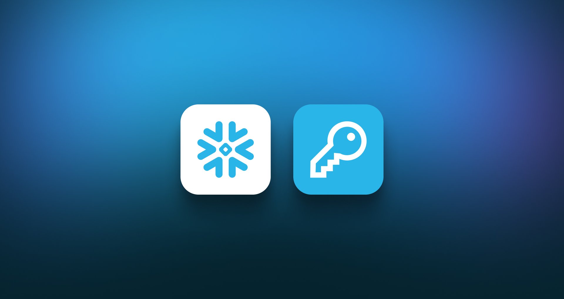
Snowflake is ending support for password authentication. As a result, we’ve updated our Snowflake integration to use key pair authentication.
Learn moreSeptember 2025
Google Ads connector

We’ve updated our connector to support Google Ads version 21. Learn how to connect to Google Ads in Klips.
July 2025
LinkedIn Ads Campaigns pre-built dashboard
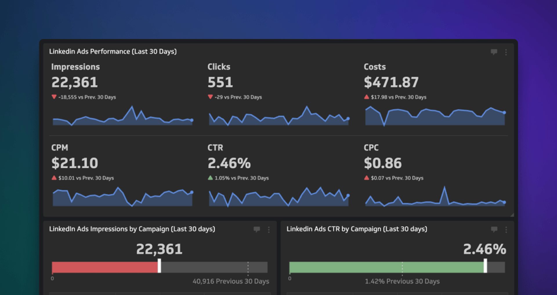
With this professionally-curated, pre-built dashboard, you’ll be monitoring the effectiveness of your LinkedIn Ads campaigns in no time flat!
Learn moreApril 2025
Better dashboard control
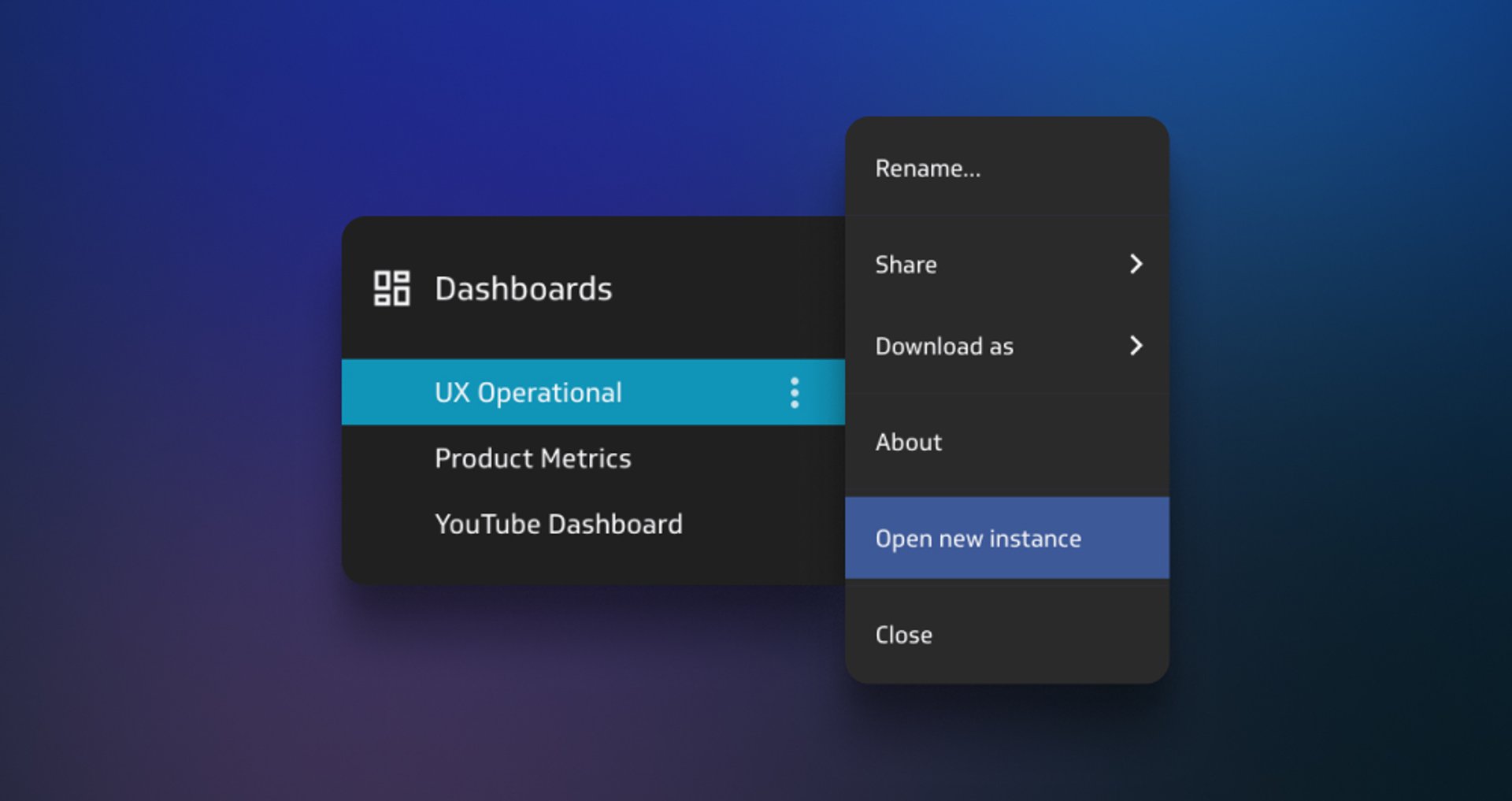
Adding instances to your list of open dashboards is now more intentional, removing the risk of duplication and clutter in your list of go-to dashboards!
Learn moreMarch 2025
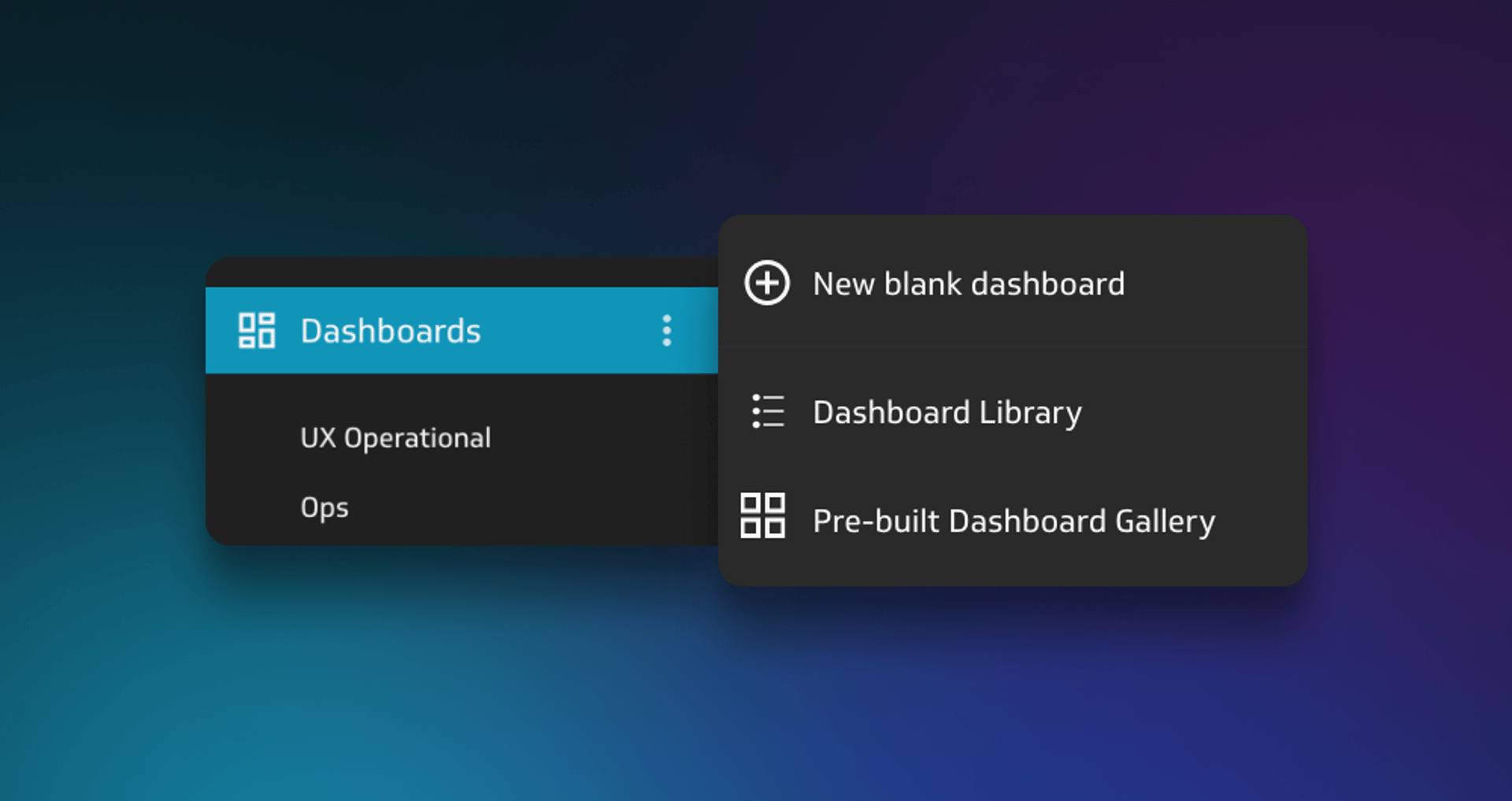
Pre-built Klip dashboards
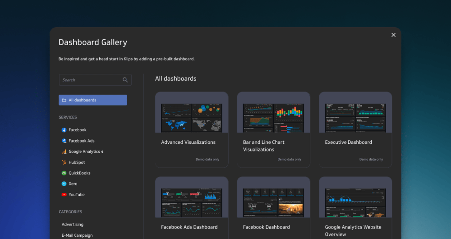
Instantly add curated dashboards that bring together essential Klips for Finance, Marketing, Social Media, Web Analytics and more!
Learn moreGet there faster!
Redesigned mobile experience for Klips!
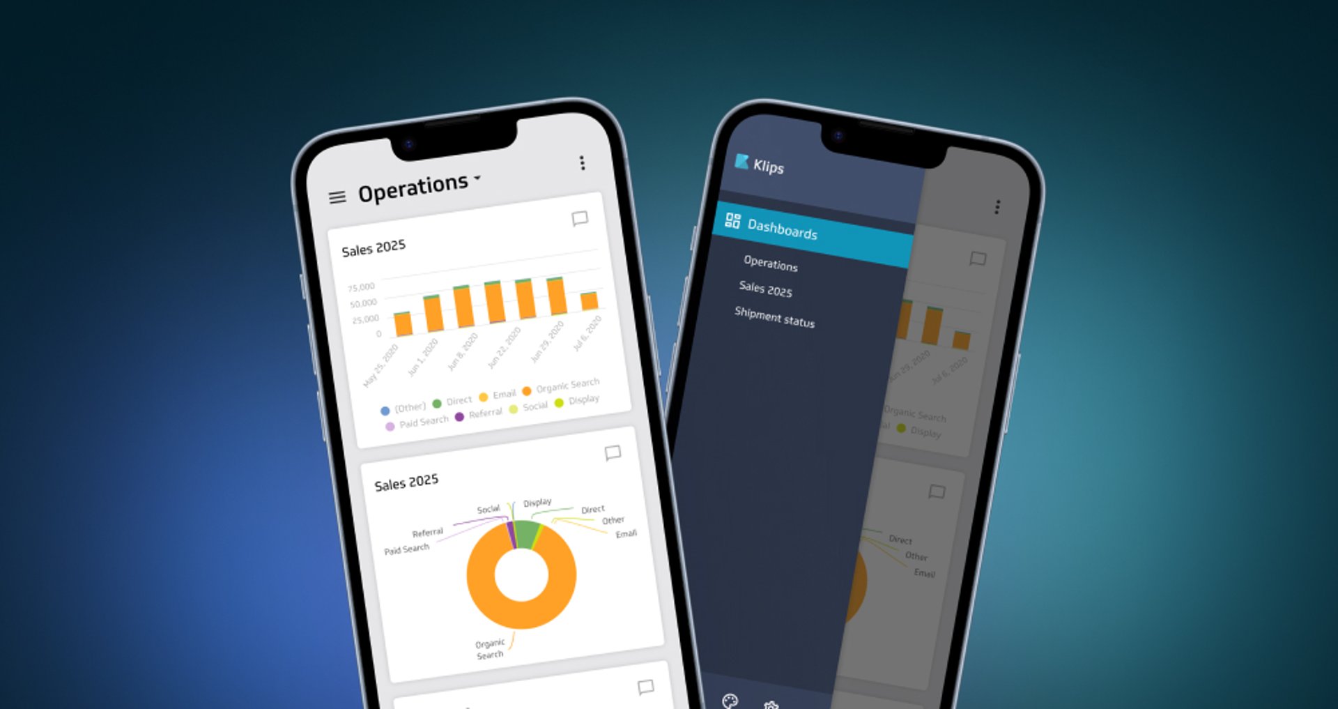
Get instant, on-the-go access to dashboards on your smartphone.
Learn more
Custom theme
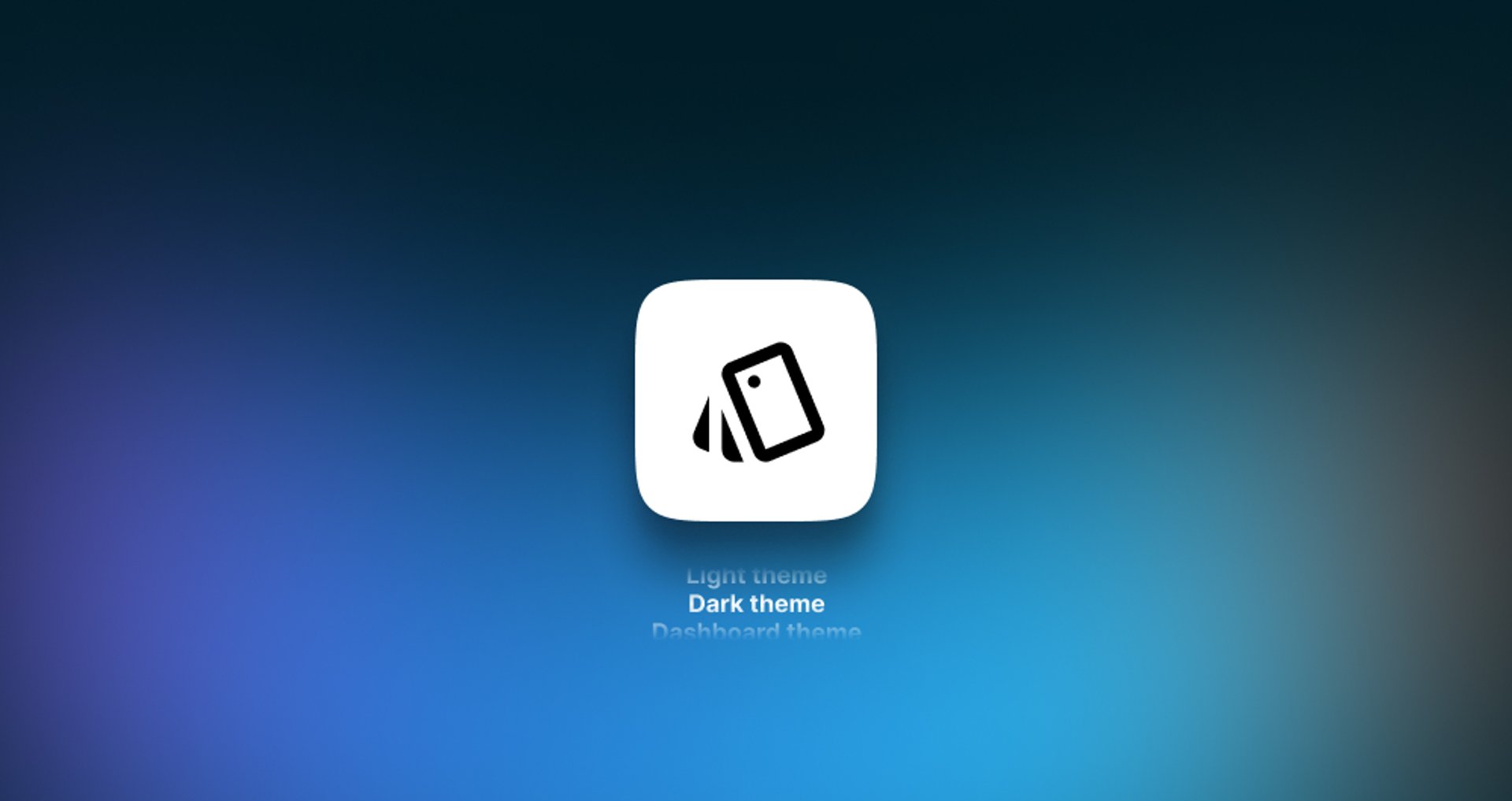
You can now apply customized styling to the left-navigation sidebar in Klips.
Learn moreConnecting to your Zoho data

In response to recent changes in the Zoho service, we now have separate built-in connectors for Zoho Desk and Zoho CRM.
Learn more