Let’s fix analytics so we can stop asking you for dashboards

Published 2023-09-11, updated 2023-11-27

Summary - With that many self-serve analytics tools out there, why do business teams, like marketing or customer success, still frequently ask their data teams for dashboards? Truth is, a well-crafted dashboard addresses their needs in many ways that an organization’s self-serve analytics solution does not. This article describes the business team’s perspective on what true self-serve analytics should look like.
Self-serve business intelligence and analytics solutions are supposed to be designed for people like me. I’m the Chief Operating Officer at Klipfolio, and oversee the marketing and customer success teams that make data-driven decisions every day. Despite being part of an analytics company and fairly data-literate, I’m not a technical data specialist. My decision making, therefore, relies on clean, trusted data presented in a format my teams and I can understand and use. Unfortunately, the needs of end users are often an afterthought when discussing the challenges of modern business intelligence software. This needs to change.
I firmly believe that keeping the end user in mind is key to developing a superior product. And, that includes self-serve analytics solutions. Based on my personal experience and interactions with our customers (team members from marketing, sales, or customer service) I’ve learned there’s one thing most of them want - dashboards. Sorry, data team! Please try to hold back your yawns. Why dashboards? Because their needs are not being met by their current analytics solution. They keep coming back to the familiarity of dashboards as they try to accomplish these three things:
- Understand and communicate their data’s story
- Trust their data as a single source of truth
- Have access to a truly self-serve analytics tool that's straightforward to use
I’m convinced there’s a way to navigate the data “wild west” that’s plaguing many organizations today. Let’s fix analytics together! I promise your data team will never have to build another report or dashboard, your business teams will be able to confidently make independent, data-driven decisions, and your organization will finally be able to leverage the power of data.
The state of self-serve analytics
Analytics and Business Intelligence (BI) concepts propel business decisions based on data from customers, external resources, and the software used by various teams. Smaller organizations sometimes have “someone technical” on the team who can provide others with the data they need. However, this solution doesn’t scale well in growing companies with their ever-increasing requests for data. Integrating a self-serve analytics solution into the company's data stack not only decreases the number of ad hoc requests to the data team, it enables business teams to make faster, data-driven decisions. But, according to these studies, BI tools have an alarmingly low adoption rate of 26% on average across all organizations (Wiisdom), with 74% of employees feeling overwhelmed or dissatisfied when handling data (Accenture). Based on customer conversations and my experience working in mid-sized companies, I've learned which end users' needs aren’t being met by most self-serve analytics tools – and I’m ready to share.
Not just a “wish”, a “need”
Data team members may groan when asked for yet another dashboard. Though dashboards aren’t exactly cutting edge these days, they’re frequently requested by end users because they represent data using a familiar format. The same applies to requests for “a slightly different version of that report”. As effective leaders, we understand that there’s a need behind every expressed wish. In the case of dashboards, there are several (non-trivial) needs worth considering. When your marketing leader asks for a marketing campaign dashboard, they’re expressing the need for the following requirements.
What business teams need
Guidance & definitions
Business users need guidance on what to measure. For example, which metrics should a marketing leader be using? You may assume this is something they should already know but that’s often not the case. Figuring out the right metrics for the task usually requires iteration and a cross-functional effort. Consider this example: Your marketing team uses Google Ads as one of their marketing channels. They need to know how much they can spend per conversion or sale to maintain profitability. They also require a set of visualizations so they can easily access useful data each time they review the performance of their campaigns. In this scenario, the finance department needs to provide insight into the maximum customer acquisition costs. The marketing team needs to share how they structure and steer their campaigns and what other metrics they use (for example, CTR). Obviously, also the data team, that accesses, cleans, transforms, and visualizes the raw data, plays a critical role. All three departments must collaborate closely to agree on the definition and calculation of metrics such as "cost per lead" or "customer acquisition cost". Identifying and defining the essential metrics for the entire business is a cross-functional effort. As a crucial part of data-driven decisions, this process must be carefully considered and shouldn’t be rushed. Metric libraries like MetricHQ can help with definition and calculation, but each organization ultimately needs to determine which metrics are most relevant to them. To understand more about the value of metrics for decision-making, check out this article.
Insight
To gain insights from your data, you need to view the same metric from various perspectives, a task well-designed dashboards should accomplish. However, this requirement may be challenging for non-technical users to describe. This might be why your business colleagues repeatedly make ad hoc requests for visualization adjustments. A well-defined metric should be broken down into segments that reflect the marketing or organizational strategy. Verticals and geographies can represent significant segments, aiding the marketing team in gaining deeper insights into their campaign performance. An easy, non-technical method of filtering and segmenting data can address a significant number of ad hoc requests. However, a carefully curated dashboard is still necessary to see the whole picture without the bias that comes from focusing on limited perspectives.
Trustworthy data
When analyzing data, nothing’s more frustrating than discovering conflicting values in your reports. The inability to rely on a self-serve analytics solution can be as exasperating for business end users as it is for the data team to reconcile misaligned KPIs. Most business teams don’t have the technical expertise to sift through all the tables to extract the data they need. Data duplication and misaligned definitions and calculations are generally far removed from the day-to-day tasks of most end users. This makes it difficult for them to fully grasp the challenges faced by their data team. Relying on misleading data not only results in poor business decisions, it also undermines trust in their self-serve analytics solution. In most cases, rather than run the risk of ending up with incorrect data, business users choose not to try to do it themselves and, instead, open another ad hoc request with the data team. What business users want (and need) are curated metrics that include reliable, consistent data.
An intuitive BI solution
Let's be honest. Most people in marketing, sales, and customer success, and even many business leaders, struggle to use BI solutions, even those that claim to be self-serve. Tools like Tableau and PowerBI, while powerful and loved by many analysts, can be challenging for the majority of business teams due to their technical complexity. Despite companies investing time and money in training, most users never become proficient at using these tools. As a result, user confidence is low which leads to poor adoption rates. The consistency and familiarity of a dashboard, in contrast, is easy to use and doesn’t require users to dig into a solution with which they’re uncomfortable.
Independent decision making
While I can't speak for everyone, my experience suggests that many business users would love to find the answers to their data questions themselves. They just need the right tools and metrics. I don’t think anyone enjoys lining up their ad hoc requests and having their projects delayed while they wait for data. As an aside, most people would agree that data specialists should focus on the true data challenges, such as improving the data infrastructure, solving complex or new analytical challenges, and learning how AI could propel their decision making. The desire for independence and easy access to data makes dashboards especially appealing to business users. A dashboard isn’t only accessible and trustworthy. It’s also a personal space where business users can make decisions without depending on (or waiting for) contributions from the data team.
The role of dashboards
Requests for dashboards aren’t likely to diminish anytime soon, especially in smaller, less data-mature organizations. That’s because the concept of a curated, continually-updated dashboard – acting as an authoritative single source of truth for decision making – is not only valid, it's precisely what's required to make data-driven decisions. Dashboards go a long way toward satisfying the need for guidance, insight, and trustworthy data. They’re the basis for independent decision making but can only truly shine when they’re powered by the right analytics solution.
Taking dashboards to the next level
So far we’ve talked about the need for reliable dashboards. Now, let’s look at how the right BI solution can provide the missing pieces of the dashboard puzzle.
Quality metrics for quality decisions: We don’t need more data, we need better data
In this era of information, we’re overwhelmed by an excess of data, much of which lacks meaning and structure. Jordan Tigani, the founding engineer of BigQuery, believes that much of the data that’s stored goes unprocessed, particularly as it ages. He’s publicly discussed the challenges of big data, labeling it a "liability". I think we all agree that data has no value without meaning. This is the main reason why an increasing number of data engineers and analysts are implementing a metrics framework within their organization so they can structure their data and infuse it with business relevance.
A metric simultaneously describes a data structure and a business concept. This helps companies determine which data is genuinely necessary for decision making. By identifying the (leading) indicators of success and allocating the resources needed to define and calculate high-quality metrics, businesses can decide which data to focus on and maintain.
Metrics will vary from business model to business model, industry to industry, and department to department, but there are many defined "best practice" metrics that are applicable to most companies. MetricHQ, the first community-driven dictionary for metrics and KPIs, is a widely-used resource for researching metrics, looking up definitions and calculations, and even contributing your own metrics. Identifying the essential metrics for your business is a crucial first step, as it informs teams on what they should measure and ensures everyone uses the same definitions.
A semantic layer as a single source of truth
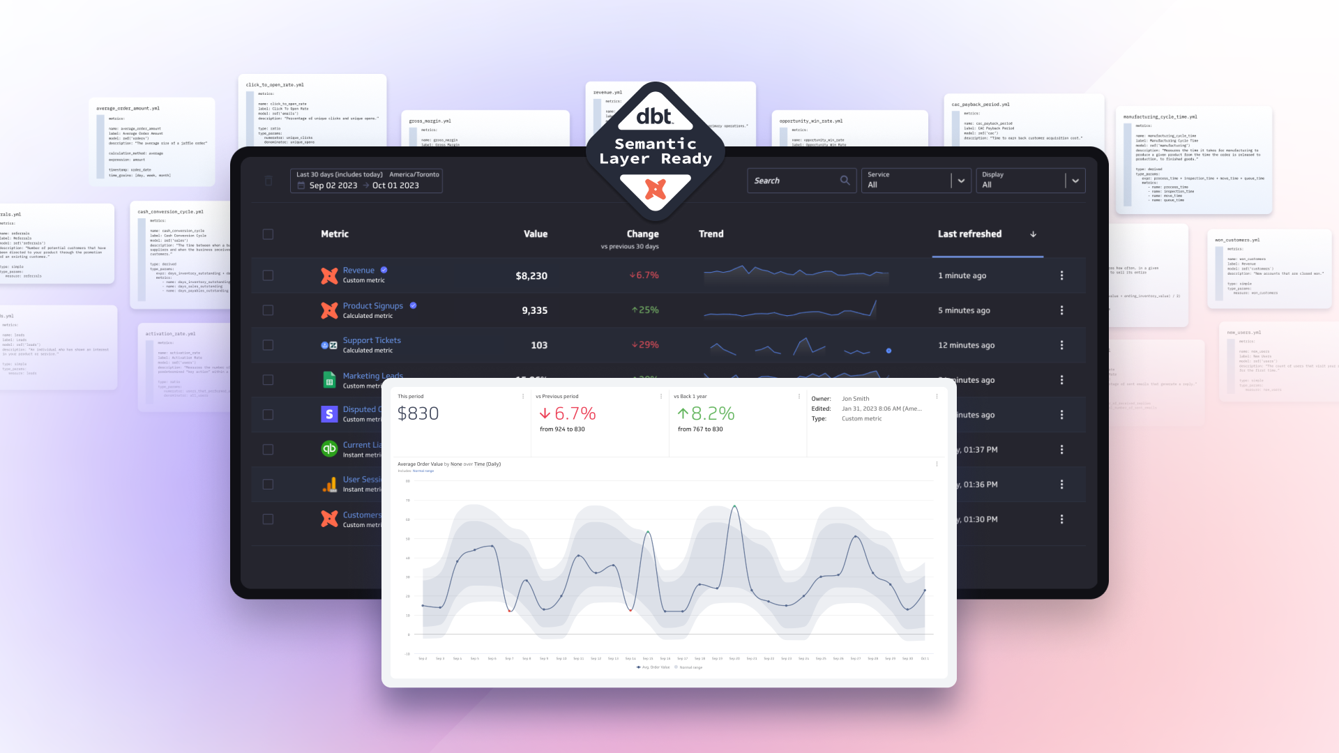
For a BI tool to be effective (and well-adopted), end users need to be 100% confident in the data. Business users may not have the technical expertise (or the time) to understand the complexities of the data’s structure. They just need to know that it’s reliable and consistent. Their data has to reflect the same values for the same metric company wide. This leads us to a crucial point – everyone must operate based on the same metric, thus a metric should be unique. This is where the semantic layer (at Klipfolio we often refer to it as a metrics layer) comes into play. As an integral part of the modern data stack, the semantic layer approach has gained popularity in recent years, and for good reasons. The semantic layer abstracts the business logic from raw data and sits between data sources and the visualization layer. It becomes the metric's single source of truth and comprises the metric name, the definition, the formula and aggregation method, and the instructions on where to query the data.
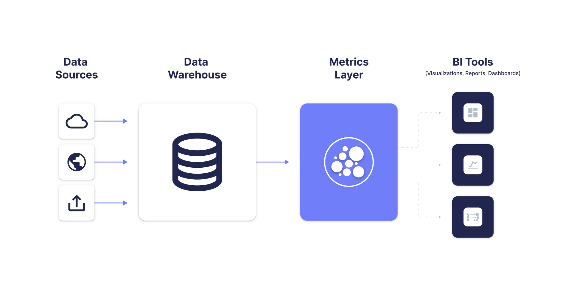
PowerMetrics was the first analytics product built around a metrics layer, though other players are starting to adopt this approach. The benefits of this layer are significant for both business and data teams. The data team maintains a central repository of metrics, ensuring the data is accurate, complete, and unique. Metrics can be shared with individuals or teams for self-serve analysis and dashboards. Regardless of who uses the metric, it consistently reflects the same values.
Analytics designed for business teams and decision makers
Many of our customers tell us that while their analysts are adept at using complex but powerful business intelligence solutions, such as Tableau and PowerBI, their business teams – like marketing, sales, and customer success – find them too challenging. Despite claims of self-service capabilities, these tools aren't accessible to everyone. In most companies, business team members significantly outnumber the analysts. Consequently, the majority of people who should be making data-driven decisions either lack access to trusted data or rely on data teams to present the data to them, causing bottlenecks. Or worse, they stick with Excel.
Wouldn't it make sense to complement the analytics stack with a solution designed specifically for use by business teams? With all metrics centrally stored in the semantic layer (aka the metrics layer), there would be no issues with data duplication, even if an organization decided to implement multiple analytics solutions. In fact, this would allow every team to select their preferred tool, while working from the same underlying metrics.
PowerMetrics is close to the solution. It’s an analytics tool designed for non-technical decision makers and business teams, backed by a strong data-team feature set. Offering a broad range of powerful analytics features, it still feels lightweight and is not overwhelming to use. Our customers appreciate using PowerMetrics in parallel with other applications, and we're working on making this system more open to integration with more analytics solutions.
While building dashboards may not seem like a glamorous task for a data team, it’s critical for business teams. Dashboards are incredibly useful for telling a data story and sharing that story with others. That’s why dashboards should be built by the business teams who craft the story, not by the data teams who provide the metrics. With PowerMetrics, once validated metrics are provided, business users are able to independently create meaningful dashboards and share them with their colleagues.
Data by the data team. Business by the business team.
The needs of business end users – more guidance on what to measure, help in defining metrics, access to trustworthy data, and an analytics solution that’s designed for their requirements (including the ability to create and share dashboards) – are perfectly aligned with the needs of most data teams. After creating metrics, many data engineers prefer a “hands-off” approach when it comes to visualization, analytics, and dashboard creation. This is what makes working with PowerMetrics, a metric-centric analytics product, so exhilarating. It allows the data team to own the metrics and keep them clean and accurate. At the same time, it enables the data-literate, but non-technical, business teams to be completely independent with access to a truly self-serve BI tool. No more bottlenecks and ad hoc dashboard requests. Let’s work toward an analytics future where every team can focus and excel at what they do best. If we can do that, my promise to data teams will be fulfilled – you'll never have to build another dashboard!
Related Articles

PowerMetrics Case Study: The Project Booth
By Cathrin Schneider — April 11th, 2024

Top Six Data and Analytics Trends – 2024
By Allan Wille, Co-Founder — December 11th, 2023

Maximizing Business Insights: The Power of dbt’s Semantic Layer with Klipfolio PowerMetrics
By Jeroen Visser — November 27th, 2023
Unlocking the Value of Metrics for Everyone: Introducing PowerMetrics + revamped dbt Semantic Layer
By David Mennie — October 17th, 2023