
How Klipfolio runs its business on dashboards: a startup guide
See the 12 real dashboards Klipfolio uses across CEO, marketing, sales, DevOps, support, and UX teams, with live examples and templates for your startup.
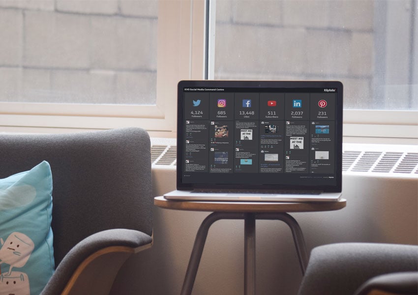
This is an inside look at how Klipfolio runs its own business using dashboards. Every department tracks real metrics on real dashboards, visible to everyone in the company, updated in real time.
What you'll find here:
- Real dashboard templates every startup should be using now
- Dashboards for CEOs, Marketing, DevOps, Sales, Support, and UX teams
- Links to live examples of the 12 operational dashboards Klipfolio has on its office walls
Look for the "View the live dashboard" link in each section to explore the interactive public versions. The underlying data has been modified, but the dashboards themselves are exact replicas of what the team uses every day.
How we use these dashboards
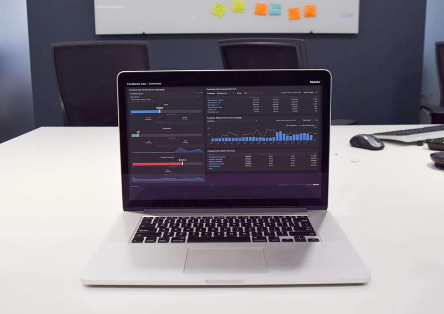
For a startup, growth is the only metric that matters. Every decision either accelerates it or slows it down.
At Klipfolio, dashboards are the connective tissue of the business. They give every leader and team member real-time visibility into the numbers that matter most. When something goes wrong, the dashboard flags it immediately. When a number moves in the wrong direction, the team acts, not at the next weekly meeting, not after a report gets pulled, but now.
These dashboards don't just display data. They create accountability, surface problems early, and make it possible to run a fast-moving company without losing sight of what's working and what isn't. The goal is always the same: know where you stand, decide what to do, and move.
CEO dashboards
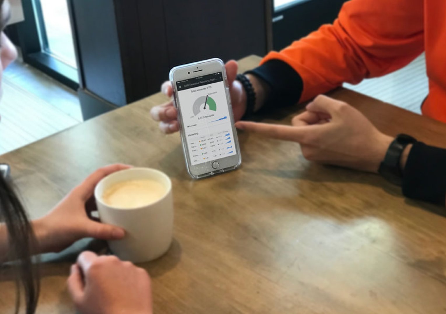
"My dashboard enables me to keep my finger on the pulse of the business. In one view, I can track KPIs for every department: from marketing, sales, and support to user experience, dev-ops, and finances."
- Allan Wille, CEO/President of Klipfolio
Overview
A startup CEO doesn't have time to chase down numbers. The executive dashboard exists so that one glance answers the question every leader is always asking: are we on track?
At Klipfolio, the CEO dashboard surfaces real-time KPIs across every department. It replaces the need to ask, wait, or dig. The numbers are there, current, and reliable.
Executive
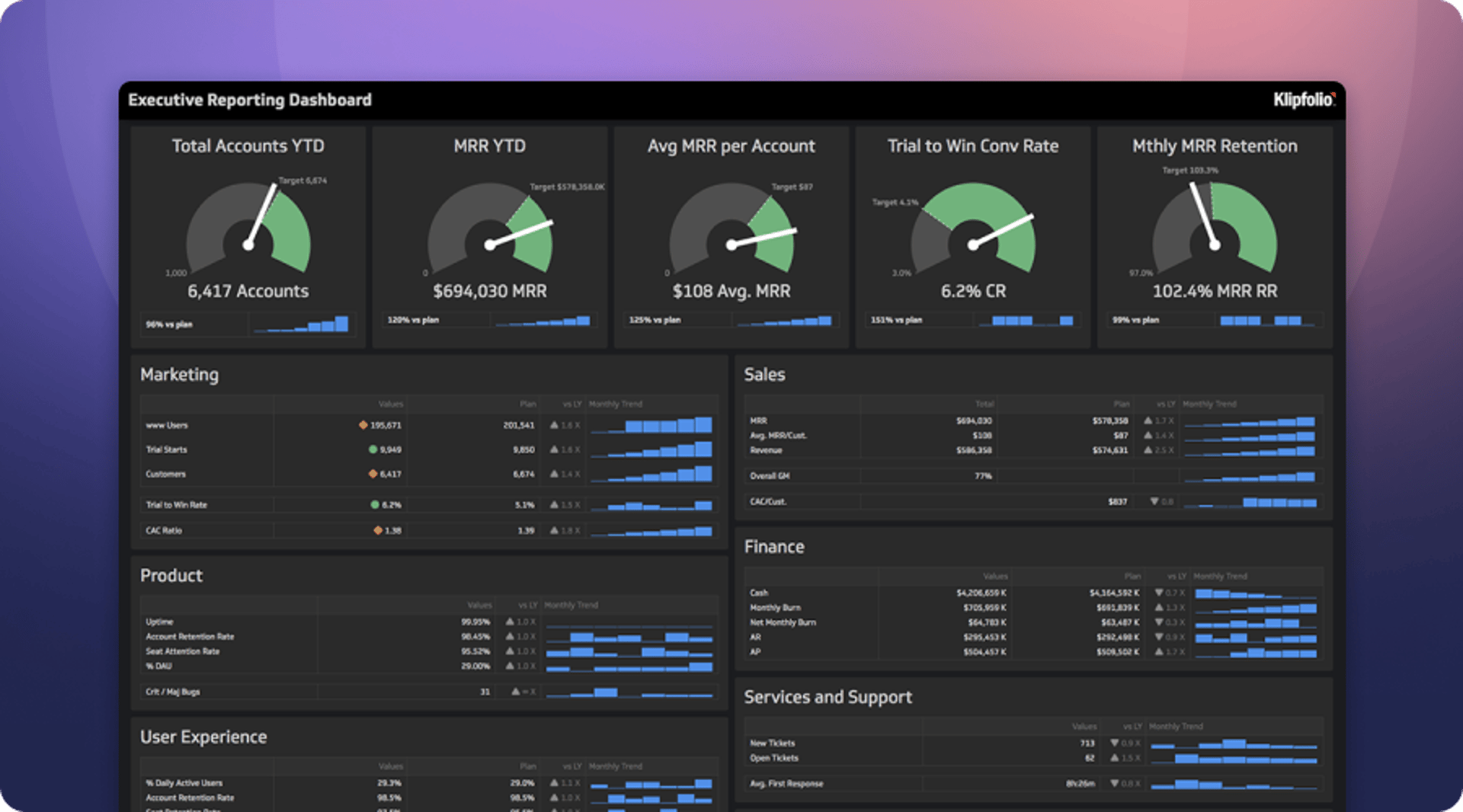
Dashboard overview: The Executive Dashboard displays operational KPIs for each department at Klipfolio. Allan and his team get instant visibility into progress against key growth targets. As a SaaS startup, the most important numbers are total accounts, Monthly Recurring Revenue, MRR per account, lead-to-win rates, and retention. Each department contributes to those high-level goals through its own targets: visitors and leads (marketing), new wins and average MRR (sales), active users and account retention (UX), monthly burn rate (finance), product uptime (development), and new and open tickets (support).
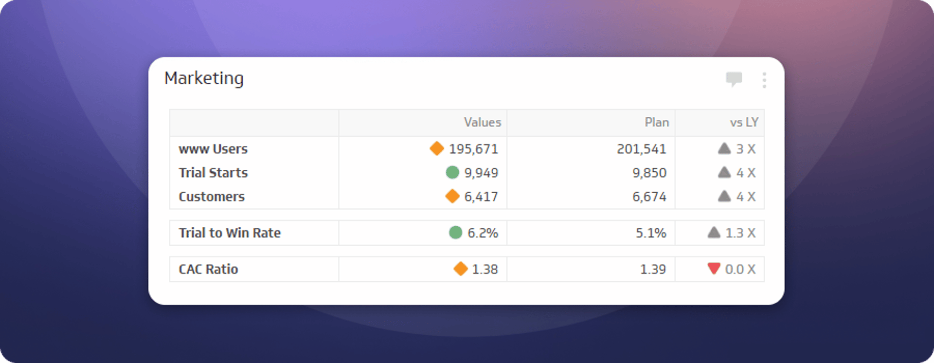
Marketing
Key metrics include number of web visitors, trial starts, and trial-to-win rates.
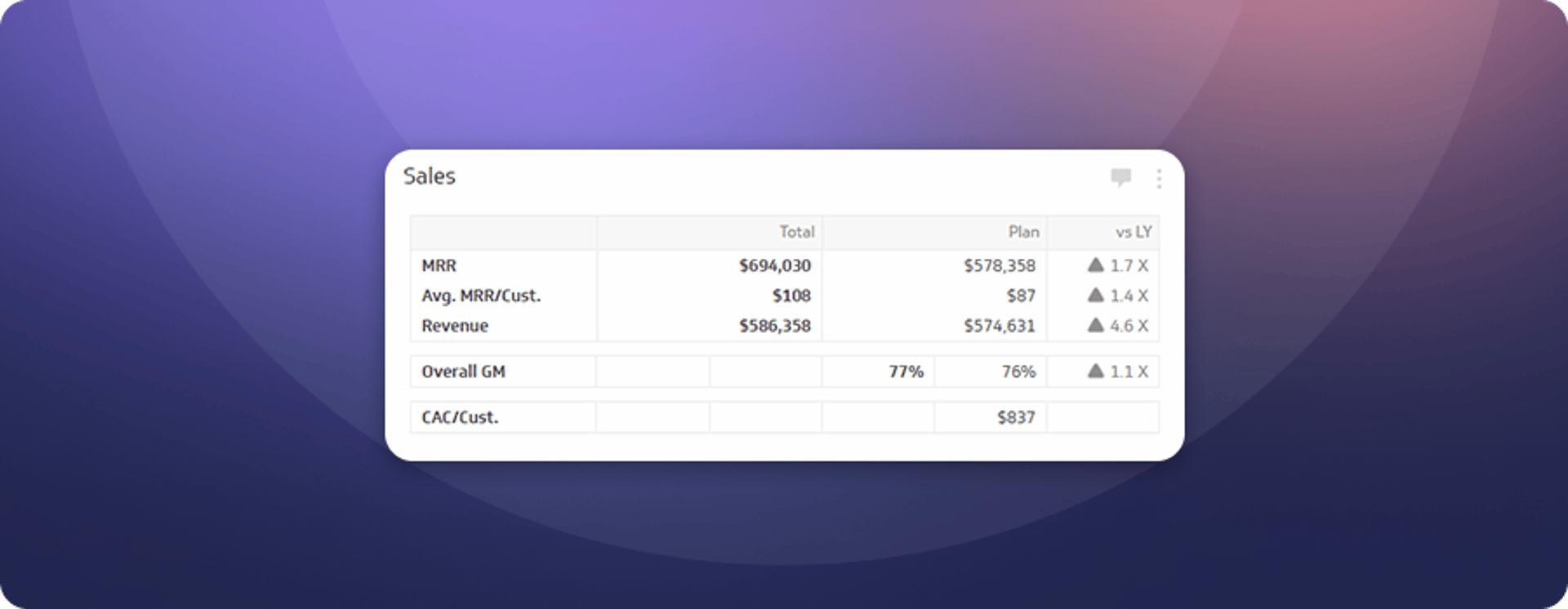
Sales
Key metrics include total MRR, average MRR per customer, and Customer Acquisition Cost.
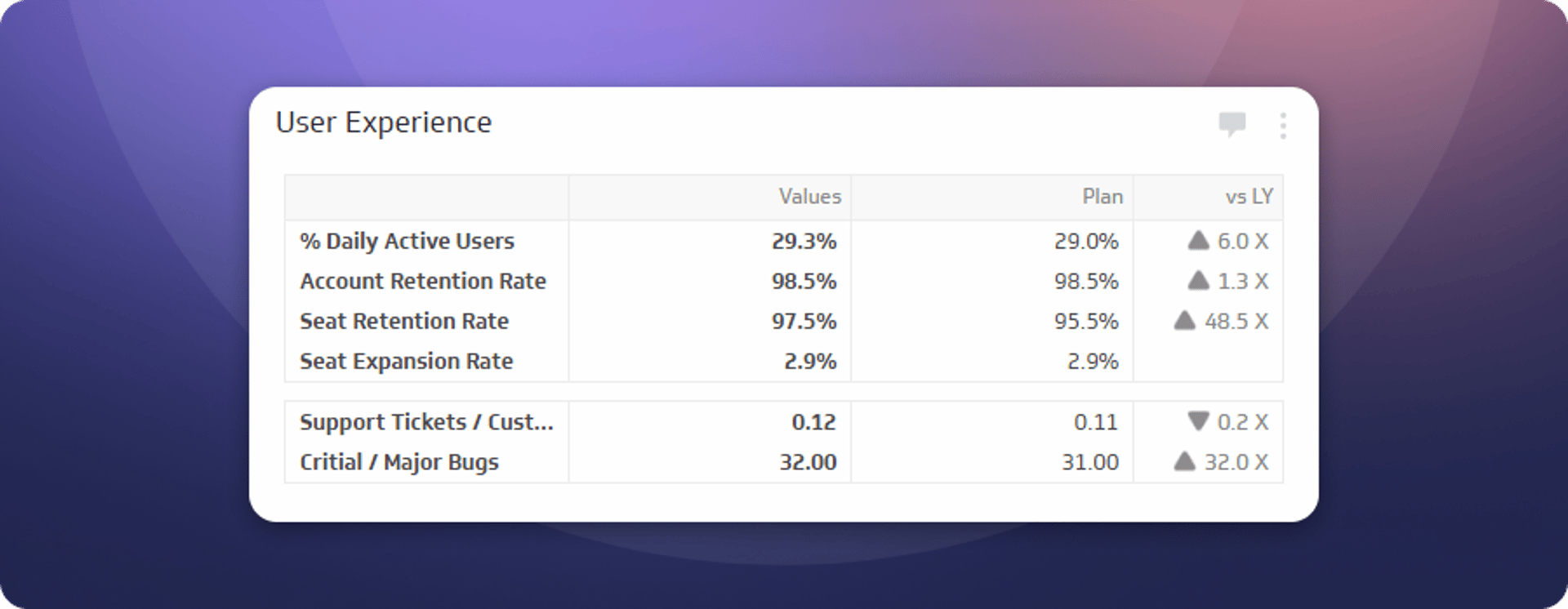
User experience
Key metrics include percentage of daily active users, seat retention rate, and number of tickets submitted per customer.
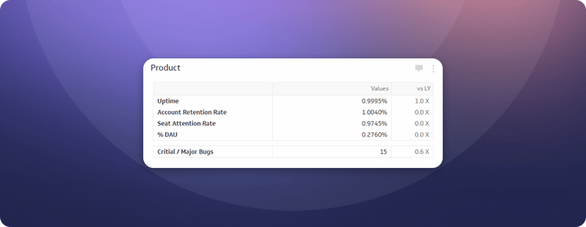
Product
Key metrics include uptime, account and seat retention, and number of critical and major bugs.
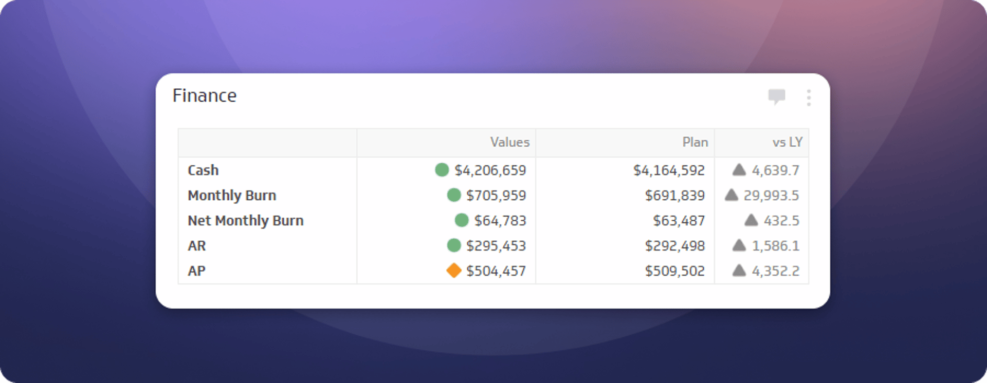
Finance
Key metrics include total cash, monthly burn rate, and accounts receivable.
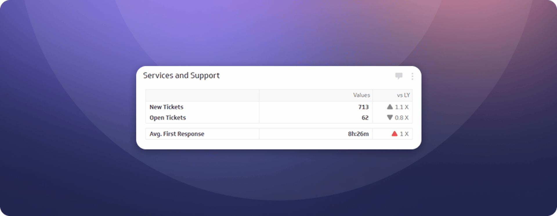
Services and support
Key metrics include new tickets, open tickets, and average first response time.
Marketing dashboards
"What keeps us up at night? Growth. If we're not growing the business, we're not doing our job. We've created three operational dashboards to track how we're performing. With insights from these dashboards, we can fix small inefficiencies before they become major problems, and shift effort and investment to where we're getting the best results."
- Jonathan Taylor, Senior Marketing Manager
Overview
Marketing data doesn't live in one place. Web visitors come from Google Analytics, leads from a marketing automation tool, opportunities and wins from a CRM, and ad performance from paid platforms. A useful marketing dashboard pulls all of that together so the team can see the full picture, not just one slice of it.
Without that consolidated view, it's easy to optimize one channel while losing ground somewhere else. The dashboards below give the Klipfolio marketing team a single source of truth across social, paid, and inbound.
Social media
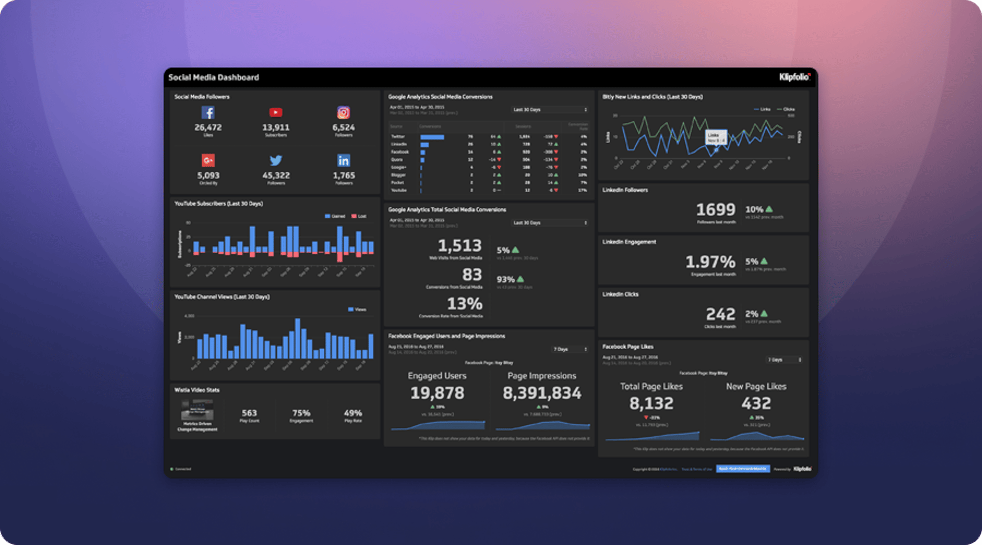
Dashboard overview: The Social Media Dashboard combines metrics from social platforms with Google Analytics. The reasoning is straightforward: social media activity should produce tangible results in the form of web visitors and new leads. Tracking both together shows whether the effort is actually working.
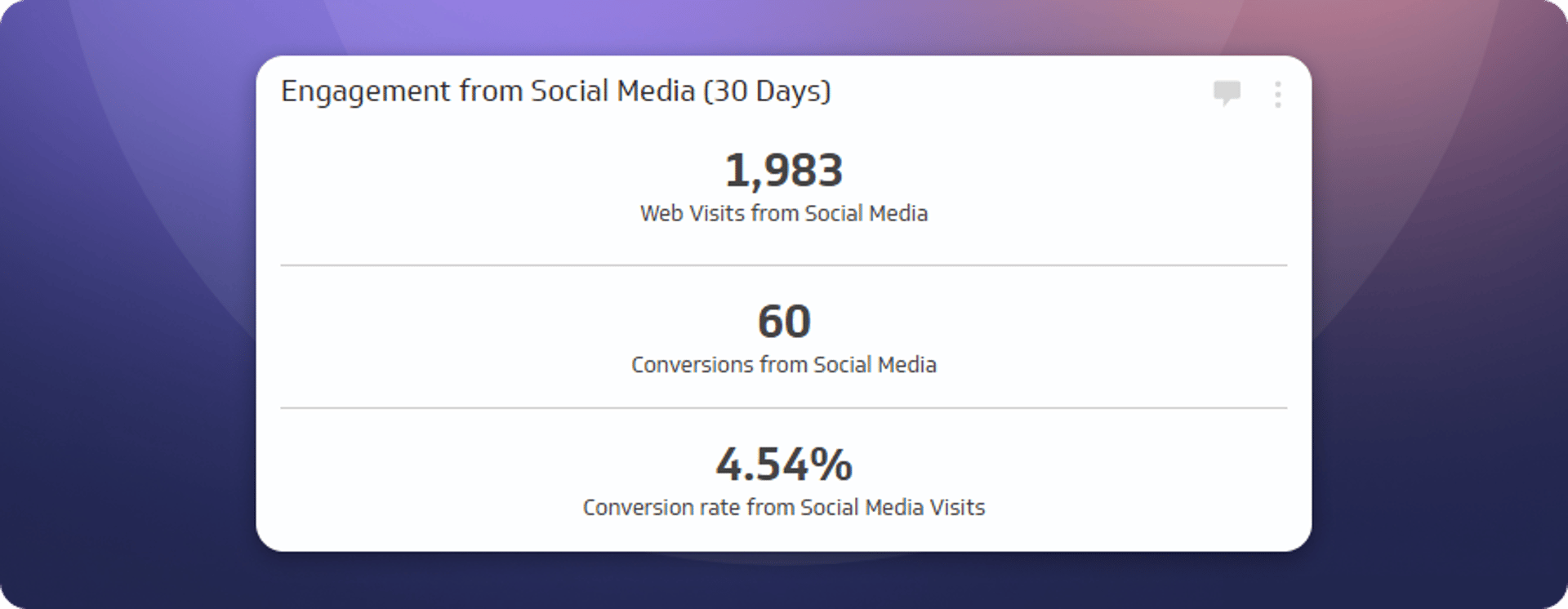
Engagement from social media (30 days)
This Klip measures how effectively social media campaigns drive visitors and leads to the website. It shows total visitors and leads from social, plus overall conversion rates, so the team knows whether the audience it's building is actually moving through the funnel.
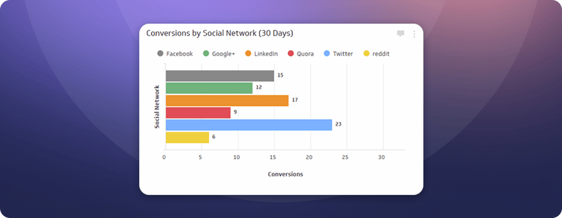
Conversions by social network (30 days)
Marketing resources are finite. This Klip shows how many conversions come from each social platform, making it clear where to invest. Quora consistently drives qualified leads, and the team has allocated budget accordingly.
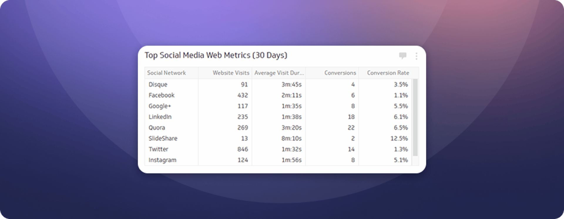
Top social media web metrics (30 days)
Volume is only part of the story. This Klip digs into the quality of traffic from each network, measuring visits, average visit duration, conversions, and goal conversion rate. It answers the question: which platforms are actually worth the time?
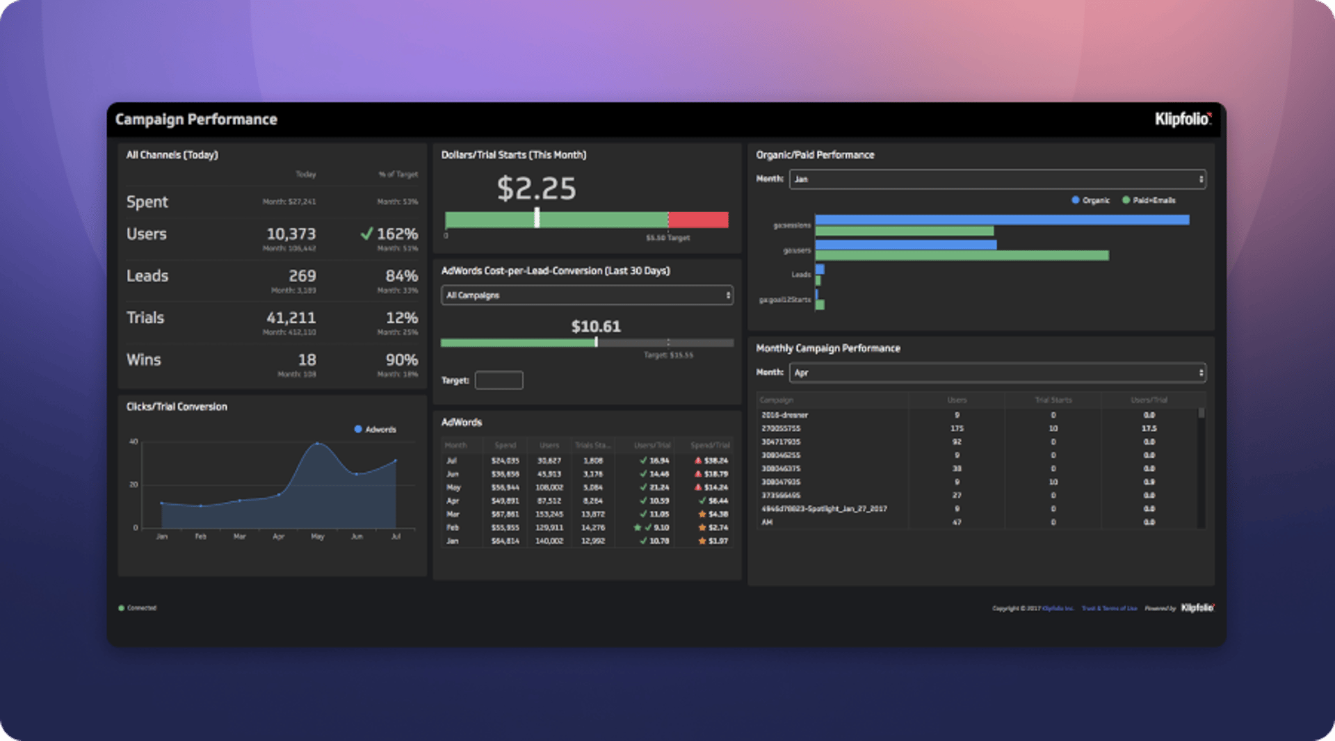
Campaign performance
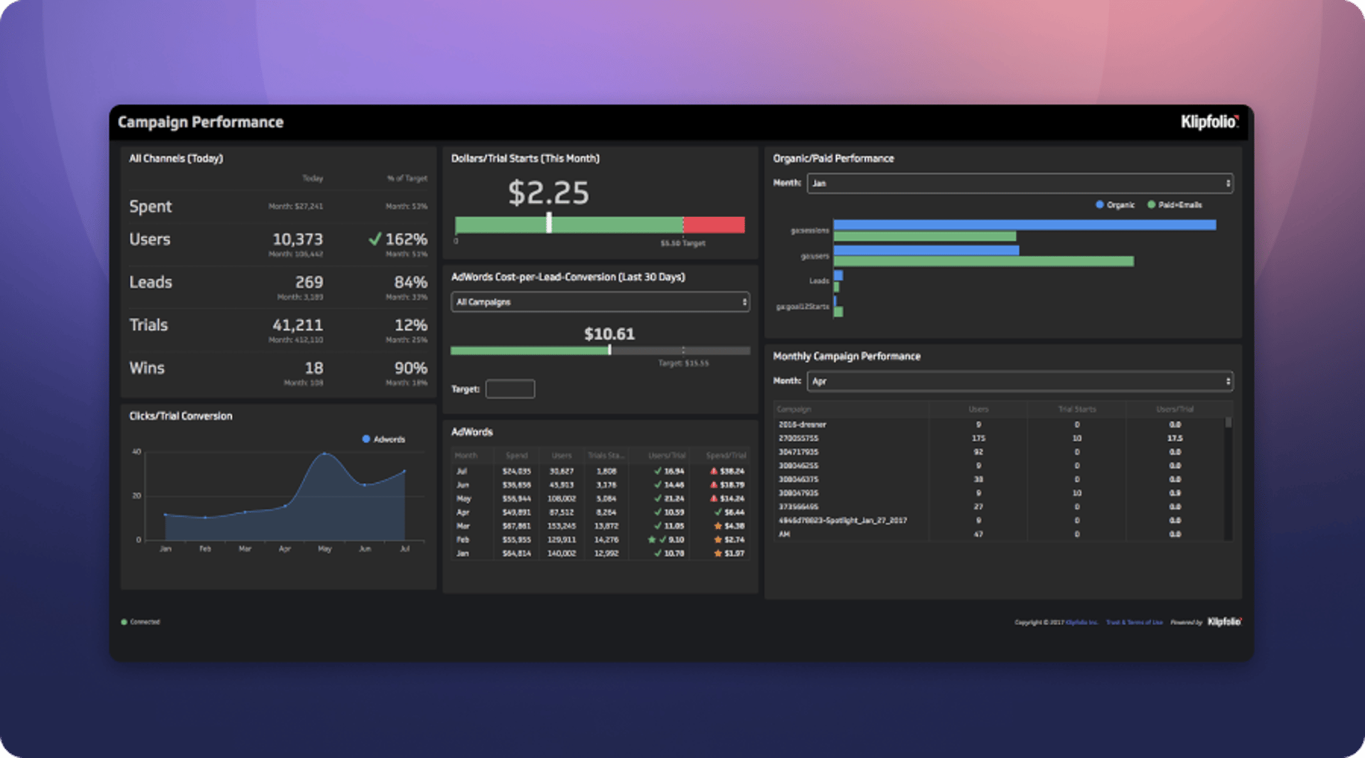
Dashboard overview: The Klipfolio marketing team runs dozens of campaigns simultaneously. Without a dashboard, the data becomes noise. The Campaign Performance Dashboard keeps paid advertising spend visible and accountable, so the team knows whether it's generating the right volume of leads at an acceptable cost per conversion.
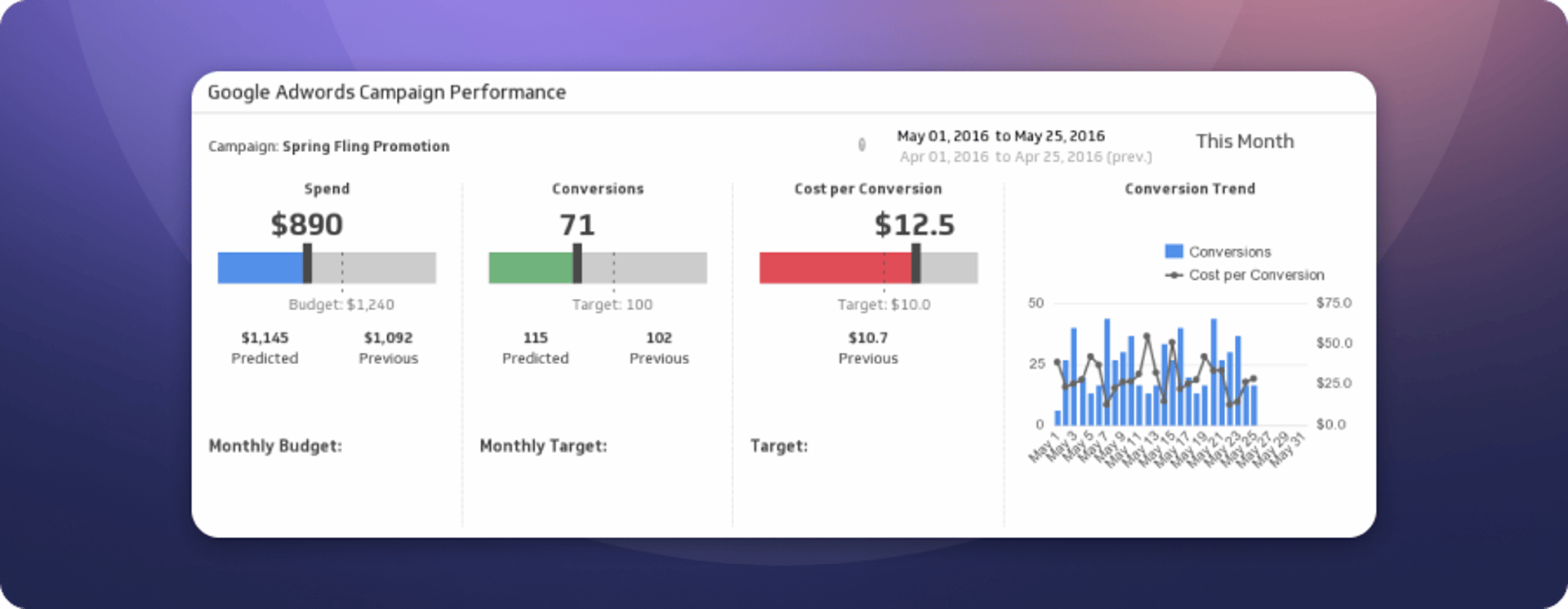
Google Ads
This Klip tracks the effectiveness of paid search campaigns, which represent the largest share of the online advertising budget. The spend-per-trial ratio is monitored closely against a target of $10 per trial, making it easy to spot when a campaign is burning budget without producing results.
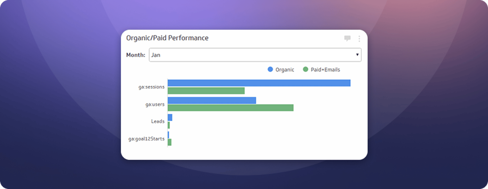
Organic vs. paid performance
This Klip shows the relative performance of paid and organic web traffic each month. The balance shifts depending on goals, content output, and available bandwidth. Seeing both together makes it easier to decide where to focus.
Inbound lead generation
Dashboard overview: Free trials are one of the most effective lead generation tools for a SaaS startup. Trial leads tend to be higher quality and more likely to convert into paying customers. The Inbound Lead Generation Dashboard tracks progress toward a monthly trial target, so the team always knows whether it's on pace.
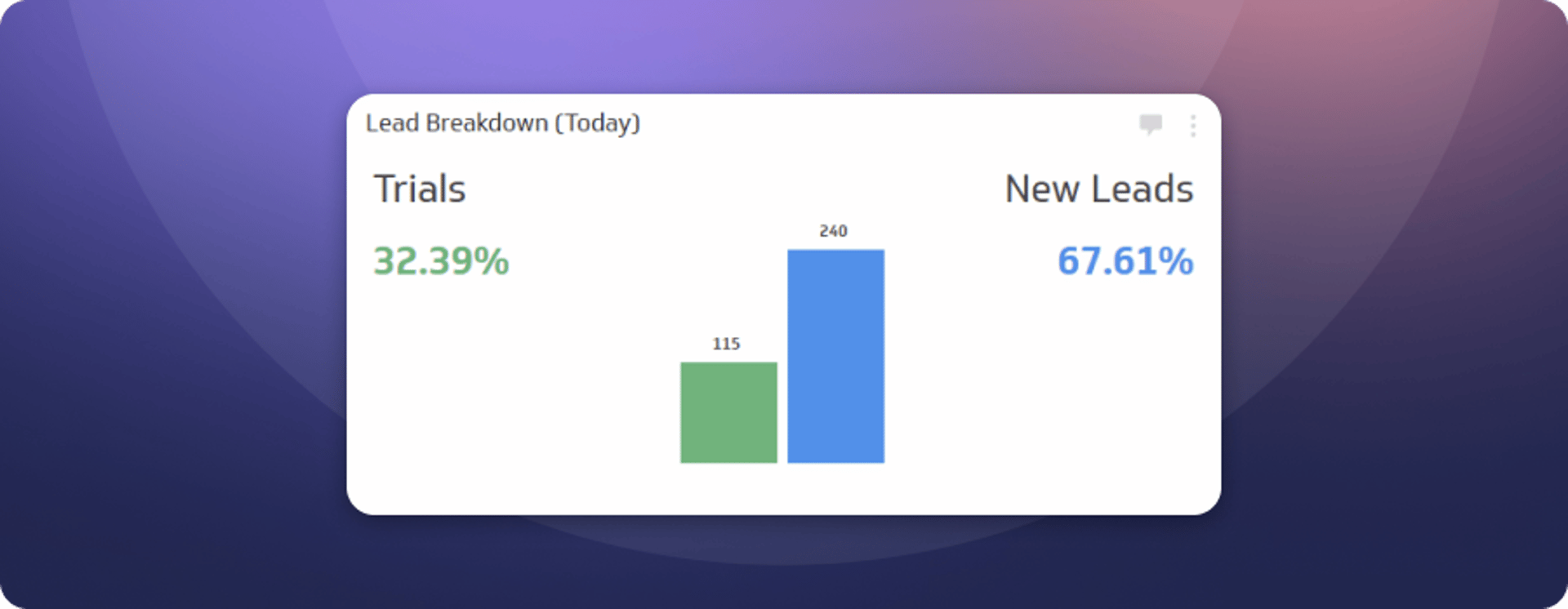
Lead breakdown (today)
This Klip shows the daily split between trial leads and leads from other sources. Trial leads convert at a significantly higher rate. Prospects who commit time to building a dashboard tend to see the value quickly and want to keep going.
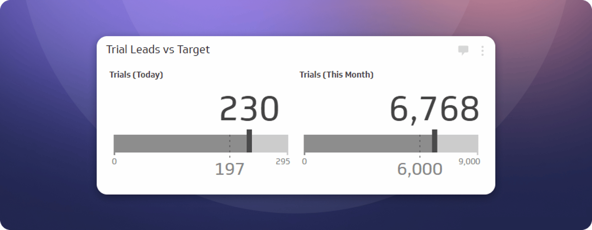
Trial leads vs. target
This Klip tracks progress against both a daily trial target and a monthly trial target. The daily target is calculated from the monthly goal, so the team always knows exactly where it stands. The gauge stays red until the target is hit. The marketing team finds that useful.
Development dashboards

"In a software startup, development is the product-building engine. Successful startups ensure this team runs as quickly, efficiently, and effectively as possible so the product team can deliver outstanding results."
- Ali Pourshahid, Senior Software Development Manager
Overview
The development team at Klipfolio uses dashboards to track product requests, priorities, and progress on active projects. That includes watching the number of critical and major issues to make sure problems don't cross an acceptable threshold, and flagging projects that need additional attention before they fall behind.
Development
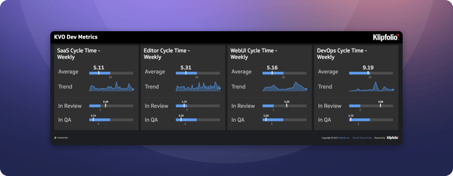
Dashboard overview: The Development Dashboard gives the team a live view of the KPIs that drive day-to-day decisions. It's projected on the wall during daily standups, so every team member sees the same numbers and knows what needs attention before the meeting ends.
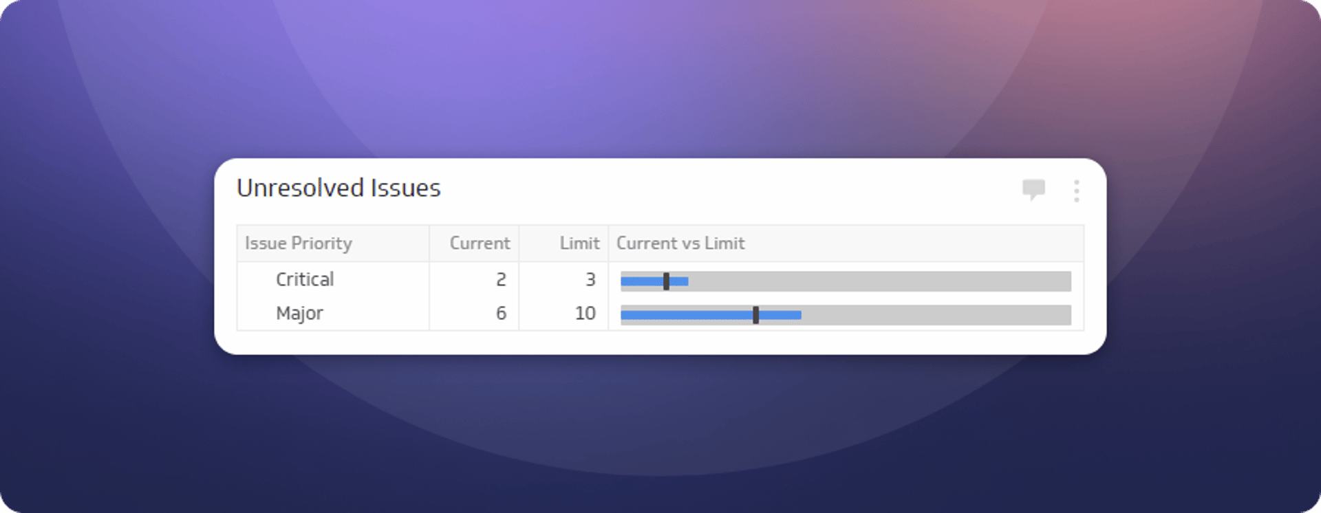
Unresolved issues
This Klip tracks the number of critical and major open issues. Critical issues affect multiple customers and require immediate action. Major issues are more contained, typically affecting one customer and usually having a workaround available. Keeping both visible ensures nothing sits unaddressed for too long.
Create custom dashboards for you and your team.
Get started with KlipsDevOps
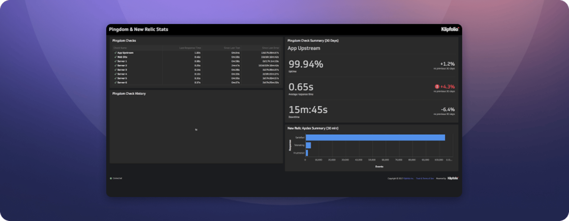
Dashboard overview: For a SaaS company, application performance and customer satisfaction are directly linked. Degraded performance means degraded experience, and that shows up quickly in support tickets and churn. The DevOps Dashboard keeps the team in step with performance changes as they happen. If something goes wrong, the team knows before customers have to tell them.
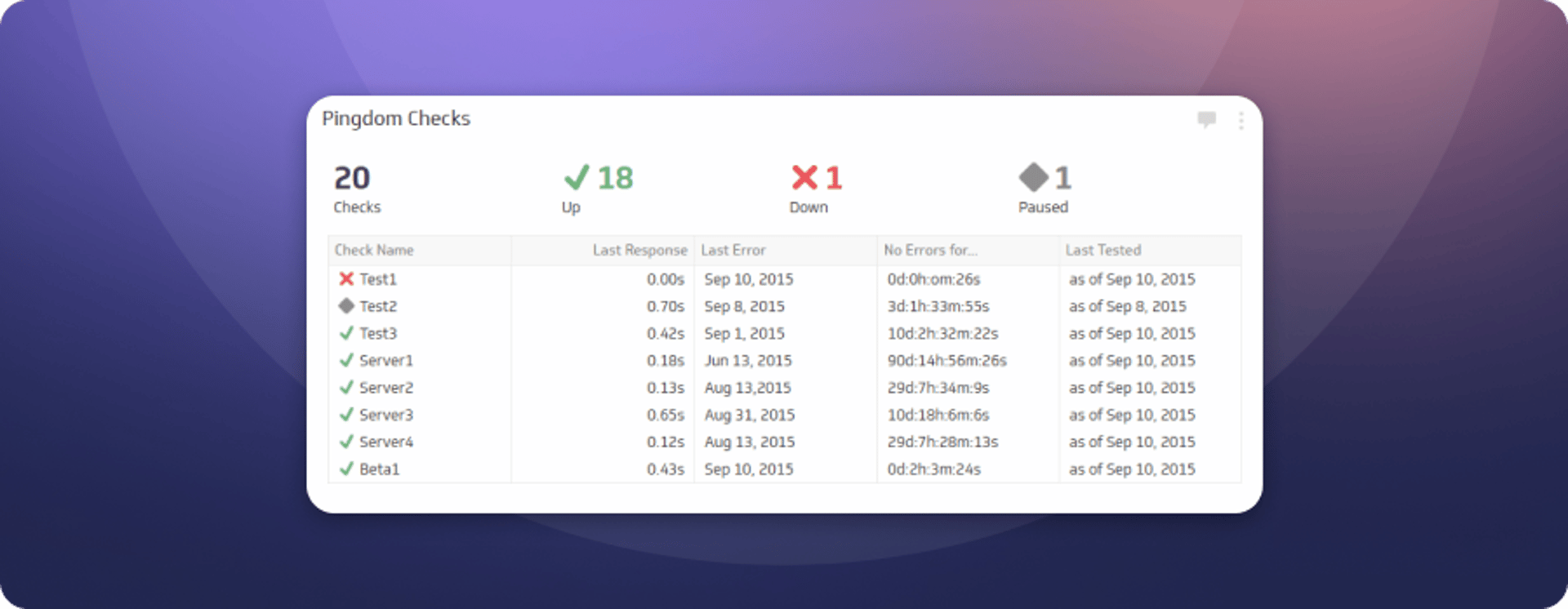
Pingdom checks
Displays service availability and response times. Pingdom checks confirm whether a service is reachable from the outside world and how long it takes to respond, giving the team an external view of uptime rather than relying on internal signals alone.
Sales dashboards

"Our sales dashboard is about hitting our growth targets one day at a time. If we're lagging behind a goal, we go all-hands and act immediately."
- Rupert Bonham-Carter, VP of Customer Success
Overview
Sales targets and growth objectives are the same thing at a startup. Missing one means falling behind on the other. The Klipfolio sales team tracks daily and monthly targets, and the dashboards are built to surface shortfalls early enough to do something about them.
The goal isn't just to report on performance. It's to make sure the team never gets to the end of the month surprised by where they landed.
Current performance
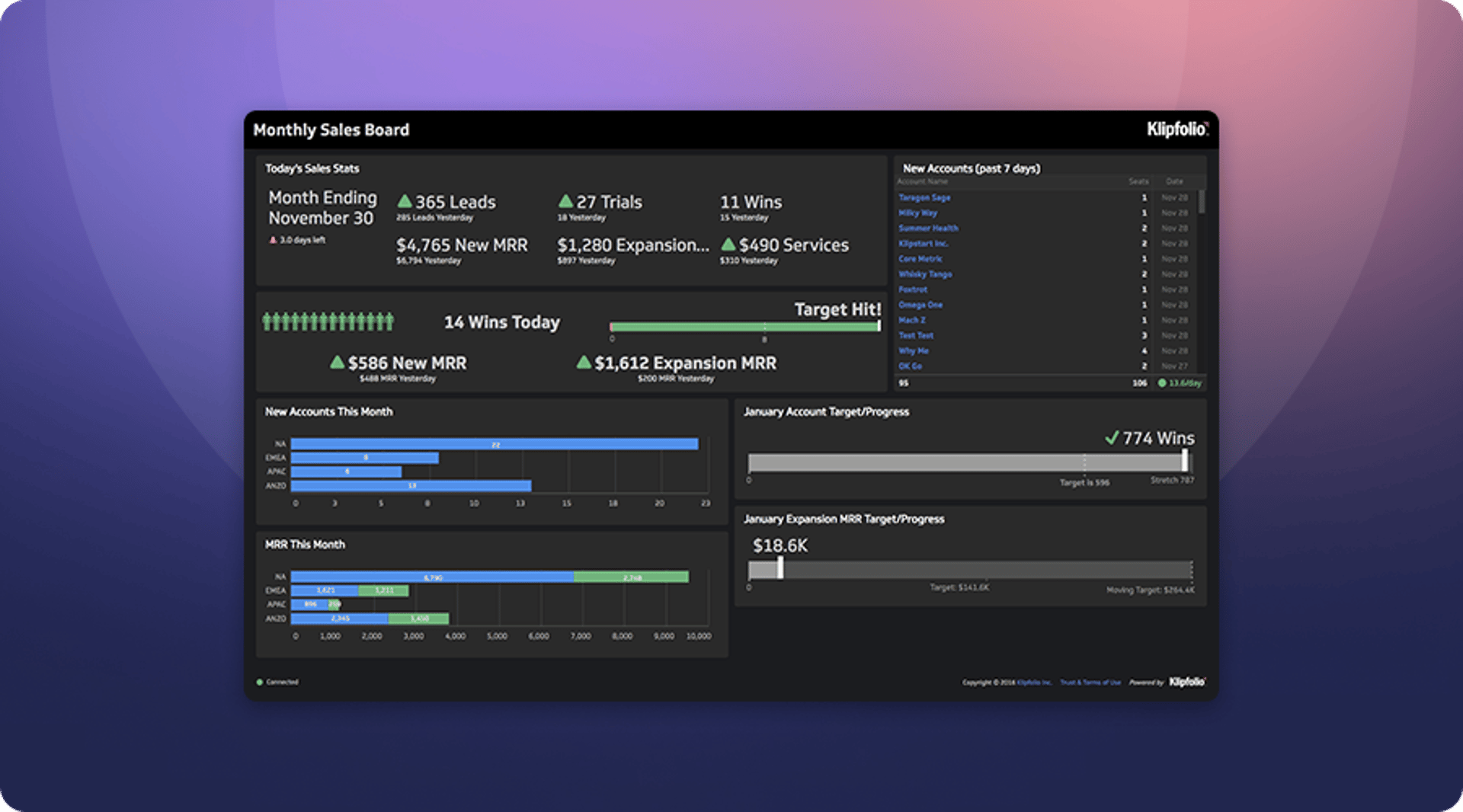
Dashboard overview: The Current Performance Sales Dashboard gives the sales team and leadership a live view of activity and attainment against targets. Each Klip is designed to prompt action when a target is at risk. The team can see where they stand at any point in the month and make adjustments before it's too late.
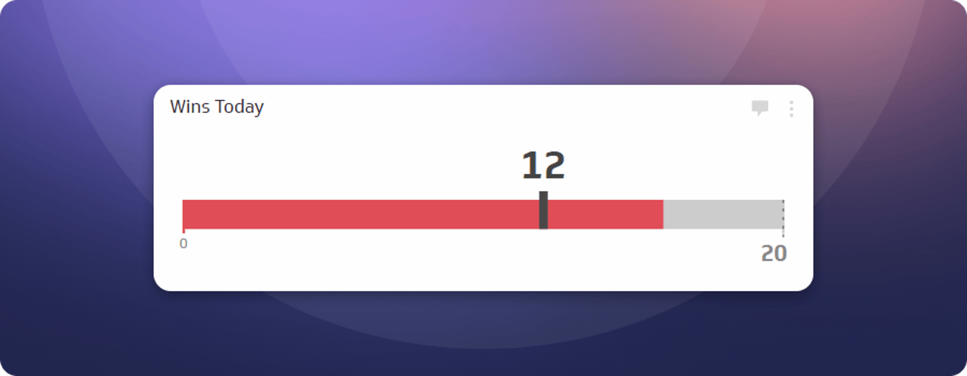
Wins today
Daily targets matter because monthly targets are built from them. This Klip shows how many customers the team has won today against the daily goal. The gauge turns green when the target is hit. Until then, it stays red. That colour is a signal, not a judgment, and the team responds to it.
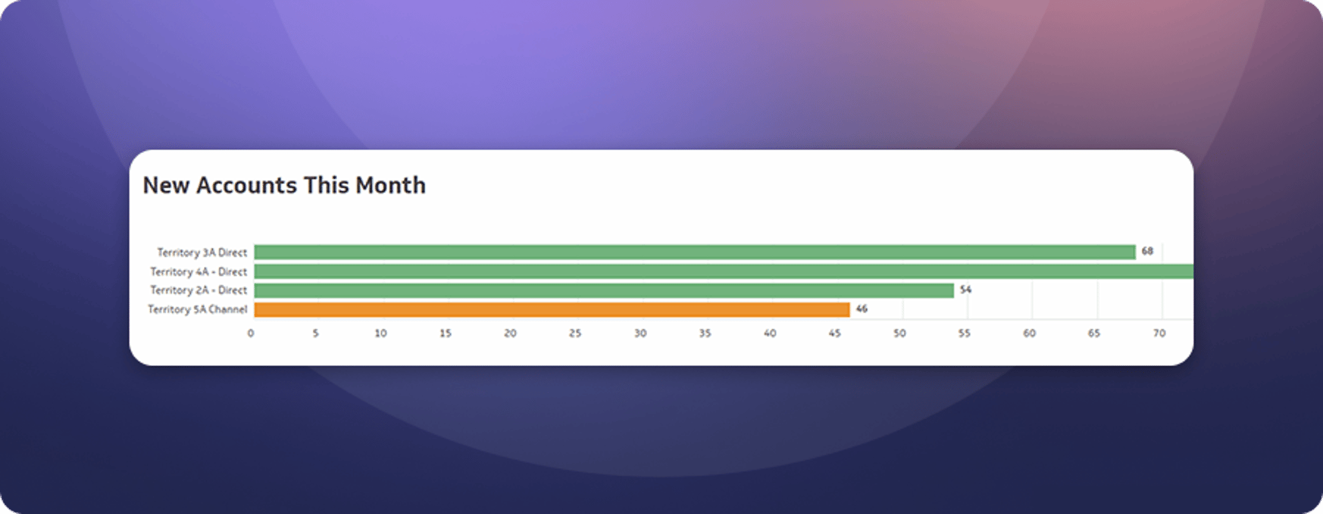
New accounts target (this month)
Daily wins tell part of the story. This Klip shows how those wins are accumulating toward the monthly target, including a stretch goal that gives the team something to aim past. Seeing both numbers together keeps the short-term and long-term in the same frame.
Periodic performance
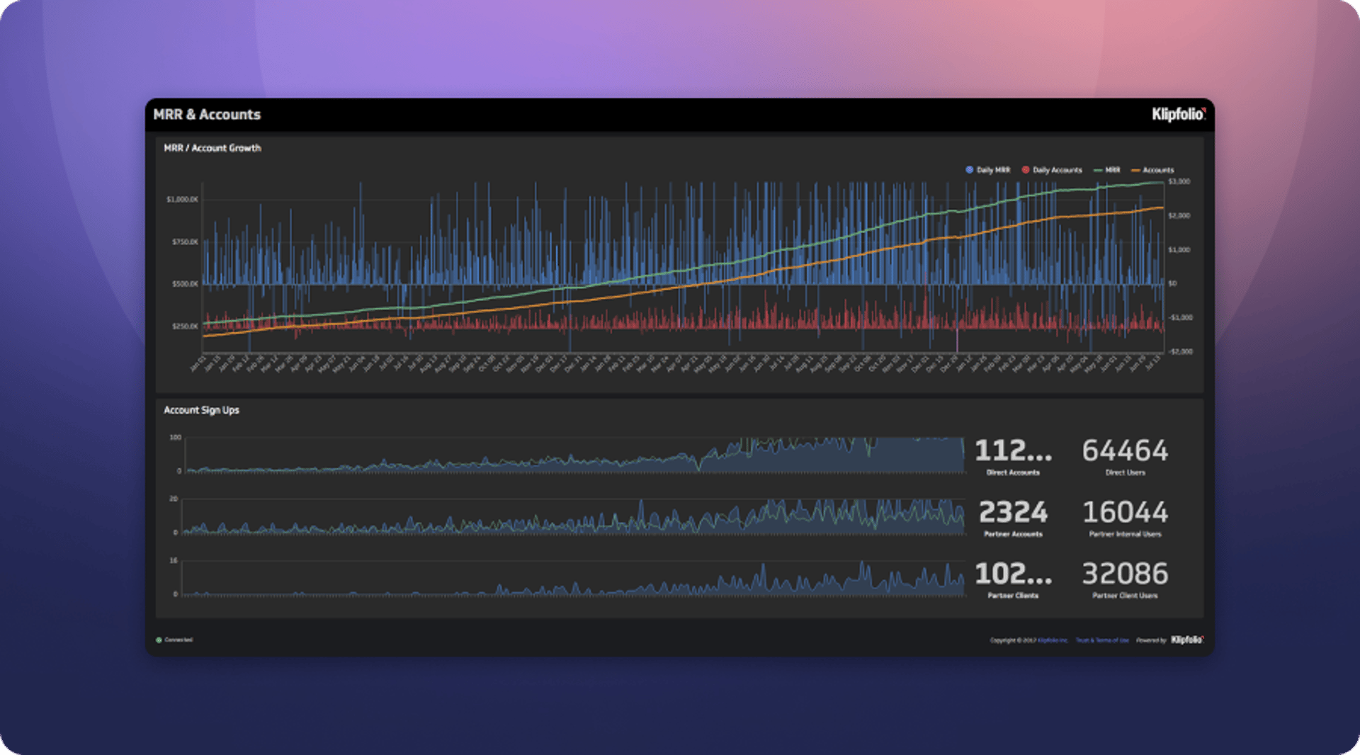
Dashboard overview: Not every useful dashboard is built for urgency. The Periodic Performance Dashboard takes a longer view, showing trends in account acquisition, MRR growth, and churn over time. It's where the team goes to understand the shape of the business, not just the score for today.
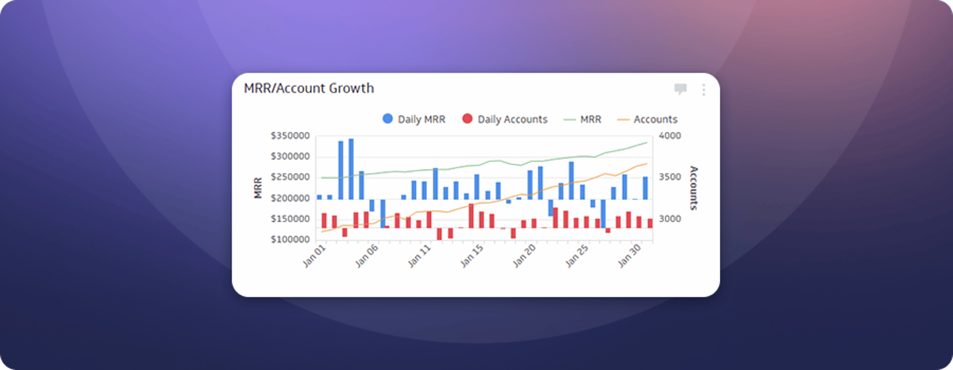
MRR and account growth
This chart tracks year-to-date trends for new accounts, churned accounts, MRR growth, and total account base. Seeing all four together makes it easy to spot whether growth is accelerating, plateauing, or being offset by churn.
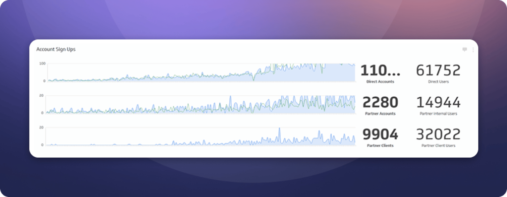
Account sign-ups
Klipfolio serves a diverse mix of companies and works with a growing partner network of agencies, consultants, and resellers. This Klip tracks growth over time and shows the breakdown of the customer base, which informs both sales strategy and product prioritization.
Support dashboards
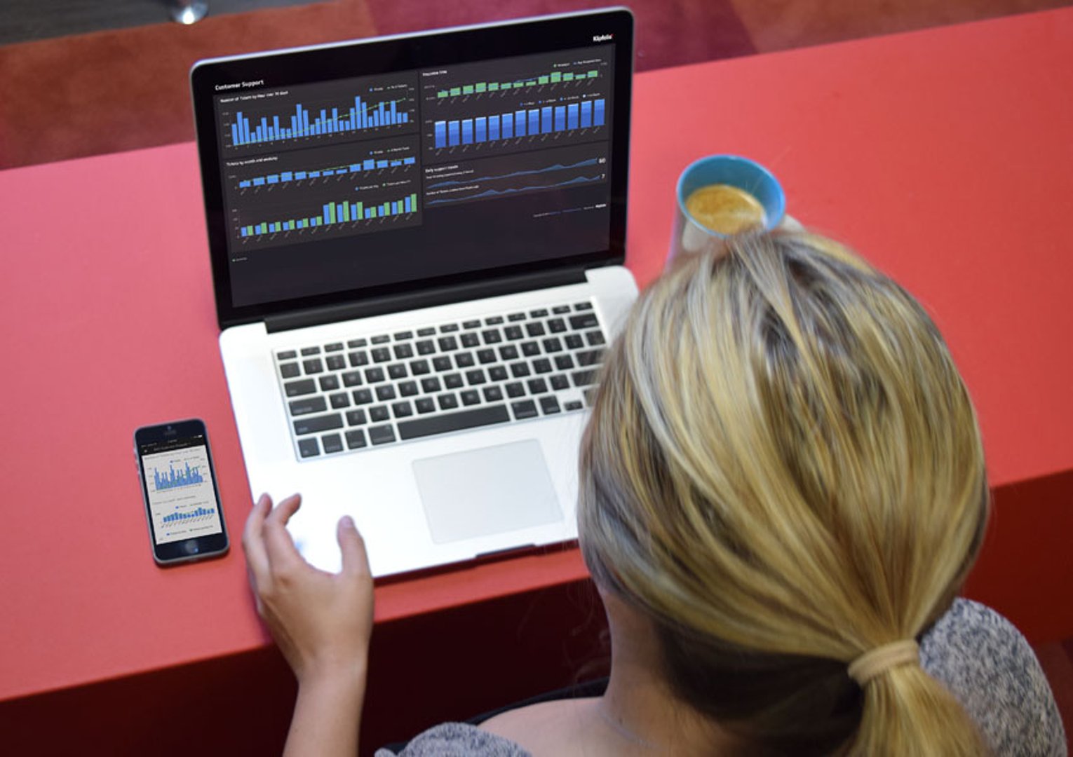
"The Support Dashboard plays an integral role in helping us monitor daily support tickets and documentation trends. By paying close attention to the dashboard, we can quickly identify areas that require our attention and make informed decisions about how to allocate our resources effectively."
- Keely Davison, Director of Services
Overview
Support and customer success are closely linked at Klipfolio. Customers who get good support during a trial convert at a higher rate. Customers who get good support after signing up stay longer.
The support dashboards track the metrics that signal customer satisfaction in real time: response times, ticket volumes, and resolution rates. Because support issues can appear without warning, the team relies on its dashboard to stay ahead of them rather than reacting after the fact.
Support tickets and response
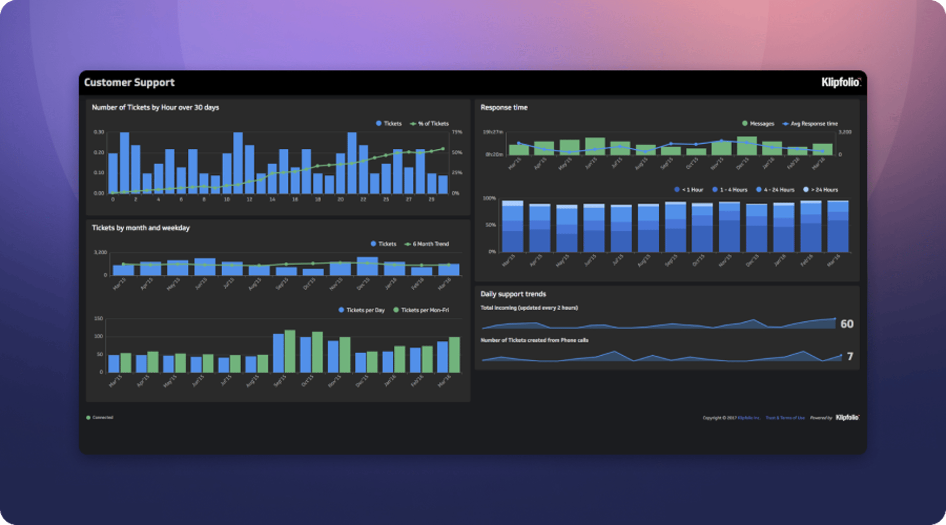
Dashboard overview: The Support Tickets and Response Dashboard tracks the team's ability to respond to customer tickets quickly. Fast response times produce satisfied customers. The dashboard monitors ticket trends and response times on a monthly basis, making it easy to spot patterns before they become problems.
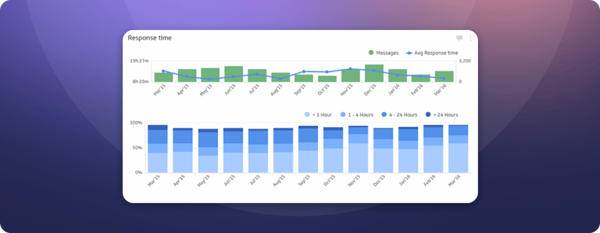
Response time
This Klip tracks how quickly the team responds to incoming tickets. The goal is to resolve all tickets within four hours. Some issues take longer to investigate, but the target keeps the team oriented toward speed. Customers notice when support is fast.
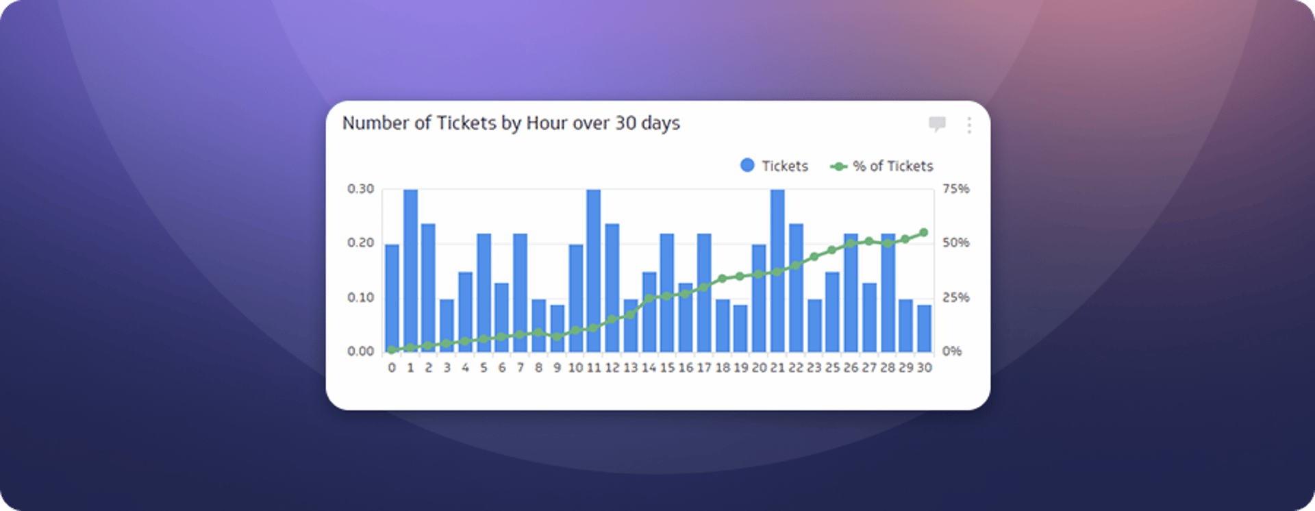
Number of tickets by hour (30 days)
This Klip answers a simple but important question: when do most tickets arrive? Knowing the answer makes it possible to staff appropriately and ensure the right number of people are available when customers need them most.
Tickets by type
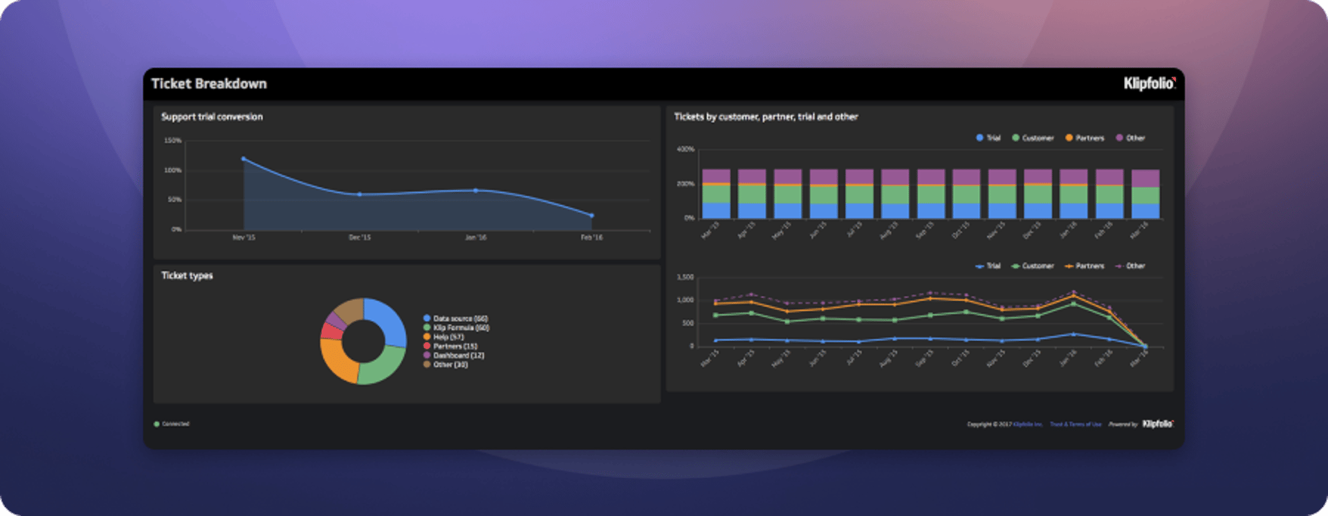
Dashboard overview: The Tickets by Type Dashboard breaks down support tickets by account type (customer, partner, trial, or other) and by ticket type (data sources, formulas, admin, and so on). That breakdown surfaces patterns the sales and product teams can act on, whether it's an opportunity to improve onboarding or a signal that a feature needs attention.
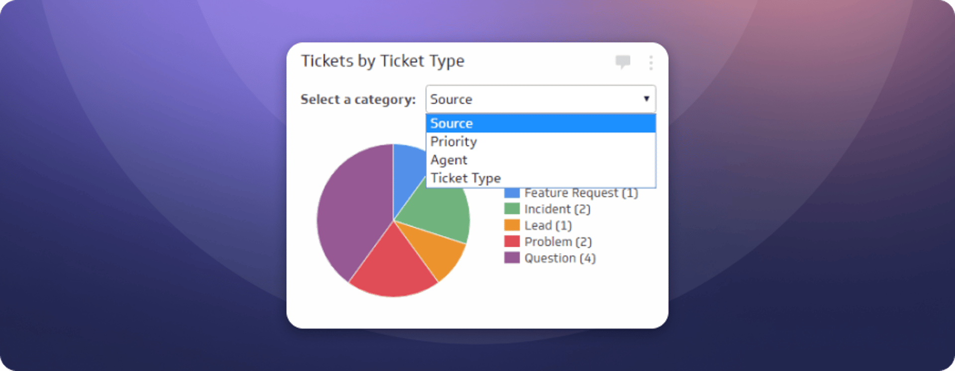
Ticket types
Tracking the types of tickets that come in helps the team spot trends worth sharing with development and UX. It also helps the support team anticipate what kinds of questions they'll be fielding on any given day, which means faster and more confident answers.
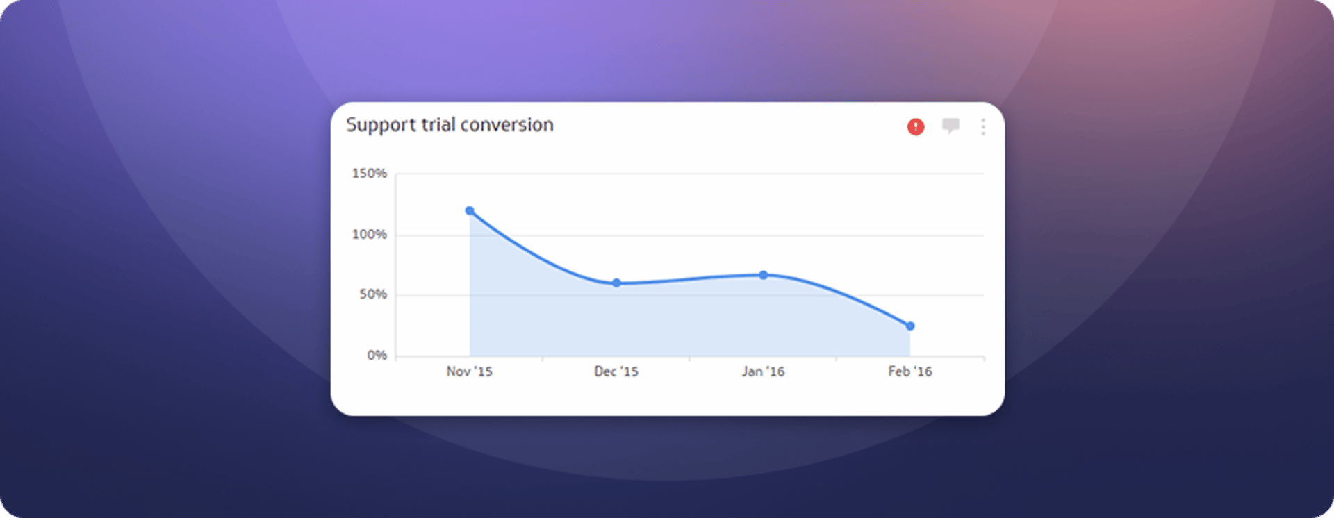
Support trial conversion
A positive support experience during a trial has a measurable effect on conversion rates. This Klip tracks that relationship directly. The team monitors it closely because it connects support quality to revenue, making the case for investing in fast, helpful responses from day one.
Documentation and web analytics
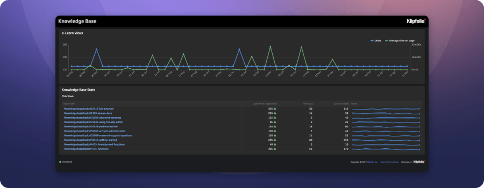
Dashboard overview: Klipfolio has invested significantly in web-based documentation. This dashboard tracks how that documentation is performing, with the two core metrics being views to the Knowledge Base and views to the e-learning modules.
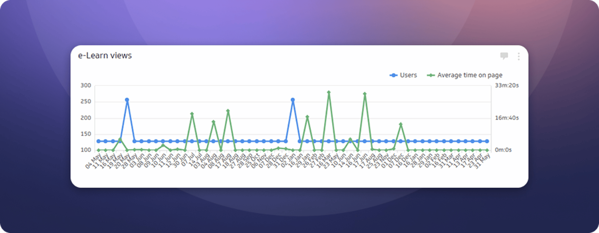
E-learn views
This Klip tracks visits to the e-learning module and average time on page. Average time on page is a leading indicator of whether the content is actually being read and used, not just found.
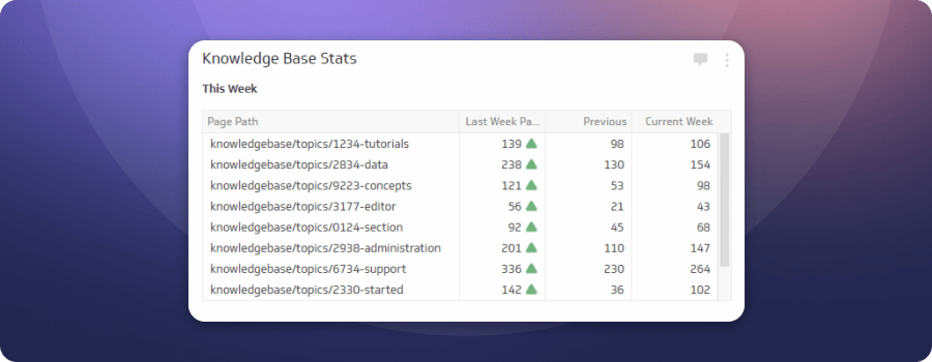
Knowledge Base stats
This Klip tracks visits to individual Knowledge Base articles and compares each to the prior week. The most-visited articles get prioritized for review, and the traffic patterns inform decisions about what content to create next.
UX dashboards
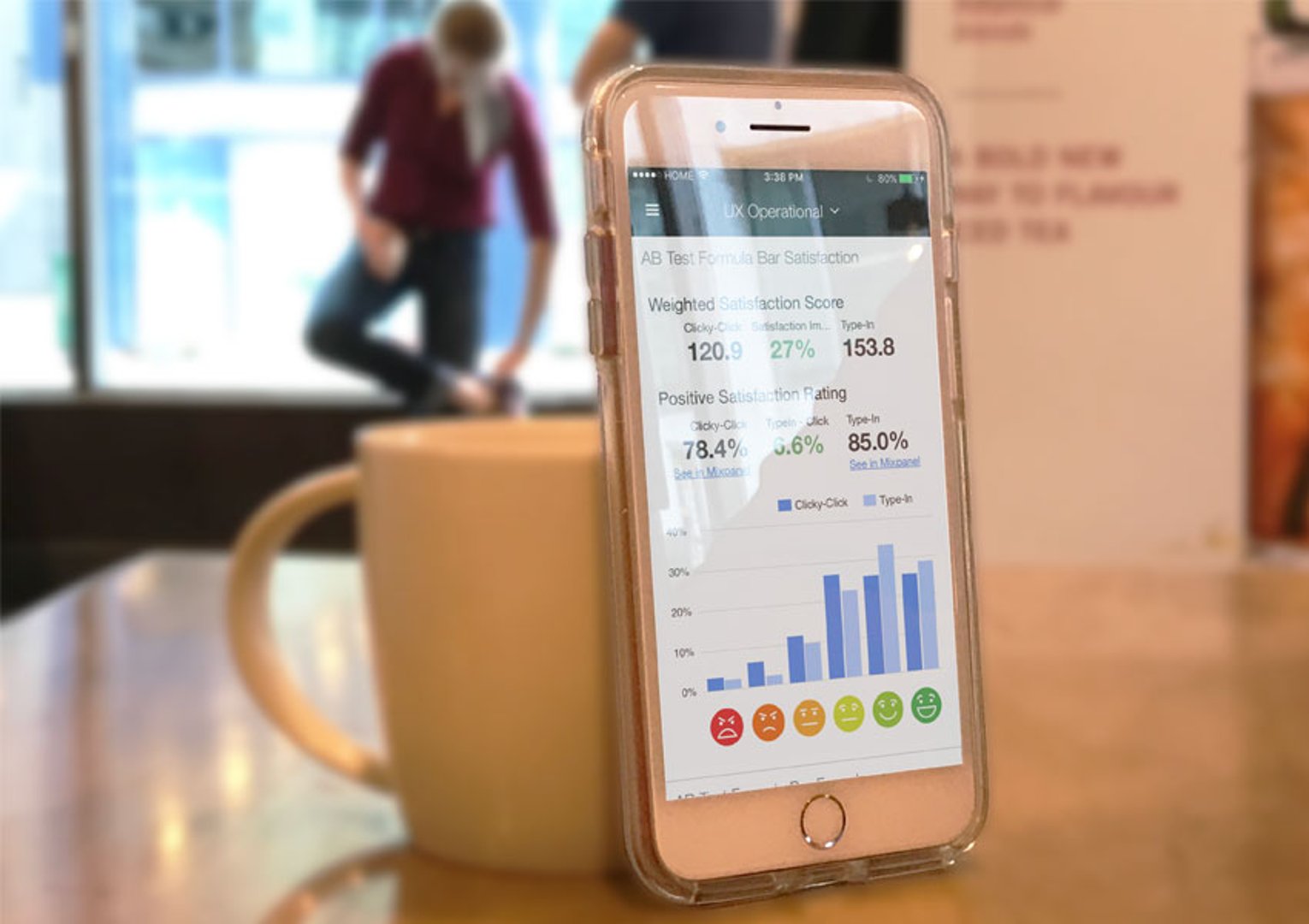
"A SaaS startup's most valuable growth asset is its product. Our team is tasked with improving user experience within the product to give customers and prospects the best experience possible. The dashboards we use reflect this, and show how we measure our progress."
- Peter Matthews, CXO
Overview
The UX team measures its success through win rates and customer churn. Both metrics are tracked daily against historic averages, which makes it easier to distinguish genuine shifts from short-term noise. Leading indicators like daily active users round out the picture.
These dashboards connect the UX and product teams around customer-facing priorities. Sometimes a number flags something that needs action today. Other times it provides context for a longer-term decision. Either way, the team doesn't have to wait for a report to know where things stand.
UX operations
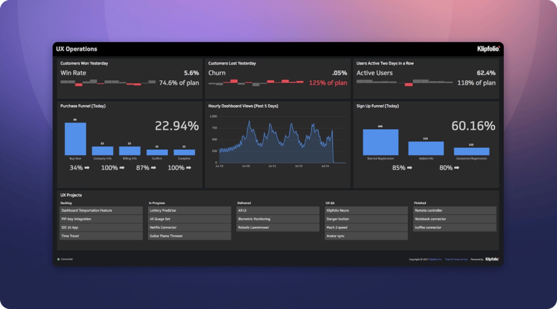
Dashboard overview: The UX Operations Dashboard provides a daily view of how users are interacting with the product. Task completion funnels show whether customers are successfully completing key actions like purchasing or creating a visualization. Top-line metrics like win rates and customer churn give the team a quick read on overall health.
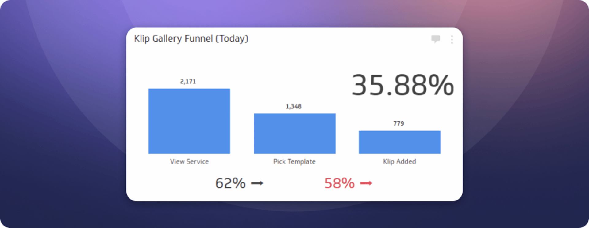
Klip Gallery funnel
The Klip Gallery was launched to speed up and simplify dashboard creation in Klipfolio. This funnel tracks how successfully customers are adding template Klips to their dashboard, which is one of the clearest signals of whether new users are getting value quickly.
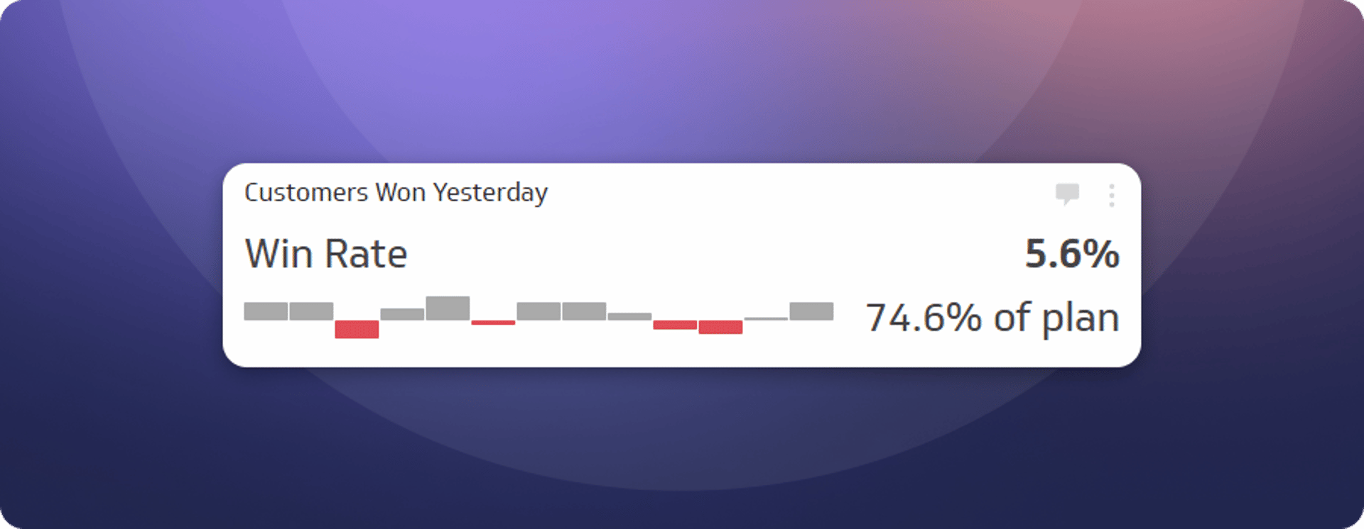
Customers won yesterday
Trial users arrive with no preconceptions. The UX team's job is to make sure they find value fast enough to want to keep going. Customer win rate is the most direct measure of whether that's happening. This Klip shows yesterday's number so the team starts each day knowing how the previous one ended.
How do you track your performance?
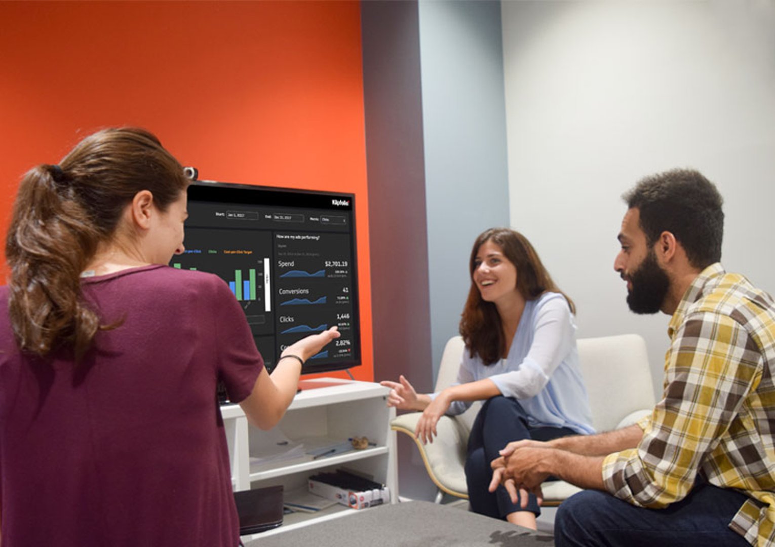
The dashboards in this guide are the ones Klipfolio's own teams rely on every day. They're built for startups that move fast and can't afford to find out something went wrong at the end of the month.
Each dashboard answers a version of the same question: how are we doing right now, and what should we do about it? That question matters whether you're tracking MRR, ticket response times, or trial conversion rates. The answer should never require a spreadsheet, a data pull, or a message to someone on another team.
If your business is still figuring out performance from manual reports or by pasting numbers into a spreadsheet (or a chatbot) every week, these dashboards show a different way to work. The numbers are always there. The team always knows. And when something changes, you act on it before it becomes a problem.
Updated 2026-08-29
Continue learning

What are business metrics? Definition and examples

The complete guide to NDR and CAC Payback Period
What Is a Dashboard? Types, benefits, and how to build one

The CEO's guide to metrics that actually matter

What is a KPI? Types, limitations, and how to make KPIs work for your business
Best practices for TV and wallboard dashboards
Most recent
- OCT 16Klips MCP Server: Use AI to Work with Your Data
- SEP 2310 ways to automate Klips with the Klips API
- SEP 14Automate Klips: from repetitive tasks to managing reporting at scale
- AUG 20The consolidating stack: 3 years of SMB data connection trends
- MAY 28Dashboard Data Security and Privacy: A Five-Layer Framework
- MAR 30The CEO's guide to metrics that actually matter