
The CEO's guide to metrics that actually matter
Learn which metrics every CEO should track across finance, customer, people, and operations — and how to build a dashboard that drives decisions, not just reporting.

The problem with most CEO dashboards
Here's a scene that plays out in boardrooms everywhere. The CEO pulls up the dashboard, points to revenue growth (up 22% year-over-year), customer count (crossed 1,000 last month), and app downloads (best month ever). Everyone nods. The meeting ends.
Six weeks later, churn spikes. The sales pipeline has quietly emptied out. Two of the best engineers have handed in their notice. None of that showed up in the numbers they were watching.
This is the core problem with how most growing companies approach metrics: they measure what's easy to measure, celebrate what looks good, and miss the signals that would have let them change course while there was still time.
This guide is for CEOs who want to fix that. Not by tracking more things — by tracking the right things, understanding what each number is actually telling you, and knowing what to do when it moves.
We'll cover four domains of metrics every growing company needs to watch, the single most important concept in business measurement that most leaders never learn, and a practical framework for building a dashboard that actually runs your business.
The concept that changes everything: leading vs. lagging indicators
Before we get into specific metrics, there's one idea worth understanding, because it reframes everything else.
Every metric in your business is either a lagging indicator or a leading indicator. Most CEOs track almost entirely lagging indicators — and wonder why they always feel like they're reacting rather than steering.
Lagging indicators: your business's report card
Lagging indicators tell you what already happened. Revenue last quarter. Churn rate last month. Net profit last year. These numbers are certain, clean, and unambiguous — and by the time you're looking at them, it's too late to change them.
That's not to say they're useless. They're essential for accountability, for investor reporting, for understanding whether your strategy worked. But they're a rearview mirror. You need them, but you can't steer with them.
Leading indicators: your early warning system
Leading indicators are signals that influence future outcomes. Sales pipeline volume predicts next quarter's revenue. Employee engagement scores predict retention six months from now. Net Promoter Score trends predict churn before it shows up in the numbers.
Leading indicators are harder to identify and sometimes harder to measure — but they're the metrics that give you time to act. If your pipeline starts shrinking in January, you can hire sales reps, adjust pricing, or revisit your positioning before Q2 revenue misses. If you only look at Q2 revenue, you're filing the incident report, not preventing the accident.
| The CEO's dashboard principle |
|---|
| Lagging indicators tell you how you did. Leading indicators tell you how you're doing. A great CEO dashboard has both — but leans heavily toward leading indicators for day-to-day decisions and uses lagging indicators to validate strategy over time. |
Here's the practical test: for every metric you track, ask yourself — if this number changes today, can I do something about it? If yes, it's a leading indicator. If the only answer is "understand what happened," it's lagging. You need both, but they serve different purposes.
The four domains every CEO needs to watch
Most CEO dashboards are really just finance dashboards with a couple of customer metrics bolted on. That's a problem, because the business is more than its financials — and the leading signals for financial health often live outside the finance numbers entirely.
A well-built CEO dashboard covers four domains: financial health, customer, people, and operations. Think of them as the four legs of a table. If one is weak or missing, the whole thing wobbles — even if the other three look fine.
Domain 1: Financial health
Financial metrics are the lagging indicators of last resort — they confirm whether everything else is working. But within the financial domain, there's still a spectrum from more leading to more lagging, and the details matter a lot.
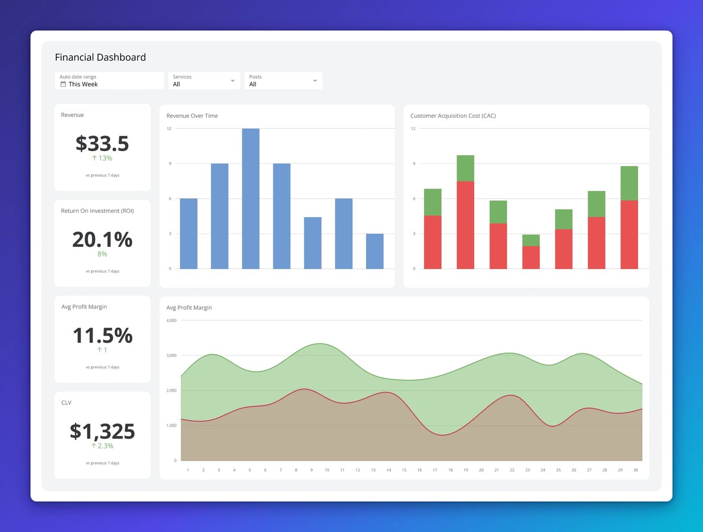
Revenue Growth Rate
Revenue growth is the most watched metric for any growing company, and for good reason — it's the clearest single signal of whether the market wants what you're selling.
The formula is simple: (Current Period Revenue minus Previous Period Revenue) divided by Previous Period Revenue, multiplied by 100. But the insight is in the segmentation, not the aggregate. If overall revenue is up 20% but one product line is flat while another is up 60%, those are very different strategic situations. Break revenue down by product, channel, customer segment, and geography. The total is for the board deck. The segments are for decisions.
| Revenue Growth Rate | |
|---|---|
| What it tells you | Whether your market wants what you're selling, and how fast you're capturing it |
| Formula | (Current Revenue minus Prior Revenue) / Prior Revenue × 100 |
| Healthy benchmark | 20–40% YoY is strong for a scaling company; context matters by industry |
| Leading companion | Pipeline velocity — a shrinking pipeline today is a revenue miss in 90 days |
| Decision trigger | If growth decelerates for two consecutive quarters, investigate before it becomes a trend |
Gross Profit Margin
Revenue growth without healthy margins is just expensive customer acquisition. Gross Profit Margin (revenue minus cost of goods sold, divided by revenue) tells you how much of each dollar you're actually keeping before operating expenses.
For a scaling company, the trend matters as much as the absolute number. Margins should generally improve as you scale — that's the whole premise of a scalable business model. If margins are compressing as you grow, something is wrong with your unit economics, your pricing, or your operational efficiency. Find it early.
SaaS companies typically target 70–80% gross margins. Services businesses might run 30–50%. Manufacturing might be 20–40%. Know your industry benchmarks and track your trend against them.
| Gross Profit Margin | |
|---|---|
| What it tells you | How much of each revenue dollar survives after the cost of delivery |
| Formula | (Revenue minus Cost of Goods Sold) / Revenue × 100 |
| Decision trigger | If margins compress more than 3 percentage points over two quarters, investigate pricing, COGS, or product mix |
| Common mistake | Celebrating revenue growth while margins quietly erode — revenue can mask a structural unit economics problem |
Operating Cash Flow
Profit is an opinion. Cash flow is a fact.
Companies go bankrupt not because they're unprofitable on paper, but because they run out of cash. Operating Cash Flow measures how much actual cash your business generates from its core operations — not accounting entries, not deferred revenue, not depreciation schedules. Cash.
For a growing company, Operating Cash Flow is the metric that determines whether you can fund your own growth or whether you're dependent on external capital. A business with strong and growing Operating Cash Flow has options. A business with thin or negative Operating Cash Flow is always one bad quarter away from an existential conversation.
Track it monthly. Watch the trend. If revenue is growing but Operating Cash Flow is flat or declining, that's a collections problem, a spending problem, or a business model problem — all of which you want to know about before your bank balance tells you.
| Operating Cash Flow | |
|---|---|
| What it tells you | Whether the business generates real cash from operations, independent of accounting |
| Leading companion | Accounts receivable aging — slow collections are an early warning sign |
| Decision trigger | Three months of declining Operating Cash Flow alongside revenue growth requires an immediate investigation into collections, COGS creep, or operational waste |
| Why it matters | Profitable companies have gone bankrupt; cash flow is the metric that keeps the lights on |
Burn rate and runway (if pre-profitability)
If your company isn't yet profitable, burn rate belongs on the CEO's weekly dashboard, full stop. Burn rate is how much cash you're spending per month net of revenue. Runway is how many months of cash you have left at the current burn rate.
The practical rule of thumb: always know your runway, always be working to extend it, and raise capital when you have 12+ months of runway remaining — not 3. The fundraising market can close faster than most CEOs expect, and desperation is visible to investors.
Domain 2: Customer metrics
Here's a counterintuitive truth: customer metrics are better leading indicators of your financial future than most financial metrics. If your customers are happy, staying, and referring others, your revenue will be fine. If they're churning or disengaged, no amount of sales effort will compensate forever.
The customer metrics domain is also where most companies have the largest measurement gaps. They know their revenue but have no idea what it costs to acquire a customer, how long those customers stay, or whether those customers would recommend them to a friend.
If you've been pasting revenue numbers into a generic AI tool and asking it to diagnose your business, you already know the problem: without consistent, connected customer data, you're guessing. The metrics below give you the real picture.
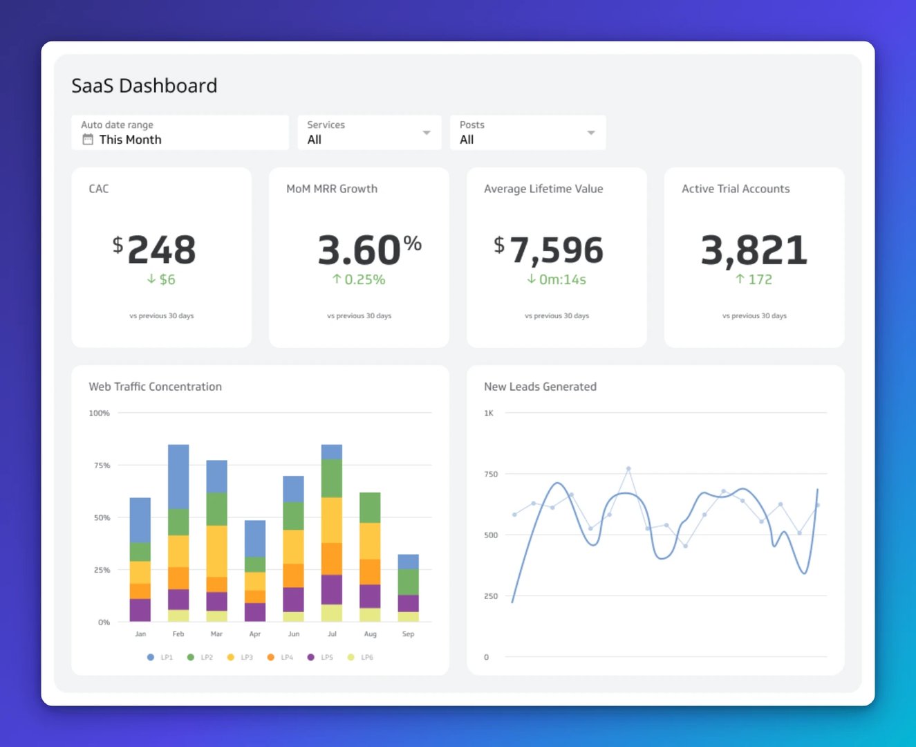
Customer Acquisition Cost (CAC)
Customer Acquisition Cost is how much it costs you, on average, to acquire a single new customer. It includes all sales and marketing spend — salaries, tools, ad spend, events, everything — divided by the number of new customers acquired in that period.
On its own, Customer Acquisition Cost is interesting. In combination with LTV (below), it's one of the most important numbers in your business.
| Customer Acquisition Cost (CAC) | |
|---|---|
| Formula | Total sales and marketing spend / number of new customers acquired |
| Why to segment it | CAC by channel reveals which acquisition sources are efficient vs. wasteful |
| Healthy range | Highly context-dependent; the only number that matters is CAC vs. LTV |
| Common mistake | Only counting ad spend in CAC — fully-loaded CAC includes all people, tools, and overhead in sales and marketing |
Customer Lifetime Value (LTV)
Customer Lifetime Value is the total revenue (or better, gross profit) you expect to generate from a customer over the entire relationship. It requires knowing your average revenue per customer, your gross margin, and your churn rate.
There are different formulas of varying complexity, but a simple starting point for subscription businesses is: average monthly revenue per customer divided by monthly churn rate. For transactional businesses, it's average order value multiplied by purchase frequency multiplied by average customer lifespan.
Customer Lifetime Value matters because it sets the ceiling for how much you can rationally spend to acquire a customer. If your LTV is $1,000, spending $800 in CAC is probably unsustainable. Spending $200 means you have room to invest more aggressively in growth.
The LTV:CAC ratio — the metric that tells you if your business model actually works
If you could only track one metric to determine whether a company's growth engine is healthy, this would be it. The LTV:CAC ratio tells you how much value you create relative to what it costs you to acquire customers.
The widely accepted benchmark for a healthy scaling company is 3:1 — you should generate at least $3 of lifetime value for every $1 spent on acquisition. Below 1:1 means you're destroying value with every customer you add. Above 5:1 sometimes means you're being too conservative with growth investment and leaving market share on the table.
Track this quarterly, segment it by customer cohort and acquisition channel, and treat it as a north star for your go-to-market investment decisions.
| The LTV:CAC benchmark |
|---|
| Below 1:1: You're losing money on every customer. Stop scaling until this is fixed. |
| 1:1 to 2:1: Marginal. You're not creating enough value above acquisition cost. |
| 3:1: Healthy. The generally accepted benchmark for a scaling company. |
| Above 5:1: Consider investing more in growth — you may be leaving market share behind. |
Churn rate
Churn rate is the percentage of customers (or revenue) you lose in a given period. It's one of the most honest metrics in business, because customers who leave don't lie about why — they just leave.
Net revenue churn is often more useful than logo churn. If you lose 5% of customers but the remaining customers expand their contracts, your net revenue churn might be zero or negative — a sign of a very healthy business. If you have zero logo churn but customers are all shrinking their spend, that's a warning sign the number alone won't show.
More importantly: churn is a lagging indicator. By the time someone has churned, the problem happened months ago. The leading indicators of churn are engagement metrics, support ticket volume, NPS scores, and usage trends. Track those and you can intervene before the cancellation.
| Churn rate | |
|---|---|
| Logo churn | % of customers who cancel in a period — tracks customer count health |
| Revenue churn | % of MRR/ARR lost in a period — often more meaningful than logo churn |
| Net revenue churn | Revenue churn minus expansion revenue — can be negative (a very good sign) |
| Decision trigger | Monthly churn above 2% for a SaaS business warrants an immediate customer success investigation |
| Leading indicators of churn | Declining login frequency, unresolved support tickets, NPS detractors, declining feature usage |
Net Promoter Score (NPS)
NPS is a single-question survey: "On a scale of 0–10, how likely are you to recommend us to a colleague or friend?" Promoters (9–10) minus Detractors (0–6) equals your NPS, which ranges from -100 to +100.
It gets criticized as too simple, and the criticism has merit — a single number can hide a lot. But for a CEO, that's also the point. NPS is a leading indicator of retention and referral growth that every team in the company can rally around. Track it monthly, segment by cohort and customer type, and read the verbatim comments. The number tells you whether there's a problem. The comments tell you what it is.
World-class B2B companies typically score 40–70. If you're below 30, customer experience should be at the top of your priority list. If you're above 50, you have a referral engine worth investing in.
Domain 3: People metrics
People metrics are the most commonly absent from CEO dashboards, and the most predictive of future performance. Your team is the leading indicator of every other business outcome. Engaged, high-performing people build great products, serve customers well, and execute strategy. Disengaged or departing people do the opposite.
For a company in the 50–500 person range, people metrics are especially important because culture can shift faster than most CEOs realize. The signal often shows up in data before it shows up in executive team conversations.
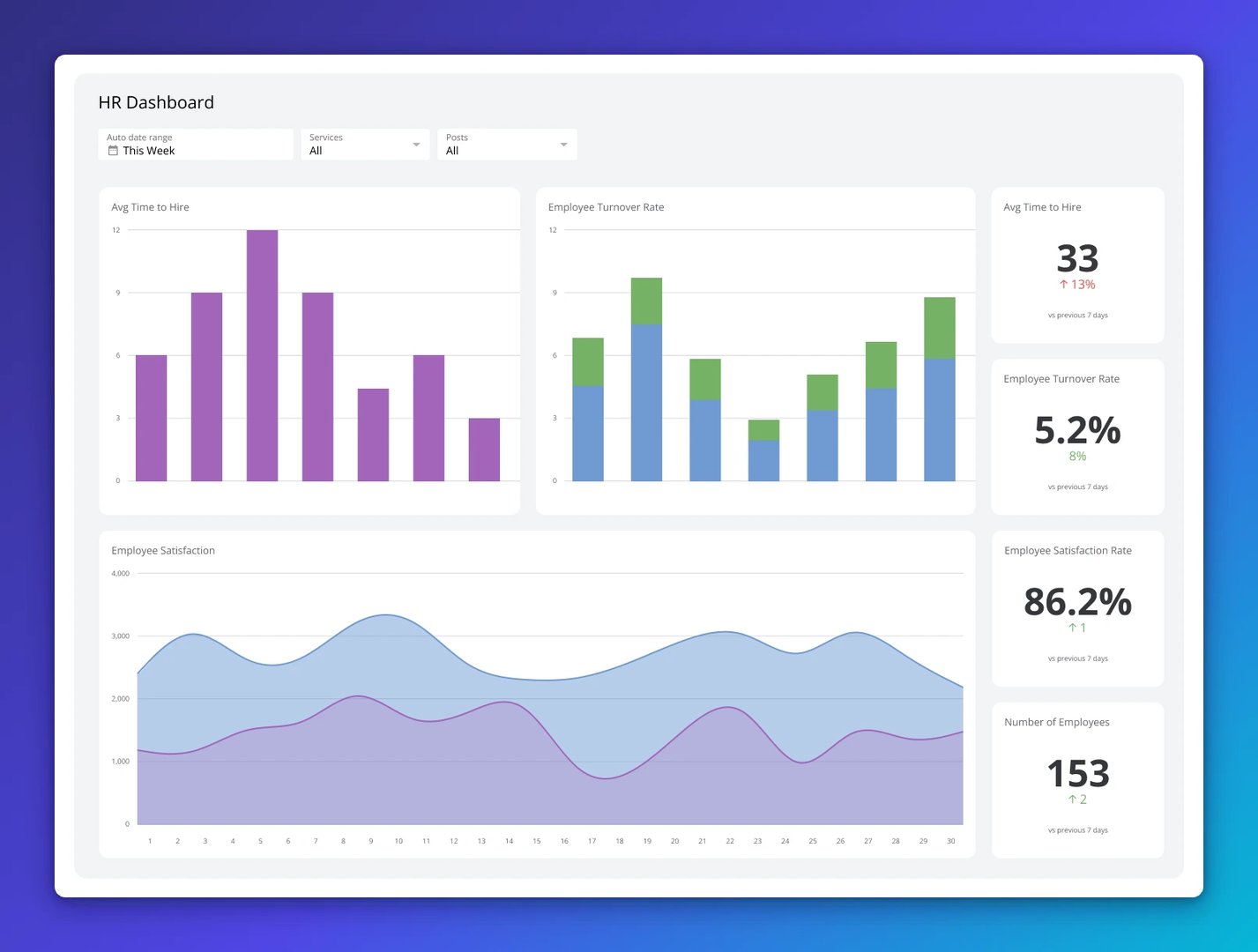
Employee engagement score
Employee engagement scores typically come from regular pulse surveys (tools like Lattice, Culture Amp, or 15Five) and measure how motivated, committed, and connected your team feels to the work and the company.
The data here is striking: according to Gallup's research, companies with engaged employees are significantly more profitable than those without, and engaged employees show meaningfully lower turnover. For a scaling company, where every departing engineer or salesperson costs months of productivity, this is not a soft metric — it has direct financial implications.
Run pulse surveys at minimum quarterly, ideally monthly. Share results with your leadership team. Act visibly on the feedback. Nothing destroys engagement faster than employees feeling like their input goes into a void.
| Employee engagement score | |
|---|---|
| What it tells you | How motivated and committed your team is — a leading indicator of retention and performance |
| How to measure it | Quarterly or monthly pulse surveys using dedicated tools (Lattice, Culture Amp, Leapsome) |
| Decision trigger | Engagement score declining for two consecutive quarters should trigger an executive team review and action plan |
| Leading companion | eNPS (Employee Net Promoter Score) — "Would you recommend this as a place to work?" is a faster, lighter-weight pulse check |
Regrettable attrition rate
Not all attrition is equal. If your lowest-performing 5% of employees leave, that might actually improve your company. If your top performers start leaving, that's an existential signal.
Regrettable attrition is the percentage of departures that your managers would have wanted to prevent — typically your high performers, your institutional knowledge holders, and your culture carriers. Track it separately from total attrition, and talk to people who leave. The exit interview is one of the most valuable and underused sources of business intelligence available to a CEO.
Revenue per employee
Revenue per employee is a proxy for organizational productivity and efficiency. Calculate it simply: total revenue divided by headcount. For a scaling company, the trend is what matters — it should generally increase as you grow, reflecting the leverage that scale creates.
Compare yourself to industry benchmarks. Technology companies often run $200K–$500K per employee. Professional services firms might be $150K–$250K. If your revenue per employee is flat or declining as you hire, you may be adding headcount ahead of the revenue and process structures that justify it.
Create custom dashboards for you and your team.
Get started with KlipsDomain 4: Operational metrics
Operational metrics (marketing, sales, support) are the connective tissue between your strategy and your results. They tell you whether your business is executing well day-to-day — and more importantly, they often give you the clearest view of problems before they show up in financial results.
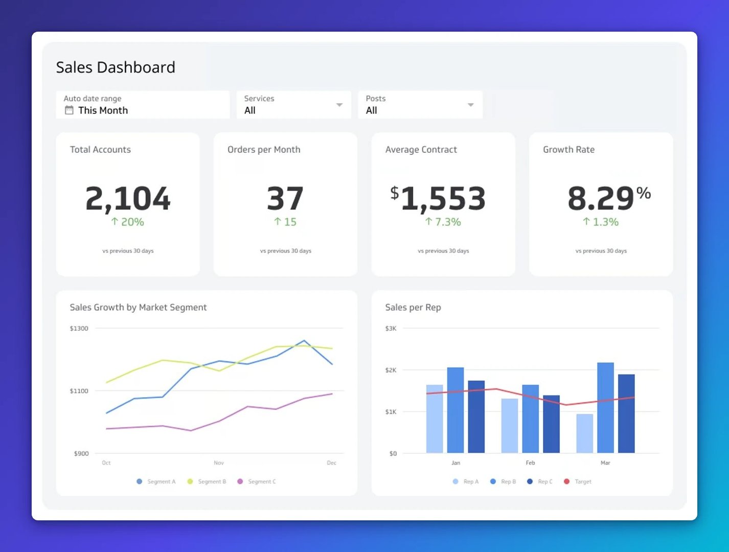
Sales pipeline velocity
Pipeline velocity is one of the most powerful leading indicators of future revenue available to a CEO. It measures how quickly deals move through your pipeline and how much value that flow represents.
The full formula is: (Number of Opportunities × Average Deal Value × Win Rate) / Average Sales Cycle Length. But even a simpler version — pipeline coverage (total pipeline value vs. revenue target) — gives you a fast read on whether your sales team has enough to work with.
Rule of thumb: you want 3–4× your quarterly revenue target sitting in your active pipeline. If pipeline coverage drops below 2×, your next quarter's revenue is already in trouble — even if sales reps tell you they'll close it all. They won't.
| Sales pipeline velocity | |
|---|---|
| What it tells you | Whether you have enough opportunity in the pipeline to hit future revenue targets |
| Coverage benchmark | 3–4× your quarterly target in active pipeline is healthy; below 2× is a warning |
| Decision trigger | If pipeline coverage drops below 3× for two consecutive months, investigate top-of-funnel marketing and outbound activity immediately |
| Leading companion | Lead conversion rate — if conversion is declining, you can add pipeline volume, but the underlying issue is product-market fit or sales process |
Lead conversion rate
Lead conversion rate is the percentage of prospects who become customers. Track it across the funnel — from initial contact to qualified lead to proposal to close — and you'll see exactly where deals are stalling.
If your top-of-funnel is healthy but deals stall at demo, that's a product demonstration or positioning problem. If deals stall at proposal, it's a pricing or competitive problem. If deals close but quickly churn, it's a customer-fit problem. The funnel conversion rates are your diagnostic tool for the go-to-market engine.
Capacity utilization (for services businesses)
If your business delivers through people — consulting, professional services, managed services, agencies — capacity utilization is a critical operational metric. It measures the percentage of billable capacity that's actually being billed.
Healthy utilization rates typically sit between 70–80%. Below that and you're carrying unproductive overhead. Above 85%, people start burning out and quality suffers. The range isn't just about efficiency — it's about sustainable growth.
Decision triggers: what to do when the numbers move
Tracking metrics without knowing what they should prompt you to do is just expensive wallpaper. The most valuable thing about a well-designed CEO dashboard isn't the numbers — it's what you do next when they change.
For each of your key metrics, you should be able to complete this sentence: "If this number goes below X for Y consecutive periods, I will do Z."
Here are decision triggers for the metrics that most commonly catch CEOs off guard.
Revenue Growth Rate decelerating for 2+ quarters
This is not a sales problem until proven otherwise. Before calling a sales review, examine: Is the market growing or contracting? Has product-market fit drifted as you moved upmarket? Is pricing out of step with value delivered? Is new customer growth strong but expansion revenue weak? Find the root cause before prescribing the solution.
LTV:CAC drops below 2:1
Stop scaling the growth engine. Something in the unit economics is broken — either acquisition is getting more expensive, customers aren't staying long enough, or your pricing isn't capturing the value you deliver. Figure out which before adding sales headcount or marketing spend.
Monthly churn exceeds 2% (SaaS)
Talk to churned customers immediately — not just through survey data, but real conversations. Churn at this level is a product, onboarding, or customer fit signal. Check whether churners share characteristics (company size, industry, acquisition channel) that might indicate a targeting problem.
NPS drops 15+ points in a quarter
This is a customer experience event. It rarely happens without a cause — a product change, a support quality dip, a pricing increase, a competitor move. Pull the verbatim comments, talk to your customer success team, and talk to detractors directly. The cause is almost always identifiable.
Employee engagement declines for 2+ consecutive quarters
This is a leadership and culture signal, and ignoring it is expensive. Start with your managers — engagement typically rises or falls at the team level before it shows in company-wide scores. One bad manager can affect engagement for 10–15 people. Identify where the problem is concentrated before treating it as a company-wide issue.
Pipeline coverage drops below 3×
You have a revenue problem in roughly 90 days. The response should be immediate: review top-of-funnel activity, assess outbound capacity, check whether marketing qualified lead volume has declined, and if needed, personally reach out to your top opportunities. The time to address a pipeline problem is when you first see it, not when it shows up in revenue.
Stage-appropriate dashboards: what to track at 50, 150, and 500 people
There's no universal CEO dashboard. The metrics that matter most depend on your stage, your business model, and what you're trying to prove or protect right now. Here's a practical guide to what deserves focus at three key growth stages.
At 50 people: prove the model
At this stage, the questions are existential: Does the product work? Can we acquire customers efficiently? Do customers stay? Everything else is secondary.
| 50 people (Prove the model) | 150 people (Scale what works) | 500 people (Optimize and defend) |
|---|---|---|
| Monthly Recurring Revenue | Revenue Growth Rate (QoQ, YoY) | Revenue by segment/geo |
| Revenue Growth Rate (MoM) | Gross Profit Margin trend | Gross and net profit margin |
| LTV:CAC ratio | Operating Cash Flow | Free cash flow |
| Churn rate (monthly) | Net revenue churn | NRR (net revenue retention) |
| NPS | Customer Acquisition Cost by channel | LTV by customer cohort |
| Burn rate and runway | Sales pipeline velocity | Market share indicators |
| Pipeline coverage | Revenue per employee | Org health index |
| Employee engagement | Regrettable attrition | Strategic initiative progress |
The pattern here is directional rather than prescriptive. At each stage, the dashboard evolves from survival metrics to growth metrics to optimization metrics. Resist the urge to add metrics from a later stage before the fundamentals of your current stage are solid.
What to stop tracking: the vanity metrics problem
Eric Ries, who coined the term "vanity metrics" in The Lean Startup, defined them as numbers that make you feel good but don't help you understand your own performance in a way that informs decisions. They're the business equivalent of checking social media likes — emotionally satisfying, strategically useless.
Vanity metrics are seductive because they almost always go up. Total registered users never decreases. Total downloads never decreases. Cumulative revenue never decreases. When a metric can only move in one direction, it's not measuring anything meaningful about your business's health.
Here's the practical test: if the metric changed significantly tomorrow, would it change what you do? If the answer is no, it's a vanity metric.
| Vanity metric | Replace it with | Why it matters |
|---|---|---|
| Total registered users | Monthly Active Users (MAU) or Daily Active Users (DAU) | Total users includes everyone who ever signed up. Active users tells you who actually gets value from your product. |
| Total downloads | Activation rate (trial-to-paid conversion) | Downloads are free. Customers who pay, return, and expand are the signal. |
| Website traffic | Qualified lead volume and lead conversion rate | Traffic from the wrong audience converts to nothing. Focus on traffic that turns into pipeline. |
| Social media followers | Engagement rate and referral traffic from social | Follower counts are inflatable. Engagement and traffic reflect actual audience quality. |
| Cumulative revenue | Revenue Growth Rate (MoM or QoQ) | Cumulative revenue always goes up. The trend — how fast it's growing — is what matters. |
| Press mentions | Branded search volume and direct traffic | PR is a means to an end. These metrics tell you if the PR is actually moving awareness with your target audience. |
| Number of features shipped | Feature adoption rate and impact on key metrics | Shipping features is not the goal. Customers using features and getting value from them is. |
A useful rule: if a metric would look good in a press release regardless of your actual business performance, treat it with suspicion. The metrics that actually matter are often the ones that are harder to talk about publicly — because they're honest.
Building a CEO dashboard that actually gets used
The best CEO dashboard is the one your team reviews together every week and actually changes behaviour. Here are the principles that separate dashboards that work from dashboards that become outdated browser tabs.
Principle 1: fewer metrics, more meaning
The instinct is to add metrics. Resist it. A dashboard with 30 metrics is a dashboard where nobody knows what to focus on. Start with 8–12 metrics — no more than 2–3 per domain — and be willing to remove a metric when it stops being useful. The goal is a single view that tells you whether the business is healthy, and where it isn't.
Principle 2: pair every lagging metric with a leading companion
Revenue Growth Rate (lagging) paired with pipeline coverage (leading). Churn rate (lagging) paired with NPS trend (leading). Net profit (lagging) paired with Gross Profit Margin trend (leading). The lagging metric tells you how you did. The leading metric tells you what's coming. Run them together.
Principle 3: build in decision triggers, not just targets
Targets tell you whether you hit the number. Decision triggers tell you what to do when you don't. Before publishing your dashboard, define the response for each metric: "If X goes below Y for Z consecutive periods, we will do A, B, C." This prevents the post-hoc scramble of figuring out what a bad number means after it appears.
Principle 4: share it with your leadership team
A CEO dashboard that only the CEO sees is a reporting tool. A dashboard that the entire leadership team reviews together every week is an alignment tool. The conversation around the numbers — why that metric moved, what it means, who owns the response — is often more valuable than the numbers themselves.
Principle 5: review cadence matters more than you think
Some metrics should be reviewed weekly (pipeline coverage, cash balance, key operational throughput). Some monthly (financial summary, churn, NPS, engagement). Some quarterly (LTV:CAC, Revenue Growth Rate trends, strategic initiative progress). Build different review cadences for different metrics, and don't let monthly reviews collapse into quarterly ones because you got busy.
The goal isn't a beautiful dashboard. It's a team that knows what's true, agrees on what matters, and knows what to do next.
Quick reference: the CEO's core metric stack
| Domain | Metric | Type | Decision trigger |
|---|---|---|---|
| Financial | Revenue Growth Rate | Lagging | Deceleration for 2+ quarters: investigate root cause |
| Financial | Gross Profit Margin | Lagging | 3pp+ compression over 2 quarters: investigate pricing/COGS |
| Financial | Operating Cash Flow | Lagging | 3 months declining alongside revenue growth: investigate |
| Financial | Sales Pipeline Coverage | Leading | Below 3× quarterly target: immediate top-of-funnel review |
| Customer | LTV:CAC ratio | Leading/Lagging | Below 2:1: stop scaling; fix unit economics first |
| Customer | Churn rate | Lagging | Above 2%/month (SaaS): immediate customer success investigation |
| Customer | NPS | Leading | Drop 15+ points in one quarter: identify cause; talk to detractors |
| People | Employee engagement score | Leading | Decline for 2+ quarters: leadership review; identify teams |
| People | Regrettable attrition | Lagging | Above 10% annually: investigate manager quality and comp |
| Operations | Pipeline velocity | Leading | Coverage below 3×: investigate top-of-funnel immediately |
| Operations | Lead Conversion Rate | Leading | Declining for 2+ months: funnel-stage analysis to find blockage |
Updated 2026-09-08
Continue learning

The complete guide to NDR and CAC Payback Period

What are business metrics? Definition and examples

What is a KPI? Types, limitations, and how to make KPIs work for your business

Startup dashboard guide: how Klipfolio tracks every KPI
KPIs and Business Intelligence Dashboards: Best Practices
What Is a Dashboard? Types, benefits, and how to build one
Most recent
- OCT 16Klips MCP Server: Use AI to Work with Your Data
- SEP 2310 ways to automate Klips with the Klips API
- SEP 14Automate Klips: from repetitive tasks to managing reporting at scale
- AUG 20The consolidating stack: 3 years of SMB data connection trends
- MAY 28Dashboard Data Security and Privacy: A Five-Layer Framework
- MAR 18What is a KPI? Types, limitations, and how to make KPIs work for your business