

6 dashboards I use daily to run my SaaS company
Discover the six dashboards Allan Wille, Klipfolio's CEO, uses daily to drive accountability and make faster decisions across every department. See real examples of executive, sales, marketing, support, product, and development dashboards.
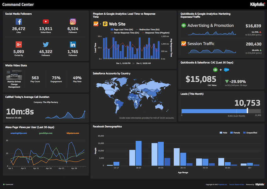
Dashboard software that drives real action
To succeed, you need to create value and grow. The challenge: your business environment shifts constantly. You need to course-correct quickly, adjust products and campaigns, and make decisions based on real data. But simply making data available isn't enough. You need a culture where every team member tracks the metrics they own, understands their impact, and feels accountable for results.
At Klipfolio, we've built that culture using dashboards. Everyone, from marketing to development to support, refers to dashboards throughout the day to stay on target. The most critical ones display on screens across our office, keeping what matters most visible at all times. When a metric moves from healthy to concerning, we act immediately, not at the next weekly meeting.
Here are six dashboards my team and I use every day. Some are specific to SaaS businesses; most apply to any company. Hopefully they give you a starting point for building something similar.
Dashboard #1: Executive overview
As CEO, I need a single view of all operational KPIs across every department. This dashboard gives me immediate clarity on where we stand against our key growth targets, without waiting for someone to pull a number or paste figures into a report.
I track essential business metrics: total accounts, Monthly Recurring Revenue (MRR), MRR per account, lead-to-win rates, and retention. Each department contributes to these high-level goals through their own objectives:
- Marketing: Visitor and lead volume
- Sales: New customer wins and average MRR per account
- Product (UX): Active users and account retention
- Finance: Monthly burn rate
- Development: Product uptime and system performance
- Support: New and open support tickets
This dashboard is our north star. It keeps leadership aligned on what's working and where we need to act.
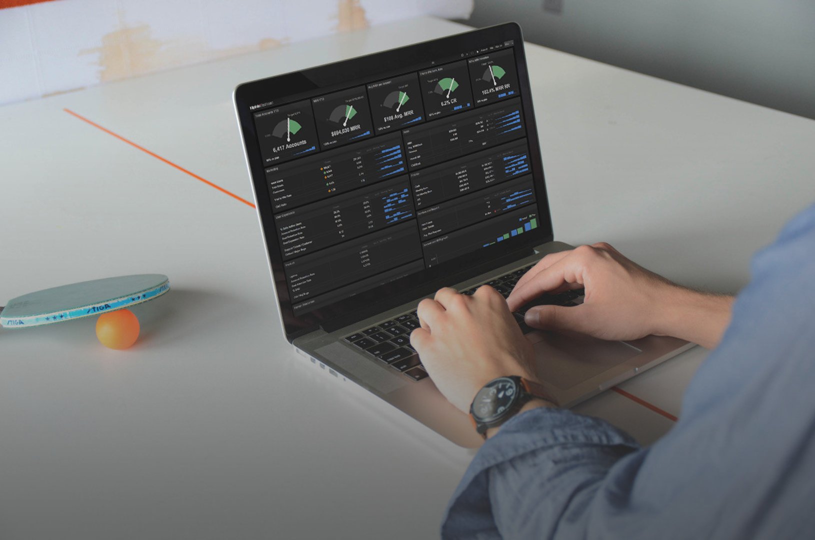
View the executive dashboard to see the metrics I monitor daily. Note: The data shown is sample data, not our actual performance.
Dashboard #2: Sales performance
Our sales model is straightforward: inbound, low average deal size, mostly credit card transactions, running 24/7. Because of this, our sales dashboards track daily targets alongside monthly totals. When we fall short, the entire team investigates and fixes the issue immediately, not at end of month.
We rotate two dashboards on our sales team's wall display:
Current sales performance: Our Customer Success team uses this to track real-time sales activity and progress toward quota. It shows individual and team performance, daily bookings, and pipeline health.
Period sales performance: This dashboard reveals long-term trends, high-level business objectives, and deeper analysis of how we're acquiring and retaining accounts. It helps the team spot seasonal patterns and forecast future revenue.
We pull Salesforce data directly into these dashboards, so the numbers are always current and the team can trust what they're looking at.
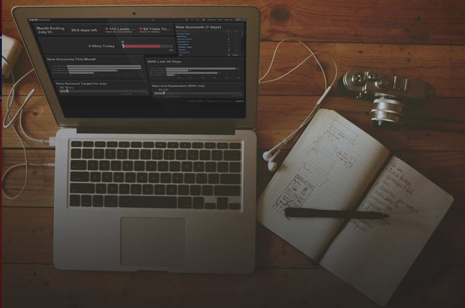
Create custom dashboards for you and your team.
Get started with KlipsDashboard #3: Marketing campaigns and channels
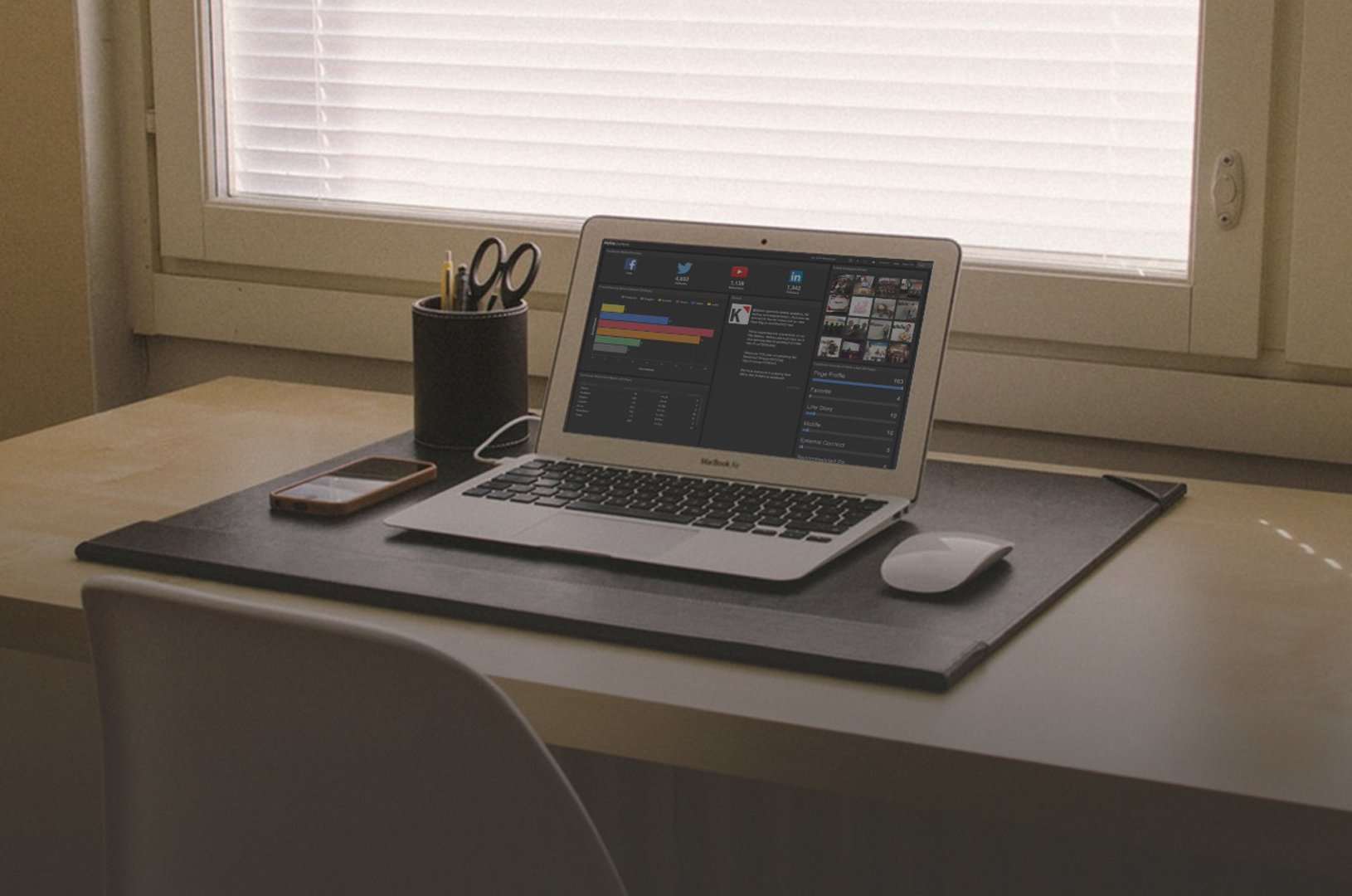
Our marketing strategy evolves constantly. We test new channels, adopt new tools, and run campaigns across multiple platforms. That means our metrics pull from many sources: paid search, social networks, email providers, analytics tools, and more.
Because we connect all those sources into Klips, our dashboards automatically combine and calculate metrics across channels. No manual consolidation, no pasting numbers from one place to another. The team sees a unified view of what's working.
The marketing team rotates three dashboards:
Social media: Tracks engagement rates, click-through rates, and conversions from our social channels. The team uses this to sharpen content and posting schedules.
Campaign performance: Shows paid search and organic search performance side by side. Metrics include impressions, clicks, cost per click, and conversion rates. This is how we decide where to put budget.
Lead generation: Converting web visitors to free trial signups is critical to our growth. This dashboard tracks the entire funnel: website visitors, trial signups, trial-to-customer conversion, and Cost per Acquired Customer. Marketing uses it daily to find bottlenecks and test improvements.
Dashboard #4: Support quality and responsiveness
Our support team uses their dashboard to monitor daily ticket volume, response times, and documentation usage. Watching these metrics closely tells them whether they're hitting response time targets, whether staffing is adequate, and which help articles are most valuable to customers.
The team monitors two key dashboards:
Support ticket and response: Tracks how quickly the team responds to customer tickets, average resolution time, and ticket volume by category. When response times slip, the dashboard surfaces it so we can adjust staffing or prioritize urgent issues before customers feel the impact.
Documentation web analytics: Shows which help articles and training modules customers view most. High traffic to certain topics tells us where customers are struggling, so we can improve those articles or add new content.
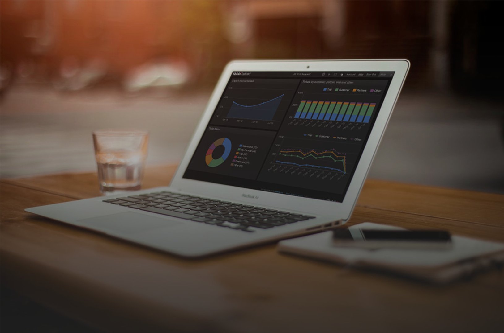
Dashboard #5: User experience and product adoption
Our product team's dashboard helps them monitor and improve the experience inside our application. Their goal is straightforward: give customers and prospects the best possible experience, and catch problems before customers have to report them.
The UX dashboard tracks metrics daily and compares them against historical averages. That comparison is what makes it useful: it's not just a snapshot, it's a signal for when something has changed.
The team focuses on leading indicators:
- Daily active users: Shows whether more or fewer customers are engaging with the product each day
- Key user journeys: Tracks whether users complete critical workflows, like creating a dashboard, connecting a data source, or inviting team members
- Feature adoption: Monitors whether new features are being used and by how many customers
This dashboard keeps the product and UX teams aligned around customer-facing improvements. Sometimes it flags an immediate issue that needs fixing. Other times it provides real-time context for strategic planning.
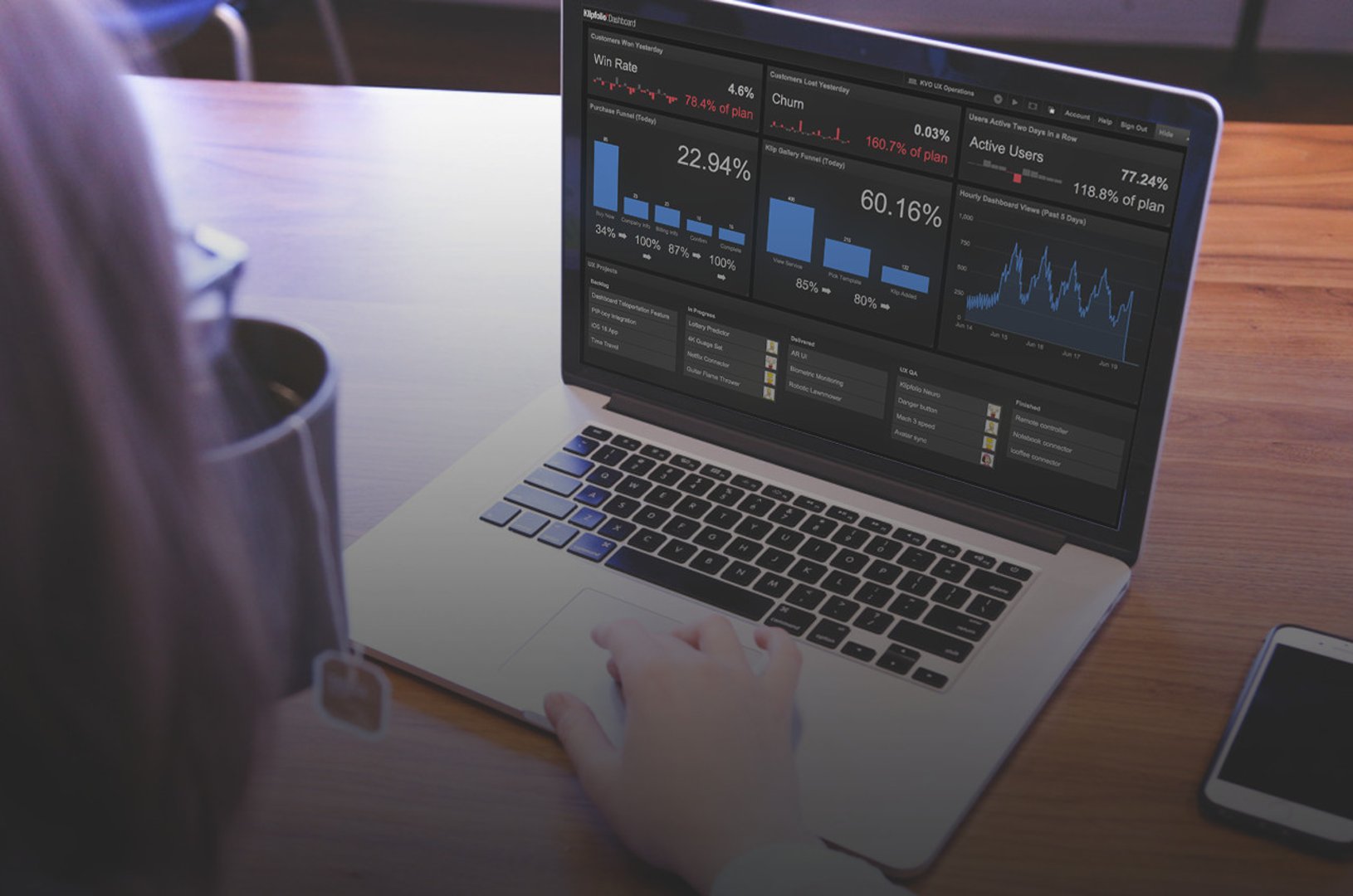
Dashboard #6: Development velocity and system health
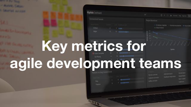
Our development team uses two dashboards: one to track project progress and team capacity, and another to monitor application performance and uptime.
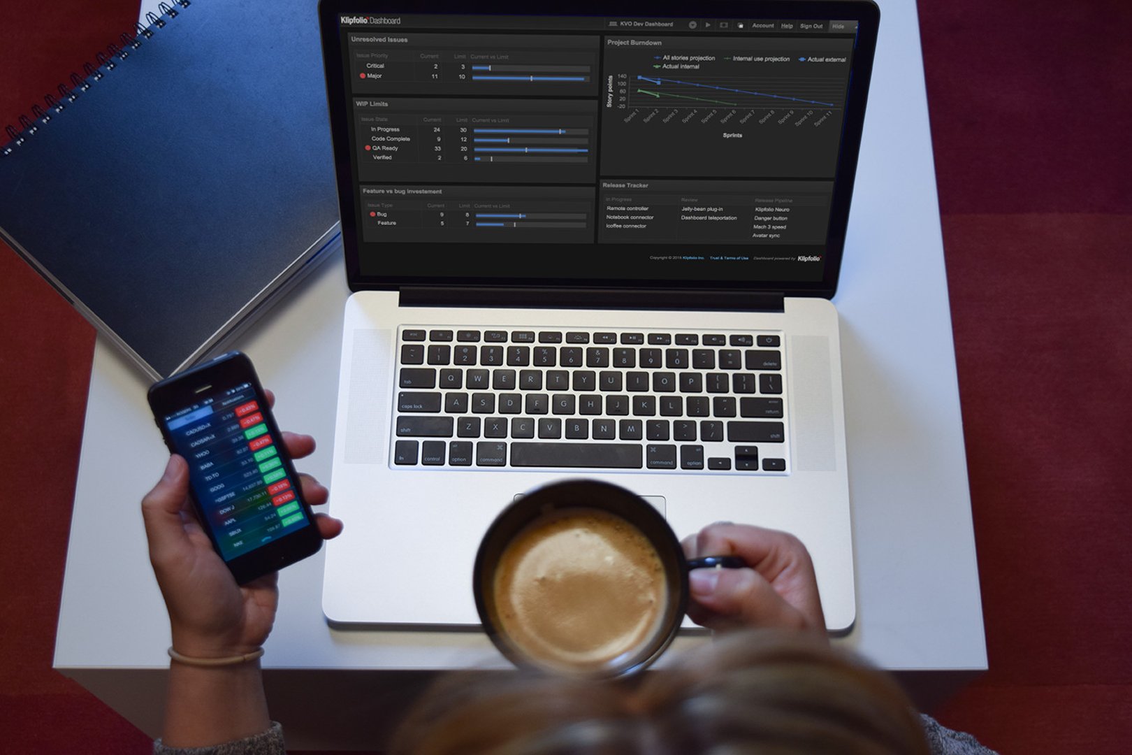
Development work items: Shows the status of all issues and features in progress, the team's capacity across sprints, and completion rates. This helps the team forecast delivery dates and catch bottlenecks before they become delays.
DevOps performance: Monitors application uptime, response times, error rates, and infrastructure health. System uptime is one of the biggest drivers of customer satisfaction, so this dashboard gets constant attention. When performance dips, the team investigates immediately.
Create custom dashboards for you and your team.
Get started with KlipsYour metrics will evolve, and that's okay
These dashboards didn't appear overnight. They've been refined over months and continue to change as our business does. When we enter a new market, launch a product, or shift strategy, we adjust the dashboards to match.
The key is to start somewhere. Pick the metrics that matter most to your business right now. Build dashboards to track them. Share those dashboards with your team. Review them regularly. Over time, you'll build a culture where the numbers are trusted, decisions happen faster, and your team operates with the confidence of knowing exactly where things stand.
I'd love to hear how your organization uses dashboards. If you track different metrics or have built something innovative, reach out and share your story.
Updated 2026-08-31


Most recent
- SEP 25What SOC 2 taught a small team about trust
- SEP 15The AI race: progress, humanity, and trust
- SEP 9The good advisor
- AUG 11Beyond simple sign-ups: how True Trials and Activation predict growth
- JUL 7Why business leaders miss important trends in their dashboards
- JUN 19The best chart for the job: Visualizing data for non-technical users