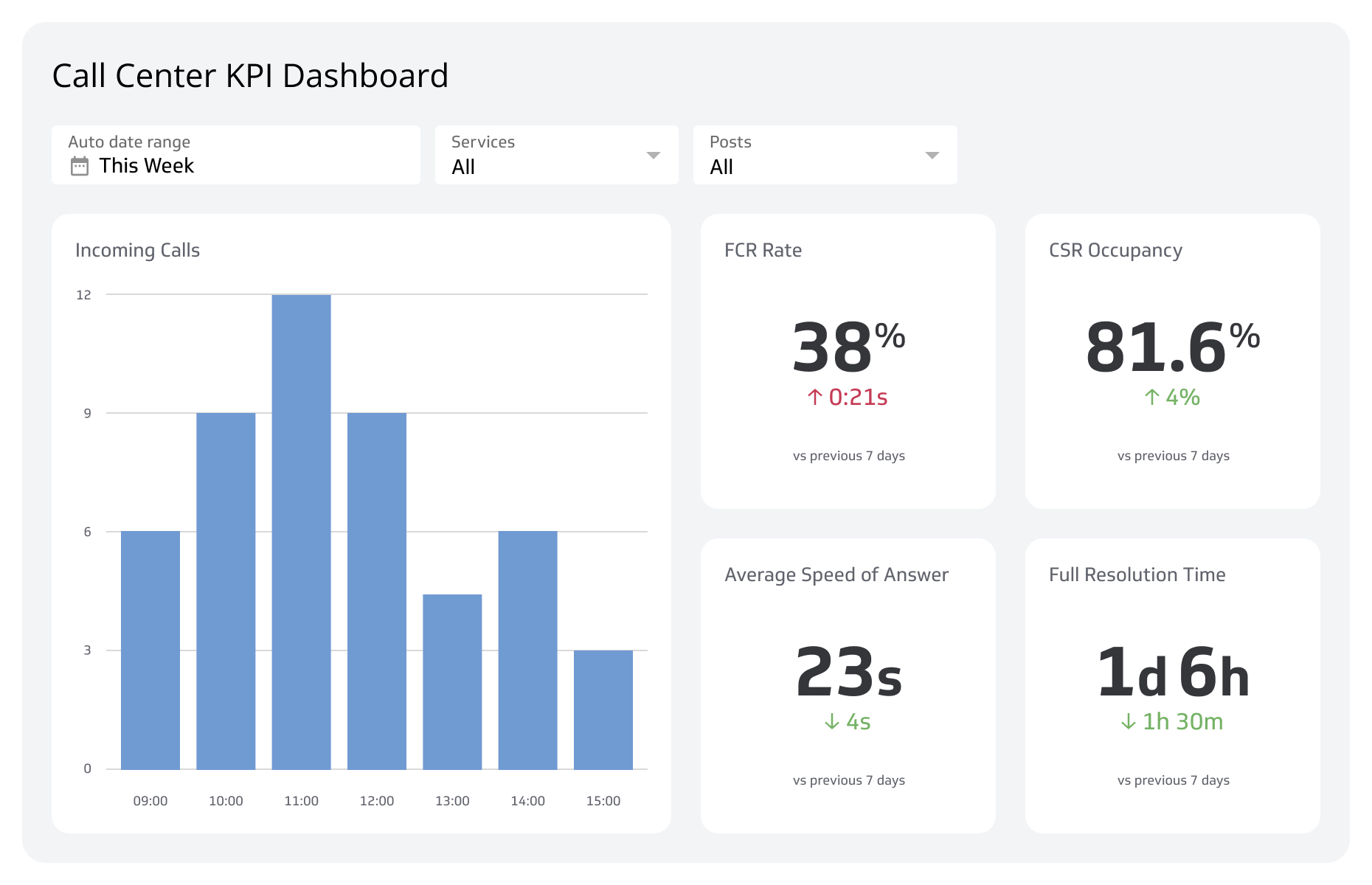
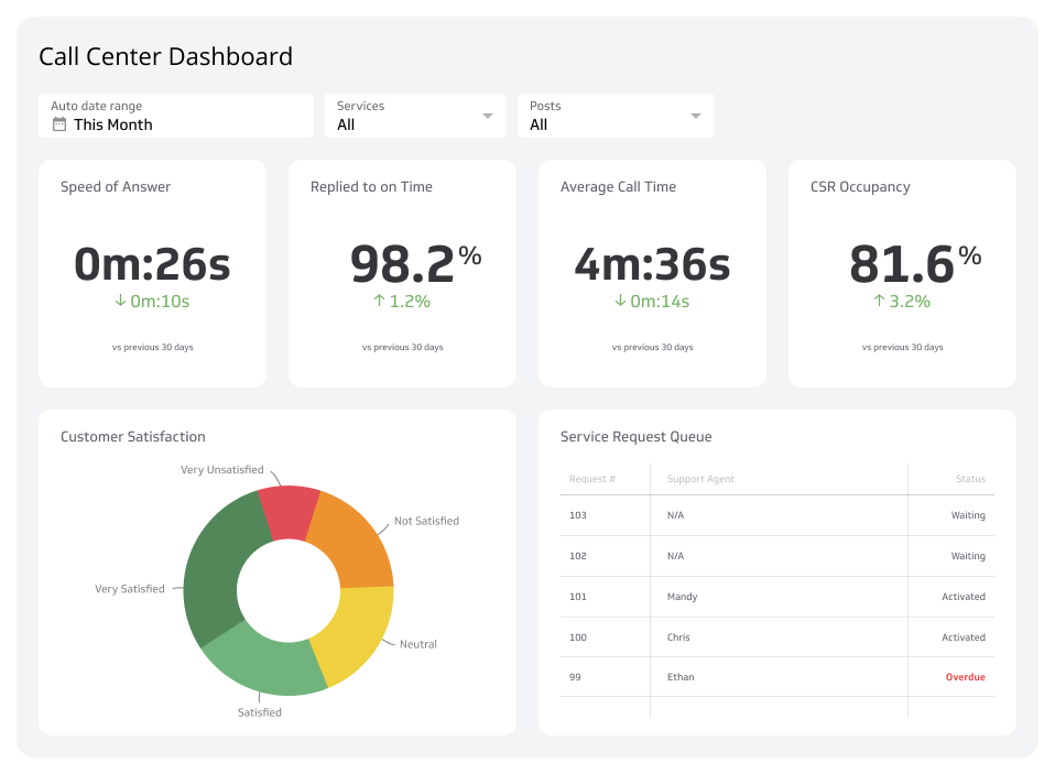
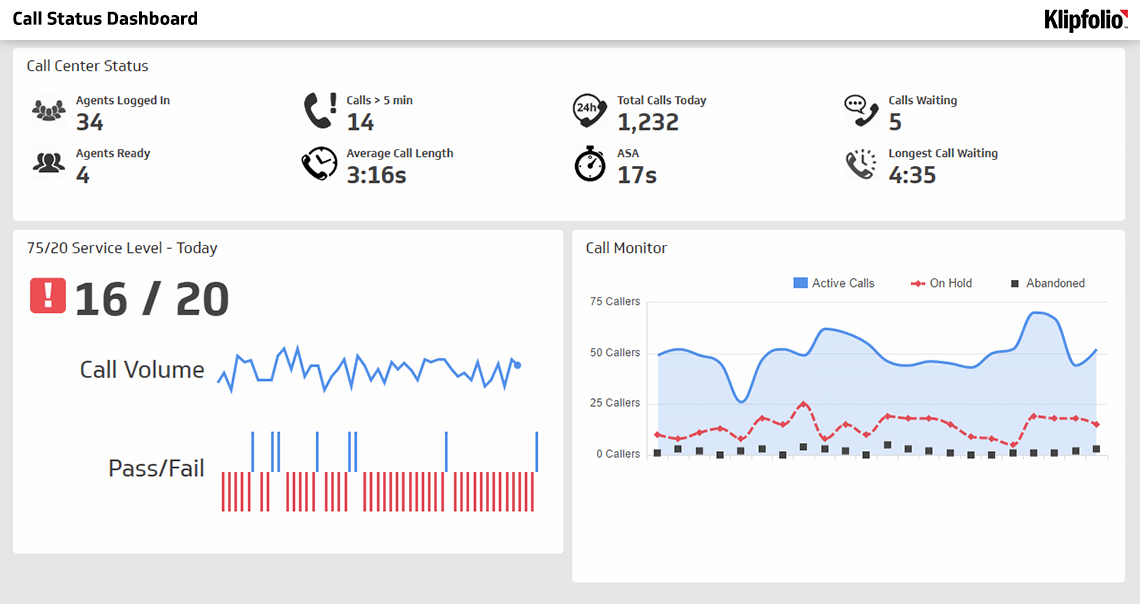
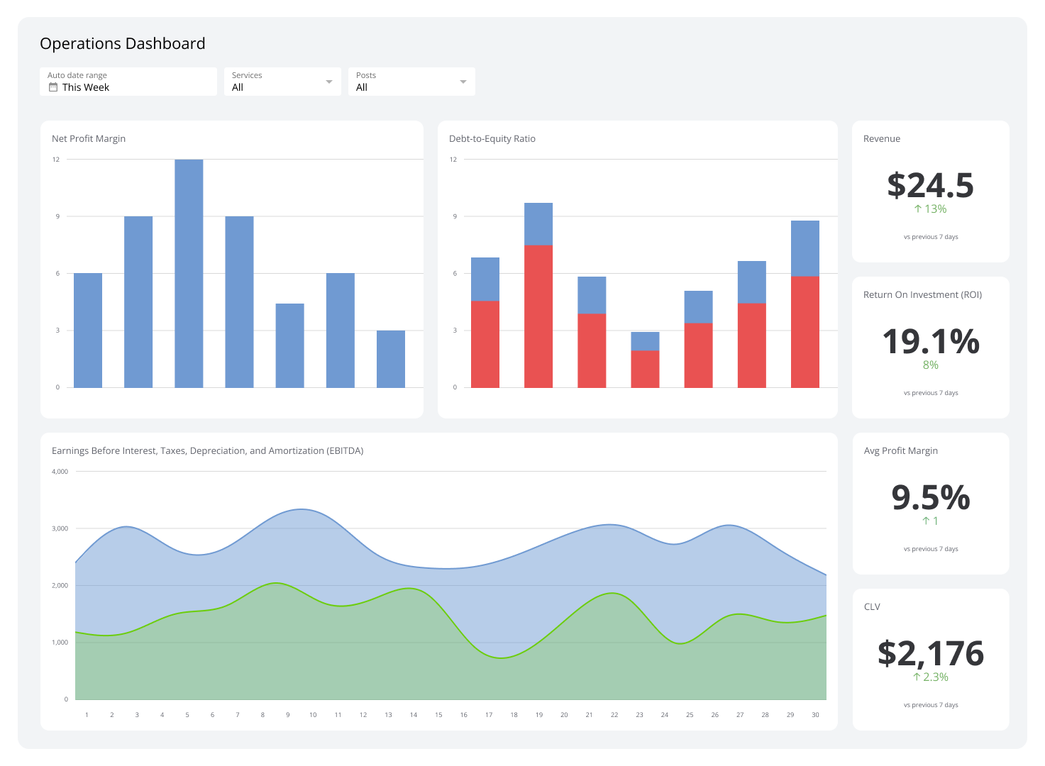
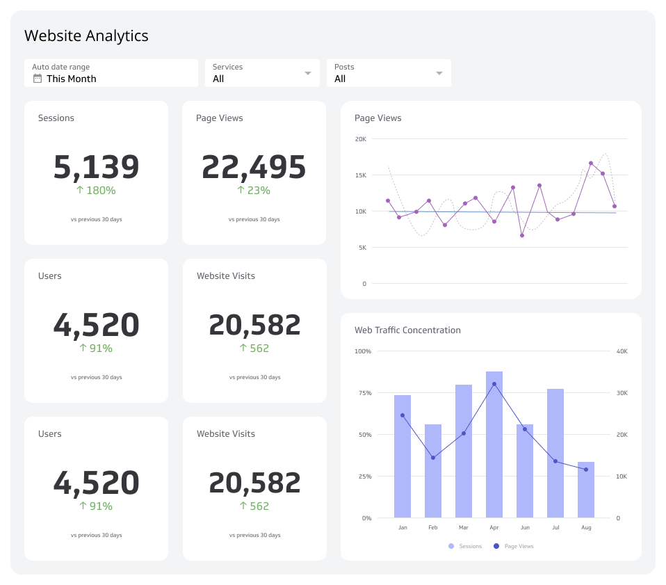
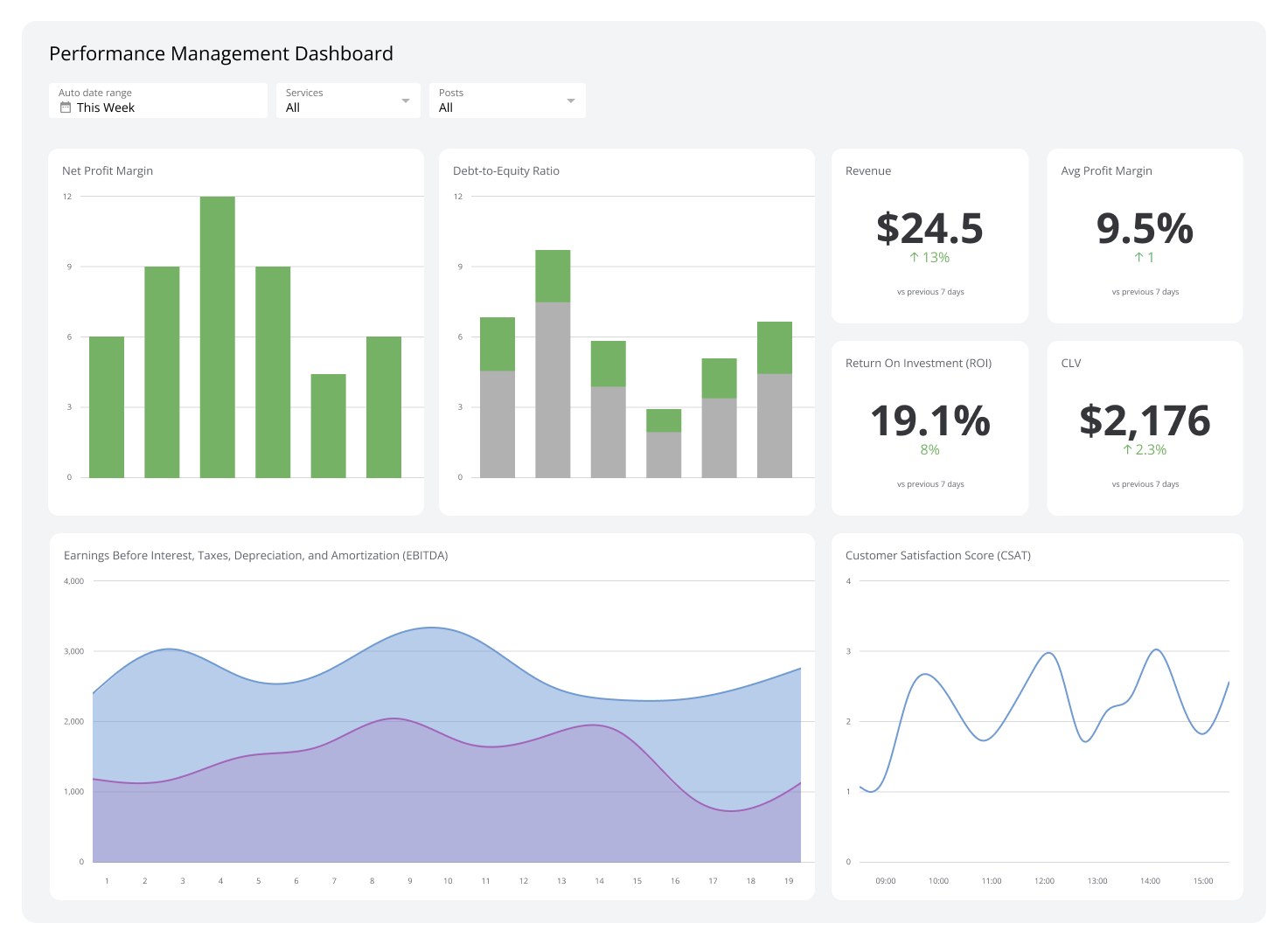
Customer Support Dashboard
Track ticket volume, response times, resolution rates, and agent performance in one real-time view.
What is a customer support dashboard?
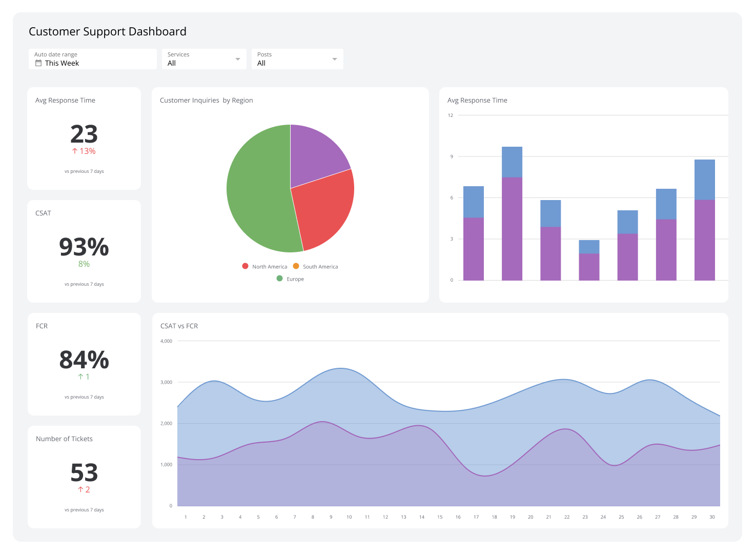
A customer support dashboard is a real-time visual display of your support team's key metrics and KPIs: ticket volume, response times, resolution rates, and agent performance, all in one place.
This SaaS dashboard gives leaders a clear, current picture of how support is running without having to pull reports, chase down numbers, or paste figures into a spreadsheet to figure out what's happening. When something is off — tickets spiking, calls going unanswered, resolution times creeping up — you know immediately, not after the fact.
A strong support team is central to any SaaS company's success. The Customer Support Dashboard consolidates your team's activity so you can spot customer pain points early, make staffing decisions with confidence, and keep service quality consistent as your business grows.
Zendesk
Connect Zendesk to your support dashboard to track the health of your customer service operation in real time. Zendesk is part of your users' product experience, not a back-office tool. When you monitor it live alongside your other metrics, you can act on what's happening now instead of reviewing what happened last week.
Tickets by month
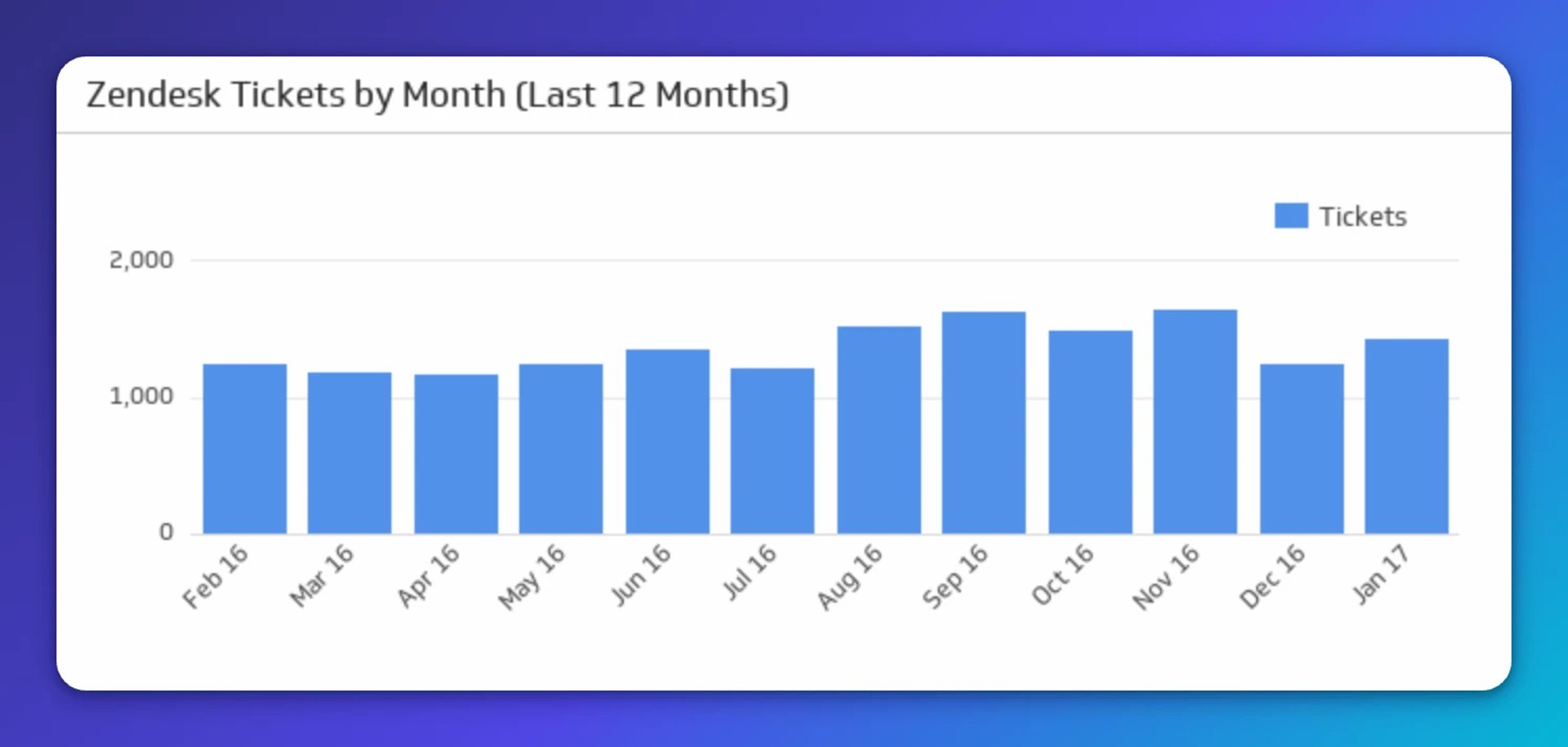
The Tickets by Month KPI shows total ticket volume over the last twelve months. It's one of the clearest signals you have for how customers are responding to your product: a spike after a major release, a steady climb as your user base grows, or an unexpected drop that's worth investigating.
It's also a practical planning tool. If ticket volume is trending toward numbers your team can't handle, you'll see it before it becomes a problem. You can act on staffing or self-serve resources before customers feel the strain, rather than scrambling to explain a backlog to leadership after the fact.
Ticket stats (today)
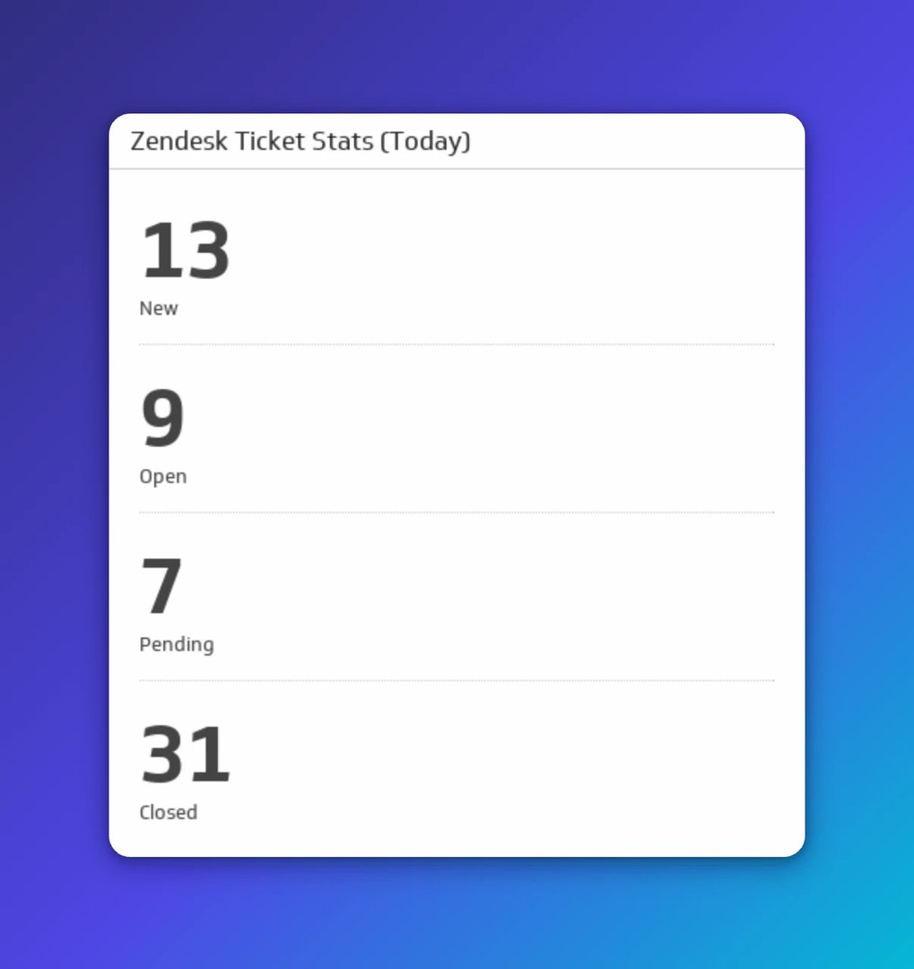
This metric shows new, open, pending, and closed tickets as they move through the queue, right now, not at end of day. For lean teams where everyone pitches in, visibility into live ticket status helps you triage faster and avoid letting anything slip.
The difference between getting ahead of a backlog and discovering one too late is usually just knowing where things stand. This view gives you that without having to ask anyone.
Average tickets per day
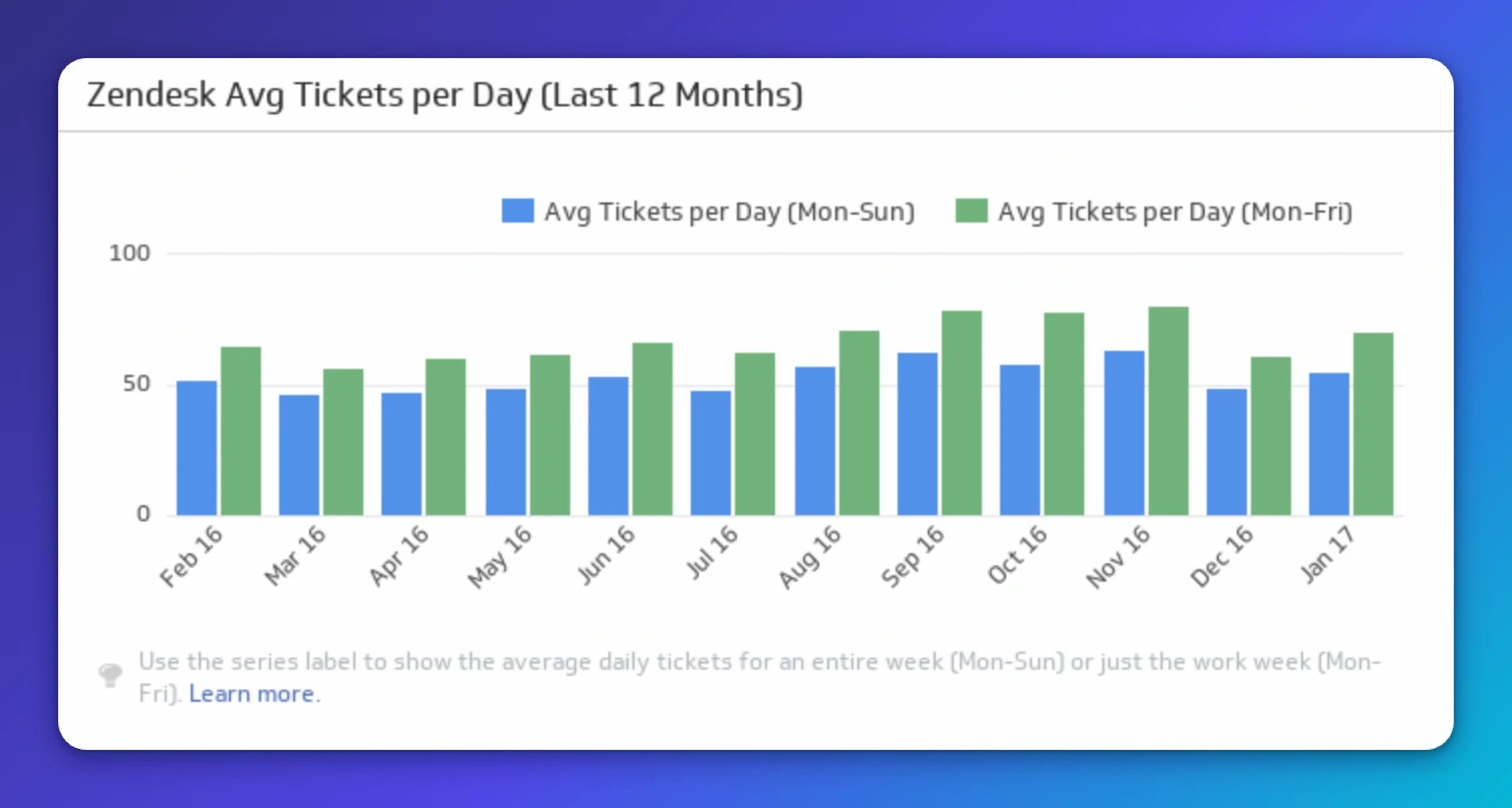
This KPI tracks the average number of tickets per day over the past twelve months, with breakdowns for five-day and seven-day weekly averages. The pattern it reveals is more useful than the number itself.
If your customers need more help on weekends than weekdays, your scheduling should reflect that. If Monday mornings consistently spike, you can staff accordingly. This metric gives you the evidence to make those calls with confidence rather than gut instinct, without needing someone to pull a custom report every time the question comes up.
CallRail
Phone support still matters, even for SaaS businesses. Hearing a real person during a frustrating moment can turn a poor experience into a loyal customer. Add CallRail metrics to your support dashboard to make sure your phone channel is performing as well as your digital one.
Average call duration (last 500 calls)
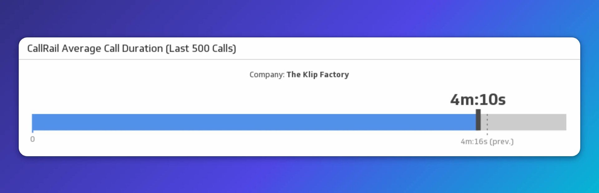
Call duration tells you two things at once: how efficiently your team resolves issues, and whether customers are getting the help they actually need.
Short calls usually mean quick resolutions, which is good, provided quality isn't being sacrificed for speed. Long calls often point to gaps in training or documentation. Tracking Average Call Duration over time helps you find the right balance: efficient enough that no one waits too long, thorough enough that customers don't call back with the same problem.
Create custom dashboards for you and your team.
Get started with KlipsSummary of call stats
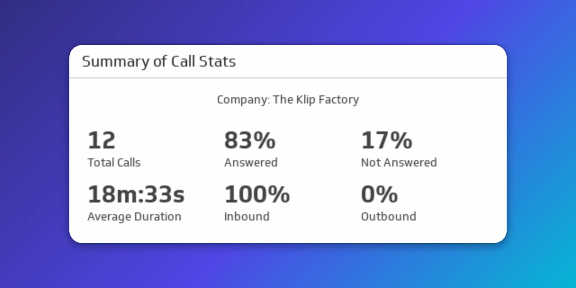
This KPI pulls together the full picture of your phone support: total calls, percentage answered, percentage missed, average duration, and the split between inbound and outbound. It's the view you share with leaders who need to make decisions about support capacity and performance, without having to dig through raw call logs or wait for a weekly report.
A high answer rate means customers aren't hitting a wall when they need help. A rising missed-call percentage is a signal to act before it affects satisfaction scores. This summary gives everyone on the team, from frontline staff to leadership, a shared, reliable view of how the phone channel is performing.