
AI can't see what you're missing: How to get the right chart for your business question
AI data visualization can draw a chart fast, but picking the right one takes clear definitions and rules. See how to get answers you can trust.

AI can generate a chart from your data, but it can't reliably pick the chart that answers your question unless it works from clear definitions and rules.
Charts are no longer the hard part. Almost anyone can turn almost any data set into a visualization, and many new data tools skip the chart layer entirely in favour of AI chat. The current theory is that if data is well defined, any visualization library can display it.
That theory misses something. Good visualization means using the right chart at the right time, every time. Many leaders find that choice difficult, and a wrong choice costs more than a slow one. Recent advances in consistent metric definitions and AI give tools a better chance of showing your numbers the way you need to see them.
Your brain craves pictures, not numbers
The right visualization makes data understandable at a glance. Charts use the most powerful pattern-matching parts of the human brain, the retina and the visual cortex. An out-of-place point is easy to spot on a line chart and hard to find in a table of raw values. That's why leaders rely on charts to interpret results and share them with the team.
Visualization hasn't always been appreciated. One of the earliest pioneers of statistical graphics was William Playfair (1759 to 1823). His peers often ridiculed him, but he kept experimenting with ways to make numbers easier for the general public to understand. Line, bar, and pie charts, all of which he pioneered, are still standard today.
More than 200 years ago, Playfair introduced charts as a new way to understand numbers. Today they're the standard way people see their data. He was onto something.
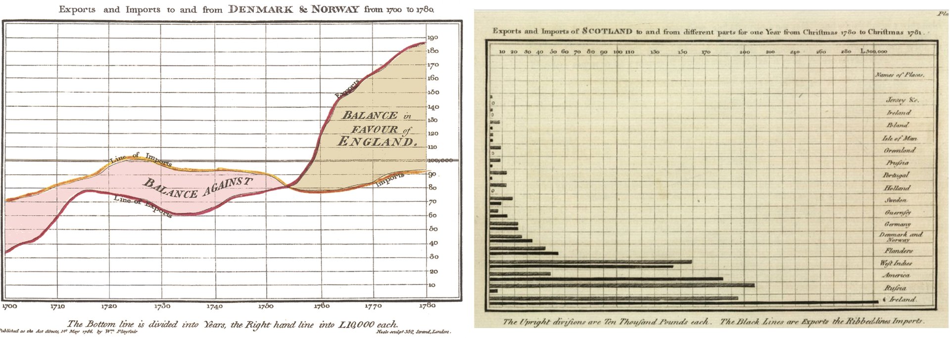
Chart choice is everything
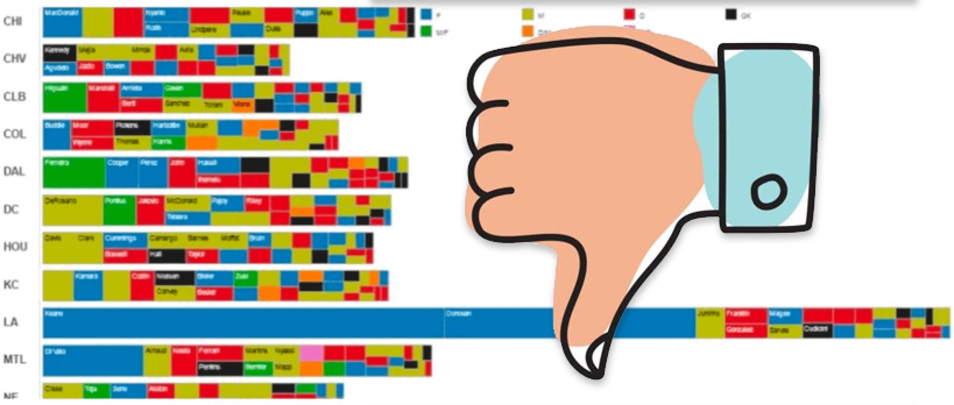
Today's reader has a vast array of chart types, each with its own purpose. The right chart gets you an answer. The wrong one can lead you to a false conclusion and, in the worst case, a faulty business decision.
Most traditional reporting tools don't know your business or what you're trying to learn, so they can't help you choose well. They're rich in capability but poor in guidance. The gap isn't knowledge of chart types, which is well documented. It's understanding what you need from your numbers.
Instead of offering the ideal chart, most tools hand you a large menu and let you experiment. If you know the chart types and your data well, you'll find answers quickly. If either is unfamiliar, it becomes an exhausting round of trial and error, and the decision waits.
Smarter chart choices come from business context
New chart types are rare these days. The progress is in helping people reach the most effective chart faster. Two advances make that possible:
- Consistent definitions: When each metric has a formal description, tools can make good guesses about which patterns matter and which chart communicates them best. A basic description of the data can't support that.
- Natural language and AI: When you describe what you want and why, a tool that understands your request can pick an appropriate chart, or at least make a very good guess.
Create custom dashboards for you and your team.
Get started with KlipsWhy chat interfaces don't always get it right
AI chat is quickly becoming the first stop for business users who want answers. You can ask for a chart and get one. Often it isn't the chart you need to read your data correctly.
LLM-based AI models are built to return natural language, and sometimes images. They generate answers by imitating responses to similar questions in their training data, not by understanding your question.
Charts can look alike and tell different stories. A chart that resembles other charts may be useless or make no sense for your question. The right chart takes an understanding of the question and careful reasoning, applied the same way each time. Current LLMs can't do that reliably. In practice, that means pasting numbers into a chatbot, re-explaining your business, and double-checking the result next week.
Rules and AI together give consistent visualizations
Even with AI, charts authored by experts are the most dependable way to read business data. Curated dashboards are lasting references that decision-makers can rely on to track the health of the business. When they're clear and consistent, everyone on the team can spot important changes and act on them.
Combined with AI, rule-based systems add guardrails. The AI doesn't draw a chart from raw data. It selects the data and passes the user's question to the visualization system. That system applies standard visualization rules to build a chart that fits the question. Because the rules produce the chart, you get the same unambiguous result every time.
How metrics power better visualizations
Metrics suit this approach well. A metric carries described data, a known structure, and an attached business meaning. It also comes with the analyses people typically run on it. Those qualities point to the best charts and make users' likely questions easier to predict than they would be with a generic data model.
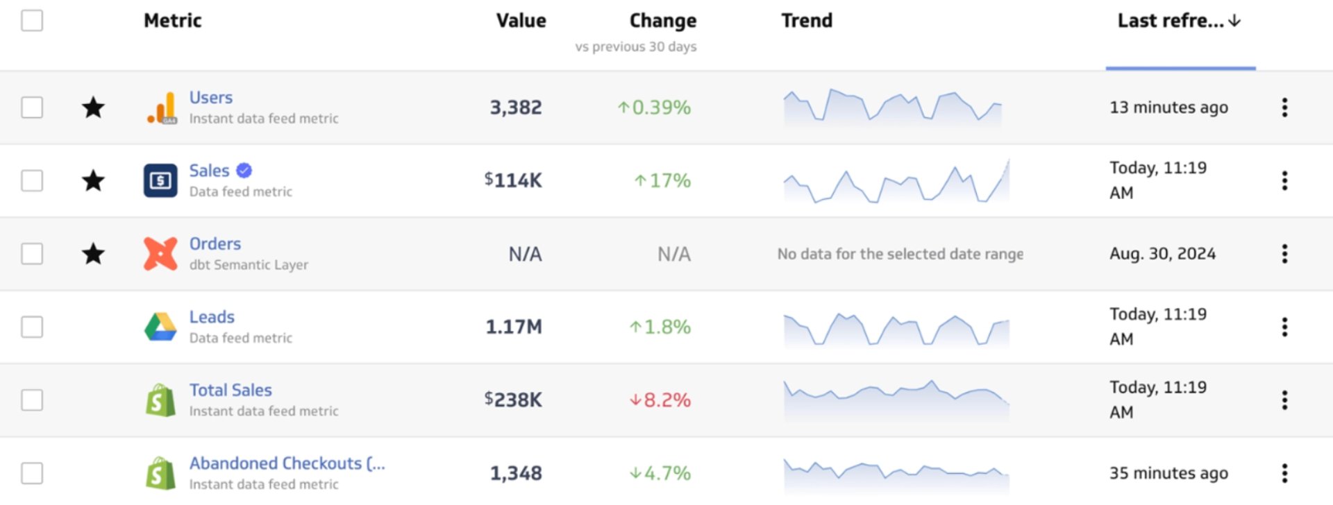
A metric should deliver insight the moment it loads. A tool can pair each metric with its expected chart and show something useful right away. That default may be exactly what you need, or a good starting point for digging in. You should still be able to switch chart types, but the first view should be easy to understand and reinforce what the metric means for your business.
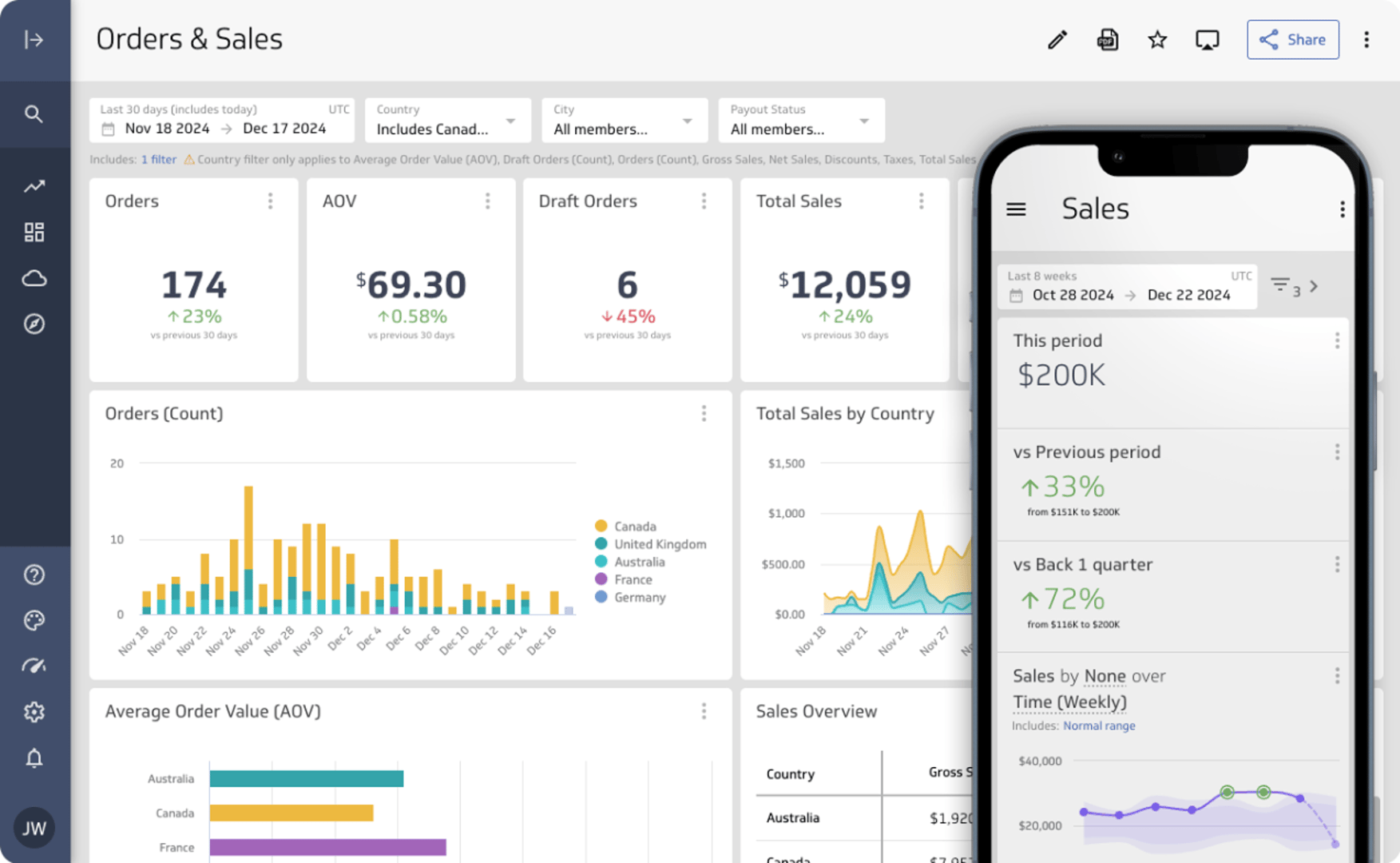
Metrics also work well with AI and natural language. The same definitions and context that help a tool display metrics give AI systems what they need to interpret the data and match it to your goal. With a clear description behind each metric, an AI system can choose the right chart type and the right metric to answer your question.
Test the tools you already use
Pick one question you ask every week, such as whether revenue is on track this quarter. Ask it of your current tools and of a generic AI chatbot, then compare the charts. Check whether each answer uses your definitions, shows the change that matters, and looks the same when you ask again next week. That test shows quickly whether a tool understands your business or just draws pictures.
Updated 2026-10-15
Continue learning

Metrics layer vs semantic layer: Which fits your business?
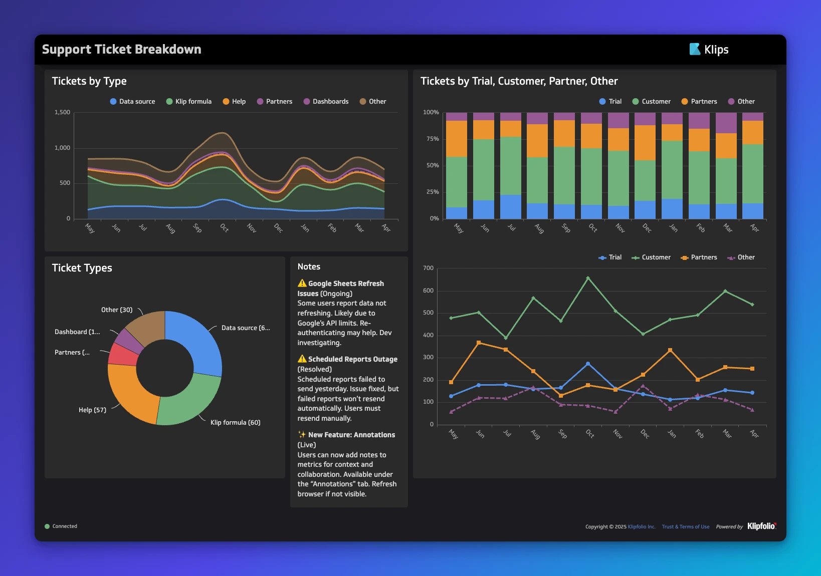
Dashboard design: principles, visualizations, and best practices

Metrics layer: One set of definitions for your team
KPI vs metrics vs measures: What's the difference?
The consolidating stack: 3 years of SMB data connection trends

What are Dashboards and Scorecards? Key differences explained
Most recent
- SEP 2310 ways to automate Klips with the Klips API
- SEP 14Automate Klips: from repetitive tasks to managing reporting at scale
- AUG 20The consolidating stack: 3 years of SMB data connection trends
- MAY 28Dashboard Data Security and Privacy: A Five-Layer Framework
- MAR 30The CEO's guide to metrics that actually matter
- MAR 18What is a KPI? Types, limitations, and how to make KPIs work for your business