YouTube Analytics Dashboard
Track views, watch time, and subscriber growth in a clear YouTube dashboard.
What is a YouTube Analytics Dashboard?
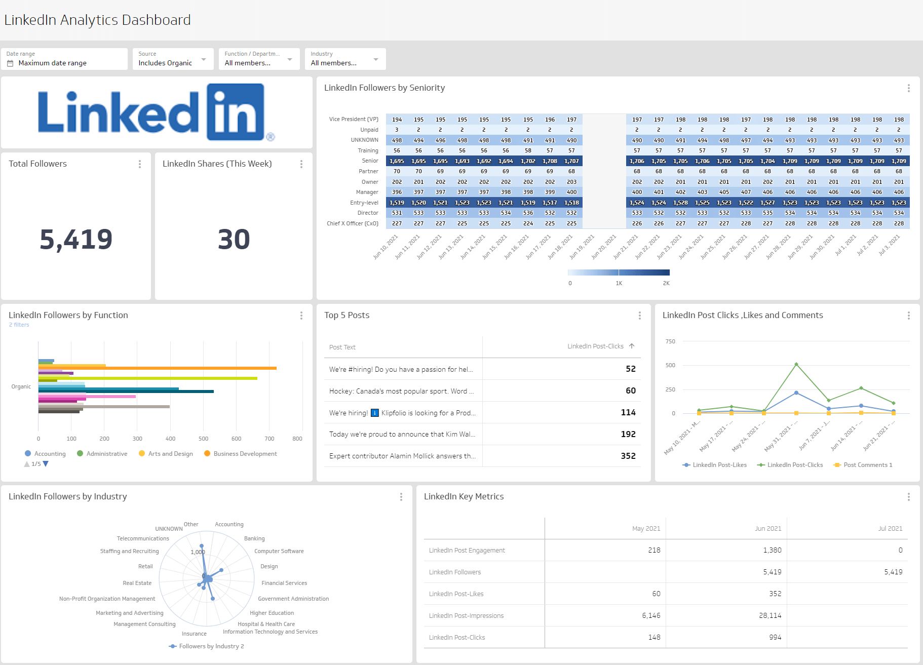
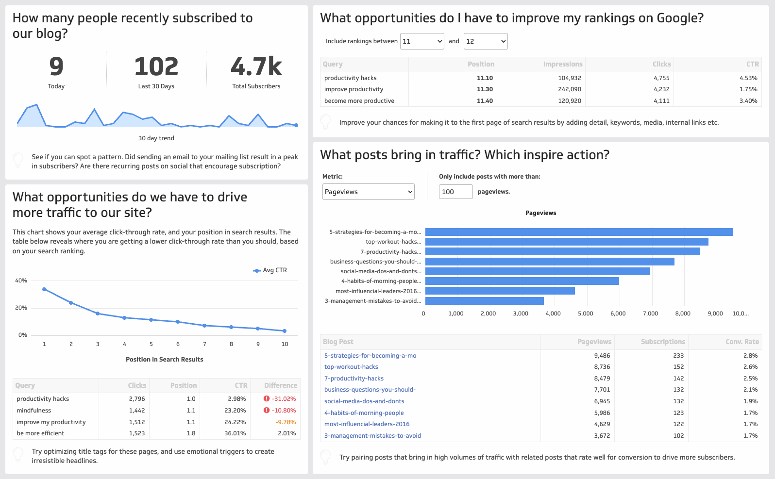
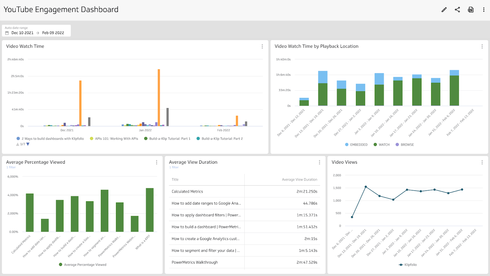
A YouTube Analytics Dashboard is a visual report for your channel that brings every metric you care about into one place, so you always know what's working without having to dig for it.
Instead of logging into YouTube Studio, pulling numbers into a spreadsheet, or pasting data into a chatbot every time someone asks how the channel is performing, you get a single, reliable view of your channel. Views, Watch Time, Subscribers, Click-Through Rate, and traffic source, all consistent, all current.
Use it to answer questions like:
- Which videos generate the most views?
- Are your videos engaging and retaining viewers?
- Where are people discovering your videos?
- How fast is your subscriber count growing or shrinking?
With a dashboard, you can segment data and see how your audience behaves by traffic source, geography, device, or time period.
What metrics should be on a YouTube Analytics Dashboard?
The right metrics depend on what you're trying to decide. These are the ones that matter most for understanding channel performance and guiding content decisions.
- Views: How many times your videos were watched over a selected period. The baseline for reach.
- Watch Time: Total minutes watched across your videos. A core signal for content quality and algorithmic reach.
- Average View Duration: How long a viewer stays before leaving. Guides editing, pacing, and hook decisions.
- Impressions and Click-Through Rate (CTR): How often thumbnails were shown and how often they were clicked. Tells you whether your titles and thumbnails are earning attention.
- Subscribers: Total subscribers and net change by period. Tracks growth and the impact of campaigns or content pushes.
- Traffic Source: Breaks down views by source: Search, Suggested, External, Browse Features. Shows you which discovery paths are actually working.
- Audience Retention: Where viewers drop off in a video. Surfaces the moments that lose people so you can fix them.
What visualization works best for YouTube data?
YouTube data is time-based and rich with dimensions. The right chart makes the pattern obvious without requiring explanation.
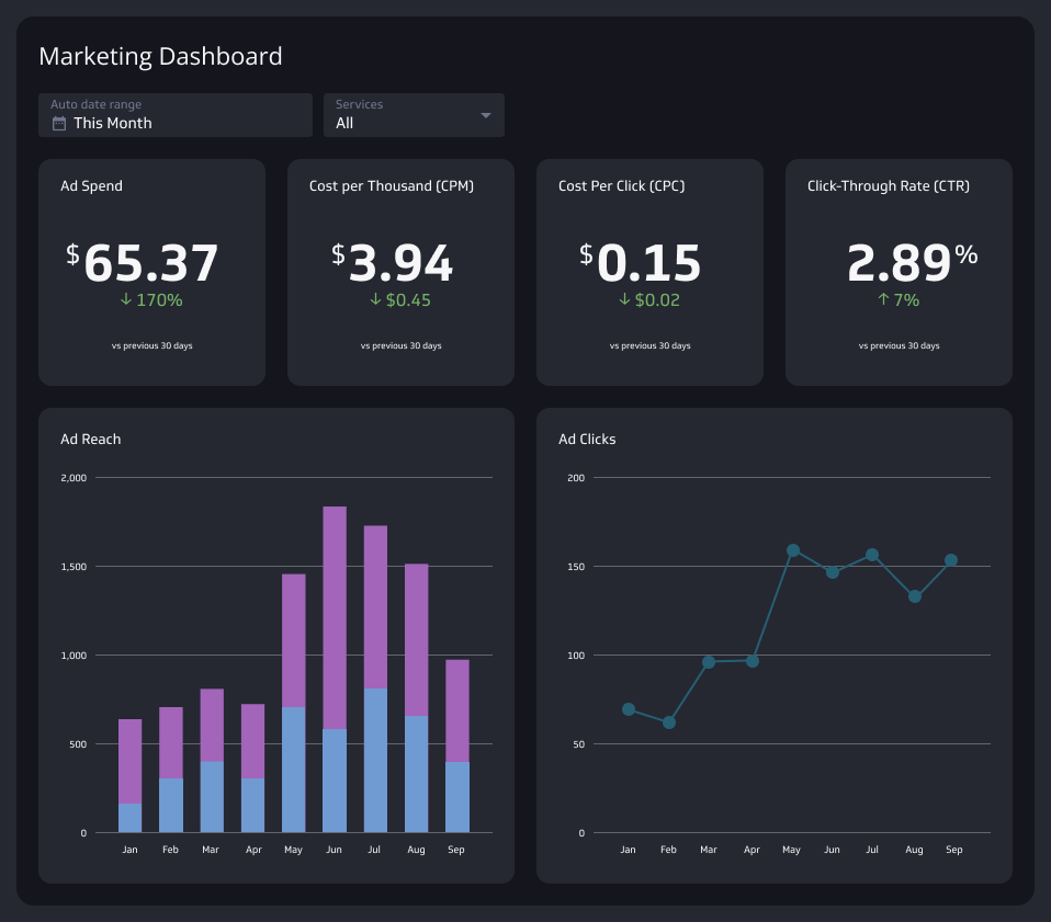
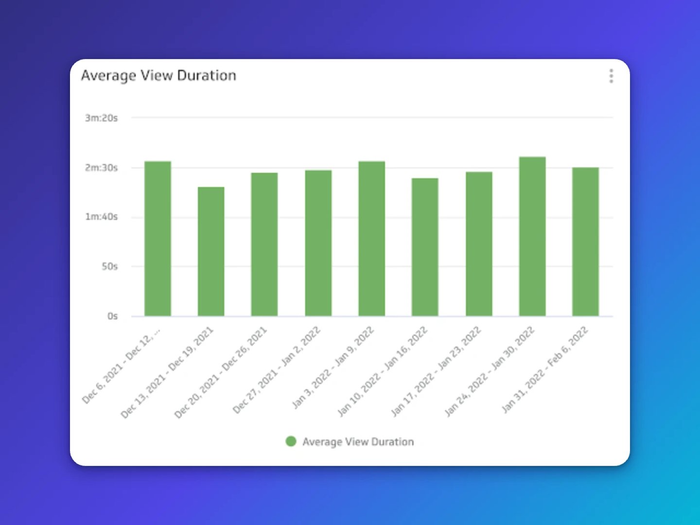
Use a bar or line chart for trends over time. Compare Watch Time or views by device each week with a bar chart. Average View Duration over time works well as a line chart so you can spot dips after the first 30 seconds.
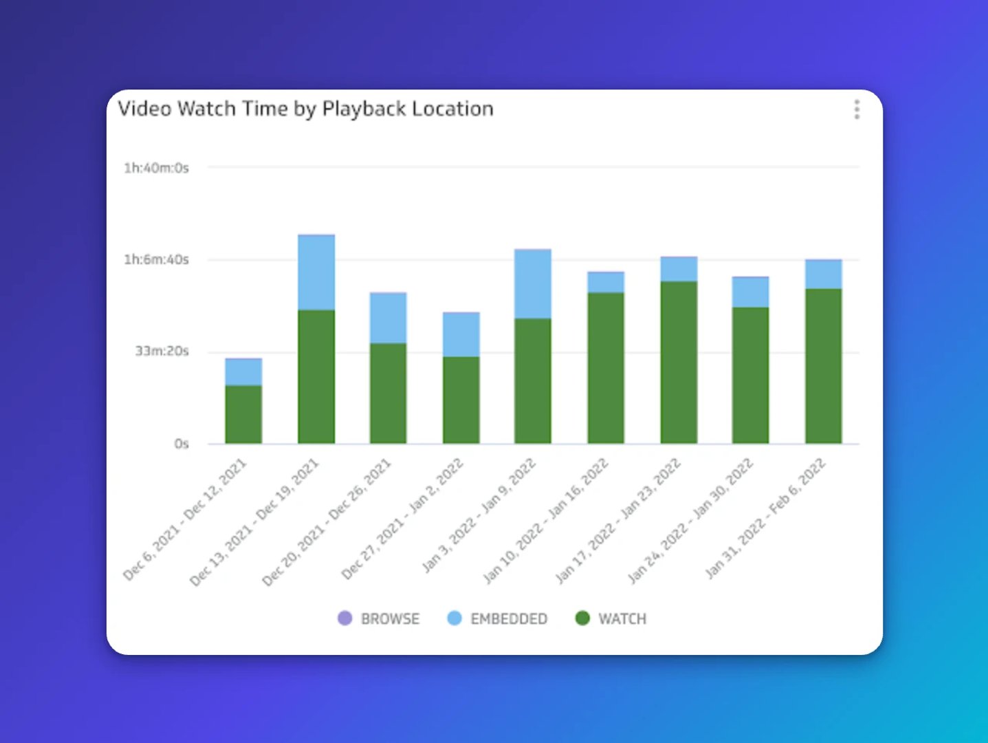
Use a pie or stacked bar to show parts of a whole. For example, video views by traffic source for the last 28 days makes it immediately clear which discovery paths matter most.
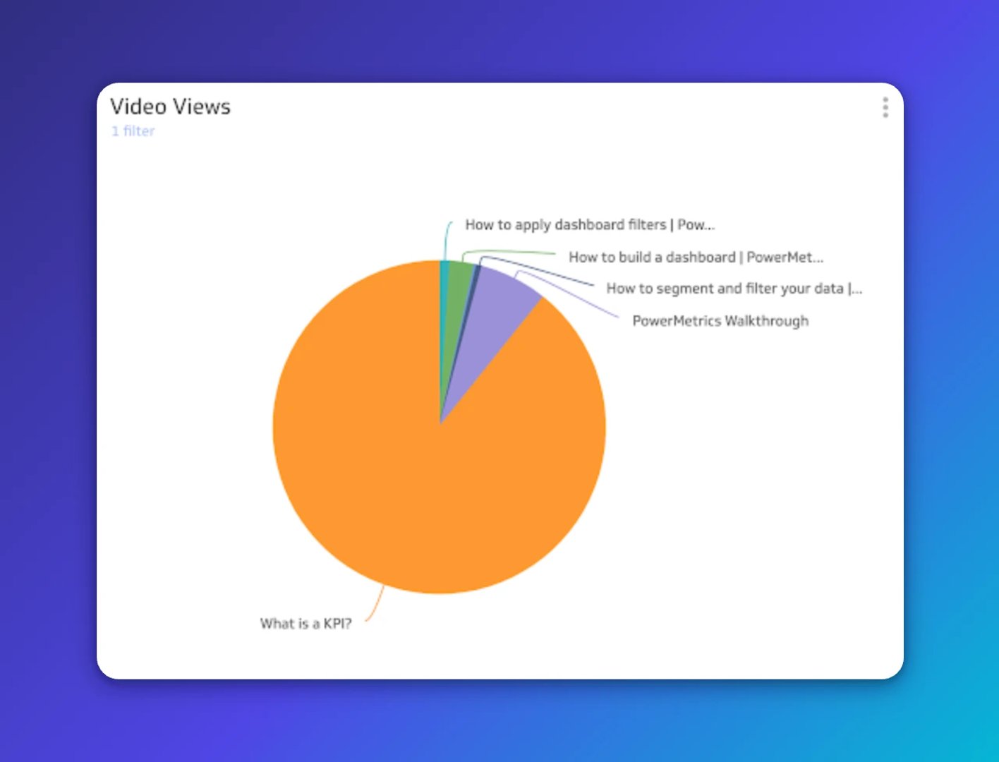
Use a summary chart for quick checks. Track subscriber growth or top video views with a single value and a period comparison so you can tell at a glance whether you're trending up or down.
Dashboard layouts that work
It can be hard to know where to start. These two layouts cover the most common use cases: understanding how your content performs and tracking channel growth over time.
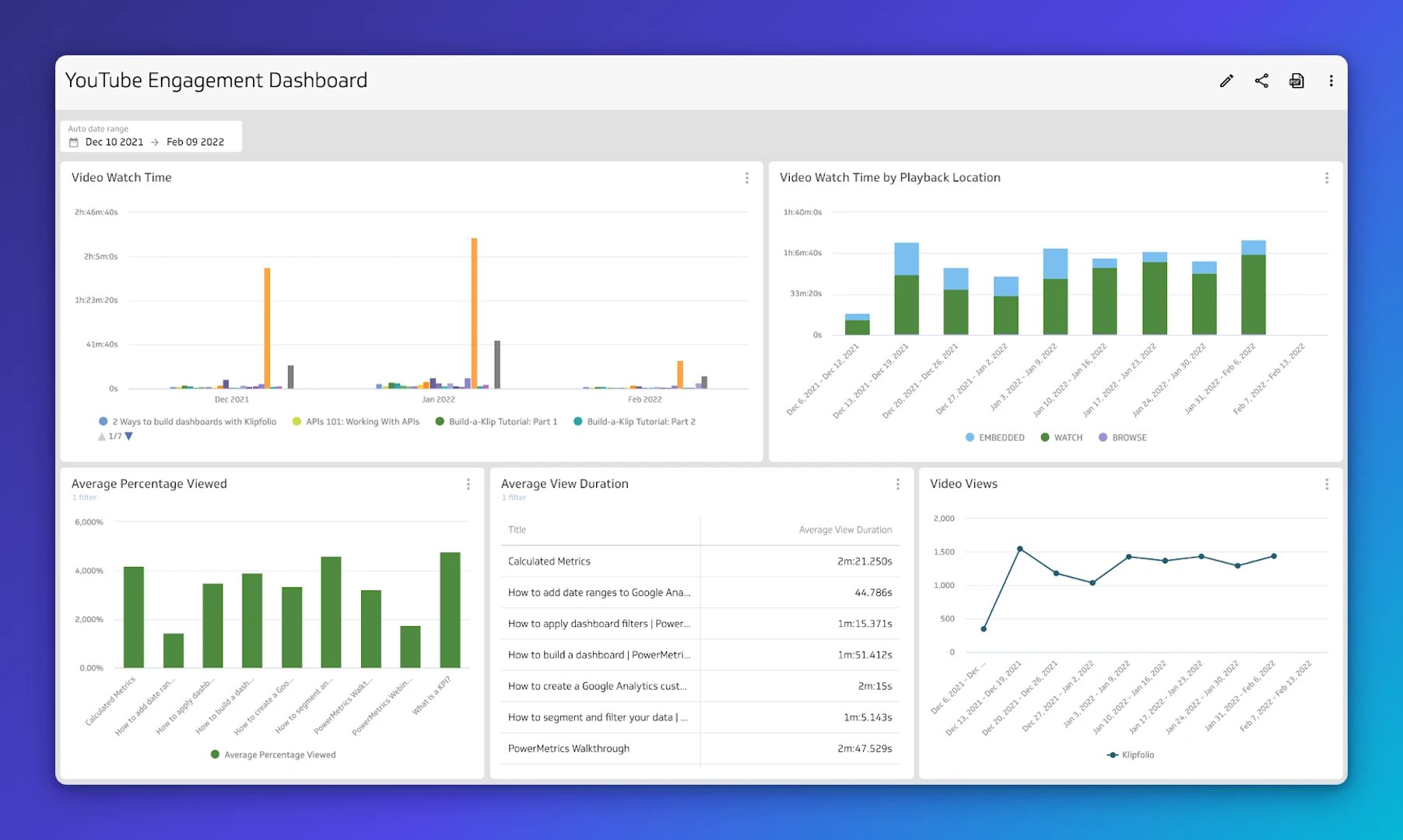
Track viewer engagement
Build a dashboard focused on how people engage with your videos. The questions it should answer:
- What is the Average View Duration?
- What is the average percentage viewed?
- Where do viewers drop off?
These patterns guide editing, hooks, and pacing for future videos. When you can see exactly where people leave, you stop guessing and start improving.
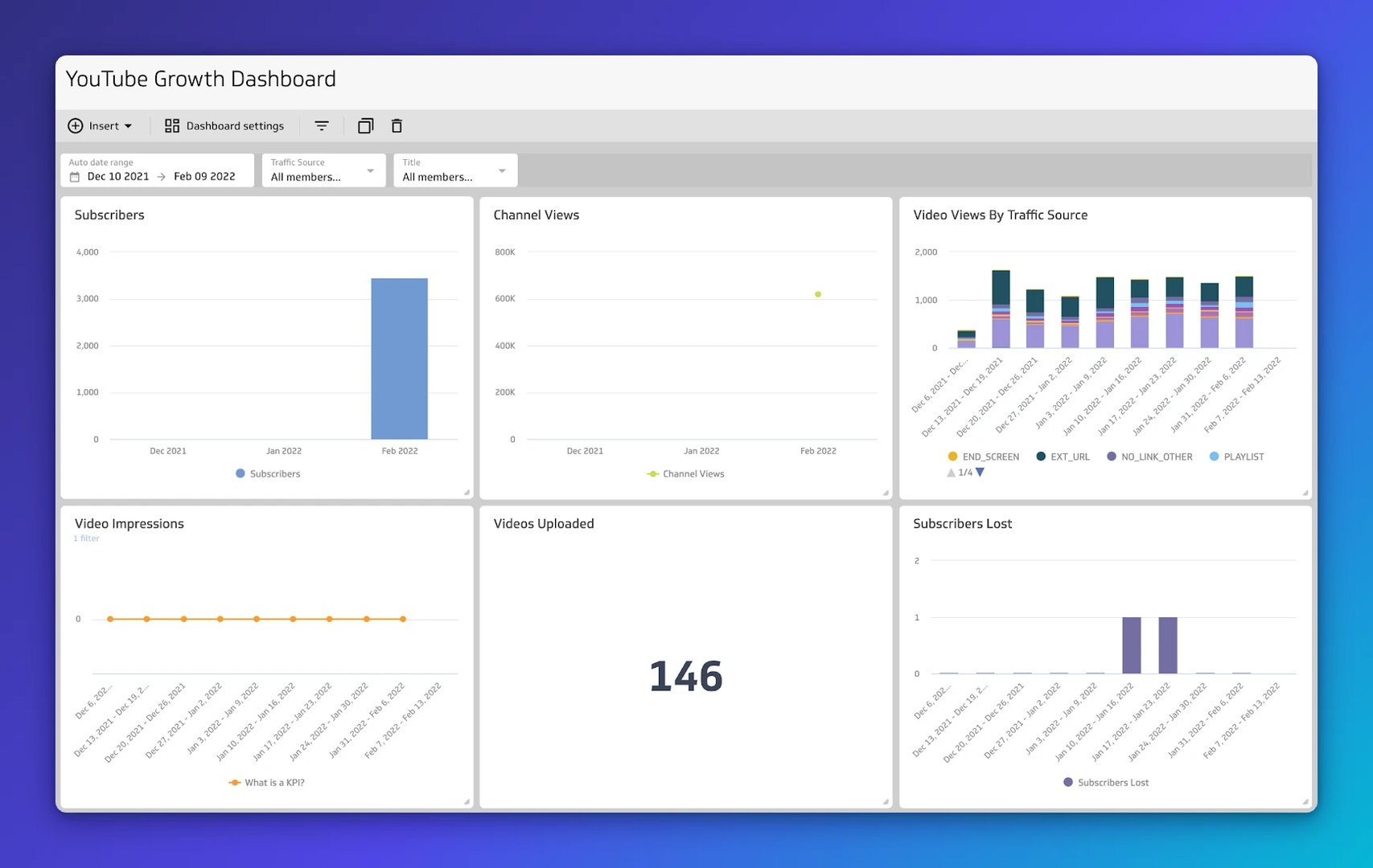
Track your growth
Create a growth view with Subscribers, channel views, and traffic source mix. The questions it should answer:
- How many subscribers do you have, and how fast is that changing?
- Which geographies or sources are driving views?
- Where is momentum coming from?
This keeps your growth efforts focused on what's actually moving the needle.
Why use a YouTube Analytics Dashboard?
The main benefit is shared visibility without shared effort. When your team can check channel performance without logging into YouTube Studio or waiting for someone to pull a report, decisions happen faster and everyone works from the same numbers.
A Klips dashboard gives you that. You choose the right date ranges, the right charts, and the right distribution method: private link, TV mode, PDF, or scheduled email. The numbers are consistent and reliable, not assembled fresh every time someone asks.
That matters especially on a lean team. You shouldn't have to explain your channel's context from scratch every time you want a quick answer. A well-built dashboard surfaces what matters without being asked.
How to build a YouTube Analytics Dashboard in Klips
Connect your data
- Use the YouTube Data API with the Klips REST/URL connector, or pull a prepared CSV or Google Sheet.
- Create data sources for channels, videos, and the analytics endpoints you need.
Design your visuals
- Add Klips for line, bar, summary, and table views.
- Include variables and filters for date range, device, geography, and traffic source.
Share with your team
- Add Klips to a dashboard, arrange, and size.
- Share by private link, TV mode, PDF export, or scheduled email.
Create custom dashboards for you and your team.
Get started with KlipsWhat a strong YouTube Analytics Dashboard gives you
When everyone on your team sees the same numbers, content planning becomes a decision, not a debate. You can run experiments, track what changes, and improve what works, without waiting for someone to pull a report or reconcile two different versions of the data.
That's the real payoff: less time spent figuring out what's happening, more time spent doing something about it.