Software Development Dashboard
Track sprint progress, code quality, and release velocity in one place.
What is a software development dashboard?
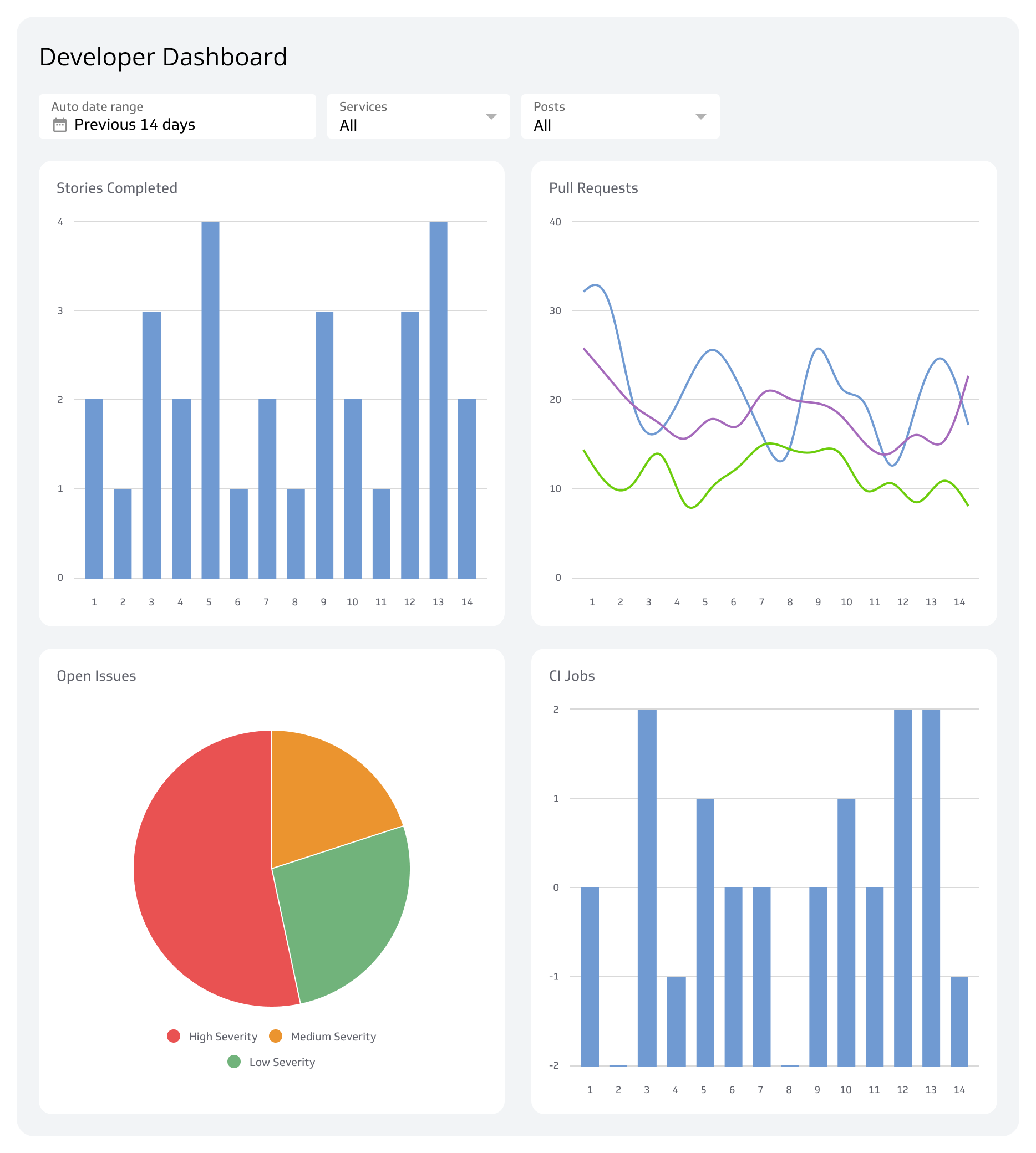
A software development dashboard pulls all your key engineering and project data into one place. Instead of jumping between Jira, GitHub, Bitbucket, and your CI/CD tool, you get a single, real-time view of your team's performance and project health.
This dashboard is built for engineering managers, Scrum Masters, and DevOps teams who need to track project progress, monitor code quality, and align on release schedules. Are we spending too much time on bugs? Is our release pipeline healthy? Are we on track to hit our sprint goals? A Software Development Dashboard answers those questions, so you can ship better code, faster, without waiting for someone to pull a number or paste figures into a spreadsheet.
Relevant KPIs and metrics
Here are the most critical metrics to include on your Software Development Dashboard.
Project Burndown
The Project Burndown chart is your primary progress tracker in an Agile sprint. It shows the amount of work remaining versus the time left.
Why it matters: It gives you an immediate visual answer to "Are we on track?" If the actual line sits consistently above the ideal line, the team is behind schedule and you can act before the sprint ends, not after.
Feature vs. Bug Investment
This metric tracks the ratio of time or effort your team spends on building new features versus fixing bugs or addressing technical debt.
Why it matters: A high bug investment means quality issues are slowing down innovation. A healthy ratio tells you the product is moving forward, not just treading water.
Release Tracker
The Release Tracker provides a high-level view of features in the pipeline, under review, and in progress.
Why it matters: This visualization is built for stakeholders like product managers and executives. It clearly answers "What's coming next?" and "When will that feature be live?" without anyone having to dig through a project board.
Cycle Time
Cycle Time measures the total time it takes for a task to move from "In Progress" to "Done."
Why it matters: Shorter cycle times signal a more responsive team. If cycle times are creeping up, it usually points to bottlenecks in code reviews or testing, and you'll see it before it becomes a release problem.
Deployment Frequency
A core DORA metric, Deployment Frequency tracks how often your team successfully deploys code to production.
Why it matters: This is a direct measure of throughput and CI/CD pipeline health. High-performing teams deploy daily or more, enabling faster iteration and faster delivery of value.
Change Failure Rate (CFR)
Change Failure Rate measures the percentage of deployments that result in a production failure, such as an outage or a required hotfix.
Why it matters: A low Change Failure Rate indicates a reliable development and testing process. A high number is a signal that code is shipping without sufficient quality checks, and that's a problem worth catching on a dashboard rather than in a post-mortem.
Mean Time to Recovery (MTTR)
When a failure happens, Mean Time to Recovery measures the average time it takes to restore service.
Why it matters: A low Mean Time to Recovery means your team has strong monitoring, alerting, and rollback procedures in place. Resilience matters as much as prevention, and this metric keeps both honest.
Create custom dashboards for you and your team.
Get started with KlipsHow to get the most from your Software Development Dashboard
A dashboard is only useful if it drives action. Here's how to make it a central part of your workflow.
Focus on what matters for your stage. Not every metric belongs on every dashboard.
- Startups: Prioritize Sprint Velocity and Deployment Frequency to maximize speed and iteration.
- Growth-stage teams: Balance growth with stability using Feature vs. Bug Investment and Cycle Time to manage technical debt.
- Enterprise teams: Protect revenue and user trust with Change Failure Rate and Mean Time to Recovery as non-negotiable reliability indicators.
Make it visible. Put your dashboard on a screen in the engineering bay. Share a link in your team's Slack or Teams channel. When data is visible and shared, it creates alignment and natural accountability without anyone having to ask for a status update.
Connect all your sources. The real value comes from combining data. Pull metrics from your project management tool (like Jira), your code repository (like GitHub), and your CI/CD tool (like Jenkins). Seeing bug counts alongside Deployment Frequency gives you context you can't get from any single tool. And when those numbers update automatically, you're always working from the current picture, not last week's export.
Building a comprehensive Software Development Dashboard is tough when your data is scattered across platforms. Klipfolio Klips connects directly to services like Jira, GitHub, GitLab, and more, pulling all your key metrics into one automated, easy-to-share dashboard. Keep your team aligned and shipping high-quality code, without the manual work.