Insurance Dashboard
Track claims, premiums, and risk to run a healthier insurance business.
What is an insurance dashboard?
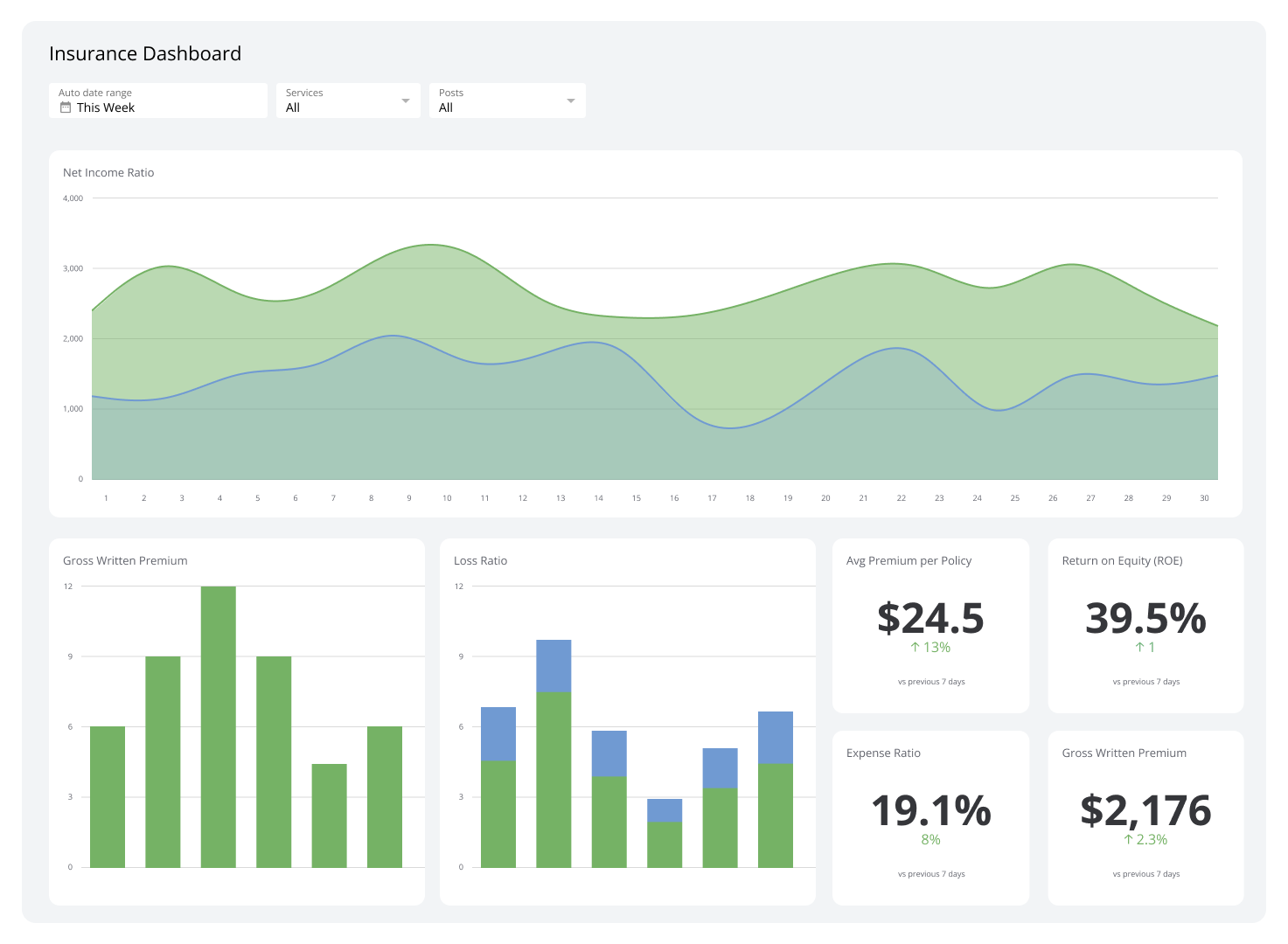
An insurance dashboard brings live data together to track insurance-related metrics and KPIs like claims frequency, net earned premium, expense and loss ratios, and growth. It helps you spot patterns by segment, flag at-risk customers early, improve risk scoring, and tune pricing.
The goal isn't a prettier report. The goal is knowing what's happening across your book of business without having to ask, dig, or wait. When your numbers are current and centralized, you catch problems early, act with confidence, and stop spending time chasing data that should already be in front of you.
Examples of insurance dashboards
Insurance Performance Dashboard
An Insurance Performance Dashboard gives you a clear picture of your company's financial health, operational efficiency, and reputation. It covers metrics related to policy sales, claims processing, risk assessments, and customer retention, so you can improve underwriting and claims management without waiting for someone to pull a number. It can also surface underperforming segments and highlight growth opportunities before they become obvious.
| Who's it for | Insurance executives, underwriters, claims managers, actuaries, sales managers, customer service managers, risk analysts, financial officers |
|---|---|
| How often it's needed | Daily, weekly, monthly, quarterly |
| Covered KPIs | Gross written premium, net income ratio, loss ratio, combined ratio, expense ratio, policy retention rate, claims ratio, new business growth rate, average premium per policy, claims frequency, average claim settlement time, claims severity, underwriting profit margin, investment income, return on equity (ROE), solvency ratio, customer satisfaction score, policy lapse rate, cross-sell ratio, average policy duration, time to quote, quote-to-bind ratio, agent productivity, fraud detection rate, risk-adjusted return on capital (RAROC), reinsurance efficiency, reserve adequacy, premium collection ratio, customer acquisition cost (CAC), lifetime value of a policyholder, claims denial rate, policy renewal rate, underwriting expense ratio, loss adjustment expense ratio, net promoter score (NPS), digital adoption rate, speed of claims processing, policy servicing turnaround time, distribution channel effectiveness, risk exposure by line of business, regulatory compliance score, customer complaint ratio, market share by product line, actuarial accuracy, operational efficiency ratio |
Claims Overview Dashboard
A Claims Overview Dashboard helps you see exactly how your claims operation is performing, without pasting numbers into a spreadsheet or waiting for a weekly report. It tracks settlement rates, highlights trends in claim types and frequencies, and surfaces potential fraud early, so you can act on what's happening now, not what happened last month.
| Who's it for | Claims managers, claims adjusters, underwriters, actuaries, customer service representatives, fraud detection teams, insurance executives |
|---|---|
| How often it's needed | Daily, weekly, monthly, quarterly |
| Covered KPIs | Total number of claims, claims frequency rate, average claim processing time, claims settlement ratio, average cost per claim, claims by type, claims by region, claims approval rate, claims denial rate, claims in process, reopened claims rate, claim cycle time, loss ratio, expense ratio, combined ratio, claims reserves accuracy, subrogation recovery rate, fraudulent claims detected, customer satisfaction with claims process, claims adjuster productivity, time to first contact, claim severity, litigation rate for claims, claims paid within SLA, claims backlog, claims leakage rate, cost per claim, claims handled per adjuster, claims settlement accuracy, fast-track claims ratio, claims reported vs. claims settled, average time to assign adjuster, customer complaints related to claims, claim reserve development, claims expense ratio, total incurred losses, claim closure rate, claims paid to premium ratio, claims automation rate, third-party claims cost, claim escalation rate, NPS for claims process, claims-related customer retention rate |
Create custom dashboards for you and your team.
Get started with KlipsPolicy Administration Dashboard
A Policy Administration Dashboard lets you monitor the efficiency of issuing and renewing policies, track collection rates, and see how policy trends vary across customer demographics. When something slows down, you see it immediately: a bottleneck in policy issuance, a dip in renewal rates, or a compliance gap that needs attention.
The result is faster turnaround times and fewer decisions made on stale information.
| Who's it for | Policy administrators, underwriters, customer service representatives, insurance agents, actuaries, product managers, insurance executives, compliance officers |
|---|---|
| How often it's needed | Daily, weekly, monthly, quarterly |
| Covered KPIs | Total number of active policies, new policy issuance rate, policy renewal rate, policy lapse rate, average premium per policy, policies by type, policies by region, policy modification rate, premium collection rate, time to policy issuance, underwriting accuracy, policy endorsement processing time, customer retention rate, policy cancellation rate, average policy duration, premium growth rate, policy administration expenses, straight-through processing rate, policy servicing turnaround time, cross-sell/upsell rate, policy accuracy rate, customer satisfaction with policy administration, agent productivity in policy management, time to quote, quote-to-bind ratio, policy document delivery time, policy-related customer inquiries, first contact resolution rate for policy queries, policy exception rate, policy backlog, paperless policy adoption rate, policy pricing accuracy, policy-related compliance violations, policy profitability by segment, average time for policy changes, policy-related customer complaints, policy reinstatement rate, policy-related fraud detection rate, policy administration system uptime, policy data quality score, policy-related customer self-service adoption rate, time to process policy claims, policy-related NPS |
Risk Assessment Dashboard
A Risk Assessment Dashboard gives you a clear view of your risk exposure and underwriting performance across product lines, customer segments, and geographic regions. It tracks risk indicators and highlights claims and loss ratio trends, so you can maintain a proper balance between risk and profitability.
When you need to update risk models or introduce new policy exclusions, the data is already there. You're not explaining your business from scratch or waiting for an analyst to run the numbers.
| Who's it for | Underwriters, actuaries, risk managers, claims adjusters, insurance executives, portfolio managers, reinsurance specialists, compliance officers |
|---|---|
| How often it's needed | Daily, weekly, monthly, quarterly |
| Covered KPIs | Total risk exposure, loss ratio, combined ratio, risk-adjusted return on capital (RAROC), probability of default, loss frequency, loss severity, reserve adequacy, underwriting profit margin, claims frequency, average claim cost, policy lapse rate, premium adequacy, risk concentration by geography, risk concentration by line of business, catastrophe exposure, reinsurance utilization, risk-based capital ratio, solvency ratio, technical provisions, credit risk exposure, market risk exposure, operational risk metrics, stress test results, value at risk (VaR), expected shortfall, risk appetite utilization, risk limit breaches, emerging risk indicators, risk-adjusted pricing accuracy, underwriting exceptions rate, claims development patterns, large loss events, risk model performance, risk-based customer segmentation, fraud detection rate, policyholder risk score distribution, risk transfer efficiency, tail value at risk (TVaR), economic capital allocation, scenario analysis outcomes, risk correlation metrics, risk-adjusted profitability by product line, regulatory capital requirements compliance, risk diversification index, risk retention levels, risk mitigation effectiveness, underwriting guideline adherence, risk-based audit findings, risk data quality score, risk reporting timeliness, risk management maturity level, risk culture assessment score |
Fraud Detection Dashboard
A Fraud Detection Dashboard gives you a clear view of suspicious activity across transactions and customer behaviours. It surfaces anomalies and risk indicators in real time, so your team can identify, investigate, and prevent fraud as it happens, not after the fact.
Catching fraud early protects your customers, your reserves, and your reputation.
| Who's it for | Fraud analysts, risk managers, compliance officers, security teams, financial controllers, customer service managers, IT security specialists, legal teams, senior management |
|---|---|
| How often it's needed | Real-time, daily, weekly, monthly |
| Covered KPIs | Total number of fraud attempts, fraud detection rate, false positive rate, fraud loss amount, fraud prevention savings, average time to detect fraud, average time to resolve fraud cases, number of high-risk transactions, fraud by transaction type, fraud by geographic location, fraud by customer segment, fraud by product/service, number of blocked accounts, number of suspicious activity reports (SARs) filed, fraud pattern identification rate, rule effectiveness score, machine learning model accuracy, fraud investigation backlog, customer fraud complaints, identity verification success rate, account takeover attempts, chargeback rate, fraud-related customer churn rate, fraud ring detection rate, emerging fraud trend indicators, cross-channel fraud correlation, employee fraud incidents, third-party fraud incidents, fraud loss recovery rate, fraud prevention ROI, compliance violation rate, anti-money laundering (AML) alerts, know your customer (KYC) compliance rate, fraud risk score distribution, behavioral biometrics anomalies, device fingerprinting matches, IP risk assessment, transaction velocity alerts, fraud detection system uptime, fraud analyst productivity, fraud case resolution time, fraud prevention training completion rate, fraud awareness campaign effectiveness, fraud policy violation incidents, fraud detection algorithm performance, fraud data quality score, fraud reporting accuracy, fraud risk assessment frequency, fraud control effectiveness, fraud mitigation strategy success rate |
Agent/Broker Performance Dashboard
An Agent/Broker Performance Dashboard shows you how your agents and brokers are performing across every metric that matters: cross-selling success, policy renewal rates, customer retention, and revenue against target. It pulls from multiple sources so you have one consistent view, not a patchwork of app-specific reports.
When you know which strategies are working and where performance is slipping, coaching and resource decisions become straightforward.
| Who's it for | Agency owners, branch managers, team leaders, individual agents/brokers, compliance officers, training and development teams, marketing managers |
|---|---|
| How often it's needed | Daily, weekly, monthly, quarterly, annually |
| Covered KPIs | Total premiums written, policy retention rate, new business acquisition, cross-selling success rate, average policy size, loss ratio, commission income, number of policies sold, customer satisfaction score, lead conversion rate, quote-to-bind ratio, average time to close, policy renewal rate, claims ratio, upsell rate, customer lifetime value, NPS, average revenue per customer, sales pipeline value, lead response time, policy accuracy rate, compliance score, continuing education credits earned, client contact frequency, referral generation rate, market share growth, profitability per client, average premium per policy, policy cancellation rate, time to first appointment, social media engagement metrics, website traffic from agent/broker efforts, customer onboarding time, underwriting submission quality, policy diversification index, client retention cost, time spent on administrative tasks vs. selling, number of cross-department collaborations, client education initiatives conducted, technology adoption rate, customer self-service usage rate, speed of claims processing involvement, number of high-value client acquisitions, client portfolio risk assessment accuracy, number of policy adjustments/endorsements, seasonal performance variations, performance relative to agency/brokerage goals, team collaboration effectiveness, client feedback implementation rate |
Overtime Report Dashboard
An Overtime Report Dashboard tracks the frequency, duration, and cost of overtime across departments and roles. It gives HR managers, finance teams, and operations leaders the visibility they need to act quickly on scheduling issues and plan more effectively over time.
When overtime is concentrated in one team or spiking during claims peaks, you see it immediately and can respond before it affects productivity or morale.
| Who's it for | Human resources managers, department heads, operations managers, finance teams, compliance officers, executive leadership, team supervisors, payroll managers |
|---|---|
| How often it's needed | Daily, weekly, monthly, quarterly |
| Covered KPIs | Total overtime hours, overtime costs, overtime percentage of total work hours, overtime by department, overtime by job role, overtime by employee, average overtime hours per employee, overtime trend analysis, overtime cost as a percentage of total labor cost, overtime hours distribution (weekday vs. weekend), seasonal overtime patterns, overtime approval rate, overtime reason categories, overtime impact on productivity, overtime-related errors or quality issues, compliance with labour laws and regulations, overtime budget variance, overtime vs. hiring new staff cost analysis, overtime impact on employee satisfaction, overtime correlation with absenteeism, overtime correlation with turnover rates, claims processing overtime, customer service overtime, underwriting overtime, IT support overtime, overtime during peak periods, overtime reduction initiatives effectiveness, overtime vs. regular time productivity comparison, overtime impact on employee health and safety, overtime forecasting accuracy, overtime policy adherence rate, overtime-related grievances or complaints, overtime impact on project timelines, overtime distribution equity among employees, overtime correlation with customer satisfaction scores, overtime-related training hours, overtime impact on employee work-life balance, overtime authorization process efficiency, overtime reporting accuracy and timeliness |
Create custom dashboards for you and your team.
Get started with KlipsPut your insurance metrics to work
Insurance dashboards give you a reliable, up-to-date picture of your company's performance, risk levels, and operational efficiency across policy management, claims processing, fraud detection, and agent performance. When the numbers are consistent and always current, you spend less time chasing data and more time acting on it.
Klips brings your essential insurance metrics into one place, connected to your sources and distributed the way your team works. Start a free Klips trial.