
Summary - Balancing deadlines and quality can be challenging. Burndown charts are a useful tool to help teams focus, meet deadlines, and improve quality.
No one likes deadlines, and in an ideal world, time would not be a constraint.
But reality (and stakeholders) demands that software projects be ready for release by a specific date. So for agile teams, the question that follows is: How can you manage a successful software release, despite the time constraints, while keeping the quality high and your team happy?
The burndown chart is one of my favourite tools for managing agile software releases with deadlines.
In this blog, I’ll describe our recent experience managing releases using burndown charts, from early planning phases all the way to the finish line.
I’ll also discuss some of the patterns you need to look out for in burndown charts to make effective use of them.
Note: All charts in this post are from Youtrack, the issue tracking tool we use.
What is a burndown chart, and what does it show?
Simply put, a burndown chart is a graphic expression of the work that remains to be done on a given project, and the time left to do it in.
Work is expressed on the vertical axis, and time on the horizontal axis. As time progresses, the work left to be done should decrease until it reaches zero, ideally right on the planned release date.
The chart is useful because it shows how much work should be completed by a specific date in order to meet the release deadline (the ideal burn rate), and it compares that with the work that has actually been done (the actual burn rate), so that at any given time you can tell how things are progressing, and whether or not you are on track.
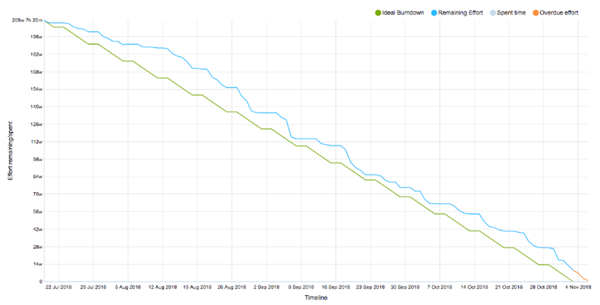
A typical burndown chart looks similar to this example below:
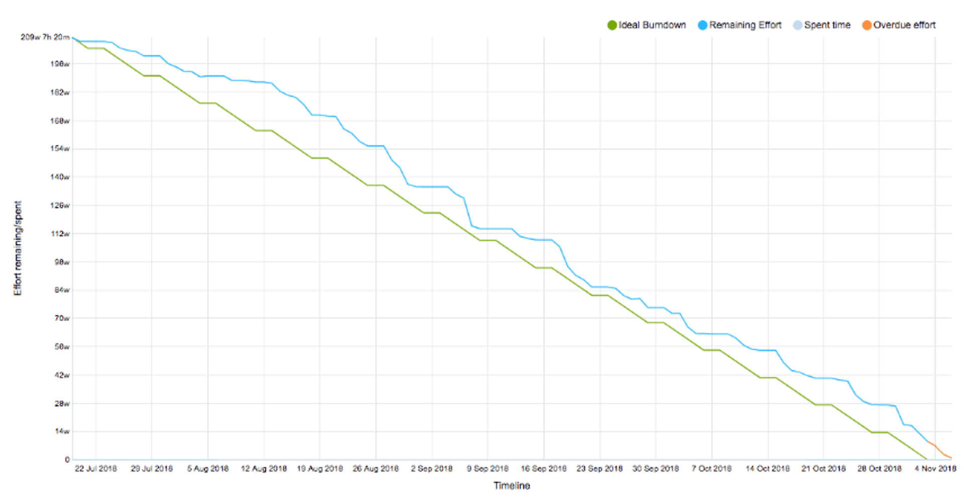
The above chart is a real example from one of our releases. As you can see, the team had a good consistent burn rate. There was some increase in the scope early in the release (the bump in the blue line) and the team was a bit late (orange overdue line) in delivering the release.
You can tell a lot about a team’s behaviour by looking at their burndown chart.
6 ways burndown charts help your team
Burndown charts are good at helping agile teams with several important elements:
- Identifying the right target date for project completion
- Setting expectations and managing up
- Focussing the project by containing releases and preventing scope creep
- Deducing team behaviours and managing the team
- Managing multiple teams at the macro level
- Continuously monitoring the release and managing the to-do list (backlog)
How we used burndown charts to manage a release
1. Identifying the right target date and setting expectations
Let’s start at the beginning, and the planning phase, using as an example a project we recently worked on.
In this case, we were asked to deliver a set of features on a specific date. The project had already started, and fortunately, we had enough information on how fast work was progressing (our velocity or the burn rate) to be able to conclude that there was no way we were going to be able to deliver by the date that had been requested. In fact, if we had agreed to the original date, we would have missed the target by more than two months! (The distance between the blue and green lines shows how off-track the projection is from the ideal rate.)
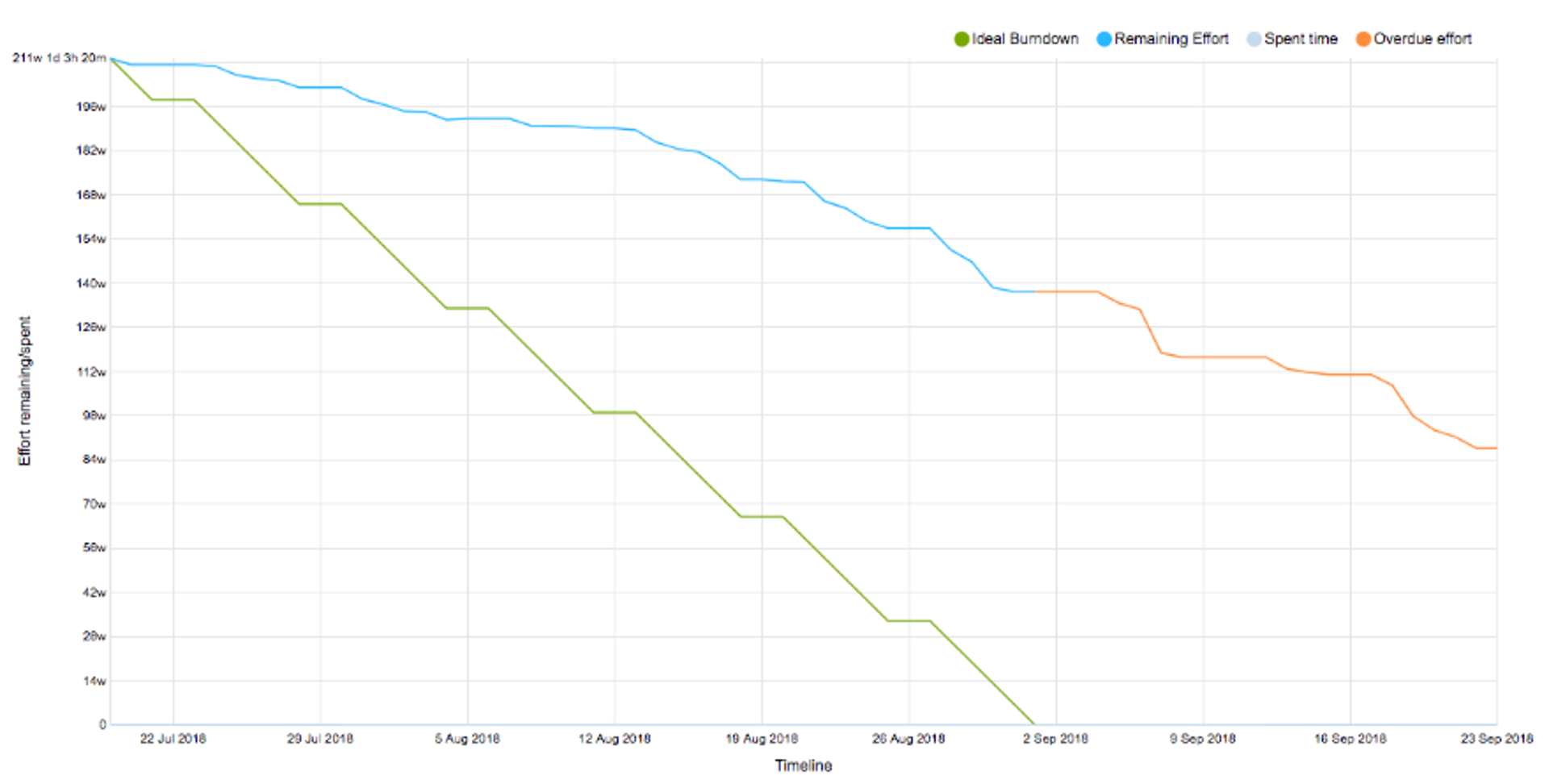
We used the information we had about actual burn rates to create a few burndown charts with different targets. This helped us choose a more reasonable target for project completion, which happened to be about two months later than the original ask.
During the process of creating new charts, having the data and being able to clearly visualize why the original target date would not work was very helpful. It allowed us to set the right expectations with the senior management, and move the date.
2. Adjusting the project scope, preventing scope creep & bringing focus to the table
With every release, there is usually an initial scope, decided at a high level.
As teams define the user stories at a greater level of granularity, new user stories are discovered, and scope and estimates start to grow.
Burndown charts can make this issue very visible.
As the charts are updated, this pattern becomes visible and you can keep an eye on things to make sure you don’t have a massive increase in the scope of the project that will prevent delivery by the agreed-upon due date.
This information allows you to focus the teams on the agreed-upon deliverables and, as mentioned previously, avoid scope creep.
You can see an example of the phenomenon in the following chart. There is a slight bump in the blue line early in the release cycle.
This is exactly what happened in our release. The burndown chart made the issue very visible. If we had continued to add to the backlog, the blue line would have continued to grow further away from the green line and we wouldn’t have hit the release date. Being able to see to see this problem early on helped us drop some of the features from the backlog, and plan them for future releases.
Observe team behaviours & manage multiple teams
We often use two levels of burndown charts.
The first, at a high level, covers the entire release to-do list (backlog) that all teams are working on.
The second, at a team level, covers each team's portion of the work.
These two charts are both very valuable... The first one shows the overall progress on the release, while the second set shows how specific teams are doing and can shed light on their behaviour.
Further, the second set of burndown charts can help identify teams that are overloaded and are in danger of burning out from pulling all-nighters to finish their work.
Personally, I find this to be a good approach for managing multiple teams at a macro level, while leaving the details of their backlogs up to them.
The patterns to look for when examining team burndown charts:
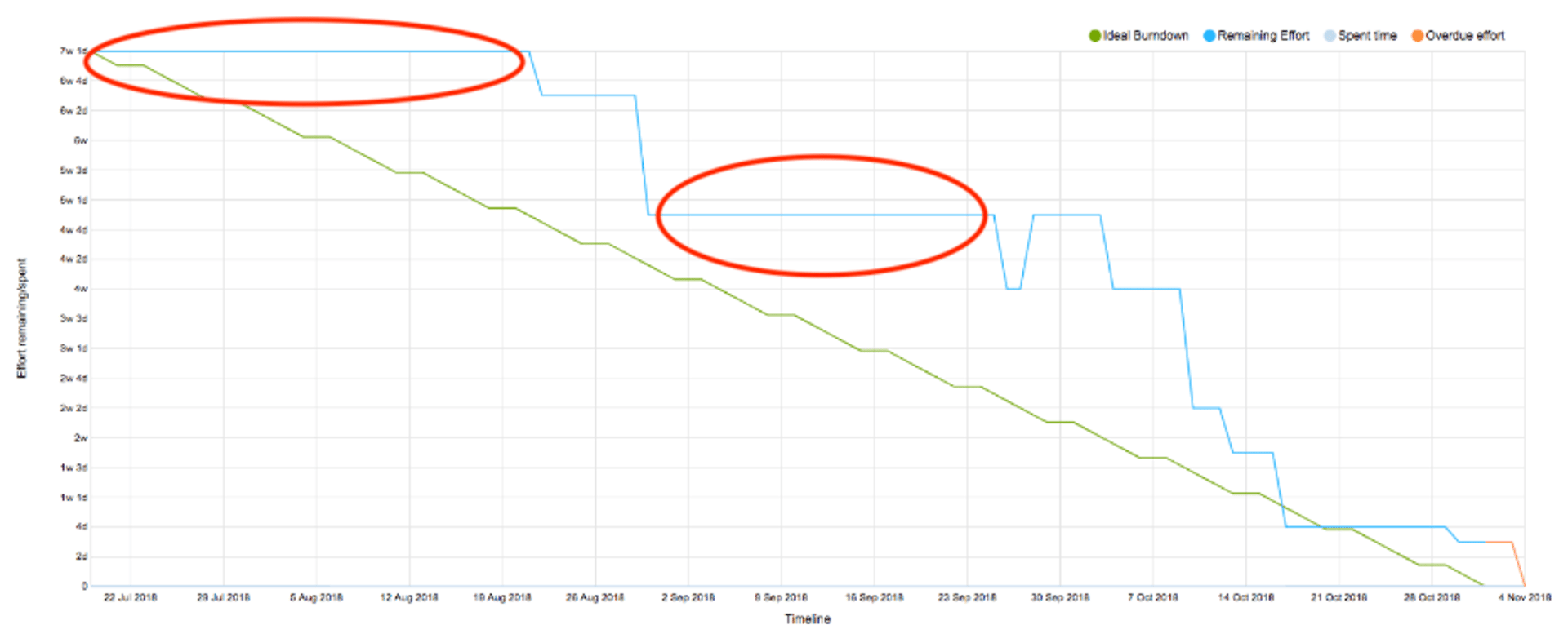
The straight lines depicted in the above chart show times of no progress.
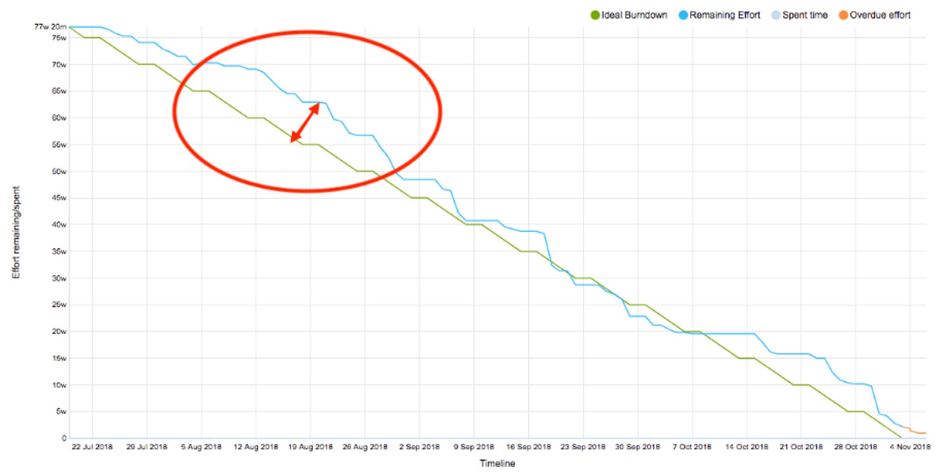
The discrepancy between the blue and green lines - the blue bump - shows potential scope creep or team slow-down.
This particular chart shows the progress towards the project release to be much faster than expected. This ideal/actual rate discrepancy does not always indicate something positive, such as teams being surprisingly efficient in their effort. It can also be due to estimation padding or a lack of enough work for the team, showing the potential for resource reallocation to help other teams.
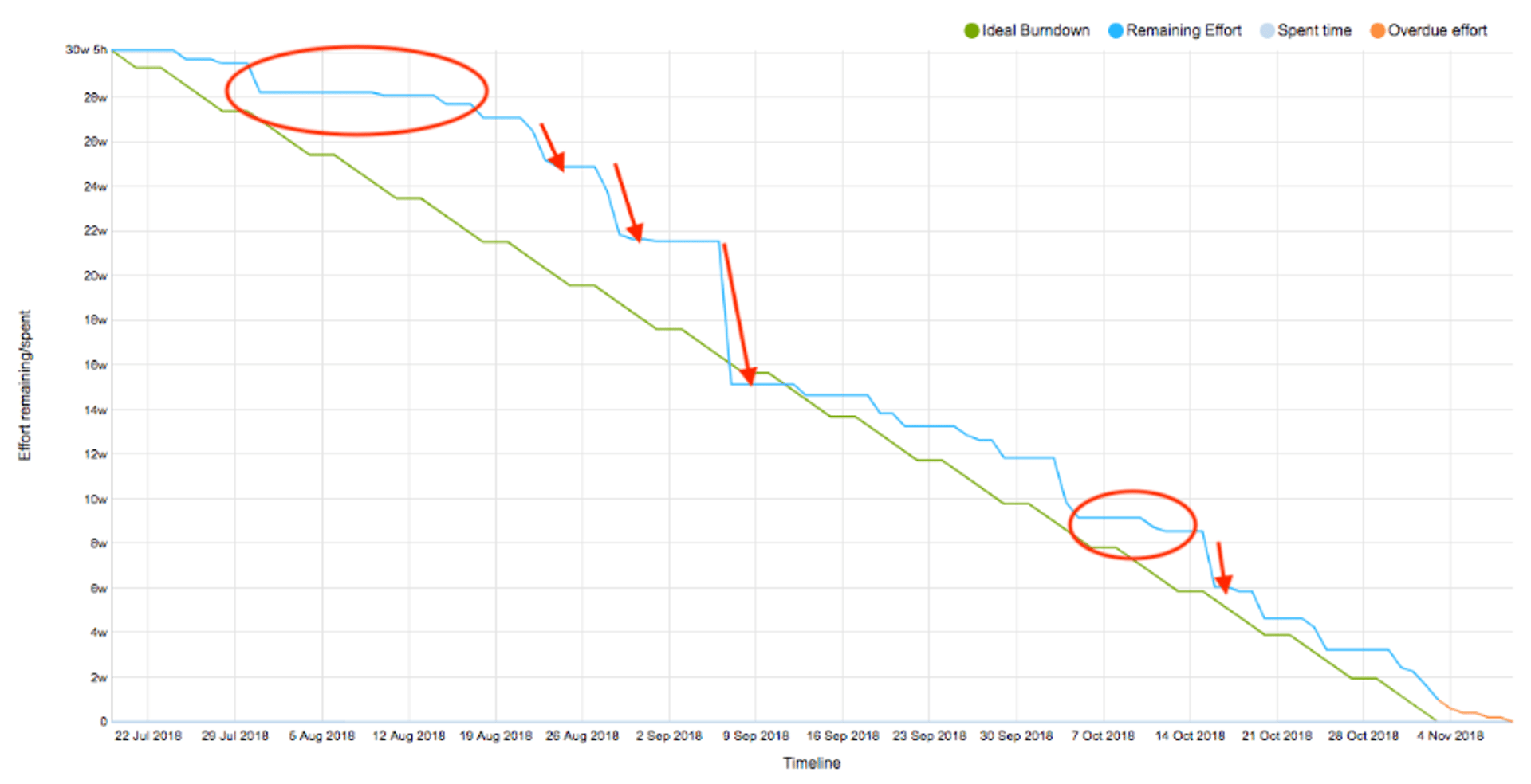
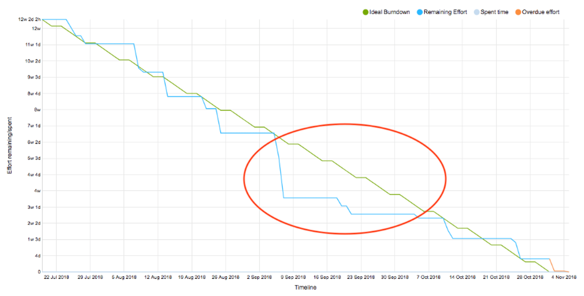
The final pattern to look for indicates the potential use of long-running feature branches. As shown in the chart, this looks like a horizontal line(no progress) followed by a cliff in the blue line.
While the patterns in the first three charts are clear, I’d like to drill down into this fourth example a little bit. As you see on the above chart, the team was not making good progress for a while, and then all of a sudden it seemed to have caught up with expectations.
Why is that?
We don’t consider work done until it’s released on production. What happened here is the team was actually making progress on a long-running feature branch (a code branch that is created in version control for a work item and lives for a long time before it’s merged back into the master branch). But because the work had not been broken down into smaller shippable increments and was not being released, it appeared as if progress was stalled.
I’d like to address the idea of why long-running feature branches are a terrible idea in another blog post. But for now, the takeaway message is this: When you see this pattern, risk is building up in the release. My advice is to break down the large features into small increments and deliver those increments continuously to production behind a feature switch.
Continuously monitoring the release & managing the backlog
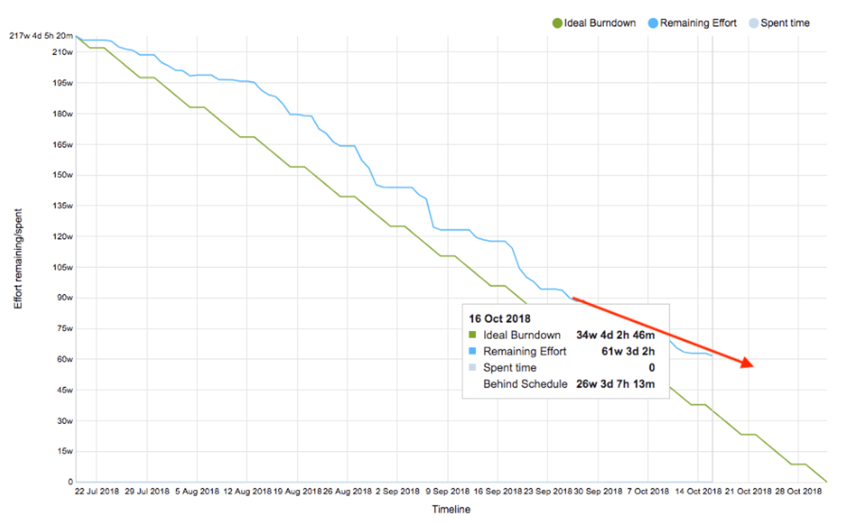
Burndown helps you know where you are with the release at any given moment, but it’s up to you to decide what to do with that information.
For instance, there were a few times during a recent release when we noticed the burn rate was trending in the wrong direction. (See the following chart.)
We drilled down into various teams’ backlogs to see which team was contributing to the delay. By managing their backlog, adjusting the scope of the project, reallocating resources and dropping certain features, we managed to put the release back on track.
A final word about managing burndown charts
To be effective, the charts have to be created and kept up to date. The best approach is to use automated reporting that is integrated with your issue tracking tool. In our case we use Youtrack.
That’s a job for the team leaders – both the person leading the project as a whole, and the team’s scrum masters if each team needs a chart.
And the charts have to set realistic goals for work completed over time. That requires a certain amount of experience. Expectations have to be realistic. Making sure technical specs are in place for your changes will greatly help set realistic expectations.
The charts also have to be accessible to anyone who has an interest in the project. That includes senior managers who want to keep track of how the project is advancing overall, and team members who want to be able to see how they are doing – as well as check the progress of other teams working on the same project whose work may affect theirs.
We often open up the charts in our weekly scrum of scrums meeting, where scrum masters from all teams get together to review progress and address risks and dependencies.
Used correctly, burndown charts are an effective tool for delivering projects on time. That keeps senior management happy, while keeping work teams efficient and focused. It also prevents crazy all-nighters and team burnouts as people strive to hit the release date.
- Ali Pourshahid, PhD, is the VP of Software Developement at Klipfolio. He can be reached at @ali_pourshadid.
- Jeremy Hall is a Software Development Manager at Klipfolio. He can be reached at jhall@klipfolio.com.