

Summary - Free comes at a price. A paid service like Klipfolio has a lot more to offer.
As a data and dashboard company, Cervino Marketing has built and deployed countless Klipfolio dashboards in the last five years and currently manages over 200 Klipfolio dashboards for it’s clients. After the introduction of Google Data Studio (mid 2016) we expected demand to change, from Klipfolio (a paid solution) to Data Studio (free to use), but the demand has been limited.
If you are wondering why that is, here’s my answer: free comes at a price. A paid service like Klipfolio has a lot more to offer. Depending on your needs you can choose your preferred dashboard tool.
Based on our experience with both Data Studio and Klipfolio, we can give some advice on which tool to choose.
If you are looking for a quick and dirty way to show some key metrics (likely coming from a Google Sheet) in a good but not really fancy looking dashboard, Data Studio is a decent choice.
But if you are looking for a more professional looking and more advanced dashboard, Klipfolio is still the better option. And that’s not an easy thing to achieve if you think about the difference in size and available budgets between the two companies.
Klipfolio VS Data Studio
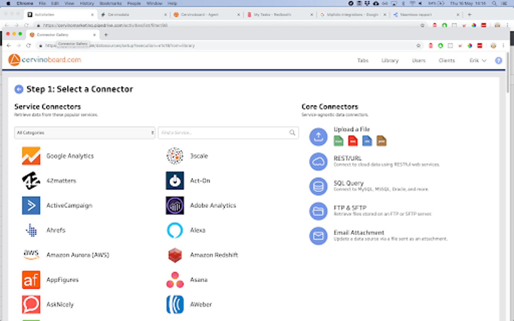
Connecting your data
Klipfolio offers over 400 native integrations with other platforms (including our Cervinodata integration). Data Studio only has 18. Although Data Studio does offer a ‘Data Studio community connector’ with 138 partner connectors, many of those connectors are for the same channel (for example, there are 18 Facebook Ads connectors).
Even if the number of connectors grows in Data Studio, it is still much easier to get data into Klipfolio. In particular the core connectors (see the screenshot below) offer a variety of easy ways to get your data in.
Data mashups
Both Data Studio and Klipfolio provide the option to combine multiple data sources in one visualization.
So, when is it necessary to mashup your data sources? If data stored in different places (like Salesforce and Google Adwords) need to be combined in one graph or table (like a graph that shows how your ad spend has affected customer acquisition). As mentioned earlier, with Klifpolio you can connect to hundreds of different data sources which allows for more mashup options.
If you need to combine many data sources into one data source (for example, all of the analytics views for your 20+ websites) it helps to clean up the data before connecting it to a reporting tool. Tools like Supermetrics or Cervinodata can help with this.
Visualizing your data
Snap-to-grid/responsiveness
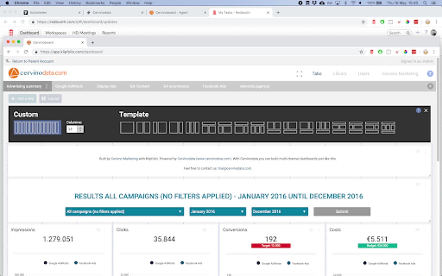
Both Data Studio and Klipfolio offer ways to make their visualizations snap-to-grid, but again, Klipfolio makes it easier to do this. With Klipfolio’s Layout Grid feature it’s easy to choose from a multitude of predefined grids, but you can also define the amount of columns you need. Klipfolio also helps you align vertically by showing guidelines (like in Powerpoint).
Data Studio offers the option to define canvas size in pixels, and a grid with tiny squares to align your visualizations on, but they are harder to use. Also, there is an “align” option in Data Studio, but clicking the wrong alignment (horizontal instead of vertical, for instance) will mess up your dashboard configuration. It still works, but it’s just not as user friendly as Klipfolio.
One key thing Data Studio is missing is responsiveness. Klipfolio will scale seamlessly from desktop to TV screen to tablet. Data Studio will force you to zoom in or out or type Command + or - in order to adjust your view.
TV screen mode
It is possible to show a Data Studio dashboard on a TV screen but showing multiple pages in a carousel is not an easy thing to set up.
In Klipfolio, you can us the Full Screen Mode feature and press play. You can also adjust the time each page is shown before moving to the next page.
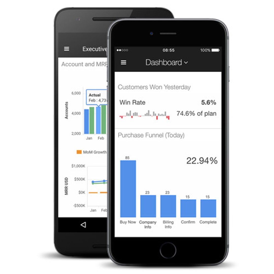
Mobile app
If you wish to see your performance on the go, Klipfolio offers a mobile app version. It is recommended that if you want to look at your data on the Klipfolio mobile app, that you make and test a separate mobile-friendly dashboard in the editor.
Data Studio is only available on desktop.
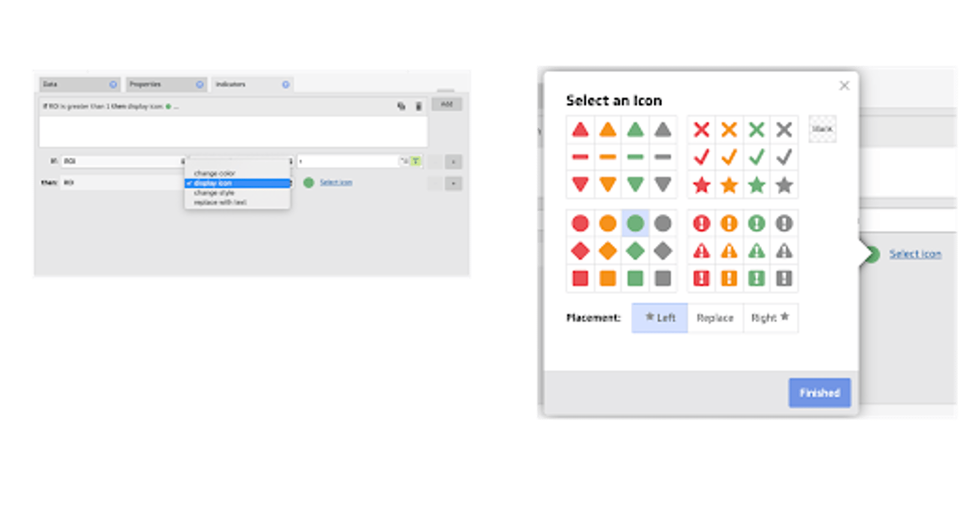
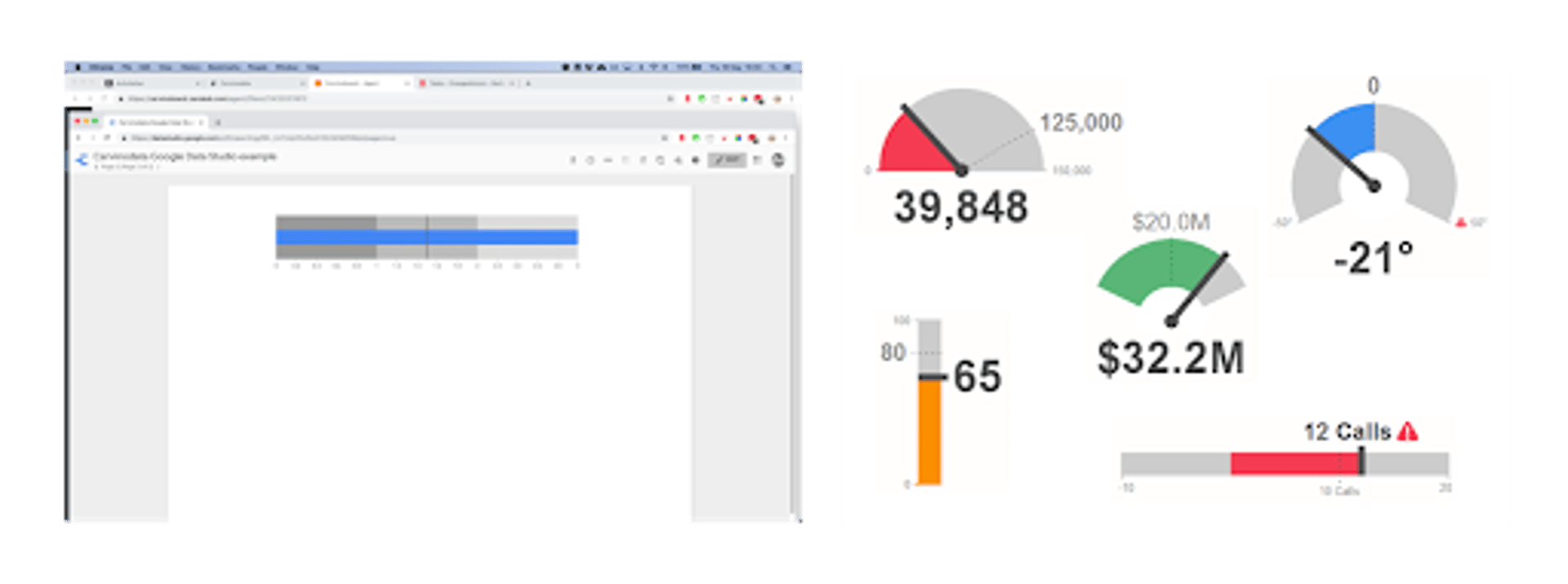
Indicators
One big use case for metric monitoring in a dashboard is to highlight the key metrics that need your attention (see an example in the image below). Klipfolio offers various types of indicators. Data Studio does not.
If the out of the box indicators are not enough, it is possible to enhance your indicators using the custom style sheet, something we do for most of our clients. Here is a list of live examples.
CSS/Stylesheets
We use the style sheet feature in Klipfolio to customize the designs of most of the dashboards we deploy and maintain. The CSS style sheet is handy because you can fully customize the design to fit your needs and make multiple changes at once. Take, for example, an online agency that manages 30 dashboards for 30 different clients. You can change the CSS in one place and, voila, the font size or color is changed in all your dashboards.
One other cool thing about the Klipfolio CSS is that you can also change the way the headers and navigation menu looks to match your brand guidelines.
In Data Studio it is possible to use and re-use a reporting template, but it��’s not easy to change the styling in all the dashboards at once.
Types of visualization
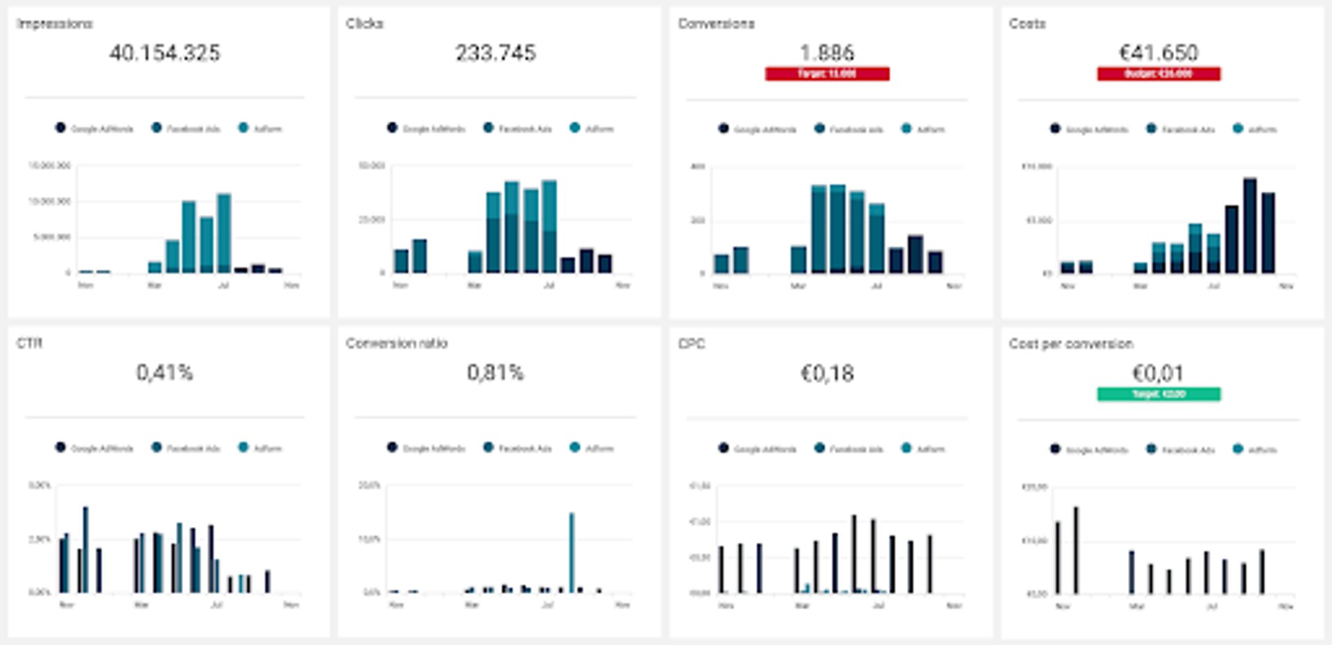
Beyond the basic visualizations like tables, bar charts, line graphs, etc. that both Data Studio and Klipfolio deliver, Klipfolio offers a few additional visualizations that we think are essential: gauge charts and mini charts within a table.
Data Studio offers one alternate version of gauge charts: the bullet chart, but its customization is limited. Klipfolio offers the same visualization, but with dynamic ranges that can change color if a threshold is reached (it works similar to an indicator). Klipfolio also offers the bullet chart as part of a table, which is awesome.
Deploy and manage dashboards at scale
API connection for scalable deployment & management
For more advanced users and larger organizations with development capacity, Klipfolio is very powerful. It allows you to basically change every element in Klipfolio while maintaining its automation. This ranges from copy/pasting a dashboard into another client and replacing the content of a data source with the right data, to changing the roles of many users at once.
In Klipfolio you can even replace a complete dashboard page (tab) with a newer version. For example, if you decide you want to add the data of the previous period to a couple of graphs, but you have 30 clients with the same dashboard, you would go crazy if you had to do this one-by-one. With the Klipfolio API you can just copy/past. It’s that simple!
SSO, domain aliasing, etc.
Both Data Studio and Klipfolio offer ways to embed a dashboard, but again, Klipfolio is far more advanced in this functionality. With SSO (Single Sign-On), you can create dashboards that are seamlessly integrated within other platforms, where users get to see only what they need to see, depending on their permissions in Klipfolio.
Another nice feature is domain aliasing. Klipfolio allows you to create your own url (for example, dashboard.yourcompany.com) to give your users or clients a better brand experience.
Our verdict: Klipfolio is more powerful and flexible compared to Data Studio
Data Studio is great for your basic dashboarding requirements, whereas Klipfolio is a well rounded, robust solution.
Klipfolio is easy to edit and scale, and the API capabilities are second to none in its category.
Klipfolio is here to stay as a client offering in our company.
Be sure to check out Klipfolio’s new PowerMetrics feature that was recently introduced.
