

4 types of dashboards: Operational, analytical, strategic & tactical
Dashboards turn raw data into decisions. This guide covers the four types of dashboards (operational, strategic, analytical, and tactical), how to choose the right one for your reporting needs, and best practices for dashboard design, including data visualizations, audience considerations, and key metrics to track.

Dashboards turn raw data into decisions. They gather information from across your business and present it in one place, so you always know what's happening, what's working, and where to act.
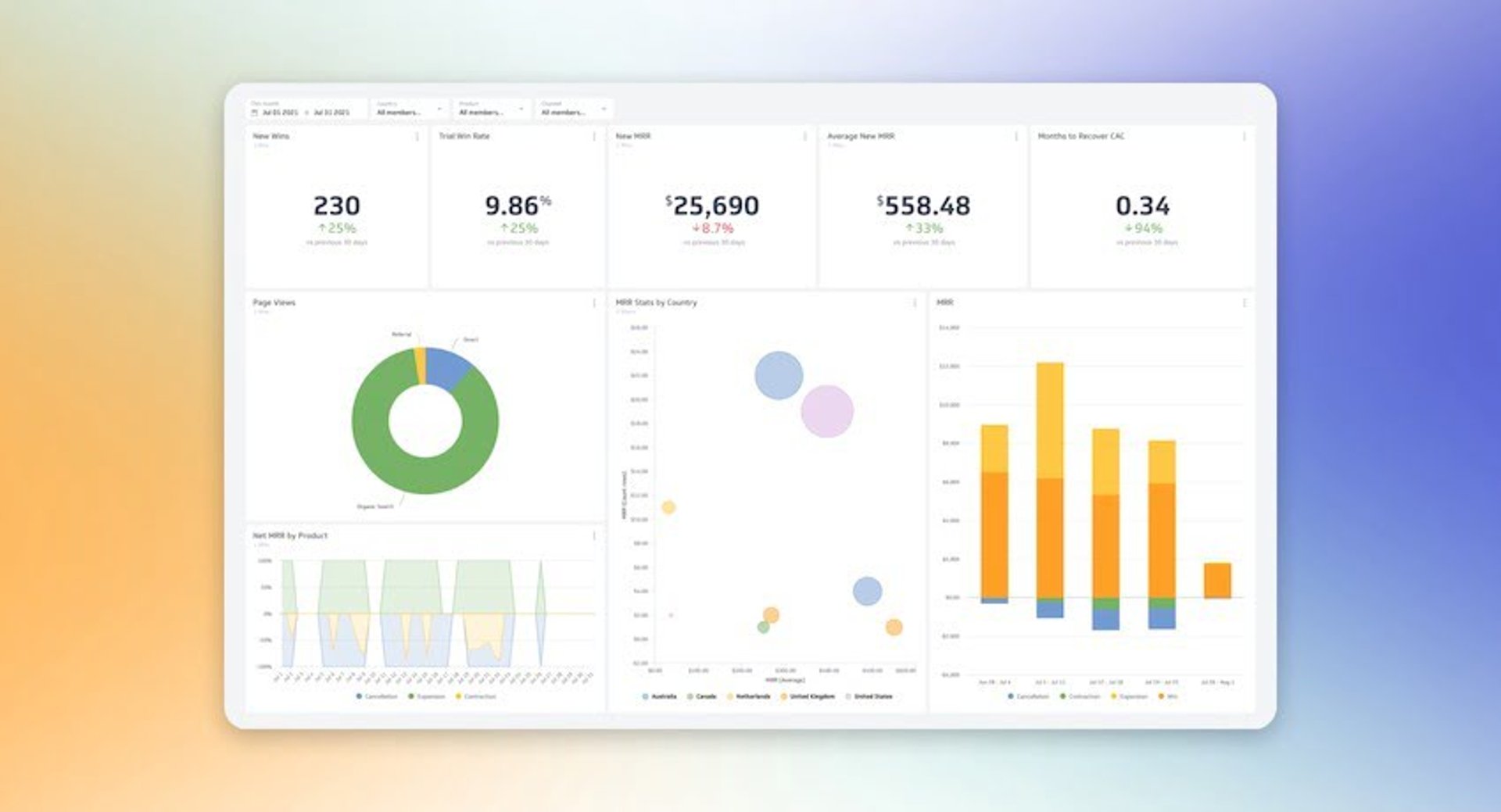
What is a dashboard?
A dashboard is an information management tool used to track business KPIs, metrics, and key data points relevant to your business, department, or a specific process. Dashboards collect and visualize data from multiple sources, such as databases, locally hosted files, and web services. With a dashboard, you can monitor performance through historical trends, actionable data, and real-time information.
Businesses run on dozens of interconnected processes. With data flowing in from every direction, extracting what actually matters can feel impossible. BI tools like dashboards cut through the noise. They simplify data analysis and distribution so you can make smarter, faster decisions without waiting for someone to pull a number or paste figures into a spreadsheet.
A well-designed dashboard also keeps everyone aligned. Whether your team is tracking campaign performance, new wins, or churn rate, a dashboard brings your metrics together in one place so the whole organization is working from the same picture.
What's the difference between a dashboard and a report?
Dashboards and reports both provide historical data and bring multiple metrics together. The difference is in how they work:
Reports are static. They share information on known areas of interest at a point in time.
Dashboards are interactive. They monitor those same areas with live, dynamically updated data.
Why are dashboards important to business?
Dashboards give you clarity without the manual effort. Instead of logging into multiple tools or sorting through spreadsheets, you see the metrics that matter, updated automatically, in one place.
That clarity has real value at every level of your organization. Your marketing team can track website performance and conversion rates. Your sales team can monitor opportunities in real time. Founders and executives can get a holistic view of company growth without waiting for a weekly update or a manually assembled slide deck.
Dashboards also support data democracy. When the right information is accessible to everyone, decisions improve across the board, not just at the top.
Why do I need a dashboard?
When used effectively, dashboards can significantly change how your organization operates. Here are three reasons to invest in one.
1. Get more value out of your data
Data is one of the most valuable assets your organization has, but only if people can understand it and act on it. A well-designed dashboard makes that possible. It surfaces the information that matters, presents it clearly, and gives everyone the context to make better decisions without needing to dig.
2. Consolidate and automate multiple data points
Dashboards bring different types of information together on a single interface. You no longer have to log into multiple services or open a dozen spreadsheets. With Klips, you can connect your data sources in a few clicks and let the dashboard do the work of keeping everything current.
3. Align teams and departments
When everyone sees the same numbers, conversations shift from debating the data to deciding what to do about it. Dashboards give your teams a shared, unbiased view of performance. Tools like TV dashboards take that further, displaying key metrics on a screen in your office so the whole team stays focused on what matters.
The ultimate dashboard feature: Data visualizations
Choosing the right data visualization is one of the most important decisions in dashboard design. The right visual makes a trend obvious at a glance. The wrong one buries it.
Before picking a visualization type, ask what question you want the viewer to answer. That determines everything else.
There are three common types of data visualizations in dashboard design:
Tables
Line charts
Bar charts
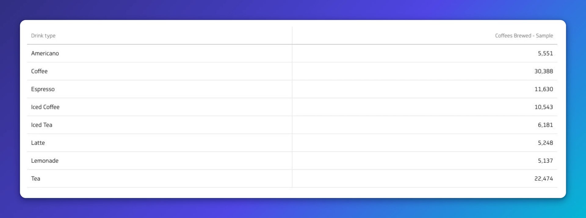
Tables
Tables arrange data in columns and rows and can include small charts or trend lines. They're best for comparison and structured analysis.
Use a table to:
Show data that fits a two-way layout, like categories and values
Break down large data sets into smaller, more understandable parts
Don't use a table to:
- Display large volumes of data, as it quickly becomes hard to read
Best practices for table visualizations
Organize your data clearly. Start with labels, categories, and numbers, then add graphics.
Keep it concise. Aim for no more than 10 rows to avoid overwhelming the viewer.
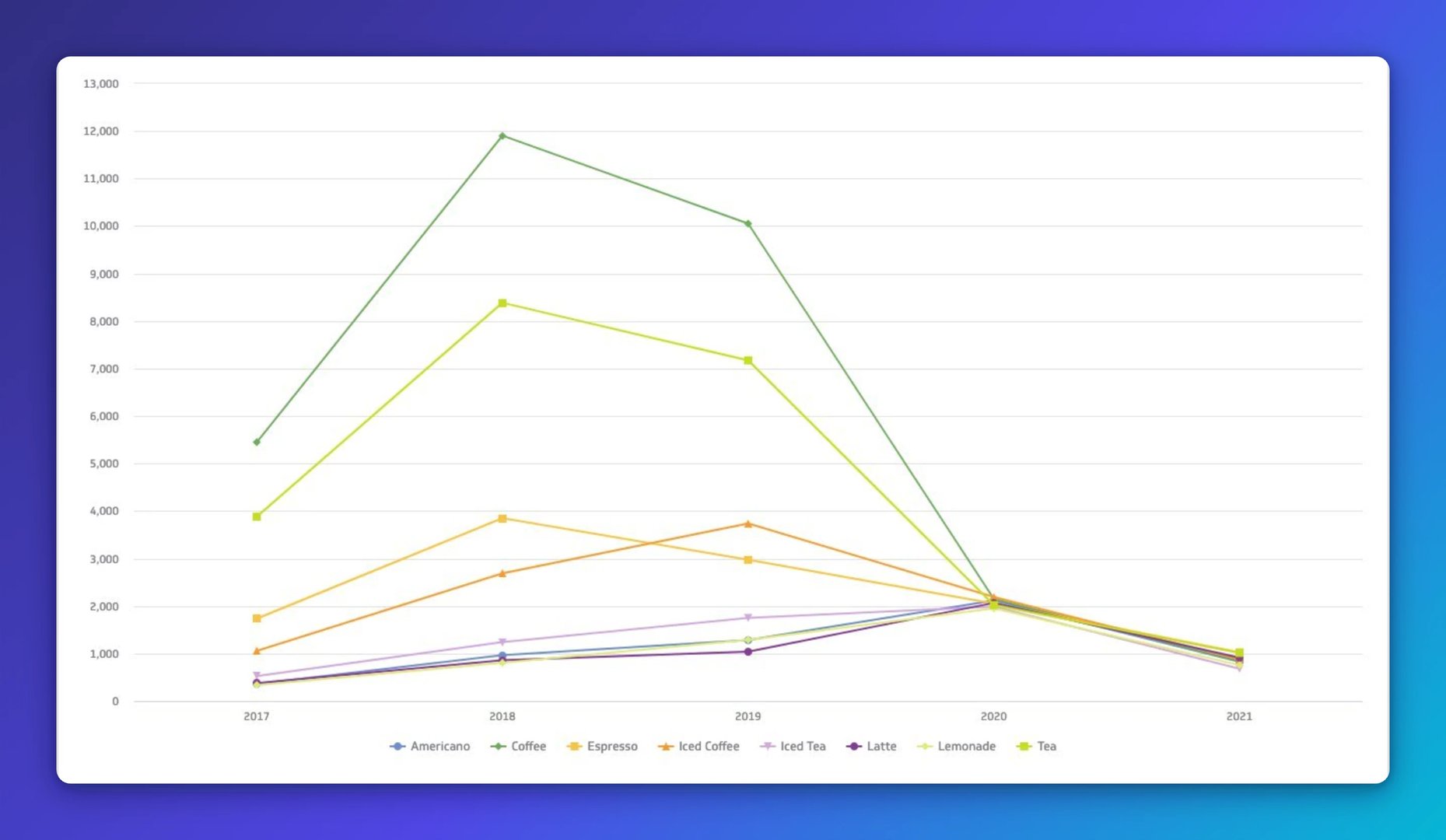
Line chart
Line charts show how values change over time. Their simple format makes trends easy to spot. Multiple lines let you compare related variables side by side.
Use a line chart to:
Understand trends, patterns, and changes in your data over time
Compare different but related data sets
Predict future trends based on historical movement
Don't use a line chart to:
- Get an in-depth view of individual data points, since line charts are best for general trends
Best practices for line chart visualizations
Use distinct colours for each category and solid lines to keep the chart readable.
Limit comparisons to four categories or fewer to avoid visual clutter.
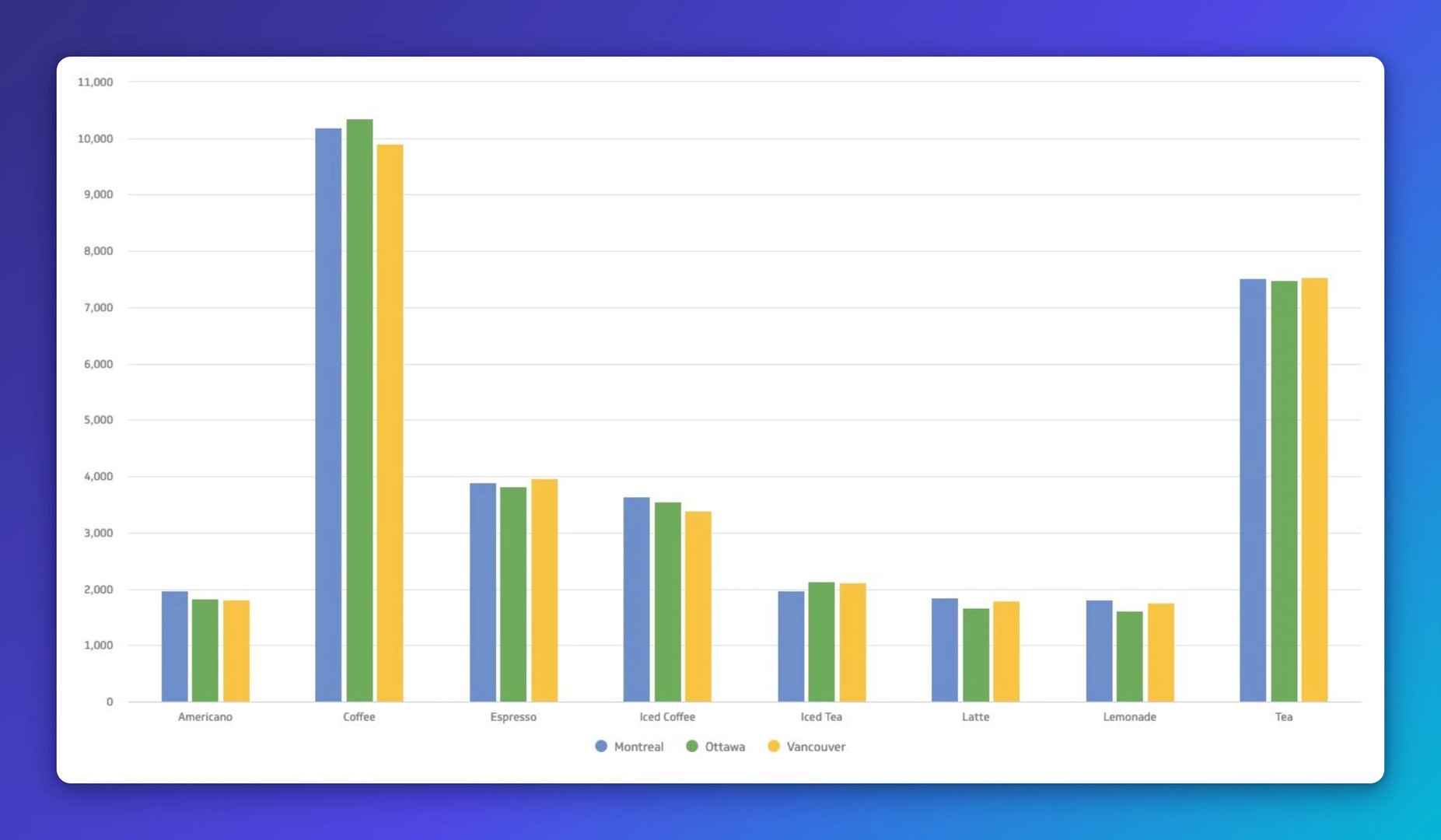
Bar chart
Bar charts use rectangular bars to show differences between variables or data sets. They're one of the most versatile and widely understood visualization types.
Use a bar chart to:
Compare two or more values in the same category
Show how parts contribute to a whole
Compare up to 10 groups for the best viewing experience
Understand relationships between different data sets
Don't use a bar chart to:
Show a single value in a category
Display data that changes continuously over time
Create custom dashboards for you and your team.
Get started with KlipsBest practices for bar chart visualizations
Keep colours and labels consistent throughout so relationships are easy to identify.
Start the y-axis at 0 for accurate, consistent data presentation.
To go deeper on visualization types and when to use them, read our guide to data visualizations.
Types of dashboards
There are four types of dashboards: operational, strategic, analytical, and tactical. Each one answers a different question and serves a different audience.
In summary:
Operational dashboards tell you what is happening right now
Strategic dashboards track key performance indicators against long-term goals
Analytical dashboards process data to identify trends and inform targets
Tactical dashboards offer detailed insights into short-term projects and departmental goals
What is an operational dashboard?
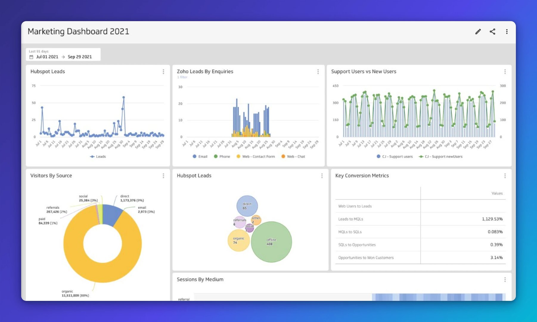
An operational dashboard monitors real-time or near-real-time data against key metrics and KPIs, such as sales performance and inventory levels. It updates frequently, sometimes to the minute, so front-line workers, supervisors, and team leads always know where things stand.
Operational dashboards are built for daily use. They surface what's happening now so your team can respond without waiting for a report or chasing down a number.
Metrics you can track on an operational dashboard
Website performance metrics like new users or bounce rate
Follower count or comments across your social media channels
Return on ad spend to track the effectiveness of your advertising spend
What is a strategic dashboard?
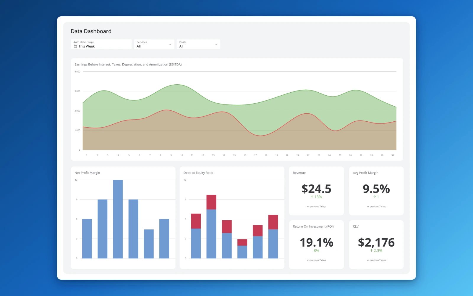
A strategic dashboard monitors the status of KPIs related to overall business performance, including market position and financial health. It updates less frequently than an operational dashboard because it focuses on long-term trends and objectives.
Executives and senior leaders use strategic dashboards to review progress on ongoing priorities and confirm that day-to-day activity is moving in the right direction. Monthly, quarterly, and annual reviews give you the bigger picture and the confidence to forecast and plan.
Metrics you can track on a strategic dashboard
Monthly, quarterly, or yearly fiscal performance
Account and MRR growth rate
Earnings before interest, tax, depreciation, and amortization (EBITDA)
What is an analytical dashboard?
An analytical dashboard helps you make sense of large volumes of data. Users can assess trends, predict outcomes, and set targets based on historical patterns, without needing a data analyst to interpret the results for them.
Analytical dashboards used to require specialist expertise to build and maintain. Modern dashboard tools have changed that. Today, marketers, founders, and executives can build and share analytical dashboards without writing a line of code.
Metrics you can track on an analytical dashboard
Annual contract value to understand what an average customer contract is worth
The Bessemer Efficiency Score to track company spending habits
Daily active user growth rate over a defined period
What is a tactical dashboard?
A tactical dashboard bridges strategic planning and daily operations. It provides real-time or near-real-time data to support decisions that affect short-term goals, specific projects, and departmental targets.
Where a strategic dashboard shows the destination and an operational dashboard shows today's activity, a tactical dashboard tracks the route, including status, costs, and progress against milestones.
Metrics you can track on a tactical dashboard
Milestones reached to track the status of ongoing projects
Sales targets or production efficiency and other department-specific KPIs
Machine uptime and employee productivity to monitor resource utilization
Use all four dashboard types together
Each dashboard type answers a different question. Together, they give you full visibility across your business, from the long-term strategy down to what's happening on the floor right now.
Learn more about dashboard design and what makes a dashboard genuinely effective in our guide to dashboard design.
How to choose the right dashboard based on business reporting requirements
The table below maps common reporting questions to the dashboard type best suited to answer them.
| What question are you looking to answer? | Best fit: Operational | Best fit: Strategic | Best fit: Analytical |
|---|---|---|---|
| What problem are we trying to solve? | Increased data awareness and access to time-sensitive data | Line of sight into top-line organizational KPIs | Access to trends or deeper insights |
| Who will use the dashboards? | Managers and their teams | Directors and executives | Analysts and executives |
| What gaps exist in our performance? | Daily performance | Monthly, quarterly performance | Performance issues, weekly performance |
| What are our goals? | Increased employee awareness and tracking against goals | Setting strategic goals, achieving KPI targets | Setting analytics goals and increased visibility into key processes |
How to choose the right dashboard based on technical reporting requirements
These questions help you match a dashboard type to your data infrastructure and latency needs.
| What question are you looking to answer? | Best fit: Operational | Best fit: Strategic | Best fit: Analytical |
|---|---|---|---|
| What is the state of our data infrastructure? | Web APIs, databases, spreadsheets | Web APIs, databases, spreadsheets, data warehouse | Data warehouse, database |
| What are the data latency requirements? | Low-latency, time-sensitive, real-time | Incremental updates needed for accurate, right-time information | High latency, accurate data |
| How many data sources are we pulling our data from? | Multiple systems and applications to improve visibility | Multiple data sources within a single dashboard or set of visualizations | Multiple data sources within a single dashboard or set of visualizations |
Dashboard design tips to get you started
A great dashboard is not just visually clean. It gives the right people the right information at the right time, without making them work for it. Here are five strategies to help you build one that actually gets used.
1. Design your dashboard with your audience in mind
Start by defining who will use the dashboard and how. An executive checking in weekly needs something different from a team lead monitoring daily activity. The audience determines the metrics you show, the level of detail you include, and even the device the dashboard will be viewed on, whether that's a browser, a mobile screen, or a TV dashboard in the office.
The best dashboard gives the viewer what they need to know and nothing more. Clarity is the goal.
2. Identify your key metrics
Start with the problem you're trying to solve. That focus will tell you which metrics belong on the dashboard and which ones are noise. If you're not sure where to start, MetricHQ is a free library of metrics and KPIs you can browse by category or data source.
3. Consider user context
Think about the situation in which the dashboard will be viewed. An executive may want a compact layout with simple, high-level visuals. An analyst may want to drill deeper with more detailed breakdowns. The visualization style should match what the viewer needs to do with the information.
User context shapes whether a dashboard actually gets used. The data has to be readable at a glance for the person looking at it.
4. Design for immediate action
A dashboard should prompt a response, whether that's recognizing a win or flagging a problem that needs attention. Use a simple colour scheme, limit the number of symbols, and remove anything that doesn't help the viewer decide or act. The easier the dashboard is to read, the faster people can respond.
5. Test, evaluate, and tweak
Collect feedback from the people who use the dashboard regularly. Their experience will tell you what's working, what's confusing, and what's missing. Adjust accordingly. A dashboard that improves over time is far more valuable than one that's perfect on launch day and never touched again.
Build dashboards that keep your team moving
The right dashboard type depends on the question you need answered. Operational dashboards keep your team on top of daily activity. Strategic dashboards give leaders confidence in the direction. Analytical dashboards surface the trends that inform better decisions. Tactical dashboards close the gap between strategy and execution.
Klips connects to 130+ data sources, refreshes automatically, and distributes your dashboards however your team needs them, from browser to TV to scheduled email. You get reliable numbers without the manual effort, and your team gets the clarity to act.
Updated 2026-09-01



Most recent
- SEP 25What SOC 2 taught a small team about trust
- SEP 15The AI race: progress, humanity, and trust
- SEP 9The good advisor
- AUG 11Beyond simple sign-ups: how True Trials and Activation predict growth
- JUL 7Why business leaders miss important trends in their dashboards
- JUN 19The best chart for the job: Visualizing data for non-technical users