
Summary - Non-technical executives don't need less data — they need clearer data. This post covers the best chart types for trends, comparisons, funnels, and flow, and explains why decision-first design is the difference between a dashboard that drives action and one that collects dust.
The best chart for the job: visualizing data that non-technical users actually understand
I've worked with hundreds of builders and analysts over the years. Smart people. People who care deeply about their data and want to share it clearly. And almost all of them make the same mistake.
They build dashboards for themselves.
They add most of the metrics they track, every dimension they slice, every comparison they find interesting. The result is a wall of numbers that tells a technically complete story — and a practically useless one. The executive who opens it spends 45 seconds looking confused, then closes the tab and asks someone to "just send a summary."
Sound familiar?
The problem isn't the data. The problem is the visualization. Specifically, choosing the wrong chart for the wrong audience.
Here's what I've learned: non-technical users don't need less information. They need clearer information. And the difference between a dashboard that drives decisions and one that collects dust usually comes down to a handful of choices about how you present what you know.
Why simplicity isn't dumbing it down
There's a temptation to equate simplicity with a lack of rigour. That's backwards.
Stripping a dashboard down to its essential signal is harder than adding more. It requires you to understand your data well enough to decide what matters — and to have the confidence to leave the rest out.
Non-technical executives aren't unsophisticated. They're busy. They're making decisions across many domains simultaneously. What they need from a dashboard is fast orientation: what's happening, whether it's good or bad, and what (if anything) needs their attention.
The "eight-second rule" is real. If someone can't orient themselves to a dashboard in eight seconds, they won't use it. That's not a user problem. That's a design problem.
The right chart for trends and patterns
If you want someone to understand trajectory — whether a metric is improving, declining, or holding steady — a line chart is almost always your best option.
Line charts are intuitive. People understand them immediately because they mirror how we think about time: left to right, past to present.
A few things that make line charts dramatically more useful:
- Add a target or threshold line. A revenue line by itself tells you what happened. A revenue line with a target tells you whether what happened is acceptable.
- Use a moving average. Daily data is noisy. A 7-day or 30-day moving average smooths out the volatility and reveals the real trend underneath.
- Limit the series. One or two lines per chart. Three is pushing it. More than that and the chart stops communicating.
Sparklines — tiny inline line charts — are worth knowing about too. They're useful when you want to show trend direction for many metrics at once without dedicating a full chart to each one.

Comparisons: give numbers context
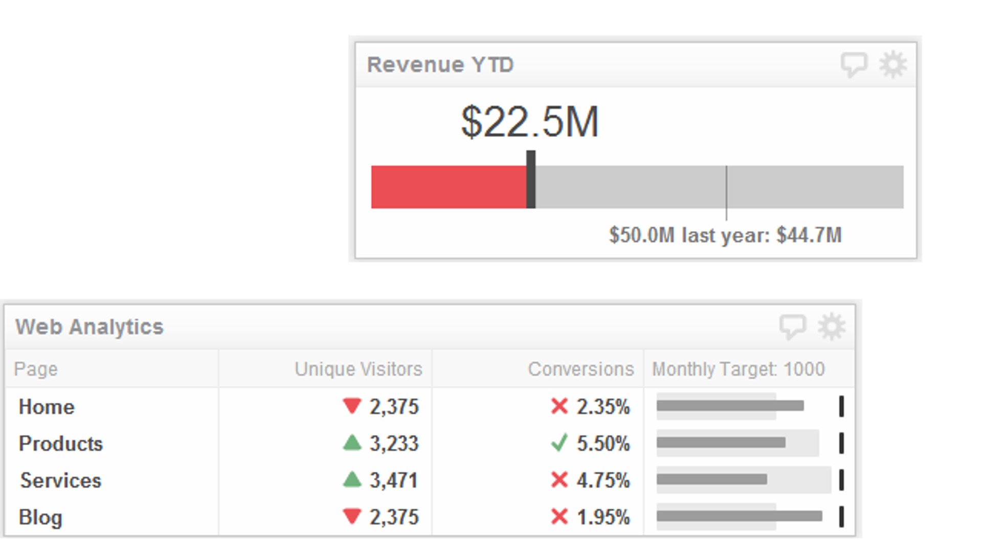
A number without context is almost meaningless. $2.3M in revenue this quarter — is that good? You can't answer that without a reference point.
Bullet graphs are underused and genuinely excellent for this. They show a single measure (say, quarterly revenue) against a target and a qualitative range (below target, on target, above target) in a compact format. One bullet graph communicates what would otherwise take a table, a bar chart, and a written annotation.
Stacked bar charts work well when you need to show how a total breaks down across categories — and how that breakdown changes over time. They're more complex than a simple bar chart, so use them only when the composition story matters.
The rule I follow: if a comparison chart requires a legend with more than three items, it's probably doing too much.
Showing what moved the needle: waterfall charts
This is one of the most underused chart types in business dashboards, and it's a shame.
A waterfall chart shows how a starting value was affected by a series of positive and negative contributions to arrive at an ending value. Think: "We started the quarter with $1.8M in pipeline. New deals added $600K. Churned deals removed $200K. We ended with $2.2M."

That story is almost impossible to tell with a bar chart or table. A waterfall chart makes it obvious at a glance.
For any metric where the why behind the change matters as much as the change itself, a waterfall chart is worth building.
Funnels and flow: where are you losing people?
If you track any kind of pipeline — sales, marketing, onboarding, support — you need a way to show where volume drops off.
A funnel chart is the standard choice. It works well for linear, sequential processes where each stage feeds the next.
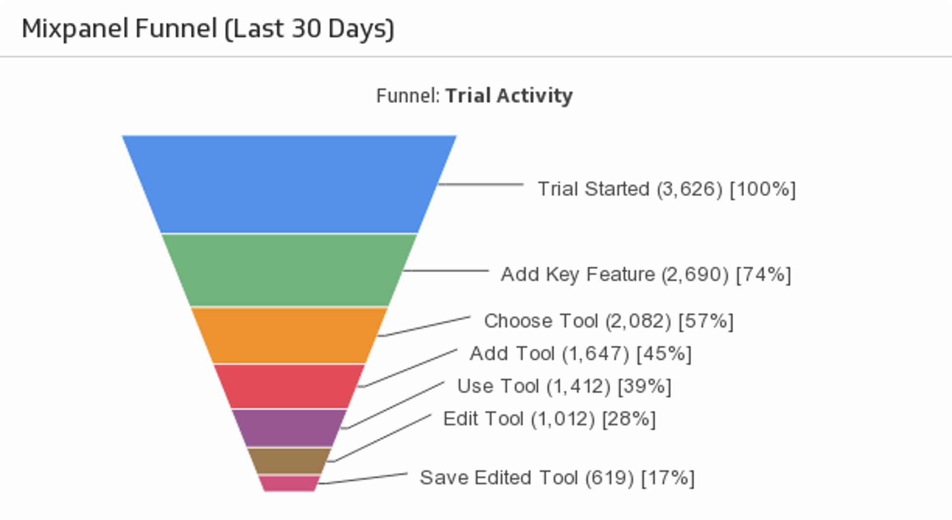
For more complex flows — where users or deals can move between multiple states, or where you want to show volume proportionally at each step — a Sankey diagram is worth considering. Sankey diagrams are more visually complex, so reserve them for audiences who'll engage with the detail. For most executive dashboards, a clean funnel chart with stage-by-stage conversion rates does the job.
The principle behind all of it: decision-first design
Every chart choice should start with the same question: what decision does this help someone make?
If you can't answer that, the chart probably shouldn't be on the dashboard.
Decision-first design means:
- Lead with the headline, not the data. If a metric is off-track, say so in the title. "Revenue below target by 12%" is more useful than "Monthly Revenue."
- Use colour with intent. Red for bad, green for good, grey for context. Don't use colour decoratively.
- Limit the metrics on any single dashboard. Five to seven KPIs is usually the right range for an executive view. More than that and nothing gets attention.
- Annotate. A spike in traffic on a specific date means nothing without context. A note that says "Email campaign launched" turns noise into signal.
What I tell every builder
When someone shows me a dashboard they've built and asks why their executives aren't engaging with it, I ask them one question: "Can you tell me, in one sentence, what this dashboard is for?"
If the answer is "it shows all our key metrics," that's the problem.
The most effective dashboards I've seen are almost boring in their simplicity. A handful of charts. Clear labels. Obvious colour coding. They don't try to show everything — they try to answer one question clearly.
That discipline is hard to maintain. There's always pressure to add more, to justify the investment in data infrastructure by showing how much you're tracking. Resist it.
Your job as a builder isn't to display data. It's to create clarity. The right chart, used well, does that. A wall of charts, however technically impressive, doesn't.
Start with the decision. Work backwards to the visual. Keep it simple enough that someone can understand it in eight seconds.
That's the whole game.
Want to see these principles in action? Klips makes it straightforward to build clean, focused dashboards that connect to your data sources and get shared the way your team actually works. Explore Klips.
