
Why business leaders miss important trends in their dashboards
Business leaders often miss critical trends in their dashboards not because of bad data, but because of poor design, data overload, slow refresh rates, aggregated metrics that hide the real story, and a lack of team training. This post breaks down the six most common reasons dashboards fail to surface important signals — and gives practical steps to fix each one.
You've built the dashboard. You've connected the data. And yet, somehow, the trend slipped past you — again.
It happens more than most leaders admit. A sales dip that looked like noise. A churn signal buried under a monthly average. A cost spike that only became obvious after it had already done damage. The dashboard was there. It just didn't tell you what you needed to know, when you needed to know it.
This isn't a data problem. It's a design, habit, and prioritization problem — and it's fixable.
Here's why business leaders consistently miss important trends in their dashboards, and what to do about it.
The dashboard paradox: more data, less clarity
A pattern shows up constantly with growing businesses: leaders invest time building dashboards, populate them with every metric they can think of, and walk away feeling like they've solved their reporting problem.
They haven't. They've created a new one.
When a dashboard tries to show everything, it effectively shows nothing. The human brain isn't built to scan 40 metrics and identify which two actually matter right now. You end up with a reporting surface that looks comprehensive but functions as wallpaper — something you glance at without actually seeing.
The fix isn't more data. It's ruthless prioritization. A well-designed dashboard should surface the five to seven KPIs most directly tied to your current business goals and make anomalies impossible to ignore. That's the version that earns a place in your morning routine.
What you should do: Before your next dashboard review, ask yourself: "If I could only track three metrics this month, which three would tell me the most about business health?" Start there, and build outward only when you have a clear reason to.
Real-time vs. historical: the lag problem
Most traditional dashboards are rear-view mirrors. They show you what happened — last week, last month, last quarter — which is useful for pattern recognition but useless for catching problems as they emerge.
If your dashboard refreshes once a day, or once a week, you're always operating on stale information. A sudden drop in conversion rate on Tuesday morning won't show up in your weekly report until Friday, by which point you've lost four days of revenue.
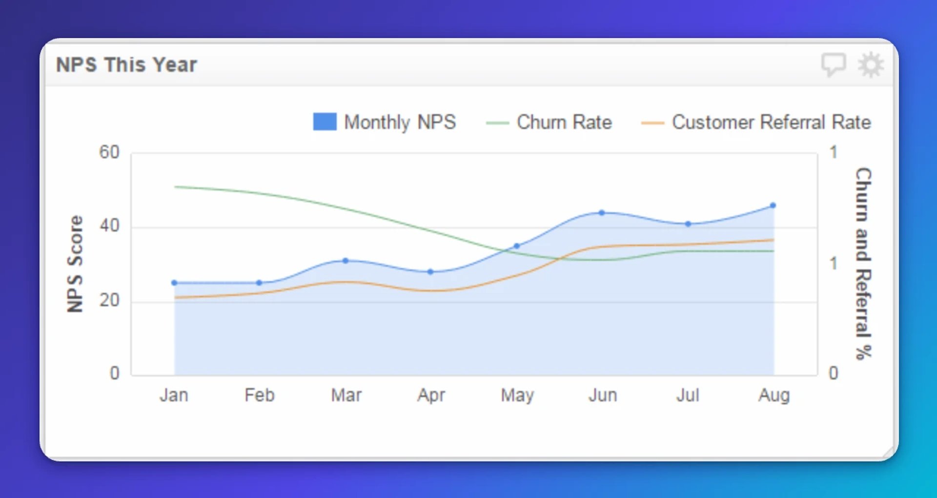
The businesses that catch trends early are the ones running dashboards with frequent, automated data refreshes. Real-time data refresh changes how you respond. Instead of discovering a problem in a meeting, you see it as it develops and act before it compounds. That's the difference between a dashboard you check and one that keeps you ahead.
What you should do: Audit your current refresh rates. If your most critical metrics — revenue, pipeline, customer churn signals — are updating less than once per hour, that's a gap worth closing. Klips supports refresh rates from one minute to 24 hours, so you can match cadence to consequence.
Averages lie: why aggregated data hides the real story
This one is subtle, and it catches a lot of smart leaders off guard.
Averages flatten reality. If your customer satisfaction score averages 4.2 out of 5 across all regions, that number feels reassuring. But it might be masking a 2.8 score in one market that's about to churn a significant customer segment.
The same applies to uptime, conversion rates, delivery times, and almost any metric you track at scale. Aggregated data gives you a comfortable headline that conceals uncomfortable details. Pasting those averages into a chat tool and asking for a summary won't surface what's hidden underneath — the problem is upstream, in how the data is structured and displayed.
Granular data — broken down by region, product line, customer segment, sales rep, or time period — is where the real signals live. It's harder to look at, and it takes more dashboard real estate to display, but it's the difference between managing your business and understanding it.
What you should do: For every key metric on your dashboard, ask: "What would this look like broken down by segment?" If the segments tell a different story than the aggregate, you've found a trend worth investigating.
Create custom dashboards for you and your team.
Get started with KlipsDesign and cognitive load: when dashboards become noise
A dashboard that's hard to read is a dashboard that doesn't get read.
Poor layout, inconsistent colour coding, mismatched chart types, and cluttered interfaces all increase cognitive load — the mental effort required to extract meaning. When that effort exceeds what a busy leader is willing to spend in a 90-second glance, the dashboard gets ignored.
This isn't a failure of discipline. It's a failure of design.
Good dashboard design best practices respect the reader's attention. They use visual hierarchy to draw the eye to what matters most, reserve colour for emphasis rather than decoration, and match chart types to the story the data is telling — a trend line for change over time, a bar chart for comparison, a single number for a critical KPI that needs to land instantly.
Role-specific dashboards matter here too. A store manager and a CFO need different views of the same business. Showing both the same dashboard means neither gets what they actually need.
What you should do: Share your dashboard with someone who doesn't look at it daily and ask them to tell you what the most important number is. If they can't answer in five seconds, the design is working against you.
The training gap: data without context is just numbers
Even a well-built, beautifully designed dashboard fails if the people using it don't know how to interpret what they're seeing.
What does a 12% week-over-week drop in qualified leads actually mean? Is it seasonal? Is it a campaign issue? Is it a data pipeline problem? Without context, most people default to one of two responses: panic or dismissal. Neither is useful.
Building dashboard literacy across your team is an underrated investment. It means teaching people not just how to read the numbers, but how to ask the next question — how to drill down, how to compare periods, and how to distinguish signal from noise. A team that can do that doesn't need to wait for someone to pull a number or explain what happened. They already know.
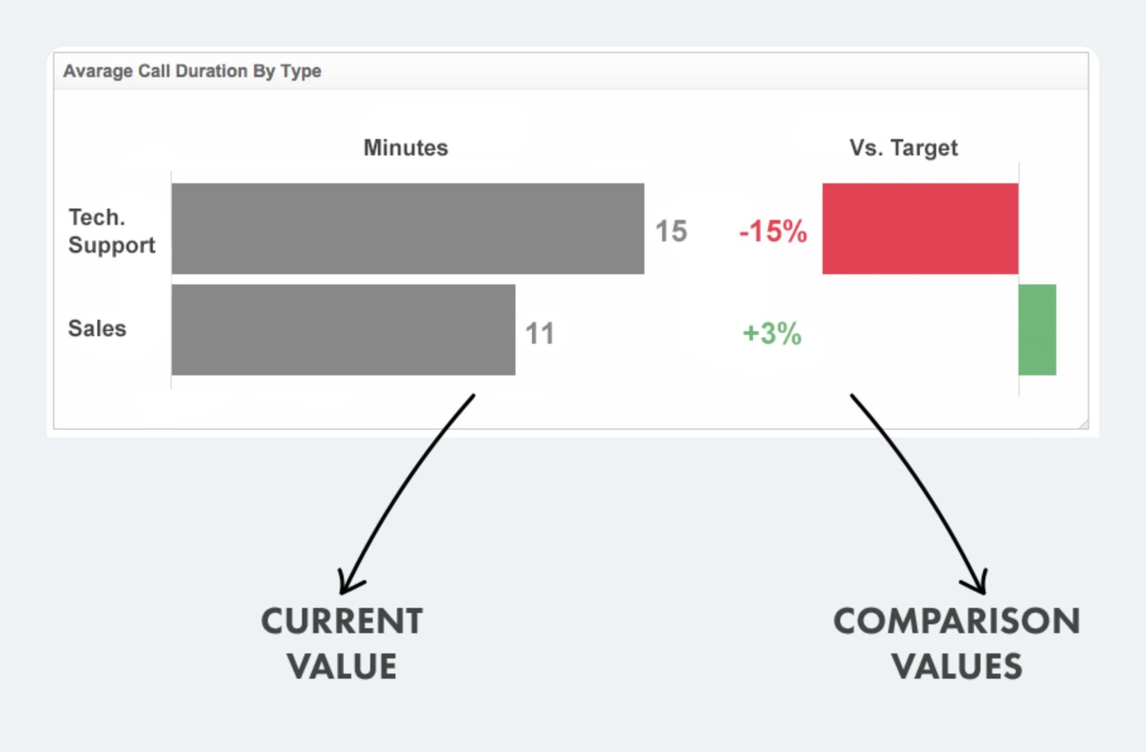
What you should do: Run a short monthly session where you walk through one dashboard with your team. Pick a metric that moved, explain why you think it moved, and invite pushback. Over time, this builds the interpretive instinct that makes dashboards genuinely useful.
Starting without a plan: the wireframing problem
Many dashboards are built backwards. Someone gets access to a tool, starts connecting data sources, and ends up with a collection of charts that reflect what was easy to pull rather than what actually matters.
The result is a dashboard that answers questions nobody asked.
Before building or rebuilding a dashboard, the most valuable thing you can do is map out what decisions it needs to support. What questions does this dashboard need to answer? Who will look at it, and how often? What action should it prompt?
A simple wireframe — even a rough sketch on paper — forces that clarity before you've committed to a layout. It's the difference between a dashboard that drives decisions and one that just displays data.
What you should do: For your next dashboard project, write down the three decisions this dashboard should make easier. Every metric you include should connect directly to at least one of those decisions. If it doesn't, leave it out.
Turning dashboards from reports into decision tools
The businesses that get the most value from their dashboards share a few common traits. They keep their metrics focused. They invest in real-time or near-real-time data. They design for the person looking at the screen, not the person who built it. And they treat dashboard literacy as an ongoing practice, not a one-time setup task.
The goal isn't a dashboard that impresses people in a meeting. It's a dashboard that makes a trend unmissable at 8 a.m. on a Tuesday, when you have 90 seconds before your first call — one that surfaces what matters without waiting to be asked.
If you're rethinking how your team tracks performance, Klips is built for exactly this kind of focused, real-time, role-specific reporting. Or explore related reads on KPI selection and dashboard design best practices to keep building your foundation.
Updated 2026-08-31
More in Dashboard design

Real-time dashboards for reporting: Why live beats static
SMB dashboarding in 2026: Trends shaping reporting
The best chart for the job: Visualizing data for non-technical users

The starter guide to dashboard design

Top 10 marketing dashboard ideas for tech companies

Employee retention metrics: The 5 metrics you should be measuring
Most recent
- SEP 25What SOC 2 taught a small team about trust
- SEP 15The AI race: progress, humanity, and trust
- SEP 9The good advisor
- AUG 11Beyond simple sign-ups: how True Trials and Activation predict growth
- JUN 19The best chart for the job: Visualizing data for non-technical users
- JUN 95 tips to understand (and organize) your restaurant data