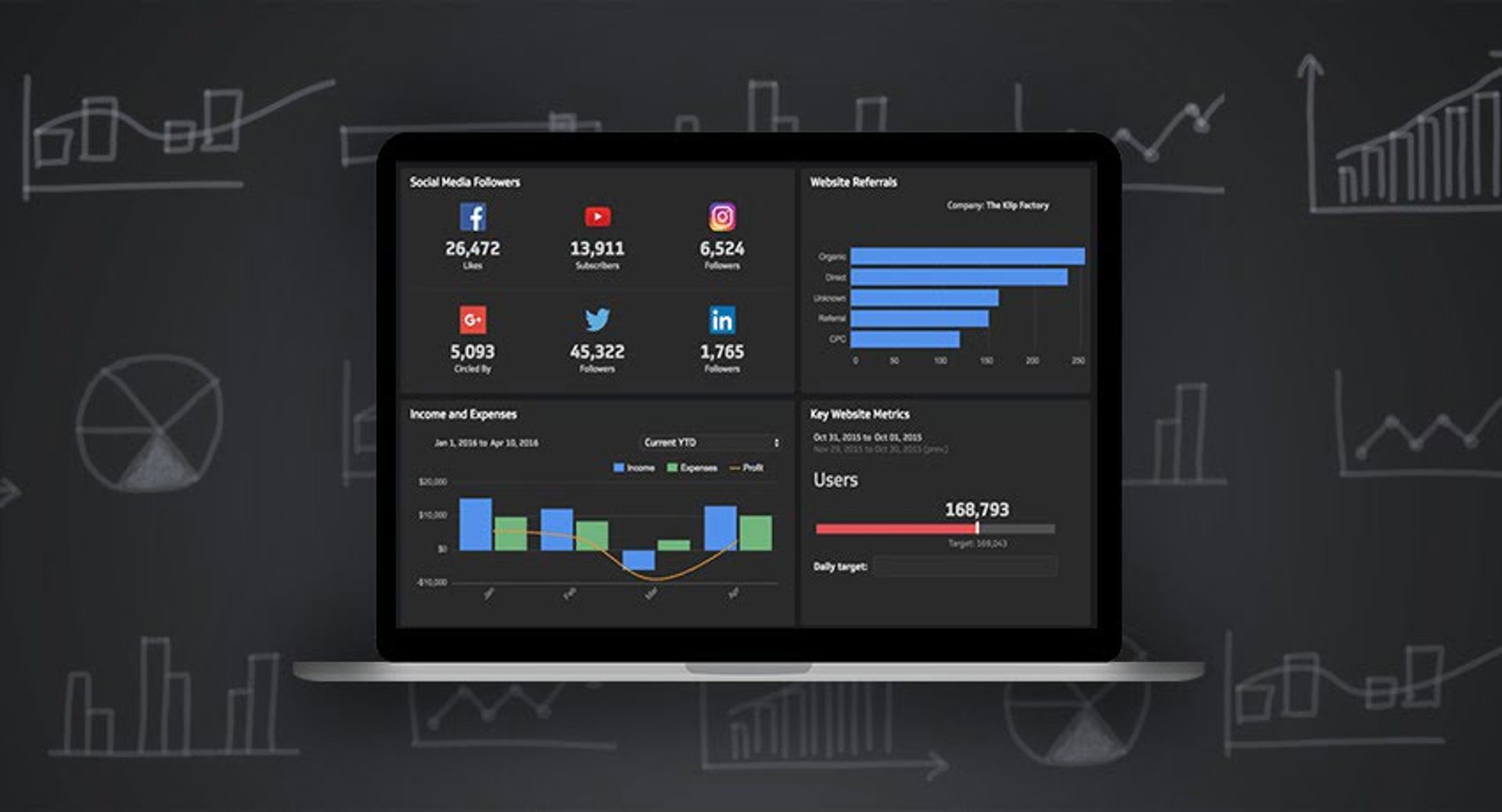

Summary - Data visualization tools like Klipfolio Klips are changing how you view and, more importantly, interpret data. The goal isn’t pretty charts on a screen. The goal is to use that data to make better informed, forward-looking decisions.
Klipfolio Klips makes it easy to take the first step with pre-built Klips, categorized by core application and function. There are full dashboards to get you started. Many teams that care about performance move past that first step and tailor what they monitor and measure to the business. In short, they need something bespoke where pre-cut Klips no longer suffice.
This post addresses two common questions that come up as businesses mature.
- What should we be measuring & monitoring?
- How do we get the data structures right to build what we need?
"The purpose of management information is to make proactive and more informed decisions which lead to improved future outcomes."
- Alastair Barlow, CEO & founder, flinder
Performance-focused businesses use a structured approach when implementing bespoke management reporting. One proven method is the 5D transformation framework below. It helps teams implement real-time reporting. The first two stages answer the questions above.
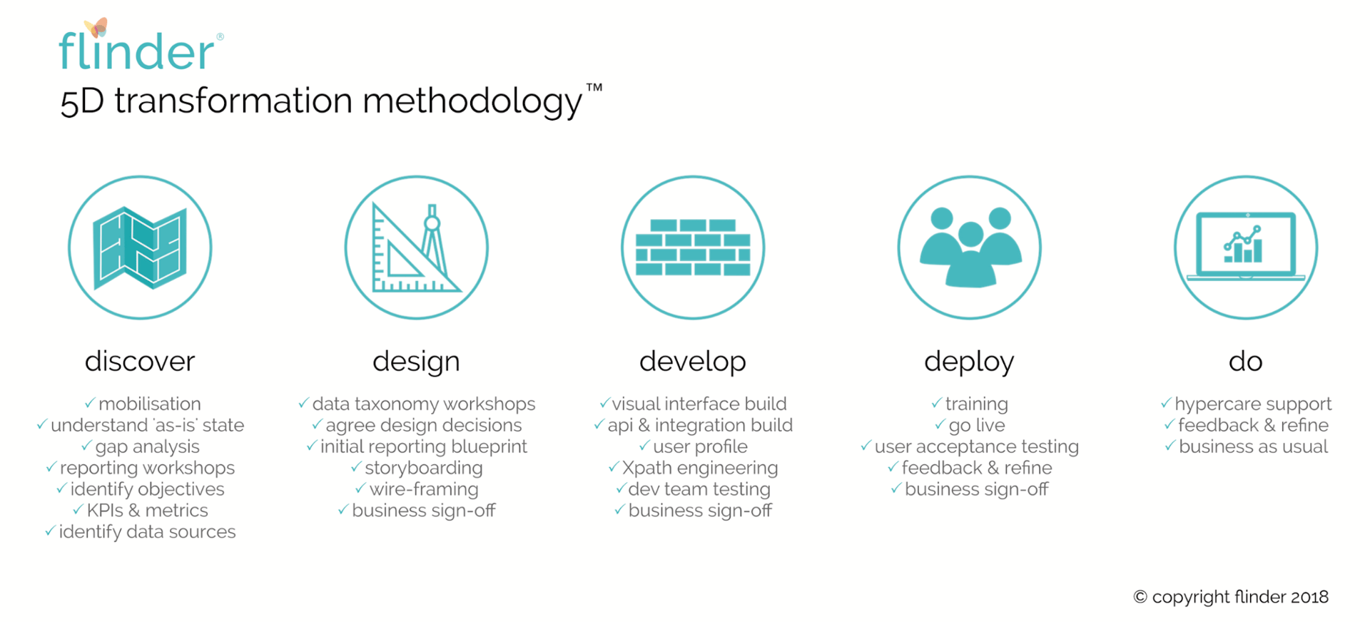
DISCOVER: What should we be measuring & monitoring?
The discover phase starts with a reporting requirements workshop. Rather than guessing what to measure and monitor, the workshop surfaces what matters to decision-makers. It’s essential to provide the right information to them.
Who are the stakeholders?
First, identify which decision-making stakeholder groups or individuals matter. This exercise often reveals groups that hadn’t been considered. Example stakeholders include:
- Investors
- Board
- Management team
- Head of Product
- Sales Manager
What questions do they ask, and what do they need answered?
A cross section of workshop participants helps here, especially those who understand what stakeholders usually request. As the list above shows, these groups are diverse, so they’ll need different information with varying levels of granularity.
For example, an investor may ask, “When will we run out of cash?” Head of Product might be more interested in “What product feature are customers wanting most?” This reveals what each stakeholder needs to make informed decisions and creates alignment between management information, objectives, and business strategy. Too often management information and business strategy are disconnected or happen by chance.
What kind of metric or KPI would answer this?
Defining the metric or KPI is often as simple as responding to the stakeholder’s question. If the question is “When will we run out of cash?” provide the future cash zero date, likely a specific month and year. They may also want to see cash inflows, outflows, and net cash flows, but at a strategic level the date sparks the right conversation. To provide this, you’d forecast monthly cash burn and the starting cash balance.
For the Head of Product asking “What product feature are customers wanting most?”, list the most requested features or group by feature category, or both. More granularity may be needed, but these examples show the approach.
What matters is pinpointing exactly what answers their questions.
What is their preferred style?
Presentation matters. If the format doesn’t fit how the stakeholder wants to interact, it won’t be used. The best technology won’t solve problems unless it’s adopted by its intended audience. Many teams ignore tools or reports that aren’t user-friendly. Learn whether the audience prefers charts, diagrams, large colourful numbers, or plain black-and-white text. That preference will determine whether the information gets used.
DESIGN: How do we get the data structure right to build this?
Many businesses make do with what they have because the core application isn’t structured correctly. They pigeonhole metrics and KPIs because the core application wasn’t set up for them. It doesn’t have to be this way. High-performing companies take a different route and get ahead.
Do we have the data available, and what is the data source?
Once the components of each important metric or KPI are identified, determine where the data comes from and whether it already exists. This may reveal new sources, collection gaps, or challenges in accessing the data.
Is this data in the correct format?
In the example of product feedback requests, the team may not be collating input by category or subcategory, so the Head of Product never gets the view that’s needed. Add a predefined taxonomy of categories and subcategories as a dropdown field in feedback requests. That change gives you data in the form required to report the way the Head of Product wants it.
The most powerful way to understand trends and performance is to segment data. The right data structures and taxonomy are the keys to useful segmentation.
Key hint: Start with stakeholders in mind when establishing what information to report.
Conclusion
Smart businesses adopt a methodology to ensure their metrics and KPIs align with their strategy, and the data they need is available. They do this by:
- Obtaining a clear understanding of the audience and the questions they are asking.
- Approaching it top-down to change the way data is organized.
Related Articles

5 tips to understand (and organize) your restaurant data
By Saleem Khatri — June 9th, 2026
Mind the gap: how to conduct a gap analysis that propels your business forward
By Stef Reid — January 29th, 2026
Anatomy of a great API
By Danielle Hodgson — January 21st, 2026