
Sales Dashboard Examples
A sales dashboard gives your team a real-time view of revenue, pipeline, and performance, so you can make faster decisions without waiting for someone to pull a report.
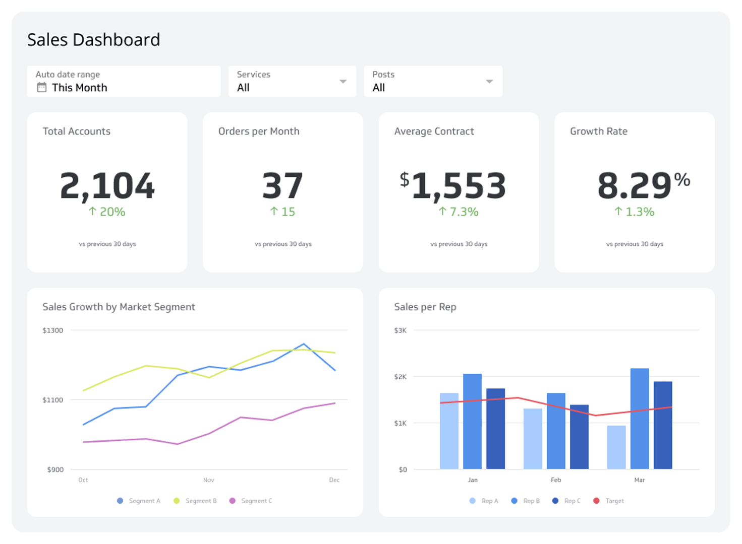
What is a sales dashboard?
A sales dashboard is a tool that gives sales leaders a real-time view of how their team is performing, displayed through charts, graphs, and key metrics.
If you lead a sales team, you already know the feeling: numbers scattered across spreadsheets, CRM exports, and email threads, and no single place to see what's actually happening. A sales dashboard solves that. It pulls your most important metrics into one view so you can spot problems early, act on opportunities, and keep your team moving toward targets without waiting for someone to pull a report.
Why sales dashboards matter
Most sales leaders don't lack data. They lack clarity. The numbers exist somewhere, but getting to them takes time, and by the time a report is ready, the moment to act has passed.
A sales dashboard changes that dynamic. Instead of chasing numbers, you see them. Instead of explaining your pipeline to a colleague or pasting figures into a spreadsheet to figure out what's going on, the answer is already in front of you.
Here's what that clarity makes possible:
- Faster decisions: When Revenue, Pipeline, and Conversion Rate are live and visible, you don't need to wait for a weekly summary to know whether you're on track.
- Consistent numbers: Everyone on the team sees the same data, pulled from the same source. No more conflicting figures between the rep's spreadsheet and the manager's report.
- Accountability without micromanagement: When performance is visible, expectations are clear. Reps know where they stand, and managers spend less time chasing updates.
- Early warning signals: A drop in Conversion Rate or a slowdown in new opportunities shows up before it becomes a missed quarter.
Key metrics on a sales dashboard
A strong sales dashboard doesn't track everything. It tracks the metrics that tell you whether your team is on pace to hit its number, and what's getting in the way if it isn't.
The right mix depends on your business model and sales cycle, but most sales dashboards include a combination of the following:
- Revenue: Total revenue closed in a given period, compared against target.
- Monthly Recurring Revenue (MRR): For subscription businesses, the most important indicator of growth and retention health.
- Win Rate: The percentage of opportunities that close as won. A low Win Rate points to qualification, competitive, or closing issues.
- Average Deal Size: Tracks the typical value of a closed deal. Shifts here can signal changes in your customer mix or discounting behaviour.
- Sales Cycle Length: How long it takes to move a deal from first contact to close. Longer cycles tie up pipeline and delay revenue.
- Pipeline Value: The total value of open opportunities, weighted or unweighted. Gives you a forward-looking view of expected revenue.
- Lead-to-Close Conversion Rate: The percentage of leads that become customers. Useful for diagnosing where deals stall.
- Customer Acquisition Cost (CAC): What it costs to win a new customer. Rising CAC without a corresponding rise in deal size is a margin problem.
- Quota Attainment: How individual reps and the team as a whole are tracking against their targets.
Sales Dashboard Examples
- Sales
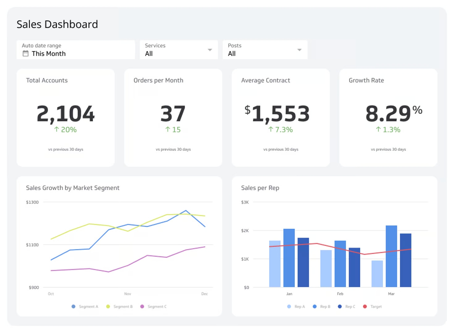
Sales Performance Dashboard
A comprehensive guide to tracking the right metrics and driving revenue with powerful sales dashboards.
- Sales
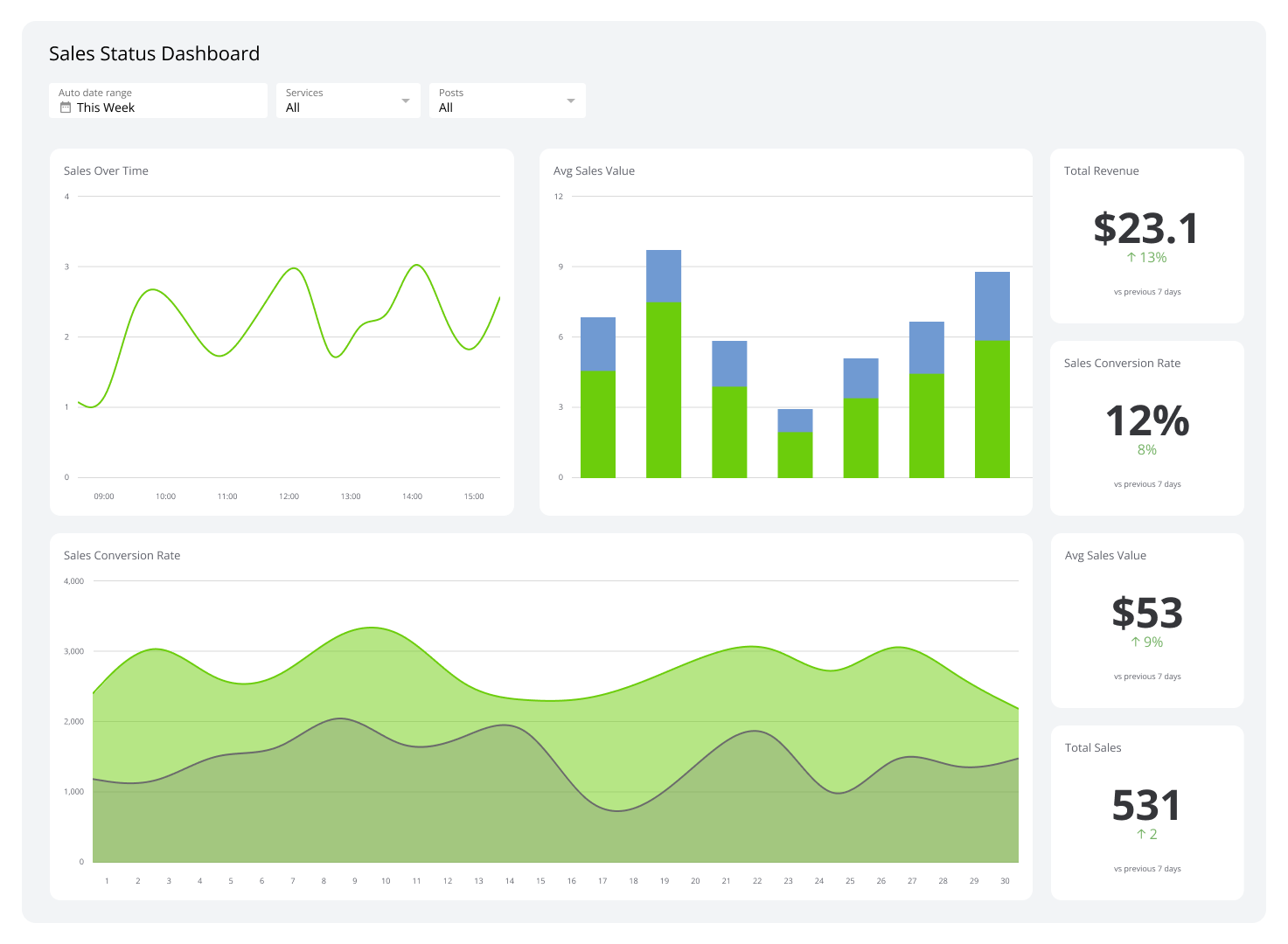
Sales Status Dashboard
Your sales team's performance, visualized in real-time.
- Sales
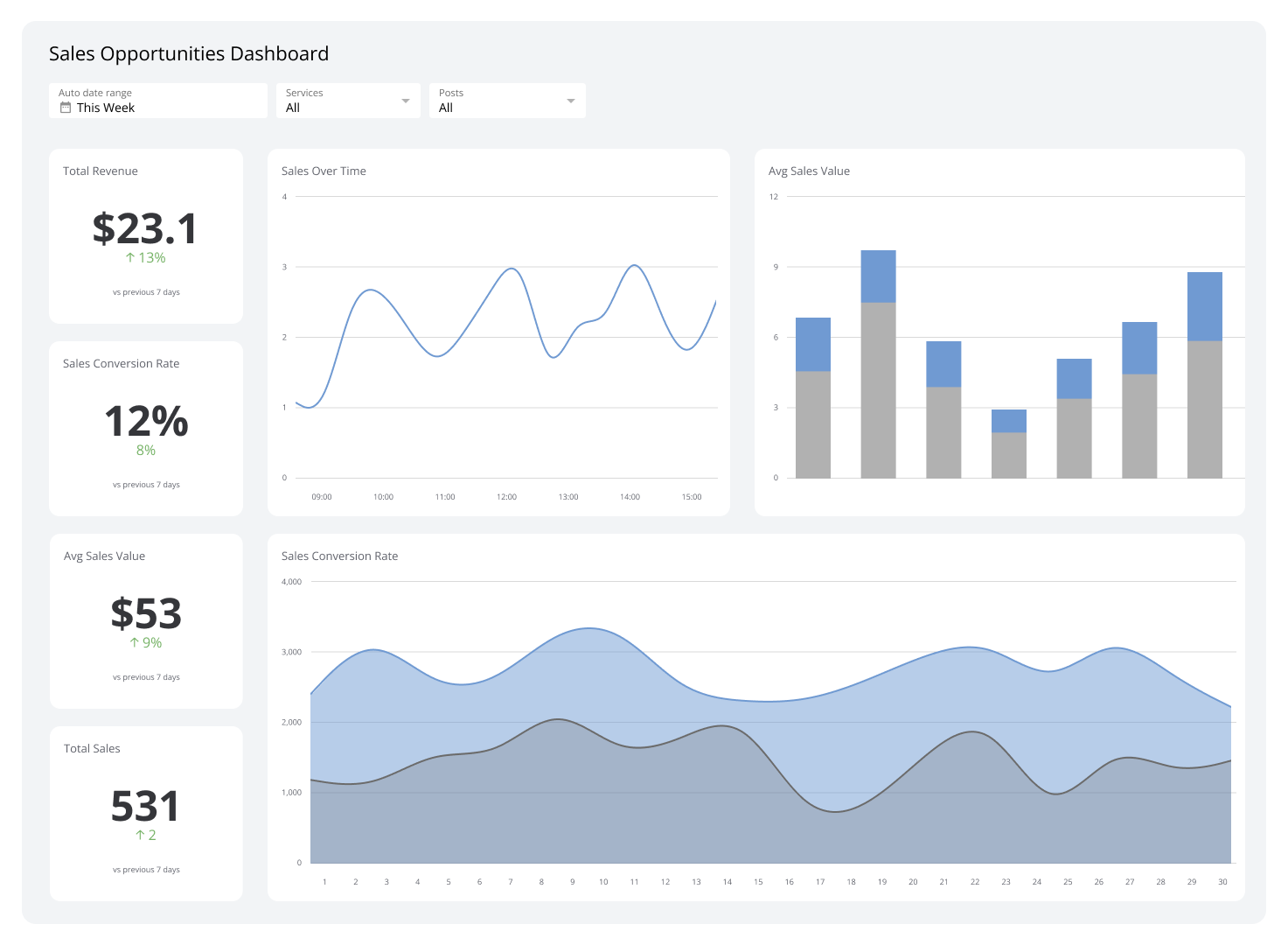
Sales Opportunities Dashboard
Your sales pipeline, visualized in real-time.
- Sales
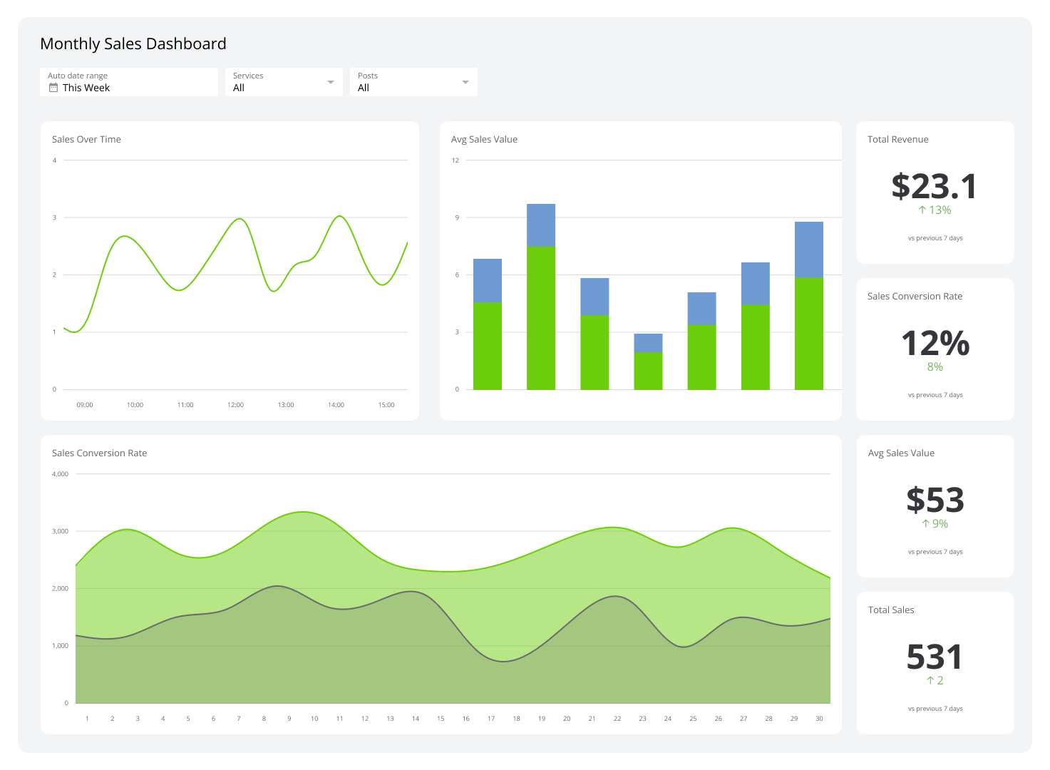
Monthly Sales Dashboard
Track MRR, new accounts, and daily sales in real-time.
- Sales
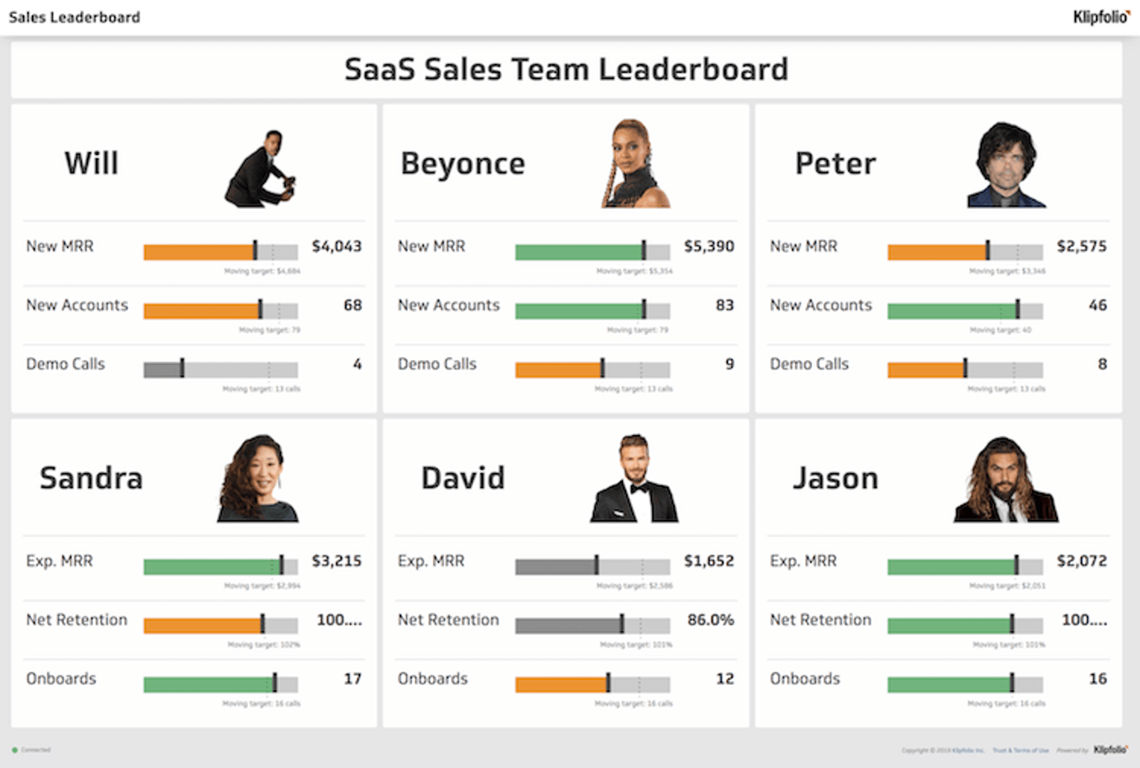
Sales Leaderboard
Track performance, motivate your team, and crush your targets.
- Sales
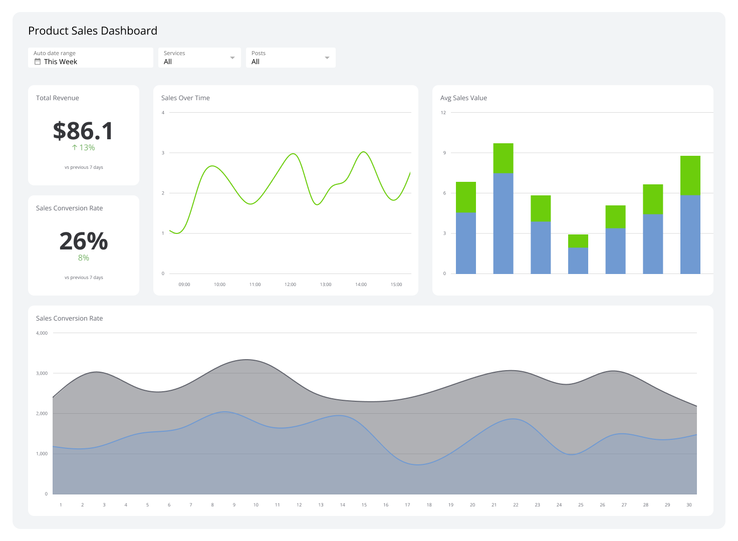
Product Sales Dashboard
See which products are driving your business forward.
- Sales
Sales Pipeline Dashboard
Visualize your sales process, from lead to close.
- Sales
Sales Manager Dashboard
Track pipeline, productivity, and forecast accuracy in one place.
- Sales
Sales Activity Dashboard
Track daily sales tasks, improve productivity, and move more deals through the pipeline.
- Sales
Sales KPI Dashboard
A sales KPI dashboard brings your revenue metrics together in one place so you can see what's working, what isn't, and what to do next.
- Sales
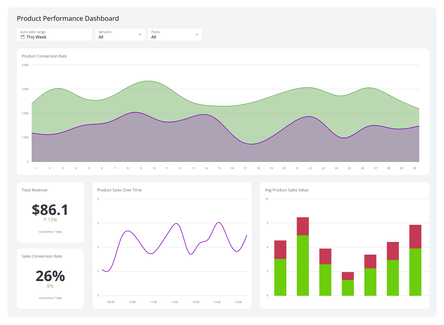
Product Performance Dashboard
See product KPIs in one view so you can make faster, smarter calls.
Sales dashboard examples
Different teams need different views. A VP of Sales watching the whole business needs different information than a rep managing their own pipeline. Below are the most common sales dashboard types and what each one is built to answer.
Sales overview dashboard
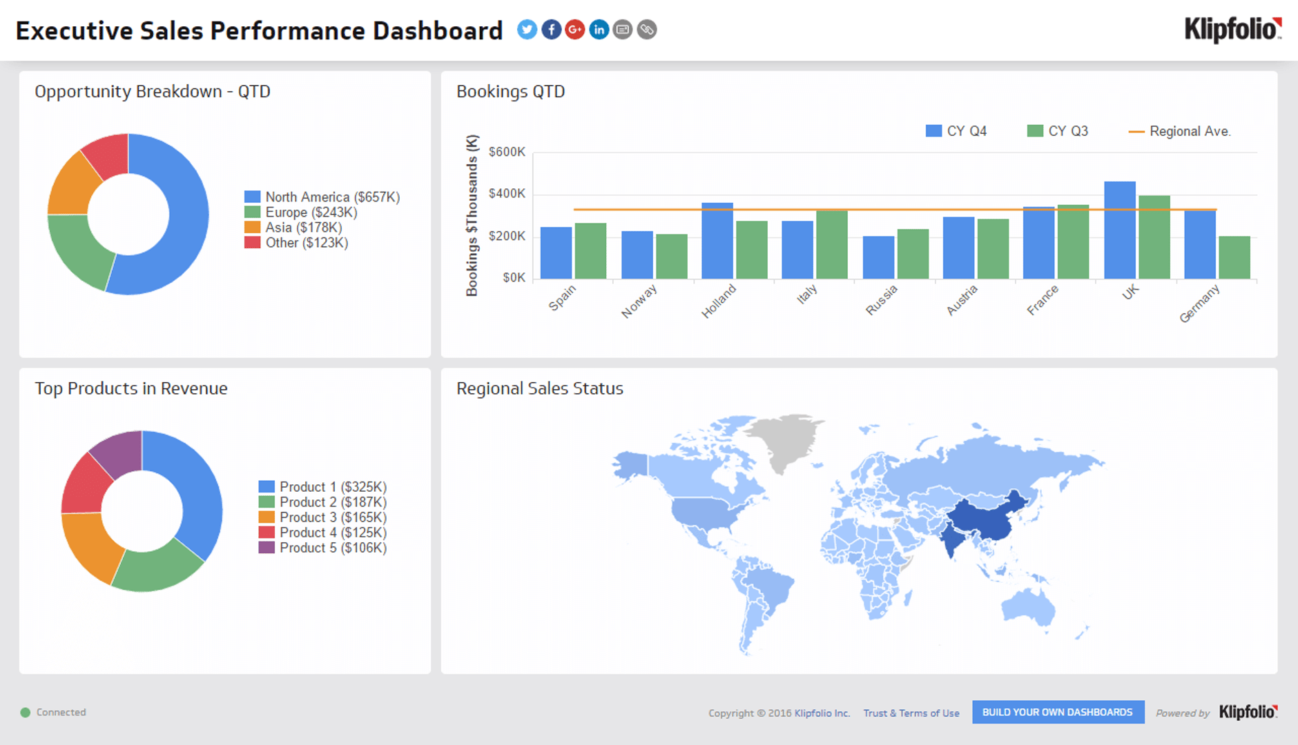
The Sales Overview Dashboard gives leadership a single view of the business: revenue versus target, pipeline health, Win Rate, and team-level Quota Attainment. It's the dashboard you open first thing in the morning to know whether the business is on track.
Create custom dashboards for you and your team.
Get started with KlipsSales rep performance dashboard
The Sales Rep Performance Dashboard tracks activity and outcomes at the individual level: calls made, meetings booked, deals closed, and revenue generated per rep. It makes performance visible without requiring a manager to chase updates, and helps reps see exactly where they stand against their goals.
Pipeline dashboard
The Pipeline Dashboard shows the current state of your sales funnel: how many deals are at each stage, their total value, and how long they've been sitting there. It's the right tool for a weekly pipeline review, helping you identify deals that are stalled, stages where conversion drops, and where your team should be focusing its effort.
Sales activity dashboard
The Sales Activity Dashboard tracks the inputs that drive outcomes: outbound calls, emails sent, demos completed, and follow-ups made. When revenue results are lagging, this dashboard tells you whether it's an activity problem or a conversion problem.
Revenue dashboard
The Revenue Dashboard focuses on closed revenue over time: by period, by rep, by product line, or by region. It's useful for spotting trends, comparing performance across segments, and forecasting what the next period is likely to look like.
Customer retention dashboard
The Customer Retention Dashboard tracks churn, expansion, and renewal rates alongside metrics like Net MRR Churn and Customer Lifetime Value. For businesses where recurring revenue matters, keeping existing customers is as important as closing new ones. This dashboard makes retention visible so it gets the same attention as new business.
What makes a sales dashboard effective
A dashboard that nobody checks is just a report nobody reads. The difference between a dashboard that drives decisions and one that collects dust comes down to a few things.
It shows the right metrics. More metrics isn't better. A dashboard cluttered with every available data point makes it harder, not easier, to know what to act on. Start with the five to eight numbers that most directly reflect whether your team is on track.
The data is reliable. A dashboard is only as useful as the numbers in it. If your team doesn't trust the data, they'll ignore the dashboard and go back to their own spreadsheets. Reliable, consistent data, pulled automatically from your CRM and other sources, is the foundation.
It updates automatically. A dashboard you have to manually refresh isn't a dashboard. It's a report. Automatic data refreshes mean the numbers you're looking at reflect what's actually happening right now, not what was true yesterday.
It's visible. A dashboard buried in a browser tab doesn't drive alignment. The most effective sales dashboards are shared, displayed on office screens, embedded in team channels, or sent as scheduled reports so the whole team stays on the same page without anyone having to go looking.
Create custom dashboards for you and your team.
Get started with KlipsHow Klips powers sales dashboards
Klipfolio's Klips connects to 130+ data sources, including Salesforce, HubSpot, and your other sales tools, so your dashboard pulls live data automatically. You don't need a data team to build it or maintain it.
Klips gives you:
- 130+ connectors to bring in data from your CRM, marketing tools, and financial systems without manual exports.
- Excel-like formulas to calculate the metrics that matter to your business, not just the defaults your CRM provides.
- Flexible distribution to share dashboards with your team via email, Slack, TV mode, or embedded views, so the right people always have the right numbers.
- Granular permissions to control who sees what, whether you're sharing internally, with a client, or across multiple teams.
The result is a sales dashboard your team actually uses, because the numbers are there, they're right, and they don't require anyone to go digging.
Try it for free today and see how your sales performance looks in one place.