

Summary - Have you found a challenge visualizing, reporting and actioning HubSpot data? Explore some of these core challenges that you can fix with Klipfolio.
HubSpot’s a leading sales and marketing platform, used by thousands of SMBs around the world. But if you’re a HubSpot user, you’ve likely run into some challenges with respect to visualizing, reporting and actioning HubSpot data.
In this post we’ll flesh out some of these core challenges, and tell you how you can address them with Klipfolio.
Why you need an external HubSpot Dashboarding Tool
Many of our customers have come to us looking to build specific data visualizations and dashboards with HubSpot data.
We’ve had customers ask how they can build a Sales Leaderboard with Hubspot data, or a Sales Funnel. Others have asked about building landing page dashboards, or about how they can mashup HubSpot data with Facebook Ads data.
Some of the top challenges our customers are running into with HubSpot are:
- Combining data in HubSpot with data that lives elsewhere: for example, you cannot combine HubSpot data with GA data in HubSpot. This can make it difficult to get a clear view to the efficiency of marketing/sales funnels.
- Customizing metrics and visualizations within HubSpot: you can’t always get access to the data points you want, or combine the data the way you want. This is analysis/reporting challenge for many customers.
- Exporting visualizations within HubSpot to share them with colleagues or clients: visualizations in HubSpot cannot be exported, only raw numbers can, so a lot of times HubSpot users are having to screenshot visualizations to include them in reports.
Luckily, many of these challenges can be overcome in Klipfolio.
It all starts by connecting your HubSpot data to your account in Klipfolio.
Working with HubSpot’s APIs
HubSpot publishes a number of APIs that power the HubSpot application (BTW if you’re new to APIs check out this 101 video).
All of the documentation for their APIs is located on their developers portal, but don’t be daunted by that if you’re not a developer - anyone can learn to “call” HubSpot APIs with a bit of learning and scanning of their API documentation.
HubSpot’s APIs are RESTful, which means they use HTTP requests to GET, POST, PUT and DELETE data - ideal for connecting and interacting with other cloud services, like Klipfolio.
As you’ll see on their developers portal, there are over two dozen HubSpot APIs that can be called with API queries.
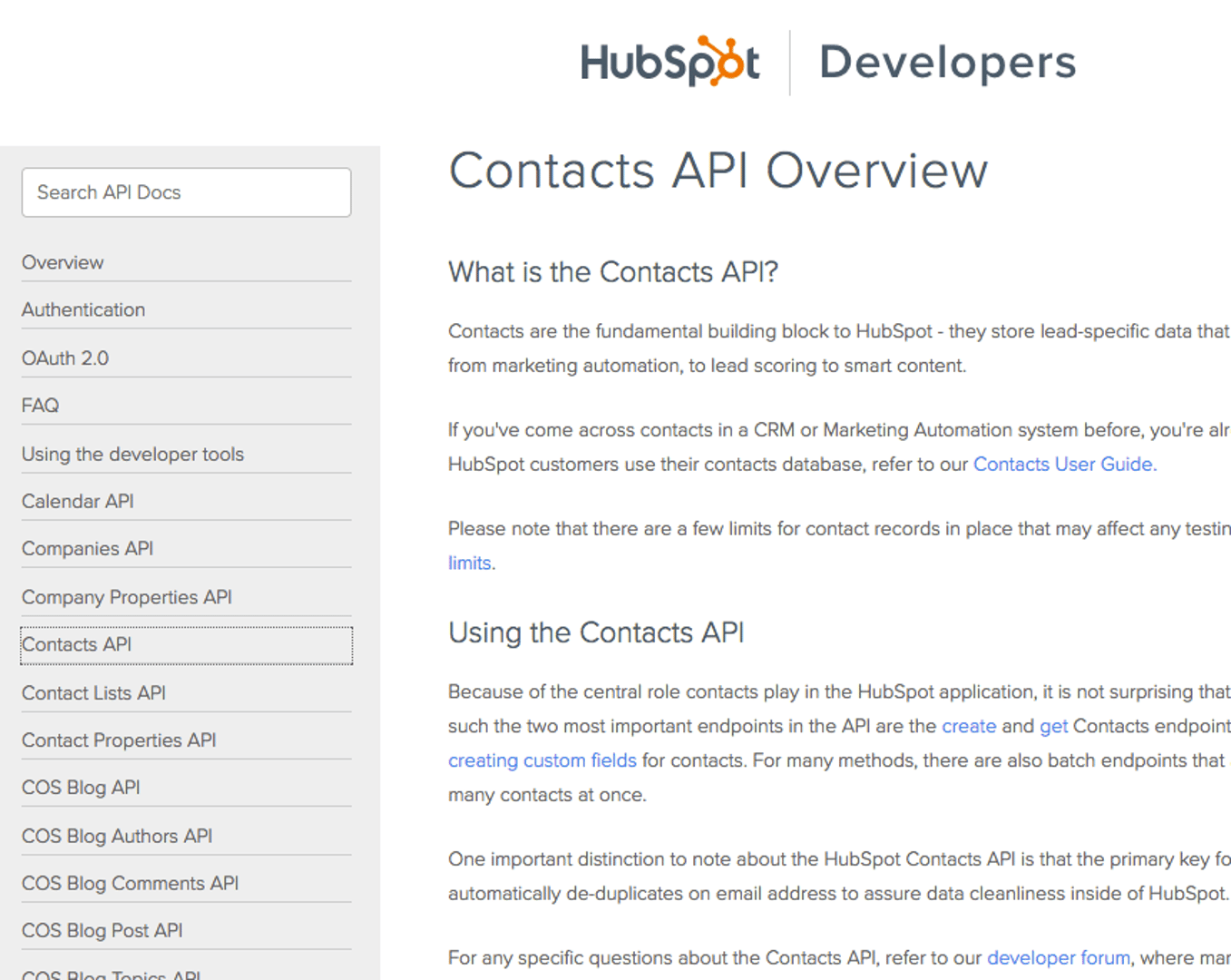
Knowing your way around this documentation is important because you’ll be referencing it in building out your API queries in Klipfolio, to access your HubSpot data.
Connecting Your HubSpot Data to Klipfolio
Data from web services like HubSpot are connected to Klipfolio in one of two ways:
1. You connect specific data endpoints in your HubSpot account to your Klipfolio account by writing your own API queries in Klipoflio’s “Connector Gallery”.
2. You authorize Klipfolio to pull in data from your HubSpot account in the process of adding pre-built data visualizations to your Klipfolio dashboard (data visualizations like this):
Lead Lifecycle
Take your marketing funnel to the next level! This is a complete lead lifecycle funnel with total numbers at each stage, with visualizations of your progress.
Uses:

The second method is pretty straightforward, so I’ll focus on the first method - setting up your own custom data connections to HubSpot.
To connect via the Connector Gallery, from your Klipfolio dashboard click “Library’, then the “Data Sources” tab, then “Create a New Data Source”. Scroll down to find the HubSpot Connector, or type it into the search field.
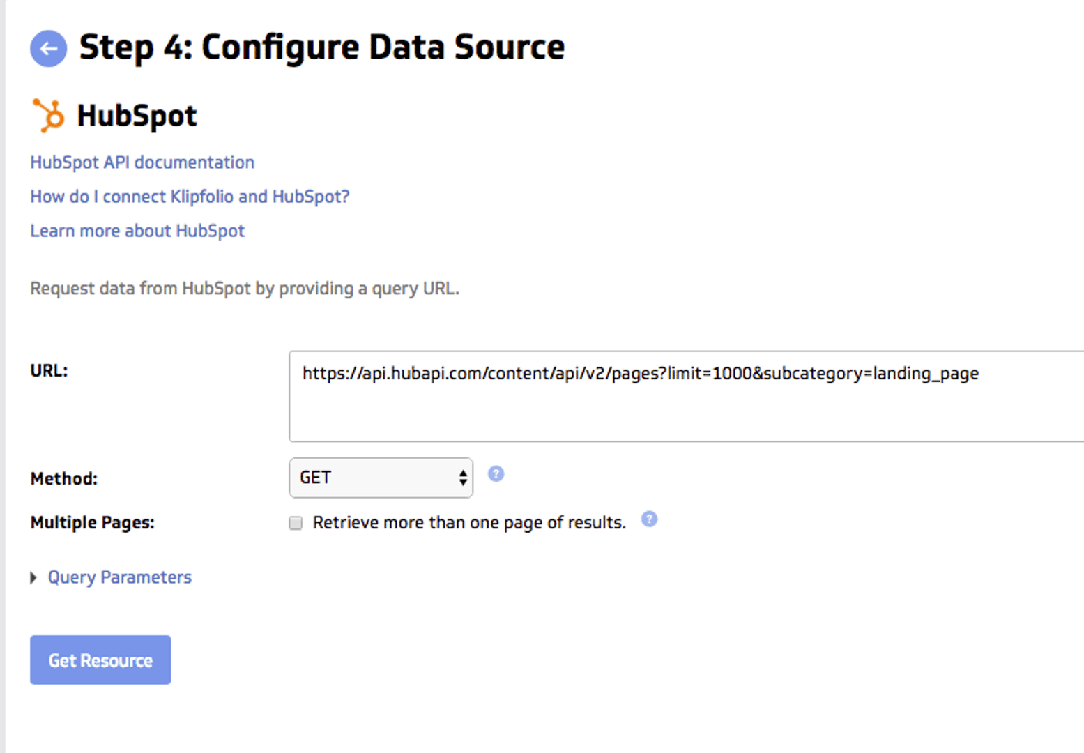
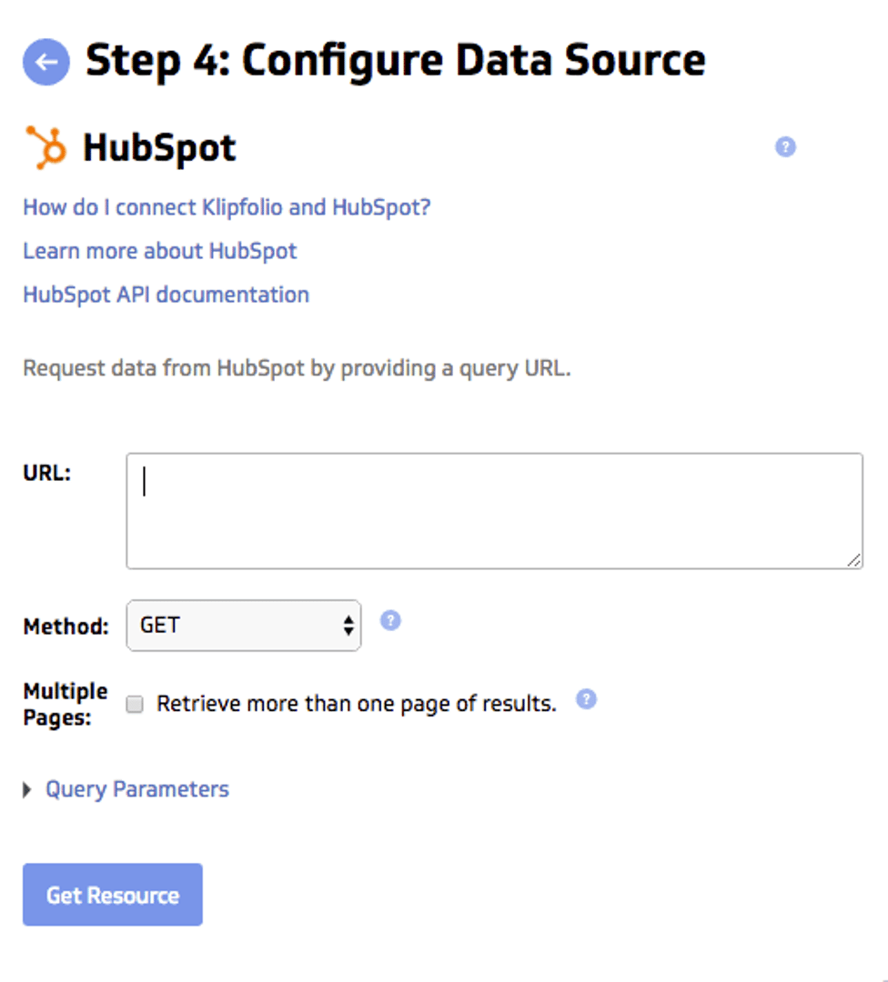
Next you’ll be asked to authenticate with your account credentials - you’re effectively creating create a handshake connection between your Klipfolio and HubSpot accounts. Once you’ve authenticated you’ll be taken to a page where you can configure your data source.
If you’ve come in without clicking one of the “inflow-queries” that will start you off with a half-baked API query, you’ll see an empty URL field like this:
Now you’ll need to refer back to HubSpot’s API documentation to write the API query that will pull in the data you’re looking for.
Here are a few examples:
Subscription status
https://api.hubapi.com/email/public/v1/subscriptions/timeline (limit)
Keyword list
https://api.hubapi.com/keywords/v1/keywords (limit)
Recently created deals
https://api.hubapi.com/deals/v1/deal/recent/created?count=500 (count)
You’ll note that the data that gets returned from these queries is in JSON (Java-Script-Object-Notation) form. You can learn more about this data format, and how to work with it here.
Building HubSpot Dashboards with Klipfolio
Once you’ve successfully connected a HubSpot data point to Klipfolio, you can save that data source in your Klipfolio data source Library, where it can be referenced to build data visualizations.
Here’s an intermediate level tutorial on how to build a custom data connection to HubSpot, and build a Klip with it.
Example: Creating an Email Subscription Timeline in Klipfolio with HubSpot data
Let’s create a Klip using the email subscription status timeline (the first sample api query noted above). First we’ll modify the sample query to only pull data for the last month using the startTimestamp and endTimestamp parameters. This particular endpoint in requires the timestamps to be in Unix Time milliseconds, so to dynamically set the parameters in the required format we can use the Klipfolio date methods. The query will look like this:
https://api.hubapi.com/email/public/v1/subscriptions/timeline?limit=1000&startTimestamp={date.startOfMonth.format("epochTime")}000&endTimestamp={date.endOfMonth.format("epochTime")}000
Here I’ve set the one page limit to 1000 results, however, klipfolio offers a pagination option to allow you to pull up to 10 additional pages as required.
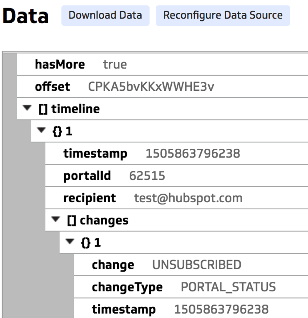
The data returned is in a JSON data format. If you’re unfamiliar with JSON data, it may be worth reviewing our JSON and XML datasource help center article.
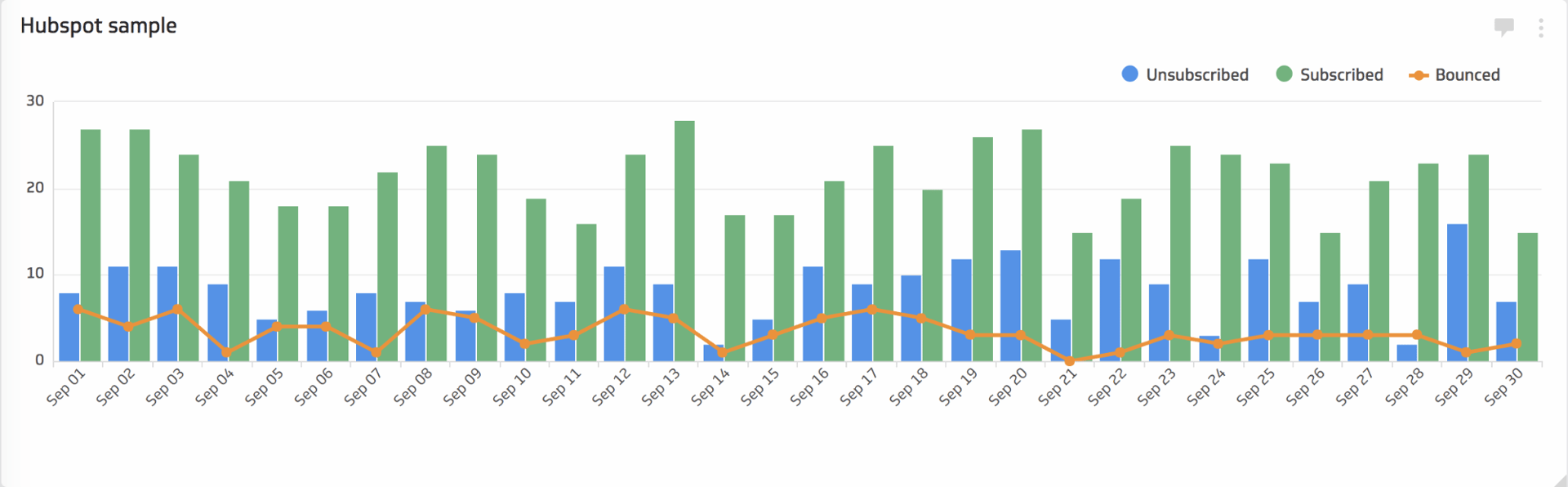
As an example visualization, we may want to look at the the number of Subscribers, Unsubscribes, and Bounces for each day of the month in the form of a bar chart. This information is contained in the ‘changes’ array as part of each timeline object.
Standard
The first thing you’ll need to do is set up the x-axis. This will be the timestamp in the changes array.
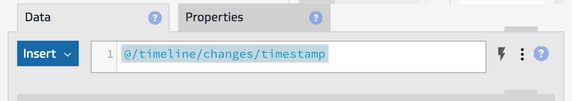
Right away you’ll notice that the x-axis isn’t in a particularly useful format (Unix milliseconds). So we’ll adjust the format using the component properties. You can choose any format you’d like, but for our purposes, we want to show the data as the day of the month.
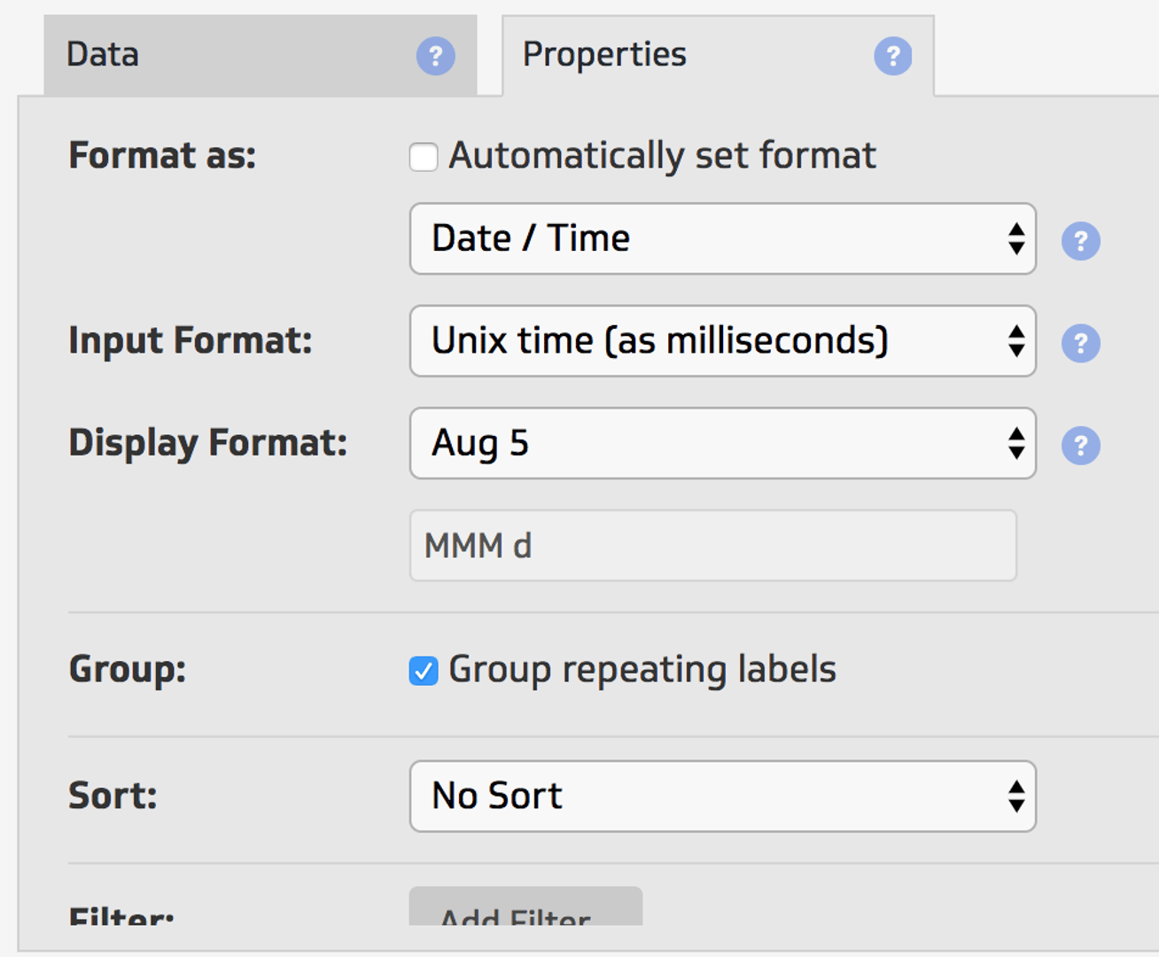
I’ve chosen to ‘Group repeating labels’ because we’ll want to group our various series’ by day of the month.
We’ll have three series’ for the chart; Subscribed, Unsubscribed, Bounced. Since we’ve chosen to group repeating labels on the x-axis, we’ll have to construct each series such that we only aggregate data according to each of the timeline changes. To do this, we’ll make use of a simple IF function to check what the value of change is and return that data if it’s the correct value for the series.
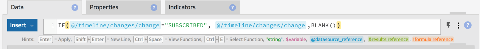
With the aggregation type for each series set to ‘Count’, this will count the each occurrence in the series per group (date) on the x-axis. This works because a blank value is not counted as part of the group.
Putting it all together, we end up with a chart that looks something like this:
Advanced
In some instances, Hubspot may not return data for every day in the time range you set in the datasource query. If you wanted your X-Axis to have a complete set of dates in the month, not only those in your datasource, you can leverage the powerful functionality of the formula bar to ensure that your data is aligned with that date range.
First you need to set the date range on the x-axis using the DATERANGE function,

Above we’ve leveraged some of the other date functions available; TODAY, DATE_STARTOF, DATE_ENDOF, and DATEVALUE.
For each series, we use of the SELECT function to filter the individual series’ to isolate the different timeline change types, group the data together using the GROUP and GROUPBY functions, then align it to the X-axis using a LOOKUP function.
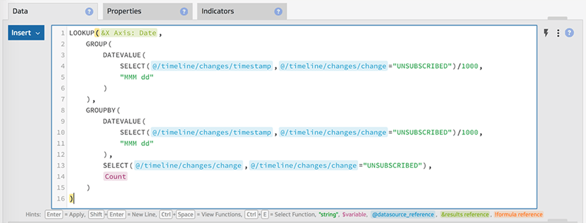
Something to note here is that the DATEVALUE function takes a Unix time (in seconds), and since the timestamp returned from Hubspot is in Unix time (in milliseconds) so we divide it by 1000 to get the correct format.
Related Articles
6 Facebook ads reports every agency needs to attract and retain high-ticket clients
By Tanya Brody — April 10th, 2026
6 dashboards I use daily to run my SaaS company
By Allan Wille, Co-Founder — April 10th, 2026
The 5 most important SEO KPIs for digital marketing success
By Sanket Patel — February 24th, 2026