

5 things you've always wanted to do in Klipfolio but didn't know you could
Five quick tips for Klipfolio Klips that most users never discover. Apply your brand colours, copy components and data sources, adjust date ranges, share a live dashboard in seconds, and bring data into Slack so your team acts on it faster.
Whether you're new to Klipfolio Klips or you've been building dashboards for years, these five tips will help you get more out of the platform, faster, and with less guesswork.
1. Customize your Klip colours
A dashboard that reflects your brand earns more trust from the people reading it. When the colours match what your team already recognizes, the numbers feel more credible, not just more polished.
You can change the colour of any component in your dashboard and apply your company's exact colour codes.
Go from this:
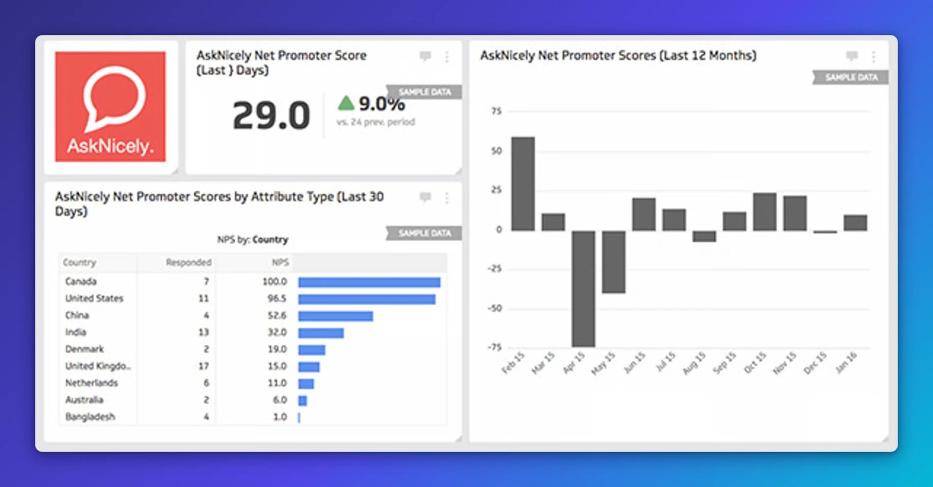
To this:
!AskNicely dashboard showing Net Promoter Score of 29.0 with 9% increase, NPS by country with Canada leading at 100.0, and monthly trend chart showing scores ranging from -50 to 75 over 12 months
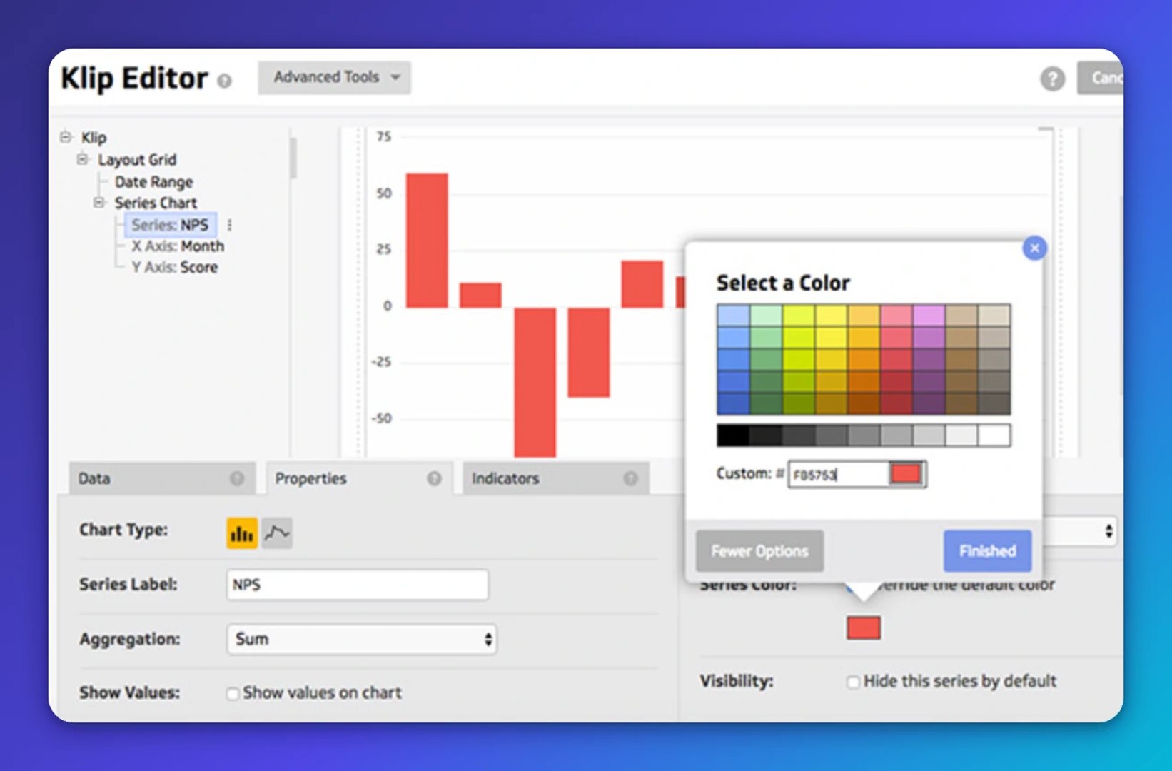
How to do it
- Edit your Klip.
- Open the Properties panel for the component you want to change.
- Choose "Override default colour," select more options, then enter your custom colour code.
2. Copy almost anything
Copying in Klips is faster than most people realize. Here's what you can duplicate and how:
- Formulas: Use Ctrl+C / Ctrl+V on Windows, or Command+C / Command+V on Mac.
- Klip components: Right-click the blue component menu and choose Copy. Navigate to another Klip, right-click in the preview window, and choose Paste.
- A full Klip: In the dropdown next to Save and Exit, choose "Save as copy..."
- A data source: Inside the data source, select the blue "Duplicate" button.
3. Change the date range on a gallery Klip
You found the right Klip in the gallery, but the timeframe is off. You can fix that by editing the data source directly. It's also a useful way to understand how Klips pulls data.
Here's how to change the date range on a Google Analytics Klip from the gallery:
1. Select the Klip menu at the top right of your Klip and press Edit.
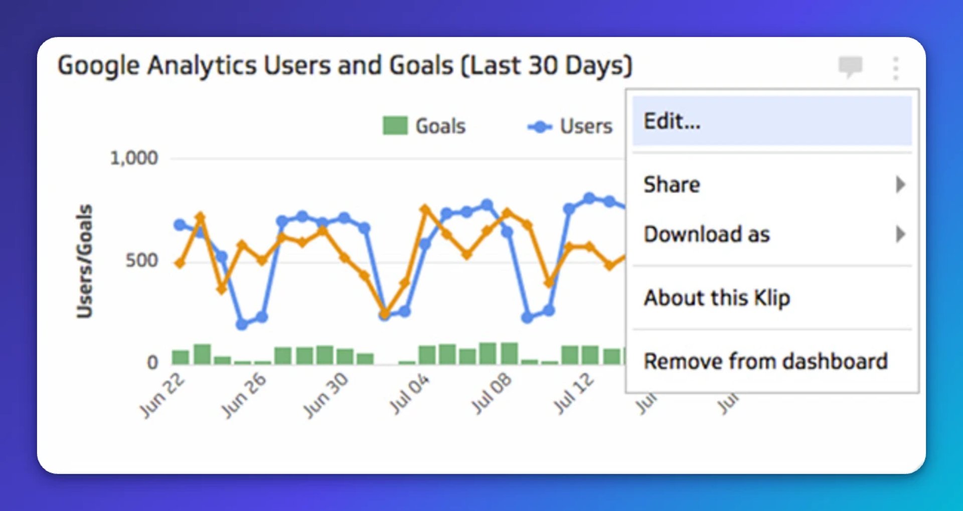
2. Find the data source in the Klip Editor. This is what drives the visualization. Click the "i" icon next to the data source name to open it in a new tab.
3. Reconfigure the data source to modify the query, including the timeframe.
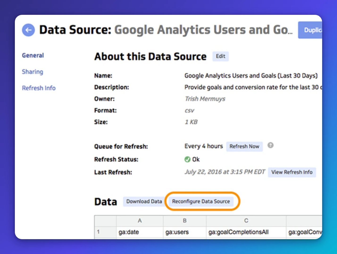
You may be prompted to authenticate at this point. Click "Next" if prompted.
4. Modify the query to update the date range. Google Analytics uses start-date and end-date parameters. In this example, change the start date to 15 days ago (-15 instead of -30). Once you've made the change, choose "Get Data" and save the data source.
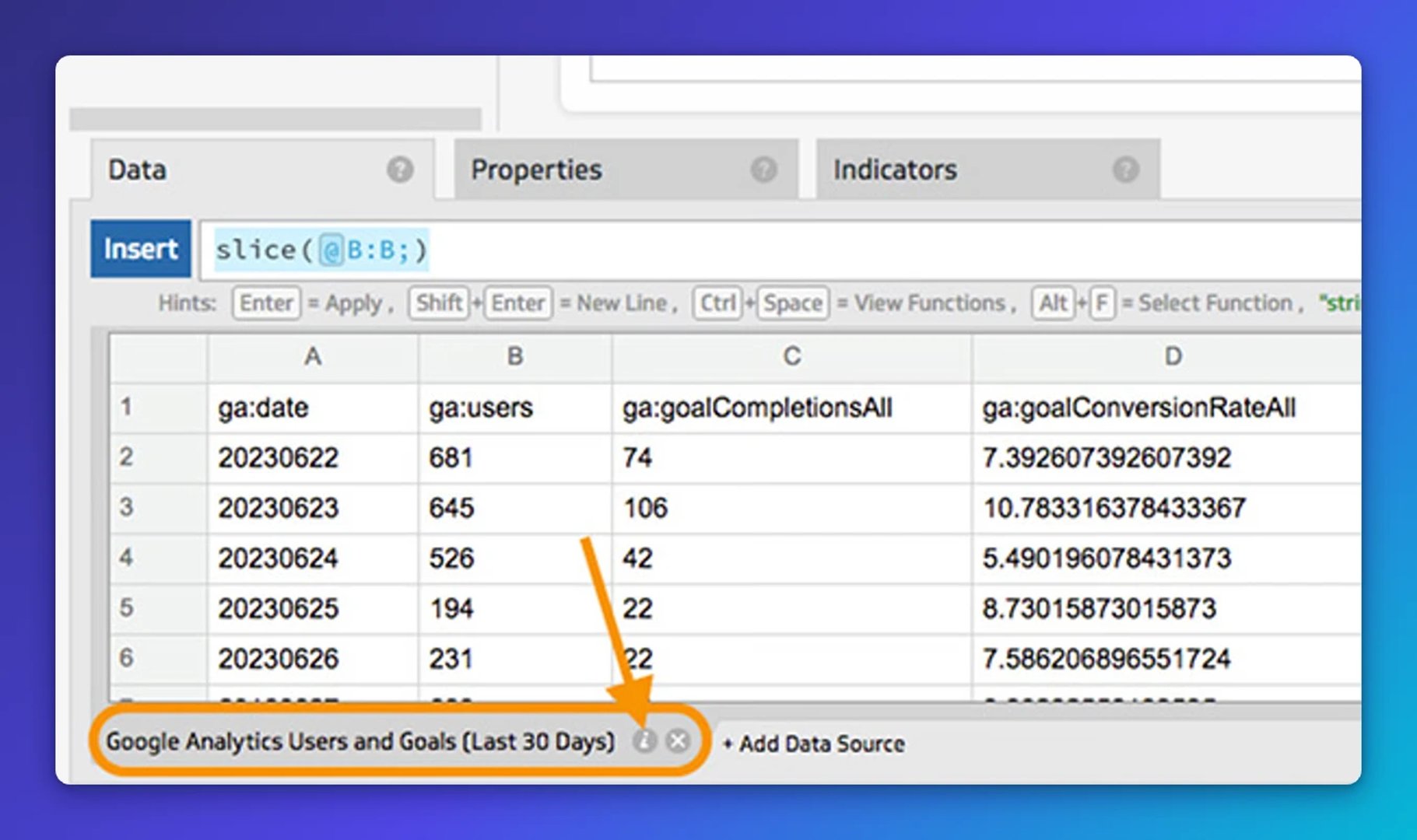
5. Update your Klip title. Return to the Klip Editor tab, update the title to reflect the new date range, then Save and Exit. The preview may not show the updated range immediately, but your dashboard will.
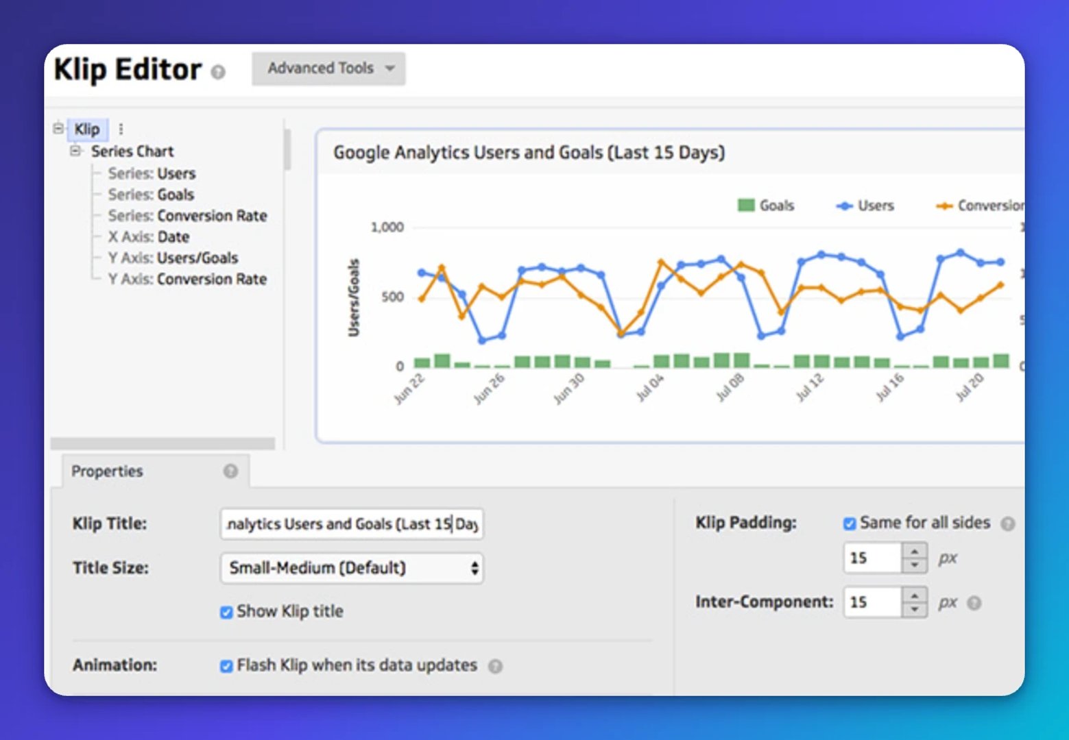
Your dashboard now shows the correct date range.
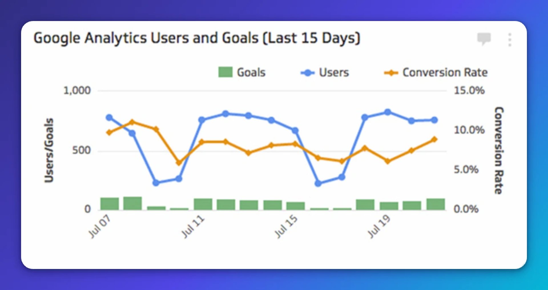
Note: Each data source works differently. Check the documentation for your specific source to confirm how date parameters work and whether there are limits on historical data.
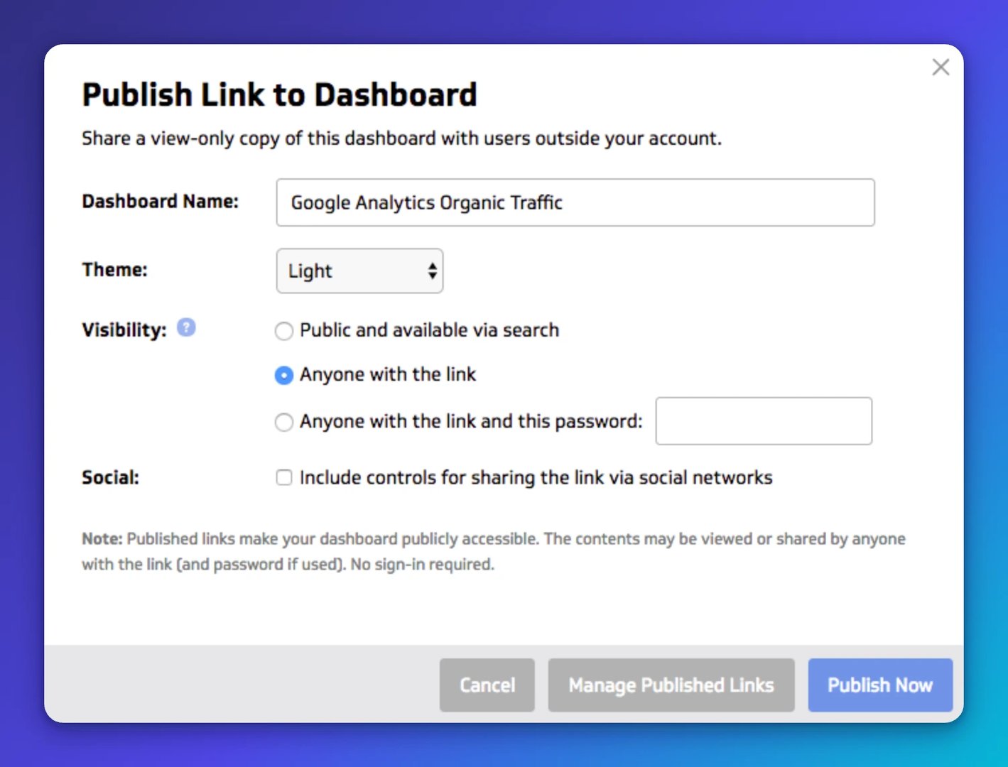
4. Share your dashboard in under five seconds
Your team shouldn't have to ask you for a number. Once your dashboard is ready, you can create a shareable URL in seconds and send it to anyone, with or without a password.
No exports. No slides. No "let me pull that for you."
Create custom dashboards for you and your team.
Get started with Klips5. Turn a dashboard into a conversation
People can see the numbers and still not act on them. If your team is viewing a dashboard but nothing is changing, bring the data into the conversation directly by sharing a Klip to a Slack channel.
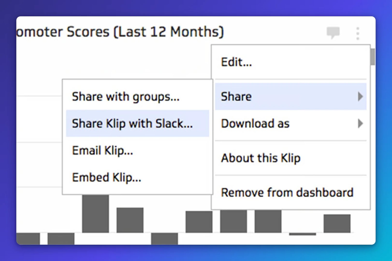
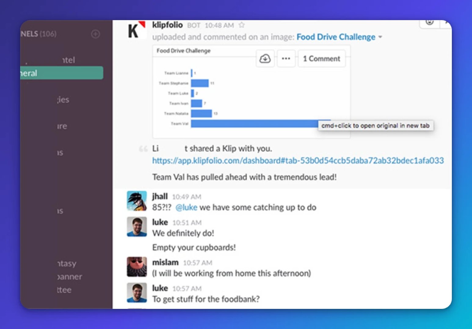
When the data shows up where your team already works, the question "what do we do about this?" gets asked a lot faster.
Note: You'll need the Slack integration enabled in your account to use this feature.
Updated 2026-08-30
More in Dashboards

Klipfolio extends flexibility with Vega integration

The Klipfolio cheat sheet for building metrics

Building custom HubSpot reports and dashboards with Klipfolio

Using Facebook's Graph API Explorer to retrieve Insights data

Top 10 marketing dashboard ideas for tech companies
How to use the Google Analytics 4 Query Explorer to export data
Most recent
- SEP 25What SOC 2 taught a small team about trust
- SEP 15The AI race: progress, humanity, and trust
- SEP 9The good advisor
- AUG 11Beyond simple sign-ups: how True Trials and Activation predict growth
- JUL 7Why business leaders miss important trends in their dashboards
- JUN 19The best chart for the job: Visualizing data for non-technical users