The magic of mashing plan data with actual results in your near realtime Klipfolio dashboard


Summary - A good plan spreadsheet answers the question, “How are we going to hit our company targets this year?” and is a gold mine for the creation of company Key Performance Indicator (KPI) target values. Target values are important as they are the real measuring stick for the question, “How are we doing compared to how we expected to be doing?”
In recent years, I have found myself saying, “Great things happen twice: once when you plan them, once when you do them.” Most plans are conceived in your mind, sketched on a scrap of paper or a napkin, and ultimately captured as numbers on a spreadsheet.
A good plan spreadsheet answers the question, “How are we going to hit our company targets this year?” and is a gold mine for the creation of company Key Performance Indicator (KPI) target values. Target values are important as they are the real measuring stick for the question, “How are we doing compared to how we expected to be doing?”
A big challenge for many dashboard builders is that this plan data (the KPI targets) and the actual performance results data that is being monitored almost never reside in the same place.
Luckily simple data mashing provides an easy answer, enhancing the end-user’s ability to gain valuable insight into business performance. Data mashing is the process of combining business data from disparate systems or sources.
Let’s take a sales leaderboard as an example. The finance plan (or budget) is handed down in a spreadsheet form and is stored somewhere like OneDrive or Google Drive. The sales rep performance data is stored in a Customer Relationship Management (CRM) system like Salesforce.com, Hubspot or Pipedrive. The sales leaderboard will monitor the performance of the sales team and compare reps to each other, dynamically ranking them against the other members of the group.
Data mashing example using plan data
 |  |  |
|---|---|---|
| Plan What you hope happens? What are reps expected to achieve? | Actual What happened? Who is on target? Who is the top rep? | Monitor How are we doing? Are the reps making their targets? |
The steps are very simple to solve this example in Klipfolio.
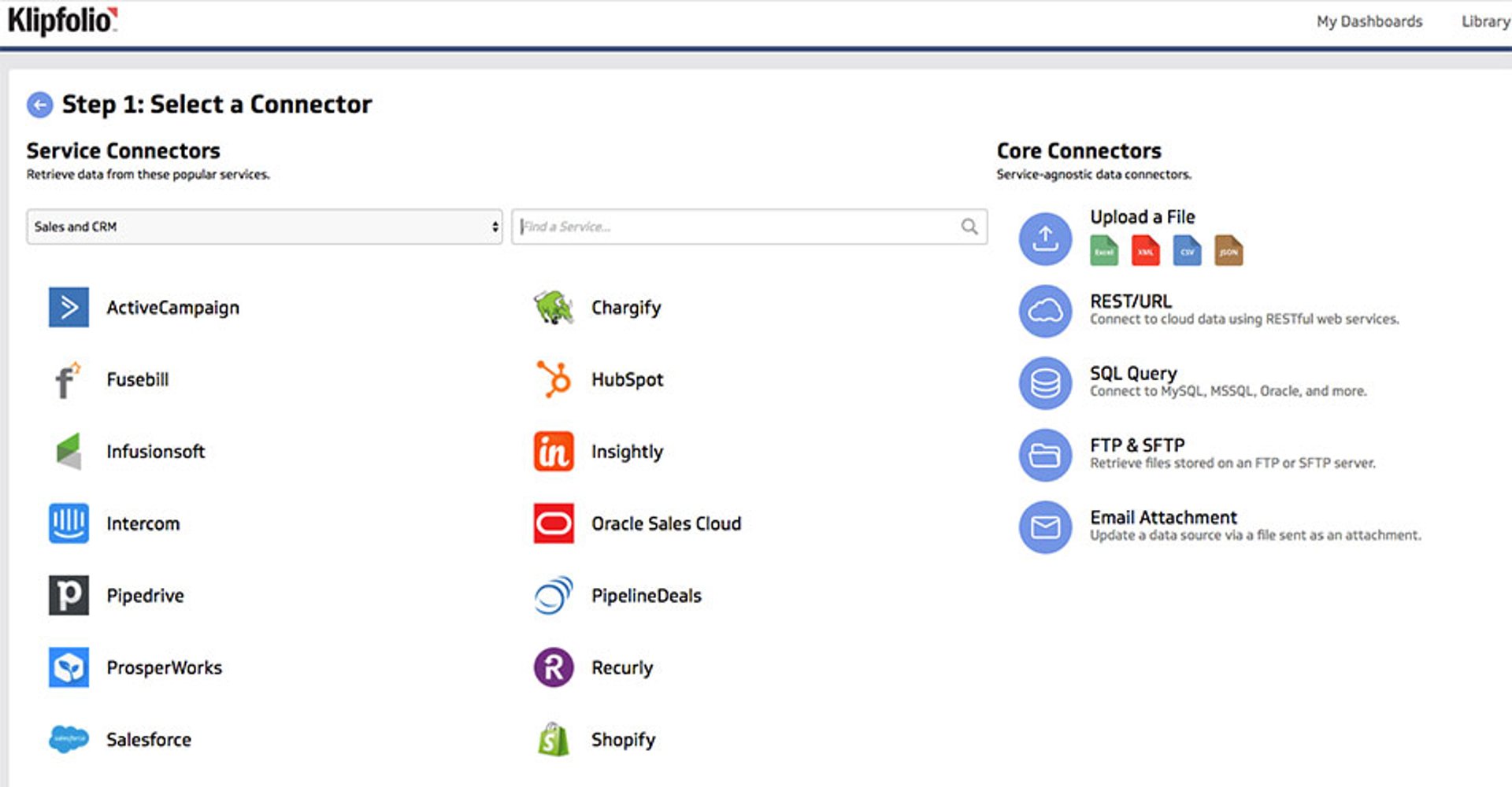
1. Using the Klipfolio Connector Gallery, connect to OneDrive and create a data source (dataset) using your plan spreadsheet
2. Using the Klipfolio Connector Gallery, connect to Salesforce.com, create and schedule a data source (dataset) that fetches the actual sales data
3. Using the Klipfolio Editor build your visualization (chart, gauge etc) that shows the actual results with data being fetched from the Salesforce.com data
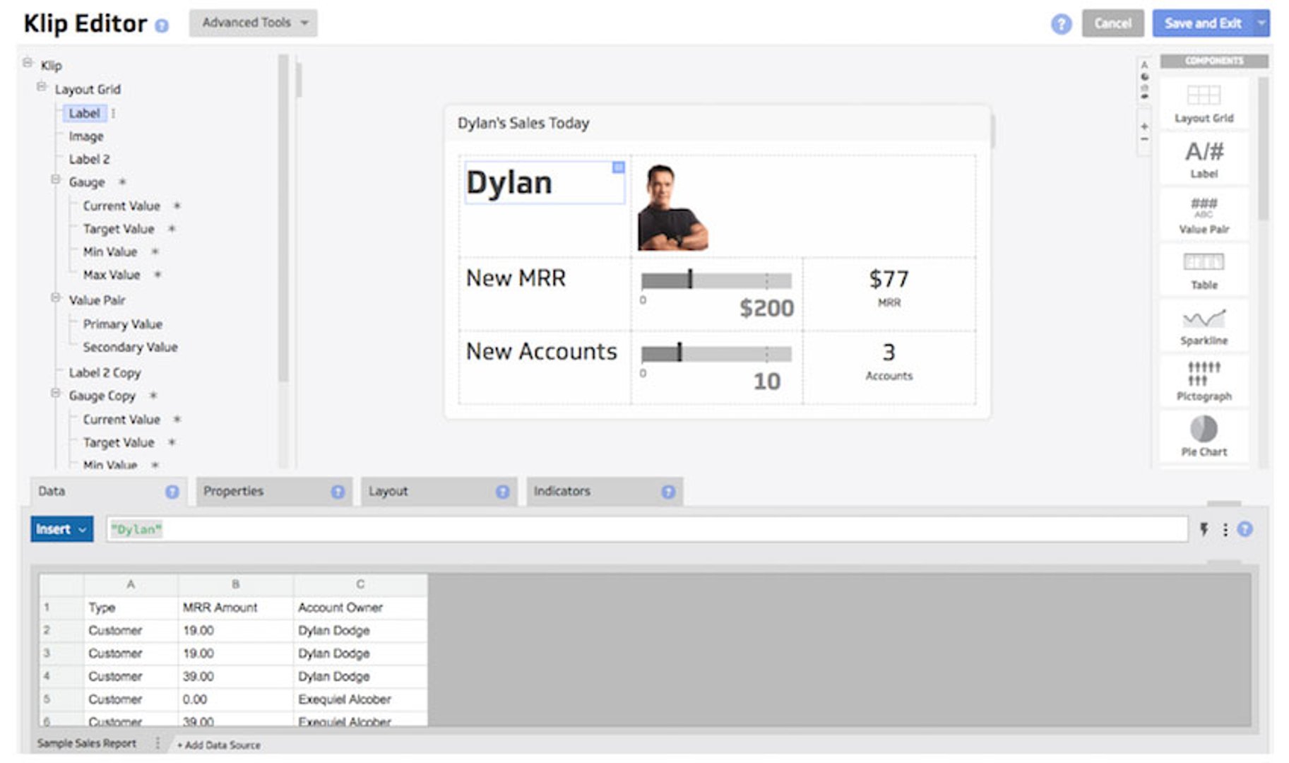
4. Finally, make your visualization come alive with dynamic targets, ranges, and indicators plugged from your spreadsheet
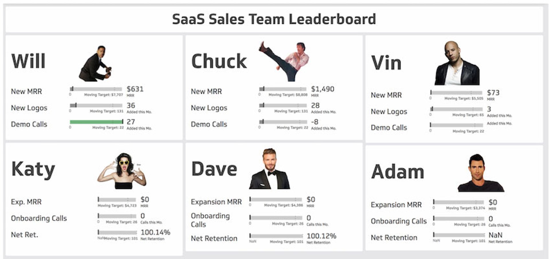
Great dashboards can monitor how you are doing in near-realtime. As both data sources are stored in cloud locations, when something changes, the data refresh schedule will pick up the change and your dashboard will flash to let you know something has changed.
Being able to compare your plan to your actual attainment is the real magic behind many great data monitoring dashboards we see our customers use everyday. Presenting this data in a good leaderboard helps keep motivated sales reps on their toes and fosters healthy competition between teammates.
The big picture, single view of multiple data sources provides an invaluable piece of business intelligence and a quick way for sales reps to see where they stand. Comparing target and performance data is just one example. There are lots of other ways to use data mashups - give it a try!
I hope you find this blog insightful. Happy dashboarding.
Related Articles

6 dashboards I use daily to run my SaaS company
By Allan Wille, Co-Founder — April 10th, 2026
Klipfolio Partner How-To #1: Duplicating dashboards across client accounts
By Stef Reid — November 27th, 2025
Klipfolio Partner How-To #2: Company Properties can simplify client set-up
By Stef Reid — November 26th, 2025