

Summary - Optimizing mobile website performance is essential. Learn how to develop KPIs that help you monitor and improve the mobile experience.
These days, mobile is king.
So if you want to reach your target audience you’d better be sure your website is optimized for mobile.
In this post we’ll delve into how you can monitor your website’s performance with key performance indicators (KPIs) that will help ensure it is delivering the best possible experience to mobile users.
Why do mobile website performance KPIs matter
Monitoring how your website performs on mobile is essential.
Why?
Because mobile has become a hugely popular means of accessing the internet.
Here are the facts:
- 77% of Americans own a smartphone (Source: pewinternet.org)
- Around half own tablet devices (Source: pewinternet.org)
- 1-in-5 Americans are “smartphone only” internet users (Source: pewinternet.org)
- 80% of social media time is spent on a mobile device (Source: comScore)
- 52.2% of all website visits take place on a mobile device (Source: Statista.com)
- 58% of searches on Google are done on a mobile device (Source: Hitwise)
- 30% of all online purchases are done on mobile phones (Source: thinkwithgoogle.com)
Slice up the data however you want – the fact is that providing a mobile-optimized experience for users is no longer optional.
So, what is mobile optimization for websites?
A site optimized for mobile consists of a few different factors.
Responsiveness
This is the most important factor behind optimizing your site for mobile.
Basically responsiveness means one thing: your website changes to fit a mobile device.
Here’s an example (via Google):
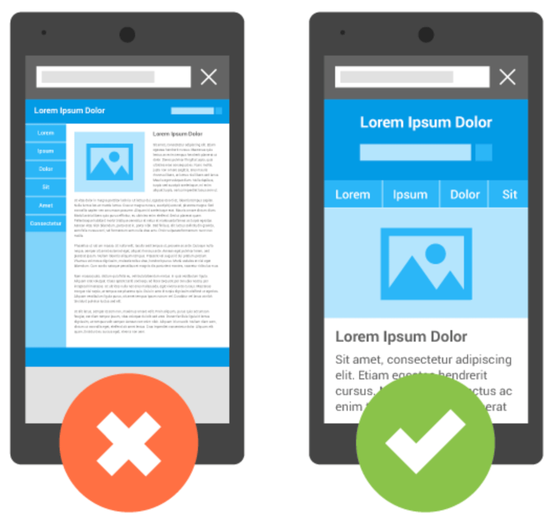
When your website loads on a mobile device, it should change shape to fit that device.
If it still looks like it does on a desktop but is just shrunk down on a phone screen, chances are your site is not mobile-optimized.
Site speed
Mobile isn’t just about how your site appears on a mobile device.
It’s also about how quickly it loads.
Forty per cent of consumers will leave a page that doesn’t load in three seconds or less.
And as consumer expectations continue to grow, that time window is probably going to continue to shrink.
That’s why Google recommends your site load in under a second.
Site speed is important regardless of the device a person is using. But it’s particularly important for mobile devices.
Why?
It’s pretty simple, really: Mobile devices can’t process data as quickly as more powerful desktop or laptop computers.
That means it will generally take far longer for a mobile device to load the same amount of data as another more powerful device.
It becomes very important, then, to find ways to decrease the size of pages so they’re more accessible for mobile devices.
Designed for touches (not clicks)
A fast, responsive site is important.
But usually it’s not enough.
That’s because mobile websites need to be designed with one important factor in mind: Audiences are tapping – not clicking.
Even sites that are optimized for mobile sometimes have poor design features that make them difficult to interact with using a touch screen.
Buttons that are easily clickable on a desktop can quickly become next to impossible to tap when you’re using something as imprecise as a finger.
A layout optimized for mobile
A mobile-responsive site sometimes doesn’t perform as it should on a mobile screen.
For example: It’s generally a best practice to have a call-to-action (CTA) high up on a page.
But if you don’t optimize your layout for a mobile device, you might end up with a CTA that’s not at all clear to the person visiting your website on a mobile device.
Reducing the size of your copy, adding images that are less vertical in layout and making CTA’s more visible are all steps you can take to improve your layout so it performs better on phones.
The advantages of a mobile-optimized website
A better user experience
Who wants to use a website that doesn’t work properly?
Not your customers.
(And definitely not your potential customers).
A poorly-designed website will turn off your users. If they can’t get your website to load properly on their phones, they might be thinking, how can they trust you with their business?
Or, what would be even worse, they might not be able to use your website at all.
For example: Your site may not perform properly on certain devices.
That could make it impossible for someone using, say, an iPhone to navigate properly.
If you have an information-based website, you’ll have to hope that your visitor returns later on another device. If you’re in the ecommerce business, it could be killer for your revenue totals.
Better search engine optimization
A mobile-optimized website has always had benefits for improving your site’s search results.
But it’s never been more important than it is now.
In 2018, Google rolled out a big change to its ranking algorithm.
Previously Google based the results of the search page you were searching for based on the device you were using.
If you searched on a desktop computer, your results would be based on how sites performed on desktops. If you searched on a mobile device, your results would be based on how sites performed on desktops.
The algorithm update changed that.
Now Google has changed to a “mobile-first index”.
That means that you will always receive “mobile” results – regardless of the device you are using for searching.
How your site performs on mobile is going to determine how your site performs on any medium.
What does that mean for you?
It means that a poor mobile site is going to cost you in terms of search result performance.
A larger audience
Now, I know what you might be saying. Our audience isn’t really on mobile devices. We primarily reach people via desktop or tablet.
And maybe that’s true. But the fact still remains: At least some of your audience is going to be searching for your company using mobile devices.
That means that, if you’re not optimizing for mobile, you’re missing out on expanding your audience.
What to consider when measuring your mobile website performance
Mobile vs. desktop vs. tablet
Comparing how your site performs on mobile compared to other platforms is a great starting point for measuring your mobile site’s success.
Let’s say the number of mobile vs. desktop visitors to your site is relatively even. But, when you look at conversions, you find a lot more of them are taking place on desktop.
This means that people are arriving at your site via mobile device, but those users aren’t converting.
That’s a sign that something’s wrong with your conversion process for mobile devices.
For example: Maybe the “checkout” button is hidden from mobile devices.
Whatever it is, you’ll want to run some tests to see how your site is performing when it’s loaded on mobile devices.
It’s just one example of how taking a metric and comparing how mobile performs versus desktop can help you get a sense for how optimized you are for mobile.
Device performance
Looking at mobile devices in the aggregate is important. But it’s not enough.
You also need to look at how your site is performing on different mobile devices.
That’s because your site won’t necessarily load the same way on different types of phones.
A site will sometimes perform differently on, say, iPhones than it will on Android devices.
By looking at how metrics break down between mobile devices you can get a sense for if site performance needs to improve on certain devices.
Cross-device activity
Of course, most users don’t use one type of device exclusively.
Consider this (theoretical) example.
A user sees one of your Instagram ads while browsing on their mobile device. They click through to your site but don’t make a purchase.
Later, while browsing on their laptop, they search for your website on Google. After clicking on one of the search results, they then complete a purchase.
The question then becomes: How do you track this cross-device activity?
Different platforms offer different means for doing so.
But the key consideration is this: you’ll want to figure out how (and if) your website users are using different devices, in addition to mobile, to interact with your website.
Factors that affect site speed
As mentioned above, site speed is an essential component of mobile website performance.
From improved search results to a better user experience, the benefits of a fast site are immense.
That’s why you’ll want to examine the factors that contribute to how quickly your site loads on mobile devices.
This includes everything from large image sizes and below-pageview loading parameters (lazy loading) to moving your site to a better server.
Useful mobile website performance KPIs worth adopting
The best mobile website performance KPIs will be unique to you and your organization.
Still, a few examples can help inspire you to find the metrics that will matter most to you.
Here are a few ideas to get you started.
Page speed (from Google’s PageSpeed Insights)
Page speed is too important to be left to chance.
Google’s PageSpeed Insights gives you an exact look at how fast your site is.
It also gives you helpful suggestions for how to improve your site’s speed.
Looking for a more detailed look? GTmetrix can be another useful tool.
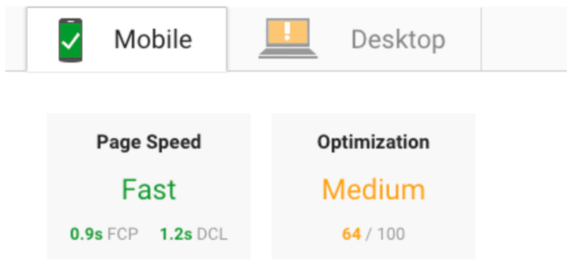
(An example of a particularly fast site being tested on PageSpeed Insights)
Mobile-friendly test
Being “mobile-friendly” isn’t enough when it comes to optimizing your site for mobile.
But it should at least be a bare minimum, especially if you want to appear in search results.
Using Google’s Mobile-Friendly Test can be an important KPI for ensuring that Google is able to crawl your mobile site properly.
Mobile device conversions
How do your site’s conversions stack up between mobile and other devices?
A low number of mobile conversions (in comparison to other devices) is a sign that your site’s conversion process might need some optimization for mobile.
Time on website by mobile device
Users should be able to access your website regardless of the type of mobile device they are using.
Your goal should be to have a relatively high average time on site for all of the major devices, such as Android, iPhone etc.
If time on site is way lower for a key type of device you are trying to target, you should investigate and fix.
Google search CTR: Desktop vs. mobile
Google Search Console is a great tool, particularly for measuring mobile website success.
One invaluable Search Console metric worth adopting as a KPI is click-through rate (CTR) on Google from desktop vs. mobile devices.
This one can help give you a sense for how you are performing when your page shows up in mobile search results.
If certain keywords are underperforming on mobile devices, it means that users are seeing your page show up in search results but are choosing not to click through.
That’s a good sign that you’ll want to check that page out to ensure that it’s optimized for mobile.
For example: Your “title” meta tag might not be written for mobile. Or perhaps other factors, such as how results appear on the page, are contributing.
Whatever it is, this KPI can be a helpful tool for monitoring your mobile site’s performance on its most important search keywords.
Pages per session on mobile devices
Arriving on your site is one thing.
But you also want to ensure users are interacting with it when they get there.
Monitoring pages per session on mobile devices allows you to ensure users are doing more than just arriving on a page and leaving.
Conclusion
There are a ton of tools out there that can help you measure your success in reaching your audience when they’re using mobile devices.
Find the ones that work for you and start monitoring!
Mark Brownlee is a digital marketing strategist in Ottawa, Canada.
Related Articles
6 Facebook ads reports every agency needs to attract and retain high-ticket clients
By Tanya Brody — April 10th, 2026
Business Metrics vs. KPIs: What’s the Difference?
By Jonathan Taylor — March 13th, 2026
The 5 most important SEO KPIs for digital marketing success
By Sanket Patel — February 24th, 2026