Customer Complaints Due to Poor Service or Product Quality
Measure the share of total complaints that stem from unmet service or product expectations, spot patterns early, and act before loyalty erodes.
Quality Complaints as Share of Total
What is Customer Complaints Due to Poor Service or Product Quality?
Customer Complaints Due to Poor Service or Product Quality measures the share of total complaints that stem specifically from unmet service or product expectations, expressed as a percentage.
When this number climbs, it signals a pattern, not a one-off incident. Unresolved patterns erode loyalty, generate negative word-of-mouth, and quietly shrink your customer base before the damage shows up in revenue.
Why this metric matters
A single complaint tells you one customer had a bad experience. A rising complaint rate tells you something in your product or service delivery is broken.
Tracking this KPI helps you:
- Spot recurring issues before they become reputation problems
- Prioritize fixes by understanding which complaint types are most frequent
- Measure improvement after changes to your product, process, or team training
- Protect loyalty by acting on feedback before customers leave without a word
Most customers who are unhappy don't complain. They leave. The ones who do complain are giving you a chance to fix something. This metric makes sure you're paying attention.
How to calculate Customer Complaints Due to Poor Service or Product Quality
(Customer complaints about service or product quality / Total number of customer complaints) × 100
Example: Your support team receives 200 complaints in a month. Of those, 60 are specifically about service quality or product defects. Your rate is:
(60 / 200) × 100 = 30%
That 30% tells you nearly one in three complaints points to a quality issue, which is worth investigating as a root cause, not just resolving ticket by ticket.
What counts as a service or product quality complaint?
Not every complaint belongs in this category. A complaint qualifies when the customer's dissatisfaction traces back to:
- Product defects or failures: the product didn't work as described or broke sooner than expected
- Service delivery gaps: a service was slow, incomplete, or inconsistent with what was promised
- Unmet expectations: the customer received something meaningfully different from what they were sold
Billing disputes, shipping delays, or general pricing complaints are typically tracked separately. Keeping categories clean makes the data more actionable.
How to interpret the rate
There's no universal benchmark for this metric. What matters most is your own trend over time and how your rate compares across product lines, service channels, or customer segments.
A few signals worth watching:
- A rising rate suggests a systemic issue in product quality or service delivery that needs investigation
- A stable but high rate suggests the problem is known but not yet fixed
- A declining rate after a product change or training initiative is a strong sign the intervention worked
- Spikes tied to specific periods (a product launch, a staffing change, a new process) help you trace root causes faster
Reporting frequency
Monthly reporting is standard for this metric. Monthly data gives you enough volume to spot trends without the noise of week-to-week fluctuations.
If your complaint volume is high, weekly tracking can surface issues faster. If you're a smaller team with lower volume, quarterly may be more meaningful.
How to reduce this rate
Tracking the metric is the first step. Acting on it is where improvement happens.
- Review complaint notes directly. Aggregate data tells you the rate. The actual complaint text tells you why. Read a sample regularly.
- Segment by product or service line. A blended rate can hide a specific area that's driving most of the complaints.
- Close the loop with customers. Following up on quality complaints and documenting what changed builds trust and reduces repeat issues.
- Share the data cross-functionally. Quality complaints aren't only a support problem. Product, operations, and customer success teams all have a role in reducing them.
Create custom dashboards for you and your team.
Get started with KlipsTrack Customer Complaints Due to Poor Service or Product Quality in Klips
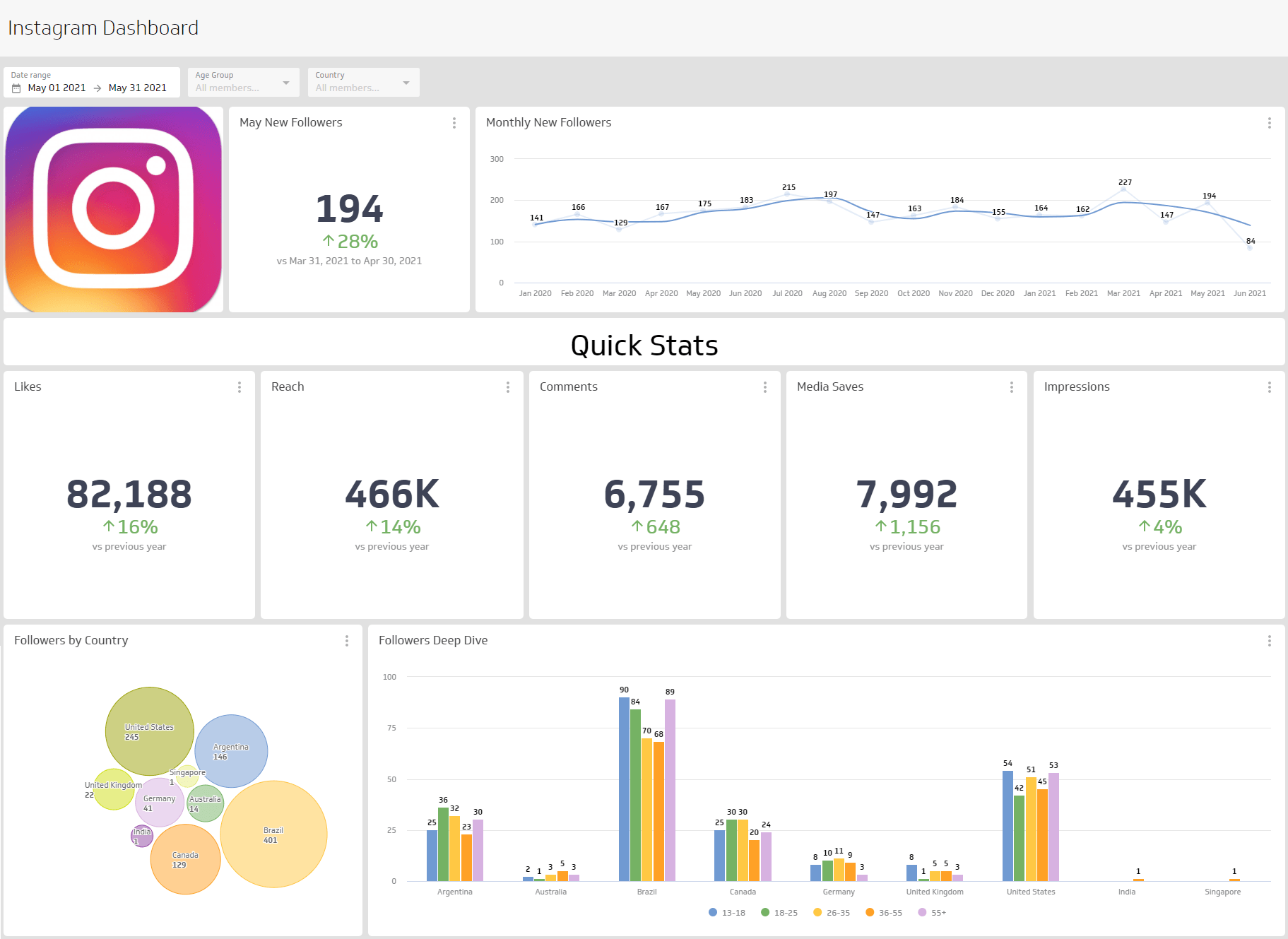
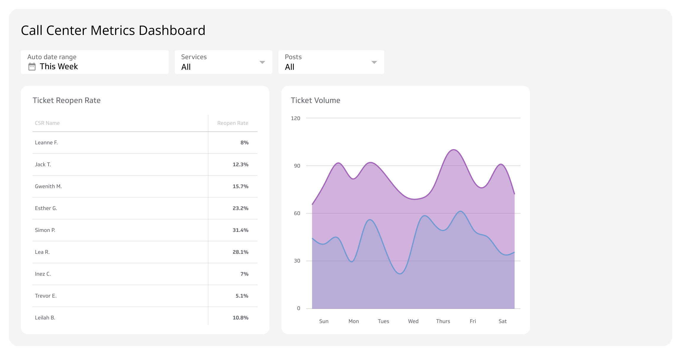
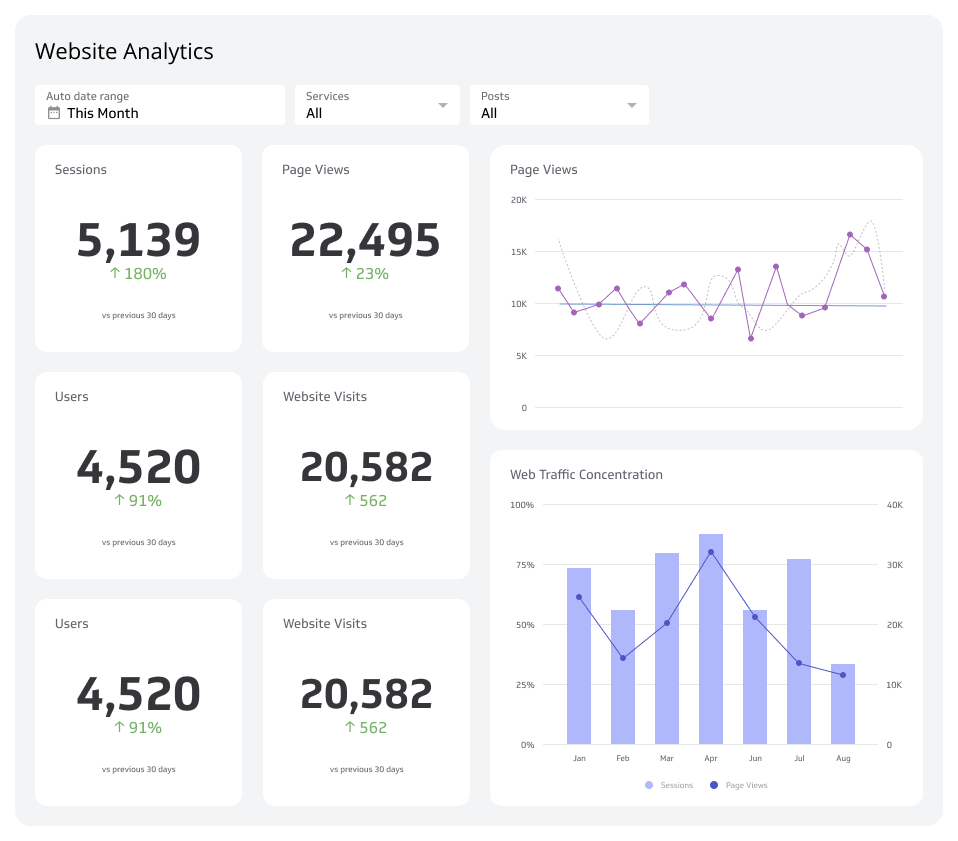
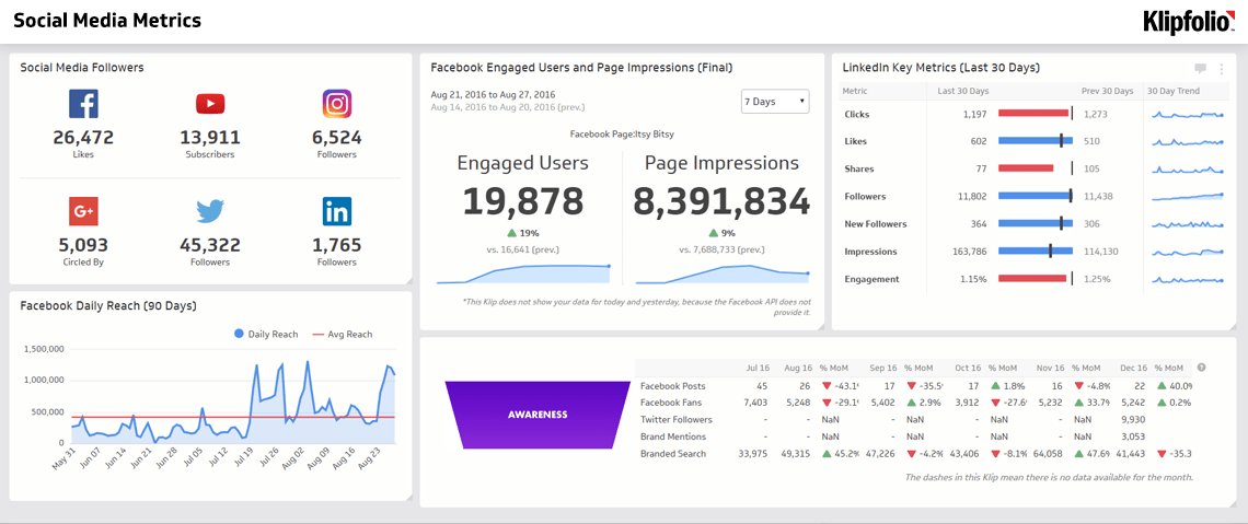
Monitoring this metric manually, or copying numbers into a spreadsheet each month, means you're always looking at yesterday's picture. A live dashboard in Klips connects your support data directly, so your team sees the current complaint rate without anyone having to pull it.
You can track complaint categories side by side, set thresholds that flag when the rate climbs, and share a consistent view with everyone who needs to act on it, from support leads to product managers.