
Summary - The arrival of social media brought with it a big shift towards community-based marketing. Discover the top 5 essential metrics for community engagement
The arrival of social media brought with it a big shift towards community-based marketing, and the companies that benefited most (like Innocent, Red Bull, and Sephora) are the ones that I’ve really learned about the community and lifestyle aspects of their products and services.
These companies are strong evidence that building a community around your brand, business, industry, or craft is the best way to foster engagement and boost loyalty, trust, and repeat business from a community of customers.
What’s so great about community engagement anyway?
The key benefit of community engagement is that you’re encouraging an open dialogue with your customers and helping them start conversations with each other.
Rather than just pushing information to them at key times in their customer lifecycle, you’re gathering loyal customers into a space for them to talk about your brand, share great customer experiences, and encourage further loyalty.
Moreover, as Forbes contributor AJ Agrawal notes, the “costs of marketing to new customers is six to seven times the amount as it is to market toward an existing community base.”
Every brand, product, and service you can think of right now is about building a community. Some are doing so with their Facebook Page. Some are even bringing their communities together in real life with events and conferences, while others have created their own dedicated community platforms purely to boost community engagement.
Building a community of repeat customers and maximizing the lifetime value of each and every one of them is a far more cost-effective way to grow your business than repeatedly finding and marketing to new one-time customers.
Community engagement vs. vanity metrics
When it comes to online communities and engagement, what really matters is not just how many people you have gathered but how deeply they care about and engage with your space. It's all about creating a vibrant and supportive environment where members feel valued and invested.
We emphasize tracking the kind of metrics that shed light on the true health of a community. This includes understanding how often members come back for more or how long they spend with us during each visit.
These indicators help us grasp the level of interest and value members derive from the community, guiding us to foster even deeper connections.
Conversely, we don’t focus on the vanity metrics. The ones that sound great and make you feel good but don’t necessarily give you any insight into the quality or depth of your audience’s engagement. These are the one-dimensional, top-line metrics like follower numbers or downloads.
Focusing on engagement quality over quantity
When it comes to building a successful, thriving community, it really is all about quality and depth of engagement, not just the number of followers you have or the overall size of the community.
Exhibit A | You have a community of 50 members. The members are all invested in their community and, on average, visit their community space four times a day. They spend a lot of their daily time collaborating with fellow community members and uploading on-topic, interesting information. |
Exhibit B | You have a community of 500,000 members. However, your members are all mildly interested in the community but don’t feel invested enough to contribute to its overall growth and success. They visit once or twice a day but only stay long enough to look at the news feed quickly and perhaps like a post from time to time. They rarely collaborate with other members or contribute any of their own content or ideas (and when they do, it’s mostly cat memes). |
We know which community we’d rather be a part of and which community we’d rather help build.
We’re not saying that a big community can’t be as successful as a small community. Or that smaller suddenly equals better. But what we are saying is that audience or community size alone isn’t a key indicator of engagement or success.
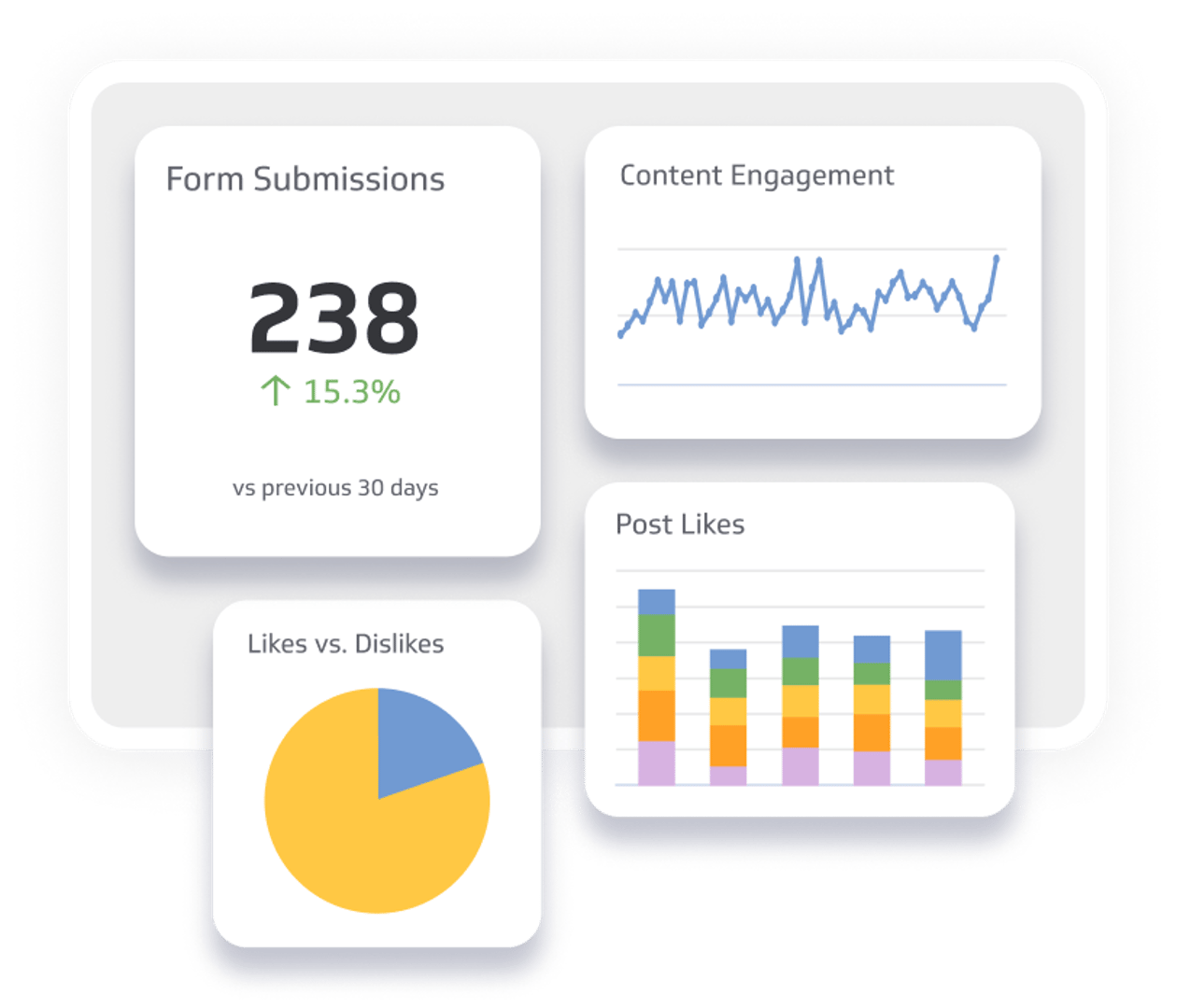
Top engagement metrics to monitor
The benefits of community engagement through marketing are endless, and we’re finding it increasingly easy to prove that to our new and potential customers just by showing them some of the data we’ve collected.
For instance, we've had the privilege of working with Disciple, a standout example of how businesses can leverage the full potential of community engagement.
Disciple is a community media platform that makes it easy for brands, businesses, and entrepreneurs to build their own interactive social community apps. These are designed to help them gather, build, and engage their communities.
With that said, let’s take a look at the five community engagement factors you should be tracking. While these won’t tell you everything you need to know about your community, they’re a great place to start.
We’ll break each aspect of community engagement down to give you a definition, an explanation of how we use it at Disciple, and an idea of what it can and can’t do.
1. Retention
Retention is the percentage of your community that joins or visits your community space and returns within a specific timeframe. It’s essential for measuring the depth of community engagement and determining whether your community delivers something valuable to its members.
Here’s what you’ll need to calculate your retention rate over a given period of time:
START - The number of community members you have at the start of the period
END - The number of community members you have at the end of the period
NEW - The number of new members who joined your community during the period
And this is how we calculate the retention rate for community apps on our platform:
(END - NEW) / START x 100 = Retention Rate (%)
For example, if you have 200 users at the start of January, 250 at the end of January, and you’ve acquired 90 new users over that month, your retention equation would look something like this:
(250 - 90) / 200 x 100 = 80% Retention in January
So, as you can see, it looks at the number of community members that return to the community space within a specific amount of time while excluding newly acquired members from the calculation.
If you have a high retention rate, it means your community is delivering value to its members and offering them something that makes them want to come back. Conversely, if you have a low retention rate, it means your community is not delivering value to its members, giving them no reason to return.
How we use it at Disciple:
App analytics platform Mixpanel describes trying to grow a community space without focusing on retention can be as challenging as filling a leaking bucket.
You’re spending a lot of time, money, and resources spreading awareness about your community and acquiring new members. If those new users don’t find anything of value when they arrive, they won’t return. That’s a lot of wasted money and effort for you and your brand.
We always present this information to our customers on their own app retention dashboard. This way, they know whether their content delivers value to its members.
The limitations:
Retention is an important factor to consider, so keep it on your list. One thing to remember here is that the retention period you choose to look at should fit with the cadence of new content and the level of activity you expect or hope to see in your community.
For example, if your community content runs on a weekly cycle, you should be looking at a retention period of seven days.
2. Daily, Weekly and/or Monthly Active Users (DAUs, WAUs & MAUs)
DAUs, WAUs, and MAUs refer to the number of unique visitors that visit your community spaces in a given time period.
DAUs: The number of unique visitors who visit your community space on a specific day.
WAUs: The number of unique visitors who visit your community space in a specific week.
MAUs: The number of unique visitors who visit your community space in a specific month.
DAUs, WAUs, and MAUs are the go-to community metrics for any online product or service. They instantly give you a snapshot of the number of people who have interacted with your product, used your service, or visited your digital space within the time period that makes the most sense for your community.
Using that information, you can get an important, albeit top-line, insight into whether usage and visits are on an upward trend.
Is your community growing and gaining popularity? Or is interest falling?
Let's say you decide to keep an eye on engagement by knowing how many people visit your community each day. You'll end up with a chart that shows you this pattern. But before you dive into tracking, it's important to really think about what makes sense for your specific community.
For instance, if your community only shares a big news update once a week, then checking who's around every single day might not tell you much.
After all, you're not adding new things for them to see every day.
Picking the right things to track helps you understand your community engagement better without wasting time on numbers that don’t help much.
When it comes to deciding which factors to show on your dashboard, think carefully about whether you should be tracking MAUs, WAUs, or DAUs. How often do you want your community members to visit your community space? How often are you delivering new information to bring them back into your community space?
The limitations:
Your DAU number alone won’t give you any understanding of the depth of engagement. It won’t tell you how much time each unique user has spent engaging with your community or what actions they completed.
When tracking DAUs, make sure you’re using those numbers in conjunction with others, such as session length and retention, to get a better understanding of engagement depth.
3. Average Session Length
Average session length refers to the amount of time a member spends in your community space in a single visit.
Again, the logic here is simple: the more engaged your members are and the more they enjoy interacting with your community, the more time they’ll spend in your community space.
Your members are busy people. They don’t have enough spare time to spend on things that don’t interest or engage them. So, the more time they choose to spend with your brand and their fellow customers, the more interested, invested, and engaged they are.
How we use it at Disciple:
We use average session length to gain insight into the depth of engagement in the communities on our platform.
A longer average session length indicates that members are finding something of value in their community. They may be creating and sharing their own content, thoughts, and ideas—or perhaps they enjoy reading other people’s content and interacting with posts, comments, and messages.
A short average session length suggests that your members are not getting enough value out of your community. Think of it in the same way you think of a bounce rate.
If visitors don’t find what they came searching for, they leave. Quickly. So, the shorter your average session length, the more people bounce, meaning they’re not getting the value they’re looking for.
The limitations:
The average session length alone won’t paint the full picture of the depth of engagement. It’ll tell you how much time they’re spending with your brand, but it won’t tell you anything about how much time they spent.
Regardless of how long your average session length is, you should use that information with more qualitative data points to see how your members spend their time. To do that, manually run through a randomly selected sample of 10 unique sessions to see what those members completed during their sessions.
4. Percentage of your community’s user-generated content (UGC)
A key ingredient in any community is conversation. Communities are built around shared interests and things that people have in common. UGC is the percentage of your content published by the community members.
Here’s what you’ll need to calculate your UGC rate over a given period of time:
UGC - The total number of posts published by community members in a specific timeframe
HOST - The total number of posts published by the community host in the same timeframe
This is how we calculate the UGC rate for community apps on our platform:
UGC / (UGC + HOST) x 100 = UGC Rate (%)
For example, if you, as the community host, have published 100 times in February, but your community has posted 1000 times in February, your equation will look something like this:
1000 / (1000 + 100) x 100 = 90% UGC Rate
In other words, one thing you should be looking for when building your community is conversation and community involvement.
Are your members engaged, involved, and invested enough in the community to spend their time publishing their thoughts and sharing their opinions/experiences with other members of the community? Are your members interacting with each others’ content?
How we use it at Disciple:
We always encourage our customers to enable the community-building elements of our feature set, including a newsfeed space dedicated to community members. Their own space to connect with each other and have those all-important conversations.
On average, across all live Disciple-powered community apps, 98% of the communities’ content comes from the members. This leaves only 2% of the content to come from the brands, businesses, influencers, or people hosting the apps.
You can absolutely see just how important UGC is in building a thriving, busy, exciting community space filled with glorious, engaging content!
The limitations:
As with all these metrics, they can’t just be looked at by themselves in a vacuum, out of context. That’s especially true regarding UGC because you need to know what the content is.
On the one hand, a high percentage of UGC could mean that your members are posting well-thought-out, on-topic, engaging opinions and experiences. But it could just be a whole host of mindless cat memes or, worse yet, inappropriate or toxic content that will inevitably drive other people away from your community space.
So, you should certainly be tracking how much of the content comes from its members, but you also have to be keeping track of what that content is.
5. Number of posts reported as inappropriate
In any community, content moderation is essential. These metrics are the number of posts and comments that have been flagged as inappropriate by other community members.
It’ll help you work out how much moderation you need to be doing. As the host, you want to build a safe, welcoming environment for your members to feel comfortable and at home.
Unfortunately, you can’t always rely on people to naturally build that by themselves. Trolls, fake accounts, and inappropriate content are all a part of online community building.
By monitoring the number of flagged posts, you can take steps to nip it in the bud and make sure inappropriate use doesn’t permeate throughout your community.
How we use it at Disciple:
We track any reports of inappropriate content and highlight that information to our customers in their app analytics dashboard. It helps us and our customers keep an eye on their members and whether anything threatens their attempt to build a thriving, engaged community.
As we all now know, thanks to the much-reported recent stories surrounding Facebook and YouTube, fake users and inappropriate content can be devastating for any group’s engagement. As such, internet users are increasingly calling for smarter measures to be put in place to detect toxic content and misuse before it ever reaches anyone else’s screens.
We at Disciple believe in building positive, safe, secure environments for communities of all shapes and sizes. As such, we have a number of moderation features and tools that we use to detect and hide inappropriate content before it reaches any other member of the community.
But, as a fallback and a safeguard, we always monitor inappropriate content and reported users.
The limitations:
In some cases, users report each others’ content for the wrong reasons. The content may not be inappropriate; it might just present a conflicting view or opinion to those who are reporting the content. This can sometimes skew the numbers and make it appear as though there’s more inappropriate behavior going on than there actually is.
But, in our opinion, it’s always worth tracking it and checking it out for yourself. Just to be sure.
Boosting your members’ engagement
To create a thriving community, you must track and understand the depth of your members' engagement based on the five key community engagement metrics above.
Checking signs of increasing involvement, such as frequent returns or abundant content creation, reveals the discussions, topics, or activities that resonate most. This way, you can focus on strategies that are working to grow your engagement.
Foster a welcoming community space where everyone feels that they belong. It's not merely about the number of members but their active participation that truly matters.
When you encourage meaningful involvement, your brand can develop a community that not only sustains interest and engagement but also cultivates loyalty and repeat business, making everyone feel valued and connected.
Related Articles

5 tips to understand (and organize) your restaurant data
By Saleem Khatri — June 9th, 2026
6 Facebook ads reports every agency needs to attract and retain high-ticket clients
By Tanya Brody — April 10th, 2026
6 dashboards I use daily to run my SaaS company
By Allan Wille, Co-Founder — April 10th, 2026