
Summary - Bullet charts provide a simple, clear way to visualize performance against targets. Learn how to use Table Klips and Gauge Klips to display bullet charts in your dashboards and keep your team aligned on progress.
Bullet charts are one of the most effective ways to visualize performance against targets. Originally developed by visual business intelligence expert Stephen Few, these charts pack meaningful data into a compact, easy-to-read format—making them ideal for any business dashboard. A bullet chart works by layering three elements: a tick-line representing your target, a solid bar showing your current value, and a shaded background bar representing a comparative benchmark. This simple structure works for any metric, whether you're tracking sales revenue, customer acquisition, or service-level agreements.
Setting the right targets
Before you build your first bullet chart, define targets that actually matter for your organization. Targets need balance. Set them too low and your team grows complacent. Set them too high and you risk burnout and disengagement. The best targets challenge your team to perform at their best without feeling impossible.
Think of it like Goldilocks: you want targets that are just right. A well-crafted target motivates behaviour and drives results. Once you've locked in your targets, you're ready to visualize them.
Two ways to display bullet charts in Klips
Klips (Klipfolio's dashboard components) offer two approaches to displaying bullet charts: Table Klips with bullet chart formatting, and Gauge Klips. Each has distinct advantages depending on your use case.
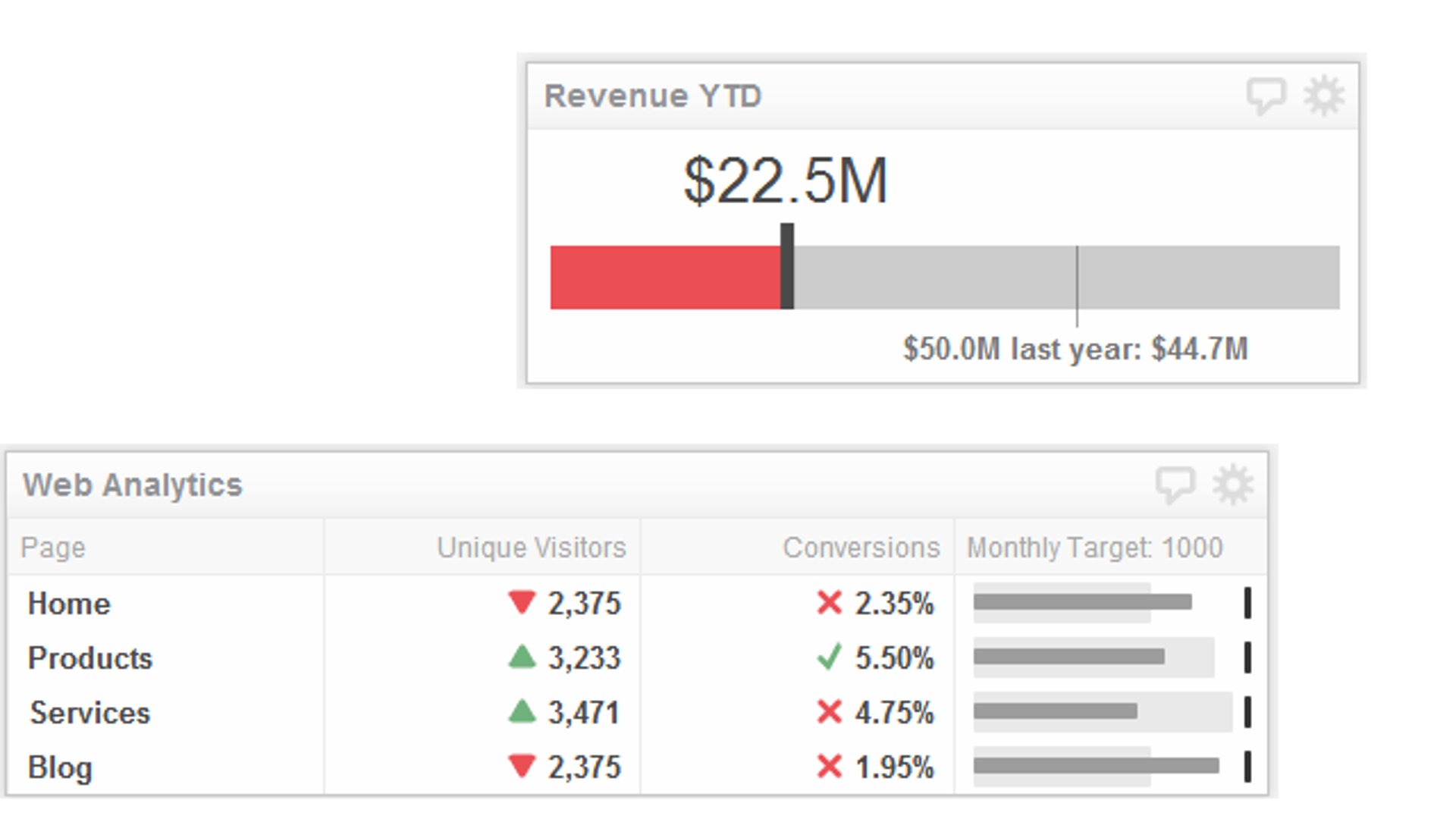
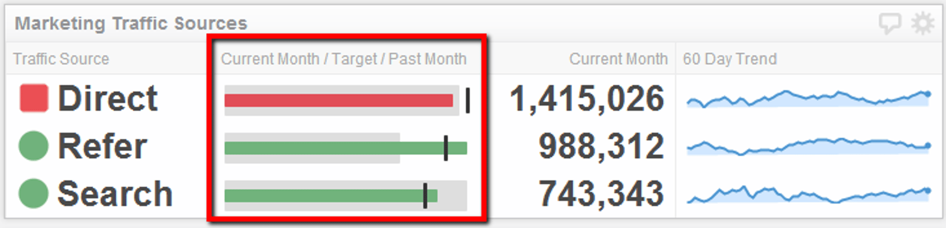
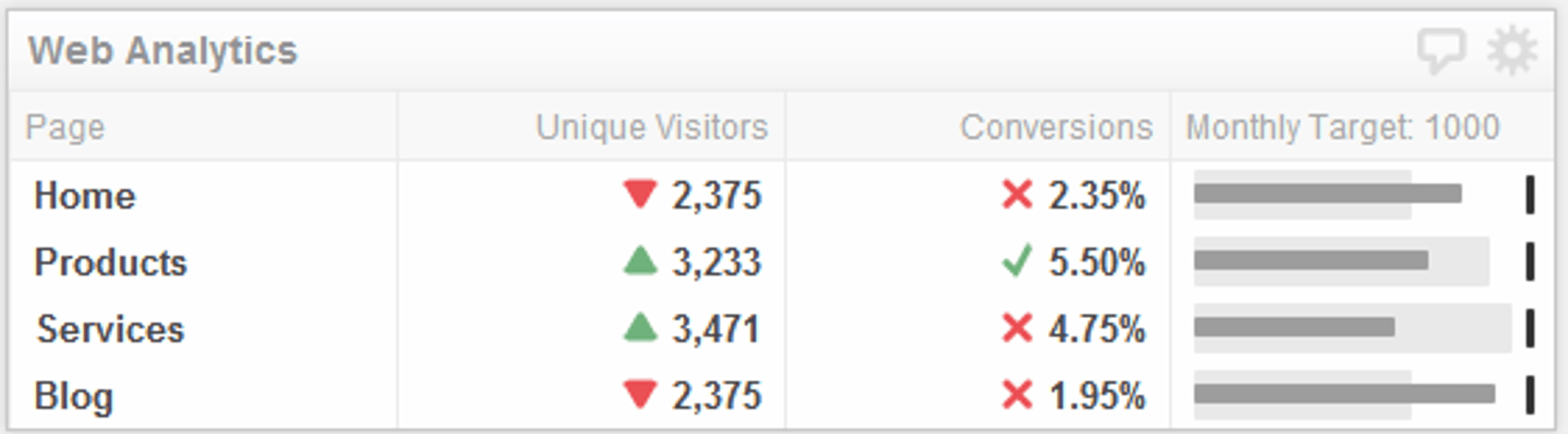
Option 1: Bullet charts in tables
Table Klips with bullet chart formatting let you combine visual performance indicators with additional context in a single view. The bullet chart itself takes up just one column, freeing up space for other metrics, trends, or supporting data.
For example, imagine tracking digital marketing KPIs like leads captured this month. A bullet chart in a table tells you at a glance whether you've hit your monthly target, while a second column shows how this month compares to last month. You get instant clarity on performance and momentum.
The advantage here is efficiency: one visual tells the full story without cluttering your dashboard.
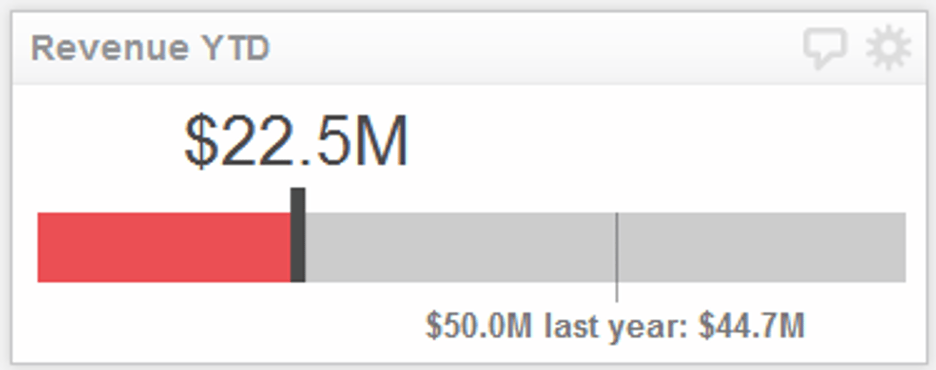
Option 2: Gauge Klips
Gauge Klips are simplified bullet charts designed to monitor a single metric against one target—perfect for revenue KPIs, conversion rates, or any headline number that deserves focus. Unlike Table Klips, Gauge Klips don't include a comparative benchmark bar, but they make up for it with richer visual features: you can layer in colour-coded indicators, custom text labels, and even suffix fields to add context (like currency symbols or percentage signs).
If you need to include a comparison value, add it to your target description or use the suffix field to keep formatting clean.
Why bullet charts work
Bullet charts succeed because they're information-dense yet instantly readable. Your eye doesn't have to hunt for meaning—the visual hierarchy is built in. You know immediately whether you're on track, ahead, or behind. This clarity is especially valuable in team settings: when everyone looks at the same dashboard, everyone understands the same story about performance.
Bullet charts also scale. Whether you're monitoring one KPI or twenty, the format remains clean and professional. They work equally well on desktop dashboards and mobile devices, making them a versatile choice for distributed teams.
Getting started
Ready to build your first bullet chart? Start with the Table Klip how-to guide and the bullet chart formatting guide. If you prefer a Gauge Klip, the Gauge Klip guide walks you through setup in minutes.
The key is choosing the right format for your audience and use case. Table Klips work best when you need context and comparison. Gauge Klips excel when you want to spotlight a single, critical metric. Either way, you'll have a clear, visual way to keep your team aligned on what matters most.
Related Articles
10 Cloud BI Dashboard Tools for Small Businesses in 2026

6 dashboards I use daily to run my SaaS company
By Allan Wille, Co-Founder — April 10th, 2026
Klipfolio Partner How-To #1: Duplicating dashboards across client accounts
By Stef Reid — November 27th, 2025