

Summary - Can you spot these misleading statistics in your analytics and data visualizations?
“74% of firms say they want to be “data-driven,” only 29% say they are good at connecting analytics to action.” - Forrester
Generating, processing, and sharing statistics and data - do these actions make you a “data-driven” company?
Sure, they do, but if the data and statistics driving your decisions are inaccurate or completely false, the ensuing negative results can spark confusion and poor performance.
Credible data eliminates the scary prospect of relying on whimsical guesses and “gut feels.” It combines human experience and intuition with concrete numbers and analytics to birth decisions capable of moving the needle.
But intuitive dashboards, charts, statistics, and graphs often mask a spurious reality: misleading statistics and data.
With technology rapidly advancing and users adapting at an equal pace, companies have become reliant on data and statistics to navigate a competitive business environment.
But it’s easy to get blinded by the absoluteness of numbers, especially when they lend credibility to favorable hypotheses or points.
Failing to recognize false statistics and data is a threat to data-driven decision-making.
It encourages you to push the proverbial wrong buttons with full confidence, and that’s where the danger lies.
In this post, you’ll learn how to spot misleading statistics and data. We’ll look at the common ways they mislead and how to determine when data can bear the weight of critical decisions.
What is a Misleading Statistic?
Misleading statistics refer to data points, figures, or visual representations that are inaccurate, false, or manipulated to convey a distorted or biased message. They often arise from errors or biases in the collection, organization, or presentation of data.
Misleading statistics can lead to incorrect conclusions, poor decision-making, and a false sense of confidence in certain beliefs or assumptions. Common ways that statistics can be misleading include selective bias, neglected sample size, faulty correlations, and causations, and the use of manipulative graphs and visuals.
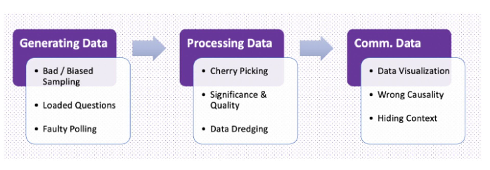
Misleading statistics are created when a fault - deliberate or not - is present in one of the three key aspects of research:
- Collecting: Using small sample sizes that project big numbers but have little statistical significance.
- Organizing: Omitting findings that contradict the point the researcher is trying to prove.
- Presenting: Manipulating visual/numerical data to influence perception.
Bad statistics creep into news outlets, ad campaigns, and even scientific literature. A shocking 33.7% of scientists - the superlatives of being data neutral - have admitted to misuse of statistics to support research. Yes, even some of societies’ trusted gate-keepers of information are guilty.
To help you make critical decisions based on the right data, we’ve listed the common ways statistics mislead and misinform.
Selective Bias To Create False Statistics
A study by Elizabeth Loftus tested the influence of language on eyewitness testimonies. Subjects were shown a film depicting multiple car accidents. After watching, they were asked, “about how fast were the cars going when they smashed into each other?”
Other subjects were then asked the same question, albeit with the word “smashed” replaced with suggestive verbs like:
- Contacted
- Hit
- Bumped
- Collided
The results?
The stronger the “loaded” verb used was, the higher the speed estimate from witnesses.
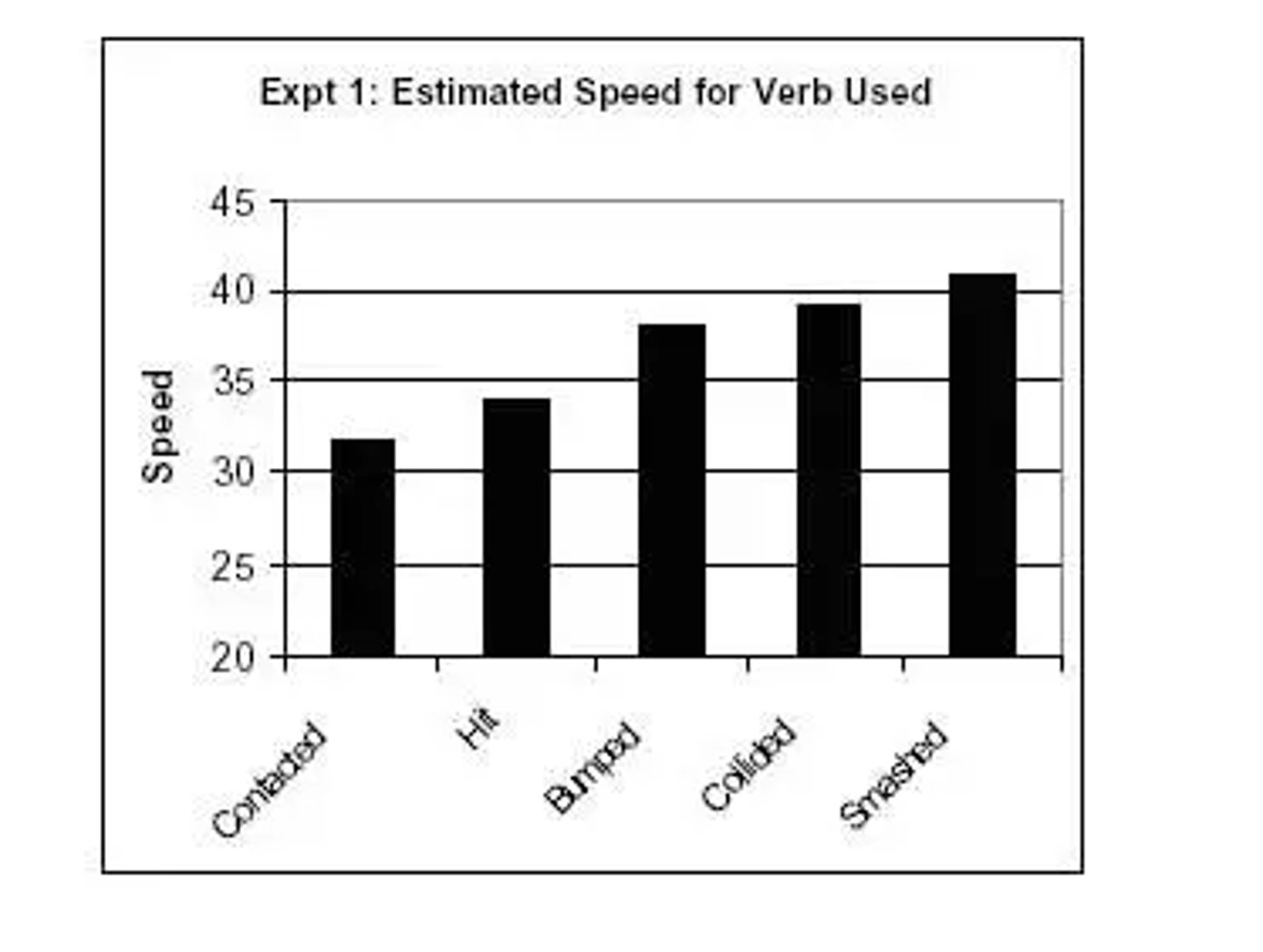
Furthermore, the study found when using a stronger verb, subjects were more likely to report broken glass at the accident, even though the broken glass wasn’t shown in the video.
Using language to influence survey answers and results is just one example of selection bias. In 2007, the Advertising Standards Authority (ASA) forced Colgate to abandon its claim that “over 80% of dentists recommend using Colgate” because the claim misleadingly implied “80% of dentists recommend Colgate toothpaste in preference to all other brands”.
The actual survey question was, “given the choice between brushing alone and using a toothpaste - like Colgate - which would they recommend.”
By cherrypicking their survey response, Colgate gave the impression that dentists recommended them over competitors’ brands; the actual recommendation was using any toothpaste is superior to brushing alone.
Selective bias often occurs when chosen samples or data are incomplete or cherrypicked to influence the perception of - and even skew - statistics and data.
Neglected Sample Size Resulting In False Precision
(source)
90 people answered “yes” out of 100 people ( 90%), versus 900 people answering “yes” out of 1000 people (also 90%); the percentages are similar, but the difference in value and validity of data is statistically significant.
Smaller sample sizes almost guarantee alarmingly significant results. Always beware of extreme results, and never accept percentages at face value. In the words of biochemistry researcher Ana-maria Sundic:
“To ensure that the sample is representative of a population, sampling should be random, i.e. every subject needs to have equal probability to be included in the study. It should be noted that sampling bias can also occur if the sample is too small to represent the target population”
Faulty Correlations and Causations To Create False Statistics
“Correlation doesn’t mean causation”.
No doubt you’ve heard this phrase before, but for a good reason, it’s true.
When two variables correlate, the following usually applies:
- Y causes X.
- X causes Y.
- A third factor triggers X + Y.
- The correlation is down to chance.
Correlation and causation warrant plenty of suspicions because researchers - and consumers of said research - fall prey to:
- Number fetishism
- Correlation hunting
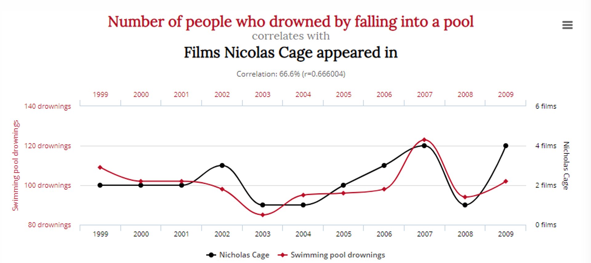
Tyler Vegihn compiled some funny misleading statistics examples to prove this exact point:
This graph depicts a compelling correlation between the number of people who drowned falling into a pool and the number of movies Nicolas Cage appeared in:
Another shows a correlation between the number of people who died by becoming entangled in bedsheets, with cheese consumption:
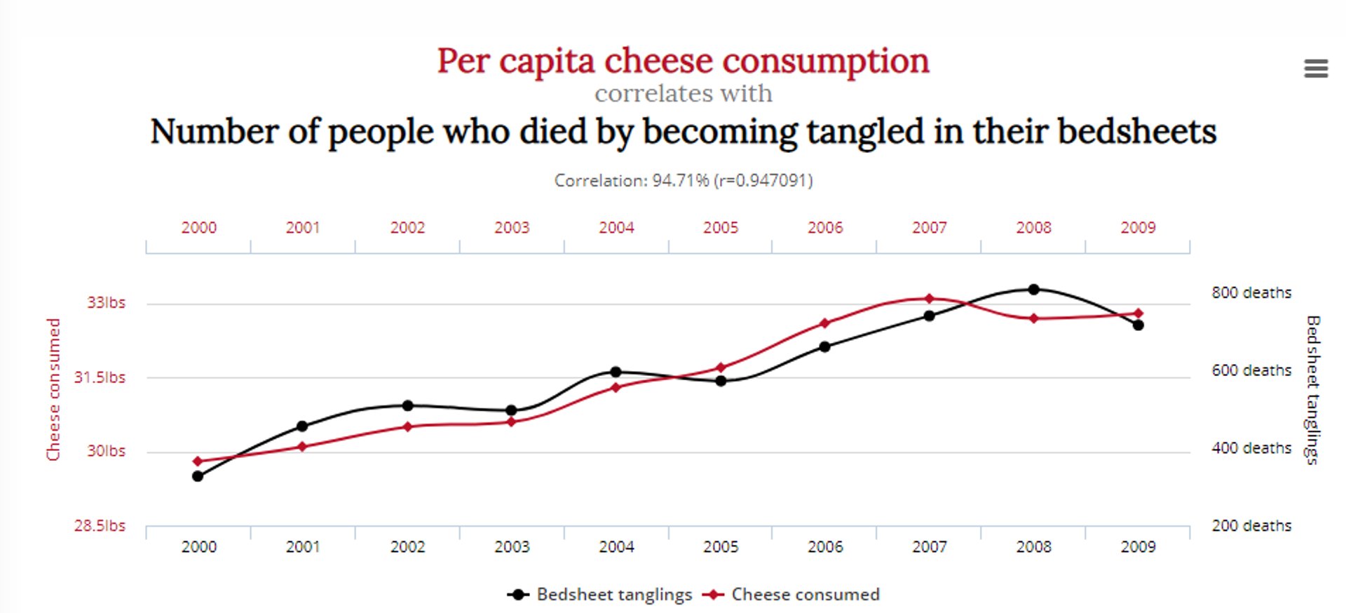
Does this mean reducing cheese consumption and Nicolas Cage’s acting roles will save lives? Probably not.
Given that researchers are pressured to discover useful data or prove a hypothesis, the temptation to prematurely declare an “aha” or “eureka” moment is high.
This poses a problem to healthy analyses and statistics; throw in enough variables, and you’re almost guaranteed to find a correlation with anything.
Misleading Graphs and Visuals
Data visualizations turn raw numbers into visual representations of key relationships, trends, and patterns. While they are able to bring your data to life, they’re also a popular medium for misleading statistics and data.
In his book “Graphics, Lies, Misleading Visuals,�” data journalist Alberto Cairo exposes misleading statistics examples from marketing ads, political campaigns, and news coverage.
One popular example from the news is the Terri Schiavo case, a right-to-die legal case in the U.S.
During the case, a graph like the one below was used by CNN to depict how different political groups felt about the removal of Terri’s life support:
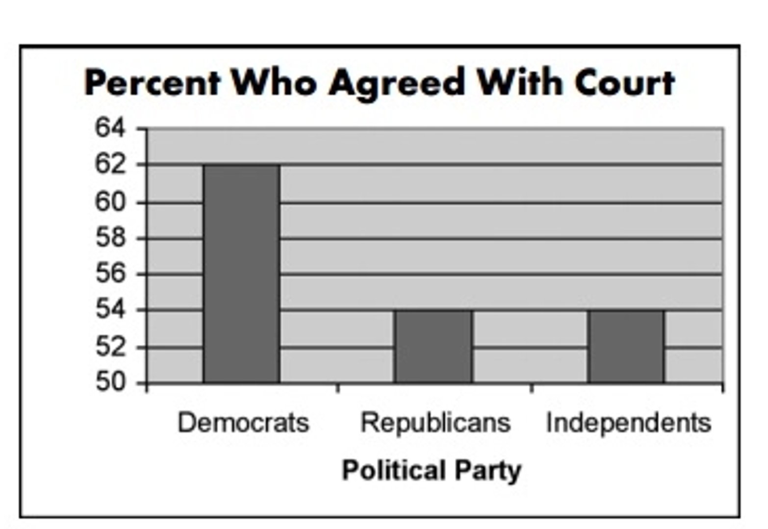
A glance at this graph suggests that when compared to Republicans and Independents, three times more Democrats agreed with the court
A closer look, however, reveals a small 14% difference in votes.
The truncated graph and tampered Y-axis (starting at 50 instead of 0) distort the data and lead you to believe an exaggerated idea about a certain group.
Avoid being misled when viewing graphs and visuals by looking out for:
- The omission of the baseline or truncated axis on a graph.
- The intervals and scales. Check for uneven increments and odd measurements (use of numbers instead of percentages etc.).
- The complete context and other comparative graphs to see how similar data is measured and represented.
Conclusion: Safeguarding Against Misleading Data and Statistics
Misleading statistics and data boast grandiose conversion rate improvements with “CTA tweaks” and “simple colour changes.”
They create shocking headlines that attract swarms of traffic but provide flawed insights at best.
Bad statistics and data are dangerous.
Instead of helping you navigate through detours, potholes, and pitfalls, they knowingly- or unknowingly - steer you right into them. But you’re smart enough to spot them.
Next time you encounter convincing data, run by these simple but powerful questions:
Who is doing the research?
Research is expensive and time-consuming. Check who is sponsoring it, weigh their bias on the topic, and how they might benefit from results. Are they a B2C company with a product? A consulting service? An independent university-funded study?
Can sample size and study length be taken seriously?
Inspecting the supporting or veiled numbers will expose weak statistical strength.
Are data visuals represented fairly?
Are the scales and intervals evenly spaced and neutral? Is a statistic pushing a specific idea or agenda? Are there too many metrics in your dashboard?
Is the research represented honestly and in an impartial manner?
Review the language used, the way the question is framed, and the people being surveyed.
To prevent misleading statistics and data from polluting your dashboards, reports, and analytics, greet new information with a curious and skeptical attitude.
Frequently Asked Questions about misleading statistics
What are the common sources of misleading statistics?
Common sources of misleading statistics can be traced back to errors or biases in the collection, organization, or presentation of data. Factors contributing to misleading statistics include selective bias, neglected sample size, faulty correlations, and causations, and the use of manipulative graphs and visuals. These issues can arise from intentional manipulation or unintentional errors in data handling and interpretation.
How can I identify and avoid falling for misleading statistics in data visualizations or reports?
To identify and avoid misleading statistics, be vigilant when evaluating data visualizations or reports by:
- Scrutinizing the data source, methodology, and potential biases of the researcher or organization behind the data.
- Assessing the sample size and its representativeness of the target population.
- Distinguishing between correlation and causation and questioning if a third factor may be responsible for the observed relationship.
- Examining graphs and visuals for fair representation, appropriate scales, and even intervals.
What are some real-world examples of misleading statistics causing negative consequences?
Real-world examples of misleading statistics causing negative consequences include marketing campaigns that misrepresent product effectiveness, political campaigns that manipulate public opinion, and scientific research that leads to incorrect conclusions. Such misleading information can result in consumer distrust, policy failures, and scientific inaccuracies.
How can researchers minimize the risk of producing misleading statistics in their studies?
Researchers can minimize the risk of producing misleading statistics by:
- Using representative and random samples to ensure data accuracy.
- Transparently disclosing methodologies, limitations, and potential biases.
- Properly organizing and presenting data to avoid distortion or misinterpretation.
- Collaborating with peers for validation and peer review, as well as engaging in ongoing training and education on data analysis best practices.
What are some techniques used to manipulate data or graphs to create misleading statistics?
Techniques used to create misleading statistics include:
- Cherry-picking data or selectively focusing on specific results that support a desired conclusion.
- Using small sample sizes to exaggerate significance or precision.
- Establishing false correlations or implying causation without sufficient evidence.
- Manipulating graphs and visuals through truncated axes, uneven intervals, or distorted scales to influence perception.
Related Articles

5 tips to understand (and organize) your restaurant data
By Saleem Khatri — June 9th, 2026
Klipfolio Partner How-To #1: Duplicating dashboards across client accounts
By Stef Reid — November 27th, 2025
Klipfolio Partner How-To #2: Company Properties can simplify client set-up
By Stef Reid — November 26th, 2025