
← Blog
Posts tagged
Data visualization
23 posts tagged “Data visualization” — practical guidance on dashboards, analytics, metrics, and KPIs.

10 cloud BI dashboard tools for growing firms in 2026
May 20, 2026

SMB dashboarding in 2026: Trends shaping reporting
By Allan WilleDecember 17, 2025

Real-time dashboards for reporting: Why live beats static
November 26, 2025
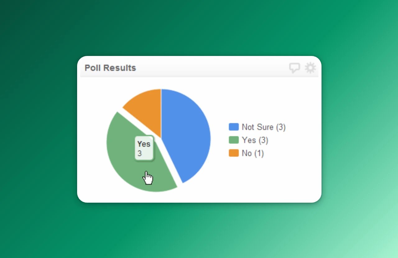
Display poll results with a pie chart
By Jonathan TaylorApril 21, 2025

What is a TV dashboard?
By Mitch DupuisNovember 19, 2024
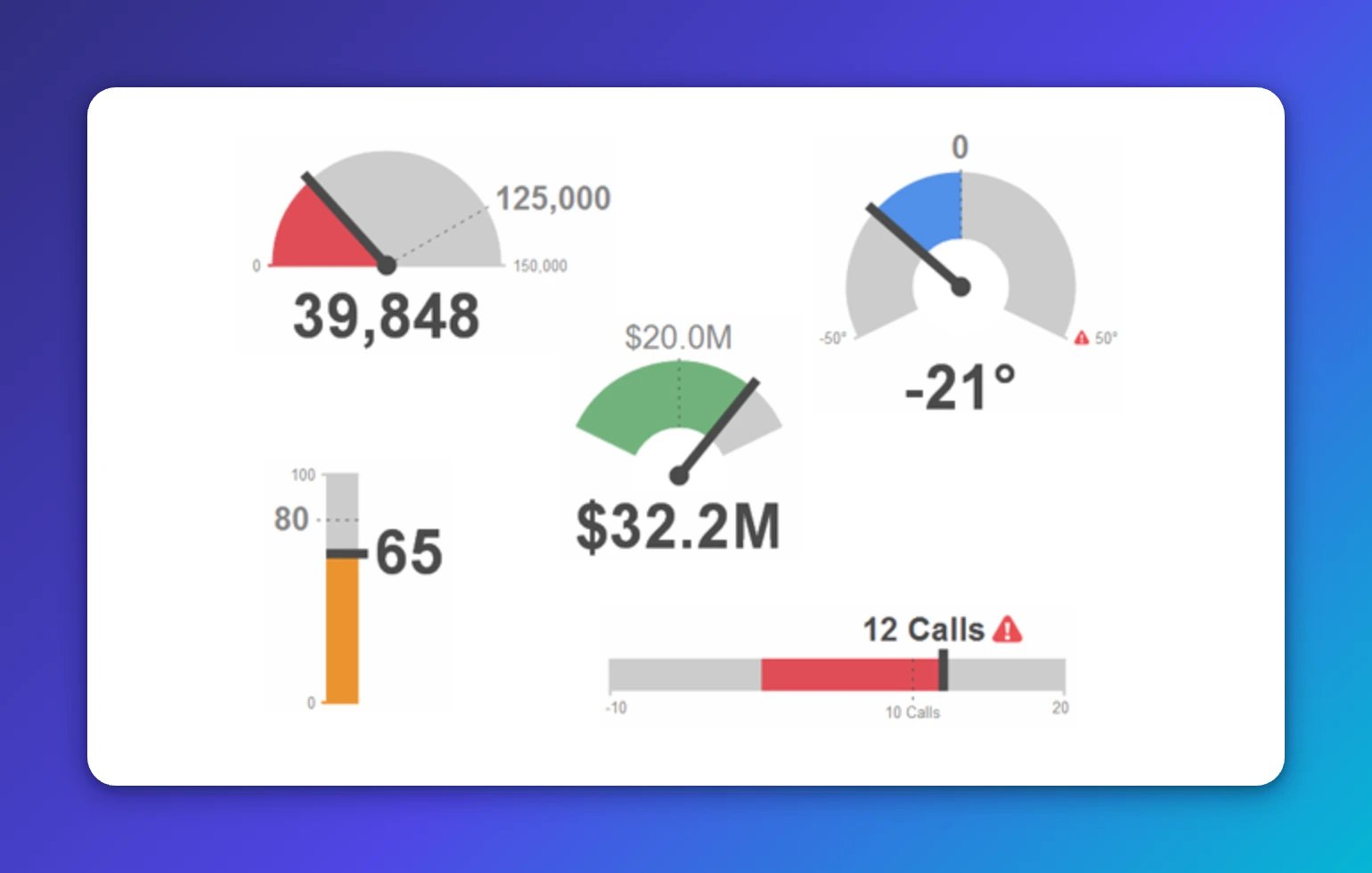
Best practices for the gauge KPI visualization
By Jonathan TaylorApril 8, 2024
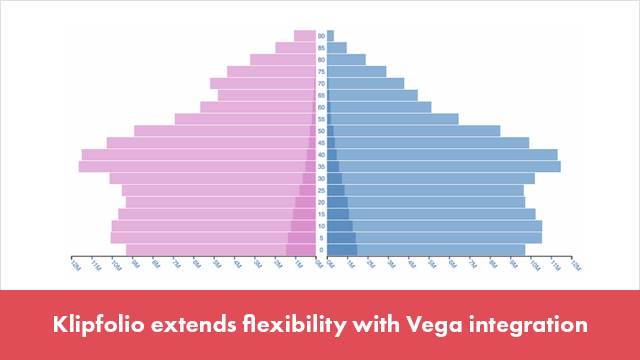
Klipfolio extends flexibility with Vega integration
By Ali PourshahidMarch 13, 2023

The most important formula in Klipfolio
November 9, 2021

What is data visualization?
By Emily HaywardOctober 6, 2021
How to get the most out of your data with the right dashboard display
By Jonathan TaylorAugust 23, 2020

Become a better CFO with these three metrics
By Jody GrundenOctober 18, 2019

Cervinodata's 5-year partnership with Klipfolio leads to 1200% growth
By Mitch DupuisAugust 26, 2019

Reach company goals faster with leading and lagging indicators
By Stef ReidApril 9, 2019

How (and when) to create a custom metric
By Mark BrownleeJanuary 23, 2019

How to use burndown charts to manage agile software releases
By KlipfolioJanuary 10, 2019
Beyond vanity metrics: Net Promoter Score (NPS) and Customer Referral Rate (CRR)
By Jonathan TaylorSeptember 25, 2015

Can DevOps teams have a life in the age of cloud-based software?
September 11, 2015

Key metrics for agile development teams
July 17, 2015

Three ways to increase dashboard user engagement
April 9, 2015
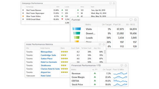
Table component overview: turning the tables on data visibility
September 13, 2012
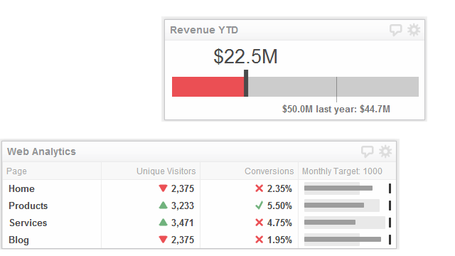
Ready, aim, fire! How a simple bullet chart can help you hit your targets
April 10, 2012