

Summary - I’ll show you how Marketo data doesn’t have to be hard to get and your results can be much more visually appealing using Klipfolio.
If you’ve had the pleasure of diving into powerful marketing automation tools like Marketo, you know life isn’t always easy. And it’s even harder to get data out of these tools. In this article, I’ll show you how Marketo data doesn’t have to be hard to get and your results can be much more visually appealing.
One of my first projects with Klipfolio was injecting some new lead gen ideas to drive more trials. Instead of reporting on a monthly or quarterly basis on the impact these campaigns were having, I wanted an easier way to display and share this data with my team and my boss.
Answering quick questions like “How many leads from this nurture started a trial?” and “How many of those trials converted into customers?” are all questions that typically require quite a bit of digging inside of Marketo.
Besides, having the ability to showcase your personal impact on the business is always powerful.
- I’ll start by walking you through the campaign and how I set it up in Marketo
- I’ll show you how to report in Marketo using static lists
- I’ll walk you through the steps to connect Marketo to Klipfolio
- I’ll show you how to build a dashboard in Klipfolio
1. The email course campaign in Marketo
In exchange for your email, we send you bite sized lessons on KPIs for digital marketers for 10 consecutive days. No pressure to buy or start a trial, the emphasis was on short, valuable introductory content tailored to digital marketers.
We wanted to test how many subscribers would organically start a trial after receiving valuable content that they would otherwise need to pay for in other places.
Here’s how I set that up inside Marketo
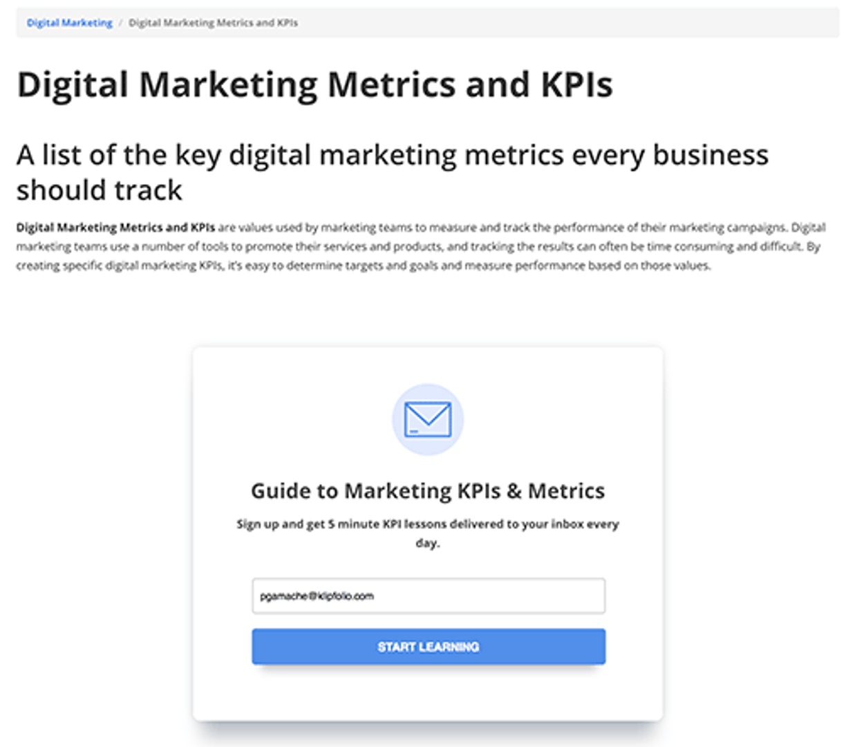
Our site is built on Drupal and we customize our landing pages inside of that CMS. In Marketo, we create simple landing pages that have basic forms and we use an iFrame in Drupal to connect to that form’s URL.
This is our form in Marketo:
This is our landing page in Drupal:
2. Marketo logic - Static lists for reporting key metrics
We then create a smart campaign that listens for leads who fill out that form (it’s labelled as newsletter-subscription) and (after some CASL double opt-in logic) we add them to a static list called subscribers. Our 5 day email-send-sequence is then triggered when a person is added to the subscriber list.
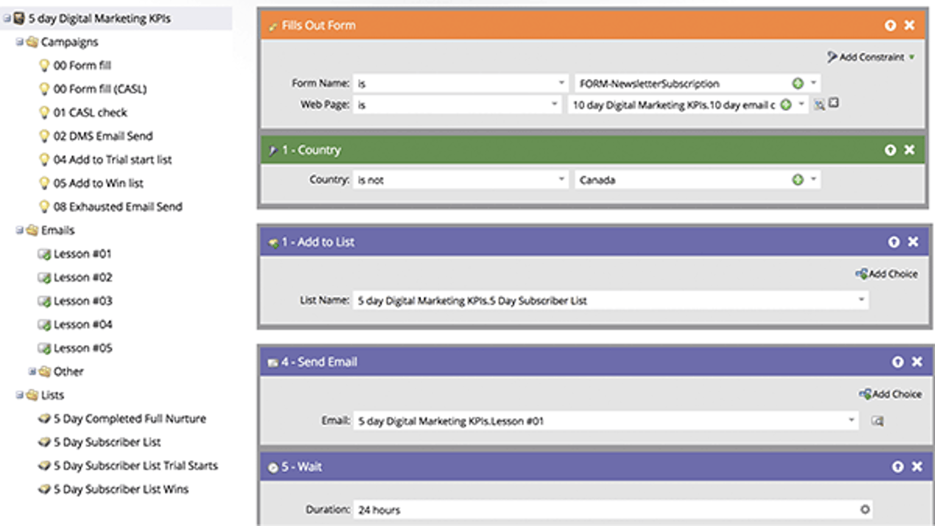
For reporting purposes, I wanted to track subscribers who completed the following actions: 1) completed the nurture, 2) free trial starts from within a course, and 3) new customers from the course. I used smart campaigns to listen for those behavioural signals and then sent them to a static list for easy reporting.
3. How to unleash your Marketo data into a Klipfolio dashboard
Marketo has great analytics built inside the software, but I’m not about to ask my CEO to log into Marketo to see the latest data. And I don’t want to be doing this multiple times a day.
This isn’t a knock against Marketo data either. Sometimes you want to do more hand-to-hand combat with your data than Marketo really allows for. Besides, I want that data out of Marketo and in a way that I can cleanly show my CEO.
I wanted to quickly tout the benefits of using static lists in Marketo for quick reporting instead of waiting for large smart lists to load.
We've already done the heavy lifting of figuring out how Marketo's static list API works. It requires editing the request URL, but that's it. Marketo has a rich list of fields you can query in a request.
Just follow my simple steps and put your brain on autopilot. For more in-depth help, view this support article.
4 simple steps are required for getting Marketo connected to Klipfolio:
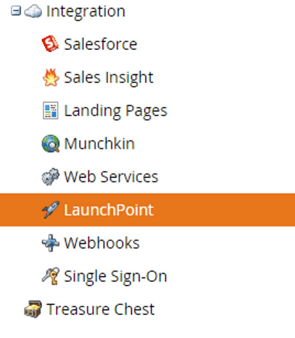
1. Set up Klipfolio as a “LaunchPoint” service in Marketo by going to Admin > LaunchPoint icon > New Service (copy the client ID and client Secret in a notepad).
2. Find your URLs.
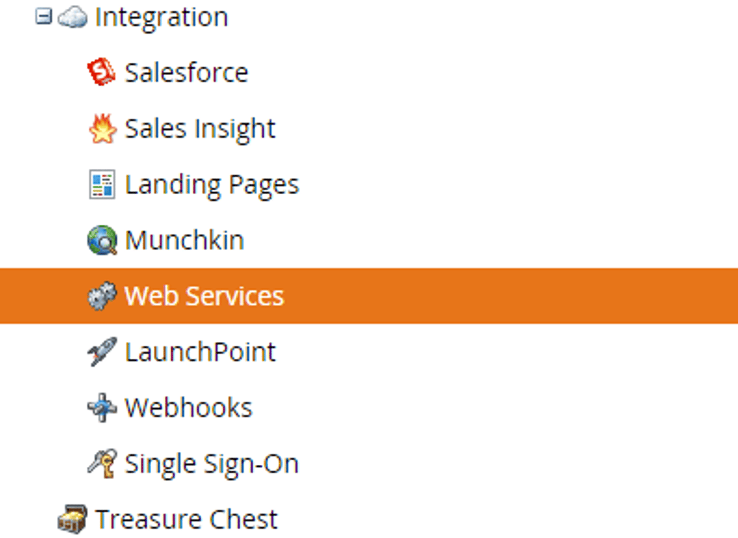
Your REST API Identity URL and your REST API Endpoint URL can be found in Marketo by going to Admin > Web Services.
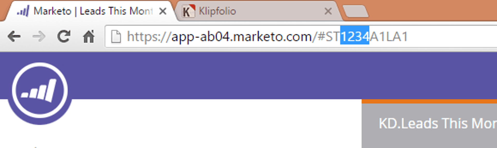
The unique ID for your Static List can be found by selecting the 4 numerical digits after the letters “ST” in the URL presented in your browser’s address bar. Save those in a notepad.
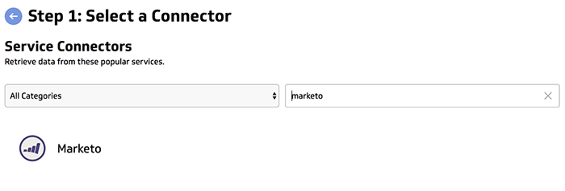
3. Create a data source in Klipfolio. Open your Klipfolio account (you can also do this with a free trial) and go to Library > Data Sources and create a new one by selecting Marketo from the list of services. Enter the appropriate values from the steps above which should be saved in your notepad.
For the REST request URL, you want it to look similar to:
https://614-OQV-361.mktorest.com/rest/v1/list/{uniqueID}/leads.json
4. Modify the API request to retrieve additional fields for example:
https://614-OQV-361.mktorest.com/rest/v1/list/2269/leads.json?fields=firstname,lastname,email,leadScore
Select Get Resource.
Congrats, your static list is connected to Klipfolio! You can now duplicate that data source for each of your static lists, all you need to do is swap out the list # in the REST request URL.
4. How to start building your Marketo dashboard
Alright, this is the fun part. Now that Klipfolio is connected to Marketo, we can create visualizations that display Marketo data.
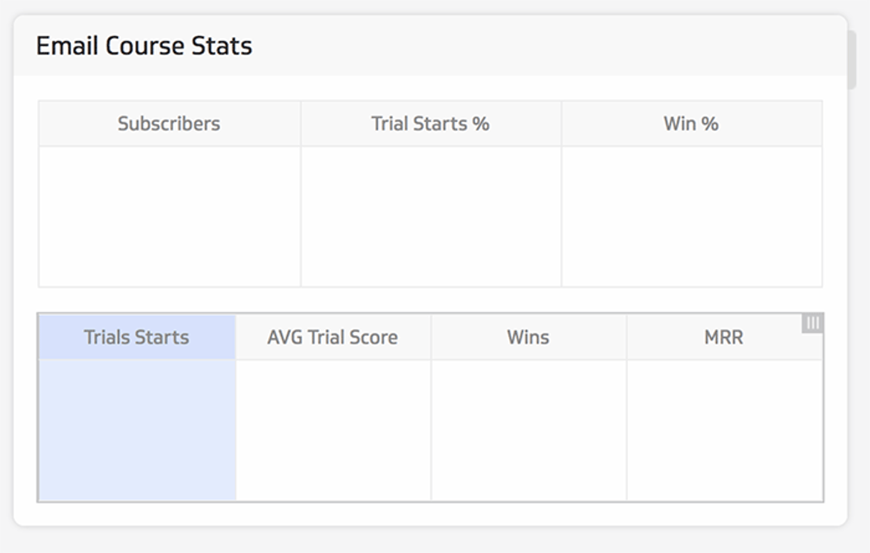
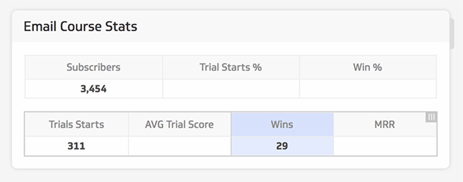
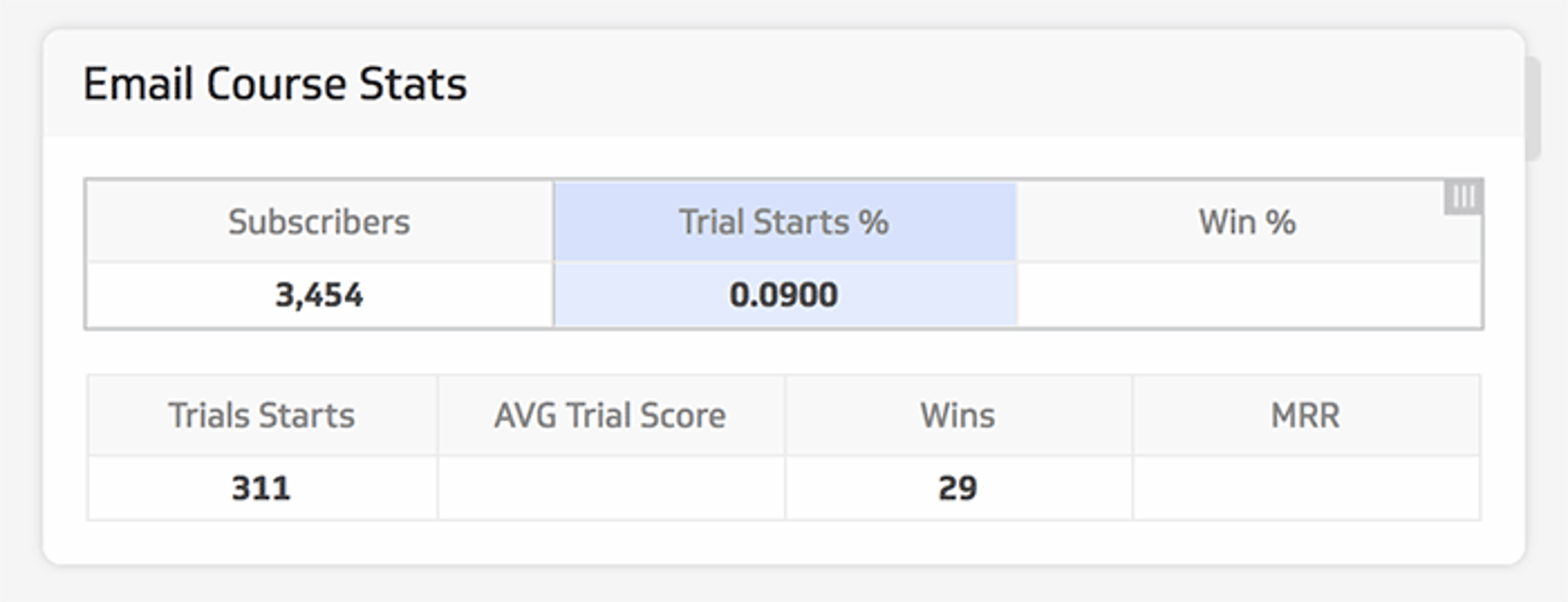
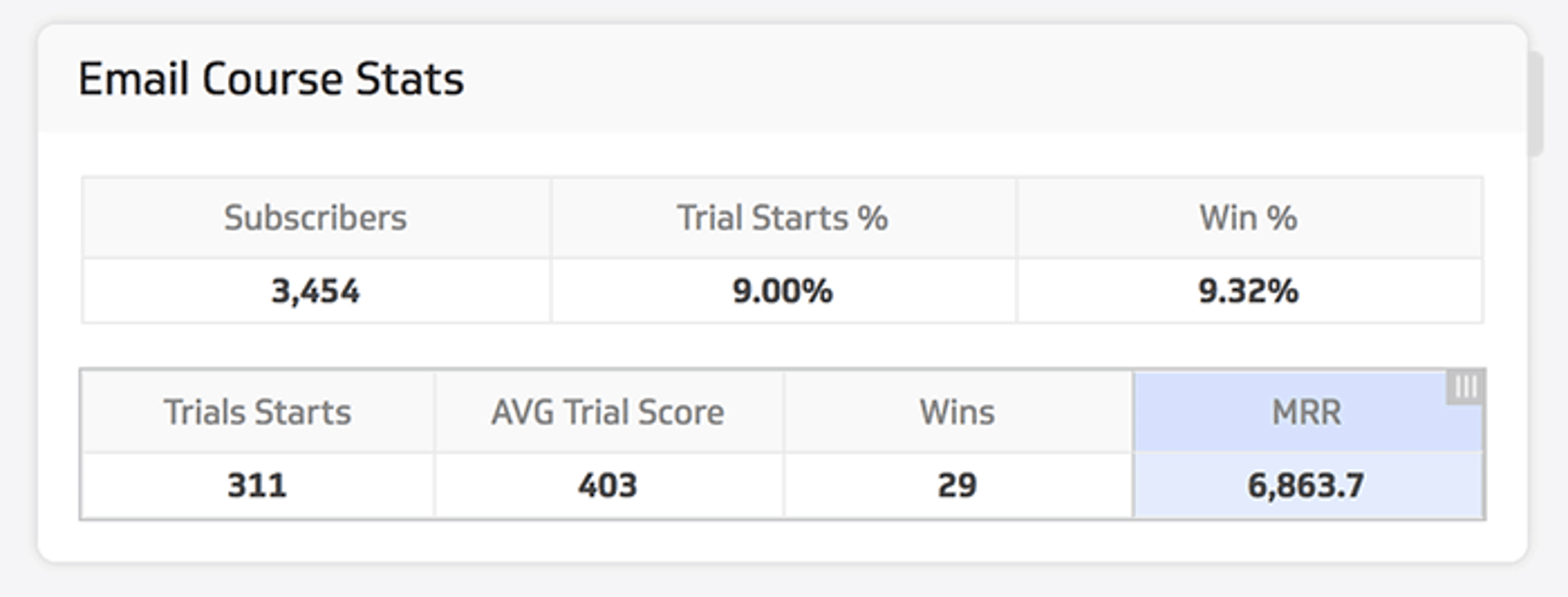
I’ll walk you through how to create this simple table for displaying the performance of the email course lead gen campaign we mentioned earlier.
I wanted to showcase the number of subscribers that signed up for the email course, what % of them started a trial, what was their trial score (behavioral score), what % of trials became customers and the total contribution to monthly recurring revenue, MRR.

In your Klipfolio dashboard, click “Add a Klip” and “Build a Custom Klip”.

In the list of chart options on the right, select the Table component and drag it into your Klip.
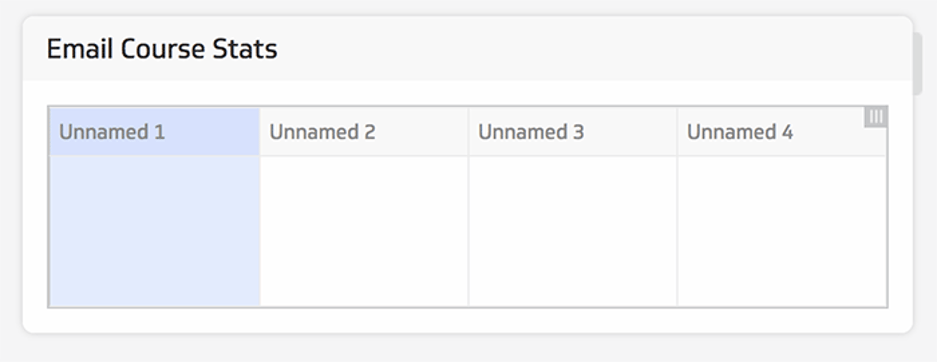
Under table properties, we’ll tweak the number of columns to 3. We’ll also name our columns: Subscribers, Trial Start % and Win %. You can also play with the formatting and font style of your column headers. We’ll do the same thing for a second table showing deeper metrics.
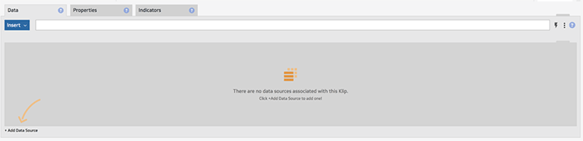
Next step is displaying your Marketo data inside your new tables. Select your subscriber column, then the Data tab. Since we have no data sources associated to our Klip yet, click the + Add Data Source at the bottom left corner.
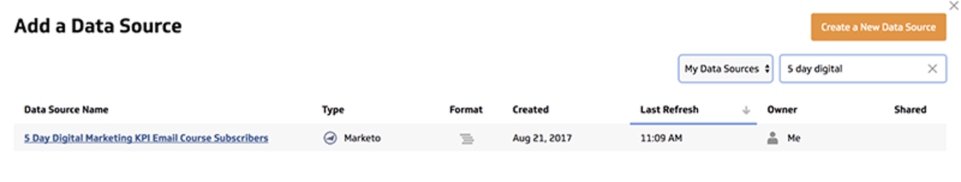
Locate the data source that you already created and select it.
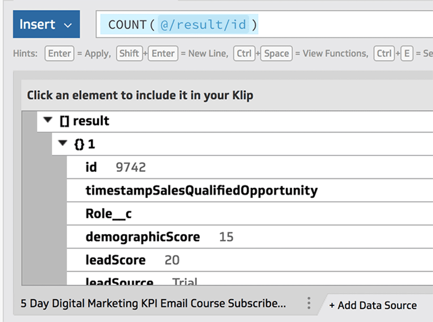
Your data source should now appear at the bottom left corner in JSON format. Don’t let this scare you, Klipfolio allows you to manipulate this data into simple numbers.
In the formula bar, type “Count” and select the recommended COUNT function.
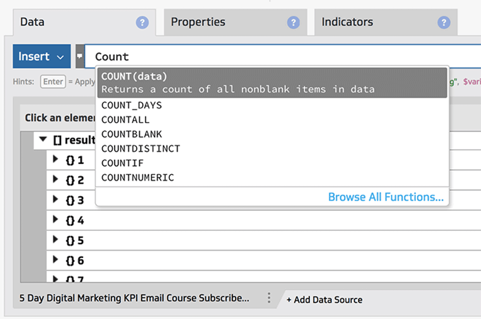
We want to count the total number of unique entries, to do this expand your JSON results, then expand the first result and click on the first “id” field. The formula bar should update with the following query COUNT(@/result/id;) and your table should now display that number.
That’s it. It’s as simple as that.
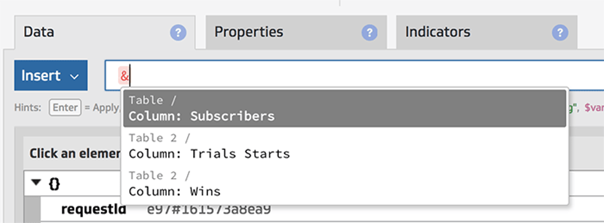
To populate the rest of your table, you need to add your two other data sources (static lists). You should have one for Trials and another for Wins.
The rest of the columns can be populated with formulas that refer to our trials and wins list.
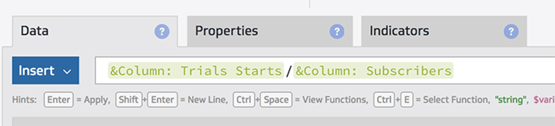
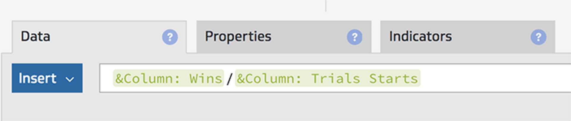
For Trial Starts %, in the formula bar type the reference character “&” then select Trial starts and divide it by a reference to your Subscribers.
Your formula should look like this.
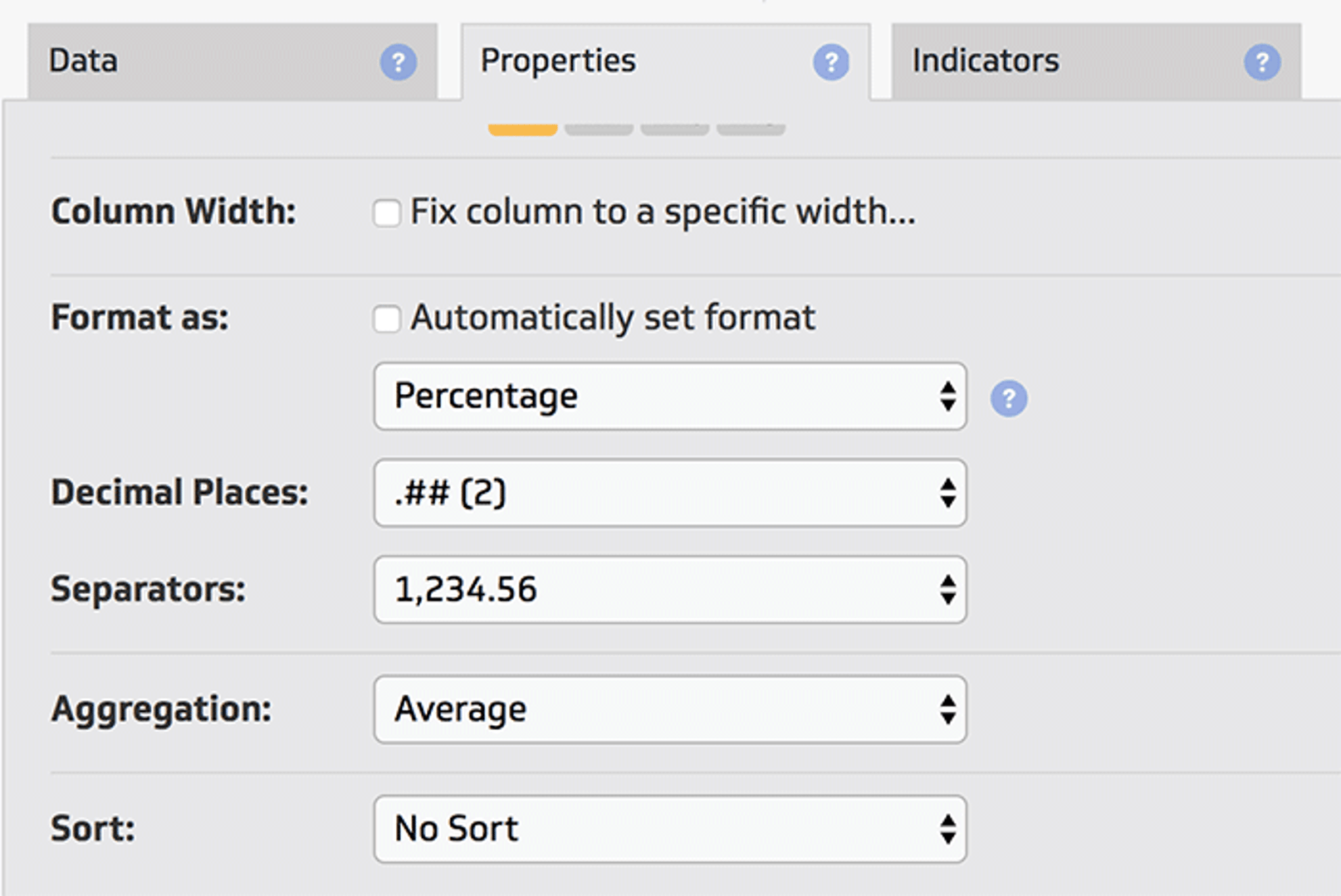
In your table, the Trial Start % doesn’t have ideal formatting.
We can tweak that in the Properties tab, by unchecking “Automatically set format” and selecting Percentage. You can also define the number of decimals that will appear.
You can do the same thing for your Win % column, so your formula would look like this:
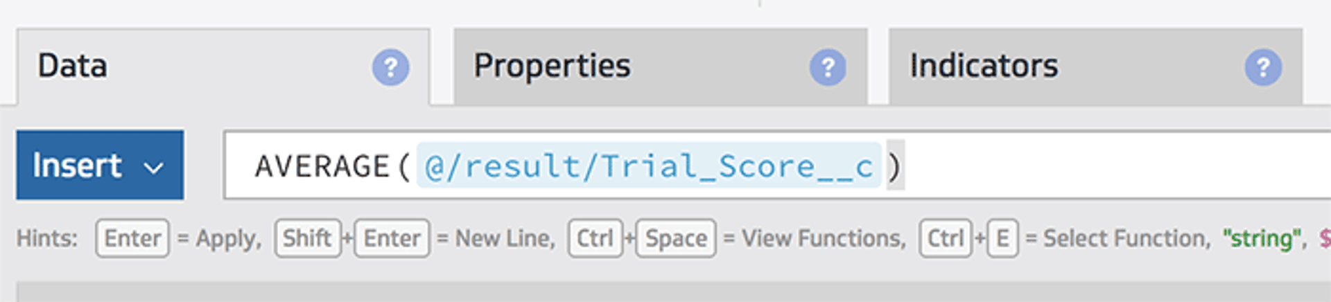
For the AVG Trial Score column our formula will be slightly different. We want to reference the specific Trial Score field that is associated to everyone in the Trial Start list. For that we’ll use the average formula, Type “Average” in the formula bar, make sure you have your trial start data source selected, scroll down to the first JSON record and find your average trial field or whatever demographic score field you use on your records and select it. Your formula should look something like this:
Finally, the last column called “MRR” needs to display the total amount of MRR when we combine all customers in the Wins list. Our formula would use the SUM formula and would look something like this:
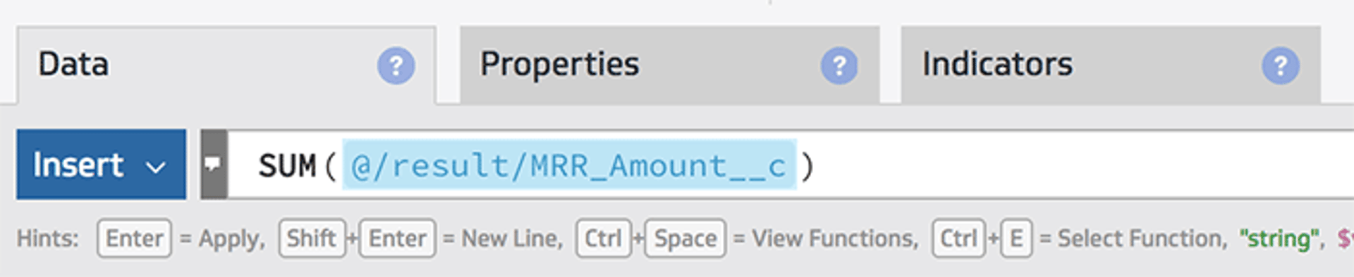
Tweak the format on some of your numbers, and boom… you’ve got your Marketo data on a dashboard.
You can add indicators to this Klip, you can email yourself a report every morning, you can share a live link with coworkers and so much more.
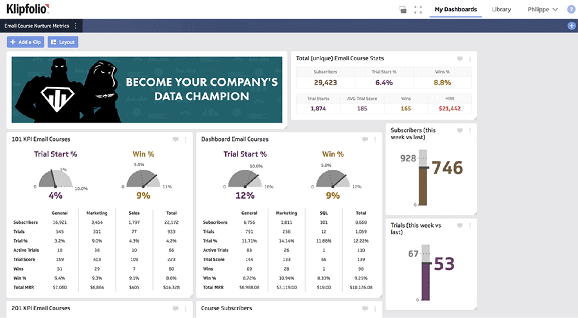
The power of sharing data
It’s been 8 months since I launched our first campaign. Today we have multiple email courses tailored to specific audiences and my dashboard has grown quite substantially. Here’s a quick look at what you could do:
If you’ve read this far, hopefully you’ll be able to get up and running with this tutorial. We have a great support team that would be happy to help out at any time.
Thanks for reading.
Related Articles
6 Facebook ads reports every agency needs to attract and retain high-ticket clients
By Tanya Brody — April 10th, 2026
6 dashboards I use daily to run my SaaS company
By Allan Wille, Co-Founder — April 10th, 2026
The 5 most important SEO KPIs for digital marketing success
By Sanket Patel — February 24th, 2026