
Summary - Data visualizations tell a story with a clear beginning, middle, and end. Visualizations tell you everything you need to know to understand the health and performance of your business from start to finish.
Leveraging data is the key to keeping your business efficient and competitive. However, digesting large and unstructured quantities of information can be challenging, especially for users with limited technical knowledge. Small and mid-sized businesses (SMBs) can make their data more accessible through a practice known as data visualization, which translates data into graphical representations, such as tables, charts, and maps.
As artificial intelligence becomes increasingly prevalent in business operations, the human need for clear, visual data interpretation has never been more critical. While AI excels at processing vast amounts of information, humans are inherently visual thinkers who can spot patterns, anomalies, and opportunities more effectively when data is presented in familiar, consistent visual formats.
What is data visualization?
Data visualization refers to the practice of representing data using visual formats such as tables, charts, graphs, and maps. These visualizations clarify the relationships between data points, helping users spot trends, patterns, and anomalies in datasets.
The primary purpose of data visualization is to make data easier to understand and draw conclusions from. A basic example would be a business owner using a year's financial statements to compare net income across all twelve months. Using numbers alone to envision how the values compare might be a struggle. Meanwhile, a bar chart would immediately show the differences in scale per month.
Why is data visualization more important than ever?
Data visualization helps you effectively communicate information about a dataset. Translating data into an intuitive format allows more people to participate in the data analysis process, increasing exploration opportunities and efficiency.
It tells a story.
Data visualization puts information in context. It shows the relationships between data points, making changes, differences, patterns, trends, and their implications easy to parse.
For example, line graphs track change over time, bar graphs compare performance across elements within a category, and pie graphs visualize the relative sizes of parts within a whole. Presenting numbers and information in a structured visual form allows viewers to intuitively grasp the broader story.
It makes data compelling
Visuals are more compelling than numbers and facts alone. Aside from inherently telling a story, data visualization formats contain visual elements that impact how viewers feel about data. Data visualization designers can leverage colors, shapes, scale, and contrast to influence viewer perception.
Take YouTube, for example. Before 2021, it used a stacked bar chart to visualize the ratio of likes to dislikes, with likes in green and dislikes in red. The ability to glean the relative scale of likes compared to dislikes predisposed incoming viewers to form biased perceptions. Because the color red carried such strong negative connotations, a high dislike count could sway viewers from watching the video entirely.
It makes data accessible
Data visualization makes data compelling and easy to understand, empowering users with limited technical knowledge to participate in data analysis. The increased accessibility allows you to tap into a wider talent pool when generating data-driven insights and strategies.
It provides trusted consistency in an AI world
In an era where AI-generated insights can vary based on algorithms and training data, consistent data visualization provides teams with a reliable, familiar way to consume information. When your team becomes accustomed to specific visual formats and layouts, they develop an intuitive understanding of the data that enables faster, more confident decision-making. This consistency builds trust and ensures that everyone interprets data the same way, creating a shared foundation for strategic discussions.
It increases human efficiency
While AI can process enormous quantities of data, the human brain excels at pattern recognition when information is presented visually. Data visualization translates data overload into a few easy-to-digest visual elements, allowing users to analyze information that they would otherwise struggle to parse manually.
Additionally, because data visualization makes data intuitive, compelling, and accessible, it speeds up the process of data interpretation. Users understand the implications of data at a glance, which serves as a jumping point for deeper analysis. This human-centric approach to data consumption remains irreplaceable, even as AI capabilities expand.
What are common types of visualizations?
To better illustrate the concept, we've outlined the most common data visualizations in the business world. Each visualization has its own unique purpose.
Line graph
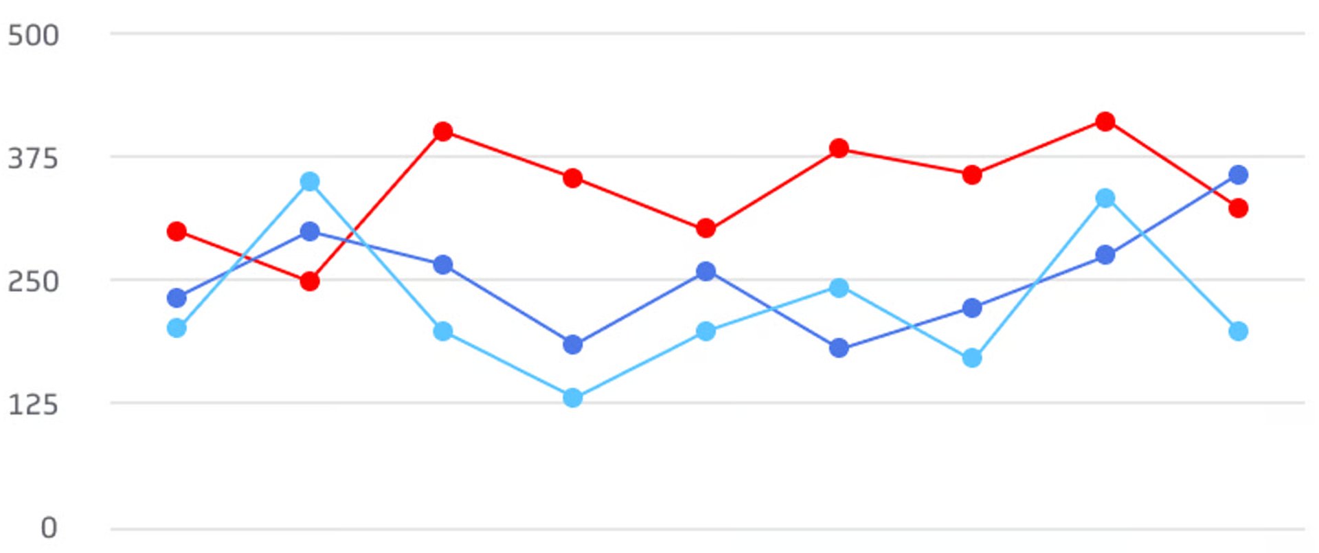
Line graphs use lines along a two-dimensional plane to visualize how a continuous range of values changes with respect to a quantifiable variable. You can create additional lines to compare multiple ranges.
The typical line graph represents change with respect to time. It represents time using the horizontal x-axis and a performance metric using the vertical y-axis. As the line rises and falls along the x-axis, it shows how the value of a variable increases or decreases within a time interval, helping users visualize trends over time.
Area graphs
Area graphs track continuous data over time, similar to line graphs, but they fill the space between the line and the horizontal axis with color or shading. This filled area serves a specific purpose: it emphasizes the cumulative magnitude of the data being measured. Area graphs are particularly useful when you want to show not just the trend, but also the total volume or quantity represented by that trend. They're ideal for displaying data like total sales over time, cumulative website traffic, or accumulated inventory levels, where the "area under the curve" has meaningful significance.

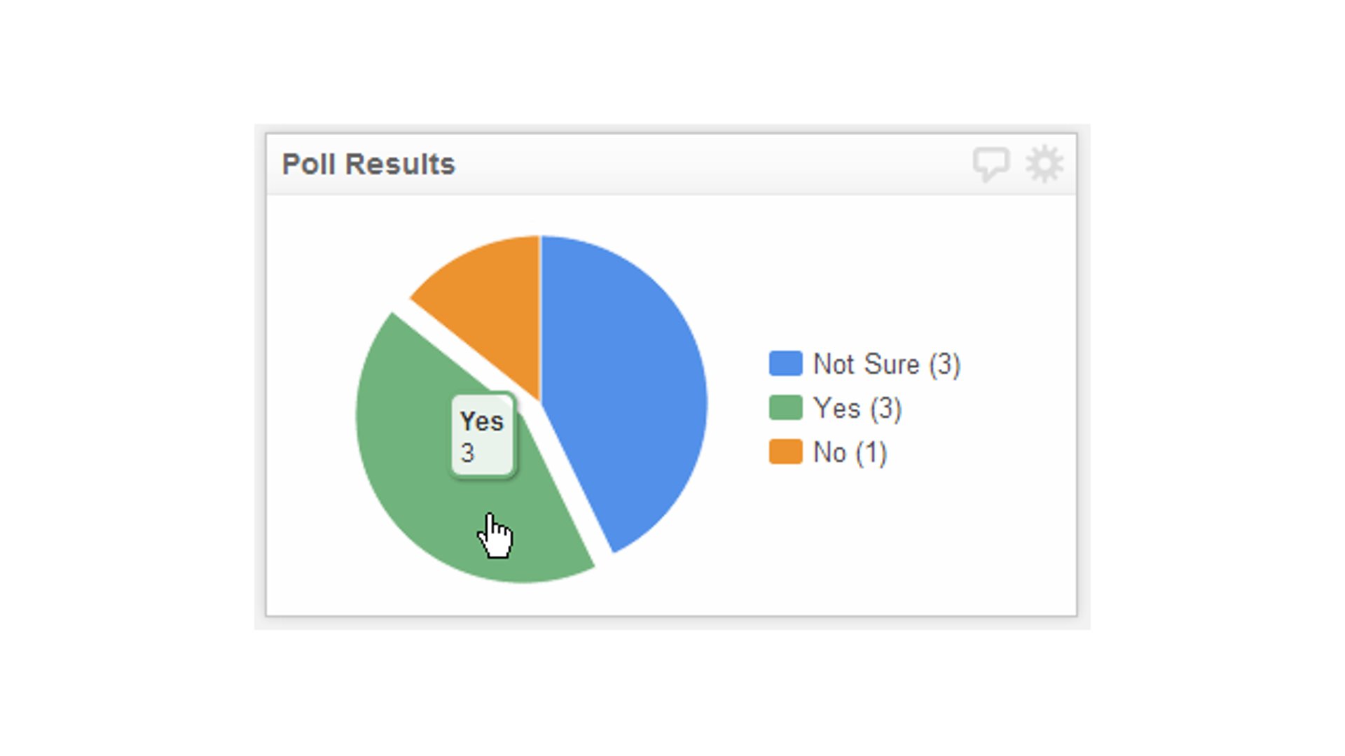
Pie graphs
Pie graphs are circular graphs that use slices to visualize percentages of a whole. They aim to highlight differences in proportions, or how much each segment contributes to a larger category.
Examples of common pie graph uses in business include:
- Market share data
- Budget allocation data
- Revenue contributions by product
- Workforce demographic breakdown

Bar graph
Bar graphs represent quantities using lines of rectangular bars on a horizontal or vertical axis. The length or height of each bar represents the value of the data. Bar charts help you intuitively visualize the differences in value between discrete variables.
Bar graphs are best used to compare or rank subgroups within a certain category. Unlike pie charts, the values don't need to represent how the subgroups contribute to a whole.
You can also modify bar graphs to present more comprehensive data. For example, you can use colors to represent sets of variables.
Another common modification of the bar graph is the stacked bar graph, which blends the strengths of the bar graph with the strengths of the pie graph. The stacked bar graph divides each bar into multiple pieces of distinct colors, each representing a segment of the represented variable. It helps you visualize how much each segment contributed to the variable's overall value.

Heat maps
Heat maps use colors on a two-dimensional plane to visualize differences in magnitude. Typically, the darker or more intense colors represent higher values, while lighter and more desaturated colors represent lower values.
There are multiple types of heat maps:
- Grid maps are regular tables composed of cells containing color-coded numerical values. The differences in darkness or intensity help the eye intuitively grasp the differences in value.
- Website analytic maps gather data on user interactions. It uses color to represent where most users hover or click.
- Geographic heat maps use color to denote trends in behavior across locations.

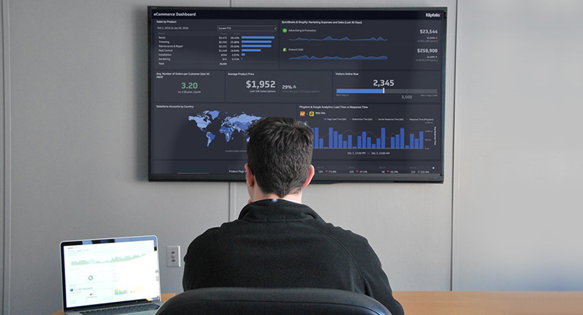
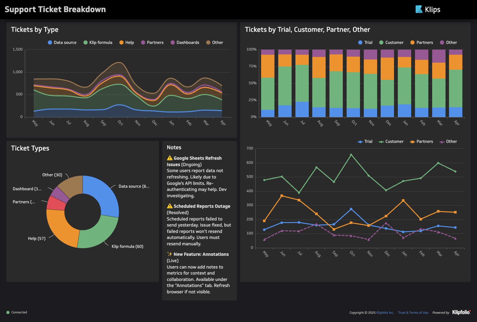
Dashboards
A software dashboard is an interactive graphical interface that displays groups of related data. The typical dashboard consists of multiple panels, each containing relevant data visualizations. Dashboards streamline data analysis by providing at-a-glance views of all data relating to the same process, objective, or topic.
Dashboards are typically interactive and customizable. They provide a high-level view of business performance, helping teams generate actionable insights faster. Typically, dashboards connect directly to your data sources and generate visualizations in real time.
Examples of visualization use cases for SMBs
SMBs use data visualization to assess performance, identify opportunities, and make informed business strategies. Data visualization has applicable use cases across all components of business, including marketing, sales, finance, and project management.
Campaign performance analysis
Companies use data visualization to analyze the performance of marketing, advertising, and sales campaigns.
Examples include:
- Bar graphs can display traffic across social media platforms like Facebook, YouTube, TikTok, and LinkedIn.
- Line graphs can track increases in account signups per day across a quarter.
- Pie graphs can show the sources of organic traffic to your website by percentage.
- Bar graphs can compare cost per click across dates in a week.
Financial analysis
Data visualization can create intuitive representations of your financial metrics and strategy. Examples include:
- Pie graphs can show the distribution of assets in your investment portfolio.
- Line graphs can track and forecast monthly revenue.
- Stacked bar graphs can compare liabilities and equity to illuminate what provides a more significant share of funding.
Lead and customer analysis
SMBs use data visualization to analyze their targets, leads, and customers. Data can reveal trends in customer behavior, allowing companies to optimize their sales strategies.
Here are some examples you can explore:
- Website heat maps aggregate user interactions, revealing what users click on, what they look at, and how far they scroll. This information can help web designers plan layouts that maximize clicks and views for critical web elements.
- Bar graphs reveal the most common device types among existing viewers, allowing design teams to tailor website, video, or graphic layouts to match preferred devices.
- Geographic heat maps show where most leads are located, revealing opportunities for location-based targeting.
Project management
Project managers use data visualization to support the planning, scheduling, and monitoring of project activities. Most project management software uses the following reports to illustrate project management insights:
- Gantt charts illustrate how much time a team intends to allocate to each component of a project. It helps project teams envision the project schedule over a year.
- Burndown charts compare remaining work against the allotted time to help project teams assess their likelihood of meeting deadlines.
- Area charts can show tasks completed against tasks created to illustrate the level of project completion.
Leverage data visualization for your SMB
Data visualization provides an immediate and intuitive view of your business data. It translates facts and figures into a compelling visual story, helping you identify strengths, weaknesses, and opportunities at a glance. SMBs should leverage data visualization tools to optimize data analysis workflows and maintain the human advantage in pattern recognition.
Use dashboards to automate data visualization for critical data. Klipfolio Klips provides powerful custom dashboards for a wide range of departments, topics, and services, integrating with over 130 data sources to update visualizations in real time. Our tools translate complex data to accommodate your unique visualization needs, empowering you to craft data-driven business strategies with maximum efficiency.
In a world where AI processes information at unprecedented speeds, Klipfolio Klips ensures your team maintains the trusted, consistent, and familiar visual interfaces they need to make confident decisions. By combining the power of automated data integration with human-centered visualization design, you get the best of both worlds: AI-powered data processing with human-optimized presentation.
FAQs
What is the difference between data visualization and data optimization?
Data optimization encompasses all processes related to improving data quality and useability, including data cleaning, partitioning, standardization, prioritization, and visualization. Meanwhile, data visualization refers to the specific practice of representing data through visual formats, such as tables, charts, graphs, and maps.
What is the difference between a graph and a chart?
Charts refer to any type of graphic that organizes data. Tables, diagrams, and graphs all count as charts. Graphs refer to a specific category of chart that visually represents the relationships between numerical data points.
For example, bar graphs and pie graphs count as graphs because they use differences in shape sizes to represent differences in quantity. Meanwhile, tables containing numerical data points would count as charts but not graphs because they offer no visual representation of quantity.
What is the difference between an area graph and a line graph?
Line and area graphs both display continuous ranges moving across a two-dimensional plane. They are most commonly used to track changes in a variable over time. However, area graphs shade the space between the line and the horizontal axis to give the data more visual weight.
Why is consistent data visualization important for teams?
Consistent data visualization creates a shared language within your organization. When teams regularly consume data in familiar formats, they develop pattern recognition skills specific to those visualizations, leading to faster insights and more confident decision-making. This consistency becomes especially valuable when AI-generated insights vary, as your established visual frameworks provide a trusted baseline for interpretation.