
Summary - The latest release of Klipfolio Dashboard completely overhauled the Bar/Line Chart visualization, adding dozens of new features and the ability to fully customize your charts. Let's take a look at five features that will help your charts stand out.
After weeks of leaking images to our Facebook and Twitter followers, you can finally sign in to app.klipfolio.com and start playing with the new and improved charts. We've added dozens of new features and customizations to make sure that each chart you create visualizes your data exactly how you want.
Let's take a peek behind the curtain, and look at the top 5 features added to the Bar/Line chart component.
The Docs: How to build Bar/Line Charts
5. Custom colors
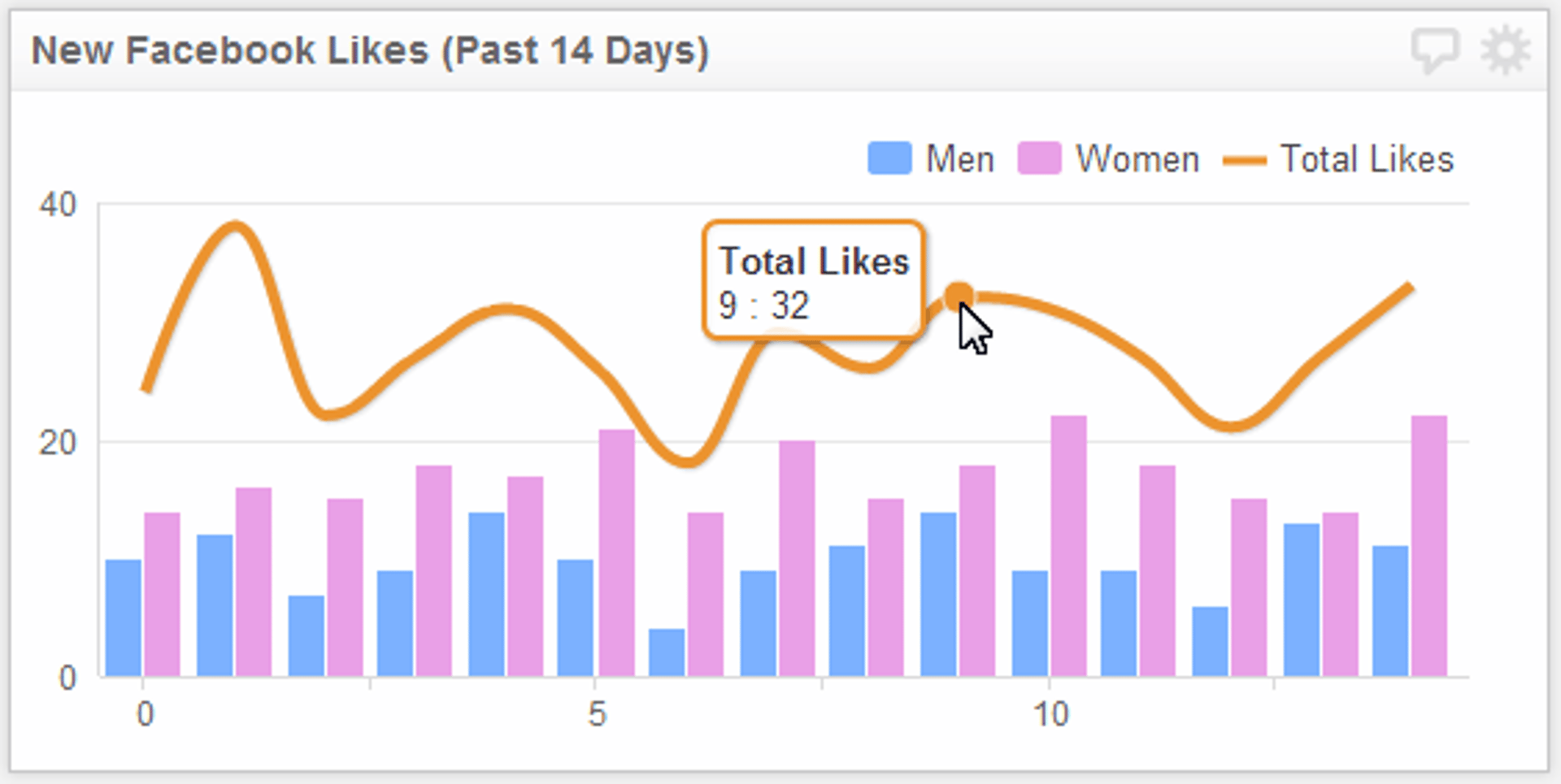
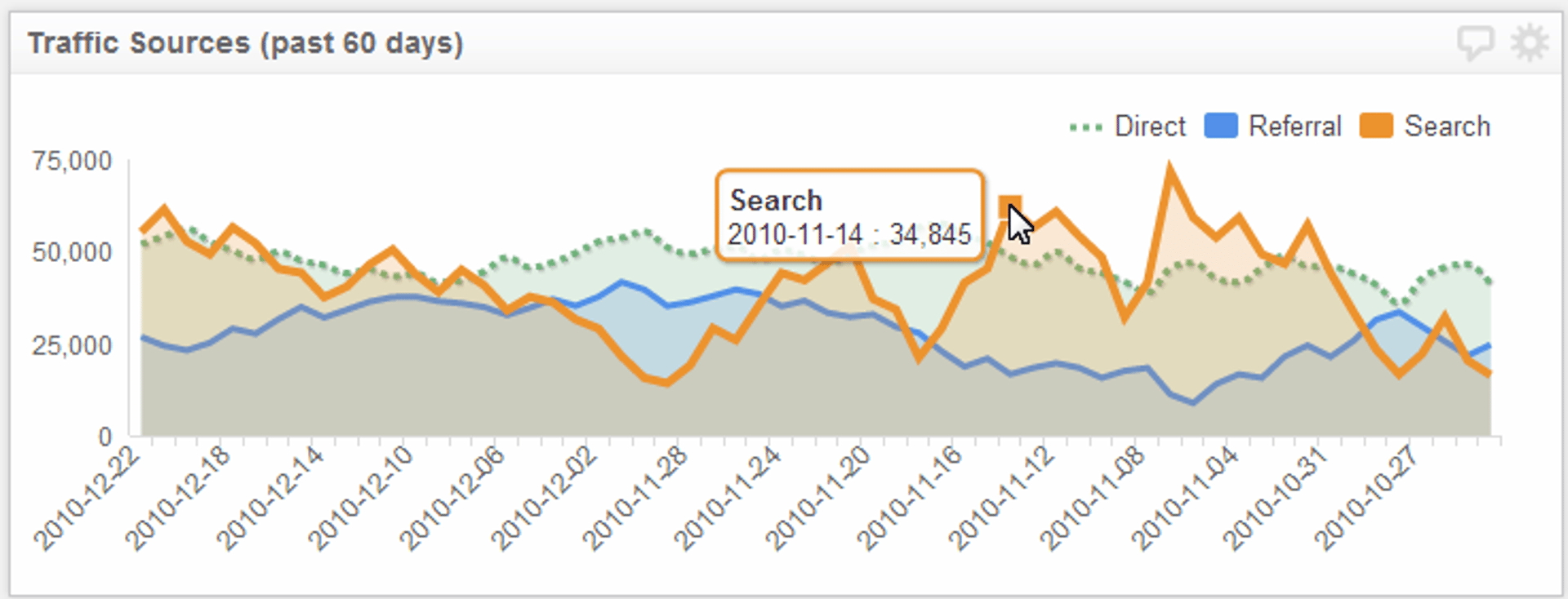
This may only be the tip of the iceberg in terms of customizing your charts, but it's an important addition to the charting feature. The example below uses custom colors to help your audience quickly distinguish between two demographics (men and women). This is a "cute" example - where this feature really shines is when you are working on charts with a large number of series. The image from example number 3 also uses custom colors, except to show the close relationship between two values.
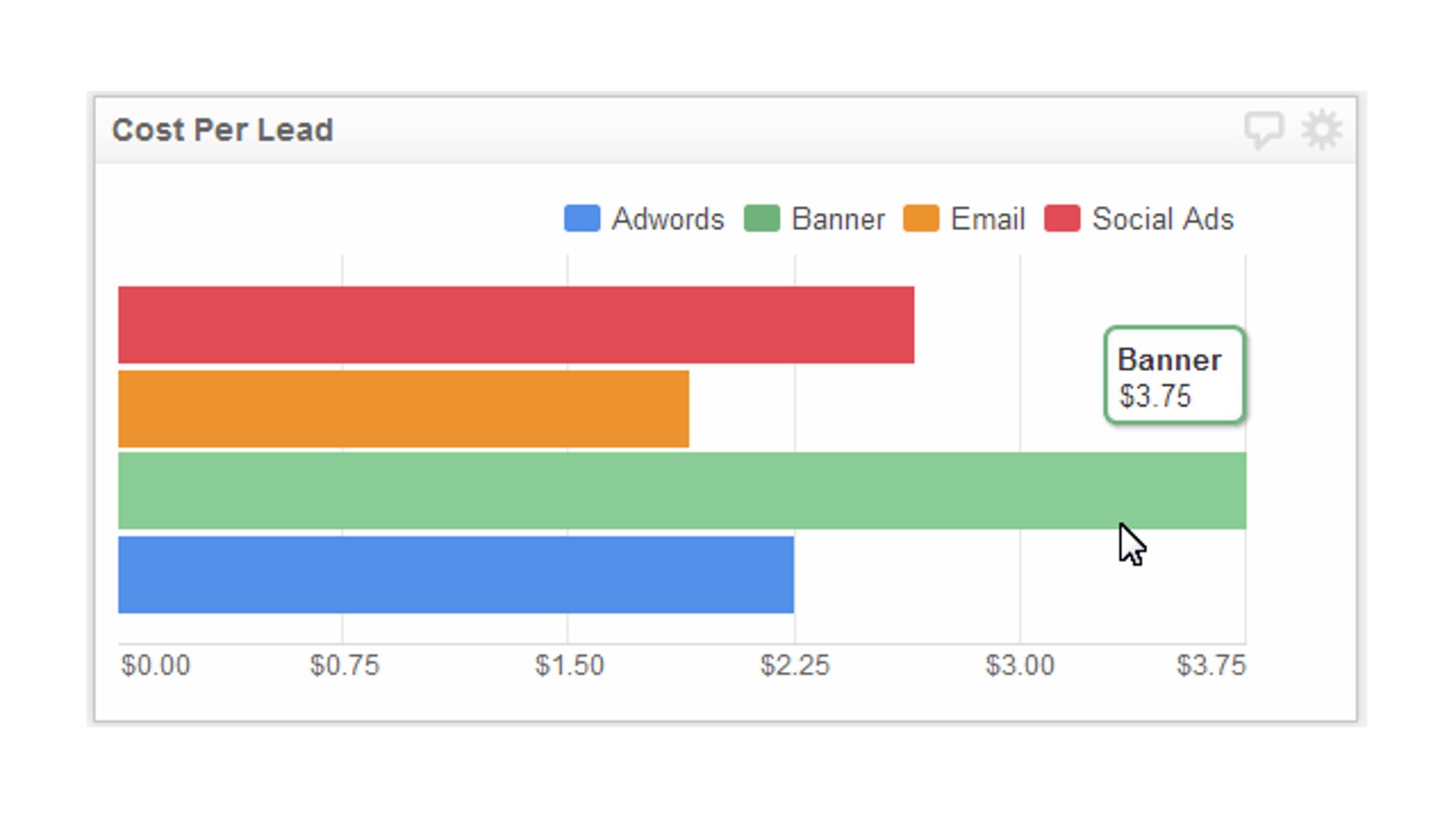
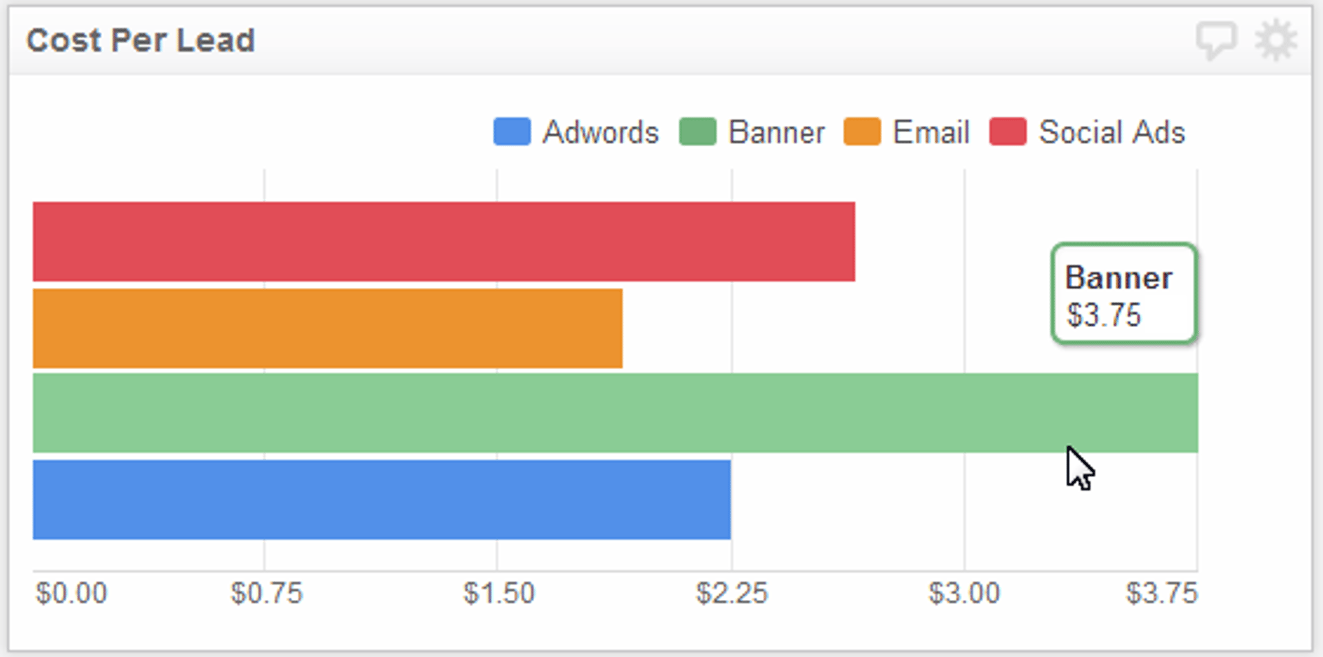
4. Inverting axes
I've already created quite a few Klips that use the inverted axis feature, two of which are on display on the top marketing KPIs page. Inverting the X and Y axis is awesome if you only need to display a single data point for each of your series. In the example below, I've inverted the axes to make it easy to see the cost per lead for a number of marketing campaigns.
3. Drawing lines
One of the key features of the chart component is the ability to mix bar and line series on the chart. Well, with the latest release, we've added literally dozens of new options for your lines. You can now change the chart style (smooth lines, shaded, etc), the line style, the line weight, and whether to use a solid line or dashes. You can also change the color of the line (but you already knew that!).
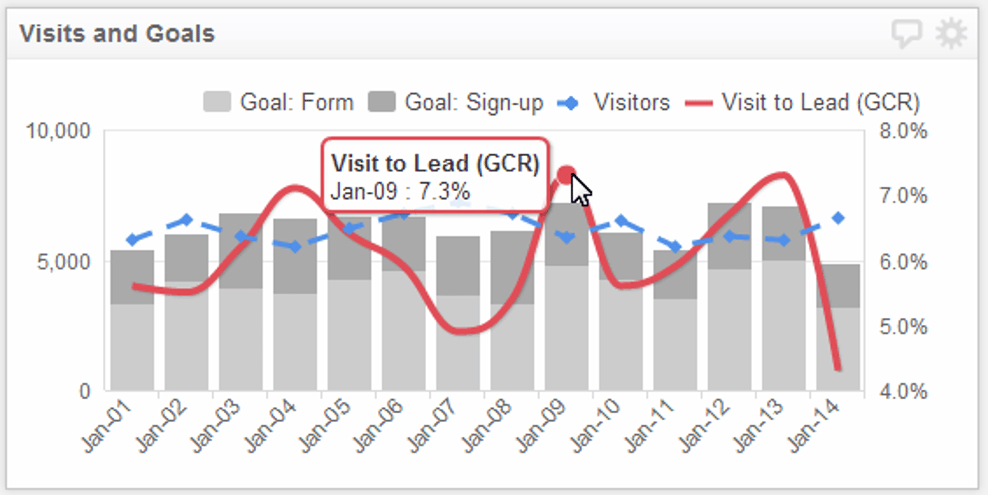
2. Add multiple Y-axes
I spend a lot of time working on Klips that use Google Analytics data, and one of the problems I frequently run into is how to show the correlation between different, but related metrics. For instance, I am measuring website traffic (visitors) and want to compare that value against my site's goal completion rate (GCR). Website traffic is measured in thousands, whereas the GCR is a percentage. As you can see from the image below, this allows me to keep both metrics in perspective (even when I include other metrics, like the raw number of goals completed).
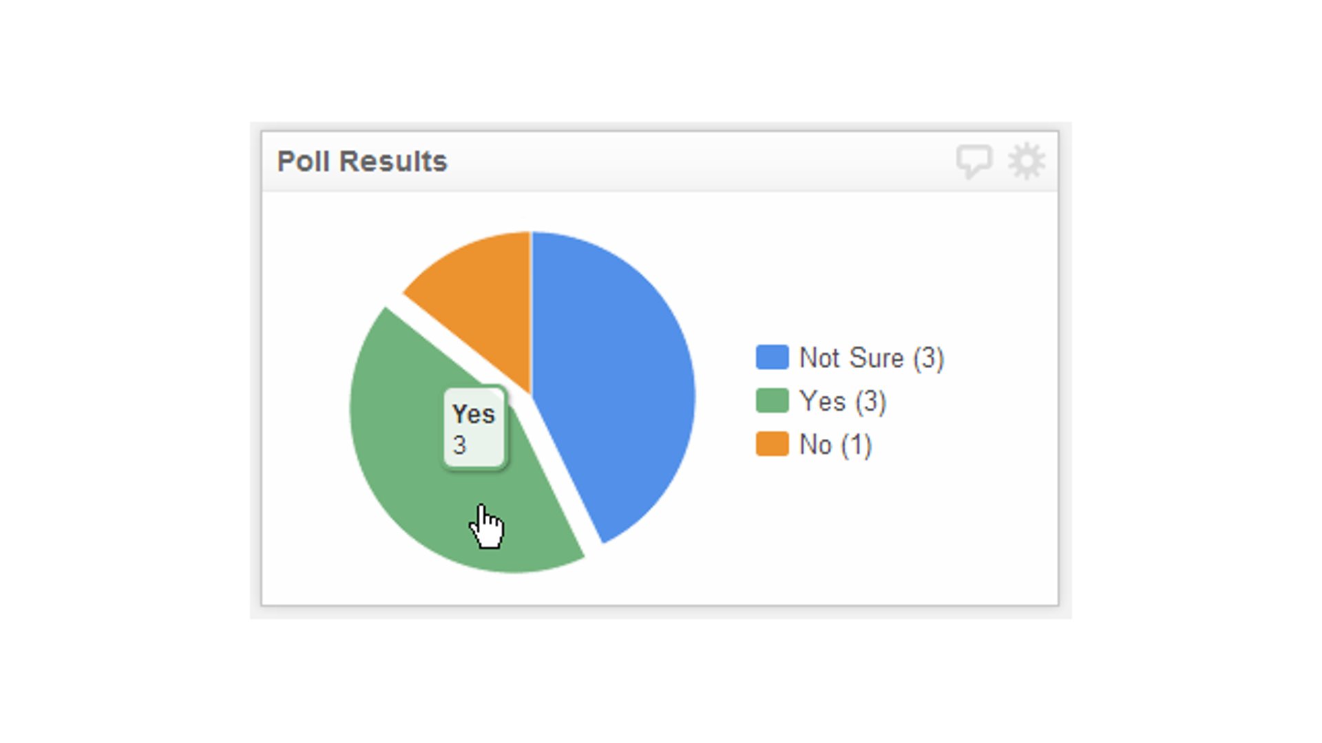
1. Tooltips
While the previous 4 features are about the nuts and bolts of the Bar/Line Chart component, this one is about the end user. I'm a firm believer that simplicity is the number one design fundamental you should adhere to in designing a dashboard (and, when possible, in life too). The easiest way to keep things simple is to provide context for each data visualization on your dashboard. Think of tooltips as your home-field advantage whenever you build a chart in Klipfolio Dashboard.
Related Articles

Klipfolio Partner How-To #1: Duplicating dashboards across client accounts
By Stef Reid — November 27th, 2025
The Starter Guide to Dashboard Design
By Emily Hayward — September 24th, 2025
What is a data dashboard?
By Emily Hayward — August 18th, 2025