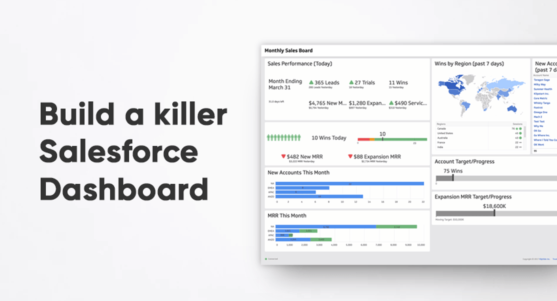

Summary - Wanting to master Salesforce reporting? Look no further!
Wanting to master Salesforce reporting? Look no further!
This article covers everything, and I mean EVERYTHING, you need to know about building a world class Salesforce reporting dashboard. While it would be awfully nice to have the entirety of Salesforce reporting boiled down to just a few words… that’s not the case. That doesn’t mean the information we’re about to throw at you isn’t easily digestible, though! You may just need to take this in bits and pieces.
So without further ado… brew yourself a cup of coffee, sit back, and get ready to learn!
This article was created to deliver you bite-sized introductions to the necessary points you need to know to begin your data journey, with step-by-step tutorials and examples. We’ve listed each topic, or lesson, in our “Table of Contents” in case you want to skip forward to a certain segment.
Table of Contents
Here’s a taste of what you’re going to learn over the next few thousand words:
- What every professional should know about KPIs
- How to design the perfect napkin dashboard
- How to connect your data to Klipfolio
- Building individual metrics for your KPIs
- Sharing your dashboard
- Summary
We will also provide you with additional resources that you can access if you wish to explore any of the subjects deeper. Ultimately, this blog will assist you in becoming more confident in driving and reaching your business objectives... no matter how big or small.
What every professional should know about KPIs
If you're reading this, you know just how competitive the business ecosystem is today. It can take a whole lot of fighting to keep up.
But that fight becomes immensely easier when you create a data-driven culture that keeps your team at the top of their game. For this to work, you all must be on a constant quest to learn about and share the right data and metrics.
As mentioned above, this piece (I was going to say "meaty piece of content"... but that would be overkill on the food analogy, wouldn't it?) will teach you everything you need to know about harnessing the power of KPIs and building a powerful Salesforce dashboard.
Before we dive into building and deploying a dashboard though, let’s explore the basics.
A brief intro to KPIs
A KPI (Key Performance Indicator) is a measurable value that demonstrates how effectively a company is achieving key business objectives. Companies use KPIs to measure and evaluate their success at reaching targets at multiple levels. Monitoring (not just reporting on) KPIs is a great way to give your team an overview of their performance and on what's happening in real-time, while also encouraging them to act on data rather than simple guess-work.
Why are KPIs important?
Without monitoring and reporting on proper KPIs, companies would be left in the dark about their performance. KPIs allow companies to not only know that they are having success, but understand the depth of that success and how it aligns with other company goals.
With these in place, teams can set realistic goals and develop strategies to reach them, while tracking monthly, weekly, daily, and even hourly progress.
What makes a KPI effective?
A KPI is only as valuable as the action it inspires. Too often, organizations blindly adopt industry-recognized KPIs and then wonder why that KPI doesn't reflect their own business and fails to affect any positive change. One of the most important, but often overlooked, aspects of KPIs is that they are a form of communication. As such, they abide by the same rules and best-practices as any other form of communication. Succinct, clear and relevant information is much more likely to be absorbed and acted upon.
In terms of developing a strategy for formulating KPIs, your team should start with the basics and understand what your organizational objectives are, how you plan on achieving them, and who can act on this information. This should be an iterative process that involves feedback from analysts, department heads and managers. As this fact finding mission unfolds, you will gain a better understanding of which business processes need to be measured with KPIs and with whom that information should be shared.
Defining organizational objectives
Understanding your organizational objectives is a critical step in selecting the right KPIs for your dashboard. As setting these objectives is an entire subject and field of study unto itself, the following list is one tried-and-true way to get on the right track:
- Ask department leaders: "What do you see as the company's long-term goals and which quarterly steps will be most crucial for us to reach them?"
- Conduct a collective SWOT (Strengths, Weaknesses, Opportunities and Threats) Analysis on these answers
- Using all assets from the interviews and the SWOT Analysis, build SMART (Specific, Measurable, Attainable, Relevant, Time-bound) organizational objectives.
Once a few key organizational objectives are established and agreed upon, it’s time to make sure there’s general alignment around what KPIs are (and what mistakes many organizations make when both defining and adopting them).
Selecting the right KPIs (for you)
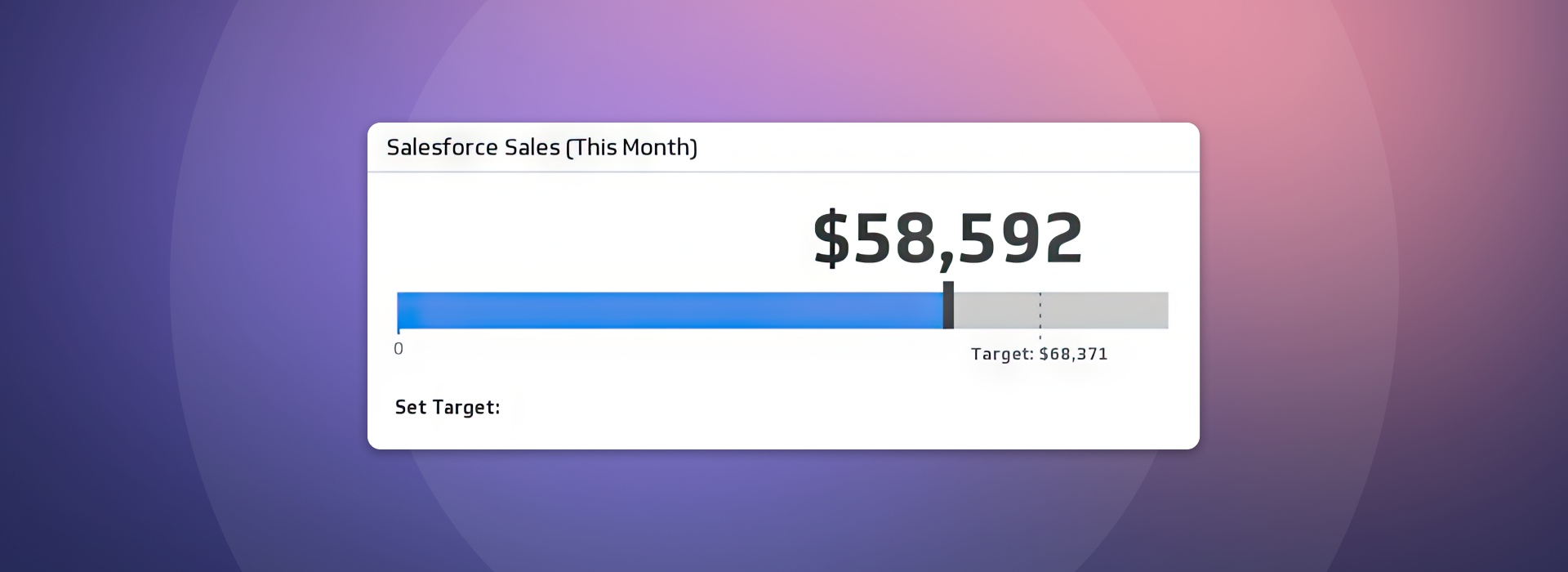
Let's walk through an example metric using Salesforce. Say we want to build a metric to make sure we have a view into our total sales this month.
The screenshot below will be our intended visualization. As mentioned, we want to display the current sales for this month, and compare that against a set monthly target. This should help your team gauge how well they are performing, how close they are to achieving their goal, and motivate them to action if they are falling behind.
The following is a list of questions to answer before setting out to build this metric:
- Question: What is my desired outcome?
Possible Answer: To reach $70,000 in sales by the end of the month.
- Question: Why does this outcome matter?
PA: As with any business, achieving sales goals is crucial to maintaining a positive cash flow. Meeting, and exceeding, monthly goals is also a major interest point for your investors.
- Question: How am I going to measure progress?
PA: Current sales this month will be measured against that month's sales goal.
- Question: How can I influence the outcome?
PA: By revamping nurture programs with leads, increasing support and highlight value prop for users in trials, work with Marketing to streamline the flow from leads to customers
- Question: Who is responsible for the business outcome?
PA: The Sales Manager is typically responsible for this metric.
- Question: How will I know I’ve achieved my outcome?
PA: The current sales will reach $70,000 by the end of the month. The gauge will pass over the target sales line.
- Question: How often will I review progress towards the outcome?
PA: The KPI will be reviewed daily.
Now you have the purpose behind your intended metric. While you may want to immediately start thinking about connecting your Salesforce data to your future dashboard software, let's go over how to plan the design of your dashboard.
How to design the perfect napkin dashboard
KPIs allow companies to know that they are having success, what kind of success, and how that success aligns with other company goals. Before selecting your KPIs and metrics, make sure you have a good grasp of your organizational objectives and ask yourself a few questions regarding the usability of your metrics and desired outcomes.
This next section is going to be all about drafting that perfect dashboard. The key theme to design here will be one that keeps your organizational objectives top of mind.
Who is this dashboard for?
Awareness of your audience, their data reporting needs, and how they will be using the dashboard will greatly determine how you design the dashboard. A Director of Internal Sales will want a very different dashboard than a Divisional Sales Rep, and you should design accordingly.
It takes a village to build a world-class dashboard, so talk to key stakeholders to make sure your dashboard will be providing them with valuable information.
Make it make sense
Avoid throwing in vanity metrics just to make your dashboard look interesting. With the right metrics it will be interesting even without dozens of pretty colours and pie charts. Group data logically. Pair similar data sets or otherwise place data sets that are related close to each other on your dashboard.
The importance of drafting your dashboard
By taking the time to draw out the setup of your dashboard, you can figure out what metrics may clutter the screen or what metrics may fit together really well, all without taking the time to build and rebuild on your device.
If you are using dashboard software that also has a mobile app like Klipfolio, don't overlook the responsive element of design. Sometimes smaller numbers look okay on desktop but might be too small for mobile.
Here are a few extra tips on designing a world class, sales-focused dashboard, or any dashboard for that matter!
- Clear and consistent naming convention
Clearly name the metrics, units of measurement, and values shown on your dashboard - Consistent colour scheme
We all know the basics: red means bad, green means goods. Adding in other colours may be helpful to indicate other changes, but too many can get confusing and distracting. - Appropriate time frames
Try to ensure your metrics are monitoring and tracking data within the same time frames. If you want to show historical data alongside a rolling time frame, make sure the time frame lines up and is clearly labelled. - Be selective with the data you show
If the data doesn't add value or insight to your story, it probably shouldn't be on your dashboard. This of course is negated if your audience demands more data! - Use menus and filters to simplify complex data sets
Don't overwhelm your audience with endless, complex data. Use drop-down menus to allow them to quickly sort and filter. - Device-specific design
Consider how your dashboard is going to be viewed: Will it be on a TV Dashboard? On a desktop? On a mobile device? Depending on the answer, the design of your dashboard will (and should) change.
For some inspiration, check out our sales dashboard examples.
Now... grab a napkin and draw it out! Once you've got a handle on what you'd like to be tracking and what that might look like in terms of layout on a dashboard, the next step is making sure you can connect all of your data.

How to connect your data to Klipfolio
Having a good handle on what metrics you want to display and understanding your business objectives: done.
Drafting your dashboard design on a napkin to plan out your layout and where specific metrics get displayed and with what prominence: done.
Next step: building your dashboard? Not so fast.
Before you can really dive into building your dashboard and its metrics, you need to be able to connect to your data. In Klipfolio, there is always a way to connect with your data, regardless of its format or housing, be it through an API call, SOQL query, or through our Connector Gallery.
Connecting your data to Klipfolio
You can connect your data to build metrics in a variety of ways, including:
- Uploading a file
- Using our FTP/SFTP connector
- Using a SQL Query
- Using our pre-built Web Services
- Leveraging the Open Web Services connector
- Updating your data via an Email Attchment
Klipfolio also has hundreds of pre-built Web services that will get you automatically connected with just a few clicks. Check out the extensive list of integrations here.

Don't panic if you don't see a connector for your data; you can still connect to your data through API keys!
After seeing the term API key, you might go right back to panicking, but don't worry. Although APIs have garnered a scary technical reputation, it's actually not all that complex if you take the time to read through documentations.
API documentation, and even API tutorials, can be overwhelmingly lengthy. If you're still not 100% sure about it, we have a great API 101 video that will get you started.
How do I connect my Salesforce data into Klipfolio?
Depending on how customizable you want your Salesforce KPIs and Dashboards, we have various ways of connecting you with your data. Our Klip and Dashboard Galleries house extensive pre-built content that can get you monitoring in minutes, as explained above. On the other hand, you can build fully custom dashboards using the Salesforce API through SOQL or Salesforce Reports.
If you already have stuff built in your Salesforce account, connecting via Salesforce Reports will likely be the best option for you. If you don't have any reports built within Salesforce, our Simple query is going to be your best choice. If it's SQLs you dream about at night, consider using our Advanced query mode.
Building a SOQL query
Klipfolio allows you to work with SOQL queries in 2 different ways, Simple Query Mode and Advanced Query Mode, to ensure that all users, including those without prior SOQL knowledge, can fully access the power of customized dashboards. To save you on some reading time, we'll just go over our Simple Query Mode here. If you want something a bit more advanced, you can head over to our support page which covers building with Advanced queries.
How to Build a Simple mode SOQL query:
- Once in app, navigate to the Library tab and select Data Sources
- Select Create a New Data Source
- Select the Salesforce connector and Create a customer Salesforce data source
- After connecting your account you will be directed to the Configure Data Source page for Salesforce
- At Retrieval Method, select SOQL and at Retrieval Format, select Tabular data (CSV)
- At Query Mode, select Simple
- At Salesforce Object, use the drop-down list to choose an object or use the search bar to find a specific object (If we're wanting to build our Total Sales Klip, you many want to use the Account object)
- At Select Field(s), use the drop-down list or simply start typing a field name to find and select one or more fields of data (To measure our total sales, we use the field 'MRR Amount' - Depending on your Salesforce naming convention, your relevant field may be different)
- Optionally, you can click Add Filter to create one or more filters to further specify the returned data. At Filter(s):
- Select a field from the first drop-down list
- Select a condition from the second drop-down list
- Enter a value in the third textbox
- Click Submit
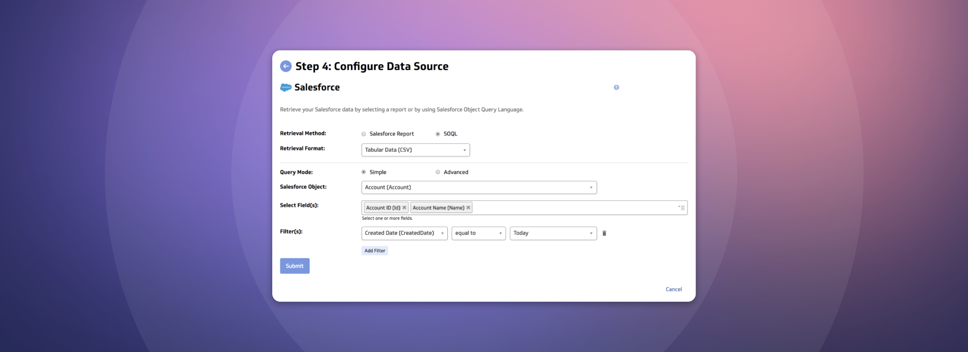
Note: If you want to add to the query created in Simple mode, click Submit, select Advanced, and edit the query. If you switch back to Simple mode after editing in Advanced mode, your previous selections will not be saved.
Next up? Building individual metrics.
Building individual metrics for your KPIs
Klip Gallery
The quickest proof of concept is using Klipfolio's pre-built metrics gallery (or Klip Gallery). Our Klip Gallery houses hundreds of metrics that are ready for you to simply click and add directly to your dashboard, no building required!
To add the Sales this Month Klip to your dashboard, click Get This Klip and sign into your Klipfolio account (if you have one).
You'll see the Klip appear on your dashboard with a small banner in the upper right corner stating Sample Data. As you hover over the banner you will have the option to connect your own data. If you've been following along in your trial account, your account should be connected. All you need to do is select Connect and the Klip will populate with your data!
If you haven't connected with Salesforce in Klipfolio yet, not to worry. The process is quite simple. Press Connect new account and a new window will open prompting you to login to your Salesforce account. Once back on your app window, you'll see you have a connector ID - YourName @ Salesforce. If this is the correct connection, you can Update Klip, and bam, your Klip is populated with your data!
Outside the Klip Gallery
While our Klip Gallery has tons of metrics for you too choose from, there is a lot of value in creating your own custom Klip.
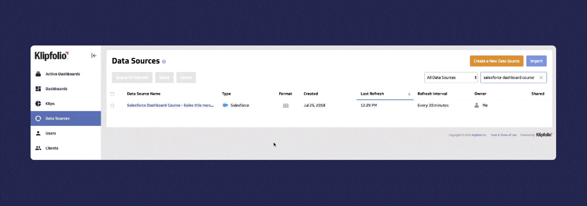
Yesterday we started a tutorial for building a metric with Salesforce. We connected our Salesforce data through a SOQL query, from there we received our new data set and saved it in our data library.
Now, it's time to learn how we work with your data in the Klip editor. The steps below will walk you through how to build a visualization monitoring MRR.
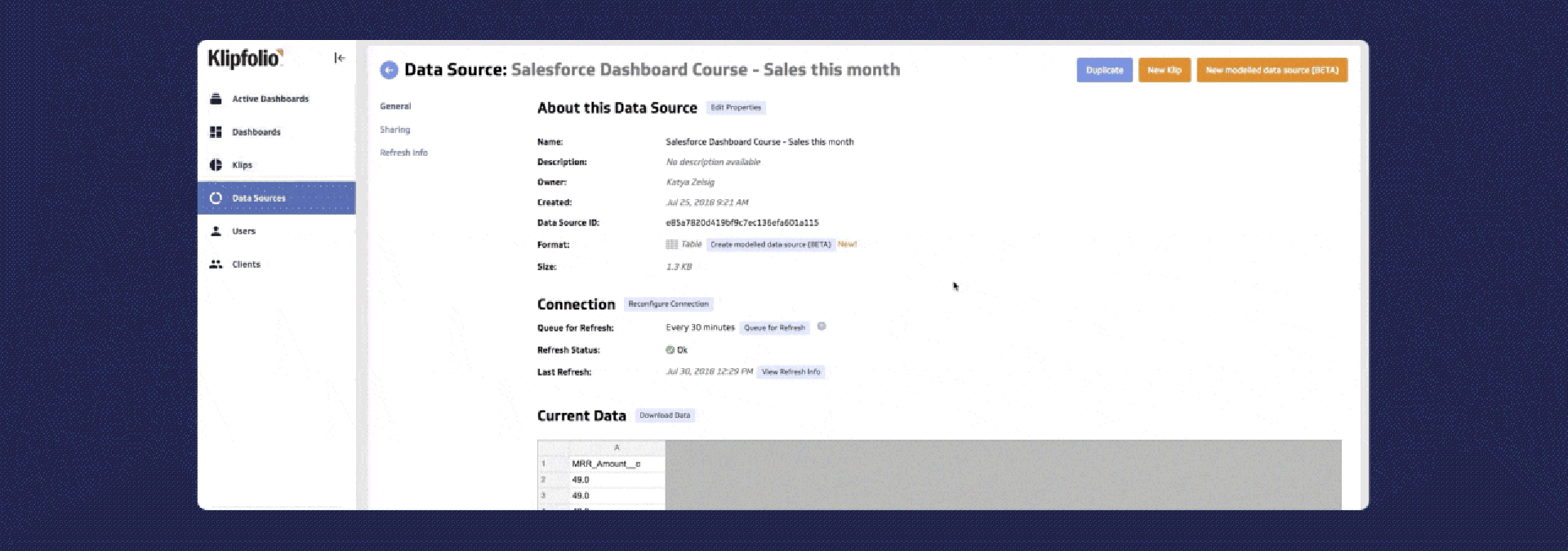
- Find your data set by going to your Data Sources tab, selecting the data source you created yesterday
- Select New Klip, in the top right-hand corner
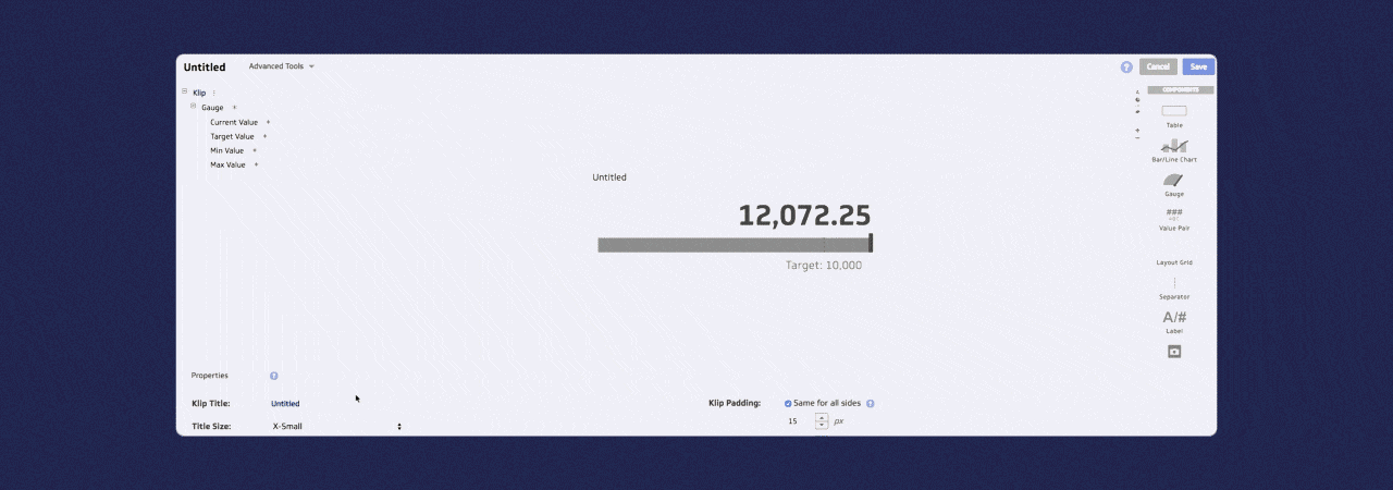
- Now you are in the editor. To track sales this month, a good component to use is the Gauge component.
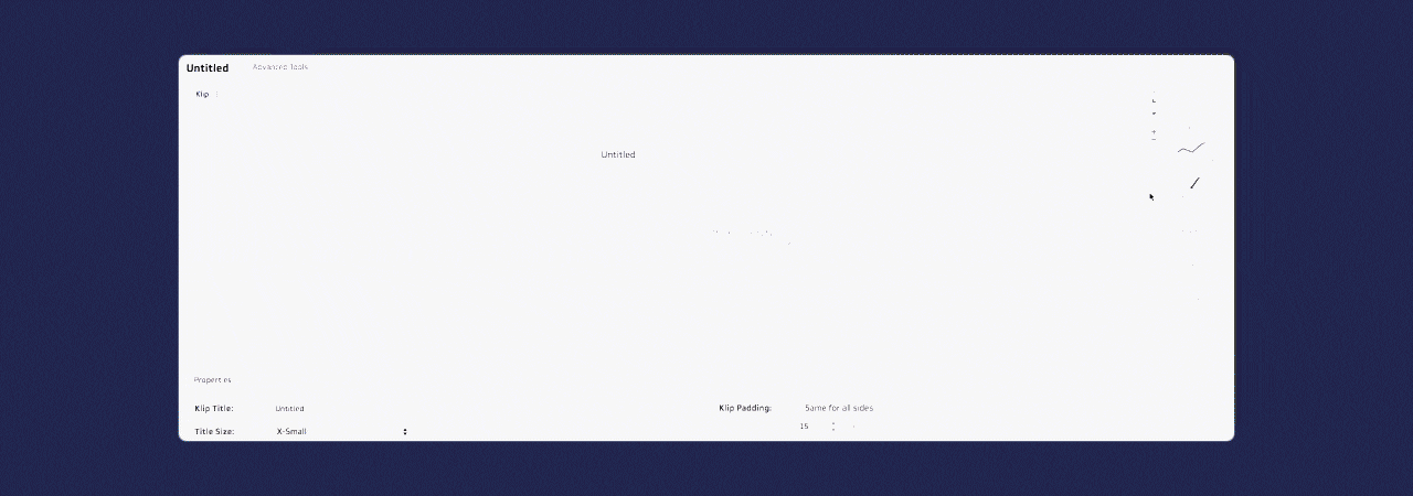
- The bottom of the page holds your data set. If you navigate to the component tree to the left and select Current Value, that portion of your metric becomes highlighted.
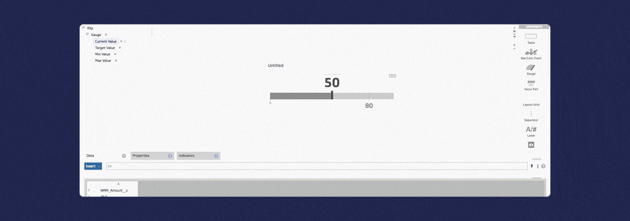
- To populate that portion with data, select the cell you would like to reference in your data set, then go to Properties to alter the data's appearance in the metric.
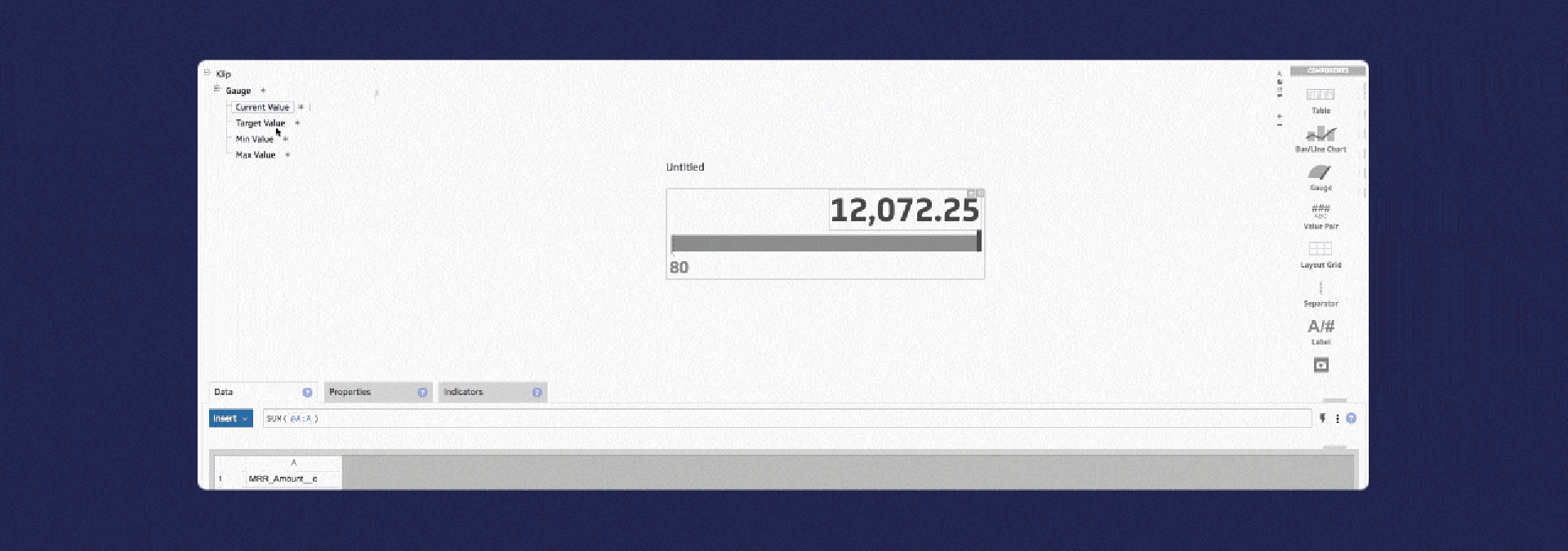
*For this metric, we want the total value of sales, so we will type SUM into the formula bar, then select our desired data row.
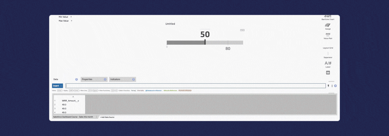
- As you manipulate the data with the type-in formula bar, you will see your Klip change at your will. You can also click to GROUP, SORT, FILTER, and AGGREGATE your data. Want to go deeper than that? We provide the tools to execute complex formulas to solve challenging problems.
- To provide more context to your metric, add your sales target for the month
- To do this, you will select Target Value and insert the target your team is aiming to reach
- Again, we move to the Properties section to add some context to this value. In this particular case, you may want to add a prefix 'Target'
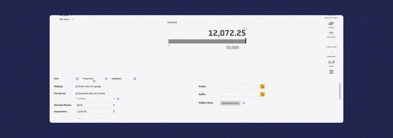
- Once in the Properties tab, you can play around with the look of your visualization. If you move over to the Indicators tab you can, of course, add custom indicators for your data and performance.
- You'll also want to adjust the Max Value in the component tree to extend the line of your gauge.
- Now you can name, save, and deploy your Klip on your dashboard.
.gif)
That was just a quick look into what you can do in terms of customizing your metrics. There are also hundreds of other ways to visualize your data in the editor.
In the final learning section below, we'll go over how you can show off to and share your Saleforce dashboard with your team or office!
Sharing your dashboard
Welcome to the end of your lessons on building with Salesforce! Have you started on your next cup of coffee yet? (I certainly have)
If you've read all of this, you're likely a Salesforce user, which means you also know that you can build dashboards inside the platform, and anyone with a Salesforce login can see it. But what if you want to share your data with someone who doesn't have a login? Klipfolio gives you the ability to share with everyone, yes, everyone.
Data, after all, is meant to be shared. A dashboard without any viewers is, well, kind of sad. Wouldn't you agree? Which is exactly why we make sure you can share with your team and clients through multiple channels.
Our customers love showing off their dashboards on wall-mounted TVs throughout the office.
- You can display all your dashboards on office wall boards via Airtame, Chromecast, or Rise Vision. Multiple dashboards can be setup to display on rotation. It's a great way for executives to nurture a culture of data transparency and the team to see their performance at a glance. Plus, it looks pretty awesome.
Ways to share
There are a few other ways to share your dashboard with your team, 8 ways total in fact!
Sharing your dashboards will allow everyone to stay on track and see their progress towards reaching goals. We want to make sure everyone reaps the benefits of your hard work, so consider sharing your dashboard in these simple ways:
- Slack
Share with Slack users or channels. Once our Slack integration is enabled in your account settings, sharing individual Klips or dashboards with users or channels in Slack is quick and easy. - Add Users
Whether your organization needs 1 seat or 1,000 (or 10,000+), we can handle it. Our user management model is inherently scalable and simply managed. To learn more about adding users to your profile, see our pricing section. - Private/Public Links
Private links to your dashboards can be shared with or without a password, to anyone that you choose. This can be shared with up to 100 concurrent connections.
Public links are an easy way to share your dashboards with a larger, public audience - up to 1,000 viewers at a time. These links are free, indexed, and can be found via search engines. - Automated Emails
You can set-up regular email reports based on data visualizations or entire dashboards. Schedule emails to go out to specific people, at specific times, and specific frequencies. - PDF Reports
Reports can be generated for visualizations or full dashboards. KPIs and dashboards can be downloaded as an image or as a PDF, and easily attached to an email. - Wallboards Display
This is one of the best ways to share your dashboard. You can set your dashboards to 'full screen TV mode' within Klipfolio, and display them on office wall boards and monitors. - Annotation
Klipfolio doesn't support in-app messaging, but it does enable users to annotate individual Klips and dashboards to collaborate and share insights.
You can also share your dashboard with the public, if you so choose. In doing this, you may want to personalize your dashboard even more with your own logo.
Adding your logo
You can replace the Klipfolio logo with your own logo to apply personal branding to your dashboard. Personalizing your dashboard is quick -- all you need is a GIF, JPEG, or PNG image file of your logo.
You will need to import images for the Default, Full Screen, and Mobile dashboard views.
To change the dashboard logo:
- Hover over the Klipfolio logo on the top left-hand side of your dashboard, and select Edit
- Click Account Brand Settings

- You can change your logos by selecting the Edit prompt beside Branding & Themes
- In the dropdown for each view (Default, Full Screen, and Mobile), select Uploaded image file from the drop-down list
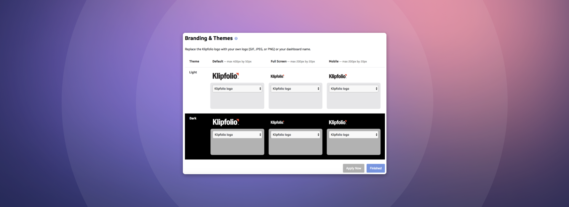
- Click Browse and navigate to and select your logo image file
- Click Open
- Repeat steps 4-6 for the Dark theme
- Click the Apply Now button.
- Click the Finished button.
Your custom logo will now be display instead of the Klipfolio logo.
We hope this helped you learn everything you need to know about building a Salesforce dashboard. To try all of this yourself, get started with a free trial.
If you run into any hurdles, refer back to this post or go to our Support page for some great documentation.
Now, before we get to the brief summary of all these lessons, let us quickly say a huge congratulations for getting through all 5 of these lessons!

Lesson Summaries
You just went through A LOT of information; let's boil it down to a few short points to summmaries everything you've learned before we sign off!
Lesson 1:
Before selecting the KPIs you will be monitoring, make sure to define your organizational goals and ask yourself a few questions, such as: What is my desired outcome? Why does this outcome matter? This process will ensure you are not just monitoring vanity metrics.
Lesson 2:
Drafting out a dashboard before building it is valuable. Sketch it out, pair similar metrics, organize by appropriate time frames, and avoid redundancy.
Lesson 3:
You can connect to your data in multiple ways. We have our Klip Gallery for quick visualization adds, our connector gallery to pull in information through the services Klipfolio connects to (including Salesforce), and API queries to pull in SOQL data or Salesforce Reports to give you the abilities to create fully customizable dashboards.p>
Lesson 4:
There are also multiple ways to build metrics. The Klip gallery offers pre-built data visualizations, and our powerful Klip editor gives you free reign over how your metrics look. With simple functions like SORT and FILTER, along with the ability to execute complex formulas in the editor bar, you can manipulate your data however you want.
Lesson 5:
Sharing your dashboard is a great way to share your data and business improvements. Through Slack, adding users, publishing links, automated emails, PDFs, Wallboards, embedding, and annotations, your team can access the benefits of your dashboards along with you.
Thanks for taking the time to learn all about KPIs and Salesforce dashboards. We hope you learned some valuable information!
If you're not already 1 of our 11,000 customers, we hope you'll consider starting a free trial. We'll be here at every step of the way to make sure you become a world class builder.
Related Articles

6 dashboards I use daily to run my SaaS company
By Allan Wille, Co-Founder — April 10th, 2026
Klipfolio Partner How-To #1: Duplicating dashboards across client accounts
By Stef Reid — November 27th, 2025
Klipfolio Partner How-To #2: Company Properties can simplify client set-up
By Stef Reid — November 26th, 2025