How I built an accounts receivable dashboard that improved our business performance


Summary - Learn how I connected accounts receivable data from Google Sheets and Salesforce to build a weekly dashboard in Klipfolio. The dashboard helps our Customer Success team spot patterns, identify at-risk accounts, and make faster decisions to reduce cancellations and improve collections.
I'm not an accountant or a bookkeeper. I'm a Customer Loyalty Manager at Klipfolio, which means I'm responsible for keeping our customers happy. I care about accounts receivable because overdue accounts often signal customer dissatisfaction—and dissatisfaction is a warning sign we can act on.
When I was relatively new to this role, my boss handed me a pile of customer account data and asked me to make sense of it. In Klipfolio terms, he wanted a dashboard on the data that would help our Customer Success team perform better. The request made perfect sense—we're a dashboard company, after all. But I'd never built a dashboard with Klipfolio before, and I wasn't sure which metrics or KPIs he actually wanted to see.
I had three options:
- Avoid the project and hope he'd forget about it.
- Build something quick and mediocre just to check the box.
- Embrace the data and build a dashboard that exceeds expectations.
I chose option three. Here's what I built, how, and why it matters.
Our accounts receivable dashboard
The dashboard I created is a weekly snapshot of customer accounts that owe us money.
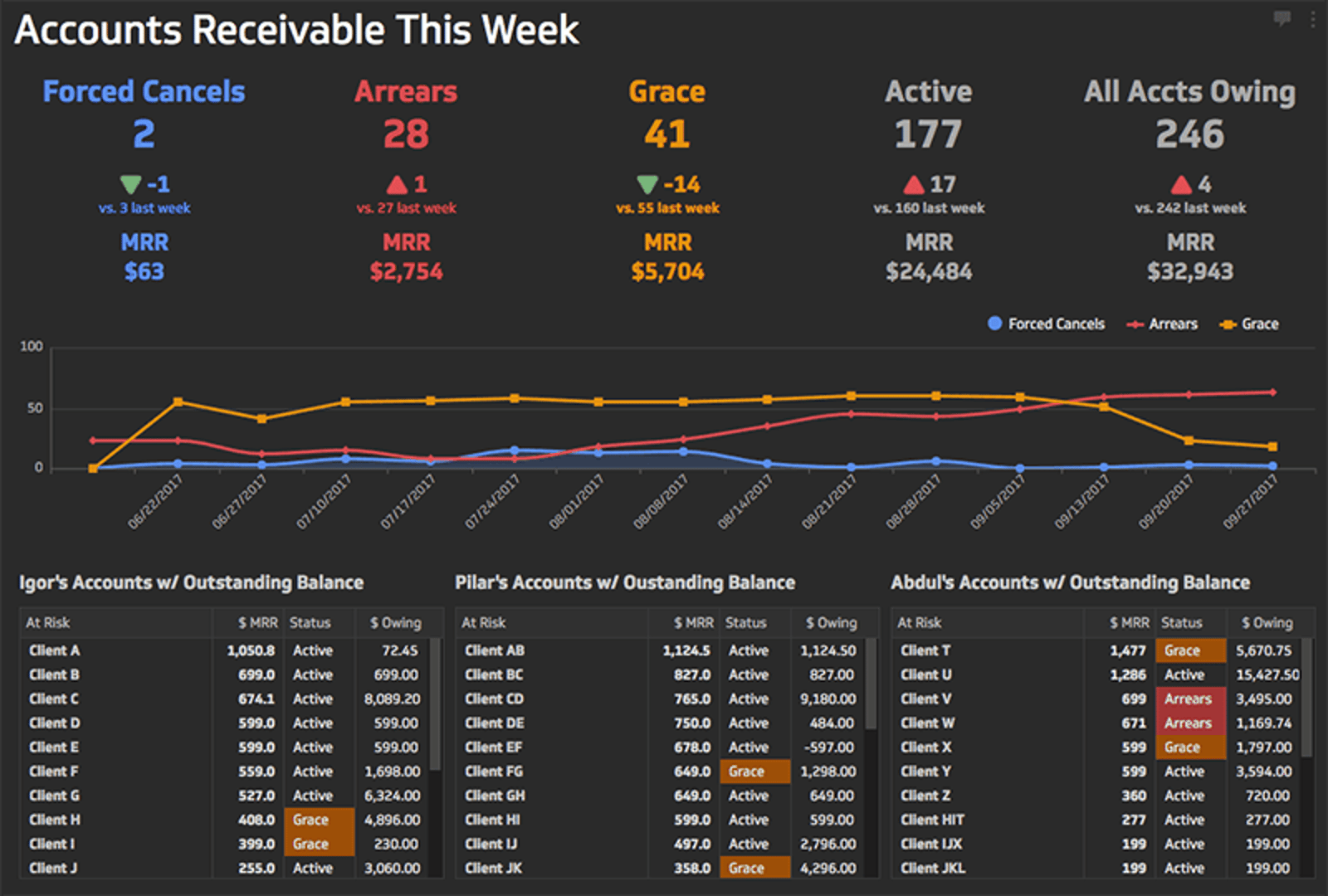
The dashboard has three sections. At the top are our key accounts receivable KPIs. These sales metrics are familiar to anyone working in SaaS (software-as-a-service).
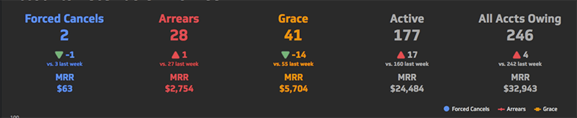
What matters most in this section is that each KPI shows context—how it compares to previous periods. The top number shows account counts in each category. The middle number shows the period-over-period change with colour-coded indicators for positive or negative trends. The bottom number shows the total dollar value (in monthly recurring revenue) of accounts in each category.
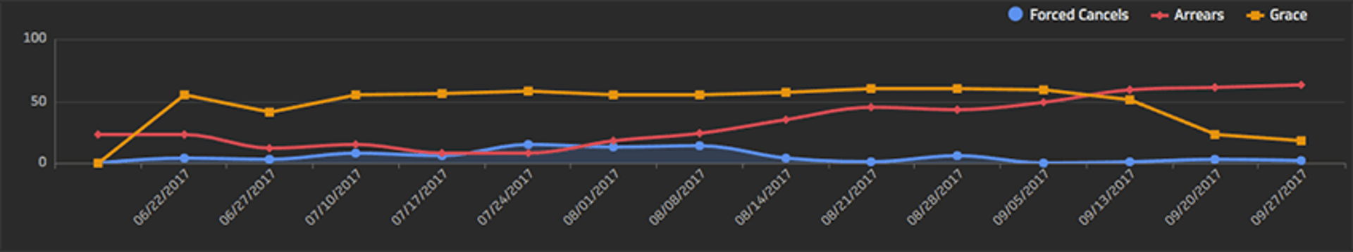
The middle section displays weekly trend lines for three account categories: Forced Cancels, Arrears, and Grace. The colours match the KPIs above for quick visual connection. Hovering over any data point reveals the exact account count for that day.
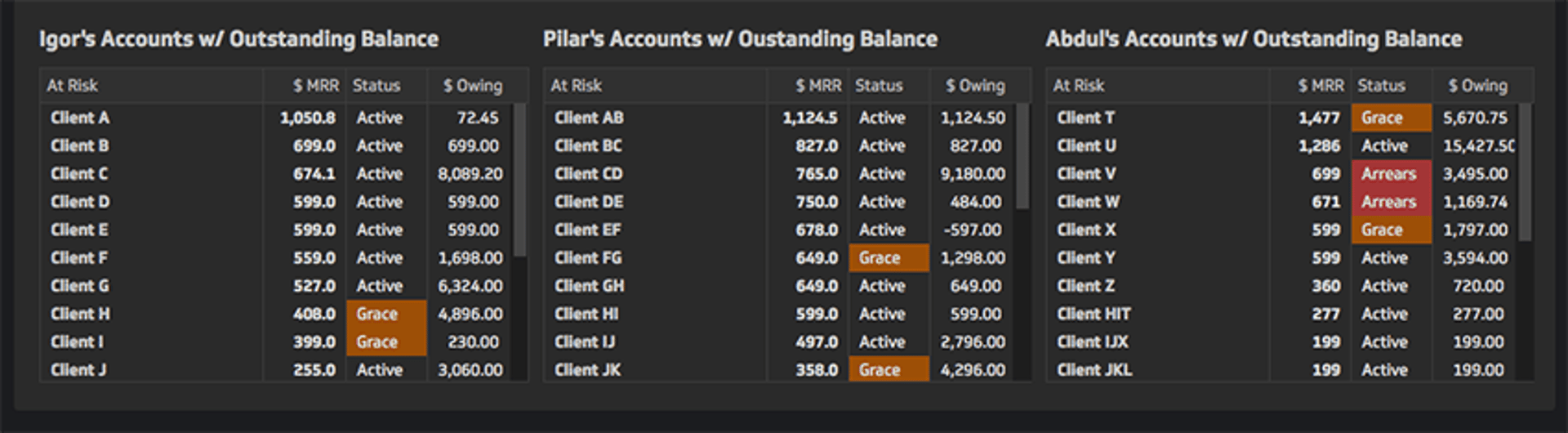
The tables at the bottom show which accounts are "at risk"—those with outstanding balances—organised by sales rep. Each row includes the account's monthly recurring revenue, status (Active, Grace, or Arrears), and amount owing.
The dashboard publishes weekly and is shared via private URL with our Customer Success, accounting, and operations teams. Many team members also receive it as an automated PDF email every Friday morning.
Building an accounts receivable dashboard with Klipfolio
What is Klipfolio?
Klipfolio is cloud-based dashboard software that connects to your data sources and turns them into real-time visualisations. You can connect web apps like Zuora, Xero, and Salesforce; Excel files; databases; or data warehouses, then build custom visualisations and publish them to a dashboard. Learn more here.
Connecting the data
My boss shared a Google Sheet with me—a report exported from our Salesforce account that pulls data from Zuora, our subscription and billing platform. Salesforce serves as our account hub, so account information from Zuora flows into Salesforce records.
Building the dashboard started by connecting this Google Sheet to Klipfolio.
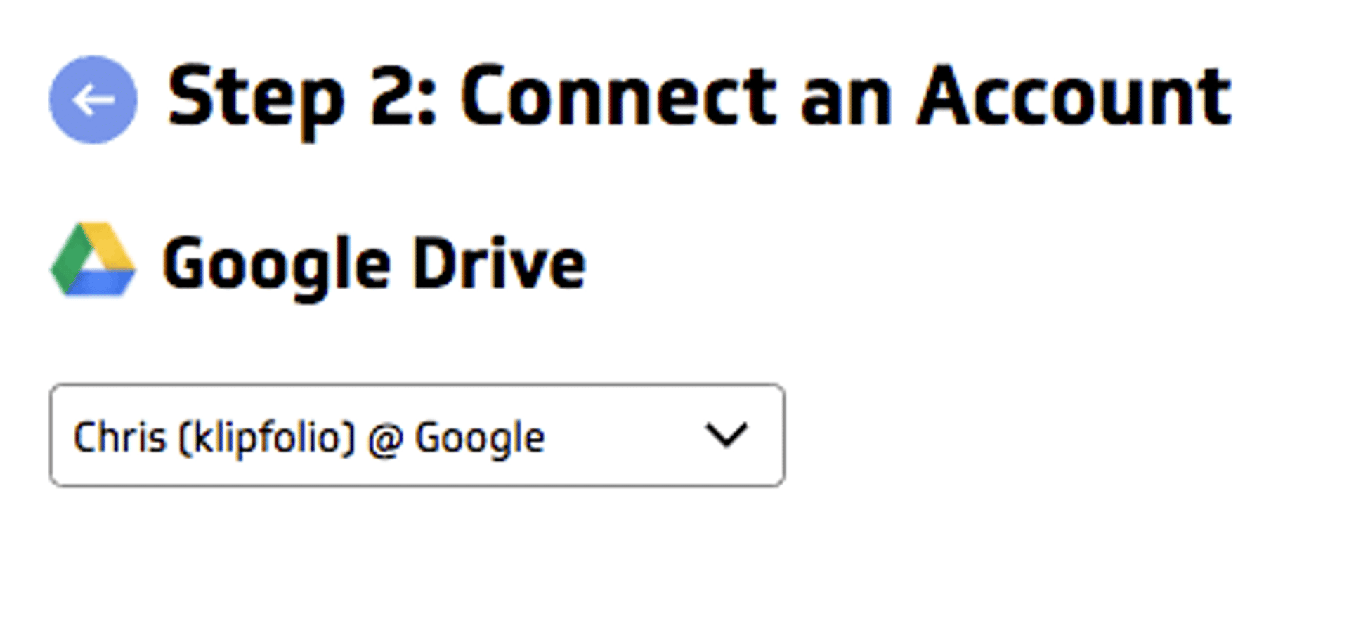
Klipfolio has a Connector Gallery where you can select and authenticate with various services, including Google Drive files.
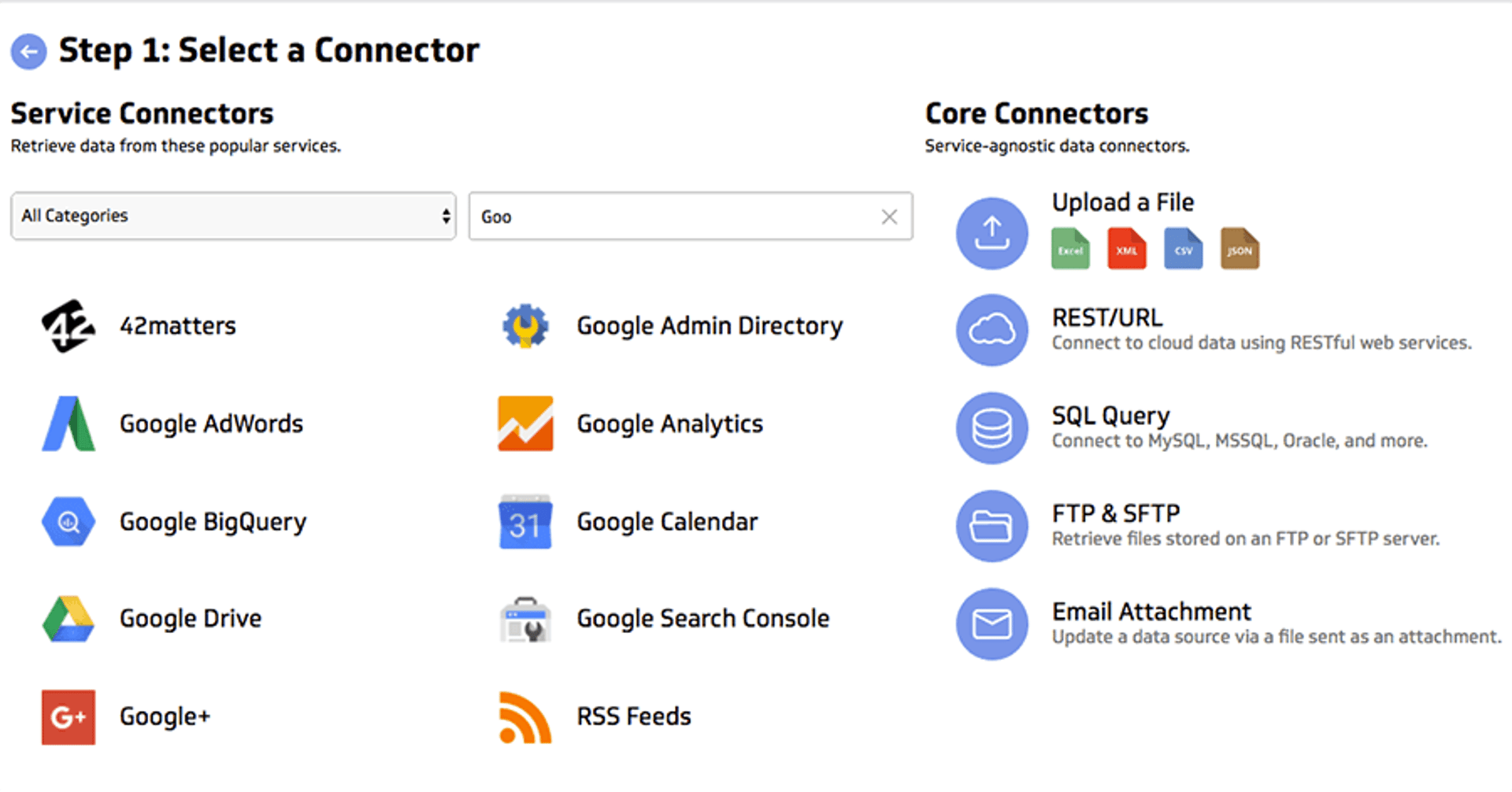
I selected the Google Drive connector, authenticated with my credentials, and selected the Google Sheet I wanted to reference.
Then I set the data refresh rate to every 30 minutes. (You can set refresh as frequently as every minute, depending on your data source.)
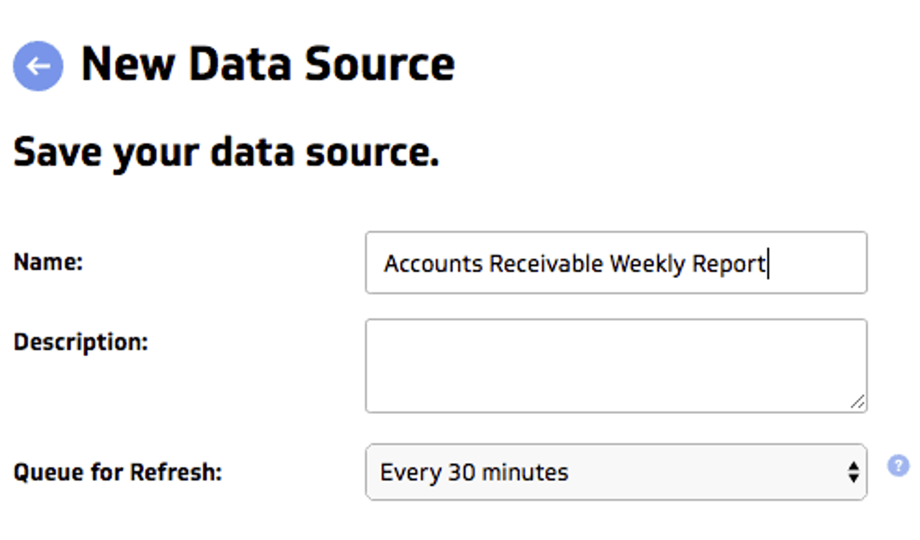
This means Klipfolio automatically pulls fresh data every 30 minutes, and any visualisations referencing that data update instantly.
Building visualisations in the editor
Once I connected the Google Sheet, I could use the Editor to build custom visualisations.
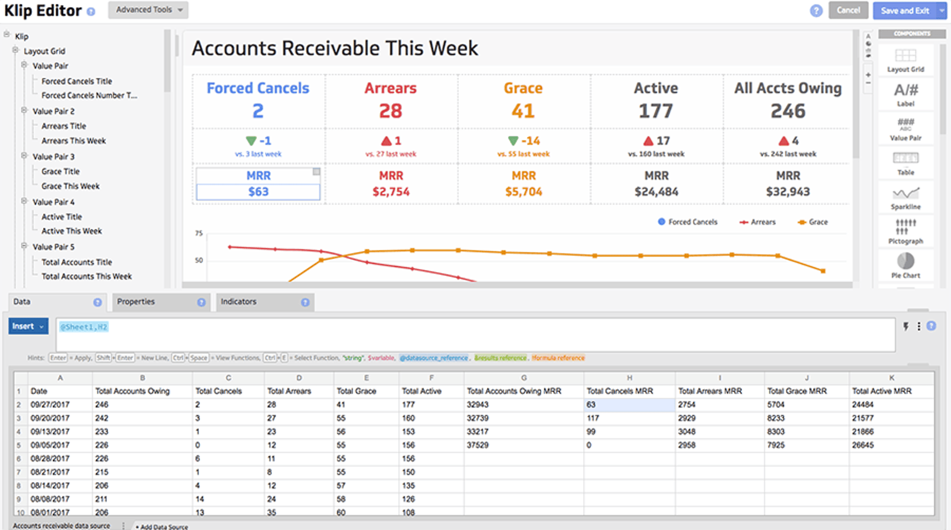
My data source appears at the bottom. (You can also add multiple data sources and work with them simultaneously as separate tabs.)
Visualisations—called "Klips" in Klipfolio—can be dragged and dropped into the preview area from the component menu on the right. The formula bar above the data is where you specify what data to pull and how, using Excel-like functions and operations.
After some focused work and several cups of coffee, I had a fully functioning dashboard that made sense of the raw spreadsheet data. A bit more iteration and I had a polished, visually appealing final product.
Or so I thought.
Picking the right KPIs
In reality, choosing the best KPIs and creating the right visualisations was an iterative process. I presented several dashboard iterations to my boss and incorporated his feedback into new designs.
What helped was constantly asking:
- What action will this data inspire?
- Does it provide enough context to improve what we're doing?
- Will the team understand what they're looking at?
This post on picking the right KPIs for your business was also useful.
I'm proud of the final product, but the process was equally valuable. The back-and-forth with my boss and team forced us to think critically about which KPIs to monitor, why they matter, and how we'd use them. That clarity alone was worth the effort.
Why an accounts receivable dashboard matters—especially in SaaS
I've covered what I built and how. Now let me explain the "why" and the business impact.
When the leadership team at Klipfolio decided to strengthen our customer retention processes, they wanted visibility into how well new initiatives were working. The focus was on three key questions:
- Are we reducing forced cancellations, especially for high-value accounts?
- How many accounts owe us money this week, and what's the total amount?
- Which account reps own accounts with outstanding balances, and can they help collections engage these customers before we force a cancellation?
The dashboard answers all three. Now we can spot patterns and trends, identify which accounts need attention, and prioritise accordingly.
This isn't just my dashboard—it's shared across the team. Every Friday morning, a snapshot goes to my fellow team members and leadership via email. We review the data together and decide which actions are most appropriate.
The best part? I scheduled that recurring email in seconds. It was incredibly simple.
Raw data in a spreadsheet has limited power. Paired with the right tool and clear thinking about what you need to see, it becomes a catalyst for smarter decisions and better business outcomes.
Related Articles

6 dashboards I use daily to run my SaaS company
By Allan Wille, Co-Founder — April 10th, 2026
Klipfolio Partner How-To #1: Duplicating dashboards across client accounts
By Stef Reid — November 27th, 2025
17 KPIs Every Data-Driven Manager Needs to Lead Their Team
By Danielle Poleski — October 14th, 2025