How A&W Boosted Email Marketing Effectiveness with Klipfolio Klips Dashboards
Renowned American fast-food restaurant chain A&W wanted to grow their email marketing programme and increase engagement. Knowing their team learns best through visualizations, they turned to the complete dashboard solution, Klipfolio Klips. They transformed their data into visual dashboards that were easy to understand and act on, empowering the whole team.
Food Services and Restaurants
Email Marketing Efficiency
Data is easier to understand and act on when it's visual. Elements like size, colour, and layout help people quickly spot patterns, trends, and anomalies. A&W wanted to draw higher-quality insights from their email marketing data. They partnered with Klipfolio Klips to translate their numbers into easy-to-read visualizations, empowering their team to dig deeper into their data story.
Introducing A&W Restaurants
A&W is a fast-food chain founded in Sacramento, California. Since opening its doors in 1923, the brand has grown to over 1,000 locations across the U.S. and Canada, making it one of the largest fast-food chains in the world. A&W is most famous for its signature root beer, so much so that its email marketing programme is named the Mug Club in its honour.
Digital Manager Liz Bazner and Associate Digital Manager Scott Barrett sought to increase the company’s email marketing engagement. At the time, the programme was steadily growing, but they wanted to know how much further they could take the campaign.
Liz and Scott's goal was simple: identify gaps and create more targeted subscriber journeys. They focused on clear objectives to close those gaps, including:
- Welcoming new subscribers with a strong onboarding experience.
- Reducing subscriber churn within the first 90 days.
- Lowering spam complaints in the first 90 days.
- Building trust and learning more about their subscribers.
Telling the A&W brand story more effectively
It all started with unearthing the data story with visualizations.
“We love the visuals that Klips adds to our data! Our marketing team is full of visual learners, and it makes it so much easier to digest the data we get from our consumer emails.”
Liz Bazner, A&W Digital Manager
A&W found that the most efficient way to achieve their goals was to monitor and track their progress using Klips. They gathered data on how subscribers were interacting with their emails and used the dashboard solution to transform that information into easy-to-understand charts and graphs. These graphic representations helped the marketing team grasp the broader data story more quickly and make informed, data-driven decisions.
Reducing Unsubscribes
A&W used data visualizations to better understand the reasons behind customer unsubscribes. They collected data on customers who hit unsubscribe—including subscription duration and their chosen channel—and used Klips to instantly visualize the root causes. This helped them see exactly where they could improve the programme and decrease churn.
For example, by using bar graphs, they instantly noticed that it was common for people to unsubscribe once their subscription duration surpassed one year.
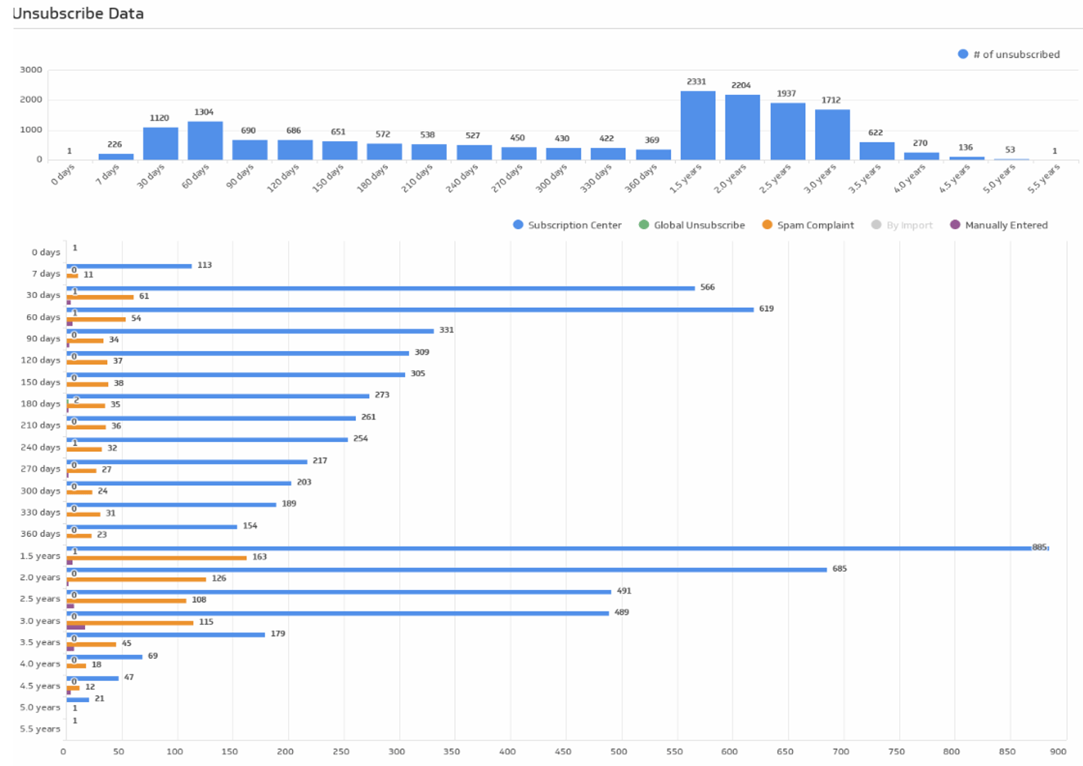
To address this, A&W replaced their generic, once-a-year re-engagement campaign with an automated, conditional one. Now, subscribers receive re-engagement messages based on their individual activity and behaviour, not just a fixed schedule. This approach ensured they reached people with the right message at the right time.
Accommodating Device Preferences
A&W also studied how Mug Club subscribers engaged with their emails. Their analytics revealed two key metrics: 70% of subscribers read through the entire email, and 50% of subscribers read emails on their mobile devices.
This data combination revealed a clear opportunity to boost sales: mobile-friendly email coupons.
Before this discovery, A&W had assumed customers would visit their website, print out coupons, and bring them in. But once the dashboard showed how many subscribers read emails on their phones, they quickly shifted gears. Now, coupons are included directly in marketing emails, making them easier for customers to access and redeem on the spot.
Increasing Satisfaction with Survey Data
Sometimes the easiest way to understand your customers is simply to ask. A&W sent short online surveys to their Mug Club subscribers to get feedback. The study revealed high interest in three key areas: mobile coupon redemption, online ordering, and text messaging.
Again, this data was immediately visible on a bar graph built with Klips, which allowed the team to clearly spot which features stood out to their customers, giving them a clear path forward for future initiatives.
A&W knows the power of visualizing data
How does your team spot patterns, trends, and anomalies?

See Success Clearly with Klipfolio Klips
The visibility on customer behaviour helped A&W tailor their sales strategies to existing customer habits, making calls to action easier to answer. This put them on track to expand their email marketing subscriber reach and maximize engagement.
“As a digital marketer specifically, much of my job revolves around educating our team and our franchisees on technology and online platforms. The dashboards we’ve built with Klipfolio Klips make great additions to any presentation involving email marketing, and it’s an added bonus that they’re so easy to update!”
Klips gives you a more comprehensive view of your data, and we'll help you streamline every step of the insight process, from pulling in data to sharing results with your team. With over 130 pre-built connectors and a REST API, you can easily bring in data from almost any source.
With the right metrics always on hand, your team can generate smarter strategies that move your business forward.
Ready to transform your data into a clear story? Explore what Klipfolio Klips can do for your organization.
Strength in numbers. And in stars.
We love what we do. And so do our customers.