Starter’s Step-By-Step Guide To Dashboard Design: Tips, Tools & Examples
Interpreting dashboards can create friction in business intelligence workflows. To maximize efficiency, you need to make your information easy to understand. Our article will teach you how to employ dashboard design elements, such as placement, color, size, and labeling, to make your dashboard more intuitive — ensuring that your organization spends less time parsing data, and more time acting on it.
Why does dashboard design matter?
A dashboard’s main purpose is to communicate information faster. A good dashboard doesn’t just put data in one place — it also gives users an intuitive understanding of what is happening, what matters, and what is good or bad for the business.
Efficiently communicating the broader data story requires a smart use of design elements. Colors, for example, can communicate negative or positive implications. Size and placement show hierarchy, highlighting the most important information. Labels add context. When you deploy design elements with care and purpose, the information becomes easier for viewers to process.
How to design effective dashboards
1. Define your users and their objectives
Before designing your dashboard, you need a general idea of who your audience is and why they need a dashboard. This information will help you determine the relevant metrics and visualizations.
Below are the important questions you need to ask:
- Who is your audience?: Identify who will use your dashboard and what their roles are within their organization.
- What is their objective?: Determine what the audience wants to achieve. The more specific, the better. For example, the marketing department might aim to increase the number of monthly email subscribers. Alternatively, the finance department might want to investigate the root causes of expense increases.
Avoid the temptation of building a one-size-fits-all dashboard — you want your audience and goal to be as specific as possible. By keeping your dashboards focused, you reduce the need for extensive filtering and segmentation, delivering all relevant information into a single, at-a-glance display.
You can narrow your audience down more easily by understanding to their objectives. There are four types of dashboards, each outlining a general purpose and set of dashboard users. The types of dashboards include strategic, operational, analytical, and tactical.
Strategic
Strategic dashboards ensure alignment with long-term objectives by tracking KPIs related to overall business performance, such as financial health, market position, and monthly recurring revenue growth rate, to ensure alignment with long-term objectives.
- Audience: Directors and executives
- Purpose: Measuring overall business performance
- Example: An executive dashboard showing performance against targets for all areas of the business
Operational
Operational dashboards support daily workflows, helping teams visualize the impact of their efforts on overall progress. They monitor real-time data against KPIs to communicate the performance of ongoing operations related to specific business areas, including departments, processes, or initiatives.
- Audience: Managers and their teams
- Purpose: For measuring the real-time performance of a specific business area
- Example: A sales leaderboard comparing each employee’s performance against targets
Analytical
Analytical dashboards compare vast amounts of data across multiple timeframes. They identify trends, patterns, and other relationships in historical data to help you investigate the root causes of performance changes, predict challenges, forecast future performance, and set realistic KPI targets.
- Audience: Analysts and executives
- Purpose: For analyzing historical data to support business initiatives
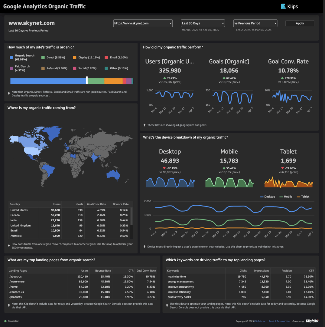
- Example: A Google Analytics dashboard breaking down the main sources of traffic by region, program, and keyword
Tactical
Tactical dashboards visualize progress for specific business areas, such as departments, processes, and initiatives. They help teams evaluate the effectiveness of their long-term and short-term strategies.
- Audience: Department heads, project heads, and managers
- Purpose: For measuring the long-term performance of a specific business area
- Example: A consolidated social media dashboard providing visibility to the overall following and summarizing gains and losses over a month
Once you’ve defined your audience and goals, narrow down what your audience needs. Outlining their specific expectations and preferences can guide you through crucial dashboard design choices, such as colors, labels, interactive elements, and display type.
Answering the following questions will help guide the design of your dashboard.
- What is their level of experience with data?
- What are their prejudices in terms of visualizations and colors?
- Where will they display the data?
2. Identify key metrics
After narrowing down the general purpose of your dashboard, use your initial objective to get more specific. If you’re building a strategic dashboard, identify the core aspect of business performance you want to evaluate. If you’re building an operational, analytical, or tactical dashboard, determine the specific department, process, or initiative you want to analyze.
Then, identify the metrics that can support initiatives related to your objective. You can ask the following questions:
- What can you use to measure the success of your objective?
- What processes contribute to progress related to your objective? How are they measured?
- What can you do to maximize the efficiency of related processes? What information can you analyze to identify problem areas and opportunities?
MetricHQ is a great reference for learning about the different types of KPIs and metrics. It helps illustrate hundreds of metrics through definitions, formulas, calculation tutorials, visualizations, and examples. You can browse by service or category to find metrics that align with your dashboard goals.
3. Choose the most effective dashboard design
Data visualizations are the backbone of your dashboard. They enable the dashboard’s key function: to get the data story across instantaneously.
It’s on you as a designer to select a visualization type that effectively communicates the implications of your data. Choosing the wrong visualization will obfuscate meaning or confuse the viewer.
Each data visualization is effective at answering a specific set of questions, which we’ve summarized below:
- Bar graphs: Which data point performed best in its category?
- Line graphs and area graphs: How did a data point change over time?
- Pie charts, doughnut, and stacked bar graphs: How much does each component contribute to the whole?
- Gauges: How far is the value of the data point from the target?
- Scatter plots: What is the relationship between two variables?
- Bubble charts: What is the correlation between three variables?
- Heat maps: Which data point had the greatest magnitude?
- Geographic heat maps: How well does one metric perform per region?
- Tables: What are the exact values of each data point?
Line graphs
Main question: How did a data point change over time?
Line graphs use lines to track how the value of a data point changes with respect to continuous increases in a particular variable. The graph measures changes in value using the y-axis and increases in the second variable through the x-axis. In the great majority of cases, the x-axis corresponds to time.
Line graphs are excellent for showing continuous change across a defined span of time. The slopes help you spot trends, patterns, and changes. You can also add lines on the graph to track multiple series within the same timeframe.
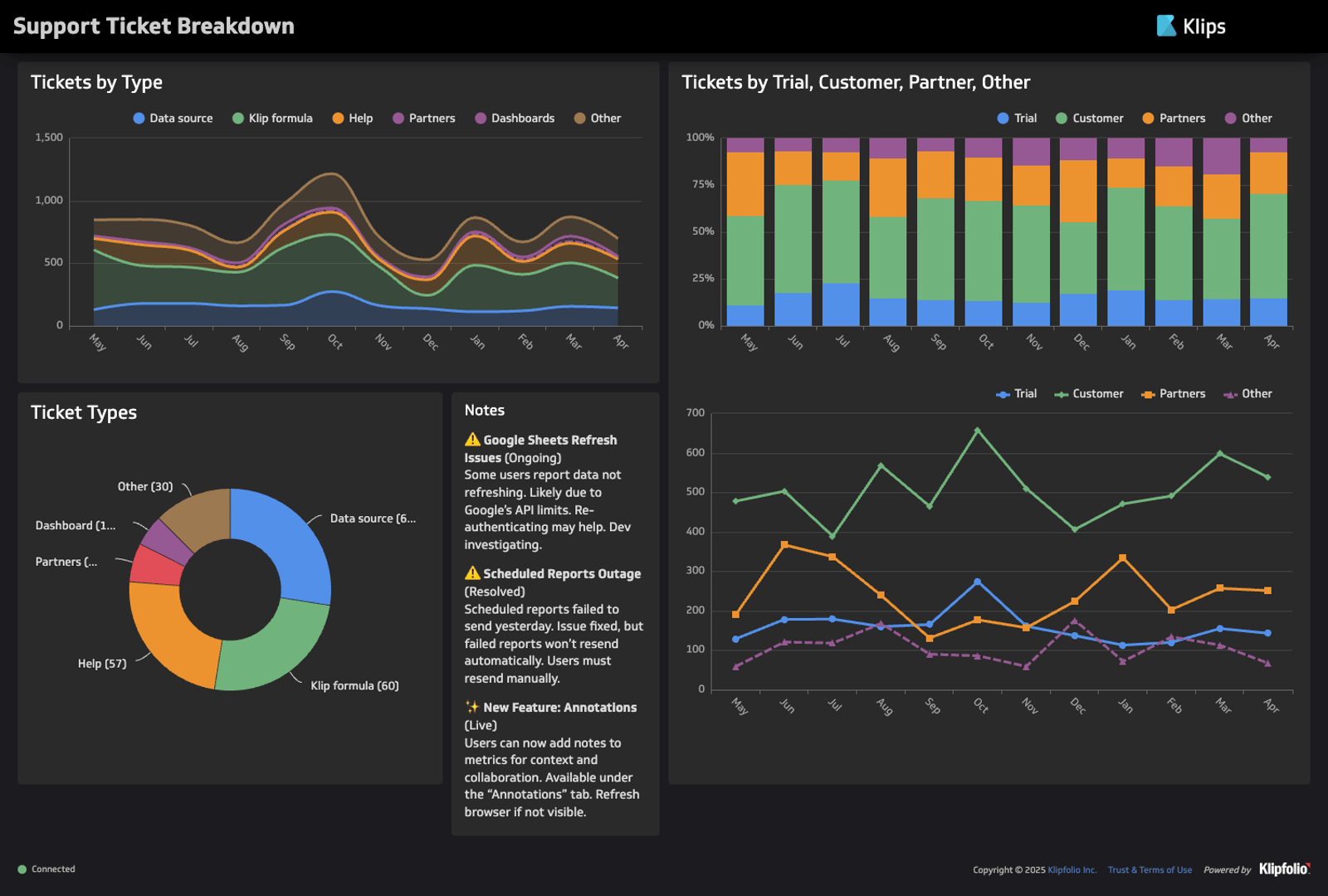
Caption: The Klipfolio Support Ticket Breakdown Dashboard uses a multi-series line graph to compare monthly tickets by trial, customer, partner, or other.
When to use a line graph
- When tracking trends, patterns, and changes over time
- When comparing change across multiple independent series
When not to use a line graph
When comparing discrete variables
Area graphs
Main question: How did a data point change over time?
The area graph is an alternative to the line graph. The difference is primarily aesthetic — area graphs shade the space between the x-axis and the bottom of the line to add visual weight. The shaded area allows the viewer to visualize the data point’s total volume.
One of the biggest reasons for choosing an area graph over a line graph is to show volume. Lines alone have no weight; the eye simply follows their movement from left to right. Meanwhile, solid shading emphasizes the area covered, creating the impression of volume or magnitude.
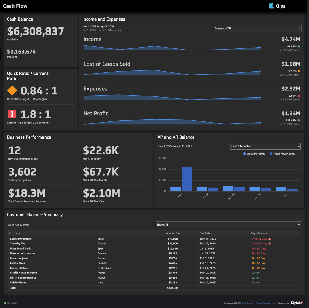
Caption: The Klipfolio Cash Flow Dashboard uses an area graph to visualize the volume of income, cost of goods sold, expenses, and net profit over one quarter.
Both area graphs and line graphs allow the inclusion of multiple variables. However, when you put multiple lines in one graph, they tend to look unrelated. The lack of visual connections distinguishes each series as independent. Meanwhile, overlapping shading can visualize cumulative relationships, letting you illustrate how much a component contributed to a whole.
For example, you might use one shape to represent the volume of sales per day, then add a shape underneath to represent the daily volume of sales from new customers.
For the same reason, you shouldn’t use area graphs to represent multiple series. The more series you add to an area graph, the more confusing it appears. Shaded areas might conceal lower-valued series. The overlaps in shading might also suggest cumulative relationships between series that are independent of each other.
When to use an area graph
- When communicating the volume of a series
- When tracking a series’ contributions to a whole
When not to use an area graph
When tracking multiple independent series
Bar graph
Main question: Which category is performing best?
Bar graphs use rectangular bars to represent the value of discrete data points. Rectangles in a bar graph can scale vertically or horizontally, showing differences in performance within a single metric. You can color-code bars to represent subgroups within a main category.
A common modification of the bar graph is the stacked bar graph. It divides each rectangle into multiple components to illustrate the contributions of each component to the variable’s overall performance.
The main limitation of bar graphs is space. The more values you compare, the more space each rectangle has to fight for. Generally speaking, you should limit the number of data points in a bar graph to 10. Anything more will make the graph look cluttered and confusing.
Caption: The Support Tickets Dashboard uses a two-colored dashboard to compare tickets per day and average tickets per day per month across a one-year period.
When to use a bar graph
- When comparing two or more values in the same category
- When ranking performance
When not to use a bar graph
- When comparing more than 10 data points
- When representing continuously changing data
Percentage graphs
Main question: How much does each component contribute to the whole?
Pie charts, doughnut graphs, and stacked bar graphs use colors within a shape to represent components of a whole. They visualize contributions and differences in proportion.
The most popular type of percentage graph is the pie chart, which represents the whole with a circle and parts as slices. A common alternative is the doughnut graph, which removes a hole at the center of the circle to make the differences in segment sizes clearer.
Caption: The Klipfolio Support Ticket Breakdown Dashboard uses a doughnut graph to measure tickets by type.
Lastly, there is the stacked bar graph, which uses a rectangle to represent the whole. Its simple shape makes size differences easier to glean. Some stacked bar graphs use a single rectangle to visualize proportions within one whole. Their shape helps them optimize space within a dashboard, as they require less white space than pie charts or doughnut graphs.
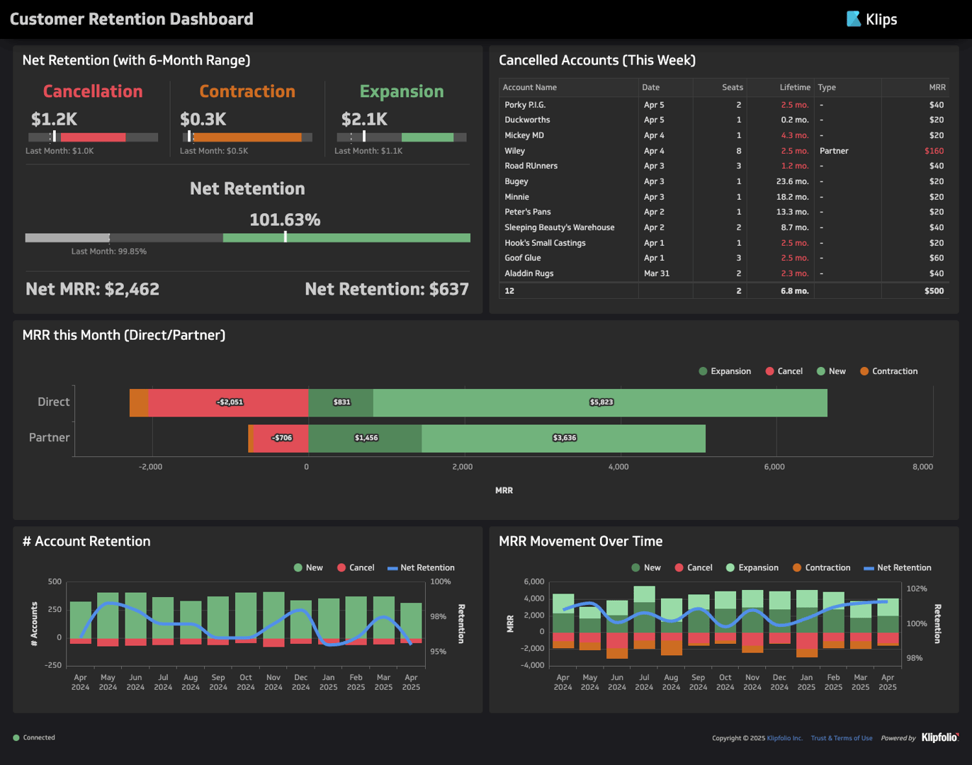
Caption: The Klipfolio Customer Retention Dashboard uses a stacked bar graph to measure the contributions of expansions, new users, and cancellations on direct and partner MRR.
Meanwhile, multi-bar stacked bar graphs add divisions as part of a larger bar graph, simultaneously comparing performance in one category and the contributions of components within each individual data point.
Like bar graphs, the main issue with percentage graphs is limited space. Though you can divide a finite shape into infinitely many categories, the more categories you add, the more difficult it will be to glean size differences between segments. To avoid clutter, limit yourself to six components per whole.
When to use a pie chart
When comparing percentages of a whole
When to use a doughnut chart
To increase visual clarity in a pie chart
When to use a single-bar stacked bar graph
To increase spatial efficiency in a dashboard
When to use a stacked bar graph
When comparing contributions to performance
When not to use a percentage graph
- When comparing more than six data points
- When not comparing contributions to a whole
Gauges
Main question: How far is the value of the data point from the target?
Gauges are similar to bar graphs in that they track performance. However, instead of setting rectangles against empty space, gauges shade out the shape of the maximum value a data point can reach. They might also mark out key points and ranges, such as low ranges, middle ranges, high ranges, and targets.
Gauges are typically rectangular or radial. Some use needles to pinpoint where a value lies within a range. Others use color to illustrate progress against a target and/or a maximum.
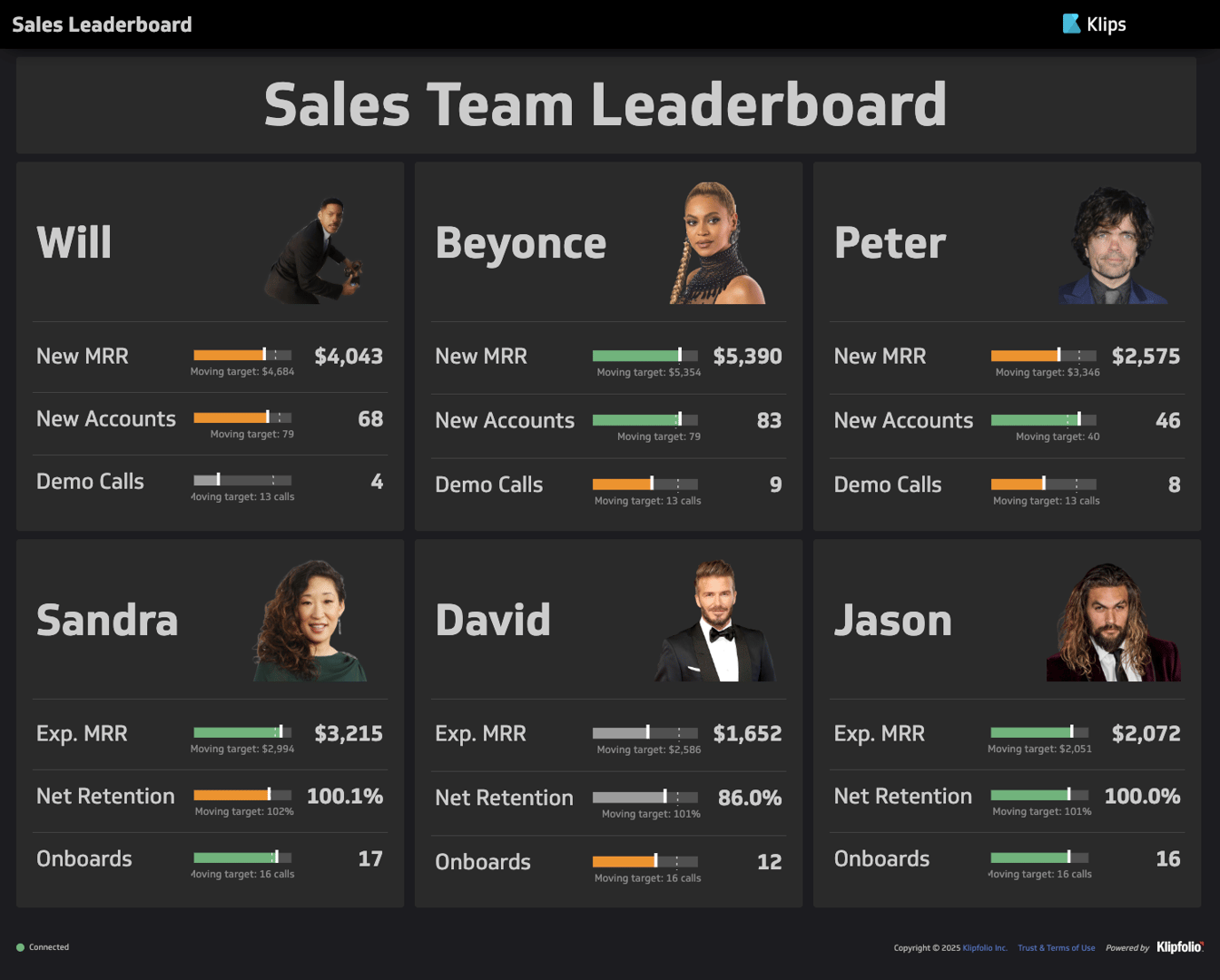
Caption: The Klipfolio Sales Leaderboard Dashboard uses rectangular gauges to measure employee performance.
The best use of gauge graphs is measuring capped progress. The visual contrast of the shaded area against the empty space visualizes a clear maximum.
When to use a gauge graph
When targets and maximums are clearly defined
When not to use a gauge graph
When targets and maximums are not significant to the dataset
Scatter plots
Main question: What is the relationship between two variables?
Similar to line graphs, scatter plots place data points on two-dimensional planes to represent values for two distinct variables, with its position on the x-axis measuring one variable, and its position on the y-axis measuring another. However, unlike line graphs, standard scatter plots do not connect data points.
Scatter plots observe the relationships between two variables. The positions of data points in relation to each other visualize patterns, such as positive trends, negative trends, linear relationships, nonlinear relationships, and outliers. It also helps determine whether the variables have no relationship at all.
When to use scatter plots
- When identifying correlations between two variables
- When relationships between variables are nonlinear
When to use scatter plots
When identifying relationships between three or more variables
Bubble charts
Main question: What is the relationship between three to four variables?
The bubble chart is a modification of the scatter plot that allows you to visualize relationships between three variables. Similar to scatter plots, each position of a data point on the x- or y-axis signifies its value. Bubble graphs have the added dimension of size, which represents value according to a third variable. If you want to add a fourth variable, you can use color.
Bubble graphs can cause confusion when not properly labeled. Viewers might measure the size of each bubble against the scales on the x- and y-axes even when there is no relation. Use a legend to communicate what bubble size means. Do the same if you add colors for a fourth variable.
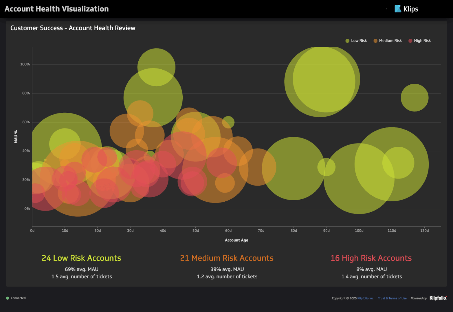
Caption: The bubble chart on the Klipfolio Account Health Dashboard uses bubbles to represent accounts, with x-axis position signifying account age, y-axis position to signifying percentage of monthly active users, bubble size signifying number of users, and color signifying risk level.
Since the third variable uses size to represent value, it is best used to communicate volume, magnitude, or quantity. Avoid using this representation for variables with negative values since it is physically impossible to illustrate a size smaller than zero.
You should also avoid the scatter plot if representing size would cause too many overlaps. Higher-value bubbles might obscure lower-value bubbles, creating confusion. In this case, a good alternative would be a colored scatter plot, which keeps the sizes of each data point uniform but uses color to communicate the value according to the third variable.
When to use bubble charts
- When identifying correlations between two variables
- When relationships between variables are nonlinear
When not to use bubble charts
- When negative values appear across all variables
- When the size of the dataset risks overplotting
Grid heat maps
Main question: Which data point had the greatest magnitude?
Grid heat maps use color to communicate the magnitude of values on a grid. The grid itself consists of two axes, with the first representing a category and the second representing uniform subgroups within the category.
Typically, the darker the color, the greater the value. The intensity of colors draws the eye in, helping the viewer identify patterns and outliers at a glance.
Grid heat maps essentially ask the same question as bar graphs: which data point performed best in its category? However, while bar graphs are best suited for categories with ten or fewer elements, grid heat maps are best suited for large datasets. Because it relies on color rather than size to communicate value, it minimizes the white space used, allowing you to pack multiple data points in a single space.
However, the average viewer will find bar graphs more intuitive than heat maps since size is a more immediate indicator of scale than color. It’s important, then, to include a legend that explains which colors correspond to what values. You can also include numerical values in each cell for full clarity.
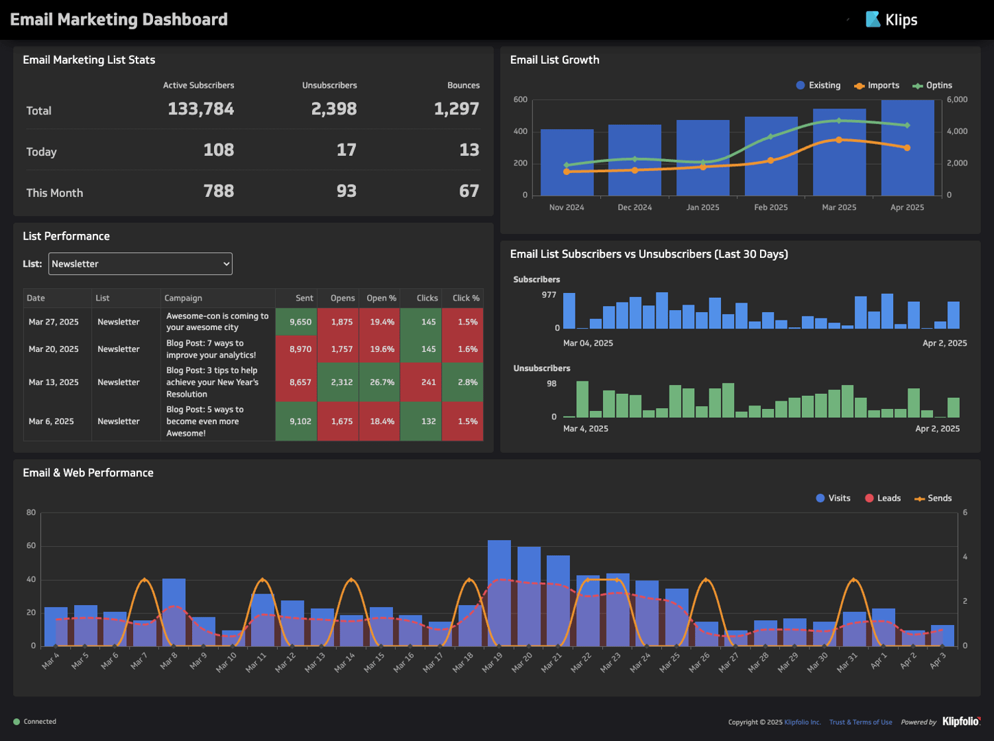
Caption: The Klipfolio Email Marketing Performance Dashboard colors cells on a grid to communicate newsletter performance.
When to use grid heat maps
When comparing values across large datasets
When not to use grid heat maps
When the dataset contains fewer than 10 data points
Geographic heat maps
Main question: How well does one metric perform per region?
Another type of heat map is the geographic heat map. Rather than adding colors to cells in a grid, map charts color geographic maps to visualize value distribution across regions. Some map charts color the exact areas where trends occur, while others color within borders as denoted by political maps.
Map charts are best used when data is available for multiple regions, or when visualizing location is relevant to your goal. For example, if you're a physical retailer tracking customers by region, a map chart will help you glean an estimate of how far your largest customer bases are from your stores.
If you only have data for a few regions, and visualizing location contributes minimal benefits to your goal, consider choosing a bar graph instead. Again, size is a more intuitive indicator of value than color. Additionally, bar graphs tend to occupy less space than map charts.
When to use geographic heat maps
When comparing trends across regions
When not to use geographic heat maps
- When location is irrelevant to the objective
- When data is only available for a few regions
Tables
Main question: What are the exact values of each data point?
Although the standard table is less intuitive than most types of data visualizations, it still has a few use cases. Tables display precise values, which can help in situations where deep and exact analysis of data points is necessary. They also allow you to organize groups of non-numerical data.
Tables are also compact and space-efficient. Like grid heat maps, they allow you to display large datasets while occupying minimal space on the dashboard. You can use tables to organize the least significant groups of data within the dashboard. You can also use tables to organize isolated groups of information, where the relationships between the metrics presented need no visualization.
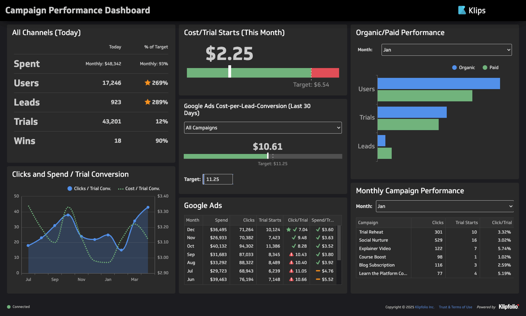
Caption: The Campaign Performance Dashboard uses a table to communicate overall performance across all channels.
For example, Klipfolio’s Campaign Performance Dashboard uses a table to communicate total spending, users, leads, trials, and wins. All information metrics are related to a single group (the total across all channels) and require no comparisons against each other, other groups, or historical data. Although it compares the values against targets, it forgoes using gauge bars to save space.
When to use tables
- When presenting precise numbers is necessary
- When organizing non-numerical data
- When presenting low-priority data, space efficiency is necessary
When not to use tables
- When visualizing the relationships between data points is critical to the purpose of the dashboard
Mixed data visualizations
Dashboards allow you to combine multiple data visualizations and leverage the strengths of each. For example, the Klipfolio Digital Marketing Dashboard uses a map chart to visualize where most sessions and leads originate, then adds a bar graph to clarify differences in volume between top regions. The graphs support each other, providing a more complete and intuitive view of the data store.
Caption: A combined map chart and bar graph from Klipfolio’s Digital Marketing Dashboard.
The main challenges of combining data visualizations are clutter and space efficiency. Having too many visual elements may confuse the viewer, and reduce available space for other dashboard panels. Ensure that all information presented is relevant to your goal.
4. Add comparison values
The best way to communicate the implications of your data is to add comparison values. These are numbers, such as historical values or targets, that give context to current metrics. They differentiate good and bad performance, highlight outliers, and confirm consistency with past data.
A guiding principle for comparison values is that they should be meaningful to users. Most comparison values fall into one of a few common categories, which help contextualize data in different ways. Below, we outline a few types of comparison values and how they serve data interpretation.
- Comparison against a set target (current average customer satisfaction rating vs. target rating set by the business): Estimates remaining work.
- Comparison against a preceding period (today vs. yesterday): Benchmarks current against past performance.
- Comparison against a prior equivalent period (this week vs. same week last year): Assesses the reliability of old strategies, the effectiveness of new strategies, or the impact of unexpected events.
- Comparison against a trailing average (today vs. an average of previous 30 days): Helps assess the effectiveness of ongoing strategies or spot outliers.
- Comparison against a projection (current cumulative total vs. expected total for this point in time): Helps assess the effectiveness of current strategies, or the accuracy of previous forecasts.
- Comparison against another metric (new account activations vs. account cancellations): Helps with qualitative analysis of performance.
If you can’t come up with a meaningful comparison value for a metric, it likely doesn’t need it.
5. Visualize your information hierarchy through size and placement
Size and placement communicate importance. The human eye will naturally gravitate towards the largest elements on screen. After that, viewers will default to their culture’s typical reading directionality: left to right, top to bottom for most of the world, and right to left, top to bottom for a few countries in North Africa, the Middle East, and South Asia.
Align your dashboard design with these typical viewing habits to get the hierarchy of information across more clearly. In general, the most important information goes in the upper left quadrant of your dashboard. Secondary information should be placed lower and take up less space so as not to divert attention.
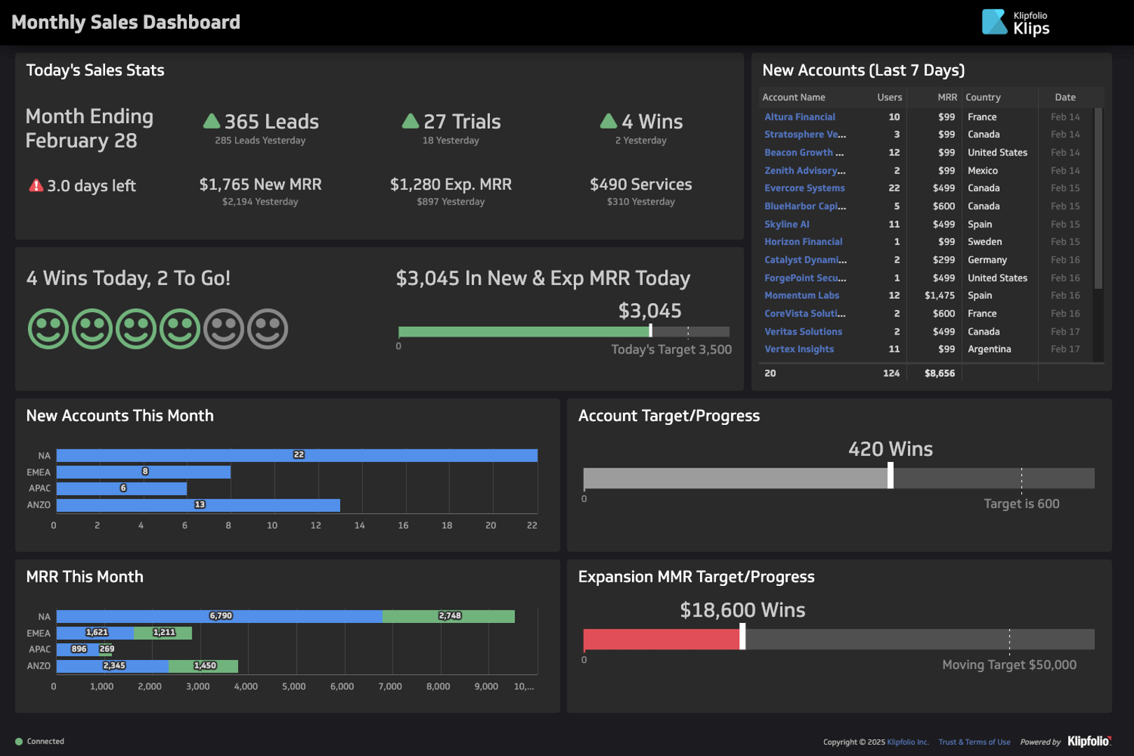
Caption: The Klipfolio Monthly Sales Dashboard starts with a card for daily sales stats at the upper left quadrant, then breaks down more specific information such as new accounts, new accounts per region, MRR per region, account target progress, and expansion progress.
6. Group related data on a single dashboard
Information is easier to locate when organized by commonalities. When related metrics are grouped, users won’t have to jump from component to component to find what they are looking for.
To ensure easy reading, the information on your dashboard should follow a logical sequence. When organizing the placements of dashboard panels, ask yourself: what would the viewer want to find out next? Identify the panels available, then determine which pieces of information have stronger commonalities.
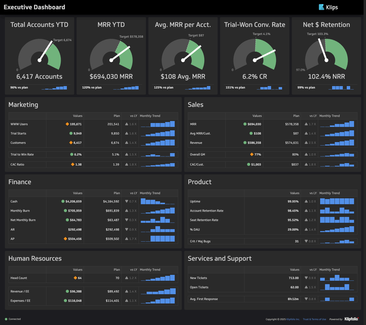
Caption: Klipfolio’s Executive KPI Dashboard.
The Executive KPI Dashboard, for example, consists of five components: revenue-year-to-date, debt-to-equity, return on equity, net profit margin, and gross profit margin. Debt-to-equity sits on the same column as return on equity, while net profit margin sits on the same column as gross profit margin. The deliberate placements make interrelated data easier to find.
7. Use color strategically
Colors have a strong impact on the viewing experience. You can use them to draw attention to important data or outliers, create contrast, or stimulate emotional associations. However, colors can also distract, overwhelm, or create confusion. Below, we name the dos and don’ts of using colors strategically in dashboard design.
Do: Use neutral colors for regular data and bold colors to highlight outliers
As a general rule, it’s best to use desaturated colors for the majority of your visualizations. Saturated colours have a time and place — use them to strategically draw attention to changes and indicators in your data.
Do: Use color to create emotional associations
Colors effectively stimulate mental associations, such as cultural connotations and emotions. You can use color to indicate the implications of data, such as positive or negative performance.
The strongest color associations are red and green. Red is most universally associated with danger, so it’s best to use it exclusively to signal negative performance. Meanwhile, green is primarily associated with growth, which makes it effective at signalling positive performance.
Yellow and orange, like red, are warm colors. Because of their closeness to red on the color wheel, they evoke similar associations of danger and negativity, only milder. Use yellow and orange sparingly to indicate minor problem areas.
Klipfolio defaults to blue when presenting neutral data, to indicate performance that has yet to carry positive or negative connotations. There are no hard rules for selecting colors for neutral data, but blue is a strong contender due to its associations with serenity, reliability, and trustworthiness.
Do: Use consistent color schemes
To ensure visual cohesion, be consistent with your use of color for the same data on different charts. Creating visual distinctions between related data will only confuse the viewer.
Additionally, be consistent about your use of color associations. If your dashboard uses green to indicate positive performance, it would be unwise to repeat the color for neutral visualizations.
Don’t: Use too many colors on a single page
One of the main strengths of color in dashboard design is the ability to create contrast. But too much contrast creates visual clutter, making it harder for the eye to determine what matters.
The rule of thumb is that you can use up to five distinct colors before the contrast becomes too overwhelming for the human brain to comprehend at a glance. To stick to the limit, try to evaluate which groups of data require color distinctions. Often, labels suffice to distinguish disparate categories, groups, or entities.
If distinct but related data points require contrast, use similar shades of the same color. For example, varied saturation can indicate inherent sequences or relationships within a category, such as time, risk levels, grade levels, or lead progression.
Don’t: Use bold colors for backgrounds
Your data should be the star of your dashboard, not your background. Using bold colors for your background may divert attention away from the information that matters. Worse, you might overwhelm and confuse the viewer.
Use dark or light gray shades for your background to ensure that the viewer’s focus stays on the data. While many people associate pure white or pure black with neutrality, it’s best to stick to less vibrant alternatives.
8. Make text easy to read
It goes without saying that your labels and titles should be easy to read. To increase the readability of the text, follow the guidelines below:
- Avoid fancy fonts. Dashboards typically use sans serif fonts, which remove unnecessary letter decoration to improve readability.
- Use a text color that contrasts with the background
- Use larger text for titles and important key metrics and smaller text for labels and values.
9. Leverage interactive elements on your dashboard
One of the many advantages of choosing dashboards over static reports is the ability to add interactive elements. While the data-ink ratio forces you to be economical with main visualization inclusions, interactive elements help you add supporting details without adding clutter. Below are the most common types of interactive elements in dashboard design:
- Tooltips show supplementary text when viewers hover over, tap, or focus on a screen component. You can use tooltips to provide precise numerical values for data points on a graph.
- Filters provide filtering conditions, such as time ranges, metrics, and other parameters, to limit displayed data. Viewers can use filters to locate precise data more easily.
- Drill-down features let viewers adjust the level of detail presented in data visualization by clicking specific data points or metrics. For example, a sales per region map chart might let users click on countries to break down sales per state or province.
- Drill-through features let viewers click into data points or metrics to jump to related reports with more specific information. For example, a bar graph for leads by the program might let users click on the social media tab and jump to the relevant social media dashboard.
10. Design for different displays
Dashboards can be displayed on various devices, from mobile phones or tablets to online browsers or TV displays. Keep the technical requirements of your chosen device type in mind to ensure readability on your display.
For mobile or tablet displays
Smartphones and tablets offer the least space compared to other types of devices. Minimalism and concision should be a priority — you have limited room to include anything beyond critical information.
When designing a dashboard for mobile or tablet display, remember to:
- Err on the side of simple and minimalistic
- Use a minimal amount of text for a clear and concise display on a small screen
- Shorten your metric titles where applicable
- Use menus and filters to simplify complex data sets
For online browser displays
Browser dashboards are some of the most flexible. The available space is typically sufficient to display data without compromising text length or detail. Additionally, online browser viewers sit close to their screens, increasing their capacity to view dashboards with intentionality and focus.
When designing a dashboard for online browser display, remember to:
- Keep responsive dashboard design in mind; ensure your metrics are sized appropriately so that if your browser window shrinks, the metrics on your dashboard are still legible
- Use this as an opportunity to build dashboards that allow for analytical exploration since users will likely be viewing at their desks and able to focus for a longer period of time (vs on-the-go exploration on mobile)
For TV displays
TV display dashboards are often employed in physical workspaces to give employees access to business metrics. They often provide ongoing performance visibility in the background of a workspace as employees carry out tasks. In other cases, they’re used in meeting rooms to support strategic discussions.
Either way, they are not always the focal point of the viewer’s attention. Physical distance limits opportunities for focused and purposeful viewing. It is imperative, then, to design dashboards that are easy to understand and read from a distance.
When designing a dashboard for TV display, remember to:
- Trim content to make it easy to view from a distance
- Use larger font sizes to increase legibility
- Save space by removing axis labels if they are implied or redundant
- Dark mode, light text and visual elements on a dark background, is generally preferable for readability.
11. Create a regular maintenance schedule for every dashboard
Many organizations upgrade to dashboards to avoid the tediousness of constantly generating static reports. However, dashboards only update information in real time, while design choices, features, and structural elements remain the same. Although continuous access to real-time data gives dashboards an edge over static reports, regular maintenance remains necessary to ensure functionality, efficiency, and alignment with evolving audience needs.
Keep your dashboards up-to-date by implementing regular maintenance schedules. Monitor performance regularly and make updates when problems arise. You should also meet with executives, heads, and other relevant stakeholders to maintain alignment with organizational goals.
12. Collect and incorporate user feedback
The best way to refine your dashboard is to involve your target audience through regular testing and review. Only through the collection and incorporation of user feedback can you fully align your dashboard with your viewers’ needs, expectations, and preferences. The more user-centric your dashboard is, the more seamless business intelligence processes will be.
Since dashboard design begins with the user in mind, dashboard maintenance should continue with the user in mind. Schedule regular surveys to collect feedback from the main users of your dashboards. Assess what works well, what can be improved, and what pain points still need addressing. Identify valid, actionable responses and integrate them into your dashboard updates.
Build better dashboards with Klipfolio
Maximizing the impact of dashboards on business intelligence workflow efficiency requires a strong understanding of audience objectives, audience needs, and visual elements like color, size, and placement. Once you narrow down your audience and their goals, you must align visual elements with their viewing habits. Purposeful design minimizes the cognitive load required to interpret information, ensuring faster processing, interpretation, and strategy ideation.
Dashboard design doesn’t have to be complicated. Klips gives you all the dashboard building tools you need, from 30+ pre-made data visualizations, to custom themes, to comprehensive sharing options. With over 130+ data services integrations, Klips streamlines business intelligence, allowing you to bring all business information together under intuitive and customizable dashboards.
For examples of effective dashboard design, check out Klipfolio’s 90+ interactive dashboard examples. These live dashboards display data for dedicated departments or services, illustrating the metrics, visualizations, and other information used in business intelligence efforts.