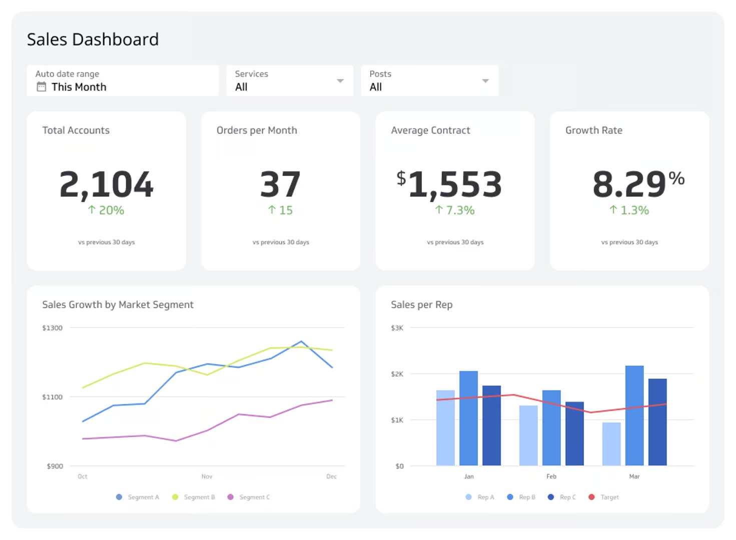
Executive Reporting Dashboard
See the "what" of your business, fast.
What is an executive reporting dashboard?
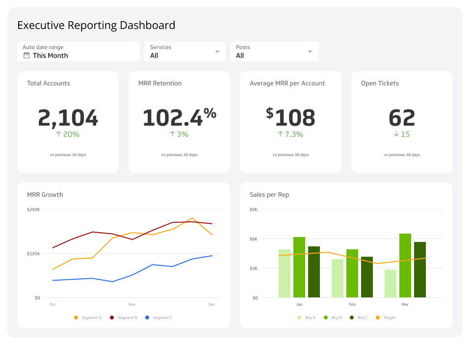
An executive reporting dashboard consolidates performance data from every department into one view, so leaders can spot opportunities and issues without digging through reports.
A good executive dashboard starts conversations with "What," not "Why." Instead of spending time chasing down context, executives get a clear picture of where the business stands right now, what changed, and where attention is needed. The metrics on this dashboard become the starting point for smarter conversations and faster decisions.
Metrics on this Executive Reporting Dashboard
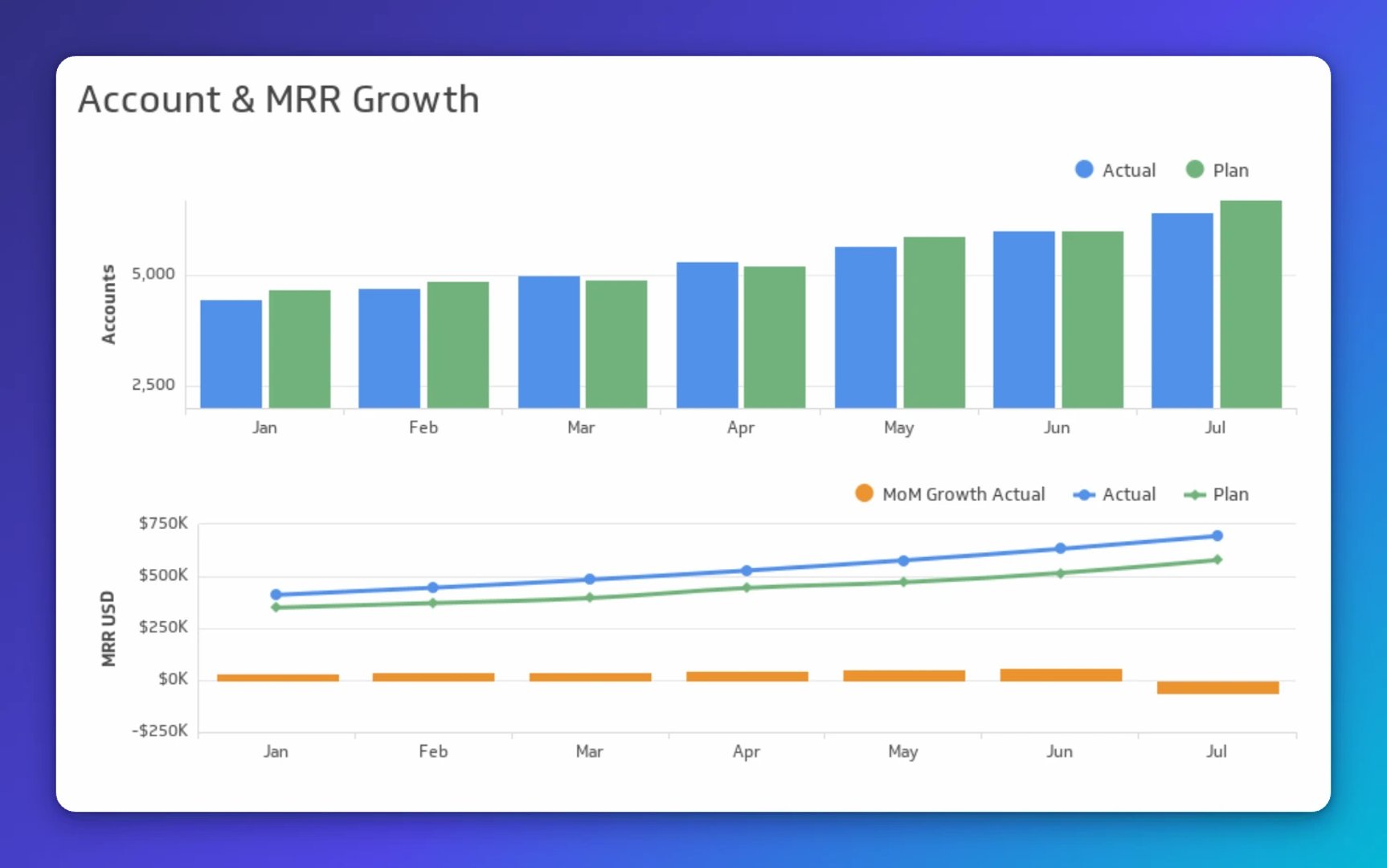
Account & MRR growth metrics
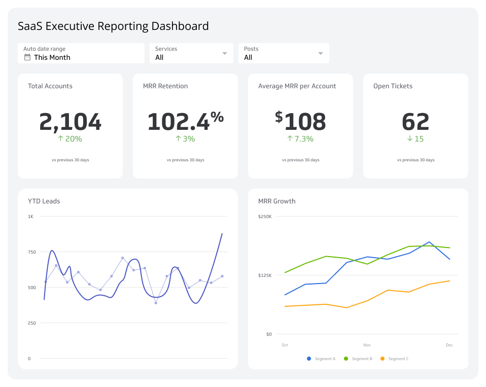
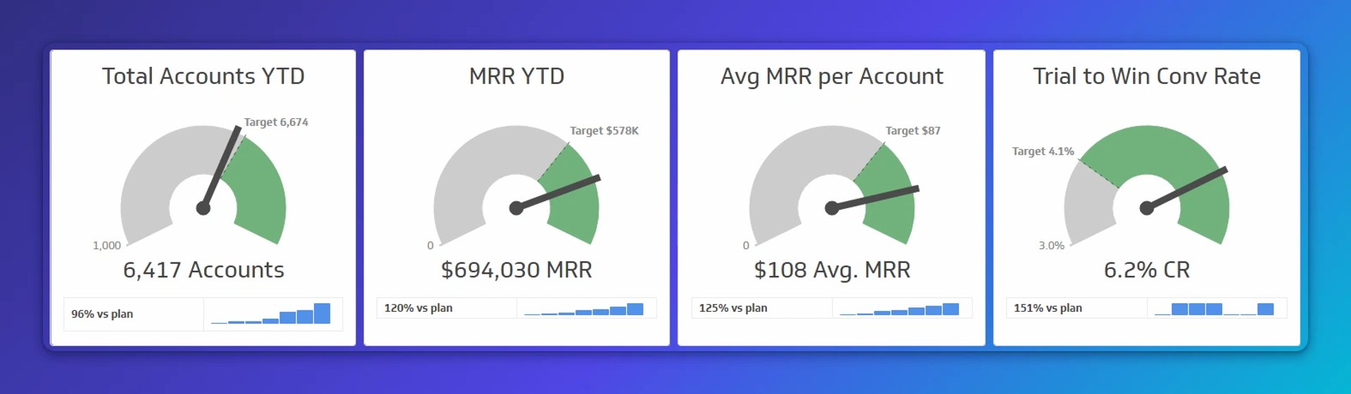
These metrics belong at the top of this reporting dashboard because they're always front of mind for any executive. They reflect your company's position against set targets, so you can always see what direction revenue and retention are heading.
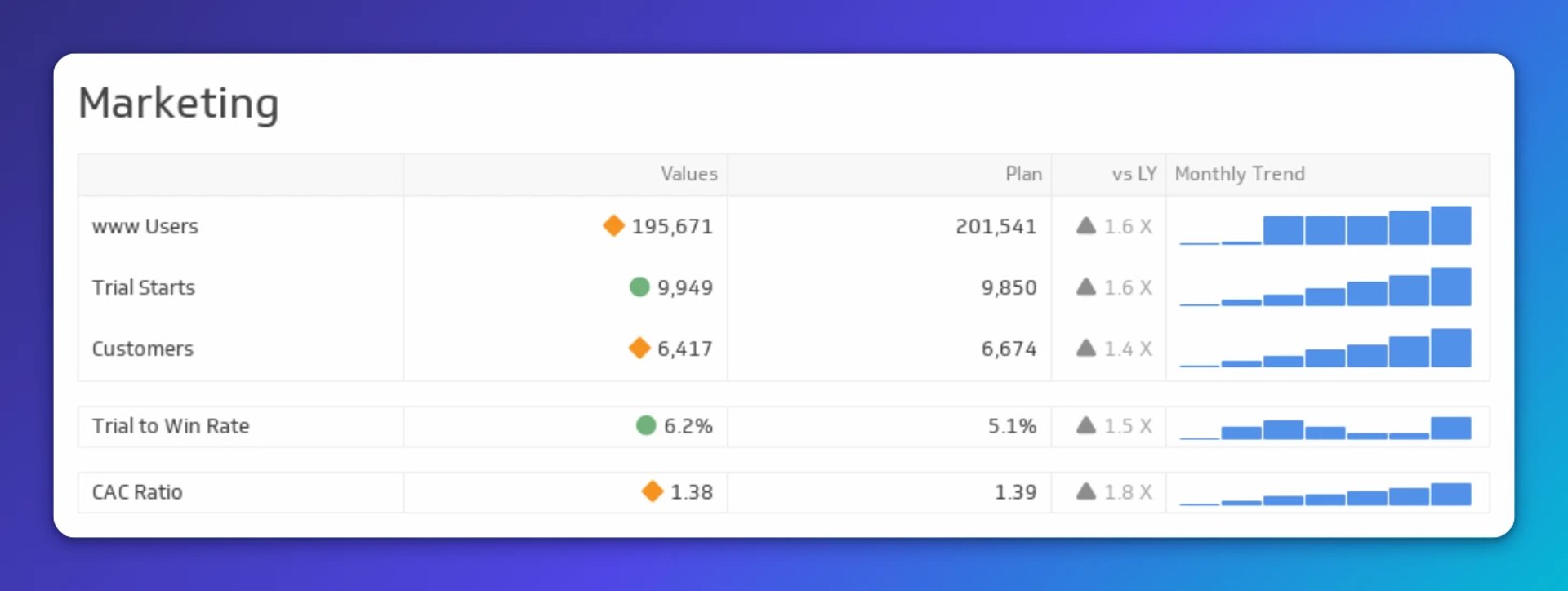
Marketing metrics
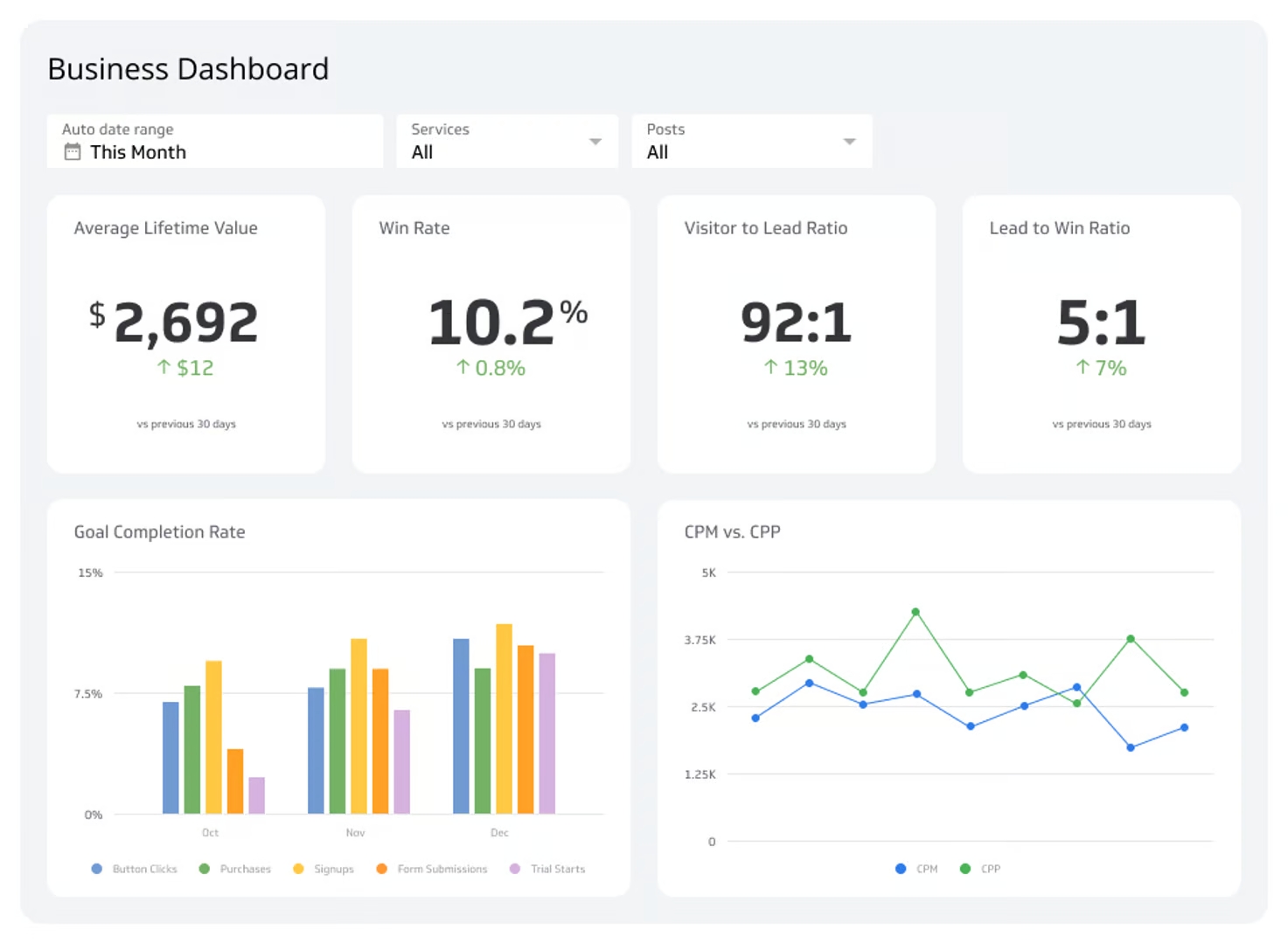
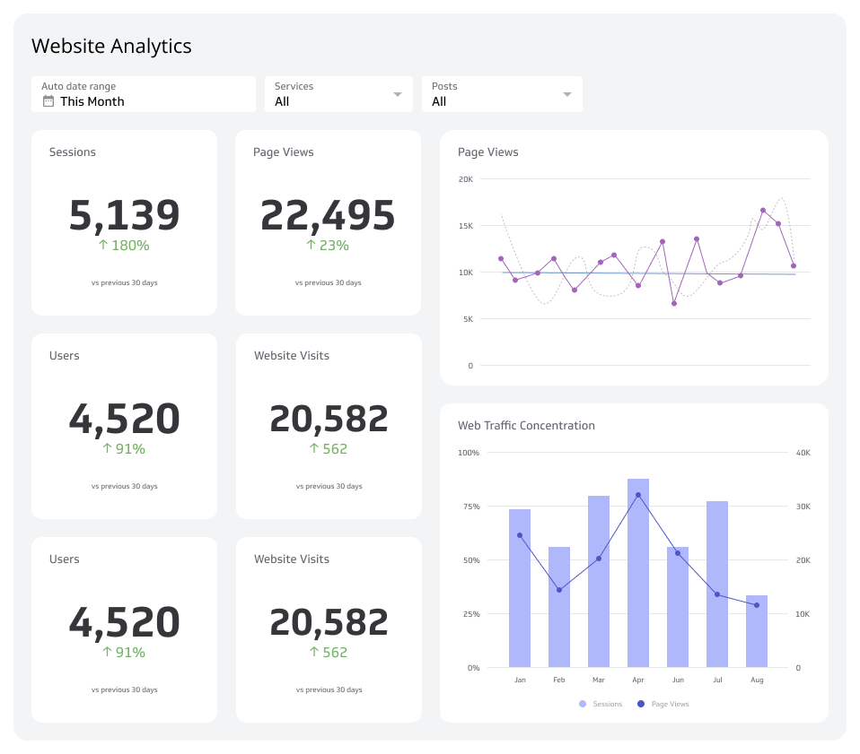
The marketing section helps the CEO track marketing performance at a summary level, not a play-by-play of every campaign. By focusing on outcomes, the executive can quickly identify areas to improve or questions worth asking.
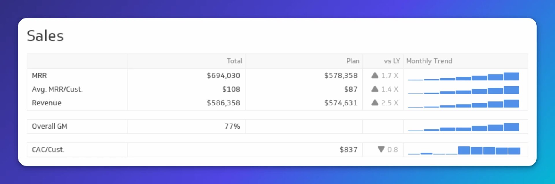
Sales metrics
Sales metrics sit right next to marketing metrics for good reason. This section is about spotting problems and fixing them fast. Every other section of this dashboard ultimately feeds into sales performance, making it the clearest signal of business growth.
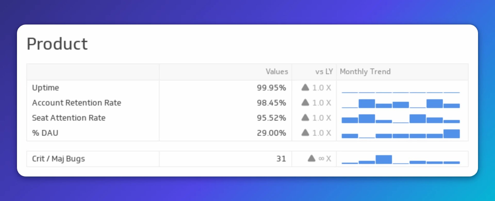
Product metrics
Product is central to any business. The product metrics on this dashboard give executives a quick read on customer behaviour, surface any active product issues, and highlight where improvement opportunities exist.
Create custom dashboards for you and your team.
Get started with KlipsFinance metrics
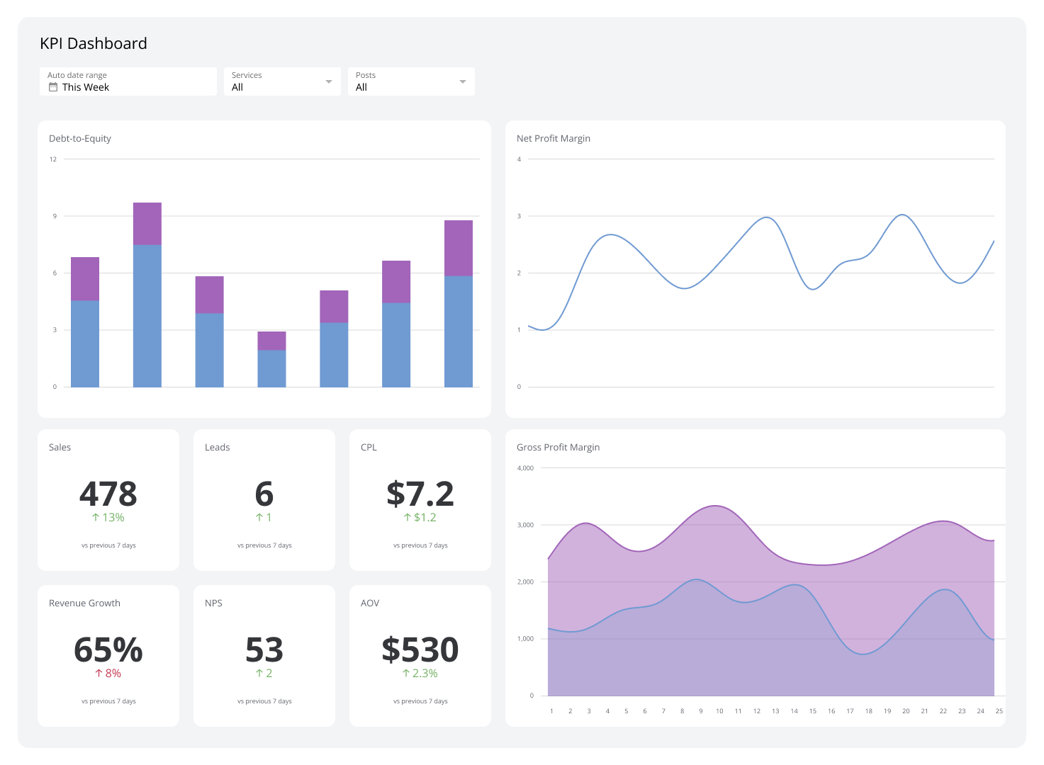
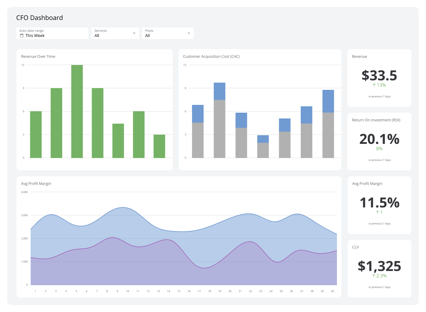
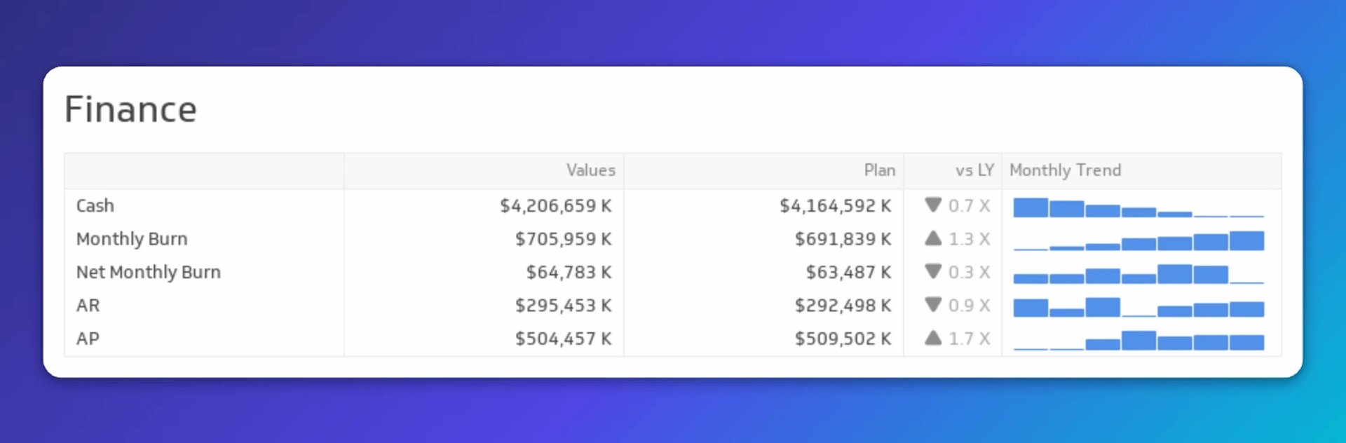
Understanding the company's finances is core to an executive's role. The finance section makes it easy to monitor cash flow and overall financial health, so you never have to sift through raw data to understand where the business stands.
User experience metrics
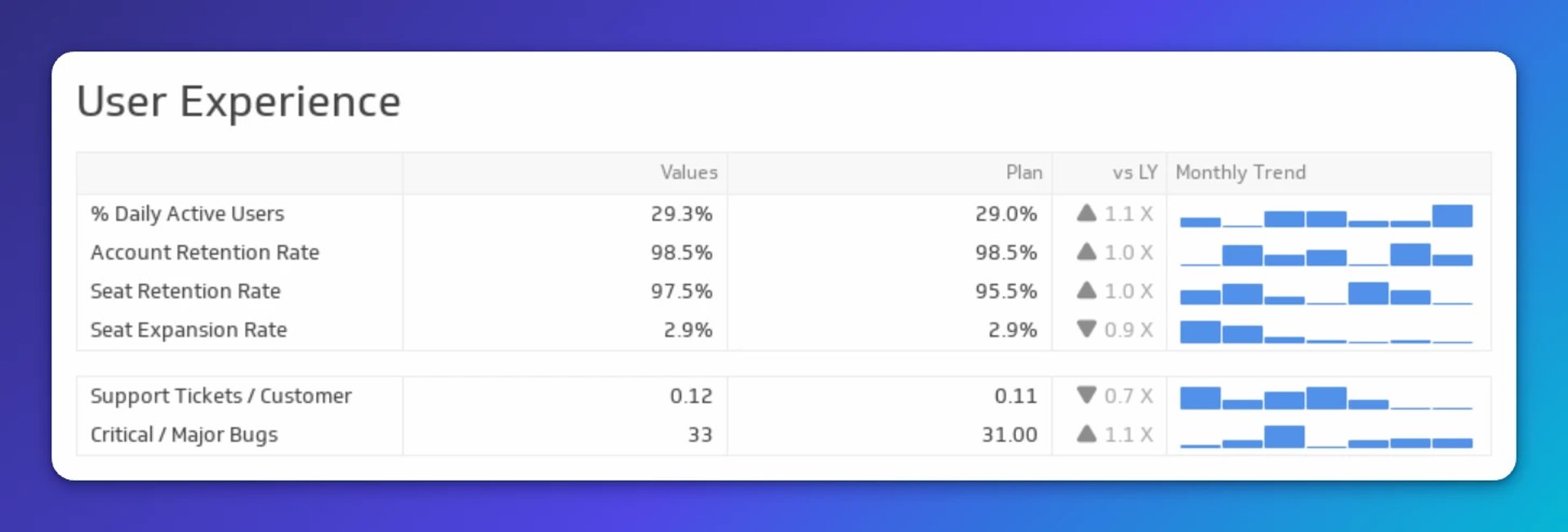
What are customers actually experiencing? User experience metrics reflect how well marketing, product, sales, and support are working together. This section tracks how users interact with the product and how the company responds. Keeping these metrics visible ensures that executive decisions always account for the end user.
Services and support metrics
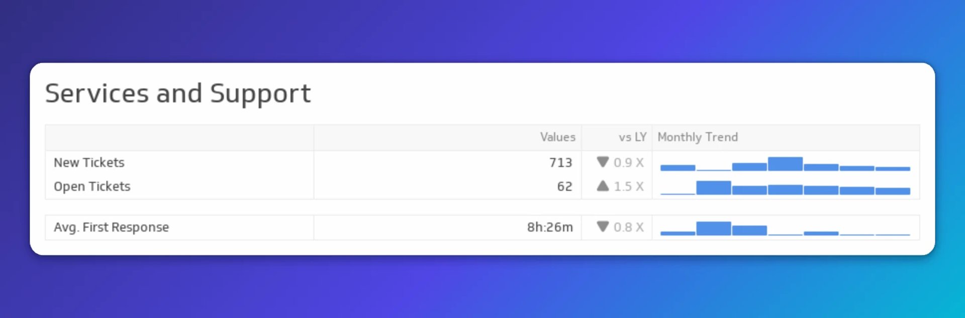
Services and support metrics serve as a check-in with customers. This section shows how the support team is responding to user needs. Whether the product recently changed or the customer base has grown, these metrics tell you whether support capacity is keeping up.
Human resources metrics
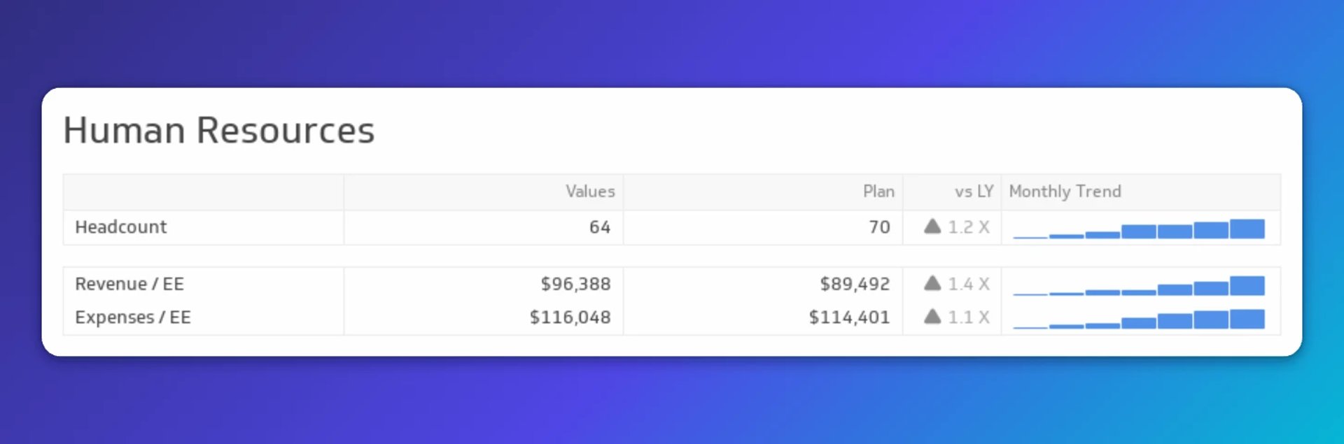
People are the foundation of any company. The HR section ensures headcount is growing at the same pace as revenue. Compare these metrics against other sections of the dashboard: if average support response time has climbed since a new product feature launched, it may be time to grow the support team.
Why build an executive reporting dashboard?
An executive reporting dashboard removes the friction between data and decisions. Rather than pulling reports from finance, sales, marketing, and HR separately, everything lives in one place, updated automatically.
Here are the core benefits:
Saves time: Data from multiple sources consolidates automatically, so leaders spend less time gathering information and more time acting on it.
Improves transparency: Real-time data creates a shared view of performance across the organization.
Strengthens communication: A shared dashboard gives leaders and departments a common reference point, supporting a culture of data-driven decisions.
Sharpens decisions: Current, accurate data means choices are grounded in what's actually happening, not last quarter's report.
What metrics belong on an executive reporting dashboard?
The right metrics depend on the executive's role, but the goal is always the same: company-level KPIs that support a quick, high-confidence review of performance. A CEO dashboard, for example, might draw from every department.
| Department | KPIs |
|---|---|
| Finance | Gross Profit Margin, EBITDA, Accounts Receivable, Accounts Payable |
| Sales | Revenue, Opportunity Pipeline |
| Marketing | MQLs, Web Sessions |
| Support | Ticket Volume, Average Resolution Time |
| Development | Lead Time, Cycle Time |
Keep the dashboard focused. Include only the KPIs each executive needs to act, and revisit the selection regularly as business priorities shift.
Build your executive reporting dashboard with Klips
Klips connects to 130+ data sources and lets you build fully customized executive dashboards with real-time data, scheduled refreshes, and flexible distribution, including TV mode, public links, and scheduled PDF reports.
Try Klips free — no credit card required.