User Experience (UX) Dashboard
The ultimate guide to visualizing user behaviour and improving your product experience.
What is a user experience dashboard?
A user experience (UX) dashboard is a visual tool that shows you how people interact with your product in real time, tracking metrics like customer win rates, churn, and task completion across key funnels.
A streamlined user experience is critical for any business. Without it, you risk losing customers and revenue. You're likely already tracking how people engage with your product and how that engagement changes over time, but how much time are you spending gathering those insights manually?
User interaction data often comes from multiple sources. A UX dashboard brings it all together, pulling from tools like Mixpanel, online surveys, and project management platforms. Everything lands on one dynamic screen, so you can focus on what matters most.
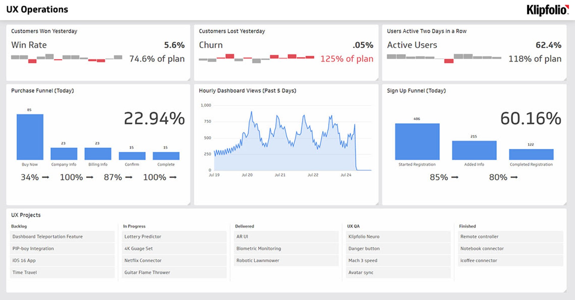
This SaaS dashboard displays user interaction KPIs for your product on a single screen. You want to see how users behave, understand their general sentiment, and track key interactions. For a complete view, it's most effective to run two UX dashboards rotating throughout the day: an A/B Test Dashboard and a UX Operations Dashboard.
Why use a UX dashboard?
To drive business success, you need to quantify your results. Paying close attention to user patterns is a must, but manually monitoring all your data platforms takes time and creates room for error. A dashboard that consolidates your UX Operations or A/B testing data saves your team time and gets everyone on the same page.
Your intuition is valuable, but decisions backed by data are stronger. A UX dashboard gives you the evidence you need, so you can point to the numbers and move forward with confidence.
Key metrics for a UX dashboard
A well-built UX dashboard tracks the signals that reveal whether your product is working for users. Here are the metrics most commonly featured:
Customers Won Yesterday: Tracks new customer acquisitions from the previous day, giving you a daily pulse on growth.
Customers Lost Yesterday: Flags churn as it happens so you can investigate and respond quickly.
Users Active Two Days in a Row: Measures short-term retention and early engagement habits.
Purchase Funnel (Today): Shows where users drop off in the buying process, from first visit to completed transaction.
Hourly Dashboard Views (Past 5 Days): Monitors how frequently your team is engaging with product data.
Sign Up Funnel (Today): Tracks conversion at each step of the registration flow to identify friction points.
UX Projects: Provides a snapshot of active initiatives, keeping your team aligned on ongoing work.
Together, these metrics give your product and growth teams a clear, shared view of user behaviour without digging through separate platforms.
A/B test dashboard vs. UX operations dashboard
Running two rotating dashboards gives you coverage across both experimentation and day-to-day operations.
A/B Test Dashboard
An A/B Test Dashboard focuses on comparing user behaviour across variants. Use it to track conversion rates, session lengths, and funnel completion for each test group. This dashboard helps you validate design and copy decisions with real user data before rolling out changes broadly.
UX Operations Dashboard
A UX Operations Dashboard monitors the health of your product experience on an ongoing basis. It surfaces churn signals, active user trends, and funnel performance so your team can catch issues early and act before they compound.
Rotating between the two keeps your team informed across both the experimental and the operational sides of UX.
How to build a UX dashboard
Building an effective UX dashboard starts with defining the questions you want to answer. From there, the process is straightforward:
- Identify your data sources. Common sources include product analytics tools, CRM platforms, survey tools, and project management software.
- Choose your core metrics. Prioritize metrics tied directly to user behaviour and business outcomes, like churn, funnel completion, and active user rates.
- Connect your data. Use a dashboard tool with native connectors to pull live data without manual exports.
- Design for your audience. Executives need top-line summaries; product teams need granular funnel views. Build separate dashboards or use layout sections to serve both.
- Set a refresh rate. UX data changes quickly. Aim for hourly or daily refreshes to keep your team working from current information.
- Share and distribute. Make the dashboard accessible to everyone who needs it, whether through a shared link, TV mode, or scheduled email reports.
Klipfolio Klips gives you the connectors, formula flexibility, and distribution options to build a UX dashboard that fits your product and your team.
What makes a good UX dashboard?
The best UX dashboards share a few common traits. They surface the right metrics without overwhelming the viewer, update automatically so the data is always current, and present information in a layout that makes patterns easy to spot.
A few principles to follow:
Keep it focused. Include only the metrics your team acts on. A cluttered dashboard slows decisions rather than speeding them up.
Use consistent time windows. Comparing daily metrics against weekly averages creates confusion. Standardize your date ranges across Klips.
Design for scanning. Use colour, size, and position to draw attention to the metrics that matter most. Anomalies should be immediately visible.
Build for the team, not just the analyst. A UX dashboard is most valuable when everyone, from product managers to executives, can read it at a glance.
A UX dashboard is essential for building a better product and a stronger business. By consolidating your data into a single, real-time view, you can stop guessing and start making data-backed decisions that improve the user experience. To see how you can build a powerful reporting tool for your team, explore Klipfolio Klips.
At a glance
Focus Area
User behaviour tracking, funnel analysis, churn monitoring, A/B testing, and UX operations.
Metrics List
Customers Won Yesterday, Customers Lost Yesterday, Users Active Two Days in a Row, Purchase Funnel, Sign Up Funnel, Hourly Dashboard Views, UX Projects.
Reference Rate
Hourly to daily refresh rates recommended for UX and product interaction data.
Related Dashboards
View all dashboards