
Summary - Map data visualizations are a mainstay of any KPI dashboard, providing insight into regional and global performance. With the Map component, getting a view of your performance is as easy as hovering your mouse over a particular region.
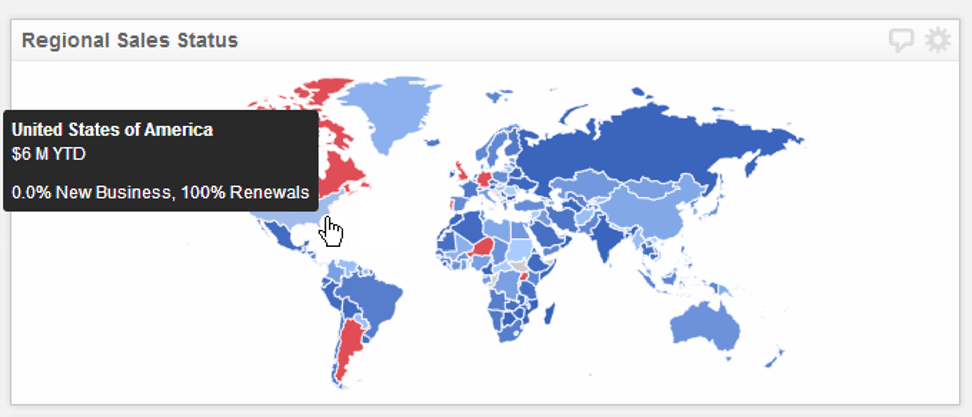
Map data visualizations are a mainstay of any KPI dashboard, providing insight into regional and global performance. The Map Component in Klipfolio Dashboard for web and mobile is interactive, allowing you to hover your mouse over any region to see values associated with that region.
Map Component
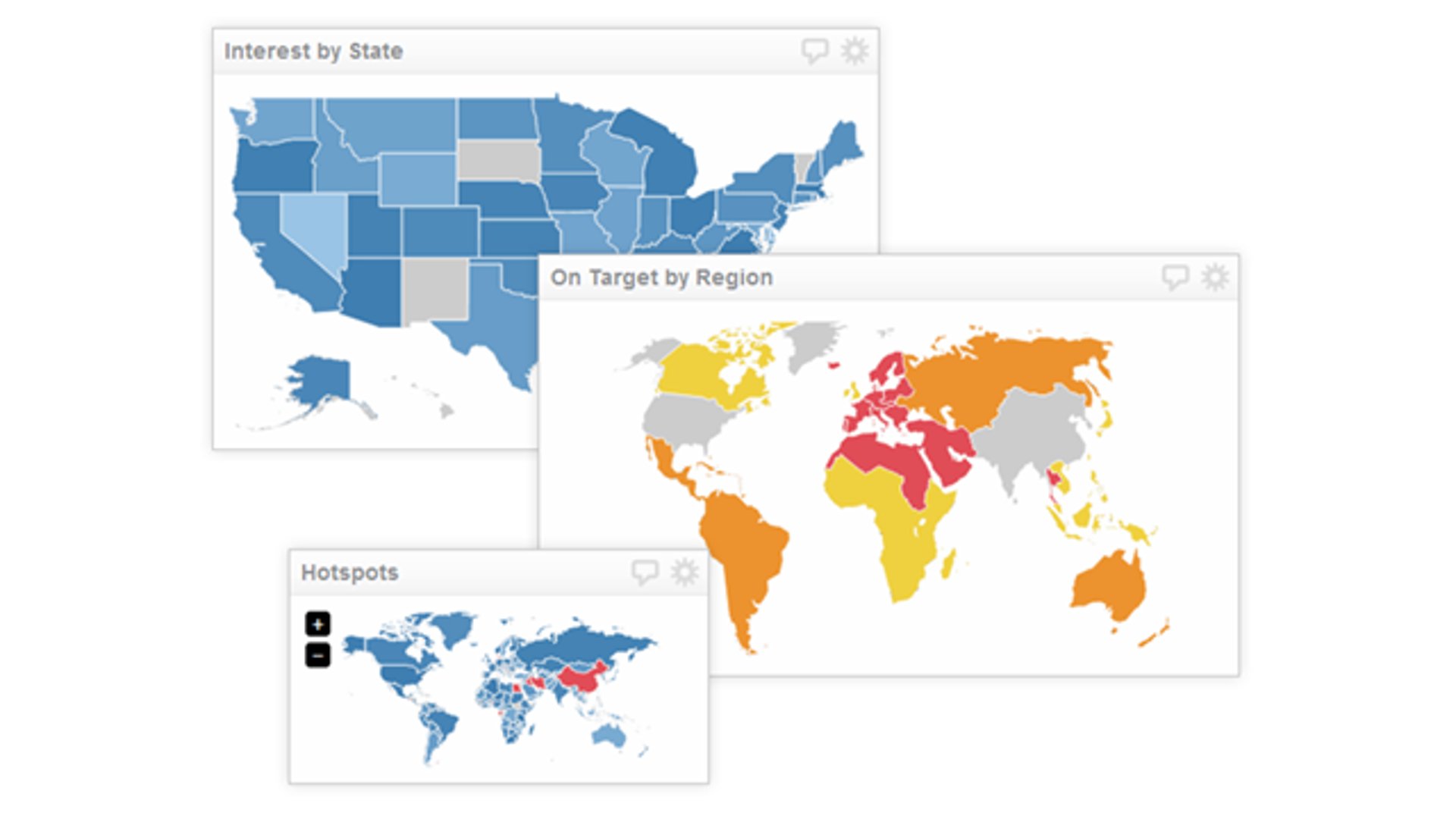
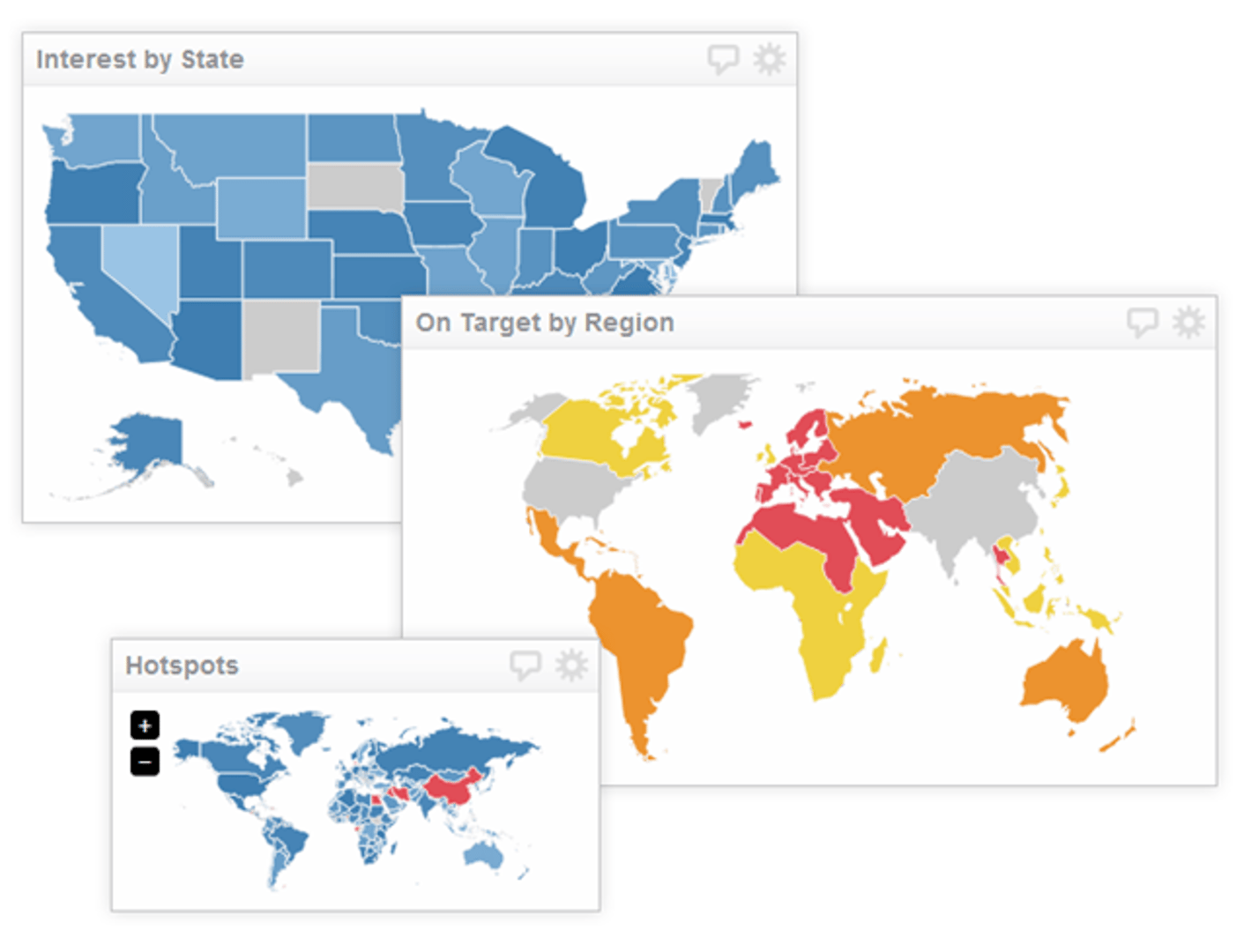
It's pretty obvious that the Map component is ideal for monitoring data associated with regional or global data sets. I've personally used (or seen it used) to monitor web analytics, poll results, and sales for different regions.
Key Features
- Includes maps: World, Europe, USA, Canada and Germany
- Custom map support (using SVG)
- Color indicator support
- Color range support based on data
- Multiple sizes
- Optional zoom controls
Best practices for the Map Component
Here are some guidelines to help you create effective Map Components in Klipfolio Dashboard for web and mobile.
- Choose the right region
The Map component lets you choose between a world, US, Canadian, European, or German map. You can even upload your own custom map to assign values to. Choosing the right region depends on what type of data set you are dealing with, and the amount of detail you want to view. If you are dealing with web analytics data, chances are you will want to see a global view of performance metrics; if you are working with regional data, like inventory metrics, you will want to see a more localized view relevant to your data.
- The LOOKUP function and region IDs
The Map component uses two letter abbreviations to assign data to the appropriate region on your map. Depending on your data source, you may need to format the data to appropriately "map" values to each region. Since we can't control what format the data you plug into Klipfolio Dashboard looks like, we suggest using the Region ID map data sources we've created to standardize your data. By using these data sources with the LOOKUP function, you can replace the irregular values in your native data source with values that this component recognizes. Here are the Region ID data sources for each region we support:
- Region IDs for World map.
- Region IDs for US map.
- Region IDs for European map
- Region IDs for German map
- Region IDs for Canadian map
- The right description
When you hover your mouse over a particular region on the map, you will notice that the values are displayed in a tool-tip. It always helps to add more context to what you are viewing on the dashboard, since many users are simply consuming the data and may not understand the data as intimately as you. The description sub-component allows you to add context so that when users view your map, they will know exactly what they are seeing.
Related Articles

10 Cloud BI Dashboard Tools for Small Businesses in 2026

6 dashboards I use daily to run my SaaS company
By Allan Wille, Co-Founder — April 10th, 2026
Klipfolio Partner How-To #1: Duplicating dashboards across client accounts
By Stef Reid — November 27th, 2025