
Summary - Social media interaction KPIs are perhaps the most misunderstood element of all social media KPIs. Here's a primer to help you understand them.
When you post content on your social media channels, you want that content to have some impact. And a good way to assess impact is by looking at the interactions that your posts get.
Social media interactions are a well-suited but often misunderstood measure for the level of engagement your content received.
This post outlines different KPIs to measure interactions for your social media profiles, using Facebook data from two budget airlines: Ryanair of Ireland and Eurowings of Germany.

This should help you to get a good overview of how to measure (and more generally think about) social media interactions in an optimal way.
What do social interactions really mean?
As there are differences among social networks, start by defining what social media interactions are.
For Facebook, social interactions encompass the following:
- Likes
- Comments
- Shares
- Emoji reactions
On X (formerly Twitter), interactions commonly include likes, replies or mentions, reposts, and quote posts for a profile.
Instagram works a bit differently. Shares are limited, so interactions typically include likes, comments, and saves. Video views and plays are also useful directional signals, but treat them separately from interactions.
While the metrics highlighted below contain only Facebook data, it's important to see the parallels between them and the other social media networks.
5 approaches to measuring social interactions
There are many different ways to approach this. We will take a look at these five common Facebook interaction KPIs:
- Facebook Total Interactions
- Facebook Engagement Rate (by Reach preferred)
- Facebook Average Interactions Per Post
- Facebook Interaction Rate by Post Type or Format
- Facebook Interaction Rate by Day and Hour
Let's start by looking at the total interactions that a profile gets.
1. Facebook Total Interactions
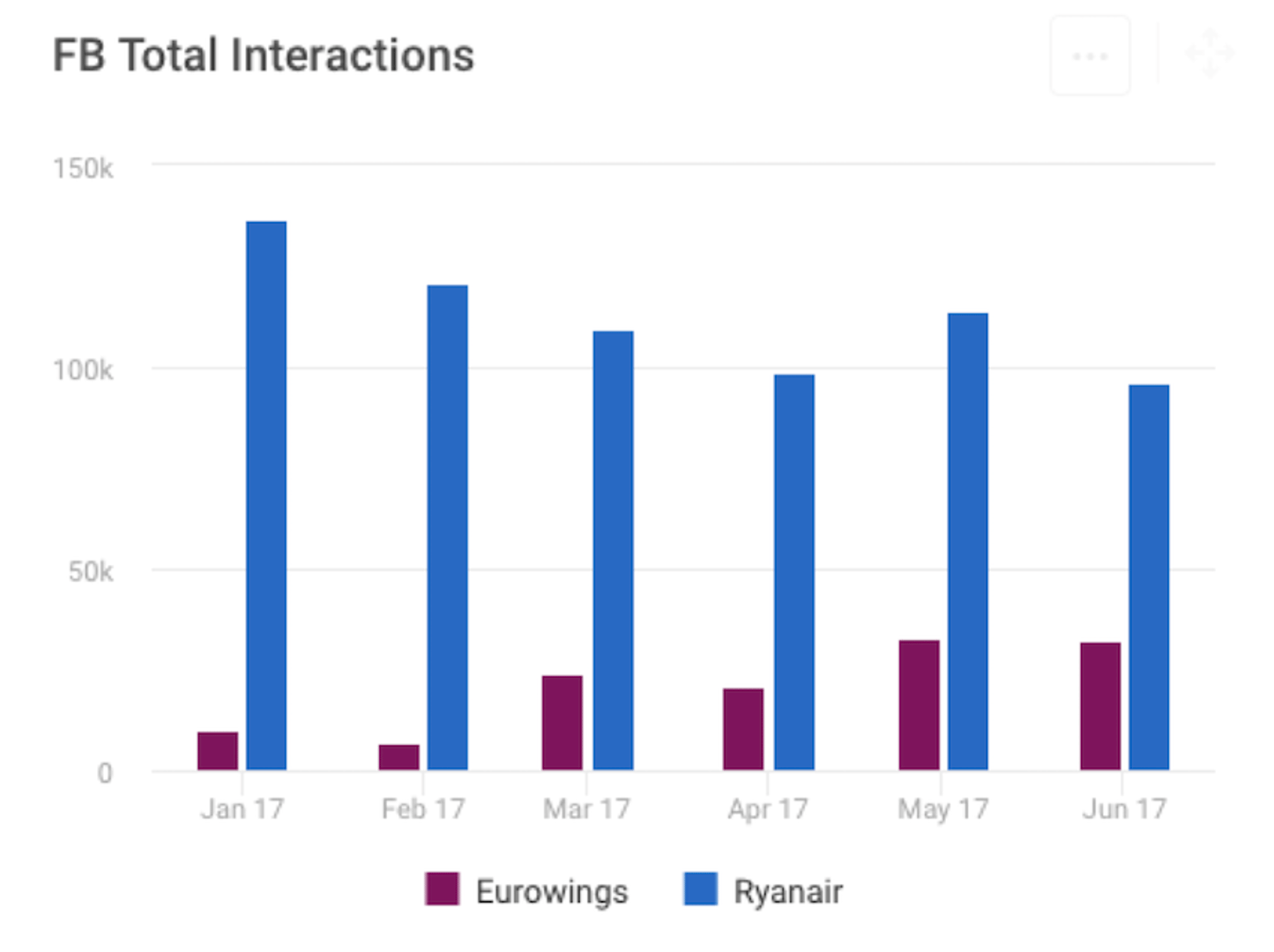
To receive a good overview on how the content for your managed profiles is performing, you can choose a larger time frame like six months. And to get a clear first impression, the visualization of the data also plays an important role.
Column charts are a clear initial way to view the data because they eliminate any potentially confusing overlaps.
Here is Ryanair's successful video post from late July 2017:
By looking at the total interactions, we can identify that Ryanair received an exceptional amount of interactions in the last week of July 2017.
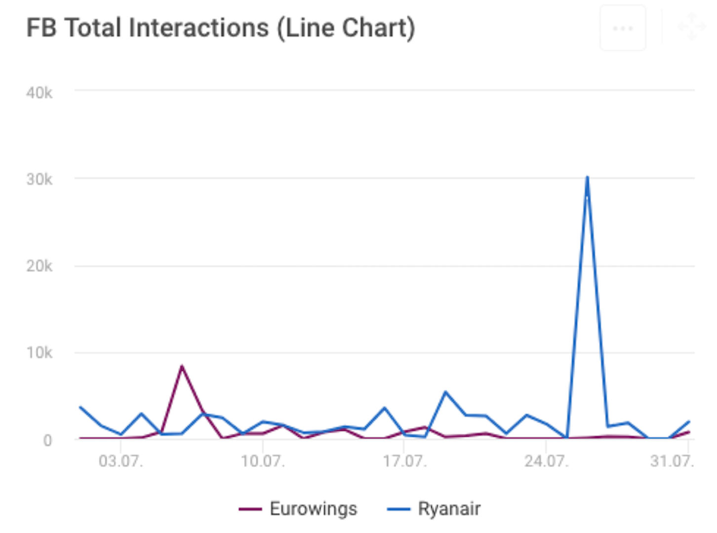
If you want to quickly find your best performing content and search for visible spikes, use a line chart with a daily time frame:
The sum of all interactions is a good measure to assess your overall success. However, many factors influence the number of interactions that you get.
This is the reason why it can make sense to look at an interaction rate rather than at the total sum. This approach is particularly useful if you want to compare profiles of differently-sized fan bases.
2. Facebook Engagement Rate (by Reach preferred)
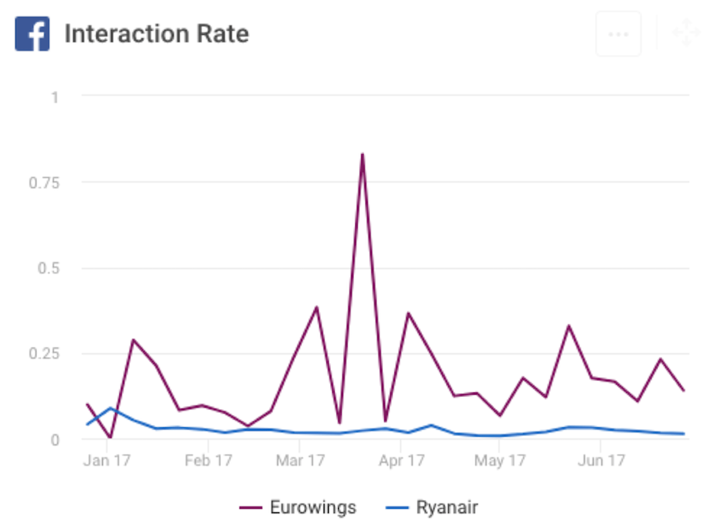
Today, most teams calculate engagement rate using reach or impressions rather than follower count whenever that data is available. This improves comparability as follower counts fluctuate and distribution is not uniform.
The engagement rate described here incorporates the number of all interactions and relates it to exposure and posting cadence. On Facebook, a practical approach is interactions per post divided by reach per post (or impressions), averaged over a period.
If you use followers as the denominator, interpret with caution. As audience size grows, follower-based rates can fall even when absolute interactions rise. A reach- or impression-based rate avoids most of this distortion.
In our case for the two budget airlines, the Engagement Rate shows a different picture than the Total Interactions metric displayed above. As noted, this can happen when you compare two differently-sized pages.
As the rates take the fan count and the number of published posts into account, for their respective size, Eurowings (appr. 580k fans) will almost always score better than Ryanair (appr. 2.3 million followers).
The Total Interactions and the Engagement Rate are interaction KPIs on the page level. However, in certain cases it makes sense to break the interactions down to a post level.
3. Facebook Average Interactions Per Post
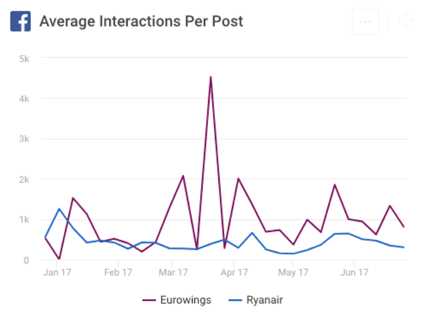
To break the data down, you can choose to measure interactions in averages per post. This adds more context by showing how efficient your posts are on average. If you post 30 times in one month and as often in the next, but your average interactions per post rise, you are obviously doing a good job!
Choose a weekly or monthly view to better show general trends. In the case of the budget airlines, we can observe that while Ryanair gets more interactions in total, Eurowings seems to be more efficient, meaning that they typically achieve more interactions per post on average.
To gain deeper insights on which types of content works best, it is wise to break down the interactions for different kinds of images, videos, links, or status updates.
4. Facebook Interaction Rate by Post Type or Format
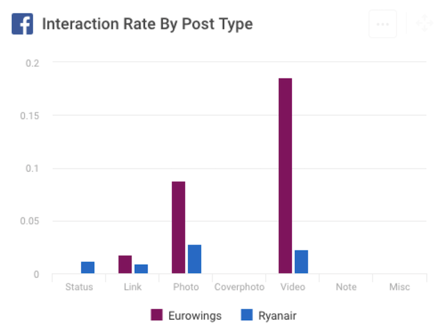
As you can see in the example, the interaction rates for links and pure status updates are much higher for photos and videos. This is in line with the widespread belief that visual content typically performs best.
Consider modern formats too, such as Reels, Stories, and carousels. Group comparable formats when you compare performance.
However, if you look at the interaction rates for Ryanair, photos are performing better than videos.
The takeaway here should be that it is always wise to question the commonly held beliefs around social media performance. Different content might work better for you and your audience than it does for a close competitor's audience.
Don’t blindly follow. Keep your data close and adjust your content accordingly.
5. Facebook Interaction Rate by Day and Hour
Many social media managers often ask us: "When is the best time to post?"
Look at both day and hour in your audience’s primary time zones. Algorithms personalize distribution, so use your own data to find the patterns that matter.
We specialize in social media KPIs at Quintly, and we believe there is not a one-size-fits all answer to that question.
A good way to approach this puzzle for your own case is to find out what type of posts (and at which times) your fans interact with the most.
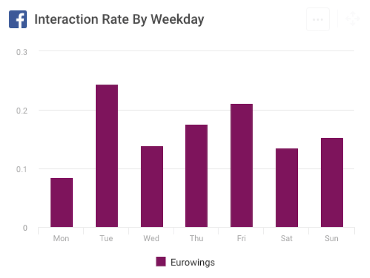
Data from the first half of 2017 for Eurowings, for example, shows a rather low bar for Mondays, meaning that the interaction rates for posts on that day are typically lower.
One could posit a few reasons for this. It could be that people are less willing to engage on social media platforms on Monday – maybe they are still a bit groggy from the weekend....
It could also be that the content Eurowings posts on Mondays is simply not as engaging as what they share on other days of the week.
Whatever the exact reason, the chart displays the fact that Mondays are not showing a good performance for Eurowings. Based on that finding, one thing is clear: it’s time to act to achieve better, more consistent results throughout the whole week.
Final takeaway on social media interaction KPIs
It's easy to get caught in paralysis analysis when it comes to establishing and monitoring social media interaction KPIs.
Start with three questions:
- Do you want to get an overall feeling for your social performance regarding interactions? Then choose Total Interactions visualized as a bar chart for different weeks or months.
- Do you want to identify your best performing content? Choose a line chart and a daily data frame to make individual peaks visible.
- Is it the specific content type that interests you? Then break down the interactions according to them.
Lastly, take data visualization seriously.
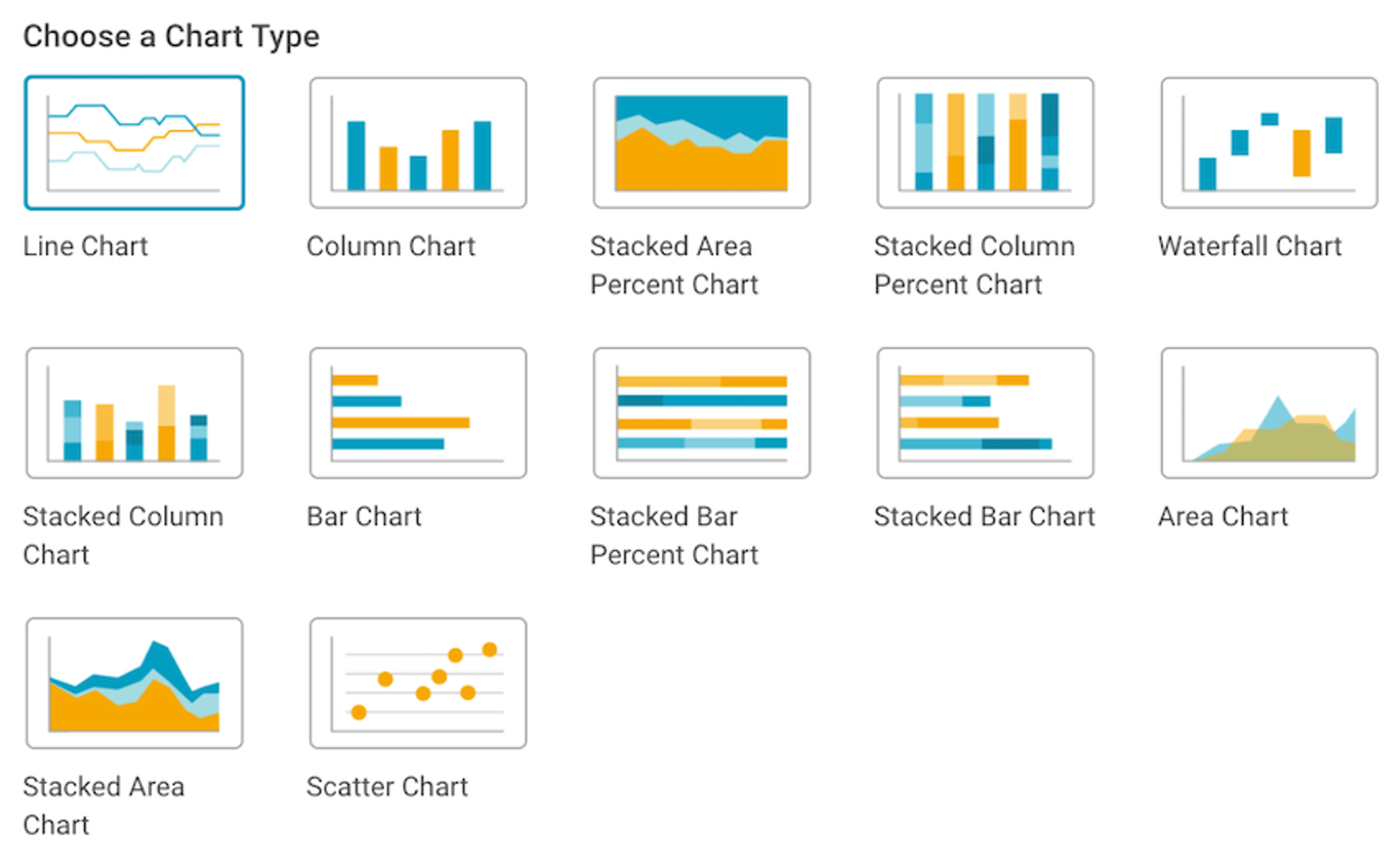
There are many options to choose from, but not every form of data visualization allows you to see insights in a single glance.
And choosing different data visualization types can give you a completely new perspective.
In practice it all comes down to a simple concept: the only way to improve your strategy with valid data is to keep your social media performance data in view.
By doing so, you will be able to find your high and low points. From there, you can identify what works best and make it work even better. And you can identify what doesn’t work so well and either improve it or get rid of it.
See Also:
Related Articles

5 tips to understand (and organize) your restaurant data
By Saleem Khatri — June 9th, 2026
6 dashboards I use daily to run my SaaS company
By Allan Wille, Co-Founder — April 10th, 2026
Business Metrics vs. KPIs: What’s the Difference?
By Jonathan Taylor — March 13th, 2026