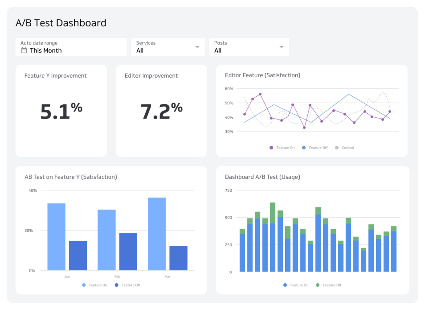
A/B Test Dashboard
Track and measure A/B test results to make data-driven decisions.
What is an A/B test dashboard?
An A/B test dashboard tracks and measures the results of controlled experiments so you can make data-driven decisions with confidence.
Are you confident that your latest feature release or website change is a genuine improvement? Guesswork can be costly. An A/B Test Dashboard removes the uncertainty by providing a clear, real-time view of your experiment's performance. It lets you track key metrics side-by-side, understand user behaviour, and prove the value of your projects with hard data.
What does an A/B test dashboard do?
An A/B test dashboard is a reporting tool designed to track and measure the results of controlled experiments. It presents user interaction data in a way that balances qualitative insights with quantitative scale, helping you understand not just what users do, but how they feel about the changes you're testing.
This type of dashboard typically monitors the results of A/B tests on specific product features, website elements, or marketing campaigns. It's an essential tool for measuring whether a variant improved the user experience or hurt it. By visualizing the performance of asset A versus asset B, you can quickly see which version better achieves your goals.
An A/B Test Dashboard is also a powerful way to communicate key experiment metrics to stakeholders and prove the impact of your work.
Why use an A/B test dashboard?
For product, UX, and marketing teams, monitoring how people engage with a product or website is critical. You need to understand the user journey from initial interaction to conversion or churn. Dashboards are the right tool to measure the impact of changes and validate your hypotheses.
For example, you can use two visualizations to show the difference between satisfaction ratings for Cohort A versus Cohort B. This can be communicated through:
Satisfaction improvement percentages: A direct measure of the change in user happiness.
Weighted satisfaction scores: To account for varying levels of feedback intensity.
Comparative bar charts: To clearly visualize the difference in satisfaction scores between variants.
Because many teams run multiple A/B tests simultaneously, SaaS dashboards let them efficiently communicate progress and results both within the team and to the wider organization.
Key metrics for your A/B test dashboard
The metrics you track will depend on what you're testing, but most A/B test dashboards include a combination of satisfaction indicators, funnel data, and long-term value signals.
Satisfaction metrics
Weighted Satisfaction Score: Provides a nuanced view of user satisfaction by assigning different weights to responses (e.g., "Very Satisfied" counts more than "Satisfied").
Positive Satisfaction Rating: A straightforward percentage of users who reported a positive experience, giving you a clear top-line indicator of success.
Feature funnel metrics
Edit to Save: Measures the immediate impact of a change on a core user action.
Edit to 6-month LTV: Connects a feature change to its long-term financial impact.
Edit to Purchase: Directly ties the A/B test result to conversion rates.
Before-and-after metrics
Weighted Satisfaction: Compares the overall satisfaction score pre- and post-change.
Satisfied Responses: Tracks the volume of positive feedback over time.
Dissatisfied Responses: Monitors for any negative impact on user experience.
Response Rates Not Affected: Confirms the change didn't discourage users from providing feedback.
How to build an A/B test dashboard
Building an effective A/B test dashboard comes down to three things: connecting the right data sources, choosing the right visualizations, and making the results easy to share.
Start by identifying the metrics that matter most for your experiment. For a product feature test, that might be funnel completion rates and satisfaction scores. For a marketing campaign testing scenario, it might be click-through rates and conversion percentages.
Next, bring your data together in one place. Most teams pull from a mix of product analytics tools, survey platforms, and CRM data. A dashboard tool that supports multiple data connectors saves significant time here.
Finally, design your layout so stakeholders can read the results at a glance. Side-by-side comparisons, clear variant labels, and trend lines over the test period all help communicate findings without requiring a deep dive into raw data. Browsing dashboard examples can help you find layouts that make experiment results easy to interpret at a glance.
To make confident, data-backed decisions, you need a way to bring all your experiment data together in one view. With Klipfolio Klips, you can build a custom A/B Test Dashboard to monitor your results in real time and share insights with your entire team.
At a glance
Focus Area
Product, UX, and marketing teams running controlled experiments on features, website elements, or campaigns.
Metrics List
Weighted Satisfaction Score, Positive Satisfaction Rating, Edit to Save, Edit to 6-month LTV, Edit to Purchase, Satisfied Responses, Dissatisfied Responses, Response Rates Not Affected
Reference Rate
Real-time to daily refresh depending on experiment volume and data source availability.
Related Dashboards
View all dashboards