Features blogs
A collection of our most recent articles on

In Beta no more! PowerMetrics for all
By Katya Zeisig — May 17, 2019
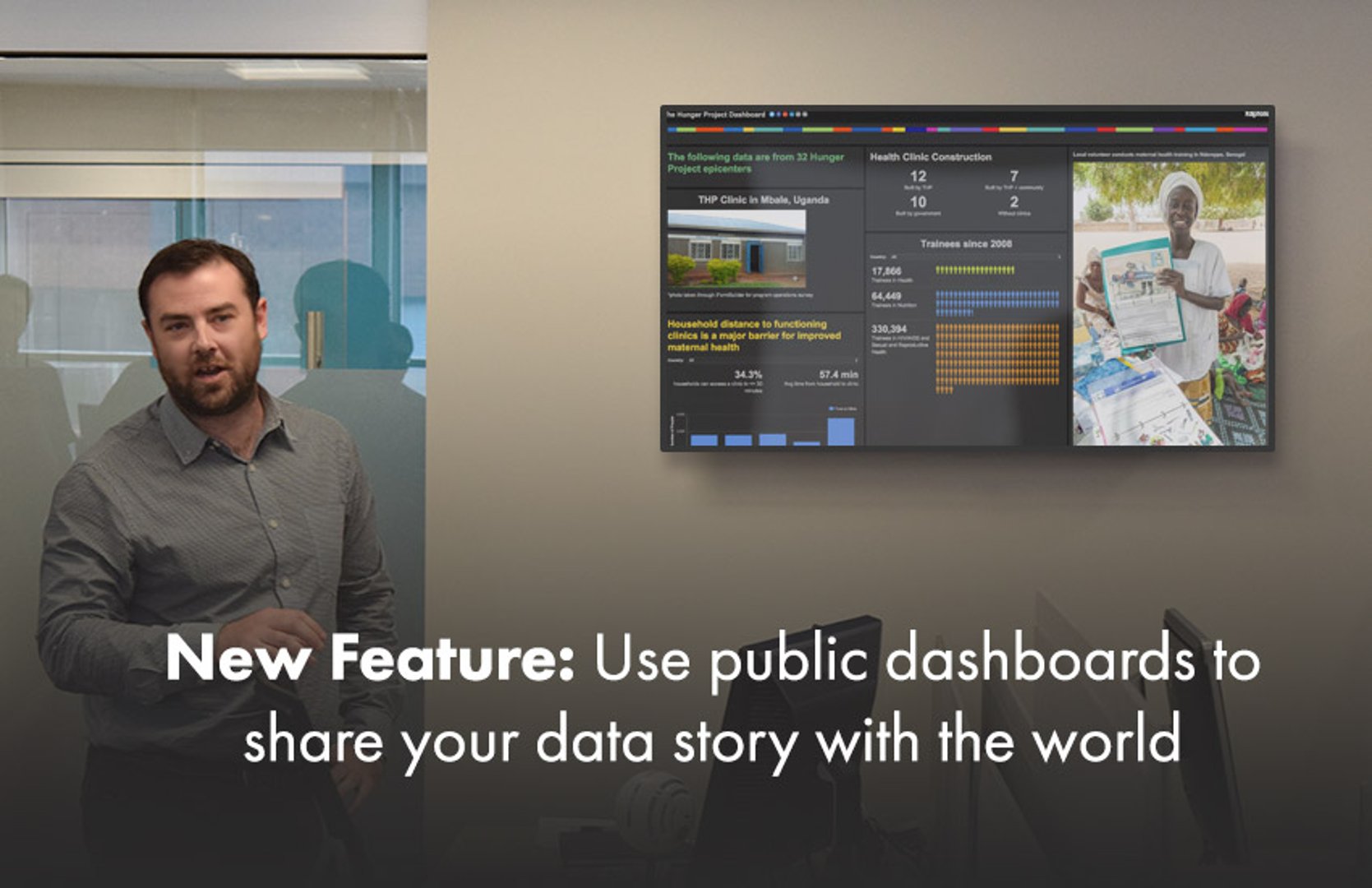
New Feature: Use public dashboards to share your data story with the world
By Jonathan Taylor — March 14, 2016
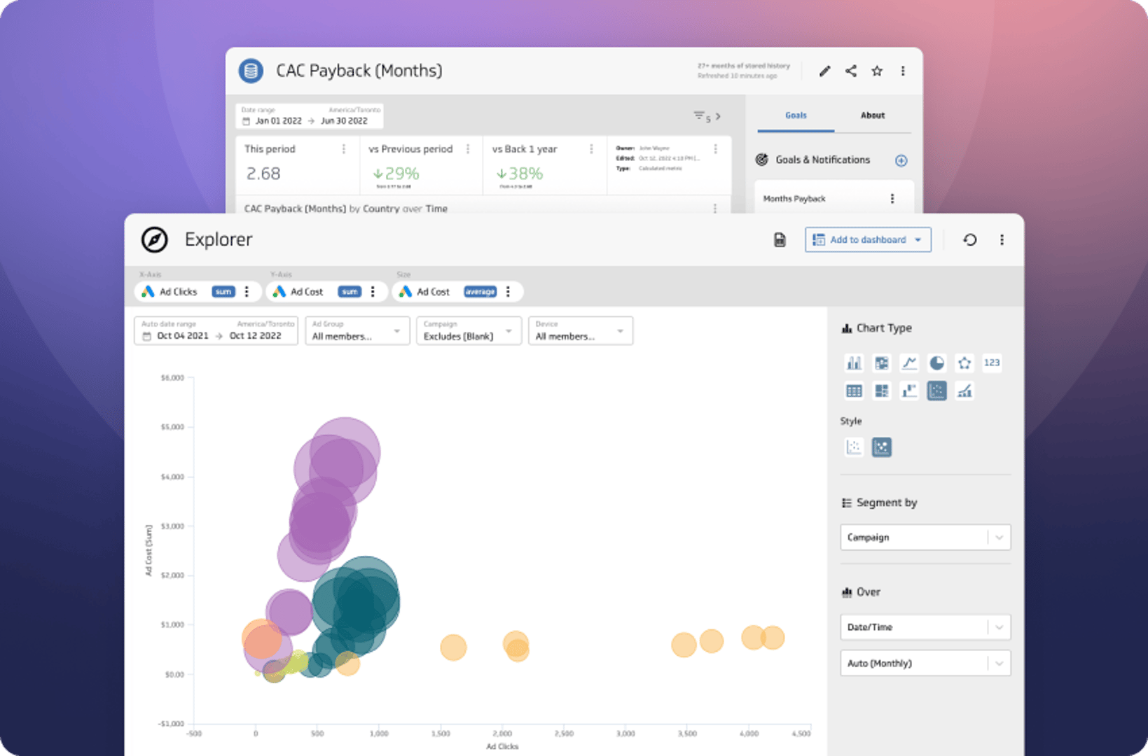
The Power of Data Exploration
By David Mennie — October 24, 2022
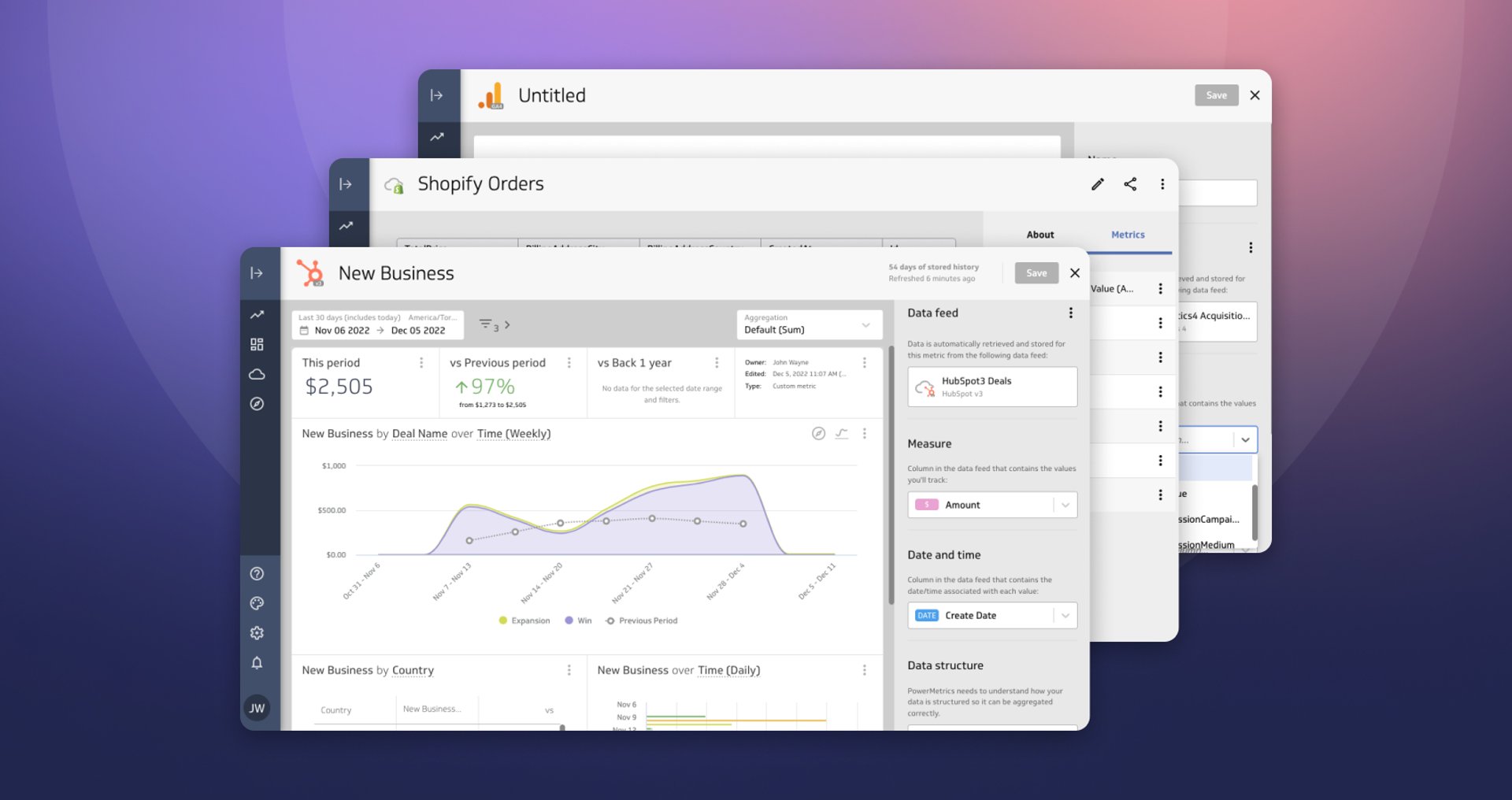
Live Data, Live Preview
By David Mennie — December 5, 2022
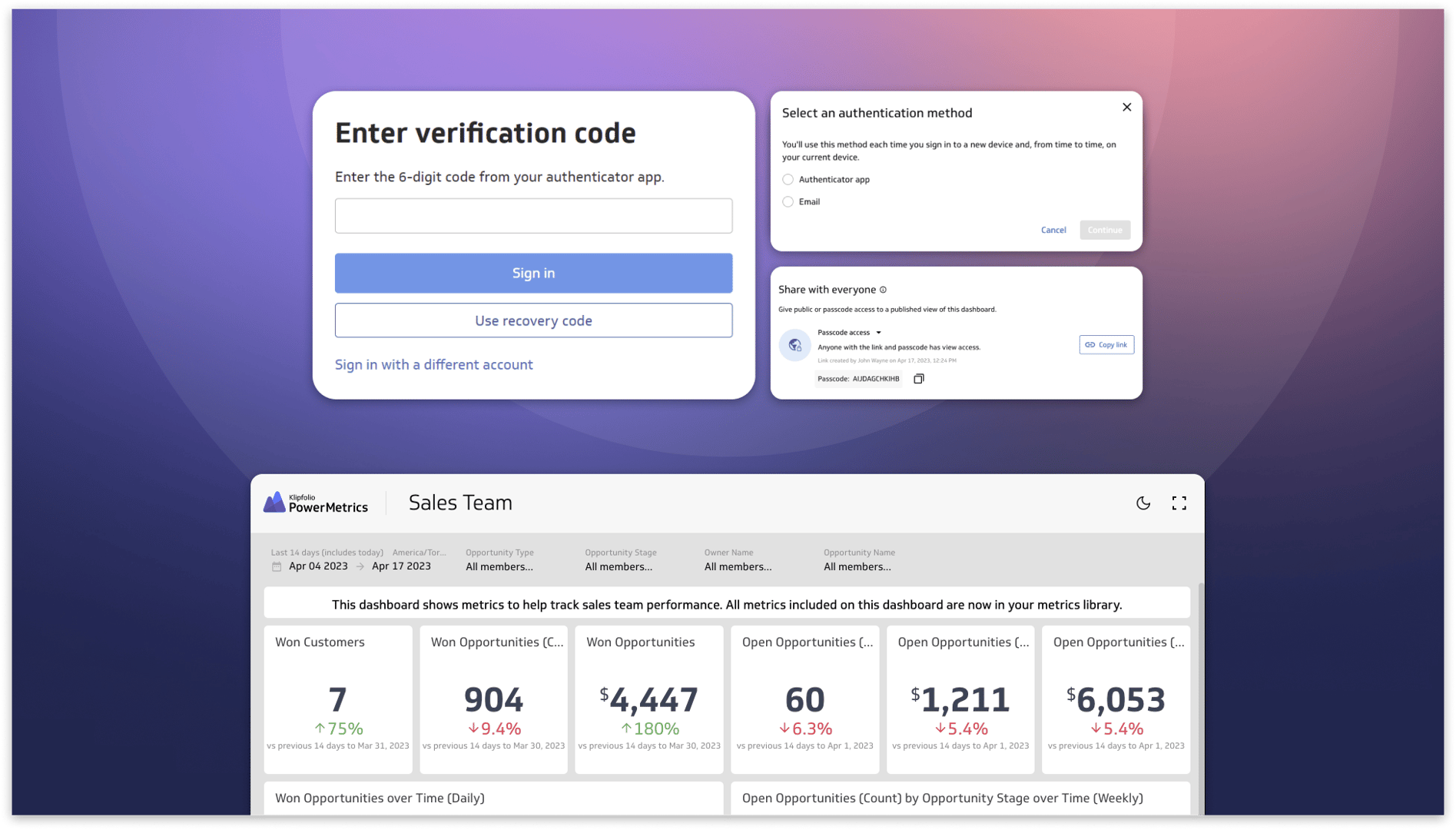
Secure and accessible dashboards for your extended team
By David Mennie — April 25, 2023
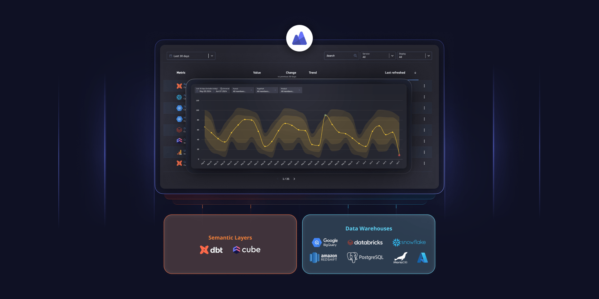
PowerMetrics - New data warehouse integrations and Cube semantic layer support
By David Mennie — June 14, 2024
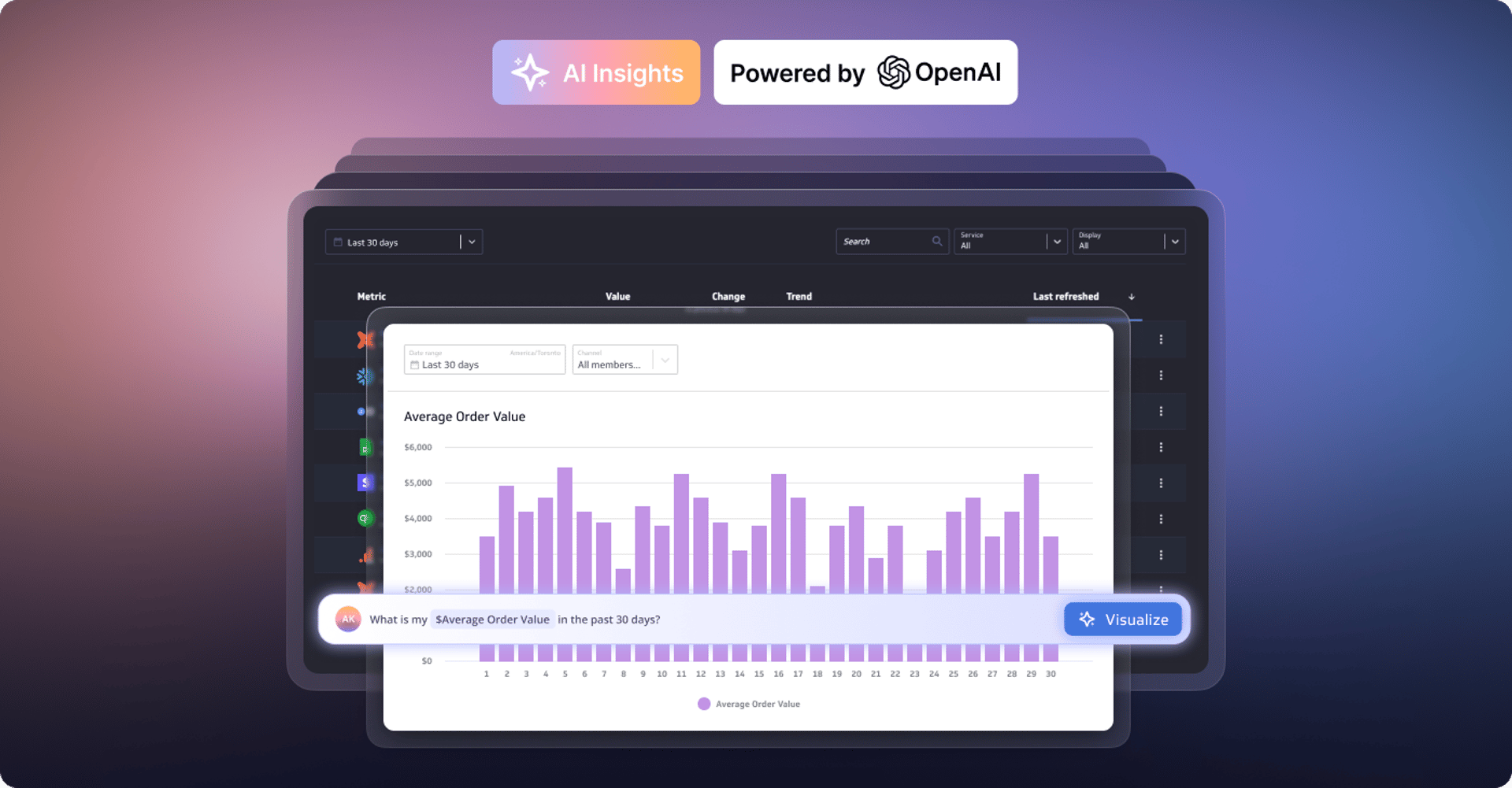
Metrics provide rich context for better AI: Introducing the new PowerMetrics AI experience
By David Mennie — June 21, 2024