
Summary - Venture Harbour currently uses six different dashboards, which each represent one area of focus for the business: Marketing, Development, Team, and then one for each of their three active ventures.
Venture Harbour builds online ventures that unlock greater human potential through technology and automation and is on a mission to build 50 of these ventures by 2060 with one rule; That each new venture solves a more ambitious problem than the last.
To date, they’ve built nine ventures, including the World’s first scientifically-valid method of measuring human comfort zones and their most recent venture, Serene, which enables remote workers to get their focus back in one click.
Meet Marcus…
Marcus Taylor is the CEO & Founder of Venture Harbour. His role is primarily focused on setting the vision for the company and leading the R&D team. While no two days look the same, you can often find Marcus building prototypes with the company’s development team, brainstorming ways to make their businesses obsolete (so that they can rebuild them to be more resilient), and refining their strategy to ensure that they achieve their vision.
Honing in on the most important metrics was a challenge
“Like the pilot of an airplane, you need a certain set of metrics to know which actions or controls to adjust next to get you to where you want to go. In an ideal world, these metrics would exist in a single space, visualised in the optimal format, and agnostic of where the data has come from.”
I couldn’t have said it better myself…
Before trying Klipfolio Klips, Marcus and his team were constantly jumping between Google Analytics, Amplitude, FullStory, and various other tools to find these answers. They battled with poorly visualized data and a lack of ability to combine different datasets.
Combining multiple data sets seamlessly with Klipfolio
Marcus and his team needed a better solution. They originally committed to another dashboarding tool before Klifpolio. Still, after a while of trying to get it working, they felt too limited by the small range of data sources offered. So they decided to give Klips a shot - and subsequently fell in love.
“Whether it's being able to combine data sources seamlessly using Excel-like formulas, the incredibly helpful support team, or the ability to display anything imaginable using REST APIs and MySQL data sources, we know Klipfolio will never limit us on what we’re able to track as a business.”
Marcus is a REST API kind of guy
“The true value of Klipfolio for us was unlocked when we started using APIs. While Klipfolio’s list of default data sources and Klips is impressive, every business is different and likely to have a unique set of data sources that aren’t available by default.”
Virtually every service you use will have an API, so if you have a certain tool that you wish you could display data from on your dashboard, chances are you can - but you need to use the API to do it.
Luckily, APIs aren’t as difficult as you think.
If you don’t have the technical skill set to work with APIs, no problem! We have an amazing network of Klipfolio Partners that you can pay to do the work for you!
Impactful metrics: 20,000 extra organic visitors from 10 minutes of work
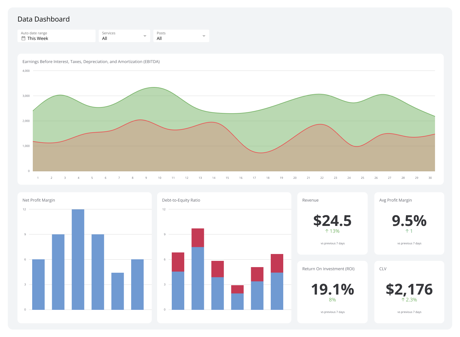
Venture Harbour currently uses six different dashboards, which each represent one area of focus for the business: Marketing, Development, Team, and then one for each of their three active ventures.
Here are Venture Harbour’s most impactful metrics:
Development pipeline - this allows everyone to see what’s currently being built by whom, what’s up next, and whether their dev pipeline is on track or not for the quarter.
Product usage funnel - similar to a marketing funnel, they have a product funnel that visualizes which features people do and do not use inside their various products, helping them better understand what features people find most and least valuable.
Risers and fallers - display which pages in Google Analytics had the sharpest increases and drops in traffic over the past 24 hours so that we are able to stay on top of trends.
“The ‘risers and fallers’ metric alone recently enabled us to identify a trend on our email marketing software guide that brought in over 20,000 extra organic visitors from about 10 minutes work - just from reacting to a short-term trend in Klipfolio."
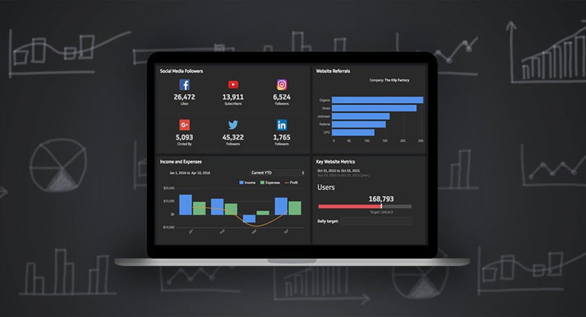
Power up with PowerMetrics
Marcus recently discovered PowerMetrics, which has been nothing short of transformational for BrokerNotes, a financial comparison website that Venture Harbour runs.
BrokerNotes has long had a reporting problem in that they work with over 50 different partners who all provide a different reporting portal that Marcus and his team have to log in to each month to see their performance stats.
Since discovering PowerMetrics, Venture Harbour has been able to get APIs from its partners and pull them all into one PowerMetrics dashboard.
“Not only does PowerMetrics save us time by not having to login to 50 portals every month, but it also allows us to have standardised reports and easily visualise data in the way that we want. It’s also sped up the time between discovering insights and taking action, enabling us to grow the business faster.”
With PowerMetrics, you can:
Compare current to historical data to see trends over time
Build a complete story by comparing metric values over time and comparing data between different time periods. You can also see trends and learn from the past and the present.
Gain insights into your data through interactive exploration
You can dig into your data, trying out different visualization types, applying various date ranges, and choosing unique ways to segment and filter your data. It's quick and easy, and you can see the impact of your choices while you experiment and explore.
“I would not be surprised if our new PowerMetrics report in Klipfolio results in actions that add 5-6 figures to our revenue.”
When you identify which metrics are most meaningful to your company’s success and then track those metrics, you have constant access to current and historical information, enabling you to make timely, impactful decisions.
“We’ve grown by over 300% since using Klipfolio, and the decisions that led to this growth have come from data displayed on Klipfolio.”
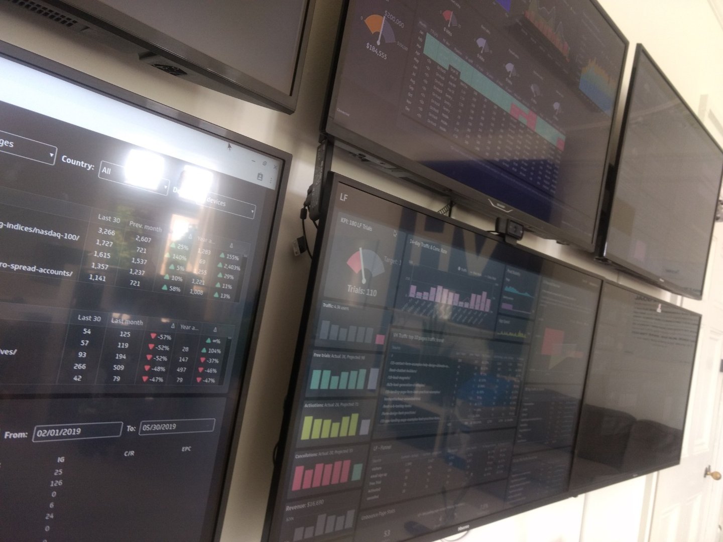
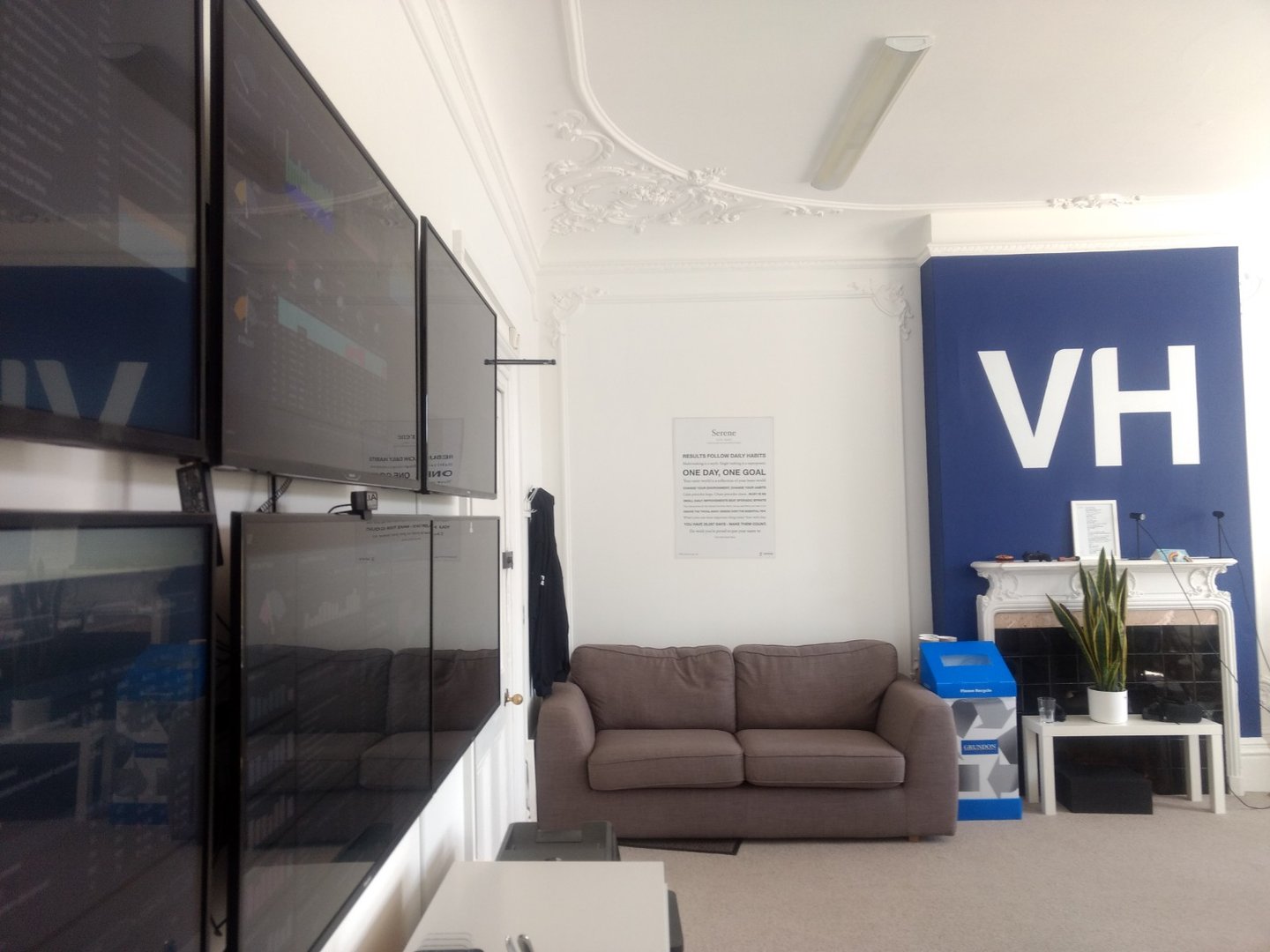
Sharing your data in style with Klipfolio wallboards
Venture Harbour has a whopping 250” wall of Klipfolio Dashboards in their office (right next to the coffee machine!), which leads to a lot of informal discussions around why certain data points are going up or down.
Every month, the team has a dashboard day where everyone gathers around their wall of TV dashboards and discusses the data. Each team member is accountable for one dashboard and must present the data to the rest of the team.
“These sessions give everyone a chance to understand what’s happening in the business and objectively challenge what we�’re doing and why with no politics or hard feelings. That’s the great thing about data - you can’t really argue with it or pull rank, it just is what it is.”
#dashboards
In addition to wallboards, they have a #dashboards Slack channel where their dashboards are posted once a week, allowing our remote staff to also have full visibility over what’s going on and discuss the data.
“My favourite thing about Klipfolio is that it reduces difficult conversations.”
Rather than telling a team member they’re behind on a KPI or that a key metric is behind where it should be, Klipfolio makes these data points clear for the Venture Harbour team - which has a self-regulating effect.
“By displaying a metric on a Klipfolio dashboard it forces us as a team to agree on what’s important, reducing miscommunication and misalignment in expectations, which from my experience is the root of virtually all negative situations and difficult conversations in business.”
A culture of personal growth and calmness
Venture Harbour’s culture is centered around personal and professional growth. Marcus has often said to his team that Venture Harbour is a vehicle for them to grow personally, which is why it’s essential that every venture is more ambitious than the last.
A related aspect of their culture is calmness. At Venture Harbour, it’s very rare for something to be urgent. Employees go home at 4 pm. They’re based in rural Oxfordshire, and they go out of their way to do things that meaningfully improve team members’ work-life integration.
“Twice a year we go on a 3-4 day retreat as a team which normally combines a 24-hour hackathon with team celebrations (last time may have included karaoke to Slipknot and Cyndi Lauper).”
I highly recommend you watch the video below for reference to the hackathon and, more importantly, the karaoke.
The ‘2:20:200’ dashboard design principle
“Design dashboards according to the ‘2:20:200’ principle, which suggests that you should be able to understand the general situation in 2 seconds, know what’s causing it in 20 seconds, and know precisely what action to take next in 200 seconds. We tend to design our dashboards in three columns with each containing the data required for these.”