

Domo vs Tableau
The main difference between Domo and Tableau is that Domo offers a comprehensive, cloud-based platform that combines data integration, transformation, and real-time analytics, making it ideal for organizations seeking an all-in-one BI solution. In contrast, Tableau specializes in advanced data visualization and analytics, providing powerful tools for creating interactive dashboards but often requires additional tools for data preparation and integration.
In today's data-driven business landscape, having a powerful business intelligence (BI) tool is essential for making informed decisions and gaining valuable insights. Two popular options in the market are Domo and Tableau, each offering unique features and capabilities to help organizations harness the potential of their data.
Let’s dive into a full review of Domo vs Tableau, analyzing their core functionalities, user-friendliness, data visualization capabilities, integration capabilities, security measures, pricing models, real-world use cases, support options, and more. Additionally, we will introduce an alternative option, Klipfolio PowerMetrics, which provides a compelling metric-centric alternative to both Domo and Tableau.
Hopefully, the insights here will help you make an informed decision.
Domo vs Tableau vs Klipfolio PowerMetrics Differences
Whether you're a business professional exploring business intelligence tools or an organization looking to improve its data analysis capabilities, it's beneficial to check additional tools and resources to find the one that best suits your needs. Understanding these core aspects will help you better understand what Domo, Tableau, and Klipfolio bring to the table and how they can benefit your organization.
Let's look closer at the key features and capabilities that define Domo, Tableau, and Klipfolio PowerMetrics.
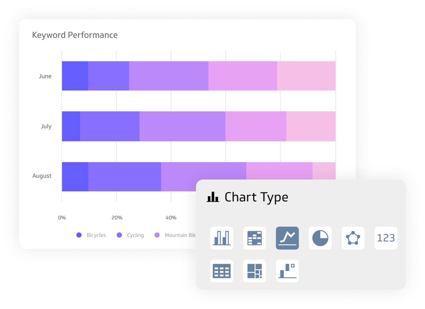
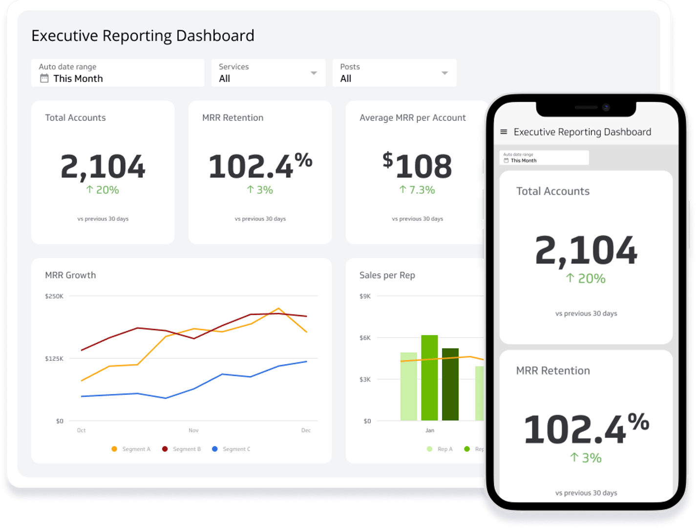
Visualizations and dashboards


Yes, automatically generated and customizable
Yes, automatically generated and customizable
150+
24
25+
400+
Data connections
Data preparation
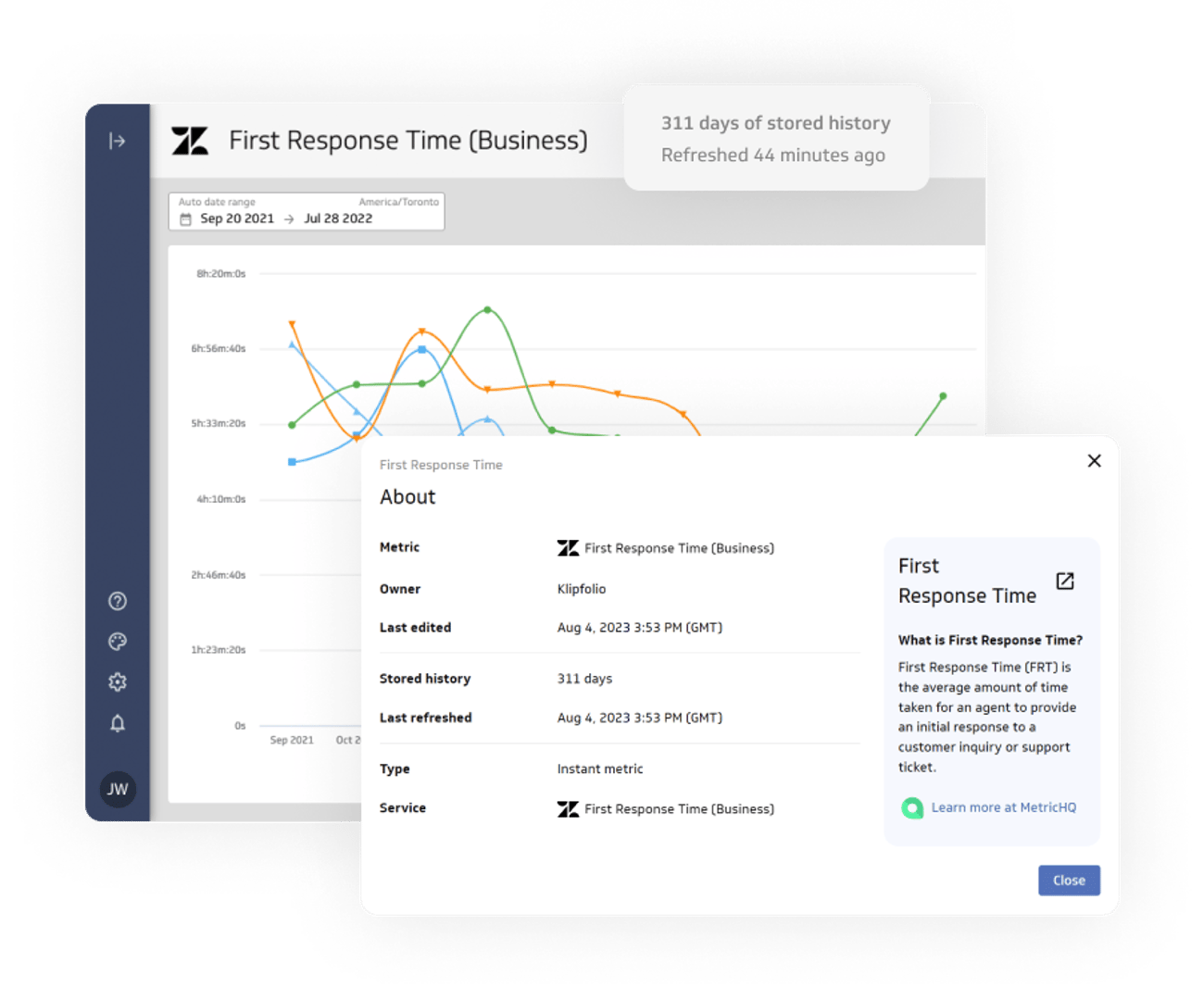
Data history and storage
Exploration
Sharing and distribution
Client management & customization
Embedded Only
Can Change Logo
Embedded Only
Privacy and security
Support and resources
API
Why Klipfolio
PowerMetrics is the best alternative to
Domo & Tableau
At Klipfolio, we prioritize the needs and requirements of our clients above all else. Thanks to continuous upgrades, we improve our software every day to ensure that you're getting all the features you want without the added premiums.
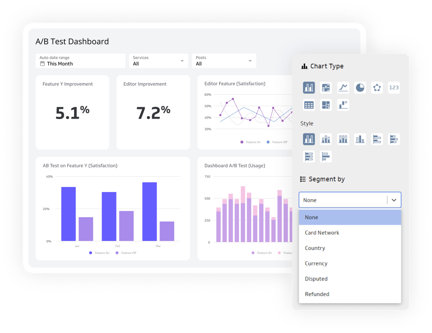
Drag-and-drop dashboard builder
When comparing Domo vs Tableau, both platforms offer powerful solutions for dashboard creation. Domo provides a visually appealing interface with pre-built connectors, allowing users to connect to popular data sources easily. Its drag-and-drop functionality enables effortless customization of dashboards. Conversely, Tableau offers flexibility and advanced data visualization capabilities, supporting various data connectors and providing extensive chart types and customization options.
Considering Klipfolio PowerMetrics as an alternative, it combines a user-friendly interface with extensive data integration and a drag-and-drop dashboard builder. Central to Klipfolio PowerMetrics' metric-centric philosophy is the metrics catalog. This catalog acts as a repository of defined business metrics organized in a user-friendly manner. Users can explore the catalog, select the metrics relevant to their specific needs, and use them as building blocks for creating personalized dashboards and reports.
A metric-centric approach to data
One of the key aspects to consider when comparing Domo, Tableau, and Klipfolio PowerMetrics is their approach to data. While all three platforms offer powerful data analysis and visualization capabilities, Klipfolio PowerMetrics stands out with its metric-centric approach.
Both Domo and Tableau offer more comprehensive data analysis capabilities that encompass a broader range of data exploration and visualization options. While this can be beneficial for users who require in-depth analysis and complex data relationships, it may also result in a more complex and time-consuming process to identify and focus on the most important metrics.
With PowerMetrics, users can create metric homepages that bring together relevant metrics and visualizations, providing a comprehensive overview of their organization's performance. This metric-centric approach helps users gain actionable insights quickly and make data-driven decisions based on the most critical aspects of their business.
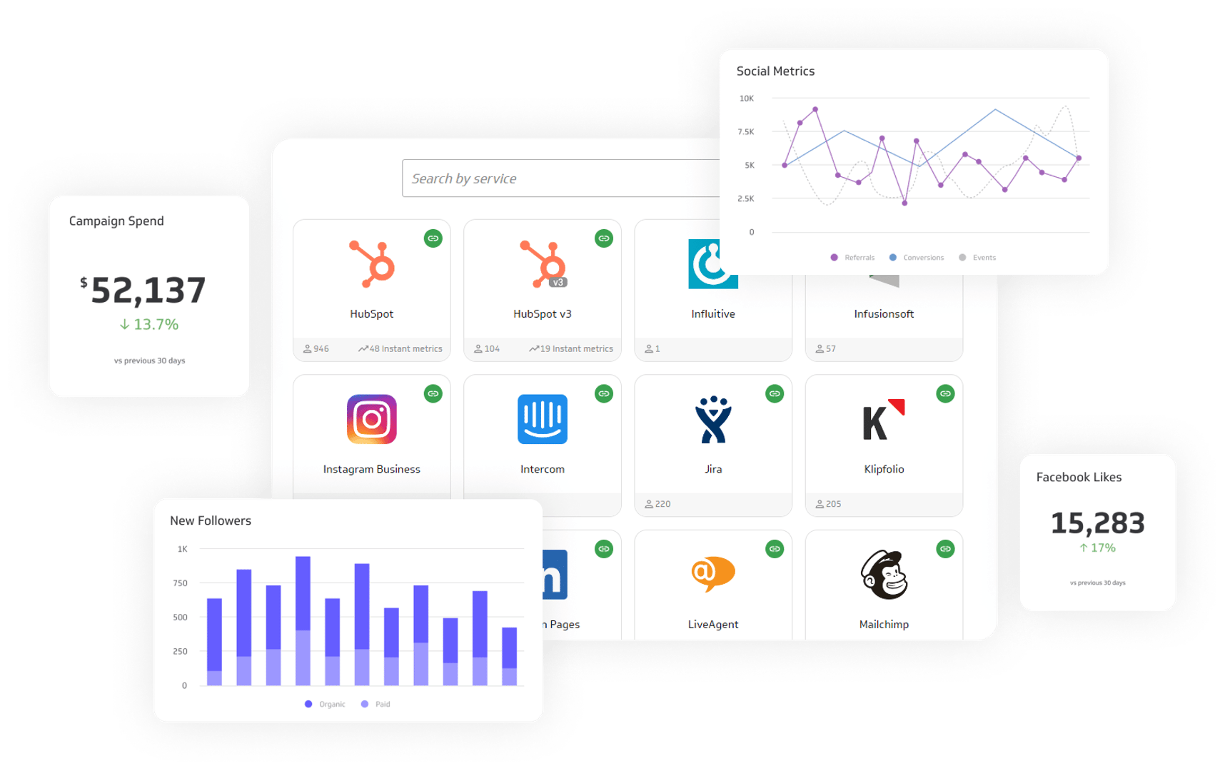
Extensive data source integration
Both Domo and Tableau provide powerful solutions for extensive data source integration, simplifying the process of connecting to various data sources and enabling insights from diverse data sets. Domo offers a wide range of pre-built connectors covering databases, cloud services, and business applications. In contrast, Tableau offers flexibility through support for popular connectors and the ability to build custom connectors using APIs and SDKs.
Tableau's integration capabilities have been further strengthened since joining forces with Salesforce in 2019. Since the acquisition, Tableau has expanded its connectivity options, seamlessly connecting to various data sources, cloud platforms, and popular services within the Salesforce ecosystem, including Google Analytics and Microsoft Excel. This strategic integration has solidified Tableau's position as a powerful BI tool, providing users with extensive data connectivity options to extract insights from their data.
However, it's also worth considering Klipfolio PowerMetrics as a similar and more affordable alternative. Klipfolio PowerMetrics sets itself apart from traditional BI solutions by adopting a metric-centric approach. Rather than drowning users in an overwhelming sea of data, the platform provides a curated selection of metrics that are essential for informed decision-making. PowerMetrics offers simplified integration with its user-friendly interface and visual query builder. It specializes in real-time data tracking and offers robust data blending and modeling capabilities.
Real-time refresh
Domo and Tableau, two prominent data analytics platforms, provide options for data refresh on their dashboards and visualizations. Domo allows users to schedule data refreshes at specified intervals, ensuring the information displayed is relatively up-to-date. Similarly, Tableau enables users to automate data refreshes from diverse data sources.
However, Klipfolio PowerMetrics takes real-time data refresh to a higher level. PowerMetrics empowers users to access the most current data insights, enabling informed decision-making based on real-time information. Dashboards and visualizations in PowerMetrics are continuously updated with the latest data from connected sources, eliminating delays and manual data updates.
PowerMetrics enables users to stay agile and responsive in data analysis by providing real-time data refresh capabilities. Real-time monitoring of data changes, identification of patterns or anomalies, and prompt actions become feasible. Manual data updates and batch processing are eliminated, saving time and ensuring data accuracy.
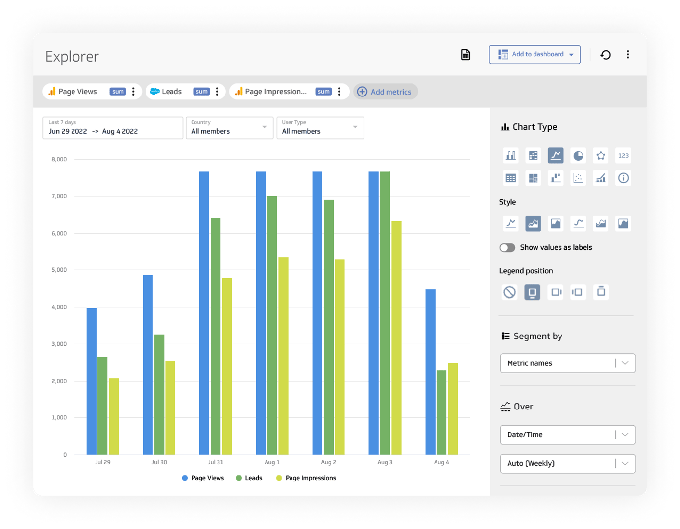
Interactive exploration
DOMO and Tableau offer basic data filtering and exploration options, allowing users to analyze their datasets. However, PowerMetrics takes data exploration to the next level by providing a user-friendly interface that facilitates deep analysis, ad-hoc filtering, and segmentation. Users can manipulate variables, explore dimensions, and uncover real-time patterns or trends.
Moreover, PowerMetrics enhances the interactive data exploration experience with built-in date range controls, personalized views, and the ability to save explorations. The software ensures that any metric can be visualized consistently across time, filtered, and segmented. This consistency empowers users to gain valuable insights quickly and easily, regardless of the metric they are analyzing.
Whether users are exploring revenue trends, customer retention rates, or marketing campaign performance, they can trust that the visualization layer will provide the necessary tools for in-depth analysis. Klipfolio PowerMetrics' consistent visualization capabilities enable users to identify patterns, spot anomalies, and make data-driven decisions efficiently.
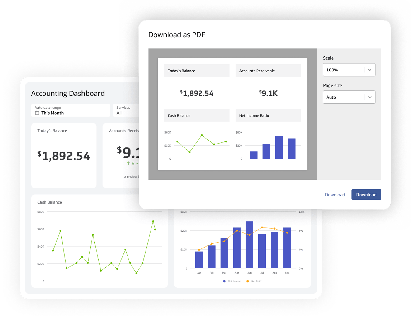
Expand automated email reports
It is clear that both Domo and Tableau offer robust tools for creating and sharing reports. Domo provides a comprehensive reporting module with interactive visualizations and scheduling options. Tableau excels in data visualization and advanced analytics. However, Klipfolio PowerMetrics introduces its own unique strength with automated email reports. Users can configure and customize notifications for automatic generation and delivery via email, saving time and ensuring timely information dissemination. PowerMetrics also offers format options like PDF attachments for offline access. Integrating PowerMetrics provides the best of both worlds, combining Domo and Tableau's reporting capabilities with the streamlined automation of email reports. This allows for efficient data sharing, enhanced collaboration, and informed decision-making across the organization.
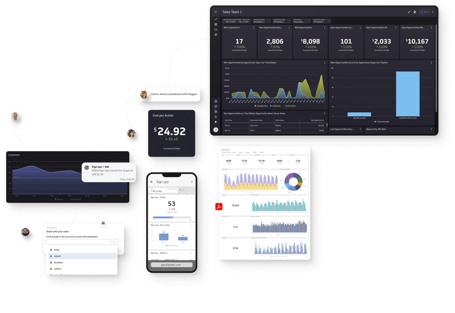
Collaborative team environment
Domo provides collaboration capabilities allowing users to share dashboards, reports, and insights. It offers features like data alerts and notifications to keep team members informed. Tableau, on the other hand, enables users to publish dashboards to Tableau Server or Tableau Online for shared access. With Salesforce's support, Tableau has become a valuable platform for teamwork and data-driven decision-making, enabling seamless collaboration across teams and departments.
However, despite these collaboration strengths, Tableau users have raised concerns about the platform's feature prioritization, particularly regarding the focus on integrations rather than addressing prevalent feedback on improvements that would’ve enhanced usability for the platform. Issues like inflexible customization, slow-loading dashboards, and scaling challenges have prompted some users to explore alternative tools that better align with their specific needs. That’s why, in terms of collaboration, many users say that Domo may be a better option.
Meanwhile, Klipfolio takes collaboration to a new level with its real-time collaboration features. Team members can work together on dashboards simultaneously, making real-time changes and updates. The metrics catalog also facilitates seamless collaboration within organizations. Team members can access the same standardized metrics, promoting consistency in the analysis and interpretation of data. This shared understanding of metrics fosters better teamwork and data-driven decision-making across departments.
The platform also provides secure access controls, allowing users to define permissions and control who can view and edit dashboards. In addition, Klipfolio supports commenting capabilities within dashboards, enabling team members to provide feedback, ask questions, and engage in discussions right within the platform.
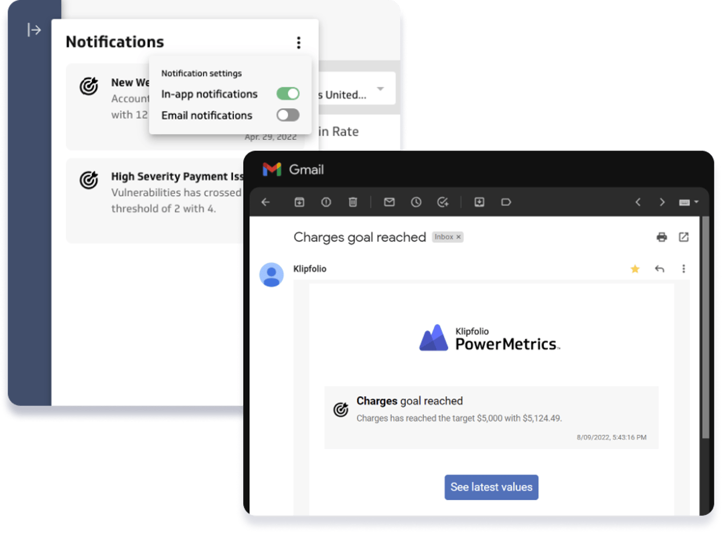
Goal tracking and notifications
Domo provides goal-tracking capabilities that allow users to set specific targets and track progress against those goals. Users can visualize their goal performance through charts and graphs, enabling them to assess their progress at a glance. Tableau also offers goal-tracking features, allowing users to define targets and measure their performance against those goals. Users can create visualizations and dashboards to monitor their progress and make data-driven decisions.
Again, though, there have been complaints about Tableau’s platform. One of the main concerns is that Tableau is not as beginner-friendly as some other BI tools, making it challenging for non-coders or those unfamiliar with SQL to learn and use effectively. This learning curve may result in a steeper onboarding process and potentially limit the accessibility of the platform for individuals without a strong technical background.
Alternatively, Klipfolio stands out in its goal tracking and notifications capabilities. Klipfolio provides a comprehensive solution that allows users to set specific goals and define key performance indicators (KPIs) within their dashboards. Users can track their progress in real-time, ensuring accurate and up-to-date goal monitoring.
Klipfolio also offers customizable notifications and alerts based on goal performance. Users can set up notifications when certain thresholds are met or exceeded, informing stakeholders of any significant changes or progress toward their goals. These notifications can be delivered through various channels such as email, SMS, or Slack, providing timely updates to users.
Responsive Mobile Access
With Domo, users can access their dashboards through the Domo mobile app, which provides a responsive and optimized experience across different devices, including smartphones and tablets. Users can view and interact with their data, explore visualizations, and stay updated on crucial metrics wherever they are.
Similarly, Tableau offers a mobile app that enables users to access and interact with their dashboards on mobile devices. The app's responsive design adapts to different screen sizes, ensuring a seamless and user-friendly experience. Users can explore data, apply filters, and interact with visualizations, all while on the move.
However, it is important to consider one common concern among Tableau users. It’s that while the app allows for dashboard access and exploration, certain complex visualizations and interactions may not render optimally. This limitation can potentially hinder users from fully experiencing the interactive capabilities and in-depth analysis that Tableau offers.
Klipfolio also offers responsive mobile access, allowing users to access their dashboards and data insights from any device. Klipfolio's mobile-optimized interface ensures that dashboards are correctly displayed and are easily navigable on smartphones and tablets. Users can stay connected to their data, monitor key metrics, and make informed decisions even when away from their desks.

Klipfolio is trusted
across industries.
PowerMetrics has been helping teams just like yours organize, visualize, and share metrics since 2019. With extensive docs, an AI-powered help UI, friendly support staff, a free tier, and low pricing plans, now's the time to give us a try.
"We've grown by over 300% since using Klipfolio, and the decisions that led to this growth have come from data displayed on Klipfolio."
Marcus Taylor
Founder and CEO of Venture Harbour"Our leadership team is making smarter decisions and were on target to grow by 40 - 50% this year thanks to our insights from Klipfolio."
Brian Dainis
Founder and CEO of Curotec"I love the full range of capabilities that are possible when building a Klipfolio dashboard (specifically with their Klips product). Unlike the majority of BI platforms, building with Klipfolio feels more like designing a web page than configuring a single chart at a time. [...] Variables are straightforward and can be made independent of the data, which makes room for creative solutions to a wide variety of UI requirements."
Graham H
Principal Consultant for SMBs"Klipfolio is data analytics software that is best suited for businesses of all sizes that are looking to get instant insights from their data"
DOMO vs Tableau vs Klipfolio Tool Pricing
$83/u/m (Standard), $160/u/m (Professional), $190/u/m (Enterprise), $30K - $50K to setup
$70/u/m (Creator), $42/u/m (Explorer), $15/u/m (Viewer), $250/m (Resource Block)
$99 to $799
The pricing for Domo’s plans typically starts at around $2,000 to $3,000 per user per year for their standard plans. However, it's important to note that Domo offers customizable enterprise plans as well, which can have higher costs depending on the specific requirements and scale of the organization.
In comparison to both, Klipfolio offers transparent pricing with fixed rates. Pricing for PowerMetrics starts at $56 per month (billed annually) and is scalable to meet the needs of even the largest companies. These prices give you access to the full range of features and capabilities of Klipfolio PowerMetrics.
If you are still uncertain about Tableau vs DOMO then check out our other comparisons: Power BI vs Tableau, Looker vs Tableau and Tableau vs Klipfolio.
Frequently Asked Questions
Yes, Klipfolio offers many connectivity options to integrate with your existing data infrastructure. It supports various data sources, including databases, cloud services, web applications, and APIs. Additionally, Klipfolio provides pre-built connectors for popular platforms, such as Google Analytics, Salesforce, and Microsoft Excel. Klipfolio also allows you to build custom data connectors using its open API if you have custom data sources.
Yes, all three tools offer mobile capabilities. Domo, Tableau, and Klipfolio PowerMetrics provide mobile apps or responsive interfaces that allow users to access and interact with their data visualizations, dashboards, and reports on smartphones and tablets. Klipfolio PowerMetrics, Tableau, and Domo’s features enable users to stay connected and make data-driven decisions on the go.
Yes, Klipfolio enables you to schedule automated data refreshes for your dashboards and reports. You can define the frequency of data updates, such as hourly, daily, or weekly, ensuring that your visualizations always reflect the most recent data. This feature eliminates manual data updates and ensures your insights are based on real-time information.
Yes, collaboration and data sharing are critical features of these tools. Domo, Tableau, and Klipfolio PowerMetrics provide user and group-sharing functionalities, allowing team members to collaborate on data analysis and reporting. Users can share dashboards, reports, and visualizations with specific individuals or groups, control access levels, and collaborate in real-time, fostering teamwork and data-driven decision-makin
Yes, Klipfolio provides extensive customization options for your dashboards. You can choose from various pre-built visualizations, including charts, graphs, tables, and gauges, and customize their colors, fonts, sizes, and layouts to align with your brand or specific design preferences. This allows you to create visually stunning, metric-centric dashboards that effectively convey your data insights.
Between Domo and Tableau, Domo wins hands down when it comes to the cloud. But PowerMetrics provides easy access to cloud file-sharing services and supports custom data connectors through its open API.
Yes, all three tools offer training and learning resources. Domo, Tableau, and Klipfolio PowerMetrics provide various forms of support, such as documentation, knowledge bases, tutorials, webinars, and user communities. Klipfolio PowerMetrics, Tableau, and Domo’s resources help users get started, learn best practices, and enhance their skills in using the tools effectively, empowering them to harness the full potential of the platforms.
Yes, Klipfolio prioritizes data security and privacy. They implement industry-standard security practices, including encryption, secure socket layer (SSL) connections, and role-based access controls. Klipfolio also offers granular permission settings, allowing you to control access to data, dashboards, and reports based on user roles and responsibilities. Your data is protected and accessible only to authorized individuals.
